What Colors Go With Gold? – 25 Harmonious Color Schemes
This post may contain affiliate links. We may earn a small commission from purchases made through them, at no additional cost to you.
Welcome to the art of interior design, where I blend passion with expertise. Today, we dive into the opulent world of gold. As a seasoned designer, I’m excited to guide you through the 25 best colors to pair with gold, transforming spaces into realms of elegance and luxury. Gold isn’t just a color; it’s an experience. Let’s uncover the secrets to creating breathtaking interiors with this timeless hue. Ready for a golden adventure? Let’s begin!
What Color Is Gold?
As an interior designer, I’ve always been captivated by the rich and vibrant allure of gold. Its sun-like shimmer and glow evoke feelings of opulence and grandeur, reminiscent of royal splendor. Gold is not just a color; it’s a symbol of success and high status, balancing timelessness with contemporary appeal. In my journey with gold, I’ve discovered its incredible range – from pale, lemony hues to deep, amber tones. Each shade of gold has its own character, whether it’s a light, buttercup tinge or a richer, autumnal burn. What fascinates me most is the versatility of gold. By blending it with other colors, like adding white for paler tones or red for deeper ones, we can create a spectrum of gold shades, each with unique charm. I’m excited to share my methods for creating these diverse gold hues, making them accessible for everyone to experiment with and enjoy in their own spaces.
| Gold Color | Gold Hex Code | RGB | CMYK Color Code (%) | Shade of Gold |
| Gold | #ffd700 | 255,215,0 | 10, 15, 90, 10 | |
| Goldenrod | #daa520 | 218,165,32 | 0, 24, 85, 15 | |
| Mellow Yellow | #f8de7e | 248,222,126 | 0, 7, 33, 8 | |
| Buff | #f0dc82 | 240,220,130 | 0, 8, 46, 6 | |
| Mustard | #ffdb58 | 255,219,88 | 0, 14, 65, 0 | |
| Sunglow | #ffcc33 | 255,204,51 | 0, 20, 80, 0 | |
| Saffron | #f4c430 | 244,196,48 | 0, 20, 80, 4 | |
| Sandstorm | #ecd540 | 236,213,64 | 0, 10, 73, 7 | |
| Golden Yellow | #ffdf00 | 255,223,0 | 0, 13, 100, 0 | |
| Golden Poppy | #fcc200 | 252,194,0 | 0, 23, 100, 1 |
25 Colors Combinations for Gold
In my journey as an interior designer, gold has always been a favorite. I’ve explored 25 captivating color combinations that elevate gold’s charm. Pairings like gold with navy blue exude classic elegance, while gold and hot pink add unexpected vibrancy. I love how gold blends with deep greens for luxury, and contrasts with soft pastels for sophistication. Each combination, from gold with crisp white to rich burgundy, isn’t just about colors; it’s about personal expression and transforming spaces into unique reflections of style and creativity.
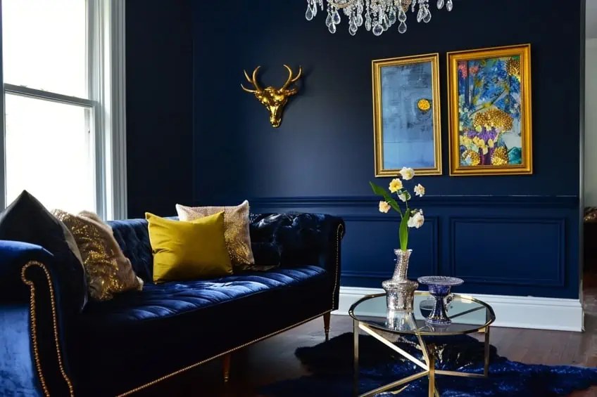
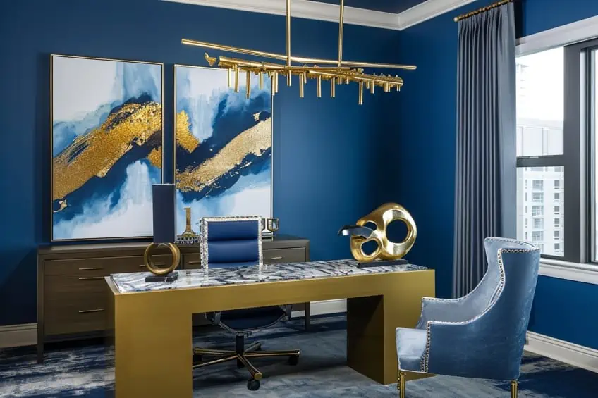
Classic Gold and Deep Navy Blue
This combination exudes timeless elegance. In a living room, use navy blue as a primary color for walls or major furniture pieces, and accent with gold in the form of decorative pillows, lamps, or picture frames. This pairing works well in formal areas, creating a sense of sophistication and luxury. My tip: Use gold in reflective materials like mirrors or picture frames to enhance the light in the room.
| Shade | Hex Code | CMYK Color Code (%) | RGB Color Code | Color |
| Classic Gold | #CFB53B | 0, 10, 70, 19 | 207, 181, 59 | |
| Deep Navy Blue | #000080 | 100, 100, 0, 50 | 0, 0, 128 |
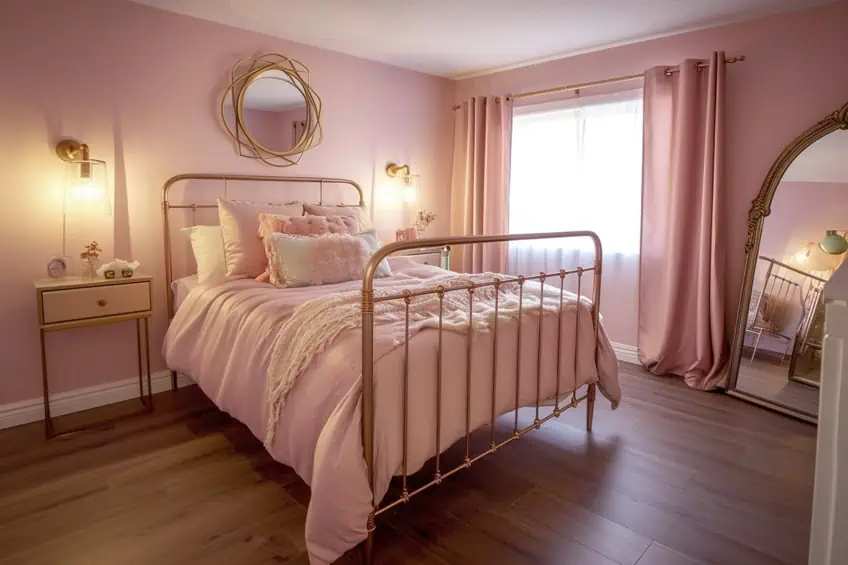
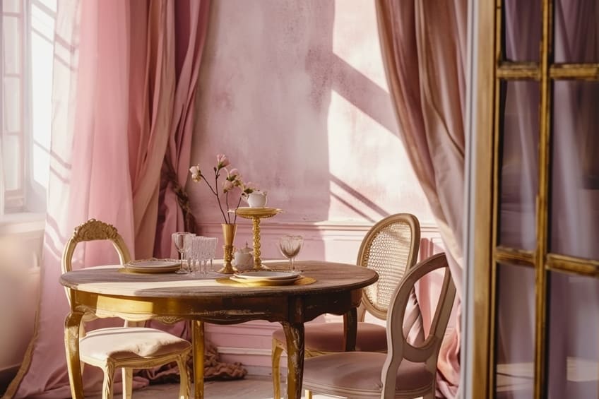
Rose Gold and Soft Blush Pink
A dreamy, romantic pairing that’s perfect for bedrooms. Rose gold light fixtures or bed frames can beautifully complement blush pink bedding or curtains. This color scheme creates a soft, serene atmosphere. I often recommend adding textures like velvet in blush pink for an added layer of luxury.
| Shade | Hex Code | CMYK Color Code (%) | RGB Color Code | Color |
| Rose Gold | #B76E79 | 0, 40, 25, 28 | 183, 110, 121 | |
| Soft Blush Pink | #FADADD | 0, 15, 8, 2 | 250, 218, 221 |
Antique Gold and Hunter Green
Ideal for creating a rich, classic look. Hunter green can be used on walls or for larger furniture pieces, while antique gold accents in the form of candle holders, vases, or trimmings add a refined touch. This combination is great for libraries or home offices. My personal tip is to use natural wood elements to bridge these two colors together seamlessly.
| Shade | Hex Code | CMYK Color Code (%) | RGB Color Code | Color |
| Antique Gold | #D4AF37 | 0, 10, 70, 17 | 212, 175, 55 | |
| Hunter Green | #355E3B | 59, 0, 39, 63 | 53, 94, 59 |
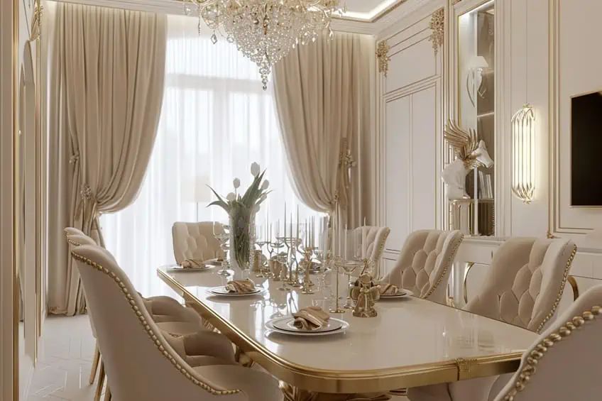
Champagne Gold and Ivory
This subtle yet luxurious combination works well in formal dining rooms or master bedrooms. Use ivory as the base color for walls and large pieces, with champagne gold accents in lighting fixtures, curtain rods, or decorative pillows. This pairing is all about creating a refined and elegant space that feels welcoming. Soft, plush fabrics in ivory can add a sense of comfort.
| Shade | Hex Code | CMYK Color Code (%) | RGB Color Code | Color |
| Champagne Gold | #F7E7CE | 0, 4, 14, 3 | 247, 231, 206 | |
| Ivory | #FFFFF0 | 0, 0, 6, 0 | 255, 255, 240 |
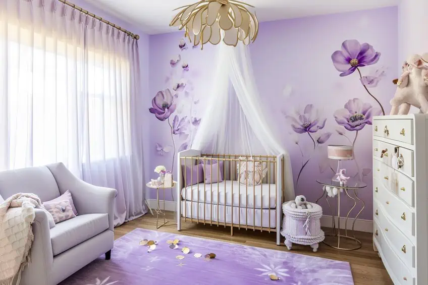
Pale Gold and Lavender
A whimsical and gentle combination, perfect for nurseries or reading nooks. Use pale gold in smaller accessories against a backdrop of lavender walls or furniture. This color scheme invites relaxation and creativity. Incorporate floral patterns or soft, flowing fabrics to enhance the dreamy feel.
| Shade | Hex Code | CMYK Color Code (%) | RGB Color Code | Color |
| Pale Gold | #E6BE8A | 0, 14, 31, 10 | 230, 190, 138 | |
| Lavender | #E6E6FA | 6, 6, 0, 2 | 230, 230, 250 |
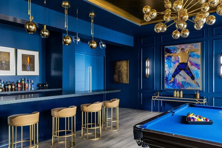
Metallic Gold and Royal Blue
Bold and regal, this combination is a statement maker. In a living room, use royal blue for a sofa or accent wall, with metallic gold in frames, lamp bases, or throw pillows. It’s great for spaces where you entertain, as it creates an atmosphere of luxury and confidence. My tip is to balance these bold colors with neutral floors or ceilings.
| Shade | Hex Code | CMYK Color Code (%) | RGB Color Code | Color |
| Metallic Gold | #D4AF37 | 0, 10, 70, 17 | 212, 175, 55 | |
| Royal Blue | #4169E1 | 71, 58, 0, 12 | 65, 105, 225 |
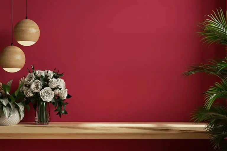
Honey Gold and Burgundy
Warm and inviting, this combination is ideal for cozy, intimate spaces like dens or bedrooms. Use burgundy for major pieces like rugs or curtains, and honey gold for accents like cushions or wall art. This palette is great for creating a snug, welcoming atmosphere. Layering different textures in these colors can add depth and interest.
| Shade | Hex Code | CMYK Color Code (%) | RGB Color Code | Color |
| Honey Gold | #DAA520 | 0, 15, 85, 15 | 218, 165, 32 | |
| Burgundy | #800020 | 0, 100, 75, 50 | 128, 0, 32 |

Brushed Gold and Charcoal Grey
A modern and chic pairing, perfect for contemporary spaces. Use charcoal grey for large furniture or walls, and add brushed gold accents in lighting or decorative items. This combination is ideal for creating a sophisticated, modern look. My advice is to keep lines clean and forms simple to maintain a contemporary feel.
| Shade | Hex Code | CMYK Color Code (%) | RGB Color Code | Color |
| Brushed Gold | #B5A642 | 0, 8, 70, 29 | 181, 166, 66 | |
| Charcoal Grey | #36454F | 44, 11, 0, 69 | 54, 69, 79 |
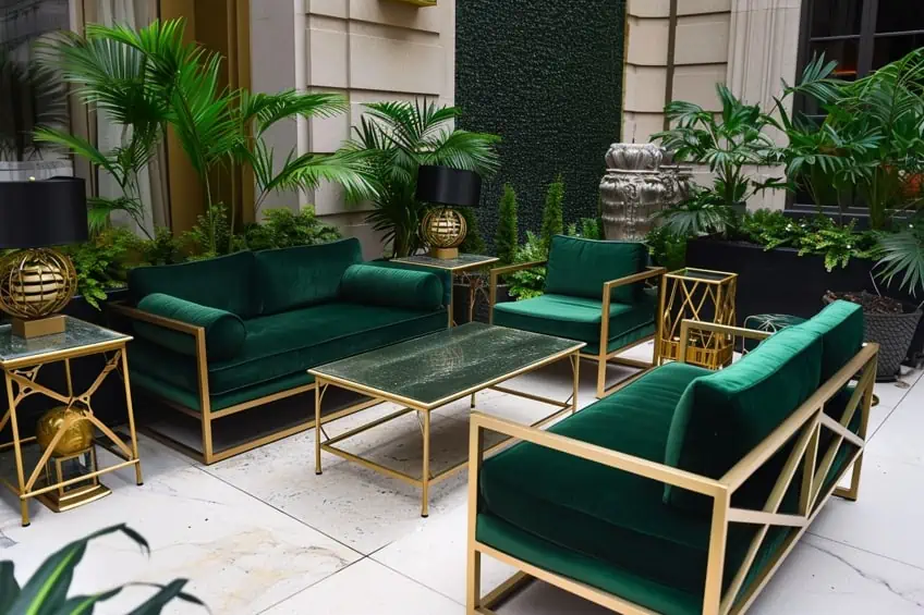
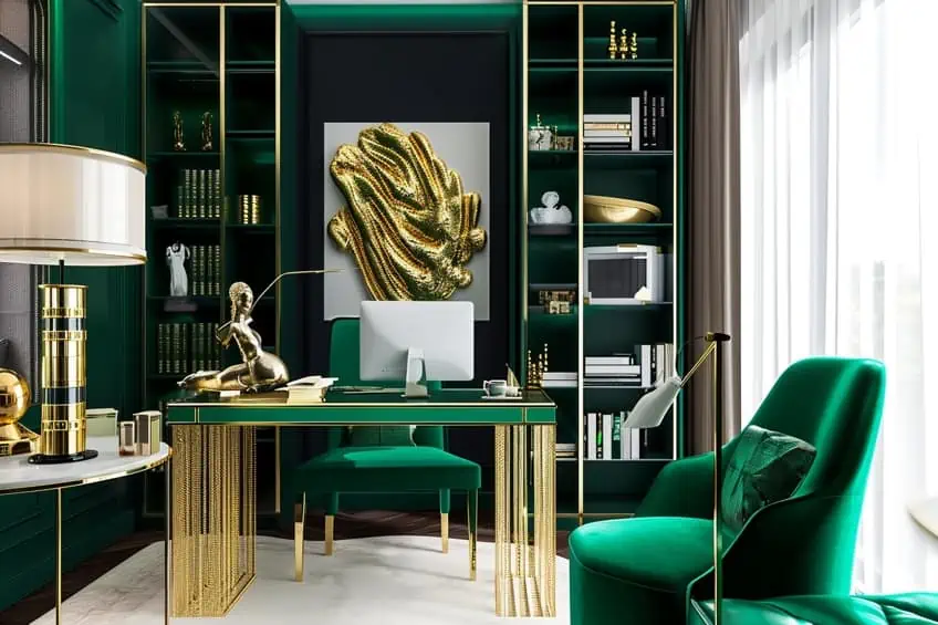
Bright Gold and Emerald Green
This vibrant and lively pairing can energize a space. Use emerald green on an accent wall or in large pieces like sofas, complemented by bright gold in vases, picture frames, or throw pillows. It’s perfect for a living room or study, adding a burst of energy and sophistication. Mixing in white or light wood tones can balance the intensity of these colors.
| Shade | Hex Code | CMYK Color Code (%) | RGB Color Code | Color |
| Bright Gold | #FFD700 | 0, 15, 100, 0 | 255, 215, 0 | |
| Emerald Green | #50C878 | 54, 0, 44, 22 | 80, 200, 120 |
Mustard Gold and Teal
An earthy, calming combination, great for creating a natural vibe in living spaces. Use teal for major elements like walls or large furniture, and mustard gold for accents. This palette brings the tranquility of nature indoors, ideal for a relaxed setting. Incorporating plants and natural textures can enhance the organic feel.
| Shade | Hex Code | CMYK Color Code (%) | RGB Color Code | Color |
| Mustard Gold | #DAA520 | 0, 20, 85, 15 | 218, 165, 32 | |
| Teal | #008080 | 100, 0, 33, 50 | 0, 128, 128 |

Satin Gold and Coral
A playful and fresh combination, perfect for energizing a space. Coral can be used on walls or for statement furniture, with satin gold accents in lighting fixtures or decorative items. This pairing is great for a youthful, vibrant space like a home office or a child’s bedroom. Adding geometric patterns can play up the fun aspect of this combination.
| Shade | Hex Code | CMYK Color Code (%) | RGB Color Code | Color |
| Satin Gold | #CBA135 | 0, 20, 70, 20 | 203, 161, 53 | |
| Coral | #FF7F50 | 0, 50, 69, 0 | 255, 127, 80 |

Glittering Gold and Black
Dramatic and luxurious, ideal for creating a glamorous space. In a dining room or living area, use black for walls or large furniture, accented with glittering gold in mirrors, picture frames, or light fixtures. This scheme is all about high contrast and drama. My tip is to use glossy finishes in black to add to the glamour.
| Shade | Hex Code | CMYK Color Code (%) | RGB Color Code | Color |
| Glittering Gold | #FFD700 | 0, 15, 100, 0 | 255, 215, 0 | |
| Black | #000000 | 0, 0, 0, 100 | 0, 0, 0 |

Goldenrod and Cobalt Blue
A dynamic and striking combination, perfect for making a bold statement. Use cobalt blue on key pieces like a sofa or curtains, with goldenrod accents in cushions, artwork, or rugs. This pairing is great for spaces where you want to stimulate conversation and energy, like a living room. Adding neutral elements can help balance the boldness.
| Shade | Hex Code | CMYK Color Code (%) | RGB Color Code | Color |
| Goldenrod | #DAA520 | 0, 20, 85, 15 | 218, 165, 32 | |
| Cobalt Blue | #0047AB | 100, 57, 0, 33 | 0, 71, 171 |

Gold Leaf and Cream
Elegant and understated, this combination is ideal for creating a sophisticated and calm space. Cream should be the dominant color in the room, with gold leaf accents in picture frames, lamp bases, or decorative objects. This color scheme works well in bedrooms or living rooms, creating a serene and refined atmosphere. My personal tip is to use different shades of cream to add depth.
| Shade | Hex Code | CMYK Color Code (%) | RGB Color Code | Color |
| Gold Leaf | #D1B000 | 0, 15, 100, 18 | 209, 176, 0 | |
| Cream | #FFFDD0 | 0, 0, 10, 0 | 255, 253, 208 |

Yellow Gold and Dark Purple
A royal and luxurious combination, perfect for creating an opulent feel. Use dark purple on walls or for major furniture pieces, with yellow gold accents in cushions, curtains, or wall art. This pairing is ideal for formal spaces or master bedrooms. Incorporating velvet or silk in these colors can heighten the sense of luxury.
| Shade | Hex Code | CMYK Color Code (%) | RGB Color Code | Color |
| Yellow Gold | #FFD700 | 0, 15, 100, 0 | 255, 215, 0 | |
| Dark Purple | #301934 | 0, 100, 0, 80 | 48, 25, 52 |

Golden Wheat and Rust Orange
A warm, autumnal combination, great for seasonal decor. Use rust orange in upholstery or curtains, complemented by golden wheat in throw pillows or area rugs. This palette creates a warm, inviting atmosphere, perfect for family rooms or dining areas. Adding natural elements like wood or stone can enhance the earthy feel.
| Shade | Hex Code | CMYK Color Code (%) | RGB Color Code | Color |
| Golden Wheat | #F5DEB3 | 0, 5, 30, 4 | 245, 222, 179 | |
| Rust Orange | #B7410E | 0, 70, 100, 28 | 183, 65, 14 |

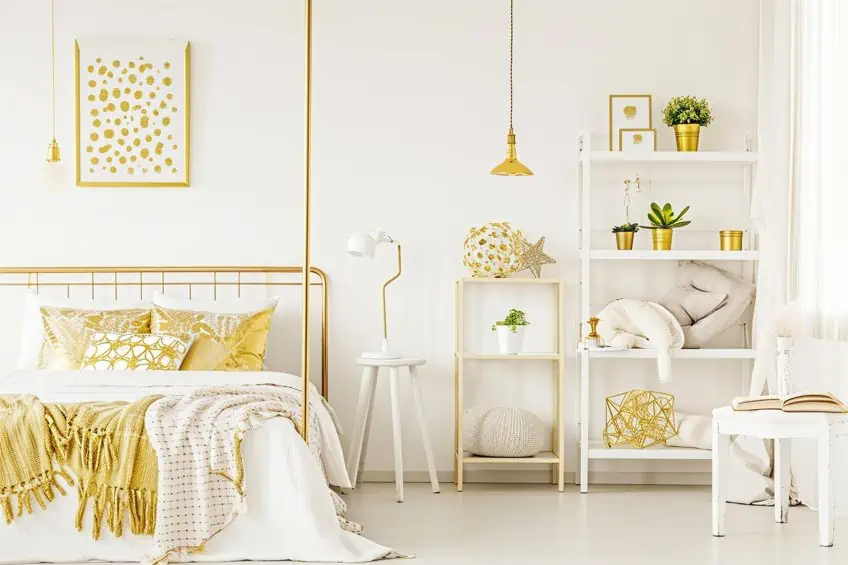
Shimmering Gold and Bright White
A crisp and clean combination, ideal for a minimalist approach. Use bright white as the base color for walls and major furniture pieces, with shimmering gold accents in light fixtures, picture frames, or decorative objects. This color scheme works well in modern, airy spaces. My tip is to keep the space uncluttered to maintain a minimalist feel.
| Shade | Hex Code | CMYK Color Code (%) | RGB Color Code | Color |
| Shimmering Gold | #CBA135 | 0, 20, 70, 20 | 203, 161, 53 | |
| Bright White | #FFFFFF | 0, 0, 0, 0 | 255, 255, 255 |

Aged Gold and Olive Green
Earthy and rich, ideal for creating a vintage or rustic look. Use olive green on walls or in upholstery, with aged gold accents in metal finishes or picture frames. This combination is perfect for spaces with a more traditional or rustic feel. Incorporating vintage or antique items can enhance the character of the space.
| Shade | Hex Code | CMYK Color Code (%) | RGB Color Code | Color |
| Aged Gold | #D4AF37 | 0, 10, 70, 17 | 212, 175, 55 | |
| Olive Green | #808000 | 20, 0, 100, 50 | 128, 128, 0 |

Light Gold and Pastel Mint
A refreshing and soothing combination, perfect for creating a tranquil atmosphere. Use pastel mint for walls or major pieces, and light gold for accents in lighting or decorative items. This color scheme is great for bathrooms or bedrooms, where a calming effect is desired. Soft, flowing fabrics in pastel mint can add to the serene feel.
| Shade | Hex Code | CMYK Color Code (%) | RGB Color Code | Color |
| Light Gold | #FDD017 | 0, 13, 90, 1 | 253, 208, 23 | |
| Pastel Mint | #98FF98 | 39, 0, 39, 0 | 152, 255, 152 |

Matte Gold and Slate Blue
Understated and stylish, this combination is great for a modern twist. Use slate blue for walls or key furniture pieces, with matte gold accents in hardware or lighting fixtures. This pairing is ideal for contemporary spaces, offering a sophisticated yet modern look. My advice is to use matte finishes to keep the look contemporary.
| Shade | Hex Code | CMYK Color Code (%) | RGB Color Code | Color |
| Matte Gold | #D3AF37 | 0, 15, 70, 18 | 211, 175, 55 | |
| Slate Blue | #6A5ACD | 56, 53, 0, 20 | 106, 90, 205 |
Tarnished Gold and Dusty Rose
A vintage and romantic pairing, perfect for creating a soft and inviting space. Use dusty rose in upholstery or curtains, with tarnished gold accents in picture frames or mirrors. This color scheme works well in bedrooms or cozy living spaces. Adding floral patterns or soft textures can enhance the romantic feel.
| Shade | Hex Code | CMYK Color Code (%) | RGB Color Code | Color |
| Tarnished Gold | #B08D57 | 0, 20, 50, 30 | 176, 141, 87 | |
| Dusty Rose | #D2B4BE | 0, 20, 13, 17 | 210, 180, 190 |
Gold Foil and Deep Red
Intense and passionate, ideal for a dramatic and luxurious space. Use deep red on walls or in key furniture pieces, complemented by gold foil accents in cushions, artwork, or decorative items. This combination is perfect for creating a sense of drama and luxury. My tip is to use velvet in deep red for a rich texture.
| Shade | Hex Code | CMYK Color Code (%) | RGB Color Code | Color |
| Gold Foil | #D4AF37 | 0, 10, 70, 17 | 212, 175, 55 | |
| Deep Red | #8B0000 | 0, 100, 100, 45 | 139, 0, 0 |

Sparkling Gold and Turquoise
Exotic and vibrant, perfect for a lively and energetic decor. Use turquoise for major elements like walls or sofas, with sparkling gold accents in cushions, curtains, or light fixtures. This pairing is great for spaces that need a burst of energy and color, like a home office or playroom. Incorporating patterns in turquoise can add to the lively feel.
| Shade | Hex Code | CMYK Color Code (%) | RGB Color Code | Color |
| Sparkling Gold | #FFD700 | 0, 15, 100, 0 | 255, 215, 0 | |
| Turquoise | #40E0D0 | 65, 0, 20, 12 | 64, 224, 208 |

Gold and Peacock Blue
Luxurious and deep, this combination is ideal for creating a sophisticated and stylish space. Use peacock blue on walls or for major furniture pieces, with gold accents in decorative items or trimmings. This color scheme works well in formal living rooms or dining areas. My personal tip is to use textures like silk or velvet in peacock blue to enhance the luxury.
| Shade | Hex Code | CMYK Color Code (%) | RGB Color Code | Color |
| Gold | #FFD700 | 0, 15, 100, 0 | 255, 215, 0 | |
| Peacock Blue | #33A1C9 | 69, 12, 0, 21 | 51, 161, 201 |

Rich Gold and Mauve
Elegant and subtle, perfect for a refined yet warm atmosphere. Use mauve for walls or upholstery, complemented by rich gold in accents like cushions, rugs, or picture frames. This combination is ideal for creating a warm, inviting space with a touch of elegance. Layering different shades of mauve can add depth and warmth.
| Shade | Hex Code | CMYK Color Code (%) | RGB Color Code | Color |
| Rich Gold | #A67D3D | 0, 25, 65, 35 | 166, 125, 61 | |
| Mauve | #E0B0FF | 14, 30, 0, 0 | 224, 176, 255 |

As we wrap up our colorful journey, I hope this article has inspired you to fearlessly pair gold in your interior design projects. It’s been a joy sharing my personal experiences and insights on how gold can transform a space when matched with the right colors. Remember, each color combination is a new adventure, a chance to infuse your personality into your home. Embrace the possibilities and let the elegance of gold elevate your decor to new heights of style and sophistication.
Frequently Asked Questions
What Are Some Common Color Combinations That Include Gold?
When wondering what colors go well with gold, there are quite a few that comes to mind. Some of the most popular colors to pair up with gold would include blue, purple, and green. Pairing either of these colors with gold can each create a completely different look and feel from each other, while still providing undertones of elegance and grandeur.
What Are Some Tips for Using Gold in a Tasteful and Not Overpowering Way in Design?
In my own home, I’ve found that deep blues and rich purples create a regal and luxurious contrast with gold accents, especially in spaces like the living room or bedroom. For a more subtle and sophisticated look, I often pair gold with off-white or light gray, as these neutrals provide a soft backdrop that makes gold elements truly shine and stand out.
What Are the Best Complementary Colors for Gold in Interior Design?

Duncan graduated with a diploma in Film and TV production from CityVarsity in 2018, after which he continued pursuing film while taking on a keen interest in writing along the way. Since having graduated, he began working as a freelance videographer, filming a variety of music videos, fashion and short films, adverts, weddings and more. Throughout this, he’s won a number of awards from various film festivals that are both locally and internationally recognized. However, Duncan still enjoys writing articles in between his filming ventures, appreciating the peace and clarity that comes with it.
His articles focus primarily around helping up-and-coming artists explore the basics of certain colors, how these colors can be paired with other shades, as well as what colors are created when you mix one with another. All while relating these shades to historically significant paintings that have incorporated them into their color palette. As a lover of the arts himself, he takes great interest in the Renaissance era of paintings, an era that has directly inspired many of his favorite films.
Learn more about Duncan van der Merwe and about us.