Color Wheel – Our Color Theory, Harmonizing, and Mixing Guide
This post may contain affiliate links. We may earn a small commission from purchases made through them, at no additional cost to you.
Understanding color theory is vital to creating visually striking and balanced pieces of art. The color wheel offers an excellent tool to explore the basics of color theory and understand how to create beautiful color pallets for both muted and loud color schemes. The color wheel and color theory not only benefit your art but can also bring harmony to your space and distinguish your brand.
Table of Contents
Exploring Color Theory
There are an infinite number of colors so picking which colors go well together for your project, as well as how to mix them, can seem like a daunting task if you are just starting out. Knowing how to mix and match colors is a vital skill in creating art, as trying to buy the exact hue that you need every time can quickly become very expensive.

Color theory teaches you not only how to mix your own colors from primary hues but also teaches you which colors, when used together, create balance and interest. Understanding color theory will improve your art, especially realism art, and will also save you money, allowing you to get more colors out of a small set and adapt your paints to get the exact color you need, which is not always available in a tube.
What Is Color Theory?
Artists of all kinds from painters to graphic designers use color theory to create and mix different colors. Color theory is a set of basic rules that allow artists to use color effectively to create impactful and aesthetic pieces that are not disjointed or overwhelming. Color theory is also used to create palettes and schemes, for making different colors, or even for creating specific moods within projects. Color theory is based mainly on three core components, which are the color theory wheel, the broader context, and color balance.

The Color Theory Wheel
Color theory can easily be seen on the color wheel. An important term to understand when talking about color theory is hue. Hue is the pure color and that color’s location on the color wheel, and does not include any tints, tones, or shades. We will be explaining these terms and many more terms used in color theory throughout the article.
What Is a Color Wheel Chart?
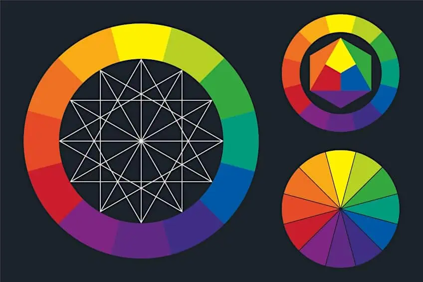
The color wheel has many names including the hue wheel and color chart, but in essence, it is a visual representation of all the colors in the spectrum arranged in a circle. The position of colors around the wheel shows how they relate and combine to create new colors, as well as how they work together and how they do not. This is why it is essential to understand the color wheel for artists, designers, and interior decorators alike.
Using the Color Wheel
The original color wheel was invented by Sir Newton in 1666 when he used a circle to plot the color spectrum. Several color wheel variations have sprung up since then that serve various color mixing purposes. Some artists have even created eye catching color wheel art projects based on the arrangement of the hues on color charts.

There are 12 colors on a basic color wheel chart, consisting of three primary secondary colors and six tertiary colors. You can use the color wheel for mixing colors of every other hue from these main colors. Depending on the exact color wheel model you are using, the three primary colors can differ slightly. The most basic and well-known primary colors are blue, yellow, and red. These are the primary colors on the Red Yellow Blue color wheel.
In color wheels based on additive color mixing, where you create new colors by mixing the different light wavelengths of colors with each other, the primary colors become red, blue, and green instead. This model is known as the Red, Green, Blue or RGB model and is used in producing colored lights on electronic screens and displays. Mixing all the colors in this model together creates white.
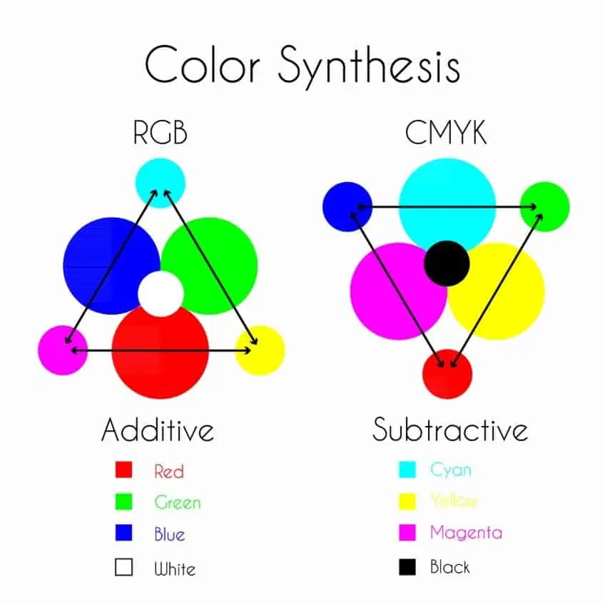
The colors yellow, magenta, and cyan are the primary colors in subtractive color models. This model is known as the CMYK model, which stands for the Cyan, Magenta, Yellow Key. This model is often used in printer ink as they are vivid when printed on white paper and all the colors mixed together appear black.

Regardless of which primary colors are used, all these colors share the same trait in their respective models. This is that they cannot be made from any other colors but are used to create every other hue on the spectrum. In the traditional RYB model we will be using, two primary hues can be combined to create secondary colors. These combinations are red and yellow for orange, yellow and blue to create green, and finally, blue and red for the color violet.
These six colors then all mix to create the six tertiary colors: blue-green, blue-violet, yellow-green, yellow-orange, red-orange, and red-violet. The exact color you create depends on the proportions of the two colors you use.
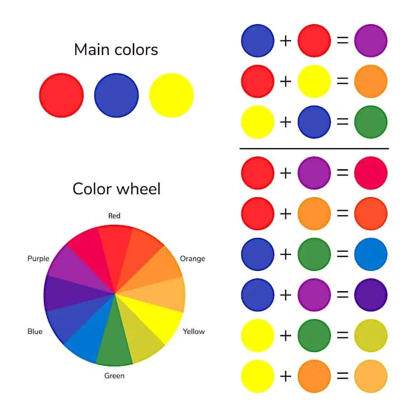
A color wheel for artists will sometimes have 24 colors and distinguish tertiary colors as the result of combining the secondary colors while mixing a primary color and a secondary color is called an intermediate color. These colors are also less radiant than primary or secondary colors as they contain some of each primary color.
Understanding Color Temperature
All colors are divided into warm and cool colors and a color wheel is a great tool for understanding these color temperatures. A rough line can be drawn through the color wheel to separate warm from cold colors, with warm colors consisting of reds, oranges, and yellows, and cold colors including a range of blues, greens, and violets. Warm colors are reminiscent of flames and sunlight whereas cool colors conjure images of icy landscapes and deep water. These associations are what give colors their temperatures and meanings.
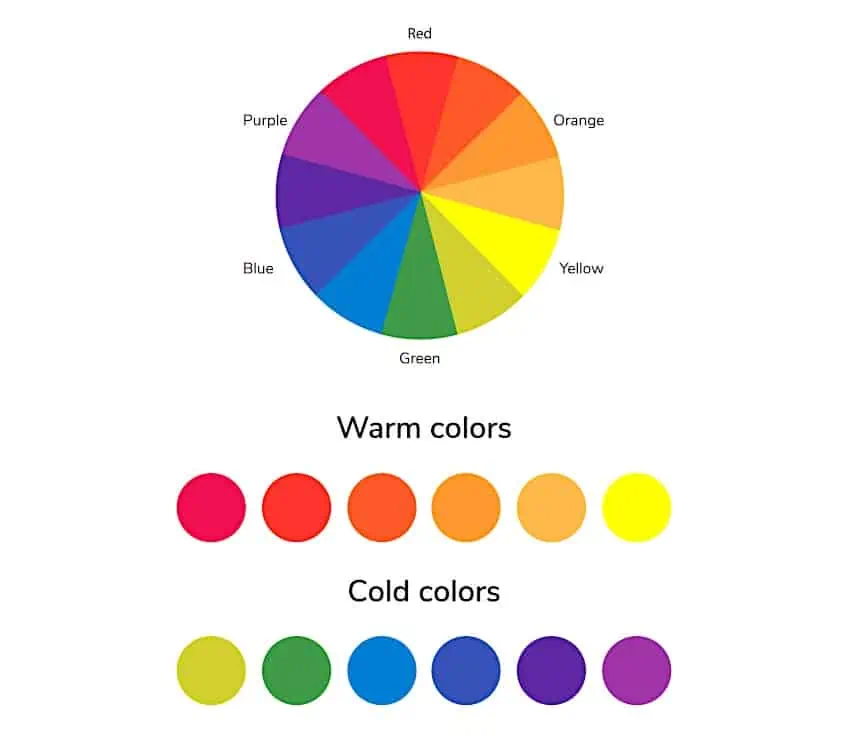
These classifications are absolute; however, no color exists in isolation and the apparent color temperature of a hue is largely relative to the colors that surround it. A color can, therefore, appear relatively warmer or cooler depending on its neighboring color. Red will be warmer than red-violet but all reds including red-violet will be warmer than blue.
Color bias is how much the color leans towards an adjacent primary or secondary hue, which is important when understanding the relative warmth or coolness of a hue. For example, green is a cool color, but you can have relatively warmer greens that have a bias towards yellow, meaning they contain more yellow than blue, and relatively cooler greens that have a bias towards blue, which contain more blue and yellow.
You should mix hues with a similar color bias towards the color you are mixing, otherwise, your resulting colors will look muddy. Taking green again, mixing a relatively warm yellow with a cool blue will result in a muddy green. For a vibrant color, mix a cooler yellow that leans towards green with a blue to create your green.
Understanding Neutrals
You do not only need to use the color wheel for mixing colors. Black, white, gray, and brown are neutrals that do not appear on the color wheel and are often overlooked in color theory and color mixing. Digital color wheels often include sliders to change a hue’s saturation and values, which is made by mixing them with these neutrals.
Values
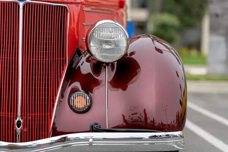
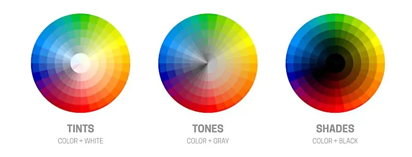
Values are a color brightness and are altered using white and black. Adding white to any color results in a tint of that color being created, which is less intense and often easier to balance than the original hue. Adding black to a color creates a shade that is darker, bolder, and more dramatic than the original color.
If you want your painting to feel realistic, getting the value right of what you are trying to capture is more important than getting the exact hue. This is because we recognize things based on their shape and the patterns created by their values. Many subjects are also not made up of the colors we expect, for example, water is not just blue but made of a variety of greens, purples, and sometimes even earth tones and oranges depending on the depth of the water you are trying to recreate.

Using Gray and Brown
When you add gray to any hue on the color wheel, it creates a tone of that color. This tone is a softer color compared to the original hue, which is useful if you want it to be less overwhelming. This is because it lowers the saturation, which is the intensity or vibrancy of a color. The colors on the color wheel are all at 100% saturation and adding gray will lower this making the colors appear to fade until they are completely washed out.
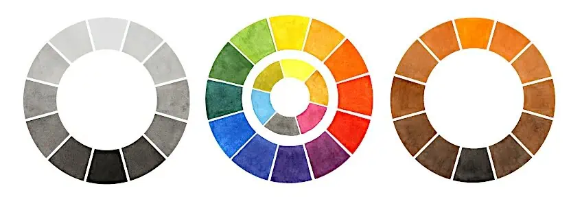
While gray is thought to only be a mixture of white and black, both gray and brown can be mixed by combining different combinations of all the primary colors and this gives you more control over the final color. The color temperature of these hues will also change depending on the proportions of colors used to make them.
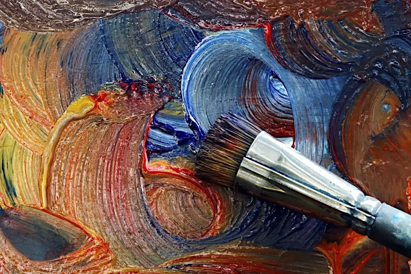
A popular mix for gray is raw umber and ultramarine blue lightened with white to the color that you want. Mixing two complementary colors will also result in gray. Try starting with mixing blue and red, and then alternate adding small amounts of yellow and white until you have your decided color. You can use more red to get warmer gray or more blue to get a cool gray. To mix brown you want to start with blue and slowly add orange until you get a dark brown then use white to lighten it. Always have less orange than blue.
It is best to experiment as there is a very fine line between what will create brown or gray. Be sure to record your paint names and approximate quantities down with a swatch next to it. This is how you get the endless variety of colors available; yellow can be lemon yellow or cadmium yellow, mixed with gray to get a pastel yellow or brown to get tan.
Color Codes
Getting the exact color amongst infinite combinations of hues, shades, tones, and saturation can be almost impossible. Thankfully, color codes can be used to identify the exact color as well as provide some insight into the colors that were used to create it.

Hex codes are based on the RGB model and are the most widely used color codes. They consist of a hash mark followed by a sequence of paired characters including either a number from zero to nine or a letter between a and f, with “00” meaning none of that color is present and “ff” meaning that that primary is at full strength. There are three pairs, and each indicates how much red, green, and blue was used in the creation of that color respectively. This is helpful when you are trying to reproduce that perfect hue.
Color Balance
You can use the color wheel and its various slices as your very own color wheel mixing guide. The balance between the colors in your art is the most important part of creating art that is aesthetically pleasing and interesting instead of dull or overstimulating. When you are painting it is not just the subject that you should consider, but you should also consider the color palette, shadows, and composition of your piece, which will only succeed if you understand how the colors on the color wheel interact in your art.
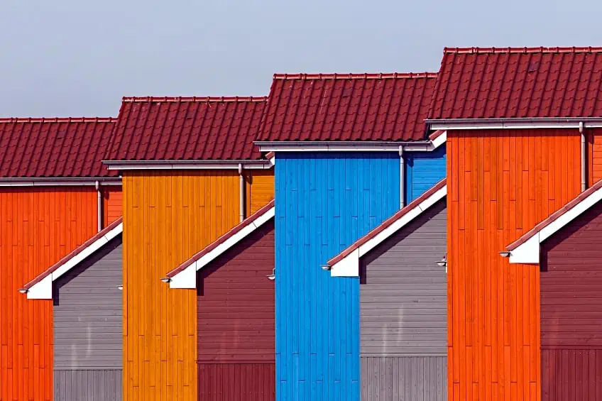
There are some universal color combination methods that are more appealing than others and the color wheel shows you which colors go together based on their positions on the wheel. There are rules like the 80:20 rule and the 60:30:10 rule, which are useful to use alongside these color schemes. The 80:20 rule is mainly for color temperature or complementary color schemes. This rule says that you should pick one main color or temperature, and this should make up around 80 percent of your piece while the other colors should be used as accents for the remaining 20 percent. The 60:30:10 rule is similar, however, your main color is used in 60 percent of your piece, a complementary color makes up another 30 percent, and accent colors are used in roughly 10 percent of your work.
A color scheme is a selection of colors that are aesthetically pleasing when viewed together. The four most popular color schemes are the complementary, monochromatic, analogous, and triadic color schemes, and these, as well as a few others we will be covering, can all be used as a color wheel mixing guide for your art.
Complementary Color Schemes
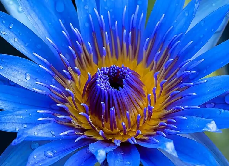
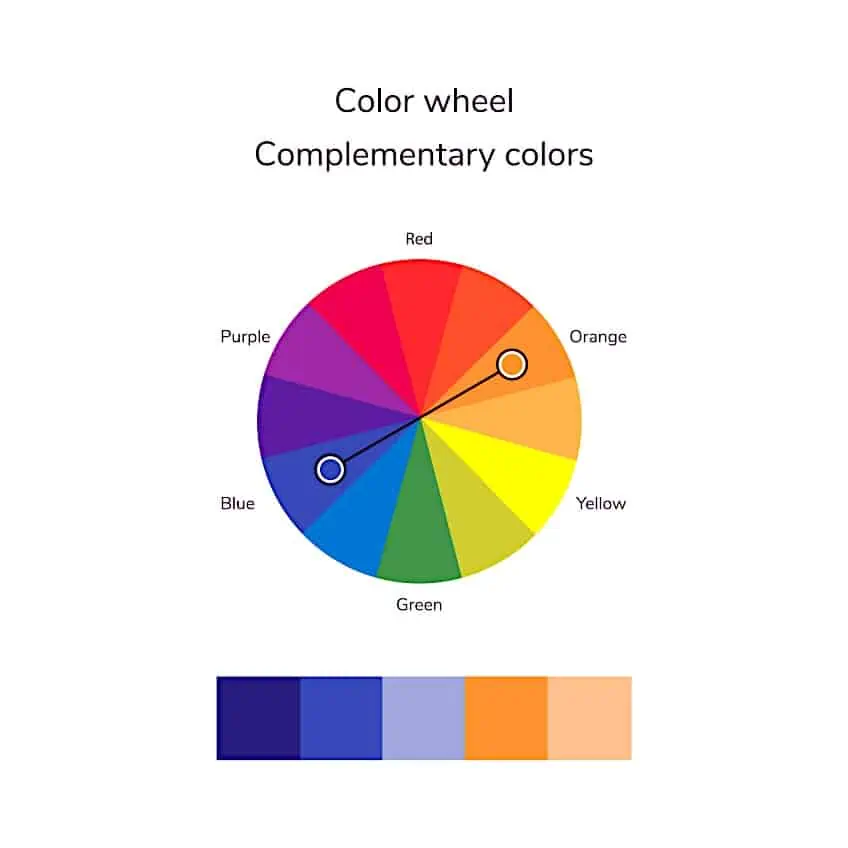
When complementary colors are used together, they make their counterparts more vibrant and create a lot of contrast within your art. It is easy to see complementary color pairs on the color wheel as they lay directly opposite each other.
Complementary colors may take some experimenting as it is easy to create a visually overwhelming piece when working with so much contrast, however, the 80:20 rule is helpful when you are starting out. You could also use the color that lies next to the complement for a softer contrast that is easier to balance.
Complementary colors create more than just a striking color scheme, they are also more useful for creating shadows in your art than merely using black. The shadow of a color will always contain some of its complementary hue, so adding some to the original color will give you the perfect shade.
Split Complementary Color Schemes
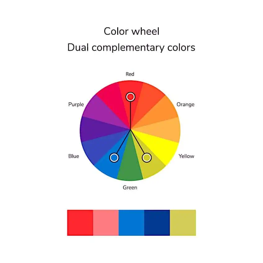
A split or dual complementary color scheme is similar to a complementary one, however, instead of using the color directly opposite your base color, you use the two colors adjacent to its complement on the color wheel as accents. Like the complementary color scheme, the split complementary combination is also difficult to balance. Choosing a dominant hue and tone for your piece will prevent it from feeling confusing.
You can also try using tints or shades of the accent colors for softer contrast. For example, pairing a bright dominant color with a darker, complementary shade to provide a background for it to pop or adding some light accents to a dark color to give the piece more visual interest and prevent it from appearing murky, boring, and heavy.
Analogous Color Schemes
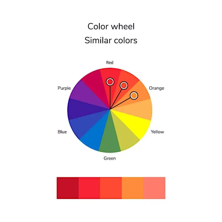
The analogous or similar color scheme is almost the opposite of a complementary one. This color combination uses colors that fall alongside each other. You can use only two colors for a more monochromatic look, however, three is the most common color combination as it offers more contrast. This color scheme comes together to create gentle pieces without loud contrast and is most useful for creating warm and cool palettes as these colors lie next to each other on the color wheel chart.
Monochromatic Color Schemes
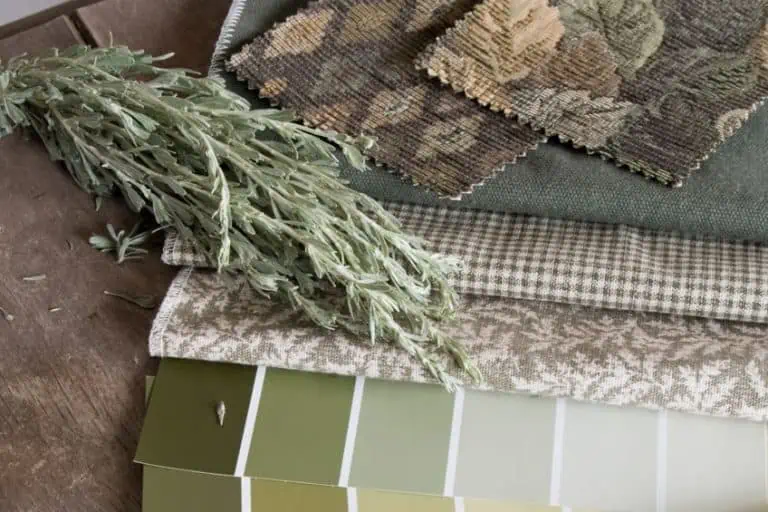
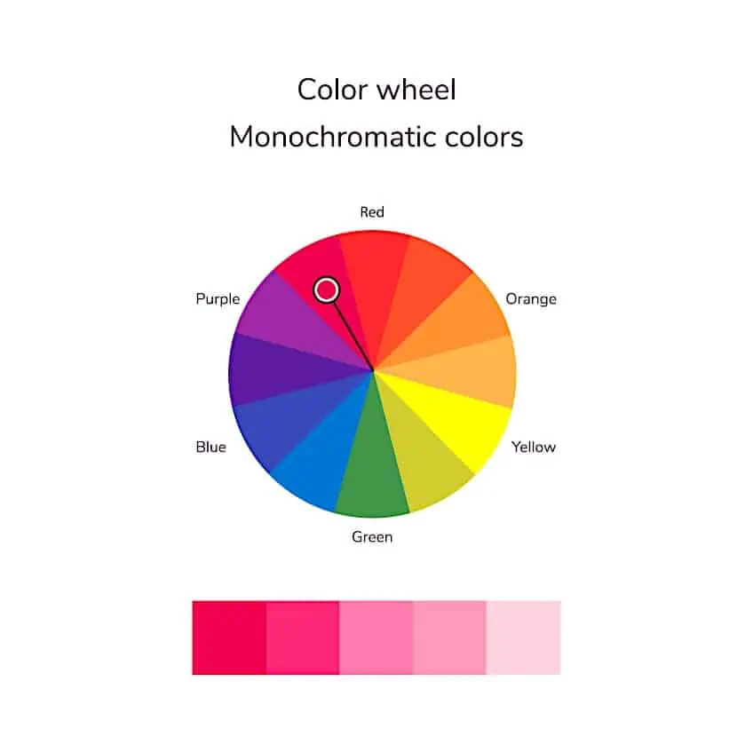
Many assume that color schemes need to be made of two or more colors to be interesting; however, a monochromatic color scheme uses only one hue. Instead of using other colors, various tones, tints, and shades of one color are used, ranging from almost white with subtle undertones to a deep shade. The effect is very harmonious especially when you experiment with color temperature and neutrals for a subtle contrast.
Triadic Color Schemes
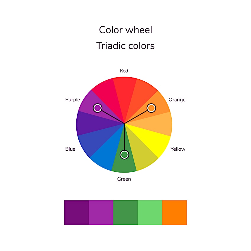
The Triadic color scheme is another popular way of combining colors. In this color scheme, you use three equally spaced colors on the color wheel. This adventurous color combination creates a high contrast; however, it is not as overwhelming as the complementary color scheme. The Triadic color scheme is also more versatile and easier to balance, especially if you use mainly two colors or tints of your non-dominant color.
Tetradic Color Schemes
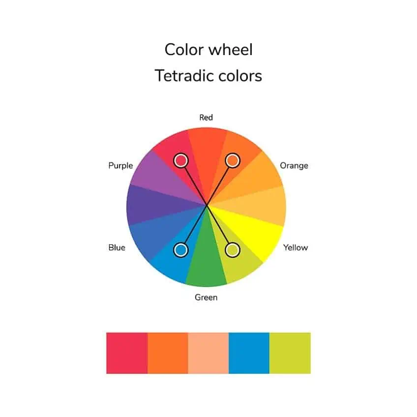
The tetradic or double complementary color scheme creates a rich color palette. This color scheme uses four colors: two colors and their complements. These complementary pairs can either be adjacent colors or in a rectangular pattern. Using this color scheme requires some practice as you will need to balance two different warm and cool colors, so it is best if one color or color pair is dominant.
True Tetradic or Square Color Schemes
This color scheme is like a combination of the triadic and double complementary color schemes. Four equally spaced colors on the color wheel are used, which create a square. These colors are spaced further apart and create a much less subtle contrast than the tetradic color combination, which can be challenging to balance. It is best to choose a dominant color, paired with shades, tones, and tints of the other colors to create a vibrant palette.
All these color combinations take some practice to master; however, if you are looking for some inspiration then some of the best color wheel art can be found on sites like Pinterest or Etsy.
Color Temperature and Context
The values, temperature, saturation, and neighboring colors can all impact how we perceive the same color across different contexts. We have talked about the relative coolness and warmth of colors, and how color theory explains how warm and cool colors are used to create depth, contrast, and shadows. A cool red can be used for subtle contrast against a warmer red or to define parts of the same object. You may notice that green leaves appear more yellow in the sun, but bluer in shadow. This is because a warm light source will have cool shadows, which can easily be created by adding complementary colors.

Color temperature can also have more subtle effects. Warm colors make things appear as though they are coming closer or closing in whereas cool colors make things seem distant or receding. This is because cooler colors, like violet, have short wavelengths and warm colors, such as red have longer wavelengths. By using cool hues in the background and warmer hues in the foreground you can create the illusions of depth and distance. You should have only one dominant temperature in your piece, which is called temperature dominance, however, using both warm and cool colors is important to create a sense of balance.
Using Tones, Tints, and Shades
Tones and tints are great for creating highlights and shadows and, along with temperature, create depth and contrast that is essential in monochromatic pieces. Gray takes on the properties of surrounding hues and even enhances them. Pairing a gray with red will bring out green undertones whilst pairing the same gray with a blue will make it appear slightly purple. Gray can also be used to break or tone down overwhelming warm colors and can even be used to create soft pastel colors.
Despite not being considered colors, white and black also display some characteristics of color temperature. White doesn’t just tint, it cools as well so be careful when using it to lighten colors. If you are looking for a more vibrant or warmer color, then try mixing the correct lighter hue instead of adding white to a darker color. Yellow is also a popular color used to lighten and warm up colors just be sure to swatch test the color first.
You should also use caution when using black to darken colors. Black can make colors muddy because many contain green, brown, or blue undertones. You can try using complementary colors for shadows or darkening the color raw umber or any other dark earth tones instead. Black can be added to red to easily create a warm dark brown. If you want a lighter brown, it can be lightened with white, or you can try mixing orange and black instead.
The Psychology of Color
Colors can affect your mood and feelings because they remind us of different objects and experiences, both good and bad. Broadly, warm colors have a stimulating effect, giving you feelings of passion, anger, and even hunger. Contrary to this, cool colors can induce a sense of calmness, renewal, or sadness. Individual hues even have their own more specific negative and positive connotations largely based on these.
Colors can therefore be used to set the mood for your overall color schemes. A warm color scheme with yellow as the dominant color will have an invigorating, optimistic, and joyful feel, like warm sun rays on a sunny day.
Using color theory and the color wheel is a great way to improve your art to make it more realistic and visually interesting, while also saving you money. Using the color wheel, you can mix the perfect hues for your project and know which colors work with them to create fun and balanced color palettes.
Frequently Asked Questions
What Is a Color Wheel?
The color wheel is a model that illustrates all the colors in the spectrum. There are many different types of color wheels but the most common one divides the spectrum into 12 main hues, which easily shows the relationships between them. There are three primary colors, three secondary colors, as well as six tertiary colors.
What Are the Basic Color Schemes?
There are seven basic color schemes: complementary and split complementary, rectangle or tetradic, triadic, square, analogous, and monochromatic.
What Are The 12 Colors on the Color Wheel?
The 12 colors on the color wheel are blue, blue-green, green, yellow-green, yellow, yellow-orange, orange, red-orange, red, red-violet, violet, and blue-violet. There are a number of different names for the same color particularly the tertiary colors, which are also known as teal, chartreuse, amber, vermillion, magenta, and purple.
Megan is a writer and researcher who graduated from the University of Cape Town with a degree in Social Sciences, specializing in Psychology and Environmental Science. Her passion for knowledge and leaving a positive impact has fueled her current work in conscious and sustainable growth in Southern Africa. Megan’s love of nature has also led her to train as an animal behaviorist. She works part-time training and rehabilitating dogs. Megan is interested in the physical and psychological effects of colors in our environment on our mood and well-being. In addition, she is concerned with how art and creativity have been an integral part of human society. Megan van Schoor has been writing blog posts on the topics of painting, drawing, and color theory for acrylgiessen since 2021.
Learn more about Megan van Schoor and about us.
