Color Combinations – Unique and Exciting Color Schemes
This post may contain affiliate links. We may earn a small commission from purchases made through them, at no additional cost to you.
Many of us go through life without even realizing how much color plays a role in influencing how we feel and what we do. Various colors and good color combinations can have a positive effect in many areas of life including your home, workplace, school, and even out shopping. Do you want to use color to create a certain atmosphere or design a logo that attracts attention? Then gaining an understanding of what colors go together can help you to achieve this. You can use this knowledge to help you in all areas of life from personal to business situations.
What Colors Go Together?
Why should you learn about colors that go together? There are many benefits to understanding good color combinations. For example, it can help you choose your clothing outfits more effectively. You can design your home to be something you want to show off to the neighbors. In business, you can attract potential clients, or simply use colors in everyday communication. Artists also need to understand how to develop certain color scheme ideas and color trends to create effective art pieces.
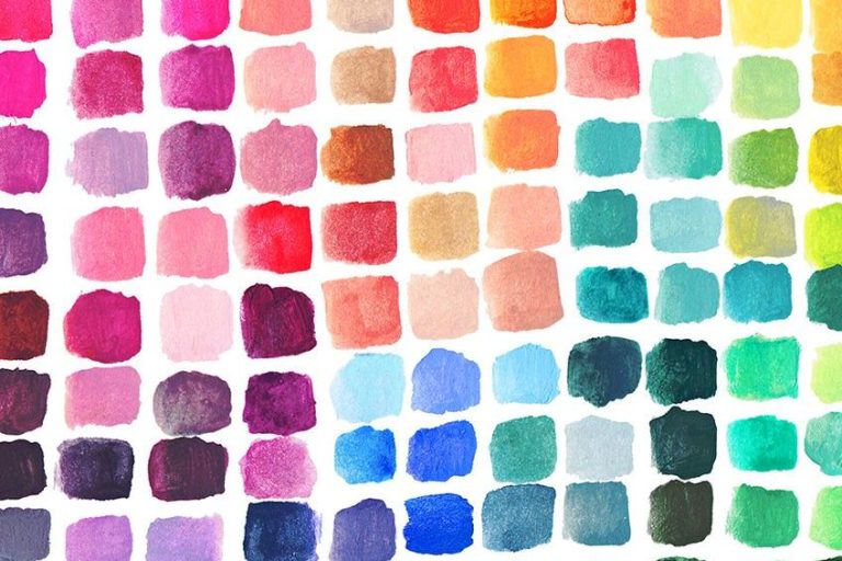
If you are interested in understanding colors and what would be the best color combinations, you need to have some knowledge of color theory. The best visual display of colors is known as the color wheel. Once you understand where colors lie on the wheel and how they interact with each other, you should be able to come up with positive and consistent color combinations.
The Main Types of Color Combinations
You have three primary colors, and they are red, yellow, and blue. You cannot create these colors, however, if you combine these colors, you get your secondary colors, orange, green and purple. You then also get your intermediary colors, which are made up of primary and secondary colors. For example, blue-green. Go even further and you can get a plethora of various shades of each color. These are all represented on a color wheel.
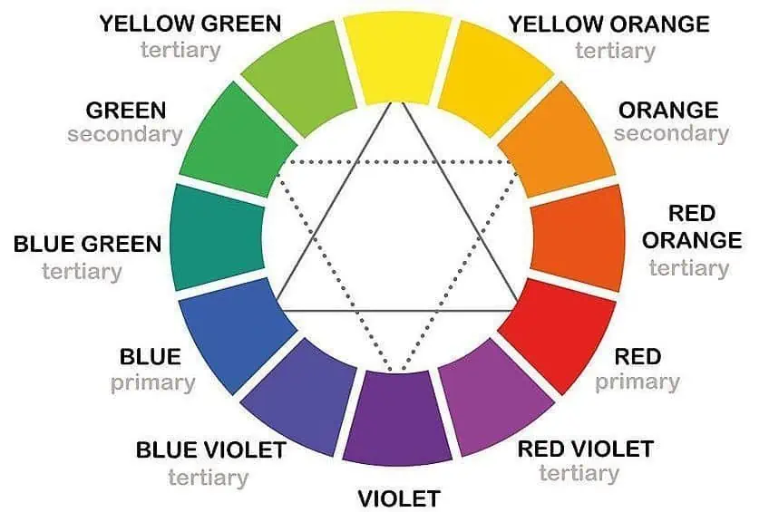
On one side of the wheel, you have warm colors like your oranges, yellow and red colors. On the other side are your cool colors including blue, green, and purple or violet colors. Warm colors are full of energy and vibrancy, while cool colors are calming and cooling. These different color values can help you to create different appealing colors that serve a purpose. You can choose a color that focuses on a certain message or feeling. Colors that go together will create unique color combinations. So, what colors go together?
Complementary Colors
When looking at the color wheel, you have many assorted colors. You will notice, as mentioned, there are three primary colors, secondary colors, intermediary colors, and all your other shades and hues. Simply, complementary colors are always opposite each other. So, if you take red, green is its complementary color. The complementary color for blue is yellow, and so you can determine the complement for each color.
These colors make each other stand out and provide a nice contrast. You can use these color combinations to create images that stand out. However, too many of these colors can become overpowering and annoying.
Complementary color schemes grab attention but should be easy to view and are mostly used for things like logos and packaging for products. If you are looking to incorporate more colors, you can use a split-complementary palette. As with complementary colors, they sit opposite each other but instead of only selecting a color and its complement, you choose another color next to it and its complement. These colors still provide contrast but are easier on the eyes.
Analogous Colors
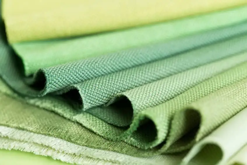
These are simply colors that can be found close to each other on the color wheel and can be any number from two to five colors. When used in color combinations, they can create a harmonious look. The colors will accent and work great together. Some popular color scheme ideas include muted varieties of analogous colors. Analogous color combinations create beautiful harmonies when used properly.
Tetradic Color Combinations
There are four colors involved, which are all equally distanced from each other. This means no color has clear dominance. The color combination includes a single primary color, two complementary colors, and another color that provides contrast. This is usually a vibrant color scheme that requires some thought before implementing it. Using an equal amount of color may have an unbalancing effect, so it is best to choose a dominant color that can stand out above the others.
Making use of your warm and cool colors as well as different hues can help to create unique color combinations.
Triadic Colors
As the name suggests, these colors can be found equal distances from each other in a triangle shape. For example, the primary colors can be seen as triadic colors. Triadic color combinations are bright colors that form a contrast yet provide a certain overall harmony.
Monochromatic Colors
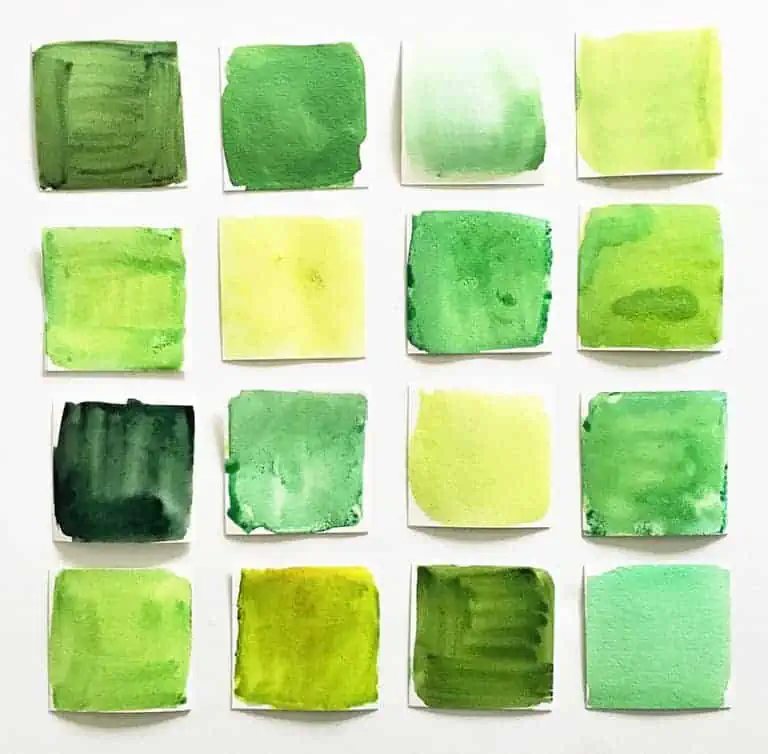
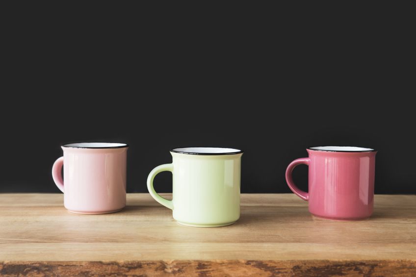
Maybe using one color seems a bit boring when it comes to creating color scheme ideas. However, if you select a certain color and then use variations of this same color, you will be surprised at how effective it can be. When using monochromatic color schemes, you can create different shades and tones of colors, thereby, producing a range of shades of colors that can grab your attention or focus. This is a plain color scheme that is easy to create. An example of a monochromatic color scheme would be using hot pink, Fuschia, and baby pink.
Color scheme ideas that involve a monochromatic set of colors are a safe bet, as they cannot easily be messed up.
Color Terminology
There are a few words you should understand when dealing with colors. Recognizing what these words mean can ensure that you avoid any misunderstandings or mistakes from occurring. Here are several of the most important color terms.
| Color Term | Description |
| Saturation | Indicates the strength and boldness, or weakness and opacity of a color |
| Hue | This refers to the actual color, for example, blue. Separate from intensity and lightness |
| Shade | Making a color darker by adding black or other colors |
| Chroma | Determines how pure a color is by measuring the amount of white, gray, or black is present or missing from the color |
| Value | Describes how dark or light a color |
| Tint | A tint is created by adding white |
| Tone | Adding the color gray can add more tone, refining the color |
The Meaning of Colors
Over the years, colors have gained meaning and can be used to elicit certain emotions. For example, colors can excite or calm, and can be used in business to attract clients or can be used in a room to create a certain atmosphere.
Using colors to create moods is known as color psychology, and can help to improve concentration, or create a tranquil or stimulating atmosphere. When using certain color combinations, this can easily enhance the overall effect the colors have. Here is a list of the more familiar colors and a brief description of their meanings along with their hex codes.
| Shade | Color Meaning | Hex Code | CMYK Color Code | RGB Color Code | Color |
| Red | A popular color that represents energy, passion, and power | #ff0000 | 0, 100, 100, 0 | 255, 0, 0 | |
| Blue | Cool, calming, and provides a sense of tranquility and confidence | #0000ff | 100, 100, 0, 0 | 0, 0, 255 | |
| Yellow | A happy color, which is full of energy | #ffff00 | 0, 0, 100, 0 | 255, 255, 0 | |
| Green | The color that closely represents everything natural, fresh and symbolizes renewal | #00ff00 | 100, 0, 100, 0 | 0, 255, 0 | |
| Orange | Another warm color that is linked to creativity and enthusiasm as well as intelligence | #ffa500 | 0, 35, 100, 0 | 255, 165, 0 | |
| Purple | A luxurious color that is also associated with creativity and royalty | #a020f0 | 33, 87, 0, 6 | 160, 32, 240 | |
| Pink | A shade of red that is more feminine and playful | #ffc0cb | 0, 25, 20, 0 | 255, 192, 203 | |
| Gray | A neutral color that works well in a variety of color combinations and can be associated with elegance and sophistication | #808080 | 0, 0, 0, 50 | 128, 128, 128 | |
| White | This color has always been linked to purity and cleanliness and suggests simplicity | #ffffff | 0, 0, 0, 0 | 255, 255, 255 | |
| Black | A color that has power and mystery, and is associated with maturity | #000000 | 0, 0, 0, 100 | 0, 0, 0 |
When choosing the best color combinations, you should always consider the color meanings and how they might affect the viewer. Knowing what you want to achieve with your chosen colors, can also help you choose what colors will work the best.
For example, red is used often in advertising to inspire action, while green is linked to everything natural and organic.
The Best Color Combination Ideas
Attracting attention and stirring feelings is what colors can do when incorporating color combinations into your advertising and marketing strategy. You need to have the right color scheme ideas for your website and logo design, so you can build a memorable brand. With different good color combinations, you can influence emotions and create a mood. Color combinations are also vital when painting an art piece or your living room wall.

However, when it comes to websites and social media, a perfect visual image is vital. Good color combinations can instantly attract an audience and provide a message. Good visual images and color combinations are also similar to a catchy tune, it becomes memorable and stays with those who have seen it. Various color combinations can have an impact not only in business, but also in places like schools, hospitals, and, of course, at home. Good color combinations should have a positive effect on the mind and places like schools can help to improve the learning environment. Let us now read through some best-recommended color combinations.
Two-Color Combinations
When designing or painting, you will more than likely be dealing with more than one color. To start, keeping it simple might be best, two colors can be just as effective as a more involved palette. Sometimes, it is even better to limit your color combinations than add too many colors, which can distract from what you want to achieve. Unique color combinations can come from using only two colors, which can stir up the feelings you want in people who are viewing your work. Some of the best combinations here are complementary color combinations. You will always be safe using complementary colors, or colors that fall opposite each other on the color wheel. These color harmonies will always work, like green and red or purple and yellow.
Here are a few two color combinations that might interest you.
Blooming Dahlia and Ultra Violet
Ultraviolet is a color that has become popular since being chosen as the color of the year in 2018, chosen by Pantone. Since then, this color has become quite prominent in all spheres of design. Ultraviolet is a color associated with ingenuity, boldness, originality, and hints at the great cosmos and mystery. Most shades of purple have strong positive overtones like creativity and luxury.
The vibrant color works perfectly as a color for marketing as it draws your attention and can work well with a variety of colors including red, orange, and green. In this case, for a more unique color combination, it is paired with the color Blooming Dahlia. This is a peachy pink color that can lend a certain sophistication to the color combination as well as provide balance to the more vibrant purple. Because both of these colors are pastels, you can create a very subtle and soft appearance. You also have some color harmonies between these shades as they are an example of monochromatic color schemes.
| Shade | Hex Code | CMYK Color Code | RGB Color Code | Color |
| Ultra Violet | #5f4b8b | 32, 46, 0, 45 | 95, 75, 139 | |
| Blooming Dahlia | #ec9688 | 0, 36, 42, 7 | 236, 150, 136 |
Warm Sand and Turquoise
Turquoise is a calming, happy color that emanates the tranquility of blue. However, it also represents growth, and since it contains hints of yellow, it also provides a certain amount of energy. The color is refreshing and brings to mind tropical beaches, palm trees, and sunny skies.
The color works well as it is calming yet vibrant and can stand out.
Since it reminds many of the beaches, it is only natural to pair it with softer brown shades like Warm Sand, providing a balanced and harmonious look. Neutral colors can stand alone, but when you pair them with turquoise, it helps to provide certain warmth. The color combinations are natural and are a reminder of sunny, summer days. You can supplement the turquoise for teal and achieve a very similar combination,
| Shade | Hex Code | CMYK Color Code | RGB Color Code | Color |
| Warm Sand | #c5ae91 | 0, 12, 26, 23 | 197, 174, 145 | |
| Turquoise | #30d5c8 | 77, 0, 6, 16 | 48, 213, 200 |
Moss Green and Forest Green
Here we are coming to a monochromatic pairing of different shades of green. All shades of green are associated with growth, renewal, and all things natural. Forest green is a darker green color that for obvious reasons, represents the trees and the environment. Not only does it work well with colors that are nearby on the color wheel, but it can also be paired with different shades of purple for contrast.
Moss green lends a more sophisticated side to the color combination. When using this color combination for interior design, the colors work well when matching up with wood. The perfect color pairing for creating a natural and grounded look.
| Shade | Hex Code | CMYK Color Code | RGB Color Code | Color |
| Forest Green | #228b22 | 76, 0, 76, 45 | 34, 139, 34 | |
| Moss Green | #8a9a5b | 10, 0, 41, 40 | 138, 154, 91 |
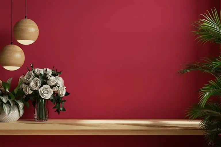
Peach and Royal Blue
Royal blue is a solid, vivid, and bold color and is quite versatile. The color is quite popular when it comes to logos as it is associated with reliability and trust. You can also use the color as an accent color when pairing it with more subtle colors like peach.
Along with lilac and pink, peach has become a popular color in recent years and helps to bring in warmth and comfort, and a little bit of sophistication.
| Shade | Hex Code | CMYK Color Code | RGB Color Code | Color |
| Peach | #ffe5b4 | 0, 10, 29, 0 | 255, 229, 180 | |
| Royal Blue | #4169e1 | 71, 53, 0, 12 | 65, 105, 225 |
Black and Mustard
Black and mustard, are not a color combination that would be first on the list for many. However, black does pair well with most colors, and mustard is an excellent choice to go with it. You can use this color combination to significant effect if you would like to create more of a masculine feeling. Black and mustard is a common color combination in logo design, as it has an efficient and reliable air.
The combination is bold, but the overall effect can appear sophisticated. Consider using black as your background and then adding in mustard as an accent color.
| Shade | Hex Code | CMYK Color Code | RGB Color Code | Color |
| Mustard | #f3ca20 | 0, 17, 87, 5 | 243, 202, 32 | |
| Black | #000000 | 0, 0, 0, 100 | 0, 0, 0 |
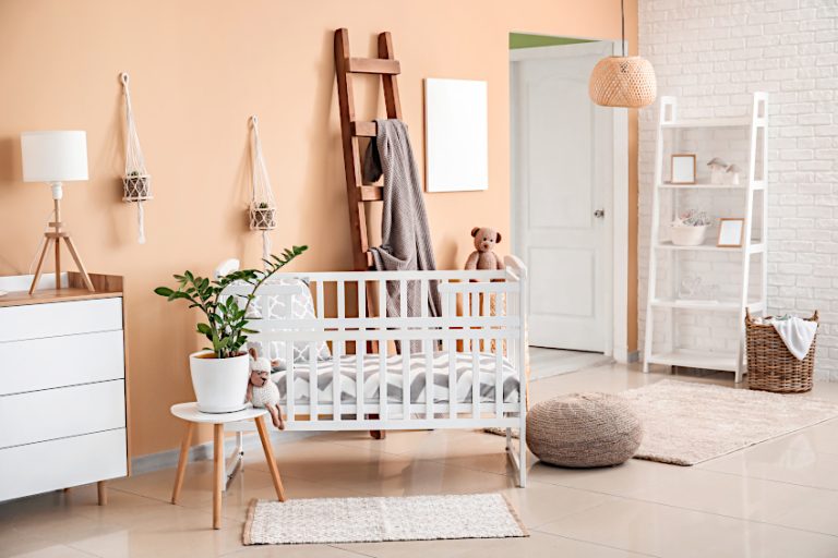
Indigo and White
This color combination is quite versatile and can be used in marketing and interior design. When used as the color palette for a bedroom, it can help to create a warm and calming atmosphere.
Indigo is a warmer color than blue and contrasts nicely with white, producing a nice cozy bedroom setting.
| Shade | Hex Code | CMYK Color Code | RGB Color Code | Color |
| Indigo | #4b0082 | 42, 100, 0, 49 | 75, 0, 130 | |
| White | #ffffff | 0, 0, 0, 0 | 255, 255, 255 |
Three Colors That Go Together
Two-color combinations are nice, but three can even be more useful when trying to achieve a more sophisticated look. However, the more colors there are, the easier it is to make a mistake when pairing the colors. Thankfully, there are already color combinations available you can choose from. You can use these colors to create amazing logos or use them to create an amazing space at home.
Sapphire, Powder Blue, and Mauve
Sapphire is a more saturated blue and is a popular color. The color can be associated with confidence, trust, and patience. Its complement is philippine gold with the hex code #b17304. However, this color combination is paired with powder blue and mauve, which creates a more feminine appearance.
The sapphire is vibrant and lends a more modern style to the color combination.
| Shade | Hex Code | CMYK Color Code | RGB Color Code | Color |
| Sapphire | #0f52ba | 92, 56, 0, 27 | 15, 82, 186 | |
| Powder Blue | #b6d0e2 | 19, 8, 0, 11 | 182, 208, 226 | |
| Mauve | #e0b0ff | 12, 31, 0, 0 | 224, 176, 255 |
Forest Biome, Storm Gray, and Living Coral
This is a refreshing color combination with dark gray paired with a more vibrant living coral and forest biome. Pleasing to the eye with a warm, soft look and these three colors that go together are perfect for websites as they provide a more modern angle. The colors are more subtle yet attract attention and are easy on the eyes.
The living coral brings the color combination to life and is a versatile option for a variety of projects. Consider how the mood is affected by the colors if you remove the living coral color and exchange it for a shade of green, it produces a completely fresh look and feels.
| Shade | Hex Code | CMYK Color Code | RGB Color Code | Color |
| Forest Biome | #194b46 | 67, 0, 7, 71 | 25, 75, 70 | |
| Storm Gray | #6e6f75 | 6, 5, 0, 54 | 110, 111, 117 | |
| Living Coral | #fa7268 | 0, 54, 58, 2 | 250, 114, 104 |
Norse Blue, Light Green, and Red
The red immediately attracts your attention, alongside the light green and Norse blue. These are your three primary colors and can be categorized as triadic colors. The combination creates a harmonious look and has been used by many businesses such as Google. The red, as mentioned, is vibrant and brings your attention in, while the blue provides a calming and focused effect.
The green pulls everything together as it is attractive but not domineering.
| Shade | Hex Code | CMYK Color Code | RGB Color Code | Color |
| Norse Blue | #0083a9 | 100, 22, 0, 34 | 0, 131, 169 | |
| Light Green | #90ee90 | 39, 0, 39, 7 | 144, 238, 144 | |
| Red | #ff0000 | 0, 100, 100, 0 | 255, 0, 0 |
Navy, Salmon, and Seafoam
This is reminiscent of the beach and helps to produce feelings of calm, peace, and warmth. The navy blue also gives a sense of authority and power and is a wonderful grounding color. The salmon brings in the warmth, while the green adds more calmness and tranquility.
| Shade | Hex Code | CMYK Color Code | RGB Color Code | Color |
| Navy | #000080 | 100, 100, 0, 50 | 0, 0, 128 | |
| Salmon | #fa8072 | 0, 49, 54, 2 | 250, 128, 114 | |
| Seafoam | #93e9be | 37, 0, 18, 9 | 147, 233, 190 |
Magenta, Green, and Rouge
Bold and rich colors that will work well with other white and black designs. Magenta is said to symbolize harmony and can help to restore emotional balance. The color is also cheerful and attracts attention. Green and magenta make a nice contrast as they complement each other.
The color rouge simply works well with both magenta and green, bringing everything into balance.
| Shade | Hex Code | CMYK Color Code | RGB Color Code | Color |
| Magenta | #ff00ff | 0, 100, 0, 0 | 255, 0, 255 | |
| Green | #00ff00 | 100, 0, 100, 0 | 0, 255, 0 | |
| Rouge | #d7707e | 0, 48, 41, 16 | 215, 112, 126 |
Clear Water, Lightest Sky, and Grass Green
These soft colors provide a fresh and clean color combination and are easy to look at. This color combination can work well as a choice for your interior design project, helping to create a calm and inviting atmosphere.
| Shade | Hex Code | CMYK Color Code | RGB Color Code | Color |
| Clear Water | #aad5db | 22, 3, 0, 14 | 170, 213, 219 | |
| Lightest Sky | #87cefa | 46, 18, 0, 2 | 135, 206, 250 | |
| Grass Green | #7db46c | 31, 0, 40, 29 | 125, 180, 108 |
More Color Scheme Ideas
You can also choose unique color combinations with more colors, there are many to choose from online. These color scheme ideas can be used for a variety of projects from social media campaigns to designing rooms and even for birthday cards.
Living Coral, Marigold, Bright Violet, and Vibrant Pink
These are beautiful and vibrant colors that are warm and produce a sense of youthfulness. The living coral is a trendy color and adds to the playfulness of the color combinations. Marigold is a yellow-orange shade that brings warmth and life to the color combination.
The liveliness of this color scheme is just what you need for seizing attention, especially on social media platforms.
| Shade | Hex Code | CMYK Color Code | RGB Color Code | Color |
| Living Coral | #fa7268 | 0, 54, 58, 2 | 250, 114, 104 | |
| Marigold | #eba832 | 0, 29, 79, 8 | 235, 168, 50 | |
| Bright Violet | #ad0afd | 32, 96, 0, 1 | 173, 10, 253 | |
| Vibrant Pink | #ff007f | 0, 100, 50, 0 | 255, 0, 127 |
Turquoise, Aquamarine, Pink Tulip, and Canary Yellow
A fresh, sweet color combination. The turquoise is a calm and happy color combined with the aquamarine which also brings harmony and a hint of spring through. The pink tulip brings a more feminine feel and also adds to the playfulness of the color scheme. The yellow brings in that pop of color that creates a clean and summery feel.

| Shade | Hex Code | CMYK Color Code | RGB Color Code | Color |
| Turquoise | #30d5c8 | 77, 0, 6, 16 | 48, 213, 200 | |
| Aquamarine | #00ffbf | 100, 0, 25, 0 | 0, 255, 191 | |
| Pink Tulip | #ff878d | 0, 47, 45, 0 | 255, 135, 141 | |
| Canary Yellow | #ffed5f | 0, 7, 63, 0 | 255, 237, 95 |
Fiery Coral, Atmosphere, White, and Delphinium Blue
This color scheme provides more of a modern and clean look. The fiery coral is a little darker than living coral, but it is just as vibrant and cheerful.
These are good color combinations if you are looking for something that is simple yet has some attractive vibrant color to it.
| Shade | Hex Code | CMYK Color Code | RGB Color Code | Color |
| Fiery Coral | #e26058 | 0, 58, 61, 11 | 226, 96, 88 | |
| Atmosphere | #c0d8f8 | 23, 13, 0, 3 | 192, 216, 248 | |
| White | #ffffff | 0, 0, 0, 0 | 255, 255, 255 | |
| Delphinium Blue | #669db3 | 43, 12, 0, 30 | 102, 157, 179 |
Honey Yellow, Medium Champagne, Celadon, and Vermilion
The color names themselves inspire warmth and luxury. You can use each of these colors to great effect by themselves, however, combining them brings out each color significantly and they offer a more unique look. When using these specific colors, make sure not to overuse the yellow and red shades of color as they can be distracting.
| Shade | Hex Code | CMYK Color Code | RGB Color Code | Color |
| Honey Yellow | #eba937 | 0, 28, 77, 8 | 235, 169, 55 | |
| Medium Champagne | #f3e5ab | 0, 6, 30, 5 | 243, 229, 171 | |
| Celadon | #ace1af | 24, 0, 22, 12 | 172, 225, 175 | |
| Vermilion | #e34234 | 0, 71, 77, 11 | 227, 66, 52 |
Unique Color Combinations of Yellows and Various Shades of Magenta
This color combination includes various shades of magenta, which is paired with some green tones. These colors work together and produce a fresh and unique color palette.
The vibrant yellows should make excellent accent colors, while the different shades of magenta can be layered in the background.
| Shade | Hex Code | CMYK Color Code | RGB Color Code | Color |
| Citrus | #93a806 | 13, 0, 96, 34 | 147, 168, 6 | |
| Yellow-Green | #bed905 | 12, 0, 98, 15 | 190, 217, 5 | |
| Shade of Magenta | #de8cf0 | 8, 42, 0, 6 | 222, 140, 240 | |
| Melanie | #dbb4da | 0, 18, 0, 14 | 219, 180, 218 | |
| Light Orchid | #daa2da | 0, 26, 0, 15 | 218, 162, 218 |
Color Combinations to Avoid
When creating color combinations, there are a few basic rules you can follow to produce an effective color scheme. However, not everybody sees colors in the same way. Have you ever had an argument where a friend says the color you are looking at is red, but it seems more purple to you? People can see colors differently, but then the associations can also be different.
Some might consider green a favorite color, while another person associates it with an unpleasant experience, for example, at a hospital. So, it is each individual’s perception of color that decides if the person will like or dislike a certain color combination. However, there are one or two instances where you should avoid using certain color combinations. The below principles are mostly geared towards colors used for graphic design.
Working With Neon Colors
Bright or neon colors stand out and grab attention, they are bold and vibrant. However, these colors can become unsettling to look at if there are more of these colors placed next to each other. When using two or more of these types of colors in the same color scheme, they will fight each other to gain your attention. In the end, it becomes difficult to concentrate and may even be painful to look at.
For one of your choices, select a muted tone and combine it with the brighter color. The one color will attract your attention and make a statement, while the muted color will help to not overstimulate the viewer.
The muted color also helps to accent the brighter color, which can bring out the best qualities in both colors. This is not a set rule but is a safe route to take if you are looking to create a more generally appealing color scheme. When working with graphics online, use these colors for text and other interface elements. Anything else the colors become disconcerting and irritating.
| Shade | Hex Code | CMYK Color Code | RGB Color Code | Color |
| Bright Red | #ee4b2b | 0, 68, 82, 7 | 238, 75, 43 | |
| Electric Orange | #ff5e00 | 0, 63, 100, 0 | 255, 94, 0 | |
| Middle red | #ed8a68 | 0, 42, 56, 7 | 237, 138, 104 |
Do not Combine Dark Colors With Other Dark Colors
When using these colors together, you create some confusion as your mind is not sure what you are looking at. There is no point of reference, and the colors seem to blend and create one big mass of dark color. There is also no clear meaning or mood, and it is difficult to pick out any particular color. When glancing at something with this color combination, you might tend to simply glance over and move on to something more interesting.
Darker colors tend to not have good associations and combining two or more of these colors should be avoided. However, you can still use dark colors, but include some lighter colors to create contrast. In this example, I used red and green side by side. However, many recommend you do not use these colors so close together and should have another color separating them. You will see in the table; the color desert sand is used for this purpose. This is because it is hard to see for some who have a form of color blindness. Also, this combination is a contradiction, red means danger, stop, or no, while green means yes.
This is most evident with computer graphics, and these colors are commonly used for onsite buttons and alerts.
| Shade | Hex Code | CMYK Color Code | RGB Color Code | Color |
| A Shade of Hunter Green | #041a03 | 85, 0, 88, 90 | 4, 26, 3 | |
| Shades of Dark Red | #1c0000 | 0, 100, 100, 89 | 28, 0, 0 | |
| Desert Sand | #e3d4ad | 0, 7, 24, 11 | 227, 212, 173 | |
| Light Shade of Green | #aad688 | 21, 0, 36, 16 | 170, 214, 136 |
Vibrating Colors
Have you ever looked at some writing on a screen and it seems to be moving? This is what happens when you combine extremely bold and saturated colors. The two colors seem to merge or blur and create an illusion of movement. This happens when looking at print, you have to squint your eyes to see the wording properly, while other letters appear to be dented.

If you use the first two colors in the table below and, for example, write green letters on the razzle-dazzle rose or vice versa, you will create the vibration effect. These colors are also difficult for color-blind people to read. So, these colors are not the best option if you wish people to stay on your website. However, you can still use one of the colors, simply change the second color to something more approachable. Below is a table where you will see a third color, replace this color with the razzle-dazzle rose. These two colors together are a lot less jarring on the eyes.
| Shade | Hex Code | CMYK Color Code | RGB Color Code | Color |
| Green | #5fa41c | 42, 0, 83, 36 | 95, 164, 28 | |
| Razzle Dazzle Rose | #ff3ac6 | 0, 77, 22, 0 | 255, 58, 198 | |
| Shade of Purple | #4c0057 | 13, 100, 0, 66 | 76, 0, 87 |
How to Harmonize a Three-Color Palette in a Room
When deciding on color scheme ideas for your home, it can be quite exciting. You will be creating a space for yourself and others, and you want to make sure it is done properly. The type and number of colors are completely up to each individual. However, deciding on a three-color palette can help to create an interesting and compelling look. To make sure the colors harmonize, make sure to plan what you want to do before you begin painting. Choose three colors that work well together, sometimes using three different shades of a similar color can be helpful as this is always a good color combination that will not fail. For example, you can choose shades of blue from a lighter blue to a blue that is darker in color.
Make sure to choose either a warm or cool combination, however, you can mix cool and warm colors but make sure the colors are well balanced. The colors you choose will also depend on the lighting of a room, which is why it is important to plan your design choices. Once you have chosen your three colors, apply the lighter of the three colors to the ceiling. This will help to enlarge the space and also reflect more light. Next, choose the darkest color out of the three and use this color as an accent color. Choose a wall you wish to accent, make sure there are no windows or doors to break the color. The best wall for this would be the one that is the farthest from the entrance. Finally, use the third and last color to paint the rest of the room.
Working with colors can be fun and if you keep things simple, you cannot go wrong. Whatever project you are attempting, your efforts should invite the viewer to stay longer. However, it is possible to choose terrible color scheme ideas. This should not happen, as you have access to numerous tools online, and if you want, there are professionals to help you out.
Take a look at our good color combos webstory here!
Frequently Asked Questions
What Are Color Scheme Ideas?
When designing or painting your home, you need to choose colors that you want to use. These are usually two or more colors that form a color scheme. The colors should work well together and must be appealing to those who are viewing the colors.
What Colors Go Together?
To understand what colors, go together, you will have to learn about color theory. This means discovering and understanding what your primary, secondary and tertiary colors are, and how they interact with each other on the color wheel. For example, analogous colors that can be found close to each other, work well together. Complementary colors can also work together and provide excellent contrast. Other types of color combinations include monochromatic, triadic, and tetradic color combinations.
What Colors Attract Attention the Most?
The color that attracts the most attention is red, which is why it’s a sign of danger. This is also the reason many businesses use color in their marketing strategy. For example, think MacDonald’s, Coca-Cola, Netflix, or Levi’s.
Can Color Affect Your Mood?
Yes, your mood can respond to various colors. Warmer colors like oranges and yellows are happy and energizing, while cooler colors like greens and blues are calming. Bright and muted colors can also help to set a mood. This is why marketers use different color combinations in their advertising campaigns. Also, interior design and using various colors can create a certain atmosphere.

Duncan graduated with a diploma in Film and TV production from CityVarsity in 2018, after which he continued pursuing film while taking on a keen interest in writing along the way. Since having graduated, he began working as a freelance videographer, filming a variety of music videos, fashion and short films, adverts, weddings and more. Throughout this, he’s won a number of awards from various film festivals that are both locally and internationally recognized. However, Duncan still enjoys writing articles in between his filming ventures, appreciating the peace and clarity that comes with it.
His articles focus primarily around helping up-and-coming artists explore the basics of certain colors, how these colors can be paired with other shades, as well as what colors are created when you mix one with another. All while relating these shades to historically significant paintings that have incorporated them into their color palette. As a lover of the arts himself, he takes great interest in the Renaissance era of paintings, an era that has directly inspired many of his favorite films.
Learn more about Duncan van der Merwe and about us.