What Colors Go With Purple? – Exploring 25 Harmonious Hues
This post may contain affiliate links. We may earn a small commission from purchases made through them, at no additional cost to you.
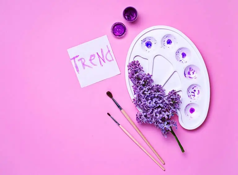
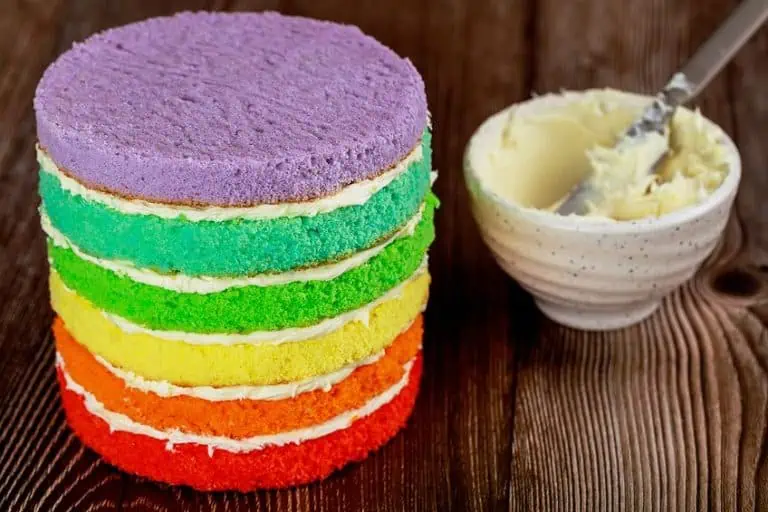
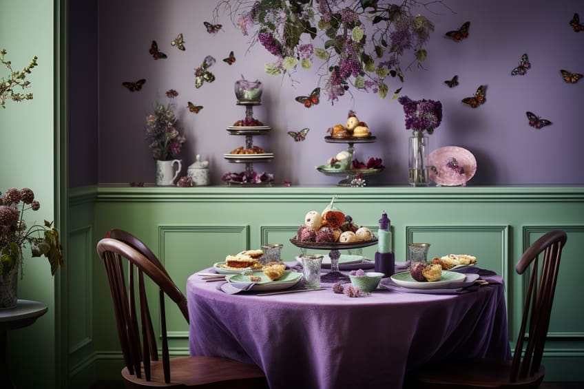
Have you ever been curious about what colors go with purple? Exploring the world of purple color schemes can lead you to discover captivating and visually stunning combinations. Whether you are aiming for a bold and vibrant look or a serene and elegant atmosphere, finding the best color combination with purple can create a striking impact. From pairing purple with contrasting shades, like yellow and green, to creating a harmonious blend with soft neutrals, like gray and white, the possibilities are endless. So, join us as we help you unlock and utilize the true beauty and versatility of this captivating hue to its fullest extent.
What Color Is Purple?
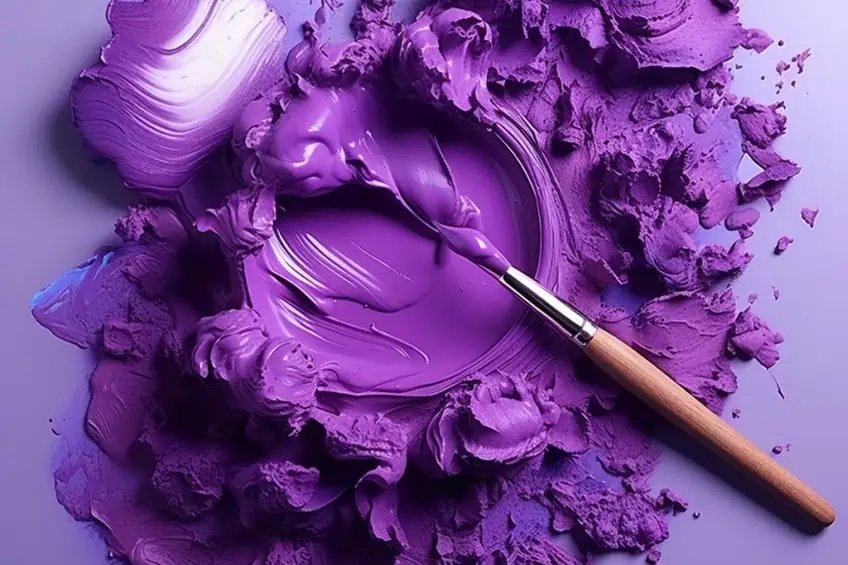
Purple, a mesmerizing color that lies at the meeting point of warm red and cool blue, is often associated with royalty, luxury, and creativity. Its distinct hue ranges from deep and regal tones to light and ethereal shades, allowing for endless possibilities when it comes to purple color schemes. In nature, purple is a rare color to find. However, when it does grace us with its presence, it leaves an indelible mark. Majestic lavender fields stretch across the countryside, their delicate blooms painting a picturesque scene. Rich amethyst gemstones, with their deep violet hues, capture the imagination and evoke a sense of mystery and enchantment.
The beauty of purple lies not only in its individuality but also in its ability to harmonize with a variety of other colors. Creating a purple color palette offers an array of possibilities to ignite your creativity and design prowess.
| Purple Color | Hex Code | RGB | CMYK (%) | Shade of Purple |
| Purple | #800080 | 128, 0, 128 | 0, 100, 0, 50 | |
| Violet | #8f00ff | 143, 0, 255 | 44, 100, 0, 0 | |
| Plum | #dda0dd | 221, 160, 221 | 0, 28, 0, 13 | |
| Orchid | #da70d6 | 218, 112, 214 | 0, 49, 2, 15 | |
| Mauve | #e0b0ff | 224, 176, 225 | 12, 31, 0, 0 | |
| Purpureus | #9a4eae | 154, 78, 174 | 11, 55, 0, 32 | |
| Mardi Gras | #340034 | 52, 0, 52 | 0, 100, 0, 80 | |
| Eminence | #6c3082 | 108, 48, 130 | 17, 63, 0, 49 | |
| Byzantium | #702963 | 112, 41, 99 | 0, 63, 12, 56 | |
| African Violet | #b284be | 178, 132, 190 | 6, 31, 0, 25 |
Colors That Go With Purple
The color wheel, a visual representation of the spectrum of colors, holds the key to unlocking the harmonious relationship between purple and its vibrant counterparts. As we delve into the intricacies of the color wheel, we discover a multitude of colors that go with purple, creating captivating and eye-catching combinations. From colors that complement purple in order to enhance its vibrancy to analogous hues that create a harmonious blend, the color wheel offers a palette of possibilities for the best color combination with purple.
Whether you are seeking bold and dramatic contrasts or subtle and elegant pairings, the color wheel becomes a guide, allowing you to unleash the full potential of purple in your creative endeavors.
Purple and Gold
Finding the best colors for purple is like embarking on a captivating journey through the realm of color possibilities. Purple, with its regal and enchanting charm, provides a rich canvas for complementary hues to shine and create striking visual harmonies. One classic and timeless color combination for purple is the pairing with gold. The opulence of gold beautifully enhances the richness of purple, creating an atmosphere of luxury and grandeur
Whether it’s gold accents in jewelry, decor, or even metallic finishes, this combination exudes elegance and sophistication.
| Color Name | Hex Code | RGB | CMYK Color Code (%) | Shade |
| Purple | #800080 | 128, 0, 128 | 0, 100, 0, 50 | |
| Gold | #ffd700 | 255, 215, 0 | 0, 16, 100, 0 |
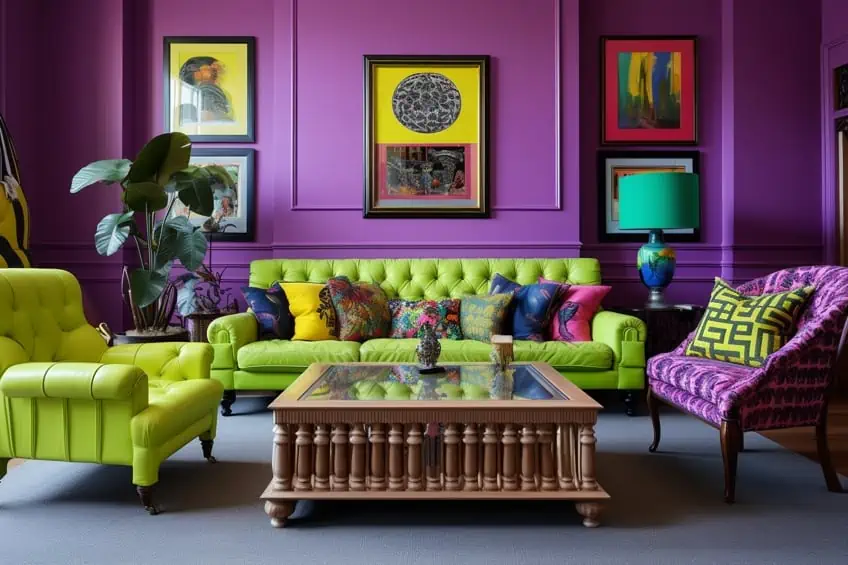
Purple and Lime Green
For a vibrant and energetic twist, combining purple with citrusy shades like lime green creates a refreshing and eye-catching palette. The zesty tones of these colors infuse a playful and dynamic element to purple, resulting in a lively and invigorating atmosphere.
| Color Name | Hex Code | RGB | CMYK Color Code (%) | Shade |
| Purple | #800080 | 128, 0, 128 | 0, 100, 0, 50 | |
| Lime Green | #32cd32 | 50, 205, 50 | 76, 0, 76, 20 |
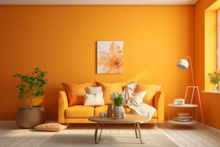
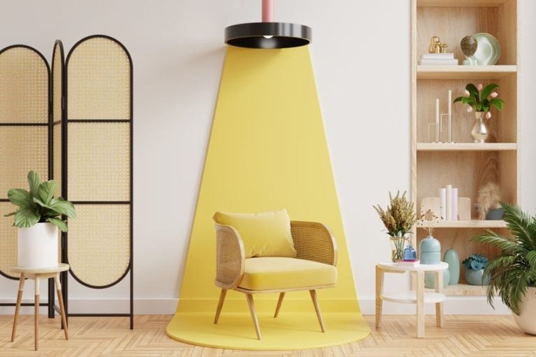
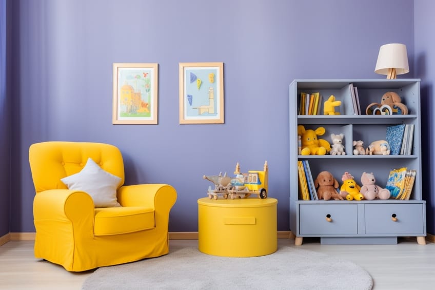
Purple and Lemon Yellow
Pairing the energetic combination of purple and lemon yellow in interior design creates a lively and sophisticated ambiance. Opt for dominant purple hues on walls or large furniture, and introduce the vibrant lemon yellow through accessories. Personally, I recommend incorporating metallic accents like gold for a touch of luxury. To balance the contrast, add natural elements such as plants or wooden textures, ensuring a harmonious and visually pleasing space.
| Color Name | Hex Code | RGB | CMYK Color Code (%) | Shade |
| Purple | #800080 | 128, 0, 128 | 0, 100, 0, 50 | |
| Lemon Yellow | #fff44f | 255, 244, 79 | 0, 4, 69, 0 |

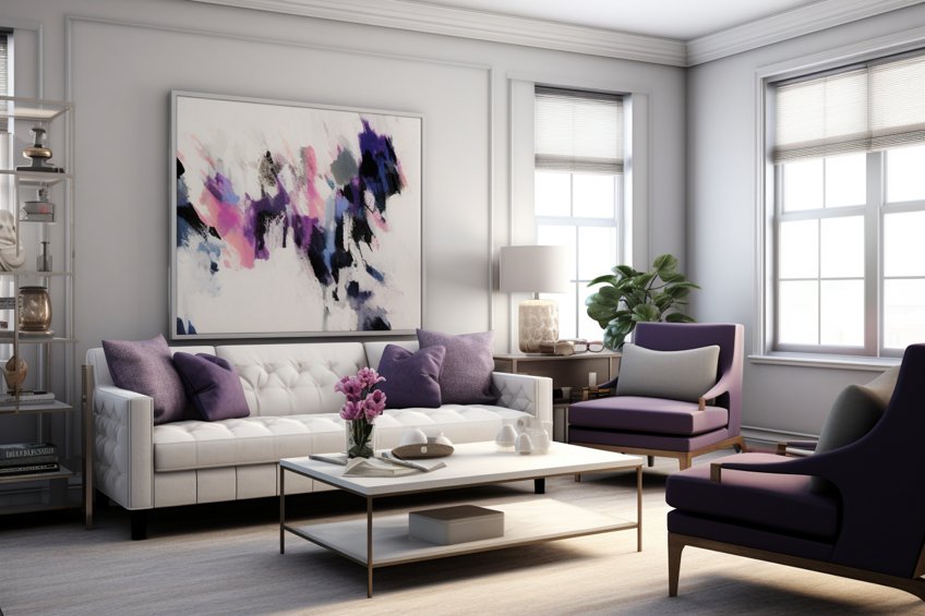
Purple and Light Gray
If you are looking for a more serene and calming ambiance, consider pairing purple with light gray. The soft and neutral undertones of light gray create a sophisticated backdrop that allows purple to take center stage. Combining these colors together creates a delicate and ethereal feel.
| Color Name | Hex Code | RGB | CMYK Color Code (%) | Shade |
| Purple | #800080 | 128, 0, 128 | 0, 100, 0, 50 | |
| Light Gray | #d3d3d3 | 211, 211, 211 | 0, 0, 0, 17 |
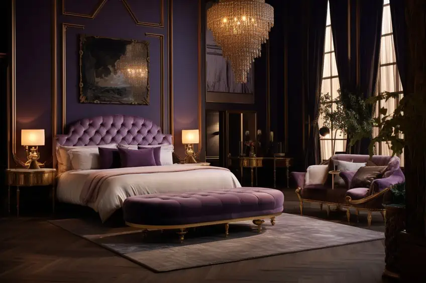
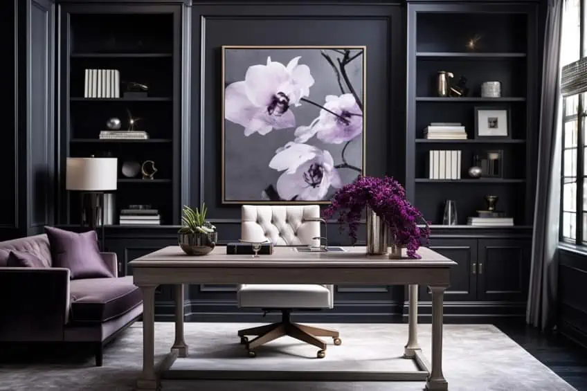
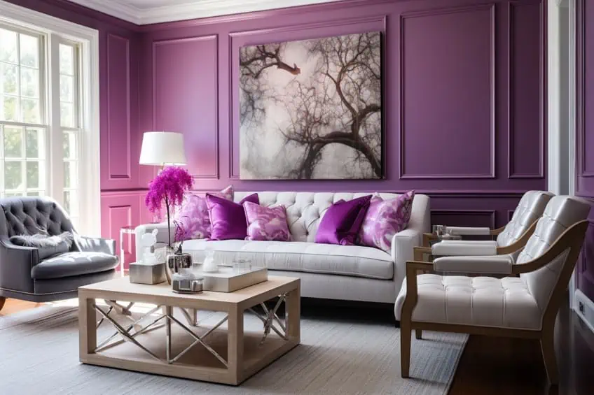
Purple and Charcoal Gray
Combining the regal richness of purple with the sleek sophistication of charcoal gray brings an elegant and modern touch to interior design. Use purple as the main color for walls or key furniture pieces, while charcoal gray can serve as a grounding neutral in larger areas. Personally, I suggest incorporating metallic or mirrored accents for a touch of glamour, and opting for light-colored accessories to prevent the space from feeling too heavy.
| Color Name | Hex Code | RGB | CMYK Color Code (%) | Shade |
| Purple | #800080 | 128, 0, 128 | 0, 100, 0, 50 | |
| Charcoal Gray | #36454f | 54, 69, 79 | 32, 13, 0, 69 |
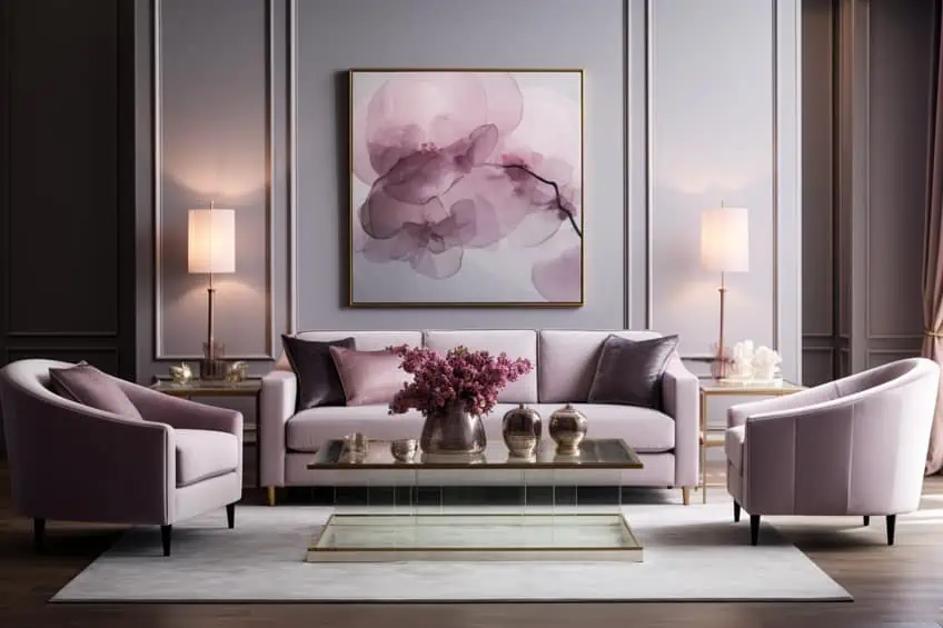
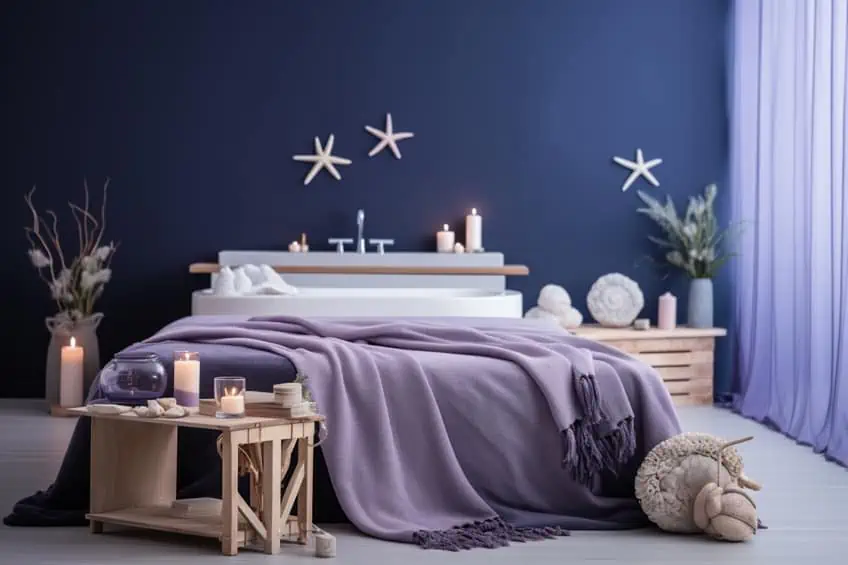
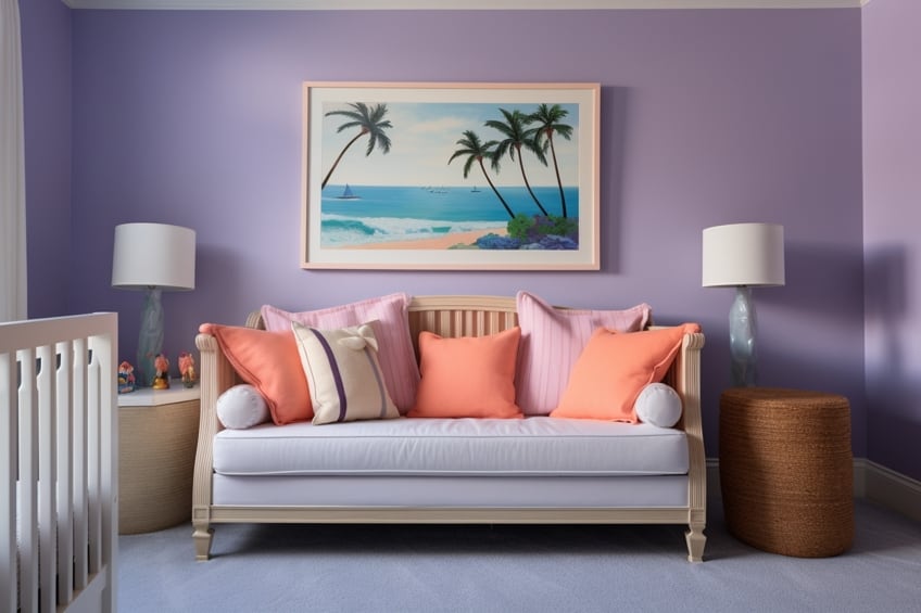
Lavender and Navy Blue
The pairing of lavender and navy blue combines serenity with depth. Use lavender as a dominant color in bedroom walls for a calming effect, while navy blue can be introduced through bedding or accent furniture. Personally, I suggest incorporating metallic silver accents to add a touch of glamour and elevate the overall sophistication. Consider adding plush textiles like velvet in navy blue to create a luxurious and comfortable ambiance.
| Shade | Hex Code | CMYK Color Code (%) | RGB Color Code | Color |
| Lavender | #E6E6FA | 15, 15, 0, 4 | 230, 230, 250 | |
| Navy Blue | #000080 | 100, 87, 0, 50 | 0, 0, 128 |
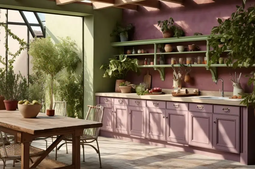
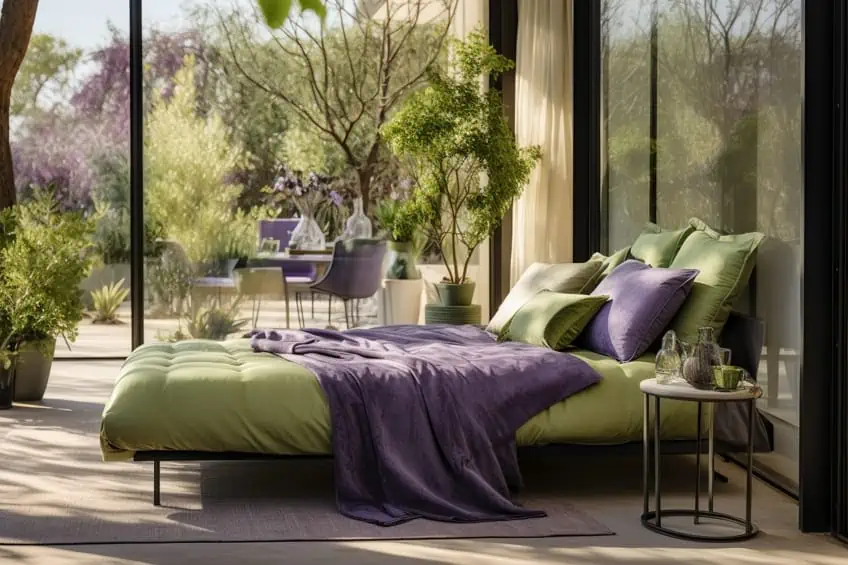
Plum and Sage Green
Plum and sage green offer a harmonious blend of richness and freshness. Apply plum as an accent color in accessories like throw pillows or vases against sage green walls for balance. To enhance the natural feel, include indoor plants and wooden elements. Personally, I find that gold or brass accents complement this combination beautifully, adding warmth and elegance to the space.
| Shade | Hex Code | CMYK Color Code (%) | RGB Color Code | Color |
| Plum | #8E4585 | 34, 77, 0, 47 | 142, 69, 133 | |
| Sage Green | #9DC183 | 29, 8, 37, 0 | 157, 193, 131 |
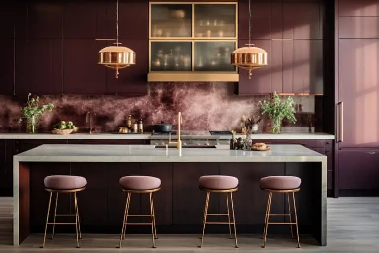
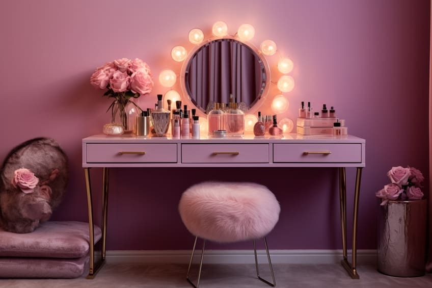
Mauve and Rose Gold
Mauve and rose gold create a romantic and modern aesthetic. Consider using mauve as the base color for bedroom walls and incorporate rose gold through light fixtures or picture frames. Personally, I recommend adding white or cream-colored furniture to maintain a soft and airy atmosphere. Mirrored or reflective surfaces can also amplify the rose gold accents, creating a sense of luxury.
| Shade | Hex Code | CMYK Color Code (%) | RGB Color Code | Color |
| Mauve | #E0B0FF | 22, 42, 0, 0 | 224, 176, 255 | |
| Rose Gold | #B76E79 | 14, 50, 40, 12 | 183, 110, 121 |
Lilac and Coral
Lilac and coral bring a playful and lively vibe to any space. Apply lilac as a dominant color in larger furniture pieces and introduce coral through accessories like artwork or decorative items. Personally, I suggest adding pops of gold or brass for a touch of glamour. Keep the overall look balanced by incorporating neutral elements like white or light gray, ensuring a vibrant yet sophisticated result.
| Shade | Hex Code | CMYK Color Code (%) | RGB Color Code | Color |
| Lilac | #C8A2C8 | 27, 45, 0, 21 | 200, 162, 200 | |
| Coral | #FF6F61 | 0, 63, 46, 0 | 255, 111, 97 |
Violet and Turquoise
Violet and turquoise create a vibrant and energetic atmosphere. Use violet as an accessory color in furnishings or statement pieces against turquoise walls. Personally, I find that incorporating natural textures like rattan or jute complements this pairing, adding a bohemian touch. Consider using a mix of patterns in these colors to create a dynamic and visually appealing space.
| Shade | Hex Code | CMYK Color Code (%) | RGB Color Code | Color |
| Violet | #8F00FF | 75, 100, 0, 0 | 143, 0, 255 | |
| Turquoise | #40E0D0 | 48, 0, 18, 0 | 64, 224, 208 |

Amethyst and Blush Pink
Amethyst and blush pink evoke a sense of romance and sophistication. Apply amethyst as a statement color in a focal point like a feature wall, while blush pink can be introduced through textiles and accessories. Personally, I recommend incorporating mirrored or metallic accents to enhance the luxurious feel. Keep the overall palette light and airy to create a dreamy and inviting ambiance.
| Shade | Hex Code | CMYK Color Code (%) | RGB Color Code | Color |
| Amethyst | #9966CC | 39, 58, 0, 20 | 153, 102, 204 | |
| Blush Pink | #FFB6C1 | 0, 19, 19, 0 | 255, 182, 193 |

Orchid and Teal
Orchid and teal bring a bold and luxurious feel to a space. Use orchid as the primary color in furniture or drapery, and introduce teal through accent pieces. Personally, I find that incorporating dark wood or metallic finishes adds depth and richness. Balance the intensity of these colors by keeping the rest of the palette neutral, allowing the orchid and teal to stand out as focal points.
| Shade | Hex Code | CMYK Color Code (%) | RGB Color Code | Color |
| Orchid | #DA70D6 | 26, 58, 0, 15 | 218, 112, 214 | |
| Teal | #008080 | 100, 0, 33, 50 | 0, 128, 128 |

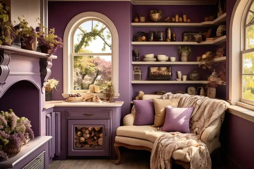
Grape and Cream
The combination of grape and cream creates a classic and sophisticated look. Apply grape as an accent color in furnishings or accessories against cream-colored walls. Personally, I suggest incorporating timeless patterns like stripes or damask in these hues for an elegant touch. Consider using soft, plush textures in furnishings to add warmth and comfort to the space.
| Shade | Hex Code | CMYK Color Code (%) | RGB Color Code | Color |
| Grape | #6F2DA8 | 57, 80, 0, 47 | 111, 45, 168 | |
| Cream | #FFFDD0 | 1, 2, 15, 0 | 255, 253, 208 |
Periwinkle and Mustard Yellow
Periwinkle and mustard yellow offer a cheerful and complementary pairing. Apply periwinkle on larger surfaces like walls and bring in mustard yellow through furniture and decor. Personally, I recommend incorporating natural materials like wood or rattan to enhance the warmth of mustard yellow. Consider using neutral tones for other elements to maintain a balanced and inviting atmosphere.
| Shade | Hex Code | CMYK Color Code (%) | RGB Color Code | Color |
| Periwinkle | #CCCCFF | 25, 25, 0, 0 | 204, 204, 255 | |
| Mustard Yellow | #FFDB58 | 0, 10, 66, 0 | 255, 219, 88 |
Eggplant and Terracotta
Eggplant and terracotta create a rich and earthy ambiance. Use eggplant as a dominant color in furnishings or textiles and introduce terracotta through accent pieces. Personally, I find that incorporating warm lighting, such as copper or bronze fixtures, enhances the cozy feel. Consider using earthy textures like clay or stone to further elevate the natural aesthetic.
| Shade | Hex Code | CMYK Color Code (%) | RGB Color Code | Color |
| Eggplant | #614051 | 42, 75, 31, 27 | 97, 64, 81 | |
| Terracotta | #E2725B | 0, 52, 39, 10 | 226, 114, 91 |

Mulberry and Mint Green
Mulberry and mint green provide a refreshing and sophisticated combination. Use mulberry as an accessory color in furnishings or decor against mint green walls for a calming effect. Personally, I recommend incorporating botanical prints or actual plants to enhance the freshness of mint green. Consider light-colored furniture to maintain a balanced and airy feel in the space.
| Shade | Hex Code | CMYK Color Code (%) | RGB Color Code | Color |
| Mulberry | #C54B8C | 28, 76, 0, 21 | 197, 75, 140 | |
| Mint Green | #98FF98 | 30, 0, 30, 0 | 152, 255, 152 |
Magenta and Sky Blue
Magenta and sky blue create a bold and energetic atmosphere. Apply magenta as a statement color in focal points like an accent wall, while introducing sky blue through accessories or textiles. Personally, I find that incorporating geometric patterns in these colors adds a modern touch. Consider using neutral tones for larger surfaces to prevent the space from feeling overwhelming.
| Shade | Hex Code | CMYK Color Code (%) | RGB Color Code | Color |
| Magenta | #FF00FF | 0, 100, 0, 0 | 255, 0, 255 | |
| Sky Blue | #87CEEB | 32, 5, 0, 7 | 135, 206, 235 |

Iris and Peach
Iris and peach offer a delicate and harmonious pairing. Use iris as the primary color in furnishings or textiles and bring in peach through smaller accents. Personally, I suggest incorporating soft, flowing fabrics like sheer curtains to enhance the ethereal feel. Consider adding gold or brass accessories for a touch of elegance.
| Shade | Hex Code | CMYK Color Code (%) | RGB Color Code | Color |
| Iris | #5A4FCF | 57, 67, 0, 19 | 90, 79, 207 | |
| Peach | #FFE5B4 | 0, 9, 26, 0 | 255, 229, 180 |
Thistle and Champagne
Thistle and champagne create an understated and elegant look. Apply thistle as the dominant color in larger furniture pieces and introduce champagne through accessories or metallic finishes. Personally, I find that incorporating mirrored surfaces enhances the sophisticated feel. Keep the overall palette neutral to allow thistle and champagne to shine as refined focal points.
| Shade | Hex Code | CMYK Color Code (%) | RGB Color Code | Color |
| Thistle | #D8BFD8 | 11, 22, 0, 16 | 216, 191, 216 | |
| Champagne | #F7E7CE | 0, 4, 20, 7 | 247, 231, 206 |
Radiant Orchid and Silver
Radiant orchid and silver offer a modern and luxurious combination. Use radiant orchid as an accent color in furnishings or decor against silver-toned walls or finishes. Personally, I recommend incorporating sleek and metallic finishes to enhance the contemporary aesthetic. Consider using minimalistic furniture to maintain a clean and sophisticated look.
| Shade | Hex Code | CMYK Color Code (%) | RGB Color Code | Color |
| Radiant Orchid | #B163A3 | 29, 56, 0, 37 | 177, 99, 163 | |
| Silver | #C0C0C0 | 0, 0, 0, 25 | 192, 192, 192 |
Heliotrope and Olive Green
Heliotrope and olive green create a rich and balanced color scheme. Apply heliotrope as a statement color in focal points and introduce olive green through furnishings or textiles. Personally, I find that incorporating wooden elements adds warmth and complements the earthy tones. Consider using soft lighting to enhance the cozy and inviting atmosphere.
| Shade | Hex Code | CMYK Color Code (%) | RGB Color Code | Color |
| Heliotrope | #DF73FF | 35, 60, 0, 0 | 223, 115, 255 | |
| Olive Green | #B5B35C | 31, 18, 71, 9 | 181, 179, 92 |
Wisteria and Copper
Wisteria and copper bring together a romantic and warm palette. Use wisteria as the dominant color in furnishings or textiles and introduce copper through accessories or light fixtures. Personally, I recommend incorporating vintage-inspired elements to enhance the timeless feel. Consider using neutral tones for larger surfaces to allow wisteria and copper to stand out.
| Shade | Hex Code | CMYK Color Code (%) | RGB Color Code | Color |
| Wisteria | #C9A0DC | 21, 30, 0, 16 | 201, 160, 220 | |
| Copper | #B87333 | 24, 47, 80, 10 | 184, 115, 51 |
Byzantium and Aqua
Byzantium and aqua create a bold and refreshing combination. Apply Byzantium as an accent color in furnishings or decor against aqua walls for a striking contrast. Personally, I find that incorporating metallic or mirrored finishes adds a touch of glamour. Consider using light-colored accessories to maintain balance and prevent the space from feeling too intense.
| Shade | Hex Code | CMYK Color Code (%) | RGB Color Code | Color |
| Byzantium | #702963 | 42, 81, 0, 38 | 112, 41, 99 | |
| Aqua | #00FFFF | 100, 0, 0, 0 | 0, 255, 255 |
Boysenberry and Celadon
Boysenberry and celadon offer a playful and sophisticated color combination. Use boysenberry as an accessory color in furnishings or textiles and introduce celadon through larger surfaces like walls or furniture. Personally, I recommend incorporating playful patterns to enhance the lively feel. Consider using neutral tones for other elements to maintain balance and avoid visual overload.
| Shade | Hex Code | CMYK Color Code (%) | RGB Color Code | Color |
| Boysenberry | #2E2A4A | 81, 87, 0, 29 | 46, 42, 74 | |
| Celadon | #ACE1AF | 27, 0, 18, 11 | 172, 225, 175 |
Pansy and Brick Red
Pansy and brick red create a rich and dramatic atmosphere. Apply pansy as the dominant color in furnishings or textiles and introduce brick red through smaller accents or statement pieces. Personally, I find that incorporating dark wood or leather elements enhances the depth and sophistication. Consider using soft lighting to create a cozy and inviting ambiance in the space.
| Shade | Hex Code | CMYK Color Code (%) | RGB Color Code | Color |
| Pansy | #78184A | 66, 100, 0, 49 | 120, 24, 74 | |
| Brick Red | #C14A41 | 0, 65, 65, 19 | 193, 74, 65 |

In the realm of colors for purple, the possibilities are truly endless. It is a matter of exploring your personal preferences, the desired atmosphere, and the mood you wish to evoke. Whether it is the regal pairing of gold, the lively combination with citrus shades, or the serene contrast with gray, each accent color brings its own unique charm and personality to purple, allowing it to shine in all its captivating glory.
Take a look at our colors that go with purple webstory here!
Frequently Asked Questions
What Colors Go Well With Purple?
Purple pairs well with a variety of colors. Some popular combinations include purple and gold for a regal look, purple and green for a vibrant contrast, purple and gray for a sophisticated ambiance, and purple and pink for a romantic feel. Ultimately, the choice depends on the desired mood and aesthetic.
How Can You Use Purple in a Neutral Color Scheme?
Purple can serve as a focal point in a neutral color scheme. Pair it with gray, beige, or white to create a sophisticated and timeless look.
Can You Use Different Shades of Purple Together?
Yes, combining different shades of purple, such as lavender and eggplant, can create a visually appealing and harmonious monochromatic look.

Duncan graduated with a diploma in Film and TV production from CityVarsity in 2018, after which he continued pursuing film while taking on a keen interest in writing along the way. Since having graduated, he began working as a freelance videographer, filming a variety of music videos, fashion and short films, adverts, weddings and more. Throughout this, he’s won a number of awards from various film festivals that are both locally and internationally recognized. However, Duncan still enjoys writing articles in between his filming ventures, appreciating the peace and clarity that comes with it.
His articles focus primarily around helping up-and-coming artists explore the basics of certain colors, how these colors can be paired with other shades, as well as what colors are created when you mix one with another. All while relating these shades to historically significant paintings that have incorporated them into their color palette. As a lover of the arts himself, he takes great interest in the Renaissance era of paintings, an era that has directly inspired many of his favorite films.
Learn more about Duncan van der Merwe and about us.