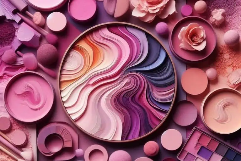
Neutral Colors – Exploring and Creating a Neutral Color Palette
This post may contain affiliate links. We may earn a small commission from purchases made through them, at no additional cost to you.
What comes to mind when neutral colors are mentioned? Maybe, you think they are uninteresting, or you just might consider these colors comforting and sophisticated. The basic neutral colors definition can be seen as various hues that seem to have no color and do not appear on the color wheel. Most commonly these include white, black, brown, and gray. Even though these “colors” do not stand out like others, they play an important role in all forms of art and design.
Neutral Colors: A Brief History
Neutral shades have not had a prolific and obvious influence like your red or blue. However, just as these colors are subtle in effect in appearance, they have also had subtle, yet profound effects over time and in cultures. Many non-western cultures embrace bright and vibrant colors, and you can see it, even today in the clothes they wear and in other cultural aspects. However, in western society, you will never commonly see businessmen walking around in brightly colored suits.
So, what happened over the years? As with many things, people are the ones who formed opinions and created ideas that should conform to the times. Colors became a form of symbolism, and wearing certain colors was and still is an indication of social status. Dyes and pigment were highly sought after, and in many cases, were quite expensive. So, ultimately only the rich and those with high status could afford to wear these colored garments.

During the colonial period where trade was established in countries like India, colorful pigments, as well as fabrics, were easier and cheaper to come by. In England during the 17th century, many of the local merchants became worried about these cheaper products entering the market. So, regulations were set up to protect the specific guilds and these cheaper varieties had to be sent to other viable markets. European traders then went elsewhere to areas like Western Africa. Not only were these colorful items sold for cash or gold, but they were also traded for slaves.
Eventually, in Europe, bright colors became something of a symbol for weakness, immorality, and something that portrays strangeness, or an oddity. The neutral colors became more and more popular and represented sophistication. These colors became a symbol of superiority as bright colors were seen to be associated with the lower classes and those who are different in society. You would see women in neutral shades and never in something like red, and men only wore dark-colored suits. This is simply one example of how colors have influenced cultures and societies, there are many other reasons, too many to mention here. Of course, over the years, due to the invention of the color wheel, and the discovery of primary colors and color theory, the use of color has become more controlled.
There are most definitely still influences from the past that remain with us, however, there is a lot more open use and expression of color in the modern world with trends coming and going, and this includes the use and increased popularity of neutral shades.
What Are Neutral Colors?
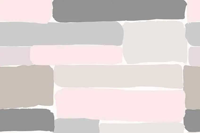
As mentioned, the neutral colors definition says that these colors do not appear on the color wheel and do not possess saturation, and include colors like white, black, gray, brown, and can also include the less common beige, tan, and cream colors. Neutral colors are also often known as earth tones. Neutral colors can be created by combining two complementary colors. These colors sit on opposite ends of the color wheel, and when combined, cancel each other out and form a color without intensity or forms color without hue. These can be considered your “pure” neutrals. However, when these two opposite colors are positioned next to each other, they create a strong contrast.
The “pure” neutrals will be your grays, white, black, and brown colors that do not have an undertone. All other neutral colors are close to neutral or known as “near-neutral”. These colors are like your creams, ivory, tan, eggshell, and beiges, which can be considered a neutral color, but they have a slight hue or undertone. This means they have a low saturation of color.

You can create these near-neutral colors by combining a pure primary color with a purely neutral shade, which can affect the vibrancy and saturation of the parent color. For example, when using gray or white, it tones down the more vibrant color to a low saturation, which can then appear close to a light gray. Sometimes, these colors are also known as chromatic grays. These muted shades almost appear to have no color, but different lighting can expose the undertone. Another example includes combining a neutral tan with yellow to create a neutral brown. This new color will have a lower saturation than the original pure color.
The various undertones can be considered warm, which would have a red, orange, or yellow hue, or the undertone could be cool with the parent hue being green, purple, or blue. In color theory, this is known as color bias. By combining a more vibrant color with a neutral color, you can improve the vibrancy.
You can then also change the tints and shades of neutral colors by adding white or black. For example, you can create a light to charcoal or dark gray.
The Symbolism of Neutral Shades
Neutral shades are uncomplicated and not difficult to look at like some colors can be. In general, neutral colors are calming, relaxing and can produce a sense of tranquility. Each main neutral color can also have its own symbolism.
- Gray: There are a variety of different shades from dark to light, but in general, gray can appear sophisticated, serious, mysterious, emotionless, formal, practical, conservative and some may even say dull. Lighter gray colors can be more soothing, while darker grays are more dramatic.
- Brown: More of an earth tone, brown is more natural, warm, wholesome, healing, and symbolizes dependability, and safety. However, it can also represent loneliness and despondency.

- White: The most common associations are peace, purity, and cleanliness but it can also represent simplicity, freshness, and elegance. Also, white can be cold and clinical.
- Black: This is quite a strong color and can symbolize strength, authority, formality, mystery, fear, and grief.
Significance of Neutral Shades
Neutral shades work wonderfully as a background as it is subtle and help to bring more attention to any surrounding colors. Neutral colors are also a safe choice for many, and they can be used to great effect in all kinds of design as well as painting. As mentioned before, neutral colors are also easy to look at and can effectively complement other more vibrant colors, making it easier to move from one focal point to the next. If a room or painting is overdone with too many vibrant colors, you simply will not know where to look, making it unpleasant and unsettling. Neutral colors help to tone down the vibrant colors and allow for comfortable attention to any focal areas.
You can also create different tones, shades, and tints in painting to bring a more realistic look to a scene.
Neutrals can also be used to create depth or distance as items can appear less saturated further away than when close up. Neutral colors also pair pretty well with most colors, which is what makes them so popular and a lot easier to work with than some other colors. This is why neutral colors are used in all forms of design and decorating styles. When dealing with interior design, neutral colors are what people return to all the time no matter what the current trend. There may be times when various colors are trending, but neutrals remain timeless and can be used over and over again.
Neutral Color Names
Neutral colors are not as bland and dull as everyone thinks, and are used more often than you think in design and art. When dealing with colors, there are many color models, one being the basic red, yellow and blue (RYB) model, which is used mostly in painting. Then you have your color models used on computers and for printing, which are your red, green, and blue (RGB) model and cyan, magenta, yellow and black (CMYK) model respectively. These models usually tell us how much of each color is needed to form a certain hue. To make things easier, there are also hex codes you can look up for each color. Below are some examples of neutral colors along with their hex codes.
White
Is white a neutral color? Yes, it is a part of the light neutral colors and in many cultures is a symbol of innocence, purity, cleanliness, honesty, and peace. White is the color of snowflakes, clouds, and chalk and reflects all the visible light wavelengths. Animals that come to mind include white doves, which are also a symbol of peace. Wearing white at traditional western weddings is a common practice, the color representing purity. The white unicorn is also a symbol of chastity and purity. White chalk or calcite was used many years ago for drawings found in caves. White has also played a significant role over the years in fashion and architecture.
In the early 20th-century titanium white was created from titanium oxide, which then replaced lead white. White is also used to lighten and soften paint colors.
| Neutral Shade | Neutral Color Hex Code | CMYK Neutral Color Code | RGB Neutral Color Code | Neutral Color |
| White | #ffffff | 0, 0, 0, 0 | 255, 255, 255 |
Brown
Brown can also be categorized as a neutral color and is a combination of green and red or red, black, and yellow in your printing CMYK color model. Brown is not the most popular of colors, however, it can be found in abundance in nature. For example, trees, wood, sand, various birds, and animals. There are many shades of brown and the color is mostly associated with warmth, nature, strength, and healing. Brown works great with most colors; however, the best colors are your shades of blue.

| Neutral Shade | Neutral Color Hex Code | CMYK Neutral Color Code | RGB Neutral Color Code | Neutral Color |
| Brown | #964B00 | 0, 50, 100, 41 | 150, 75, 0 |
Black
Is black a neutral color? Yes, black is created by the absorption of all visible wavelengths and is the opposite of white. Black paint can be used to darken colors and create shades of color. Black is commonly associated with darkness, fear, shadows, secrets, night, and evil. However, it can also represent authority, power, sophistication, and mystery. In fashion, when wearing black, you might be thinking of a black dress, which is a popular choice among women. On the other hand, there are black tuxedos for formal occasions for men.
When combining black and white, you form a gray color.
| Neutral Shade | Neutral Color Hex Code | CMYK Neutral Color Code | RGB Neutral Color Code | Neutral Color |
| Black | #000000 | 0, 0, 0, 100 | 0, 0, 0 |
Gray
When combining white and black, you will land up with gray. The various amounts of each black or white color will determine the shade of gray. Gray can be seen as dull, boring, introverted, and modest; however, it can also be elegant and a symbol of intelligence, wisdom, and balance. Consider the terms “gray matter” and “gray hairs”.
| Neutral Shade | Neutral Color Hex Code | CMYK Neutral Color Code | RGB Neutral Color Code | Neutral Color |
| Gray | #808080 | 0, 0, 0, 50 | 128, 128, 128 |
Beige
This color is calming and is warm like brown, but it also has the freshness of white. A versatile color for interior design as it works well with most colors. The color is also calming and relaxing, and also works well with other neutral colors like white and black. Beige is a dependable and serene color that can sometimes be seen as a bit boring. The color does not attract attention, yet it is welcoming and soothing.
The word beige itself is French and is an expression of the color of the wood.
| Neutral Shade | Neutral Color Hex Code | CMYK Neutral Color Code | RGB Neutral Color Code | Neutral Color |
| Beige | #f5f5dc | 0, 0, 10, 4 | 245, 245, 220 |
Ivory
Ivory is a color that is just off-white with a slight yellow undertone and is associated with the tusks of elephants and rhinos. The color is a symbol of virtue, chastity, and lavishness. The color name itself was first used in 1385.
| Neutral Shade | Neutral Color Hex Code | CMYK Neutral Color Code | RGB Neutral Color Code | Neutral Color |
| Ivory | #fffff0 | 0, 0, 6, 0 | 255, 255, 240 |
Alabaster
A soft, off-white, and warm color that also contains a neutral beige undertone. Alabaster is a part of the light neutral colors and symbolizes new beginnings and was first mentioned as a color by none other than Shakespeare himself.
Alabaster was chosen by Sherwin-Williams to be the color of the year in 2016.
| Neutral Shade | Neutral Color Hex Code | CMYK Neutral Color Code | RGB Neutral Color Code | Neutral Color |
| Alabaster | #edeade | 0, 1, 6, 7 | 237, 234, 222 |
Cream
A soft yellow color that is similar to the dairy product. This shade of white symbolizes calm, purity as well as elegance. The color can be achieved by mixing small amounts of yellow with white paint. A perfect gender-neutral combination is cream and gray.
| Neutral Shade | Neutral Color Hex Code | CMYK Neutral Color Code | RGB Neutral Color Code | Neutral Color |
| Cream | #fffdd0 | 0, 1, 18, 0 | 255, 253, 208 |
Taupe
This is a darker, gray, brown color that can be difficult to define as it could appear to be either gray or brown. The name originates from French and means “mole”. The color symbolizes sophistication, elegance, dignity, and practicality amongst others. Taupe is an organic and earthy color, and the color can be created by mixing umber with white paint. When using a neutral color palette with taupe in interior design, it is best to pair it with other colors to prevent it from being too bland.
Taupe can also be used to create flesh tones in paintings and can be used to tone down more vibrant colors.
| Neutral Shade | Neutral Color Hex Code | CMYK Neutral Color Code | RGB Neutral Color Code | Neutral Color |
| Taupe | #483c32 | 0, 17, 31, 72 | 72, 60, 50 |
Tan
This color can be seen as a lighter shade of brown and the color name was first used in the late 16th century. The name comes from what is known as tannum or oak bark, which was used in the process of tanning leather. Tan is a warm color that provides a sense of security and can easily be used with most other colors.
| Neutral Shade | Neutral Color Hex Code | CMYK Neutral Color Code | RGB Neutral Color Code | Neutral Color |
| Tan | #d2b48c | 0, 14, 33, 18 | 210, 180, 140 |
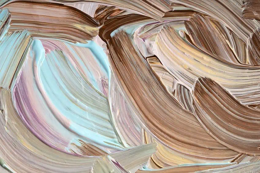
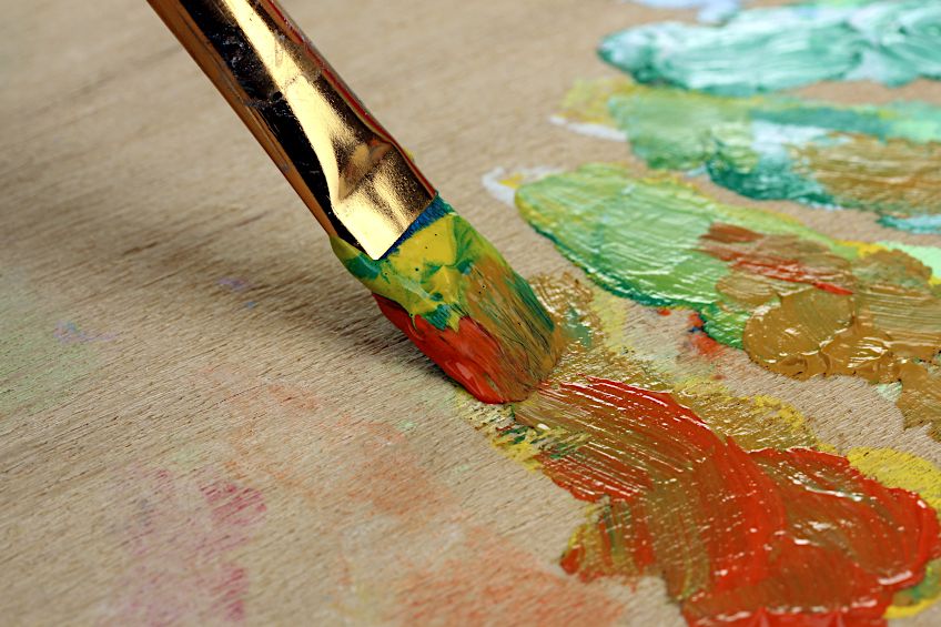
Neutral Shades In Art
We now know that neutral colors can be created by simply combining complementary colors with white. When painting, specifically realistic pieces, there are many subtleties you can overlook, especially in color temperature. To create more realistic images, neutral colors are just as important as any other color. Just because neutral colors are not located on the color wheel, does not mean you should pay less attention to them.
When painting scenery, neutral colors are what make other more vibrant colors stand out. Vibrant and saturated colors tend to be what catches the eye first and are important. However, too much of a good thing can also be bad as if there are too many bright colors, you find yourself not knowing where to look, and it can become a little confusing. The image can also appear to be unnatural and can even become unlikable.
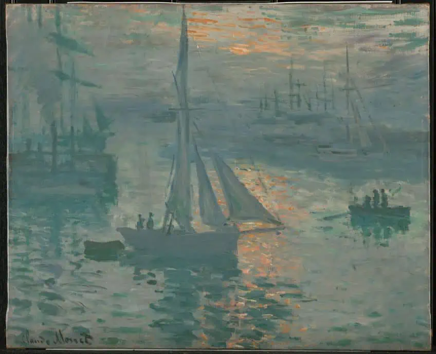 Sunrise (Marine) (1873) by Claude Monet; Claude Monet, Public domain, via Wikimedia Commons
When using neutral shades, it creates a space where the yes can rest, helping to balance the more vibrant colors. Neutral colors can also complement other colors and help them to stand out even more. You can also create different color temperatures with neutral colors, to create more subtle cooler or warmer neutrals, depending on what you are painting. Neutral colors are also needed to create more space and depth. For example, use neutrals to create depth or distance as objects further away become less saturated. Here are some paintings that use neutral colors.
- Sunrise (Marine) by Claude Monet (1873)
- Place du Théâtre Français, Paris: Rain by Camille Pissarro (1898)
- The Temptation of Christ by Ary Scheffer (1854)
Painting With a Neutral Color Palette Using Orange and Blue
Today, you can simply go to the art store and purchase various neutral paint colors. However, you can also use your primary, secondary and complementary colors to create neutral shades. Not all neutral colors will be the same, depending on what specific color you use. However, combining any of the primary colors should produce neutral paint colors. When choosing the colors, depending on what you want to do, you should determine if you want warm or cool colors or lighter or darker colors. Color temperature, in reference to cool or warm, you are dealing with color bias. These different colors will be located on either side of the color wheel.
Warmer colors will be reds and oranges, while cooler colors are your blues and greens.
You will need to know your paints to create the perfect mix as some paints like cadmium red light have a slight yellow undertone. So, when mixing it with blue, you will not create a bright violet and a darker brown or muddier color will be the result as you are mixing all three primary colors. You can also create brown to gray tone neutral paint colors by combining your complementary colors, which are located on the color wheel opposite each other.
We will look at some examples of various orange and blue paint combinations to see what neutral color they make. You can also create shadows and other effects directly on the canvas. For example, if you wish to shade or create some other effect and you used orange already, simply apply a blue paint color to create a neutral shade in a specific area.
- Cadmium Orange and Cerulean Blue create a warm and medium-light neutral brown that can be lightened further by including a little white paint.
- Ultramarine Blue and Raw Sienna create a darker blue-green as the raw sienna is a dull and dark yellow-orange.
- Cadmium Orange and Ultramarine blue create a warm red-brown neutral color as the ultramarine also has a slight red undertone.
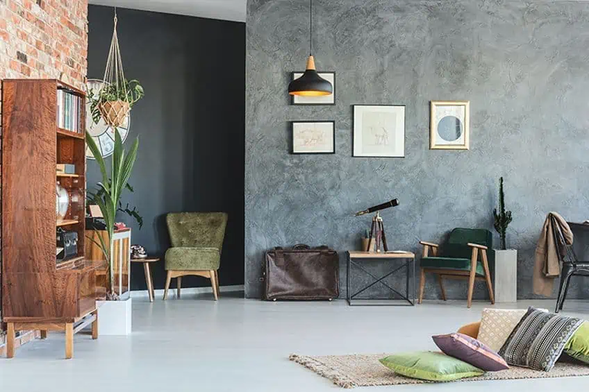
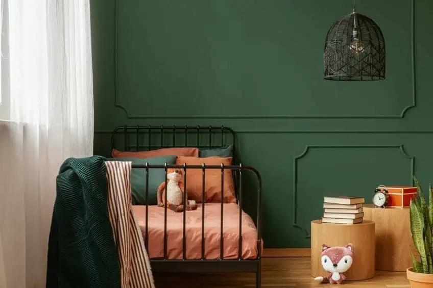
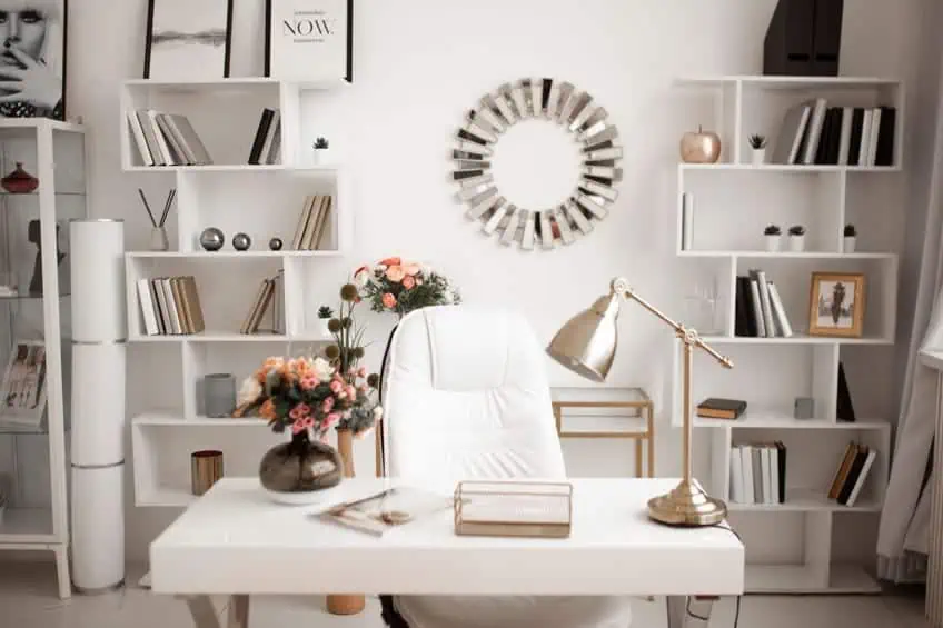
Interior Design and Neutral Colors
A neutral color scheme may appear to be too bland for some, but these are the best colors to create a quiet and calm space. When using a neutral color scheme, these colors can also act as a backdrop to other more vibrant colors you want to include. For example, neutral wall colors or sofa will make other more colorful accessories stand out.
You can easily add bolder colors and textures without overwhelming the senses.
Neutral shades are also extremely can be used with most other colors and still create a calming and balanced atmosphere. You can also change things around often without having to re-do the entire room again. Many of the neutral shades do come with various color undertones, so you should always be aware of this before working out your neutral color scheme. To make a room seem bigger, it is best to utilize bright and lighter neutral shades. For example, you can try a soft beige or a beautiful dove gray. You can also use other soft and light colors to similar effects. For example, lavender, blush pink, or a soft mint.
Using Green as a Neutral Color
Some colors like certain shades of green can also be used in similar ways to neutrals. For example, sage green and even navy can exhibit characteristics similar to neutral colors. These are all colors close to nature, and colors that are easy to look at and create a calming and relaxing environment.
Neutral Colors are Versatile
Most colors work really well with neutral shades, so you should not have any problems creating the perfect neutral color scheme. Neutral shades provide a nice starting point, and you can always swap and change the room with different textures and accessories. Neutral shades also work fantastic with any design style from your classic elegant look to something more modern with vibrant pops of color that attract the eye. Keep changing the look to keep it from getting too bland or boring. You can also use darker neutrals to great effect. For example, try using these colors for larger sofas or carpets as they are nice grounding colors that are also great at hiding those difficult to get rid of stains.
Neutral colors can also be used in any room in the home to create a welcoming and restful environment.
Make Use of Darker and Lighter Neutral Shades
Neutral colors do not only have to be light, but you can also get darker neutral colors. For example, dark brown, navy, charcoal, or deep gold. You can use a light neutral background and use darker neutral furnishings like sofas, chairs, rugs, or headboards. You can also use a dark neutral as an accent piece, which can be used on a wall, or large rug.
The best combination of lighter and darker neutrals are those with the same undertone and color bias or temperature. Choose colors that are either warm or cool, for example, cool dark neutrals work best with cool lighter neutrals. However, you can add other non-neutral warm colors to add in some color. This can also work the other way around, for example, a warm dark brown with a warm light neutral with cooler accents of color like blue.
Always Consider the Lighting
Consider how the light may affect the colors in a room, this could be natural or artificial light. Artificial light can have a slight yellow undertone and can help to strengthen the warm neutral shades. Check the time of day and see how sunlight may affect the colors in a room.
When choosing white paint, always check to see what shade of white it is as the undertone will react differently to lighting.
Ideas for a Neutral Color Palette
Neutral colors tend to be easy to work with and you can play around with the many different color scheme ideas. Some of the more common ideas include black, beige, white, brown, and gray. Below are a few examples and ideas for a neutral color palette.
- White, gray, and light blue
- Beige, white, gold, and black
- Neutral sand with navy
- Brown and light green
- Pink, taupe and black
Next time you consider neutral colors for your home, make sure to take a second look before deciding these colors may be too boring. Neutral shades can easily be incorporated to create a calming and soothing atmosphere, perfect when coming home. Not only that, but neutral colors also play an important role in all other types of design and art.
Frequently Asked Questions
What Are Neutral Colors?
Neutral colors are described as having a lack of color and cannot be found on the color wheel. The common neutral colors include white, gray, black, and brown. However, you can also get neutral colors with various undertones like beige, taupe, charcoal, cream, and more. Neutral colors tend to be calming; however, some may consider them boring.
Is Black a Neutral Color?
Yes, black is seen as a neutral color and when it comes to light, cancels, or absorbs all other visible color wavelengths. Black works well with all colors and can be used in many different styles and tastes.
Is White a Neutral Color?
Yes, white is a neutral color with many different shades of white to choose from. White is the opposite of black and instead of absorbing all colors, it reflects all visible color wavelengths.
Are Neutral Color Schemes Popular?
Since neutral shades are so versatile, they are quite popular in interior design. The colors work well with all other lighter and more vibrant colors and act as a subtle and calming background.

Duncan graduated with a diploma in Film and TV production from CityVarsity in 2018, after which he continued pursuing film while taking on a keen interest in writing along the way. Since having graduated, he began working as a freelance videographer, filming a variety of music videos, fashion and short films, adverts, weddings and more. Throughout this, he’s won a number of awards from various film festivals that are both locally and internationally recognized. However, Duncan still enjoys writing articles in between his filming ventures, appreciating the peace and clarity that comes with it.
His articles focus primarily around helping up-and-coming artists explore the basics of certain colors, how these colors can be paired with other shades, as well as what colors are created when you mix one with another. All while relating these shades to historically significant paintings that have incorporated them into their color palette. As a lover of the arts himself, he takes great interest in the Renaissance era of paintings, an era that has directly inspired many of his favorite films.
Learn more about Duncan van der Merwe and about us.