Shades of White – How to Make and Use Different Shades of White
This post may contain affiliate links. We may earn a small commission from purchases made through them, at no additional cost to you.
Shades of white are often referred to as colors that differ very slightly from the original pure white color, also known as “off-white” and are regarded as part of the neutral color scheme. Technically speaking a shade is referred to as a pure color that is mixed with black. However, shades of white comprise different saturation and hues of white like eggshell, ivory, and cream. There is a variety of shades of white, some of which will be mentioned further below.
Shades of White: A Brief History
Lead white was the most reliable white ever discovered and has been in use since 400 B.C, however, due to its toxicity, hundreds of people were killed or became sick, which is why it has now been discontinued in the United States. These deaths and illnesses were not only confined to the artists that used the white paint but also the women that used it for makeup and face creams. Despite the serious effects it had, it was still used for centuries, until the late 1700s when zinc white and titanium dioxide white replaced the use of lead white. Then, in 1921 a white titanium oil color was developed and is used by all artists due to its environmental and thermal stability, and opacity. This particular white now accounts for around 70 percent of the whole production of all pigments worldwide.

This titanium dioxide or pigment is not only used by artists but can also be found in things like plastics, toothpaste, cosmetics, skimmed milk, food, and sunblock to add whiteness and opacity. It is also extensively used for the marking of tennis courts lines and is found on the exterior of the Saturn V rocket. Shades of white or off-white colors have been extensively used with beiges in the early 1930s, and also again from 1955 to 1975. Over the years, “off-white” colors have become very popular with thousands of shades of white now available. Objects like clouds, flowers, and snow have been in existence since the creation of the world, and references to the color white have been found in many different cultures. China uses the color white to represent illness and death, while in other cultures, it represents purity, innocence, and freedom. For example, in Western countries, the bride is dressed in white.
Black and white have often been used to depict day and night, good and evil, and in the Eastern cultures, the yin and yang have been portrayed as black and white.
Psychology and Meaning of Shades of White
White is a clean, pure, and simple color and it acts as a stark contrast to black. There are various shades of purity to white, and pure white is a color that is untainted by any of the other hues. White can make you feel refreshed and inspired, but white can also be cold and produce feelings of loneliness. White helps your mind to focus and assists in bringing clarity, but if white can also be overpowering and it can make you feel uncomfortable. White is also a color of illumination, insight, and certainty and is largely associated with learning and knowledge.

The color white projects a sense of cleanliness and purity, which is why doctors wear white coats and brides dress in white. A small white picket fence in your front garden speaks of a happy and contented home. White plates have been known to enhance the perception of sweetness and the quality of the food on it. Smell plays a vital role in your ability to taste, and the color white has a part to play in this as well. The sweet and rich smell of vanilla has a soothing aroma, calming, purifying, and consoling, and the strong smell of the Gardenia blossom can lift your mood. Similarly, taste, when combined with color, can have a connection to your taste buds. Sauvignon Blanc is a very popular white wine and is full of flavor. When people drink the wine they taste passion fruit, banana, and even some other subtle tastes.
However, when the same wine is colored with food coloring, it turns red, and instantly people’s tastes change, and they experience other flavors.
Brief Overview of the Color Theory
Is white a color? Here we find a variety of different opinions amongst all of the color theory traditionalists, as to if white should be considered as a color. This is because the color white appears nowhere on the color wheel and lacks Chroma or hue as it cannot be created from any of the three primary colors, red, blue, and yellow, yet white is an essential ingredient on every paint palette.
Color theory is the science and art of colors and how they connect and interact with each other. A color wheel is a diagrammatic depiction of color theory. White cannot be found on your traditional color wheel as it is technically not color or has no hue. White can, however, change the value or tint of color, making it lighter. So, any tone or hue cannot really exist without white. There are many other terms you can learn like complementary colors, analogous colors, monochromatic colors, all of which are how colors relate to each other on the color wheel.
The essential quality of any color is called the color bias, which indicates that any color can also be seen as either cool or warm. Pure white can seem cold, however, the many shades of white can either be warm or cool, depending on the color undertone. Also, whatever color you use close to white, can create a warm or cool color as the white picks up on these colors.
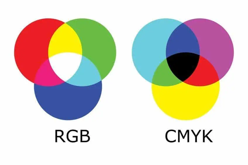
Below we are going to mention a few shades of white names and with these colors, you will find a hex code amongst other information. The hex code is simply a way to identify colors, while the other codes provided belong to certain color models. These color models are related to your computer screen and when printing. These are known as your red, green, and blue (RGB) model and cyan, magenta, yellow and black (CMYK) color models respectively.
These show how much of each of these colors is needed for each specific color name.
Shades of White Names
Technically, as we have learned, white is not a color as it does not have a specific wavelength and consists of all the colors and wavelengths of light. Also, you cannot mix colors to get white paint, so it is an absence of color. When it comes to using white for marketing, it can be successfully used when creating contrast and acts as a space connecting other elements within a certain composition. For example, think of the white page of a document, ready to be filled with writing or other design elements. However, whether it is online or painted on your living room wall, many different shades of white vary from pure white. Below are some of the more well-liked shades of white names with their hex codes.
White
First, you get your standard white from which all other shades of white originate. This white is also known as pure white or crisp white, eliciting thoughts of snowflakes, or white sugar crystals. A few other examples include doctors’ white coats or white paper. All represent cleanliness, simplicity, and purity.
| Shade of White | Hex Code | CMYK Code | RGB Code | Color |
| White | #ffffff | 0, 0, 0, 0 | 255, 255, 255 |
Ghost White
This color falls within the white family, however, it has a very slight undertone of blue. The color is subtle and seemingly appears a little transparent, hence the name. The off-white color came from the similar shade of sheets, which have been used over the years as a ghost costume. Ghost white can work nicely as a lightly colored background image.
There are even some variations of ghost-white that have also been given names. For example, ghost green and ghost gray amongst others.
| Shade of White | Hex Code | CMYK Code | RGB Code | Color |
| Ghost White | #f8f8ff | 3, 3, 0, 0 | 248, 248, 255 | |
| Ghost Green | #d9d7b8 | 0, 1, 15, 15 | 217, 215, 184 | |
| Ghost Gray | #dddcda | 0, 0, 1, 13 | 221, 220, 218 |
Alabaster White
The color originates from the soft rock that is used in sculpting as well as plaster, which most of us are familiar with. The color leans more towards a warm and soft tone of white. The color contains soft beige undertones that can work with most color palettes.
| Shade of White | Hex Code | CMYK Code | RGB Code | Color |
| Alabaster | #edeae0 | 0, 1, 5, 7 | 237, 234, 224 |
Ivory
This off-white color is in reference to the tusks or teeth of some animals like the elephant or rhino. The ivory color has yellow to cream undertones and is a warm color. The name “Ivory” was first used in the English language in the year 1385. The color generally represents a certain elegance and quietness, a pleasant color overall.
| Shade of White | Hex Code | CMYK Code | RGB Code | Color |
| Ivory | #fffff0 | 0, 0, 6, 0 | 255, 255, 240 |
Snow White
This is an obvious reference to the crystal white snowflakes, and the color is considered extremely close to pure white. The name itself raises images of snow, cold, snowmen, as well as hot cocoa and warm fires. Since this is a neutral color, it can work well with any color, but it does appear colder than other shades of white so pairing it with other cooler shades will work best. For example, purples, light blues, and cooler pinks.
| Shade of White | Hex Code | CMYK Code | RGB Code | Color |
| Snow | #f5fefd | 4, 0, 0, 0 | 245, 254, 253 |
Beige
Beige might be described more commonly as a light shade of brown; however, it is a shade of white. The color has the warmth of brown, but also the coolness of white and can easily be used with many other colors. The color is seen as relaxing and soothing, as well as refreshing and dependable.
To make a beige color paint, take some pure white paint and add a very small amount of yellow paint.
| Shade of White | Hex Code | CMYK Code | RGB Code | Color |
| Beige | #f5f5dc | 0, 0, 10, 4 | 245, 245, 220 |
Cream
Cream can be considered a warm pastel color, which is a blend of both white and yellow. The color represents fresh cream that is buttery and enticing. The color represents elegance, calm, and purity. When it comes to painting, cream is often the color used as a base for skin tones. Cream combines with gray, creating a nice soothing and neutral color combination. Various shades of cream should also go nicely with white in any room. To create a more vibrant color palette, mix it up with reds, greens, and shades of yellow.
| Shade of White | Hex Code | CMYK Code | RGB Code | Color |
| Cream | #fffdd0 | 0, 1, 18, 0 | 255, 253, 208 |
Eggshell
Although you can get different color eggshells, the more common one that most of us know looks like, a slight tan, warm color. Eggshell is also known as a type of paint that is used to create a matte finish to walls and ceilings.
| Shade of White | Hex Code | CMYK Code | RGB Code | Color |
| Eggshell | #f0ead6 | 0, 3, 11, 6 | 240, 234, 214 |
Bone White
This shade of white consists of both yellow and gray undertones and is named after the color of bones and skeletons. The color pairs well with other warm, neutral colors. This is a great color to use on any wall and can also be used on the ceiling. The color should also work well when used as a trim color.
| Shade of White | Hex Code | CMYK Code | RGB Code | Color |
| Bone | #e3dac9 | 0, 4, 11, 11 | 227, 218, 201 |
Cornsilk
This color can be described as a pale yellow with an undertone that is greenish. The color of cornsilk, which is a plant material that can be found underneath the husk of fresh corn. The color is light and pale, which is why it is classified as a shade of white.
This is a good color to use in the kitchen, along with white trims and cupboards.
| Shade of White | Hex Code | CMYK Code | RGB Code | Color |
| Cornsilk | #fff8dc | 0, 3, 14, 0 | 255, 248, 220 |
Painting With White Acrylics
White paint may actually ruin your painting; however, it is one of the first colors of paint that an artist buys and is the paint that is used the most. Choosing the correct white paint is critical for creating your masterpiece. If you choose acrylic white paint that is not opaque enough, you can have serious problems later when you try to block out certain areas in your painting. The general rule is that the cheaper acrylic white paint is less opaque than the more expensive brands, so by using a more expensive brand, you can make color mixing easier, giving you cleaner mixes, which will have less color shift.
What is the best pigment to use for your acrylic paint? There is opaque titanium white and zinc white that is transparent. If you are working with a lot of transparent layers and need slight tone shifts, often found in portrait paintings, then zinc white is the best. However, if you are painting solid vibrant blocks of color, then titanium white is better to use.

Artists have found that you require five or six times the amount of zinc white to achieve the same as titanium white. Therefore, we can conclude that you need to use titanium white to shift tones with good opacity, and zinc white if you want a more subtle color mixing. The advantage of using acrylic paints is that they all dry at the same rate, which helps you to make use of opaque white paint throughout the entire painting. There are also shades of white paint you can get ready-made in a tube. However, these might not be the same as creating color from scratch yourself.
When painting with watercolors, your painting is largely a transparent medium and you build your painting up in layers. The white paper is what gives your painting its luminance and also provides the highlights. This is why many watercolor artists try to create their paintings without using white paint at all. For you to obtain a transparent, clean wash with your watercolors, you need to purchase good quality color pigments, and for paler tones, you reserve areas of your white paper. For tinting purposes, Chinese white is used, which is made from zinc oxide pigments that are mixed with Gum Arabic.
For the best opaque watercolor paint, gouache is used.
Decorating With Shades of White
When it comes to decorating with white, it is not a simple matter as there are thousands of different shades of white. There are many shades of white paint, each quite versatile as in most cases it can work well with many colors. When choosing a shade of white for a room, it is best to look at how much light is in a room. Brighter and lighter white colors would work better in a darker room, while darker shades of white should work nicely in a room with plenty of light. You should then consider the color bias, which could affect the room you are decorating. Warmer shades can create nice and cozy living areas, while cooler shades can create a crisper and cleaner feel, which is great for bathrooms and kitchens.

We have mentioned the amount of natural light in a room, but you should also take into account the lighting in each room from lamps and other light sources. The paint color can be affected by warmer or cooler light sources, for example, LED lights. The main thing is to identify the white undertone and to check the lighting in a room. The accessories, couches, and other features in the room can also influence the color combinations. As we have discussed, the white color can reflect other colors.
So, if you include blue curtains and other accessories, expect it to reflect on the walls, which will then take on a blue tint as well.
A tip when looking at a white color paint is to hold a piece of white printing paper up against it. This should bring out any color undertones you might have missed. Whatever shade of white you choose; it will add a clean, soothing, and airy feel to any room. Here are some ideas to use shades of white in a room.
- Layer the different shades of white and create a tonal effect. You can also use stencils to add variety in different tones. Different tone wallpaper can also provide an elegant look.
- To add contrast, choose a shade of white and combine it with darker charcoal or black.
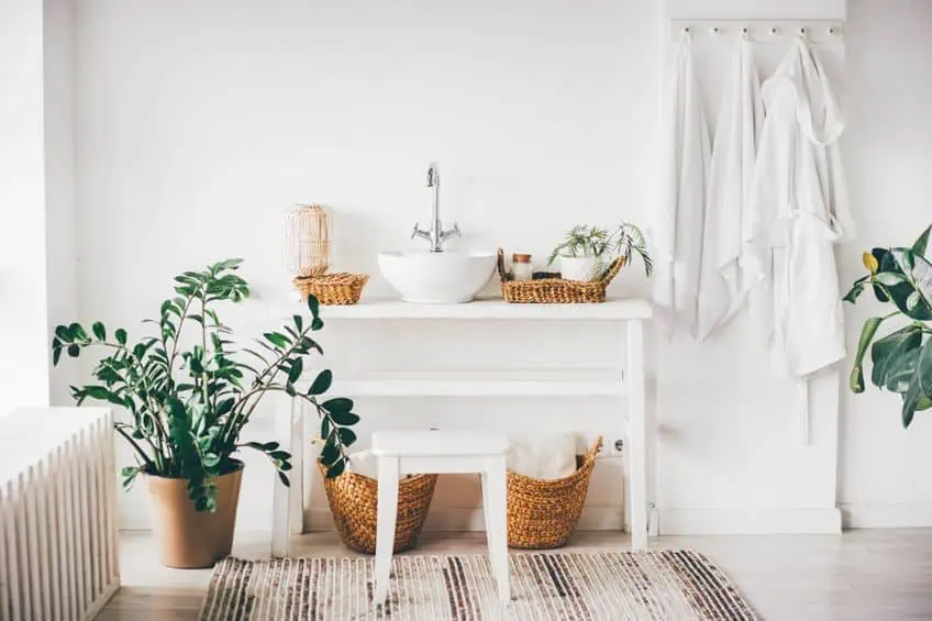
- Try a minimalistic all-white design and add color with accessories or some potted plants if you wish.
- Different shades of white and other neutrals work well together.
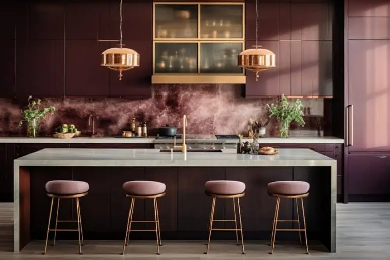
- Many like the idea of an all-white kitchen. Easy to keep clean and provides a fresh and clean feel. Bring in a bowl of lemons, color bar stools, or hanging lights for added color.
- For a nautical theme, white and blue are a wonderful grouping of colors.
- A white color palette for open living space can make it seem even more spacious and brighter.
All shades of white are versatile colors that can be used to produce amazing art pieces, as well as to create a wonderful atmosphere in your home. Wherever the different shades of white are used, it is sure to add interest or produce a sense of calm. Even though white is not technically even considered a color, it does play a big role in many areas of life.
Frequently Asked Questions
Is White a Warm or Cool Color?
White does have a cooling effect; however, many shades of white will determine if it is warm or cool. So, a shade of white with a blue undertone will produce a cool white, while a white with a yellow undertone will be warmer.
Can You Use White Around the Home?
Yes, shades of white are extremely popular as it is a versatile color that can be used with most other colors. Using a white color palette can bring a sense of openness, brightness, and calm. White can also be the perfect backdrop for any room accessories, couches, or paintings.
What Colors Work Well With Shades of White?
White tends to work well with most colors, but for contrast, red, blue, and black are best. Beige, which is considered a shade of white works well with other neutrals, browns, blues, reds, and pure white. When you paint a room, you should take into consideration the color undertone of your shade of white before choosing.
Is Cream a Shade of White?
Yes, cream is considered a shade of white that has a yellow undertone. Cream is also often used to describe many off-white colors and works well with other warm neutral colors.

Duncan graduated with a diploma in Film and TV production from CityVarsity in 2018, after which he continued pursuing film while taking on a keen interest in writing along the way. Since having graduated, he began working as a freelance videographer, filming a variety of music videos, fashion and short films, adverts, weddings and more. Throughout this, he’s won a number of awards from various film festivals that are both locally and internationally recognized. However, Duncan still enjoys writing articles in between his filming ventures, appreciating the peace and clarity that comes with it.
His articles focus primarily around helping up-and-coming artists explore the basics of certain colors, how these colors can be paired with other shades, as well as what colors are created when you mix one with another. All while relating these shades to historically significant paintings that have incorporated them into their color palette. As a lover of the arts himself, he takes great interest in the Renaissance era of paintings, an era that has directly inspired many of his favorite films.
Learn more about Duncan van der Merwe and about us.