Brown and Red Make What Color? – The Art of Mixing
This post may contain affiliate links. We may earn a small commission from purchases made through them, at no additional cost to you.
Trying to figure out the answer to the question, “brown and red make what color?”, is not very complicated as the short answer to this is maroon. However, there is a bit more that goes into color mixing, especially if you start playing with different color ratios. Below, we will discuss everything you would need to know about brown and red and the different shades that they make!
Table of Contents
Brown and Red in Color Theory
Brown and red work well together because red is often bright and vibrant, whilst brown serves as a neutral hue. As they are now, a hybrid of the two may be as appealing. On their own, they serve as completely different colors that can be used under a variety of circumstances. Brown is commonly viewed as neutral as well as natural. Brown is supposed to inspire sentiments of comfort, safety, and earthiness as a result of this. Brown does an excellent job of portraying natural-world sentiments as well as organic, healthy ones in general.

Red is the most noticeable color and is connected with powerful emotions such as affection, excitement, and vengeance. It is the worldwide hue for strength, power, bravery, and danger. Red is a lively, energetic, and exciting color that is associated with passion and heightened desires.
| Shade | Hex Code | CMYK Color Code (%) | RGB Color Code | Color |
| Brown | #964B00 | 0, 50, 100, 41 | 150, 75, 0 | |
| Red | #FF0000 | 0, 100, 100, 0 | 255, 0, 0 | |
| Maroon | #800000 | 0, 100, 100, 50 | 128, 0, 0 |
Understanding Brown
The color brown was inspired by the clay pigment umber. Painters have created several versions of the hue over the years. There are now 26 colors of brown available; however, there are also different paint brands that have their patented shades. Brown is fundamentally a dark shade of orange and this is the reason we never see brown light.
Understanding Red
Humanity began with only one hue of red, which our forefathers used to create cave drawings and to paint or dye their skin. There are currently over 40 distinct colors of red, each with a particular touch of blue and yellow.
Maroon Symbolism
Maroon is a strong color. It frequently represents ambition, self-assurance, and refinement. People are generally motivated and inspired when they encounter a maroon item. Maroon, like other hues, has both good and bad connotations. It is frequently perceived as powerful, compassionate, and welcoming. However, it may be grumpy, haughty, and unexpected at times.
It all relies on the context of the color and how it is used in your design.
Different Variations of Red and Brown Blends
When it comes to figuring out, “brown and red make what color exactly?”, the ratio of brown to red must be considered. There are a variety of different colors that can be mixed, but we will focus on those that have a distinct difference from one another.
| Shade | Hex Code | CMYK Color Code (%) | RGB Color Code | Color |
| Upsdell Red | #AE2626 | 0, 78, 78, 32 | 174, 38, 38 | |
| Firebrick | #B72222 | 0, 81, 81, 28 | 183, 34, 34 | |
| Carnelian | #C01D1D | 0, 85, 85, 25 | 192, 29, 29 | |
| Lava | #C91919 | 0, 88, 88, 21 | 201, 25, 25 | |
| Monza | #D21515 | 0, 90, 90, 18 | 210, 21, 21 | |
| Candy | #DB1111 | 0, 92, 92, 14 | 219, 17, 17 | |
| Arsenal Red | #E40D0D | 0, 94, 94, 11 | 228, 13, 13 | |
| Candy Apple | #ED0808 | 0, 97, 97, 7 | 237, 8, 8 | |
| Red | #F60404 | 0, 98, 98, 4 | 246, 4, 4 |
Using Brown and Red
Now that you have a clear understanding of the question, “brown and red make what color?”, you can start using it in different areas of design. Furthermore, these colors work very well together, so you do not have to settle for a blend of the two.
Brown and red are also frequently used in interior design, fashion, and graphic design.
Brown and Red in Graphic Design
Designing logos out of red and brown can be a good option since it gives visual contrast between the two colors while keeping a coherent design approach. Based on whether you want to send a simple yet contemporary or traditional yet timeless statement through the design of your logo, use either brighter hues of red or subdued colors of chocolaty browns and combine them so they complement each other beautifully without being too overbearing visually.
If needed, you may also use black or gray elements to make particular parts stand out. Nevertheless, it is important to understand the role of each color before using them on any printout as red can easily overwhelm and be overwhelmed. For instance, a bright red font on a soft brown background will be out of place, but if you choose a darker brown and a light red, you will have the desired contrast.
Brown and Red in Fashion Design
Fashion has accepted this pairing as well, producing apparel items such as knitwear, scarves, jackets, or footwear that feature both colors or a mix of the two tones. A rich burgundy pullover with dark brown slacks or boots may form an excellent fall clothing combination. For an even more relaxed appearance, try lighter colors like coral red combined with sand-colored khakis. Because of their shared earthy color pallet, blending red and brown in designs and graphics is quite simple.
Floral designs, which frequently incorporate both tones within the structure of the design, look especially stunning when teamed with both of these colors.
Brown and Red in Interior Design
Brown, red, and maroon could be excellent color combinations for artwork or interior design. They offer a tranquil, rural atmosphere. Consider adding additional colors to your room or job to make it more dynamic and exciting. Brown and red are complementary hues, as are pink, blue, purple, and green. Using different shades and tints of red and brown may also offer variation to the design. If you wish to utilize brown and red separately, you may have additional alternatives.
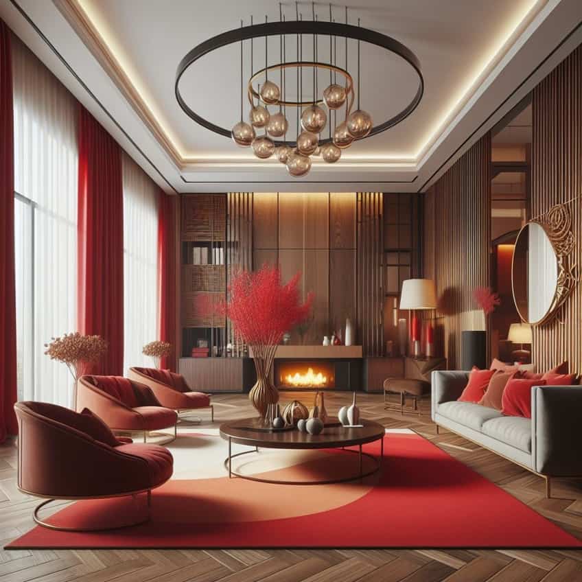
Red and brown may be utilized in interior design to establish a pleasant and inviting atmosphere. Red is a vibrant color that frequently adds energy to a room, but brown is a cozy, neutral hue that produces a welcoming ambiance. They work together to produce a vibrant but grounded sensation. For an understated contrast, match red with hues of tan or chocolate, or use brighter colors of red alongside dark tones of chocolate brown to create a powerful impression.
Whether you are building a home interior space, preparing an event, or creating a logo, adding brown or red to your color pallet may easily provide spectacular results that will look incredible. With plenty of boldness from the flaming red color and reassuring softness from the earthy brown color, this adventurous combination will bring every design or project to life. Ultimately, how you choose to use them is up to you!
Frequently Asked Questions
Will Red and Brown Mixed Give Me a New Color?
While this will not give you a new color, the combination of red and brown paint will give you maroon. This can be described as a deep red color that is essentially a darker variation of burgundy.
When Mixed Together, Brown and Red Make What Color?
There are a handful of shades that are the result of different ratios of red and brown mixed. These colors range from upsdell red to candy apple, and the darkness will depend on how much brown is mixed with the red. Naturally, for a more vibrant shade of red, all you will need to do is add more red.
Brown and Red Make What Color When Equal Parts Are Mixed?
When mixed in equal parts, red and brown make maroon. However, the shade of brown that is used will affect how light or dark the maroon color is. Of course, you could also end up with shades of burgundy, magenta, or merlot if you are not careful and add too much or too little brown.
Duncan graduated with a diploma in Film and TV production from CityVarsity in 2018, after which he continued pursuing film while taking on a keen interest in writing along the way. Since having graduated, he began working as a freelance videographer, filming a variety of music videos, fashion and short films, adverts, weddings and more. Throughout this, he’s won a number of awards from various film festivals that are both locally and internationally recognized. However, Duncan still enjoys writing articles in between his filming ventures, appreciating the peace and clarity that comes with it.
His articles focus primarily around helping up-and-coming artists explore the basics of certain colors, how these colors can be paired with other shades, as well as what colors are created when you mix one with another. All while relating these shades to historically significant paintings that have incorporated them into their color palette. As a lover of the arts himself, he takes great interest in the Renaissance era of paintings, an era that has directly inspired many of his favorite films.
Learn more about Duncan van der Merwe and about us.
