What Color Does Pink and Orange Make? – A Sunset Blend
This post may contain affiliate links. We may earn a small commission from purchases made through them, at no additional cost to you.
As a color enthusiast with a penchant for exploring vibrant palettes, I’m thrilled to delve into the whimsical world where pink and orange collide! Picture the playful dance of delicate pink petals meeting the fiery glow of a summer sunset—it’s like witnessing nature’s own masterpiece unfolding before our eyes! Today, we embark on an enchanting journey to uncover the delightful fusion that occurs when these two captivating hues intertwine. Join me as we unlock the secrets behind the magical blend of pink and orange, unveiling a spectrum of color that promises to ignite our imagination and inspire endless creative possibilities!
Key Takeaways
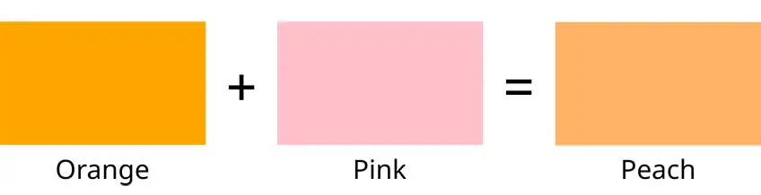
- Mixing pink and orange yields a spectrum of peach shades.
- Different proportions influence the resulting shade’s vibrancy and softness.
- The resulting peach color finds applications in various creative and cultural contexts.
Understanding Color Theory
When we mix the whimsical vivacity of pink with the cheerful energy of orange, we create a color that embodies the warmth and softness of both. The resulting shade is a variant of peach, a color that exudes a comforting and refreshing palette. This nuanced peach color finds its allure in being neither too bold like orange nor too delicate like pink, but rather a harmonious blend that offers a versatile and appealing tint.
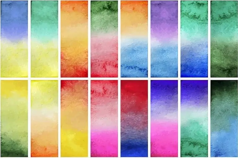
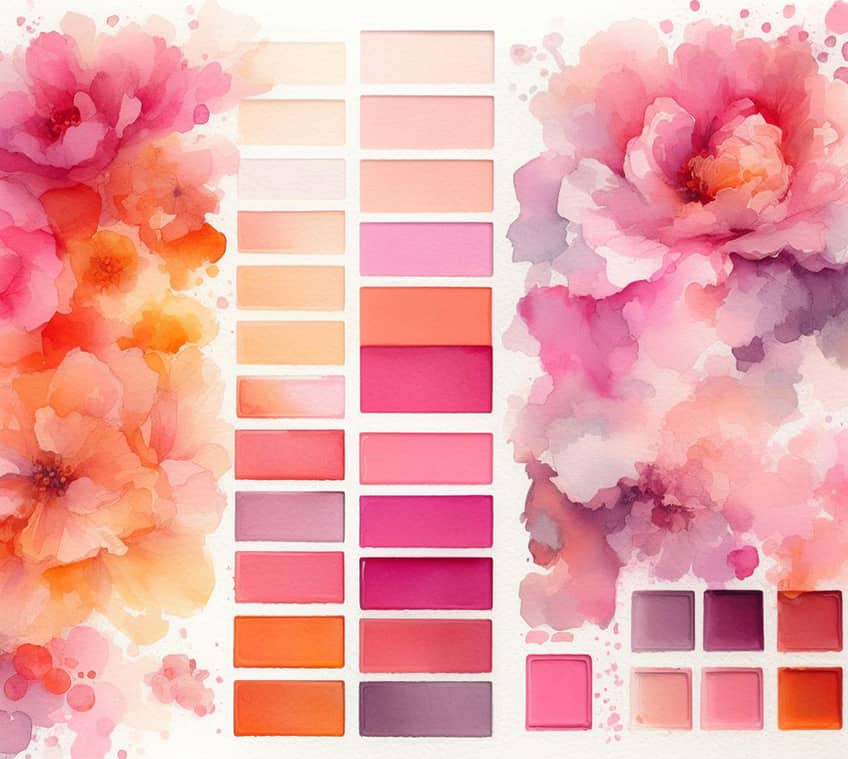
Understanding how different colors combine is crucial for everyone from artists to interior designers, as it forms the foundation of color theory. Mixing pink and orange in varying proportions can produce a spectrum of peach shades, from soft, pastel-like tones to more vibrant, sunset hues. Achieving the perfect peach requires patience and precision, as the intensity of each color will determine the depth and richness of the final product. In exploring the interaction of colors, I’ll guide you through the fundamental aspects of the color wheel and the relationships between primary and secondary colors.
Color Wheel Basics
The color wheel is a visual representation of colors arranged in a circle. It’s a tool that I use to understand how specific colors relate to each other and how they can be combined. It typically consists of twelve hues, including primary, secondary, and tertiary colors.
My usage of the color wheel helps in determining color harmony and provides insight into the results of color mixing.
Primary and Secondary Colors
Primary colors are the cornerstone of all other hues found on the color wheel. In pigment color theory, which pertains to paint and other physical media, the primary colors are red, yellow, and blue. These fundamental colors cannot be made by mixing other colors together.
Secondary colors emerge when two primary colors blend harmoniously in equal measure. Among these delightful combinations are green, a blend of blue and yellow; orange, a fusion of red and yellow; and purple, born from the union of blue and red. Each secondary color possesses its own unique charm and vibrancy, enriching the canvas of color with depth and allure. Through my understanding of primary and secondary color interactions, I can predict and create a wide range of colors by mixing them in various proportions.
What Color Does Pink and Orange Make?
When pink and orange are mixed, the result is typically a variant of peach. The specific hue created depends on the shades of pink and orange used.
Understanding Pink
| Shade | Hex Code | CMYK Color Code (%) | RGB Color Code | Color |
| Pink | #FFC0CB | 0, 25, 15, 0 | 255, 192, 203 |
Pink is a tint of red and is made by adding white to red. In color mixing, pink’s properties will influence the outcome as it combines with orange. The variety of pink, whether it be a soft pastel or a bright neon, will directly impact the shade of peach produced. In color theory, pink symbolizes love, compassion, and tenderness. It exudes warmth and sweetness, evoking affection and care. Pink represents femininity, grace, and playfulness, embodying innocence and youthfulness. Overall, it celebrates softer aspects of human nature, inviting warmth and connection into our lives.
Understanding Orange
| Shade | Hex Code | CMYK Color Code (%) | RGB Color Code | Color |
| Orange | #FFA500 | 0, 50, 100, 0 | 255, 165, 0 |
Orange is a secondary color made by mixing red and yellow. The tone of orange, ranging from a light, pastel to a deep, earthy burnt orange, will determine the saturation and vibrancy of the peach color when mixed with pink. In color theory, orange symbolizes energy, warmth, and enthusiasm. It blends the passion of red with the cheerfulness of yellow, radiating vitality and excitement. Orange evokes joy, creativity, and adventure, while also stimulating the appetite and encouraging social interaction.
Overall, it embodies a dynamic and uplifting energy that inspires exploration and zest for life.
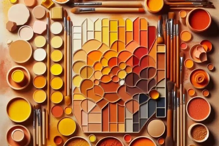
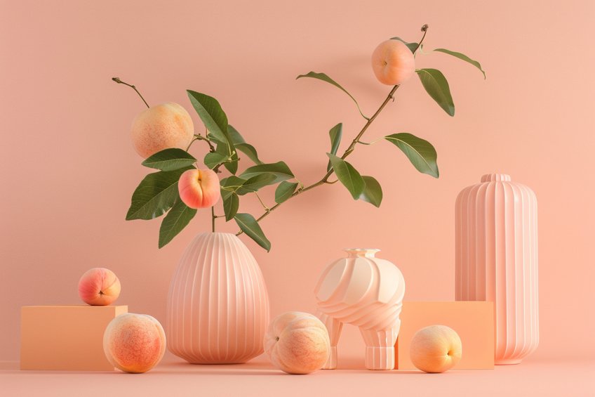
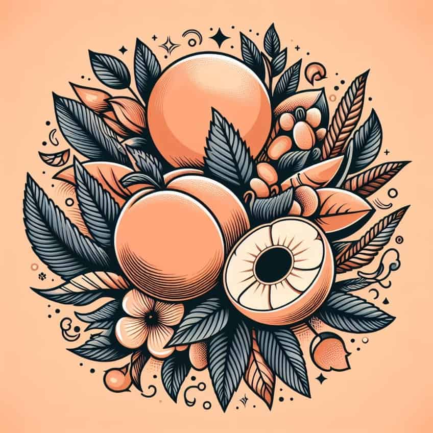
The Peach Color
| Shade | Hex Code | CMYK Color Code (%) | RGB Color Code | Color |
| Peach | #FFE5B4 | 0, 8, 28, 0 | 255, 229, 180 |
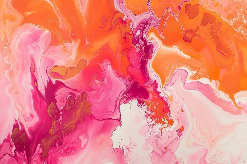
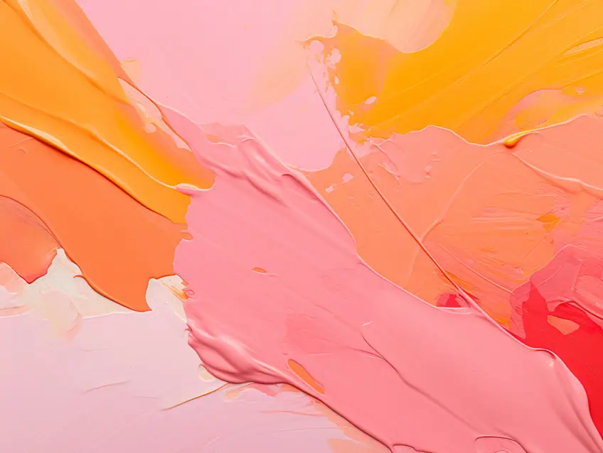
The resulting peach color is a warm, sweet hue that sits between pink and orange on the color spectrum. In color theory and symbolism, peach is a delicate and soft hue that often embodies qualities of warmth, gentleness, and sincerity. It’s a color associated with sweetness, innocence, and affection, evoking feelings of comfort and tranquility. Peach carries a sense of warmth and hospitality, making it a popular choice for interior design and décor to create welcoming and serene environments. Additionally, peach is often linked to notions of femininity, grace, and beauty, suggesting a sense of refinement and elegance. Overall, peach symbolizes a harmonious blend of softness and warmth, inviting feelings of relaxation, happiness, and emotional well-being. To help visualize the color, I have explained the color ratios below:
- Light pink and light orange: light, soft peach
- Neon pink and bright orange: vivid, punchy peach
Mixing Pink and Orange
When I mix pink and orange, I am typically creating variations of the color peach, a hue that can alter drastically based on the ratio and type of paint or medium used.
Expected Color Outcomes
In the realm of paint, when I combine the warm, vibrant tones of orange with the softness of pink, the resulting color is generally a peach. Peach itself can range from pale, soft shades to more saturated hues. The exact shade or tint is influenced by the predominance of either color.
- Light peach: More pink than orange.
- Vibrant peach: Equal amounts leading to a saturated result.
- Deep peach: More orange, resulting in a darker, richer tone.
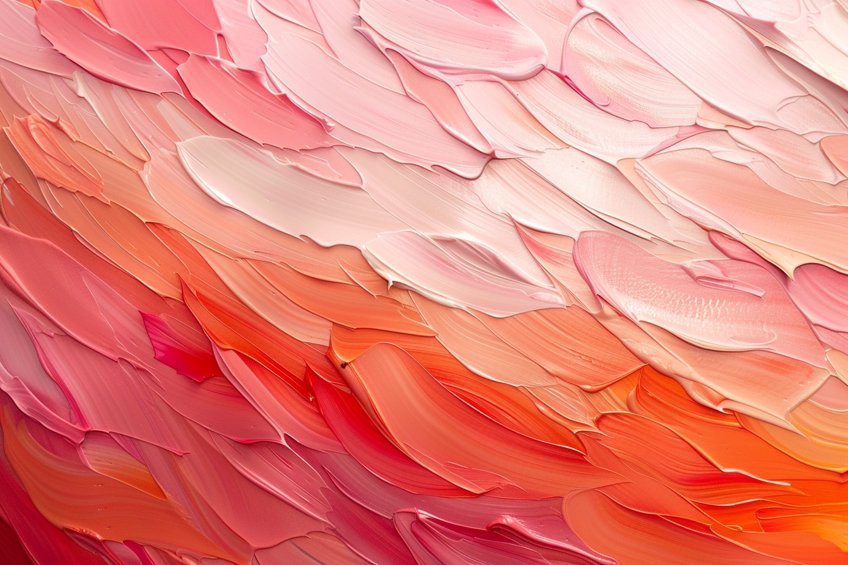
The Role of Ratios in Mixing
The ratio of pink to orange is critical in determining the final color. A 1:1 ratio produces a balanced peach with equal parts pink and orange. In contrast, a 2:1 ratio of pink to orange results in a lighter tint of peach, showcasing more pink characteristics, while a 1:2 ratio of pink to orange yields a deeper shade, reflecting a more orange-dominant hue. These ratios can be adjusted based on personal preference, whether leaning towards a tint that favors pink or one that leans more towards orange.
Adjusting these ratios allows for a customizable approach to achieving the desired shade of peach.
Impact of Paint Mediums
Different paint mediums can affect the saturation and brightness of the resulting color. Oil paint, known for its density and strong pigmentation, often yields a richer peach tone. Acrylic paint, with its quick-drying and versatile nature, tends to produce a bright peach hue. Conversely, watercolor, being more translucent, provides a lighter and more ethereal peach shade. Additionally, variations in pigment concentration across different brands and qualities of paint can further influence the exact tone achieved. These factors underscore the importance of considering both the medium and the brand when aiming for a specific peach color in painting.
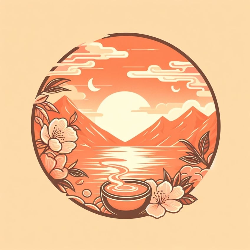
The Symbolism of Peach
When I think of peach, it immediately brings to mind a color that symbolizes warmth, joy, and a soft vibrance. I see it as a hue that carries the freshness of spring and the glow of summer with its delightful blend of orange and pink tones.
Art and Design
In the realm of art and design, peach is often used to convey a sense of approachability and gentleness. Graphic designers choose peach for its ability to stand out while maintaining a sense of softness, particularly in digital artwork where less saturated colors can be appealing. I’ve seen peach used effectively to elicit feelings of comfort and sincerity, making it a staple in artworks that wish to appear friendly and inviting.
Fashion and Makeup
Peach has made a significant impact in fashion and makeup, where it’s praised for its flattering qualities. It serves as a versatile color that complements a wide range of skin tones in apparel and cosmetic products. I’ve observed how designers and makeup artists use peach to add a touch of warmth to their creations, whether it’s through a pastel peach dress or a coral peach blush, enhancing natural beauty without overwhelming it.
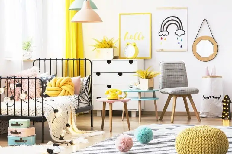
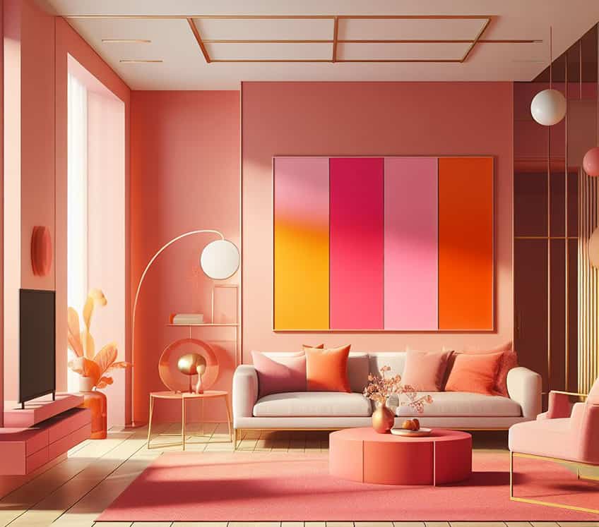
Interior Decoration
The application of peach in interior design leans into its nurturing and soft qualities. I’ve seen peach used to create a welcoming space that radiates warmth and cosiness. Additionally, its ability to reflect light beautifully makes it an excellent choice for creating the illusion of space and airiness. Peach is interwoven with cultural aesthetics, reflecting a contemporary yet timeless appeal in home designs.
Peach Color in Culture and Psychology
When I discuss peach color, I am referring to a hue that materializes from the combination of pink and orange. This color is not just a delightful visual experience but also holds significant psychological and cultural implications.
Color Symbolism
My knowledge tells me that peach is often categorized among warm colors due to its orange component. The warmth of peach comes across as inviting and approachable. In contrast, the pink component can introduce a hint of the calmness typically associated with cool colors. Therefore, peach balances the energy of warmth with the tranquility of coolness. Peach retains a softness that can be calming to look upon, making it an excellent choice for environments where I want to induce a sense of peace and comfort.
Psychological Effects
Color psychology is a field I recognize as being dedicated to understanding how color affects human behavior and feelings. Peach is typically perceived as a:
- Soothing presence: Its blend can soothe the mind and convey an aura of warmth and care.
- Inviting feeling: Peach can stimulate conversation and communication, thanks to its friendly and welcoming vibe.
Cultural Significance
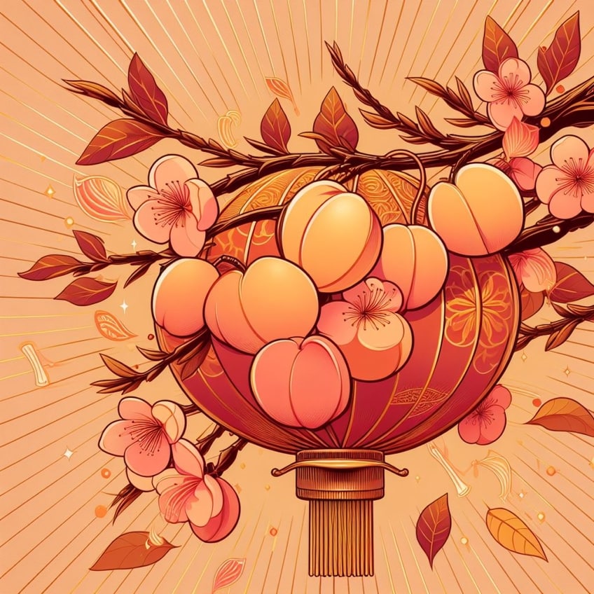
The cultural significance of the peach color varies across different societies and contexts. In some cultures, such as Chinese culture, the peach holds significant symbolism and is often associated with longevity, immortality, and good fortune. The peach fruit itself is regarded as a symbol of health, abundance, and vitality, especially during celebrations and festivals. In Western cultures, the peach color may be linked to notions of innocence, sweetness, and femininity, often evoking a sense of warmth and nostalgia. Additionally, in some religious and spiritual traditions, the peach color may hold symbolic meanings related to purity, renewal, and spiritual growth. Overall, the cultural significance of the peach color reflects its associations with health, prosperity, vitality, and emotional well-being across various societies.
- In Western cultures, peach can represent modesty and innocence, perhaps due to its close association with the skin tones of some individuals.
- In the context of color combinations, peach works harmoniously with both warm and cool colors, allowing it to symbolize balance and versatility in various cultural artifacts and designs.
Our colorful exploration into the fusion of pink and orange has been a delightful journey filled with surprises and discoveries! As we’ve uncovered, the blend of these two vibrant hues creates a spectrum of shades ranging from soft peachy pastels to bold coral bursts, each radiating its own unique charm and energy. Whether in art, fashion, or everyday life, the dynamic combination of pink and orange never fails to spark joy and inspire creativity. So, let’s continue to embrace the magic of color and celebrate the kaleidoscope of possibilities that await us with every brushstroke and hue. After all, in the palette of life, the blend of pink and orange paints a picture of endless fun and excitement!
Frequently Asked Questions
How Do You Mix Pink and Orange Paint to Get a New Color?
To mix pink and orange paint, I start by selecting the shades of pink and orange that I wish to combine. Generally, mixing equal parts of both colors results in a peach or salmon hue. The exact shade can be further refined by adjusting the ratio of pink to orange, or by adding white to achieve a lighter tint.
What Is the Outcome When Pink and Orange Are Mixed on Hair?
When pink and orange hair dyes are mixed, the outcome is typically a warm, peachy, or coral shade. The final color is influenced by the original hair color and the types of dye used. For instance, a pastel pink mixed with a vibrant orange on blonde hair might result in a soft, sunset-like color.

Duncan graduated with a diploma in Film and TV production from CityVarsity in 2018, after which he continued pursuing film while taking on a keen interest in writing along the way. Since having graduated, he began working as a freelance videographer, filming a variety of music videos, fashion and short films, adverts, weddings and more. Throughout this, he’s won a number of awards from various film festivals that are both locally and internationally recognized. However, Duncan still enjoys writing articles in between his filming ventures, appreciating the peace and clarity that comes with it.
His articles focus primarily around helping up-and-coming artists explore the basics of certain colors, how these colors can be paired with other shades, as well as what colors are created when you mix one with another. All while relating these shades to historically significant paintings that have incorporated them into their color palette. As a lover of the arts himself, he takes great interest in the Renaissance era of paintings, an era that has directly inspired many of his favorite films.
Learn more about Duncan van der Merwe and about us.