What Color Does Brown and Pink Make? – Blending Beauty
This post may contain affiliate links. We may earn a small commission from purchases made through them, at no additional cost to you.
Brown is a color that is rarely the focal point of a room or any other particular design. However, pink is commonly used to bring an edge of brightness to your living space. But have you ever considered the question, “what color does brown and pink make when mixed?”. Below, we will take a closer look at everything you need to know about these two colors!
Table of Contents
Brown and Pink in Color Theory
Unlike black, adding brown to a color doesn’t always darken it since it is a shade of dark orange. Before we can consider the outcome of, “what color does brown and pink make?”, we need to have a clear understanding of what brown is, or how it is mixed. When looking at the color wheel, brown, black, white, and gray are not seen. While black, white, and gray are neutral colors, brown is not.

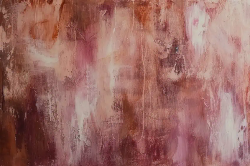
Brown can be mixed with black and orange, but it is also called a composite color, a color formed when mixing two or more primary colors. Blending brown and pink results in garnet, a darker shade of pink that closely resembles ruby, with the latter appearing closer to red.
| Shade | Hex Code | CMYK Color Code (%) | RGB Color Code | Color |
| Brown | #964B00 | 0, 50, 100, 41 | 150, 75, 0 | |
| Pink | #FFC0CB | 0, 25, 20, 0 | 255, 192, 203 | |
| Garnet | #9A2A2A | 0, 73, 73, 40 | 154, 42, 42 |
Understanding Brown
There are 26 shades of brown, which is significantly less than other colors. The clay pigment umber was initially used by classic artists and was further developed to create the different types of brown that we have available today. Brown is usually seen as a color that represents reliability and stability, but it is often used in design to symbolize simplicity.
Understanding Pink
Pink is generally viewed as a playful and passionate color linked to happiness and compassion. Some studies also suggest that, based on the shade, pink environments can be used to promote tranquility. Depending on the shade of pink that is used, it can influence connections and meanings. A light pink is frequently associated with softness, healing, and tranquility, while a hot pink is associated with boldness, excitement, and danger. There are over 200 shades of pink, some of which are incredibly dark, while others are closer to white.
Garnet Symbolism
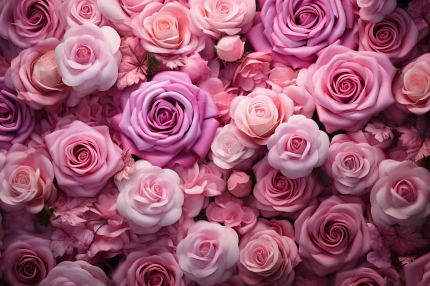
When looking at garnet, you will find that it is a basic color that is more brown than pink. If you were to blend equal parts of pink and brown, the color would lean more towards brown. Garnet is an incredibly versatile color and it symbolizes love and friendship.
There are also more meanings such as connections to one’s life force, inner fire, and heart, but this is commonly linked to the gemstone.
Different Variations of Red and Black Blends
When playing around with the idea of “what color does brown and pink make?”, you will quickly realize that different shades are available. This depends on the ratio of brown and pink that is used. Slight changes to the CMYK color code will change the shade and you will be left with a completely new color. You will also find that colors such as shimmering blush and New York pink are closely related to Indian red and deep chestnut.
| Shade | Hex Code | CMYK Color Code (%) | RGB Color Code | Color |
| Nadeshiko Pink | #F6B1BB | 0, 28, 24, 4 | 246, 177, 187 | |
| Mauvelous | #EDA2AB | 0, 32, 28, 7 | 237, 162, 171 | |
| Charm Pink | #E4939B | 0, 36, 32, 11 | 228, 147, 155 | |
| Shimmering Blush | #DB848B | 0, 40, 37, 14 | 219, 132, 139 | |
| New York Pink | #D2757B | 0, 44, 41, 18 | 210, 117, 123 | |
| Indian Red | #C9666A | 0, 49, 47, 21 | 201, 102, 106 | |
| Popstar | #C0575A | 0, 55, 53, 25 | 192, 87, 90 | |
| Deep Chestnut | #B7484A | 0, 61, 60, 28 | 183, 72, 74 | |
| Medium Carmine | #AE393A | 0, 67, 67, 32 | 174, 57, 58 |

Using Brown and Pink
Although they are two extremely contrasting colors, brown and pink make a fantastic combination. Pink is a vivid hue, so mixing it with a balanced color like brown tends to soften it. As a result, they frequently complement one another in interior design as separate colors, so there is no need to wonder, “what color does brown and pink make?”. Brown and pink go well with other pastel or neutral hues. Colors such as white, gray, green, and blue, for example, may be utilized with both of them.
Brown and pink are typically used to create relaxing environments. Fortunately, both of these colors also have their respective places in graphic design and fashion design.
Brown and Pink in Graphic Design
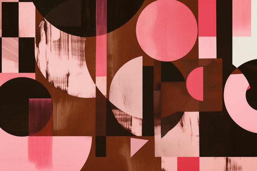
Using brown and pink in graphic design can often create a playful concept, much like you would find with rustic designs. Brown creates a sense of stability, whereas pink can be scattered around to draw attention to the design, resulting in an eye-catching motif that is not obnoxious. However, if pink is used as the base color, it is important to be mindful of the shade of brown, as it can blend with a light pink. Hence, one of them would need to be darker than the other to create enough contrast.
Brown and Pink in Fashion Design
Brown and pink is a color combo that is becoming increasingly fashionable in the fashion industry and for good reason. This combination offers a warm and friendly look that is appropriate for any occasion. Pink and brown are adaptable and elegant colors that may be worn for both formal and informal occasions. Brown and pink clothes have grown popular among fashion-forward people due to their capacity to achieve the appropriate mix of elegance and fun.
Pink’s gentle, feminine color coupled with brown’s earthy tones provides a visually attractive contrast that is simultaneously attractive and elegant.
You can easily get away with using most shades as they can seamlessly coordinate and create a striking outfit. Whether it is a brown blazer with a pair of pink pants or a brown maxi dress coupled with pink sandals, you can easily create a unique look with these colors.
Brown and Pink in Interior Design
The brown and pink combo no longer needs to be associated with the 1980s as there are plenty of modern designs that use it. For example, using light pink paint on the walls with brown furniture or accessories can create a unique living space. You could also opt for dark brown paint on the walls with hot pink accents. A third color such as white or turquoise could also be used.
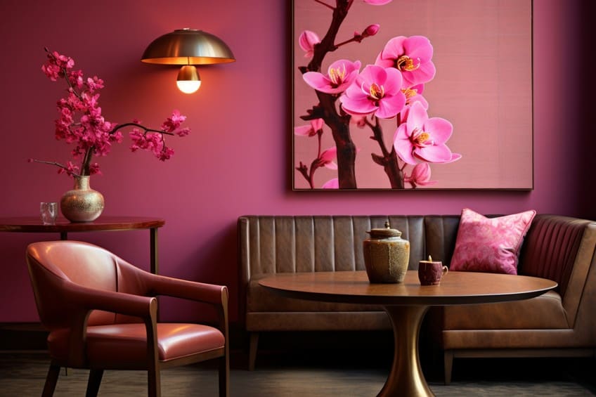
Learning about this color combination is a great way to find different ways of incorporating various shades of pink and brown into your living space, wardrobe, or designs. While this combination might not appeal to everybody, it certainly has its place in the world of color. In the end, you should decide on the different shades that are used.
Frequently Asked Questions
What Happens When Brown and Pink Are Mixed?
If you are curious about the answer to this question you will be pleasantly surprised that it creates a type of dark pink called garnet. This color is more of a brown than a type of pink, but you will also find that it features a slight bit of red.
Does Brown and Pink Work Together in Design?
Pink and brown mixed in different areas of design will work very well together. However, you need to understand that it also depends on the shades that are used. In interior design, you will usually find this combination in rustic-styled homes to provide a feminine and soft aesthetic.
Is It Easy to Mix Brown and Pink?
No, it is not. The reason is that brown can easily make other colors look murky. Pink and brown mixed incorrectly will leave you with a strange color, but with experience, you will find that there is a particular method to it. However, you should not base it on the RGB color model, as brown does not exist there.
Duncan graduated with a diploma in Film and TV production from CityVarsity in 2018, after which he continued pursuing film while taking on a keen interest in writing along the way. Since having graduated, he began working as a freelance videographer, filming a variety of music videos, fashion and short films, adverts, weddings and more. Throughout this, he’s won a number of awards from various film festivals that are both locally and internationally recognized. However, Duncan still enjoys writing articles in between his filming ventures, appreciating the peace and clarity that comes with it.
His articles focus primarily around helping up-and-coming artists explore the basics of certain colors, how these colors can be paired with other shades, as well as what colors are created when you mix one with another. All while relating these shades to historically significant paintings that have incorporated them into their color palette. As a lover of the arts himself, he takes great interest in the Renaissance era of paintings, an era that has directly inspired many of his favorite films.
Learn more about Duncan van der Merwe and about us.
