Zorn Palette – Everything You Need to Know About Zorn Palette Colors
This post may contain affiliate links. We may earn a small commission from purchases made through them, at no additional cost to you.
Many artists make use of limited palettes to improve their skills, challenge themselves, or meet a certain aesthetic. Limited palettes are great for artists of any skill level to work and experiment with. One of the most famous limited palettes is the Zorn palette, which is named after a famous artist who used it over a hundred years ago. This article is all about the Zorn palette colors and why they work together so well.
What Is the Zorn Palette?
The Zorn palette is a limited selection of colors used in many of the paintings by famous Swedish artist, Anders Zorn. Anders Zorn was a portraiture and still-life artist that lived from 1860 to 1920. He is still greatly admired among modern realist artists for his skilled brushwork and restrained color choices. The Zorn palette is most commonly reduced to the use of just four colors.
These colors, as used by Anders Zorn, were ivory black, titanium white, yellow ochre, and vermilion. Modern artists, however, tend to use cadmium red in place of vermilion.
What is interesting about the Zorn palette colors is that they are mostly subdued, earthy hues, but can be used to create surprisingly lively paintings. Red is the most saturated color on the palette and there are no other vivid colors available for use in the selection. The lack of blue also proves to be a big limitation for many artists that try to use the palette and serves as a formidable hurdle to overcome. Working with a limited palette is a great way for artists to hone their skills and refine certain techniques relating to tonal values and depth creation.
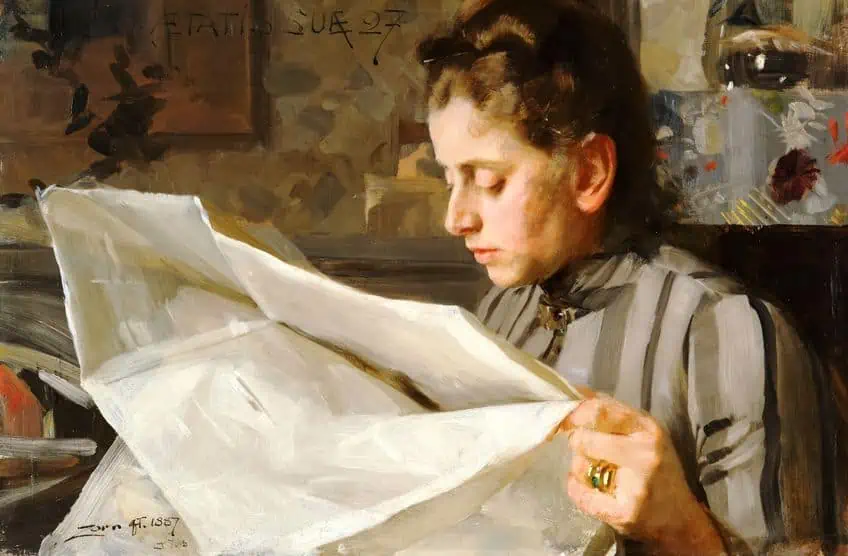 Emma Zorn Reading (1887) by Anders Zorn; Anders Zorn, Public domain, via Wikimedia Commons
There is some disagreement on the topic of what exact colors Anders used, however, and some people add viridian or cerulean blue in place of, or in conjunction with ivory black. This disagreement stems from some academics pointing out that there is the obvious use of green and blue in some of Zorn’s paintings. There were also multiple tubes of cobalt blue paint found in his studio after his passing.
The consensus stands that he did not strictly use the Zorn palette colors in every single one of his artworks, but that he favored it in a vast majority of his paintings. His actual palettes, which are now kept in museums, show that he considerably favored the four colors titanium white, ivory black, vermilion, and yellow ochre. The palettes do, however, also show some traces of cadmium yellow, viridian green, and cobalt blue.
Regardless of which variation of the Zorn palette colors you might choose, it is still very limited in its selection and will definitely help you refine your skills when working with tonal values in your artworks.
| Color | Hex Code | % RGB (Red, Green, Blue) | Shade |
| Titanium White | #F3F4F7 | (243, 244, 247) | |
| Ivory Black | #1F1F23 | (31,31,35) | |
| Vermilion | #E34234 | (227, 67, 52) | |
| Cadmium Red | #E30022 | (227, 0, 34) | |
| Yellow Ochre | #EDB525 | (237, 180, 37) | |
| Cobalt Blue | #0047AB | (0, 71, 171) | |
| Viridian Blue | #40826D | (64, 130, 109) | |
| Cerulean Blue | #2A52BE | (42, 81, 190) |
Why Use the Zorn Palette?
You might be wondering what is really so great about this palette that allows it to remain so popular over a century after Anders Zorn’s passing. Limited palettes as a whole are popular because they force artists to learn to utilize value over color when creating an artwork.
Value is the most important element of color and artists need a firm understanding and familiarity with value when working with complex color palettes or creating realistic paintings.
Now we know that limited palettes are good for artists that want to hone their ability to work using values and tones rather than by relying on color, but why are these four specific colors the ones used to create such a renowned palette? Yellow ochre and vermilion (or cadmium red) are earthy variations of the primary pigment colors yellow and red.
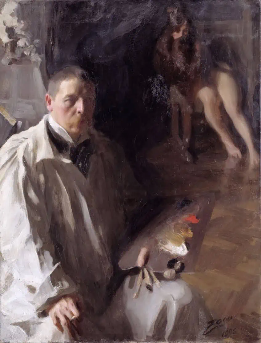 Self Portrait with Model (1896) by Anders Zorn; Anders Zorn, Public domain, via Wikimedia Commons
Ivory black is a very cool black and is used as a deep blue in the context of the Zorn palette. Cadmium red is very warm which works to balance out the coolness of ivory black and provides subtle vibrancy to the otherwise subdued palette, while yellow ochre is a very earthy color that mixes beautifully with red and black to create warm oranges and lovely greens respectively. Art teachers use the Zorn palette as a stepping-stone for their students because it limits the possibilities and their subsequent decisions but still allows them enough range to create beautiful artworks.
When learning to paint or draw, students tend to start with monochrome palettes before progressing to the Zorn palette and then graduating into more complex color palettes once their skills have progressed.
- There is less risk of creating muddy color mixes from combining too many different pigments due to the limited palette.
- The limited palette helps artists create a good balance of light and dark, transparent and opaque, or warm and cool in their painting since there are fewer colors to choose from. Balanced paintings are more pleasing to the eye and create more visual interest for a viewer.
- The Zorn palette covers a range of values from dark to light tones which gives it a larger scope than you would expect from just four colors. The tonal range of the Zorn palette allows for subtle but effective shifts in temperature and value.
- The Zorn palette is capable of creating subtle, nuanced shades which help it to accurately capture skin tones and still-lifes with ease.
- The Zorn palette has no blue shades which is quite an intimidating prospect for many artists. The closest thing to a blue in the Zorn palette is a cool gray which you can achieve by mixing titanium white with ivory black.
- The lack of blue in the Zorn palette also prevents artists from being able to mix any green or purple shades.
- The palette is not really suitable for a range of landscape paintings but can be readily used on portraits and still-lifes.
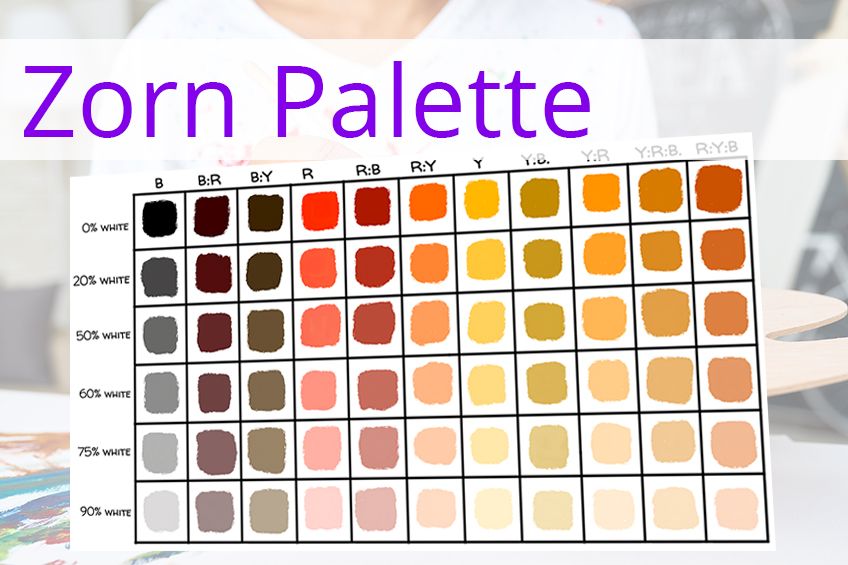
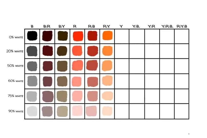
How to Create a Zorn Palette Color Chart
In this part of the article, we are going to talk you through creating a color chart using the basic Zorn palette colors. The colors used to create this chart will thus be yellow ochre, cadmium red, ivory black, and titanium white. Making color charts is the perfect way to explore the technical side of your colors and see what palettes are capable of when used to their fullest potential.
This is what you will need:
- A surface that replicates the surface you usually paint with. If you usually use paper, do not use canvas to create your color chart.
- A palette knife. You can use paintbrushes, but it will be much more difficult to clean and dry the brush between each color.
- Artist’s masking tape
- Yellow ochre paint
- Cadmium red paint
- Ivory black paint
- Titanium white paint
Step-by-Step: How to Create a Zorn Palette Color Chart
The more familiar you become with how the colors in your palette behave on their own and when mixed with one another, the easier you can utilize them in your paintings. By methodically mixing and recording the colors of the Zorn palette you will discover the potential the palette holds and just how many harmonious color combinations can be created with just four colors!
The creation of a color chart can help you to envision the kinds of paintings that can be made using the Zorn palette.
Step 1
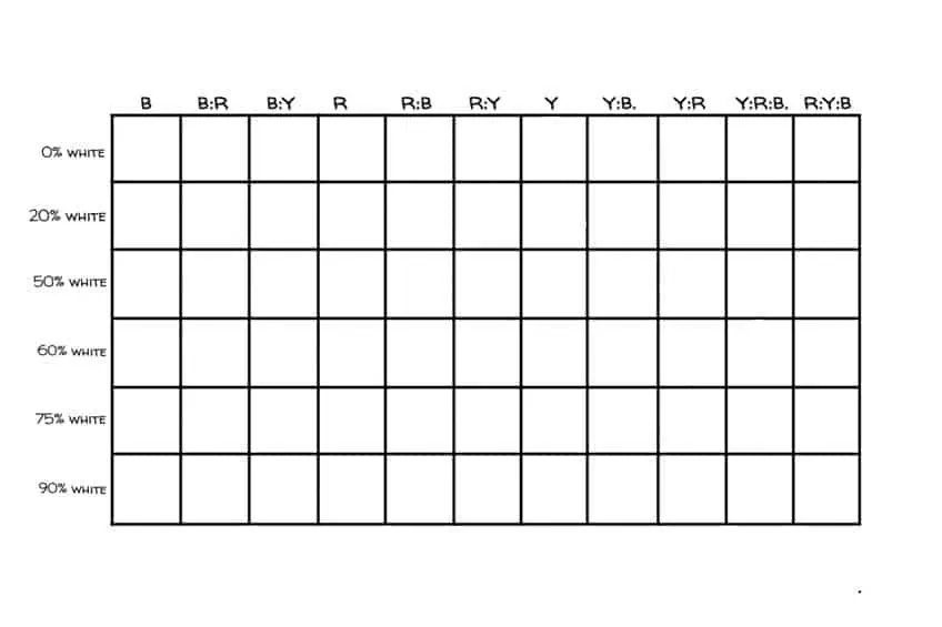
First, use artist’s masking tape to create a table with six rows and 11 columns on your canvas or sheet of paper. Once you have created your table you can use a marker or pencil to label the columns of your table as follows:
- Black
- Black and Red
- Black and Yellow
- Red
- Red and Black
- Red and Yellow
- Yellow
- Yellow and Black
- Yellow and Red
- Red, Yellow, and Black
- Yellow, Red, and Black
Once you have labeled the columns you can label the rows as follows:
- Dark (0% white)
- Lighter dark (20% white)
- Mid-tone (50% white)
- Darker light (60% white)
- Light (75% white)
- Off-white (90% white)
Step 2
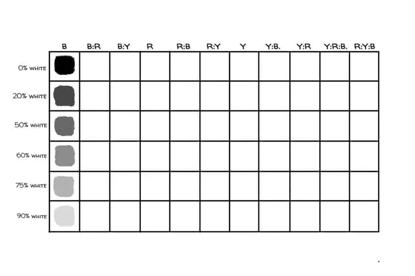
Starting with the first row of the first column, use a palette knife to apply plain black paint to the block. Next, work your way down the column, mixing the appropriate amount of white paint into the black as you go. Make sure that you wipe down your palette knife properly as you go so that you do not contaminate the colors in your boxes with any of the previous shades you created.
Step 3
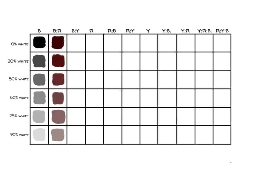
Once you have completed the first column, return to the first row of the second column. This time you will mix some red into your black paint, making sure that the black is still the dominant color in the mixture. Place this mixture into the first block of the second column and then work your way down the column to progressively lighten the mixture as you did in the previous step.
Step 4
Once you have completed the second column, return to the first row of the third column. This time you will be mixing some yellow into your black paint, making sure that the black is still the dominant color in the mixture. Place this mixture into the first block of the third column and then work your way down the column to progressively lighten the mixture as you did the previous step.

Step 5
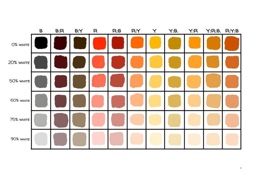
Take note of the established pattern for creating the color chart. Starting with a singular color, we lighten it using increasing amounts of white as we work our way down the column. We then progress to the next column where we add one of the remaining colors to the original color, making sure that the original color is dominant in the mixture. This mixed color will also be lightened down the column.

Step 6
Using step five to understand the pattern, repeat steps two to four on columns four to nine. You will see the pattern where each pure color is lightened, and then at a 2:1 ratio, the other two colors are added.

Step 7
Repeat step six on the final column to complete your Zorn palette color chart. Once you reach the tenth column you will see that the pattern has broken. We now have a mixture of three colors. To create this mixture, mix equal parts of the first two colors and then add a small amount of black. Once the mixture of three colors has been created you can work as expected, placing the original hue in the first block of the column and lightening it with white as you work downwards.
Zorn Palette Tips and Tricks
- Keep your palette, palette knife, colors, and surface clean when creating your color chart.
- Remember that white doesn’t only lighten the pigment it is added to once you start mixing your colors. It also alters the color, opacity, and temperature.
- Keep in mind while you mix your colors that black doesn’t only darken a color it is added to, but it also alters the color, opacity, and temperature.
- The color chart doesn’t show you that colors appear to the viewer differently based on what color they are placed next to. For example, cadmium red will appear differently when placed next to yellow ochre as opposed to ivory black. Keep this in mind when referring to your color chart while creating a painting.
- Try to avoid using a pure white painting’s surface as much as possible. Begin your painting by creating an off-white or mid-tone gray background when working with the Zorn palette. This is helpful because it is hard to gauge colors in relation to white, and everything placed on white is intensified. Using a less stark background helps you to more accurately create highlights and shadows on your paintings using the Zorn palette.
- Spread your four colors out far apart on your palette when you begin so that you have plenty of space to mix them as you start painting.
- When using a limited palette such as the Zorn palette remember that you will be prioritizing light and value over color. If you are referring to a subject while you paint, make sure that you have a strong, consistent lighting source on your subject. This is to ensure that there are defined patterns of light and dark on your subject.
- When creating a color chart, only mix one column at a time.
- Make sure that you do not obstruct the path of light towards your subject, and that your painting surface is also properly lit. If you have to use two separate lighting sources to do this the final result will be worth the extra set-up time.
- Be careful of mixing shades of cadmium red and ivory black with yellow ochre and titanium white on your canvas. This is because unintended or uncontrolled mixing of opaque colors (titanium white and yellow ochre) and transparent colors (cadmium red and ivory black) can cause your painting to look milky and messy. Try to preserve defined opaque and transparent areas on your canvas to create visual interest within your artwork.
- Cadmium red is a strong pigment that must be used with caution while working with the Zorn palette. A general rule of thumb is to mix out the cadmium red with at least a little bit of some other color from the Zorn palette rather than using it in its pure state.
- When creating highlights, you can make use of ochre or titanium white in the mixture. Yellow will create a warmer highlight than titanium white but if it is still too cool or yellow you can add a tinge of cadmium red to warm it up.
- If you have a color that is looking too saturated, you can add some ivory black to soften its vibrancy and desaturate it.
- Be careful not to soften or blend the spaces between values too much. If you need a gradual transition of color, it is better to mix the transitionary shade yourself and paint it in rather than to blend the space between the two colors. This is because blending in this way can impart a muddy look to your painting. Painting the shift in value yourself will make your painting neater and crisper than if you blended all your transitions together.
- Once you have completed your painting, don’t be afraid to lighten the background behind your subject a little to help it stand out more.
Painting with a limited palette is a great way to expand your skills as an artist because of what it teaches you about color and value. Using the Zorn palette is a great way to experiment with both portraiture work and the use of a limited palette. Many beautiful paintings have been created using the Zorn palette and it is quite surprising to see what can be created with such a small range of base colors. Why not get some paints together and give it a try? You could create a brand new, original work or even try to replicate one of Zorn’s famous paintings for yourself!
Frequently Asked Questions
What Mediums Did Anders Zorn Use?
Anders Zorn was famously known for his realistic paintings and for his use of the Zorn palette which was named after him. It is not known to many that he also had some skill with etching, sculpting, and printmaking.
Did Anders Zorn Use Blue?
Anders Zorn favored the use of the Zorn palette but was also known to use shades of blue and green in some of his landscape works. There is the obvious use of green and blue in some of Zorn’s paintings and there were multiple tubes of cobalt blue paint found in his studio after his death.
Why Do Artists Use a Limited Color Palette?
Limited palettes improve an artist’s color mixing abilities. Using a limited range of colors to create a wide variety of tones and shades is a great exercise for artists of any skill level because it allows you to learn about the relationships between values and hues.

Duncan graduated with a diploma in Film and TV production from CityVarsity in 2018, after which he continued pursuing film while taking on a keen interest in writing along the way. Since having graduated, he began working as a freelance videographer, filming a variety of music videos, fashion and short films, adverts, weddings and more. Throughout this, he’s won a number of awards from various film festivals that are both locally and internationally recognized. However, Duncan still enjoys writing articles in between his filming ventures, appreciating the peace and clarity that comes with it.
His articles focus primarily around helping up-and-coming artists explore the basics of certain colors, how these colors can be paired with other shades, as well as what colors are created when you mix one with another. All while relating these shades to historically significant paintings that have incorporated them into their color palette. As a lover of the arts himself, he takes great interest in the Renaissance era of paintings, an era that has directly inspired many of his favorite films.
Learn more about Duncan van der Merwe and about us.