Vermilion Color – Exploring Vermilion Red Color Shades
This post may contain affiliate links. We may earn a small commission from purchases made through them, at no additional cost to you.
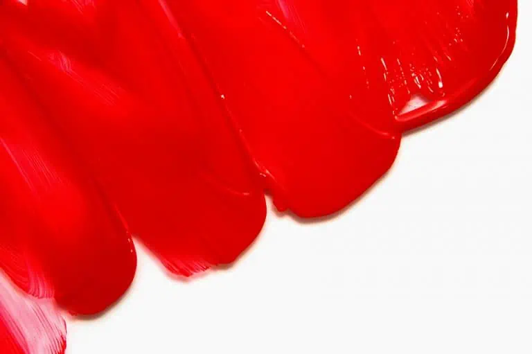
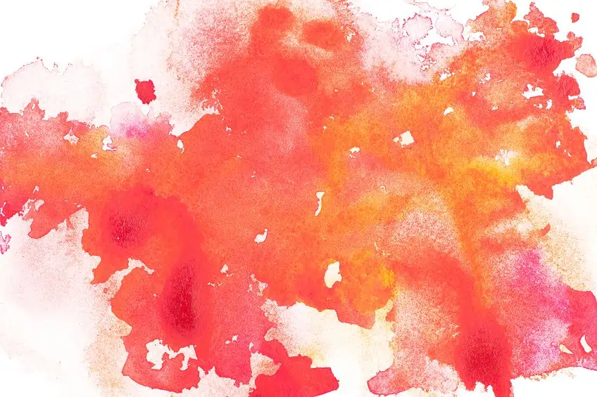
Vermilion is a brilliant red pigment that has captivated artists, designers, and a myriad of cultures throughout the history of mankind, from the eras of antiquity to modern times. It boasts a vibrant red-orange hue that has seen use in a wide range of art forms and design applications, from as far back as Ancient Egypt to today’s contemporary fashion. If you are interested in learning more about this stunning and popular shade of red, you have come to the right place. Join us as we analyze the vermilion color, its history, its many shades, and how best to use it.
A Brief History of Vermilion
| Vermilion Shade | Vermilion Hex Code | CMYK Vermilion Color Code (%) | RGB Vermilion Color Code | Vermilion Color |
| Vermilion | #e34234 | 0, 71, 77, 11 | 227, 66, 52 |
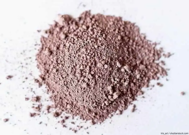
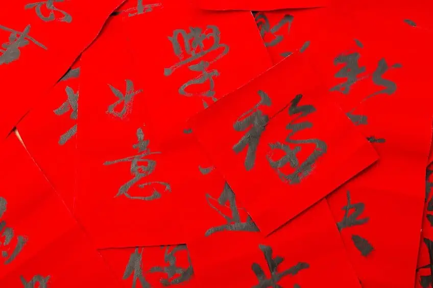
The origin point of vermilion can be traced back to the eras of Antiquity when the color was coveted for its vibrancy and impressive durability. According to art historians, one of the earliest-known examples of where vermilion was sourced comes from the mineral cinnabar, which the Ancient Egyptians exploited to produce this richly red pigment. Ancient China also saw frequent use of cinnabar to produce a finely powdered pigment that would be used in their intricate calligraphy and artwork. To the Chinese, cinnabar was not just the source of vermilion pigment but was also considered to host magical properties. For this reason, vermillion saw frequent use in their religious ceremonies.
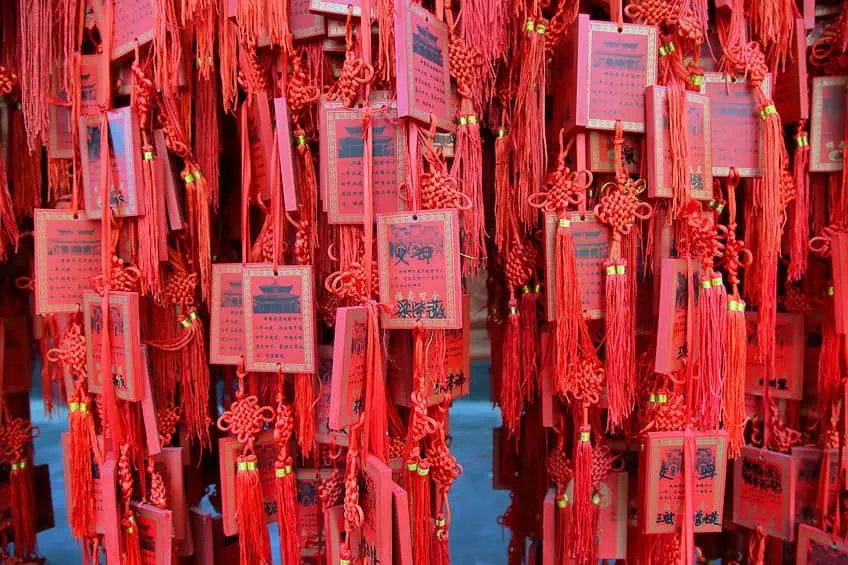
To this day, the color red is still a popular and powerful color in Chinese symbolism. For this culture, the vermilion color meaning connotes prosperity, joy, and wealth Medieval Europe also saw the popularization of vermilion.
However, its version of vermilion was produced through the heating and combining of mercury and sulfur. When mixed together, the two substances would produce the bright red pigment called “mercury vermilion”. The pigment saw frequent use in the writing of manuscripts and all facets of the traditional arts.
During the Renaissance, vermilion continued to be a popular color in the arts. In the 18th and 19th centuries, vermilion became a popular color in fashion, particularly in women’s clothing. It was often used in combination with other bright colors, such as turquoise or emerald green, to create striking and fashionable ensembles.
The popularity of vermilion persisted well into the Renaissance period, where it continued as a staple in the traditional arts. Iconic Italian painters of the time, such as Titian and Tintoretto, would frequently use vermilion to produce vivid and dramatic effects in their painted artworks.
In the modern era, vermilion’s popularity does not seem to have been abated by the sands of time by one bit. Not only is it still a common color found in art, but it is also employed quite often in the field of design. In contemporary art, vermilion is lauded for its boldness and vibrancy, with it being an irreplaceable component of many modern artists’ palettes.
In interior design and fashion, vermilion is often used to produce dramatic accents. All in all, the origins and history of vermilion are as rich as the color itself. Having been a part of the arts since pharaohs still roamed the Earth, this bold color has retained a captive audience for most of human history. This only goes to show how worthwhile it is to understand this color, how to use it, and how to master it. Very few other colors inspire as much creativity and passion as vermilion.
Shades of Vermilion
Vermilion is a color steeped in complexity and, much like many other colors of vermilion, is available in a wide variety of different shades. If you wish to use the vermilion color in any art or design project, it is up to you to decide which shade best suits your needs. Let us discuss some of the most common shades of vermilion. Where applicable, we will also cover the vermilion color meaning of the shades. At the end of this section, we will provide you with a table breaking down the vermilion color code properties of each shade as well.
Chinese Vermilion
This is a bright and intense shade of vermilion that has seen abundant use in Chinese art and culture for thousands of years. Chinese vermilion is created similarly to how the Ancient Egyptians used to, by grinding down cinnabar. The vermilion color meaning is often associated with good luck and prosperity within Chinese culture.
| Vermilion Color | Hex Code | RGB Color Code | CMYK Vermilion Color Code (%) | Shade |
| Vermilion | #e34234 | 0, 71, 77, 11 | 227, 66, 52 | |
| Chinese Vermilion | #aa381e | 170, 56, 30 | 0, 67, 82, 33 |
Mercury Vermilion
This is a deep and rich shade of vermilion that was popularized during the medieval period in Europe. Mercury vermilion is produced by heating mercury and sulfur, then combining them to create this distinctively bright red pigment. As you may have noticed, mercury vermilion has the same color codes as vermilion itself.
This is because mercury vermilion is the same color, and its name comes from how the pigment is produced.
| Vermilion Color | Hex Code | RGB Color Code | CMYK Vermilion Color Code (%) | Shade |
| Vermilion | #e34234 | 0, 71, 77, 11 | 227, 66, 52 | |
| Mercury Vermilion | #e34234 | 0, 71, 77, 11 | 227, 66, 52 |
Scarlet Vermilion
This is a lighter shade of vermilion with a more orange tone. It sees frequent use in fashion and interior design. You could take your baseline vermilion and turn it into scarlet vermilion by adding more orange to the mixture.
| Vermilion Color | Hex Code | RGB Color Code | CMYK Vermilion Color Code (%) | Shade |
| Vermilion | #e34234 | 0, 71, 77, 11 | 227, 66, 52 | |
| Scarlet Vermilion | #ff2400 | 255, 36, 0 | 0, 86, 100, 0 |
Dark Vermilion
This one is a darker, more subdued shade of vermilion that sees its most frequent use in the field of fine art. Dark vermilion is created by adding more black to the mixture.
| Vermilion Color | Hex Code | RGB Color Code | CMYK Vermilion Color Code (%) | Shade |
| Vermilion | #e34234 | 0, 71, 77, 11 | 227, 66, 52 | |
| Dark Vermilion | #8F0000 | 143, 0, 0 | 0, 100, 100, 44 |
Vermilion Color Combinations
What color is vermilion best paired with? Before getting into the nitty gritty of how best to use colors, an understanding of color theory is essential. This includes having knowledge of how the color wheel works and, subsequently, how to create an effective color combination. While finding appropriate color combinations could be as simple as searching the information on Google, it is just as easy (if not better) to figure these things out using the color wheel.
Understanding color temperature also has its benefits when it comes to producing striking color combinations.
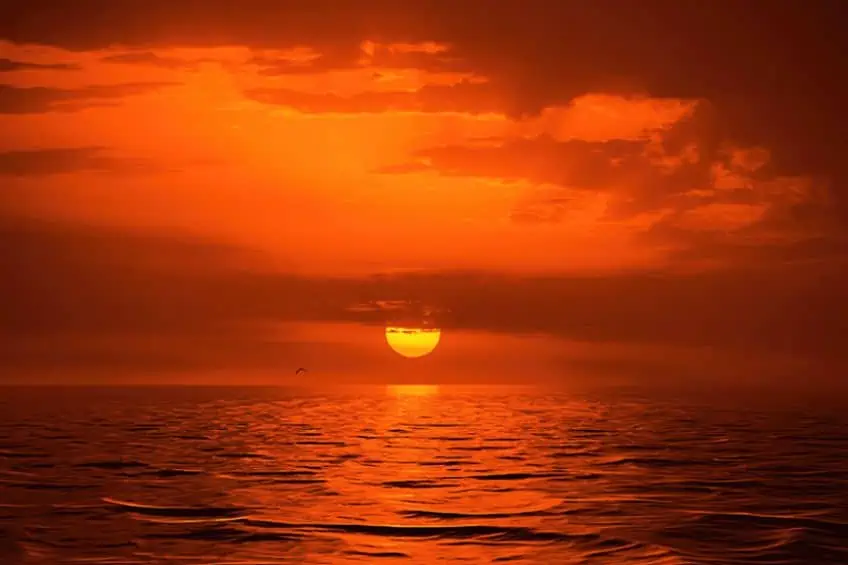
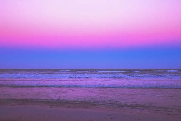
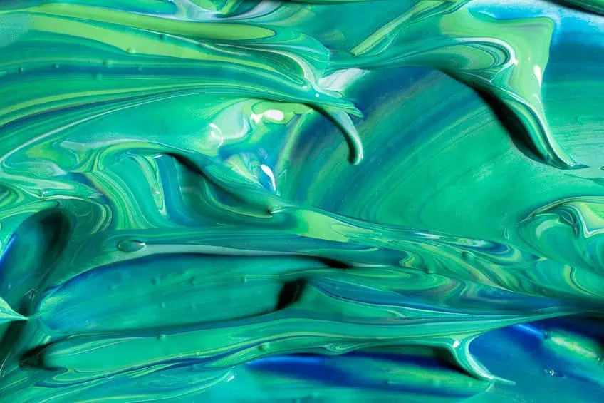
The temperature of a color refers to its perceived warmth or coolness in relation to where and how it occurs in the natural world. Vermilion is considered a warm color, as it is primarily composed of red and orange pigments, which are reminiscent of the sun and fire. Warm colors are thus often closely associated with themes of energy, excitement, and passion. Vermilion is a particularly intense warm color that can add a bold and dramatic touch to any design or artwork.
Complementary Colors for Vermilion
On the color wheel, any color’s complementary shade will sit on the direct opposite side. Why is this important to know? This is because complementary colors produce the strongest contrast when paired together and are what will most effectively grab the attention of the viewer. In terms of vermilion, its complementary colors are turquoise color and bright cyan.
When paired with one of these colors, your vermilion is able to stand out most effectively.
| Shade | Hex Code | RGB Color Code | CMYK Color Code (%) | Color |
| Vermilion | #e34234 | 227, 66, 52 | 0, 71, 77, 11 | |
| Bright Cyan | #34d5e3 | 52, 213, 227 | 77, 6, 0, 11 | |
| Turquoise | #40e0d0 | 64, 224, 208 | 71, 0, 7, 12 |
Split Complementary Colors for Vermilion
One of the other fantastic color combinations is referred to as split complementary colors. These can be described as colors that contrast one another in a way that produces a visually appealing combination. The use of such color palettes is quite prolific within the fields of web and graphic design and is produced through pairing a color with the colors found on the right and left side of its complementary.
| Shade | Hex Code | RGB Color Code | CMYK Color Code (%) | Color |
| Vermilion | #e34234 | 227, 66, 52 | 0, 71, 77, 11 | |
| Bleu De France | #347ee3 | 52, 126, 227 | 77, 44, 0, 11 | |
| Eucalyptus | #34e39a | 52, 227, 154 | 77, 0, 32, 11 |
Analogous Color Combinations for Vermilion
If you want to create an aesthetically pleasing gradient with vermilion, you could decide to explore the use of analogous colors. Analogous colors are shades that sit alongside one another on the color wheel, which would mean that they all share similar aesthetic qualities.
For vermilion, the colors pink and orange are analogous.
| Shade | Hex Code | RGB Color Code | CMYK Color Code (%) | Color |
| Vermilion | #e34234 | 227, 66, 52 | 0, 71, 77, 11 | |
| Pink | #e3347e | 227, 52, 126 | 0, 77, 44, 11 | |
| Orange | #e39a34 | 227, 154, 52 | 0, 32, 77, 11 |
Monochromatic Color Combinations for Vermilion
If you are instead on the hunt for slighter distinctions in the combination of colors you are working with, you could consider using a monochromatic color combination. These palettes are produced by pairing different hues, tints, and shades of the same color with each other. Down below, we have an example of such a combination for the vermilion color.
| Shade | Hex Code | RGB Color Code | CMYK Color Code (%) | Color |
| Vermilion | #e34234 | 227, 66, 52 | 0, 71, 77, 11 | |
| Dark Vermilion | #b22519 | 178, 37, 25 | 0, 79, 86, 30 | |
| Light Vermilion | #ec8177 | 236, 129, 119 | 0, 45, 50, 7 |
Vermilion Triadic Color Combinations
You have yet another color combination option to choose from and this one also is for the purpose of generating a striking contrast. To produce a triadic color combination, you must pair three colors that are evenly spaced apart from each other on the color wheel, so as to form an isosceles triangle.
| Shade | Hex Code | RGB Color Code | CMYK Color Code (%) | Color |
| Vermilion | #e34234 | 227, 66, 52 | 0, 71, 77, 11 | |
| Blue | #4234e3 | 66, 52, 227 | 71, 77, 0, 11 | |
| Lime Green | #34e342 | 52, 227, 66 | 77, 0, 71, 11 |
What Two Colors Make Vermilion?
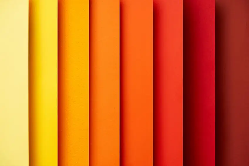
Vermilion’s color is both bright and vibrant and can be described as having a red-orange hue. While the color itself may appear so distinctive that it cannot be reproduced through the combination of various colors, doing so is actually more than possible. All you need to do is mix the appropriate shades of the colors red and orange together.
Mixing Vermilion Red Color
The first step toward producing the color vermilion is to pick the correct shades of red and orange to mix. Red is a primary color, meaning that you will not be able to produce it by mixing different colors together. This means that the soundest option for making vermilion with red is to find a shade of pure and bright red that sides closer to the color of vermilion. Scarlet red and cadmium red are both good options as far as this is concerned.
Being a secondary color, your ideal orange can be produced using a combination of red and yellow.
For the brightest and most vivid shade of vermilion, however, you might want to go with a brighter shade of orange such as tangerine or cadmium orange. With the correct colors at hand, the next thing you will have to do is mix them in the appropriate proportions. There are numerous effective ways in which one might mix colors, the easiest option that affords the greatest degree of reliability would be to employ the use of a color chart or color wheel. The color wheel will display all the primary, secondary, and tertiary colors and their relation to one another. If you would like to produce vermilion, you need only mix equal parts of the correct red and orange shades together.
What you should be left with is a vibrant and bright vermilion color that resembles the natural pigment more than close enough. Keep in mind, however, that the precise shade of vermilion produced will vary and depend on your choices of which red and orange shades you choose to combine. The color of your vermilion will also depend on the ratios you decide to mix your reds and oranges in Remember that a half-and-half mix should prove sufficient. If you have never mixed vermilion paint before, you should expect some trial-and-error in the beginning as you work your way to becoming the master of this color.
All it takes is patience, practice, and a keen interest in experimenting.
Vermilion Color Value
Lastly, you also want to take into account the color value (or brightness) of the vermilion color produced through your combination of red and orange paints. Vermilion is bright and highly saturated and thus boasts a rather high color value. If you would prefer to produce a shade of vermilion with a lower color value, you should consider mixing in a tiny amount of a darker color such as a deep blue or black. Producing your own shades of vermilion may be complicated in the beginning, but the process can be quite rewarding and only gets easier the more you do it.
Just be sure to pick the right colors to combine and be open to the idea of experimenting with the ratios. If you follow these tips, you will be creating some stunning shades of vermilion for a wide variety of art and design projects in no time.
How to Use Vermilion
Vermilion is a versatile color that can be used to create a variety of moods and effects, from bold and dramatic to subtle and refined. In this article, we will explore the many ways in which vermilion can be used in art, home decor, interior design, and fashion. Vermilion is an incredibly versatile color that can be applied to produce a wide variety of moods and effects, ranging from the dramatic and bold down to the subtle and refined. We will do our best to enlighten you on the best ways to employ vermilion.
We will keep our focus on its uses in art, home décor, interior design, and fashion.
Vermilion in Art
As we have discussed, vermilion has been used as far back as during the times of humanity’s most ancient civilizations. Some of the most acclaimed examples of vermilion being used during the era of Antiquity are murals and frescoes of Herculaneum and Pompeii. In traditional painting, vermilion is a color whose power is exploited to produce striking and bold imagery.
If you want to produce a strong contrast with this color, it can be paired with complementary colors such as blue and green.
Vermilion also sees frequent use in the creation of abstract art, where its bold shades are used to create eye-catching shapes and geometric patterns. If you are making use of vermilion in your artwork, one thing to be wary of is the fact that its power can prove to be overwhelming if wielded too frivolously. Your best bet is to use the color sparingly or in conjunction with other colors so that the composition of your art remains balanced.
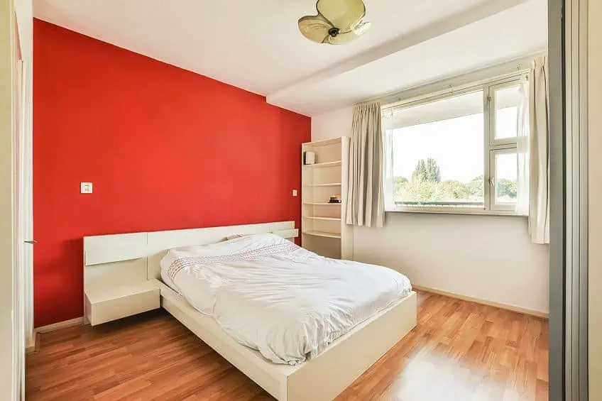
Vermilion in Home Décor
Vermilion is a fantastic choice of color to work with in many instances regarding home decoration. Any space to which it is added will be filled with a warm and inviting atmosphere. It is best used in rooms that receive an abundance of natural light since it will reflect light to create a vibrant and cheerful vibe. You can use vermilion on furniture, walls, and accessories.
It also pairs well with other warm colors, such as orange, yellow, and gold.

If you plan on using vermilion in home décor, however, one thing that you should consider is the size of the space in conjunction with the amount of natural light it is exposed to. If you are dealing with a smaller space or somewhere with limited access to natural light, you should consider only using vermilion as an accenting color.
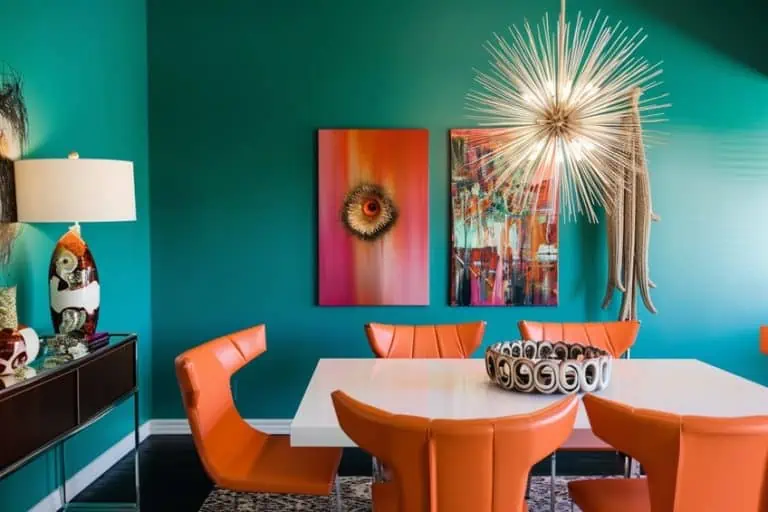
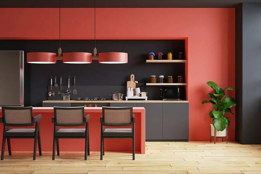
Vermilion in Interior Design
Interior designers are avidly fond of using vermilion since it brings with it a sense of sophistication and luxury. The best places for vermilion red color include walls, curtains, accessories, and upholstery if you are going for a bold aesthetic. If you are working with modern and contemporary interiors, vermilion is an excellent go-to and its addition will bring about a pop in color and energy.
The overall color scheme of a room is something worth keenly considering when it comes to using vermilion in interior design.
If you want to produce a sophisticated and mature appearance, you should consider pairing vermilion with neutral colors like beige, white, or gray. If you want to instead produce a rich and luxurious aesthetic within a space, you could pair vermilion with colors such as bronze or gold.
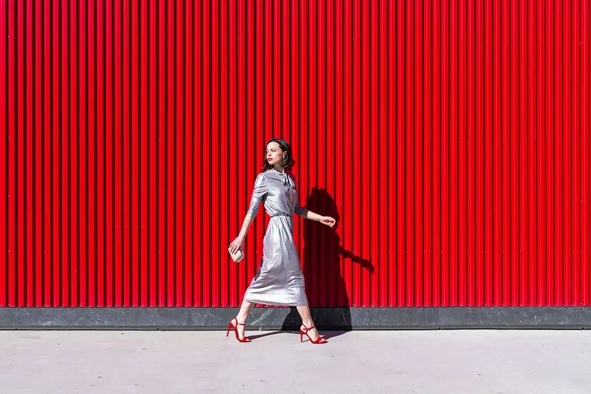
Vermilion in Fashion
This is a classic color seen in the world of fashion that has been explored for centuries. Vermilion’s addition to any wardrobe would produce a bold statement. The color sees frequent use in formal wear like suits and evening gowns. The richness of its color does well to introduce some glamor and sophistication to one’s appearance.
You can, however, introduce vermilion to casual wear as well, where it can produce an energetic look in the form of a t-shirt or sweater.

You should, however, consider the skin tone of the wearer before introducing the vermilion red color. While it pairs well with most skin tones, it may prove too overwhelming when contrasted with very fair skin or blonde hair. If you want a balanced color palette, vermilion apparel should be paired with neutral colors such as white or black.
There you have it, folks. This has been our analysis of the vermilion color. Hopefully, you can use the information we have provided to make better use of this color in your future art and design projects. It is a bold color that, if wielded properly, can be an incredibly striking and beautiful addition to any palette!
Frequently Asked Question
What Color Is Vermilion?
Vermilion is a brilliant red-orange pigment. It can be produced through the combination of red and orange. However, the pigments used to create this color occur naturally and do not need to be produced through a mixture of various pigments.
How Do I Use Vermilion in Interior Design?
Vermilion brings with it a sense of sophistication and luxury when used appropriately in interior design. The best places for the vermilion red color to be used include walls, curtains, accessories, and upholstery. Vermilion is a good choice for bringing a pop in color and energy, and its use will produce a bold aesthetic if you are working with modern and contemporary interiors.

Duncan graduated with a diploma in Film and TV production from CityVarsity in 2018, after which he continued pursuing film while taking on a keen interest in writing along the way. Since having graduated, he began working as a freelance videographer, filming a variety of music videos, fashion and short films, adverts, weddings and more. Throughout this, he’s won a number of awards from various film festivals that are both locally and internationally recognized. However, Duncan still enjoys writing articles in between his filming ventures, appreciating the peace and clarity that comes with it.
His articles focus primarily around helping up-and-coming artists explore the basics of certain colors, how these colors can be paired with other shades, as well as what colors are created when you mix one with another. All while relating these shades to historically significant paintings that have incorporated them into their color palette. As a lover of the arts himself, he takes great interest in the Renaissance era of paintings, an era that has directly inspired many of his favorite films.
Learn more about Duncan van der Merwe and about us.