Colors That Go With Beige – 30 Chic Color Combinations
This post may contain affiliate links. We may earn a small commission from purchases made through them, at no additional cost to you.
Step into the world of interior design elegance with my latest blog, “Colors That Go With Beige – 30 Chic Color Combinations.” As an impassioned advocate for the transformative potential of colors, I invite you to discover the timeless allure of beige as the perfect canvas for creating inviting and sophisticated living spaces. In this exploration, we’ll unravel the magic of pairing 30 complementary colors, unlocking a world of possibilities to elevate your home!
What Color Is Beige?
Beige is the master of versatility, effortlessly complementing a wide range of hues. It acts as a calm anchor amidst vibrant companions, allowing them to shine while providing a sense of balance. Picture vibrant splashes of coral or teal dancing alongside beige, creating a lively and energetic atmosphere. Beige is like the best supporting actor, enhancing the brilliance of other colors without stealing the spotlight. But there is more to beige than meets the eye. It holds a subtle sophistication, a touch of timeless elegance that transcends trends. It is the color of refined luxury, adorning the walls of chic boutiques and upscale hotels. Beige exudes a sense of understated beauty, effortlessly elevating any space it graces.
| Beige Color | Hex Code | RGB | CMYK (%) | Shade of Beige |
| Beige | #e4e4a1 | 228, 228, 161 | 0, 0, 29, 11 | |
| Cosmic Latte | #fff8e7 | 255, 248, 231 | 0, 3, 9, 0 | |
| Cream | #fffdd0 | 255, 253, 208 | 0, 1, 18, 0 | |
| Tuscan | #fad6a5 | 250, 214, 165 | 0, 14, 34, 2 | |
| Buff | #daa06d | 218, 160, 109 | 0, 27, 50, 15 | |
| Desert Sand | #edc9af | 237, 201, 175 | 0, 15, 26, 7 | |
| Ecru | #c2b280 | 194, 178, 128 | 0, 8, 34, 24 | |
| Khaki | #c3b091 | 195, 176, 145 | 0, 10, 26, 24 | |
| Light French Beige | #c8ad7f | 200, 173, 127 | 0, 14, 37, 22 | |
| Mode Beige | #967117 | 150, 113, 23 | 0, 25, 85, 41 |
Finding the Best Accent Color That Goes With Beige
As we delve into the realm of possibilities surrounding home decor and accent colors that go with beige, imagine a space adorned in elegant shades of beige, creating a serene and neutral foundation. Now, introduce the captivating accent color that sparks joy and captivates the eye. It might be a vibrant pop of teal, infusing the space with a burst of energy and modern flair. Or perhaps a rich jewel tone like emerald green, adding a touch of opulence and sophistication. The accent color becomes a beacon of personality and character, taking the space from ordinary to extraordinary.
The key to finding the best accent color lies in striking the delicate balance between complementing beige’s warm neutrality and making a statement.

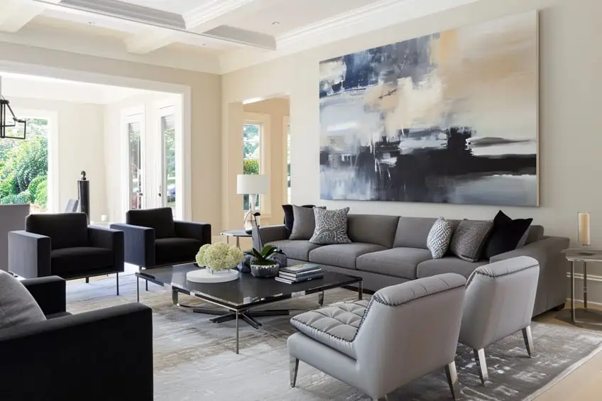
Beige and Charcoal Gray
In the realm of interior design, the sophisticated combination of beige and charcoal gray creates a timeless and elegant atmosphere. The warm undertones of beige complement the cool, deep richness of charcoal gray, achieving a harmonious balance that exudes both comfort and sophistication. This pairing offers versatility, seamlessly adapting to various design styles while maintaining a classic allure. Personally, I find the beige and charcoal gray combination to be a canvas for creativity, allowing for the integration of vibrant accents or subtle textures to elevate the overall aesthetic.
| Shade | Hex Code | CMYK Color Code (%) | RGB Color Code | Color |
| Beige | #F5F5DC | 5, 5, 15, 0 | 245, 245, 220 | |
| Charcoal Gray | #36454F | 65, 30, 30, 80 | 54, 69, 79 |
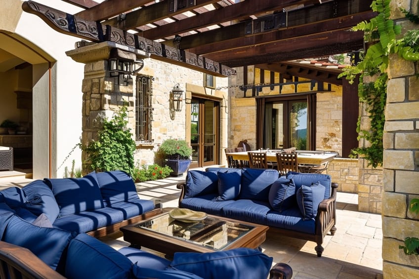
Beige and Navy Blue
Beige and navy blue, a pairing that effortlessly marries tranquility with a touch of drama. The neutrality of beige serves as a calming backdrop, allowing the deep, regal navy blue to take center stage and infuse a sense of opulence into the space. This combination strikes a perfect equilibrium between subtlety and boldness, making it suitable for both traditional and contemporary interiors. Personally, I find the beige and navy blue duo to be a captivating dance of serenity and sophistication, creating a space that invites both relaxation and a sense of refinement.
| Shade | Hex Code | CMYK Color Code (%) | RGB Color Code | Color |
| Beige | #F5F5DC | 5, 5, 20, 0 | 245, 245, 220 | |
| Navy Blue | #000080 | 100, 100, 0, 50 | 0, 0, 128 |

Beige and Sage Green
For a nature-inspired retreat, beige and sage green offer a refreshing and tranquil palette. Beige, acting as a neutral anchor, allows the muted, earthy tones of sage green to breathe life into the space, evoking a sense of calm and rejuvenation. This combination is particularly appealing for those seeking a connection to the outdoors within their interiors. Personally, I see beige and sage green as a harmonious ode to nature, providing a canvas for botanical elements and natural textures to thrive, fostering a serene sanctuary within the home.
| Shade | Hex Code | CMYK Color Code (%) | RGB Color Code | Color |
| Beige | #F5F5DC | 5, 5, 20, 0 | 245, 245, 220 | |
| Sage Green | #7C977C | 31, 0, 29, 38 | 124, 151, 124 |

Beige and Terracotta
Beige and terracotta is a warm and inviting combination that brings a touch of Mediterranean charm to interior spaces. The earthy warmth of terracotta complements beige’s neutral tones, creating a cozy and vibrant ambiance. This pairing works exceptionally well in spaces where a rustic and timeless feel is desired. Personally, I see beige and terracotta as a celebration of warmth and tradition, inspiring a sense of comfort that transcends trends.
| Shade | Hex Code | CMYK Color Code (%) | RGB Color Code | Color |
| Beige | #F5F5DC | 5, 5, 20, 0 | 245, 245, 220 | |
| Terracotta | #E2725B | 0, 50, 50, 11 | 226, 114, 91 |

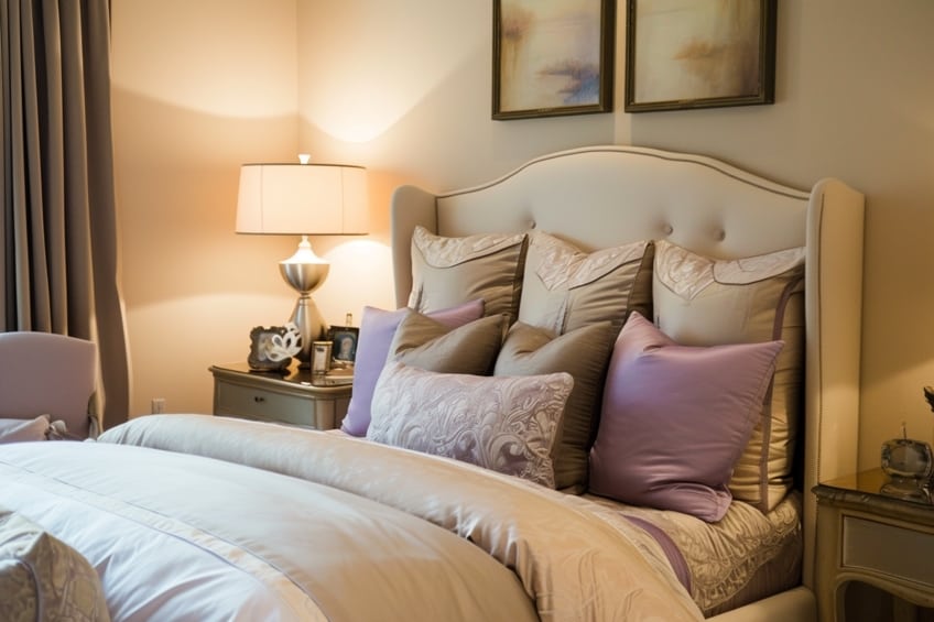
Beige and Soft Pink
For a soft and romantic ambiance, beige and soft pink come together in a delightful dance of subtlety and grace. The gentle undertones of beige provide a neutral backdrop, allowing soft pink to infuse a sense of delicacy and sweetness. This combination is perfect for creating a dreamy and feminine atmosphere, making it an ideal choice for bedrooms or cozy reading nooks. Personally, I find beige and soft pink to be a whimsical symphony of understated elegance, offering a serene escape within the home.
| Shade | Hex Code | CMYK Color Code (%) | RGB Color Code | Color |
| Beige | #F5F5DC | 5, 5, 20, 0 | 245, 245, 220 | |
| Soft Pink | #FFD8D8 | 0, 19, 19, 0 | 255, 216, 216 |

Beige and Chocolate Brown
The pairing of beige and chocolate brown exudes richness and warmth, creating a luxurious and inviting setting. Beige provides a neutral foundation, while chocolate brown adds depth and sophistication. This combination is timeless and versatile, working well in both traditional and modern interiors. Personally, I appreciate beige and chocolate brown for their ability to create a sense of opulence and comfort, transforming a space into a haven of indulgence.
| Shade | Hex Code | CMYK Color Code (%) | RGB Color Code | Color |
| Beige | #F5F5DC | 5, 5, 20, 0 | 245, 245, 220 | |
| Chocolate Brown | #5C3317 | 0, 34, 67, 58 | 92, 51, 23 |

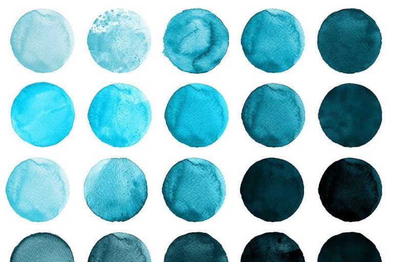
Beige and Teal
Teal and beige form a captivating union that balances vibrancy with serenity. The cool, calming nature of teal finds harmony with the neutral tones of beige, resulting in a space that feels both refreshing and grounded. This combination is ideal for those seeking a modern and dynamic color palette. Personally, I see beige and teal as a dynamic duo, providing a versatile canvas for incorporating bold accessories or subtle metallic accents, adding a touch of contemporary flair to the design.
| Shade | Hex Code | CMYK Color Code (%) | RGB Color Code | Color |
| Beige | #F5F5DC | 5, 5, 20, 0 | 245, 245, 220 | |
| Teal | #008080 | 100, 0, 33, 50 | 0, 128, 128 |

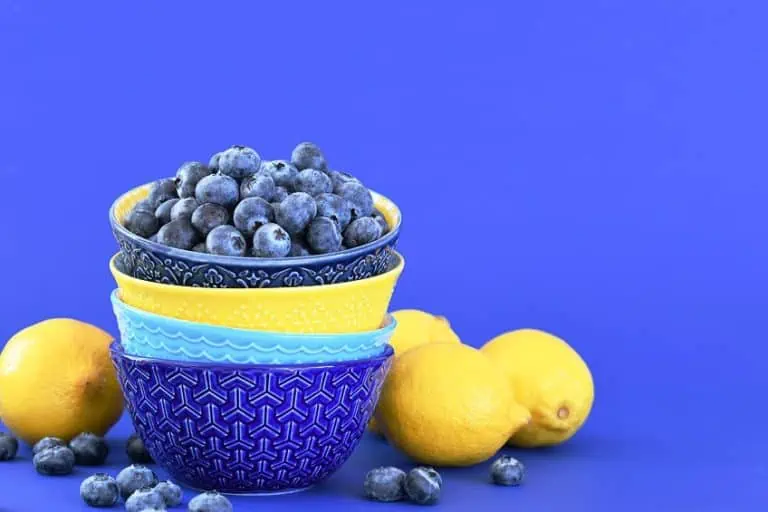
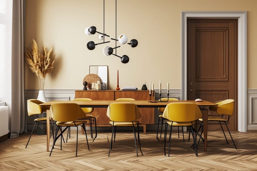
Beige and Mustard Yellow
Mustard yellow and beige create a lively and energetic pairing that injects a sense of playfulness into interior spaces. The warm, golden tones of mustard yellow enliven the neutral backdrop of beige, infusing a space with brightness and positivity. This combination works well in spaces where a cheerful and eclectic atmosphere is desired. Personally, I find beige and mustard yellow to be a celebration of optimism and creativity, inspiring a lively energy within the home.
| Shade | Hex Code | CMYK Color Code (%) | RGB Color Code | Color |
| Beige | #F5F5DC | 5, 5, 20, 0 | 245, 245, 220 | |
| Mustard Yellow | #FFDB58 | 0, 11, 63, 0 | 255, 219, 88 |

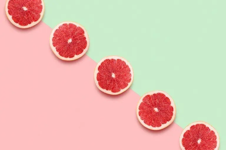
Beige and Coral
The combination of beige and coral brings a burst of warmth and vibrancy to interior design. The soft, neutral beige acts as a grounding element, allowing the lively coral to take center stage. This pairing is perfect for creating a cheerful and inviting atmosphere, especially in spaces where a touch of tropical or coastal flair is desired. Personally, I see beige and coral as a dynamic partnership, evoking a sense of joy and relaxation, reminiscent of sun-soaked destinations.
| Shade | Hex Code | CMYK Color Code (%) | RGB Color Code | Color |
| Beige | #F5F5DC | 5, 5, 20, 0 | 245, 245, 220 | |
| Coral | #FF6F61 | 0, 68, 40, 0 | 255, 111, 97 |

Beige and Olive Green
Olive green and beige create a calming and nature-inspired palette that resonates with tranquility. The earthy tones of olive green blend seamlessly with the neutral warmth of beige, resulting in a space that feels serene and balanced. This combination is well-suited for creating a connection to nature within interiors. Personally, I appreciate beige and olive green for their ability to foster a sense of well-being and natural harmony, making a space feel like a peaceful retreat.
| Shade | Hex Code | CMYK Color Code (%) | RGB Color Code | Color |
| Beige | #F5F5DC | 5, 5, 20, 0 | 245, 245, 220 | |
| Olive Green | #556B2F | 49, 0, 92, 43 | 85, 107, 47 |

Beige and Lavender
Lavender and beige join forces to create a soft and soothing ambiance. Beige acts as a versatile neutral backdrop, allowing the gentle hues of lavender to infuse a space with a sense of calm and tranquility. This combination is particularly well-suited for bedrooms and relaxation areas, providing a restful retreat within the home. Personally, I find beige and lavender to be a serene partnership, encouraging moments of relaxation and introspection.
| Shade | Hex Code | CMYK Color Code (%) | RGB Color Code | Color |
| Beige | #F5F5DC | 5, 5, 20, 0 | 245, 245, 220 | |
| Lavender | #E6E6FA | 18, 18, 0, 4 | 230, 230, 250 |
Beige and Denim Blue
Denim blue and beige come together in a classic and timeless pairing that exudes a sense of comfort and familiarity. The cool, casual nature of denim blue complements the neutral warmth of beige, creating a space that feels inviting and relaxed. This combination is well-suited for creating a laid-back and approachable atmosphere. Personally, I see beige and denim blue as a versatile combination, offering endless opportunities for personalization and expression.
| Shade | Hex Code | CMYK Color Code (%) | RGB Color Code | Color |
| Beige | #F5F5DC | 5, 5, 20, 0 | 245, 245, 220 | |
| Denim Blue | #1560BD | 100, 64, 0, 36 | 21, 96, 189 |

Beige and Burnt Orange
Burnt orange and beige form a warm and invigorating color duo that brings a sense of energy and vibrancy to interior spaces. The earthy undertones of burnt orange blend seamlessly with the neutral backdrop of beige, creating a space that feels both lively and grounded. This combination is particularly well-suited for creating a bold and dynamic atmosphere. Personally, I appreciate beige and burnt orange for their ability to inject a sense of warmth and personality into a space, making it feel uniquely inviting.
| Shade | Hex Code | CMYK Color Code (%) | RGB Color Code | Color |
| Beige | #F5F5DC | 5, 5, 20, 0 | 245, 245, 220 | |
| Burnt Orange | #CC5500 | 0, 57, 100, 20 | 204, 85, 0 |

Beige and Aqua Blue
Aqua blue and beige create a refreshing and coastal-inspired palette that evokes a sense of tranquility and relaxation. The cool, watery tones of aqua blue harmonize with the neutral warmth of beige, resulting in a space that feels light and airy. This combination is well-suited for creating a coastal or beach-themed aesthetic within interiors. Personally, I see beige and aqua blue as a breath of fresh air, transporting the ambiance of a seaside retreat into the home.
| Shade | Hex Code | CMYK Color Code (%) | RGB Color Code | Color |
| Beige | #F5F5DC | 5, 5, 20, 0 | 245, 245, 220 | |
| Aqua Blue | #00FFFF | 100, 0, 0, 0 | 0, 255, 255 |

Beige and Muted Yellow
Muted yellow and beige come together in a subtle and sophisticated pairing that exudes a sense of understated elegance. The soft, muted tones of yellow blend seamlessly with the neutral backdrop of beige, creating a space that feels refined and timeless. This combination is well-suited for those who appreciate a subtle pop of color without sacrificing a sense of sophistication. Personally, I find beige and muted yellow to be a harmonious blend of subtlety and style, creating a space that is both inviting and effortlessly chic.
| Shade | Hex Code | CMYK Color Code (%) | RGB Color Code | Color |
| Beige | #F5F5DC | 5, 5, 20, 0 | 245, 245, 220 | |
| Muted Yellow | #D1C87D | 21, 14, 57, 0 | 209, 200, 125 |

Cosmic Latte and Charcoal Gray
Cosmic latte and charcoal gray offer a sophisticated and celestial-inspired combination that adds an ethereal touch to interior design. The warm, neutral tones of cosmic latte provide a soft backdrop, allowing the deep richness of charcoal gray to create a sense of depth and mystery. This pairing is particularly well-suited for creating a refined and dreamy atmosphere within interiors. Personally, I see cosmic latte and charcoal gray as a celestial dance of light and shadow, infusing a space with a touch of otherworldly elegance.
| Shade | Hex Code | CMYK Color Code (%) | RGB Color Code | Color |
| Cosmic Latte | #FFF8E7 | 3, 2, 10, 0 | 255, 248, 231 | |
| Charcoal Gray | #36454F | 69, 53, 47, 54 | 54, 69, 79 |

Cream and Sage Green
Cream and sage green come together to create a serene and timeless combination that evokes a sense of natural tranquility. The soft, neutral tones of cream provide a gentle backdrop, allowing the muted, earthy hues of sage green to infuse a space with a calming ambiance. This pairing is well-suited for creating a connection to nature within interiors. Personally, I appreciate cream and sage green for their ability to create a space that feels both elegant and grounded, fostering a sense of peace and relaxation.
| Shade | Hex Code | CMYK Color Code (%) | RGB Color Code | Color |
| Cream | #FFFDD0 | 2, 0, 18, 0 | 255, 253, 208 | |
| Sage Green | #7C977C | 31, 0, 29, 38 | 124, 151, 124 |
Tuscan and Terracotta
Tuscan and terracotta form a warm and earthy color combination that brings a touch of Mediterranean charm to interior spaces. The rich, warm tones of tuscan provide a rustic backdrop, allowing the vibrant hues of terracotta to infuse a space with a sense of warmth and vitality. This pairing is particularly well-suited for creating a cozy and inviting atmosphere. Personally, I see tuscan and terracotta as a celebration of earthy richness, creating a space that feels grounded and full of character.
| Shade | Hex Code | CMYK Color Code (%) | RGB Color Code | Color |
| Tuscan | #FAD6A5 | 0, 15, 30, 0 | 250, 214, 165 | |
| Terracotta | #E2725B | 0, 60, 60, 11 | 226, 114, 91 |

Buff and Navy Blue
Buff and navy blue create a sophisticated and timeless combination that balances warmth and depth. The neutral tones of buff provide a soft backdrop, allowing the deep, classic navy blue to take center stage and infuse a space with a sense of elegance. This pairing is well-suited for creating a refined and tailored atmosphere within interiors. Personally, I find buff and navy blue to be a classic duo that transcends trends, offering a timeless and sophisticated aesthetic.
| Shade | Hex Code | CMYK Color Code (%) | RGB Color Code | Color |
| Buff | #F0DC82 | 5, 10, 37, 0 | 240, 220, 130 | |
| Navy Blue | #000080 | 100, 100, 0, 50 | 0, 0, 128 |

Desert Sand and Coral
Desert sand and coral come together to create a warm and inviting color combination that evokes a sense of tropical charm. The neutral warmth of desert sand provides a soft backdrop, allowing the lively and vibrant coral to infuse a space with a touch of playfulness. This pairing is particularly well-suited for creating a cheerful and energetic atmosphere. Personally, I see desert sand and coral as a celebration of warmth and vibrancy, creating a space that feels lively and welcoming.
| Shade | Hex Code | CMYK Color Code (%) | RGB Color Code | Color |
| Desert Sand | #EDC9AF | 0, 15, 25, 16 | 237, 201, 175 | |
| Coral | #FF6F61 | 0, 68, 40, 0 | 255, 111, 97 |

Ecru and Olive Green
Ecru and olive green form a soothing and nature-inspired color combination that brings a sense of calm to interior spaces. The soft, neutral tones of ecru provide a gentle backdrop, allowing the earthy and muted olive green to infuse a space with a natural and tranquil ambiance. This pairing is well-suited for creating a serene retreat within the home. Personally, I appreciate ecru and olive green for their ability to create a space that feels both elegant and grounded, fostering a connection to nature.
| Shade | Hex Code | CMYK Color Code (%) | RGB Color Code | Color |
| Ecru | #C2B280 | 20, 25, 45, 0 | 194, 178, 128 | |
| Olive Green | #556B2F | 49, 0, 92, 43 | 85, 107, 47 |

Khaki and Burgundy
Khaki and burgundy come together to create a warm and sophisticated color combination that exudes a sense of richness and depth. The neutral warmth of khaki provides a versatile backdrop, allowing the deep, regal burgundy to take center stage and infuse a space with a touch of opulence. This pairing is well-suited for creating a refined and luxurious atmosphere within interiors. Personally, I find khaki and burgundy to be a classic and timeless duo that adds a sense of grandeur to any space.
| Shade | Hex Code | CMYK Color Code (%) | RGB Color Code | Color |
| Khaki | #C3B091 | 21, 27, 42, 0 | 195, 176, 145 | |
| Burgundy | #800020 | 0, 100, 100, 49 | 128, 0, 32 |

Light French Beige and Teal
Light french beige and teal create a fresh and vibrant color combination that infuses a space with a sense of modern sophistication. The neutral tones of light french beige provide a soft backdrop, allowing the bold and energetic teal to take center stage. This pairing is well-suited for creating a contemporary and dynamic atmosphere within interiors. Personally, I see light french beige and teal as a playful yet sophisticated combination, offering a canvas for bold design choices and personal expression.
| Shade | Hex Code | CMYK Color Code (%) | RGB Color Code | Color |
| Light French Beige | #C8AD7F | 15, 23, 43, 0 | 200, 173, 127 | |
| Teal | #008080 | 100, 0, 33, 50 | 0, 128, 128 |

Mode Beige and Mauve
Mode beige and mauve come together in a soft and elegant color combination that exudes a sense of sophistication and femininity. The neutral tones of mode beige provide a versatile backdrop, allowing the subtle and romantic mauve to infuse a space with a touch of softness. This pairing is well-suited for creating a refined and elegant atmosphere within interiors. Personally, I find mode beige and Mauve to be a delicate and timeless duo that adds a sense of grace and beauty to any space.
| Shade | Hex Code | CMYK Color Code (%) | RGB Color Code | Color |
| Mode Beige | #90776E | 18, 31, 38, 21 | 144, 119, 110 | |
| Mauve | #E0B0FF | 20, 32, 0, 0 | 224, 176, 255 |

Cosmic Latte and Olive Green
Cosmic latte and olive green form a celestial and nature-inspired color combination that brings a sense of tranquility to interior spaces. The warm, neutral tones of cosmic latte provide a soft backdrop, allowing the earthy and muted olive green to infuse a space with a natural and serene ambiance. This pairing is well-suited for creating a calming retreat within the home. Personally, I appreciate cosmic latte and olive green for their ability to create a space that feels both ethereal and grounded, fostering a connection to the beauty of the natural world.
| Shade | Hex Code | CMYK Color Code (%) | RGB Color Code | Color |
| Cosmic Latte | #FFF8E7 | 3, 2, 10, 0 | 255, 248, 231 | |
| Olive Green | #556B2F | 49, 0, 92, 43 | 85, 107, 47 |

Cream and Lavender
Cream and lavender come together to create a soft and dreamy color combination that infuses a space with a sense of serenity and relaxation. The neutral tones of cream provide a gentle backdrop, allowing the gentle and calming lavender to take center stage. This pairing is well-suited for creating a peaceful and tranquil atmosphere within interiors. Personally, I see cream and lavender as a soothing and timeless combination, offering a respite from the demands of the outside world and creating a space that promotes a sense of calm.
| Shade | Hex Code | CMYK Color Code (%) | RGB Color Code | Color |
| Cream | #FFFDD0 | 2, 0, 18, 0 | 255, 253, 208 | |
| Lavender | #E6E6FA | 18, 18, 0, 3 | 230, 230, 250 |

Tuscan and Denim Blue
Tuscan and denim blue form a warm and classic color combination that brings a touch of timeless elegance to interior spaces. The rich, warm tones of tuscan provide a rustic backdrop, allowing the cool, classic denim blue to infuse a space with a sense of sophistication. This pairing is well-suited for creating a refined and welcoming atmosphere within interiors. Personally, I find tuscan and denim blue to be a versatile duo that adds a sense of charm and character to any space.
| Shade | Hex Code | CMYK Color Code (%) | RGB Color Code | Color |
| Tuscan | #FAD6A5 | 0, 15, 30, 0 | 250, 214, 165 | |
| Denim Blue | #1560BD | 100, 71, 0, 24 | 21, 96, 189 |
Buff and Burnt Orange
Buff and burnt orange create a warm and energetic color combination that infuses a space with a sense of vibrancy and playfulness. The neutral tones of buff provide a soft backdrop, allowing the lively and earthy burnt orange to take center stage. This pairing is well-suited for creating a cheerful and inviting atmosphere within interiors. Personally, I see buff and burnt orange as a celebration of warmth and creativity, creating a space that feels lively and full of personality.
| Shade | Hex Code | CMYK Color Code (%) | RGB Color Code | Color |
| Buff | #F0DC82 | 5, 10, 37, 0 | 240, 220, 130 | |
| Burnt Orange | #CC5500 | 0, 59, 100, 20 | 204, 85, 0 |

Desert Sand and Aqua Blue
Desert sand and aqua Bbue come together to create a refreshing and coastal-inspired color combination that evokes a sense of tranquility and relaxation. The neutral warmth of desert sand provides a soft backdrop, allowing the cool, watery tones of aqua blue to infuse a space with a light and airy ambiance. This pairing is well-suited for creating a coastal or beach-themed aesthetic within interiors. Personally, I see desert sand and aqua blue as a breath of fresh air, bringing the serenity of the seaside into the home.
| Shade | Hex Code | CMYK Color Code (%) | RGB Color Code | Color |
| Desert Sand | #EDC9AF | 0, 15, 25, 16 | 237, 201, 175 | |
| Aqua Blue | #00FFFF | 100, 0, 0, 0 | 0, 255, 255 |
Ecru and Muted Yellow
Ecru and muted yellow form a subtle and sophisticated color combination that infuses a space with a sense of understated elegance. The soft, neutral tones of ecru provide a versatile backdrop, allowing the muted and gentle yellow to take center stage. This pairing is well-suited for creating a refined and timeless atmosphere within interiors. Personally, I find ecru and muted yellow to be a harmonious blend of subtlety and style, creating a space that is both inviting and effortlessly chic.
| Shade | Hex Code | CMYK Color Code (%) | RGB Color Code | Color |
| Ecru | #C2B280 | 20, 25, 45, 0 | 194, 178, 128 | |
| Muted Yellow | #D0C117 | 0, 4, 65, 19 | 208, 193, 23 |

Venture forth in your quest to find the best accent color that harmonizes with beige. Let your imagination soar as you explore the vast palette of possibilities. Whether you are wanting to make use of the best accent wall colors with beige or are simply looking to find new color combinations for your outfits, embrace the joy of discovery as you uncover the perfect hue that complements beige’s warmth and elevates your space to new heights of style and personality. In this captivating journey, your home becomes a masterpiece and a testament to the transformative power of color and your own creative vision.
Frequently Asked Questions
What Are Some Colors That Match Beige?
When wondering what colors match beige, the soft neutrals of cream, ivory, and light gray, as well as the earth tones of tan, taupe, and brown come to mind. Light pastels such as blush pink, baby blue, and lavender can also complement beige nicely. Additionally, warm hues like gold, copper, and mustard can create a harmonious contrast with beige.
Are There Any Accent Wall Colors With Beige Pairings?
Yes, there are several accent wall colors that pair well with beige. Some popular choices include warm earthy tones like deep brown, rich chocolate, or terracotta, which create a cozy and inviting atmosphere. Soft neutrals like gray or cream can provide a subtle contrast while maintaining a harmonious look.

Duncan graduated with a diploma in Film and TV production from CityVarsity in 2018, after which he continued pursuing film while taking on a keen interest in writing along the way. Since having graduated, he began working as a freelance videographer, filming a variety of music videos, fashion and short films, adverts, weddings and more. Throughout this, he’s won a number of awards from various film festivals that are both locally and internationally recognized. However, Duncan still enjoys writing articles in between his filming ventures, appreciating the peace and clarity that comes with it.
His articles focus primarily around helping up-and-coming artists explore the basics of certain colors, how these colors can be paired with other shades, as well as what colors are created when you mix one with another. All while relating these shades to historically significant paintings that have incorporated them into their color palette. As a lover of the arts himself, he takes great interest in the Renaissance era of paintings, an era that has directly inspired many of his favorite films.
Learn more about Duncan van der Merwe and about us.