What Color Goes With Cream? – Pairing Colors With Confidence
This post may contain affiliate links. We may earn a small commission from purchases made through them, at no additional cost to you.
Throughout the realm of style and design, a tantalizing question emerges: “What color goes with cream?”. Like a timeless enigma, this query beckons to fashion aficionados and interior connoisseurs, sparking a quest to unveil the cream’s perfect companions. Just as notes harmonize to create a melodious symphony, discovering what matches with cream involves an artful fusion of hues that dance with seamless rhythm. As if wielding a magical brush, enthusiasts of aesthetics explore the canvas of possibilities, seeking the elusive cream complementary color that transforms outfits and spaces into captivating works of art. So, let us embark on an odyssey through the palette, unraveling the mysteries of what colors go with cream clothes, and infuse a breath of innovation into every thread and decor choice.
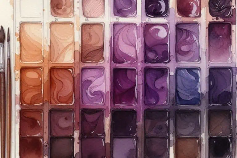
Neutral Colors That Go With Cream
Within both fashion and design, a timeless allure is woven by the delicate dance of color. Amidst this kaleidoscope of choices, one question that emerges like a whisper in the wind is: “What colors go with cream clothes?” As if seeking a symphony, fashion enthusiasts embark on a journey to discover the cream complementary color palette, a realm where neutral tones hold the key to captivating and versatile aesthetics.
| Cream Name | Cream Hex Code | RGB | CMYK Color Code (%) | Shade of Cream |
| Cream | #fffdd0 | 255, 253, 208 | 0, 1, 18, 0 | |
| Dark Cream | #fff39a | 255, 243, 154 | 0, 5, 40, 0 | |
| Light Cream | #ffffed | 255, 255, 237 | 0, 0, 7, 0 | |
| Ivory | #dac0a7 | 218, 192, 167 | 0, 12, 23, 15 | |
| Almond | #f4c29f | 244, 194, 159 | 0, 20, 35, 4 |
At the heart of this exploration lies the enchanting world of neutral colors that harmonize effortlessly with cream. These subdued shades, like steadfast companions, elevate cream to a realm of refined elegance. The soft caress of beige steps forward, embracing cream’s warmth while adding depth and sophistication to any ensemble.
A delicate dance partners cream with beige, as its earthy undertones create a sense of balance that is both calming and chic.

| Color Name | Hex Code | RGB | CMYK Color Code (%) | Shade of Color |
| Cream | #fffdd0 | 255, 253, 208 | 0, 1, 18, 0 | |
| Beige | #f5f5dc | 245, 245, 220 | 0, 0, 10, 4 |
Whispering of timeless allure, the gentle gray emerges as another entrancing companion to cream. The duo weaves a tapestry of modernity, exuding an understated charm that captures attention and subtlety. This partnership finds its zenith in tailored suits, casual knits, and ethereal evening gowns, demonstrating the range and versatility that neutral tones offer.

| Color Name | Hex Code | RGB | CMYK Color Code (%) | Shade of Color |
| Cream | #fffdd0 | 255, 253, 208 | 0, 1, 18, 0 | |
| Gray | #808080 | 128, 128, 128 | 0, 0, 0, 50 |
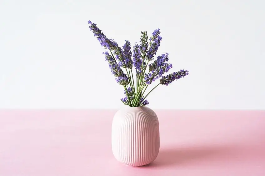
As the sun sets on the day’s endeavors, cream graciously welcomes the dusky embrace of soft, muted tones. The gentle blush of pale pink flirts with cream, infusing a touch of femininity and whimsy that transcends seasons and occasions. Alongside, the serene whispers of pale lavender create an ethereal partnership, breathing a sense of serenity into every outfit ensemble.
| Color Name | Hex Code | RGB | CMYK Color Code (%) | Shade of Color |
| Cream | #fffdd0 | 255, 253, 208 | 0, 1, 18, 0 | |
| Pale Pink | #fadadd | 250, 218, 221 | 0, 13, 12, 2 | |
| Pale Lavender | #dcd0ff | 220, 208, 255 | 14, 18, 0, 0 |
Yet, let us not forget the steadfast embrace of classic white. It stands as the ultimate companion, elevating cream to new heights of purity and sophistication. When cream and white come together, these shades become the essence of timelessness, being able to adapt to any style or event effortlessly.

| Color Name | Hex Code | RGB | CMYK Color Code (%) | Shade of Color |
| Cream | #fffdd0 | 255, 253, 208 | 0, 1, 18, 0 | |
| White | #ffffff | 255, 255, 255 | 0, 0, 0, 0 |
In the symphony of fashion, the interplay between cream and neutral tones creates a masterpiece that defies trends and resonates with individuality. From the serene embrace of beige and taupe to the modern allure of gray and the delicate whispers of pink and lavender, the spectrum of neutral companions evokes a sense of calm confidence that transcends the fleeting fads of the fashion world.
So, whether it is a casual day out, an elegant evening event, or a professional ensemble, the cream complementary color palette remains a steadfast guide to achieving captivating, versatile, and enduring style.
Warm Colors That Go With Cream
In the fields of design and aesthetics, many wonder about what colors go with cream. This inquiry unfolds like an artistic puzzle, enticing decorators, creators, and enthusiasts to unlock the harmonious possibilities that await. Among the myriad choices, the allure of warm colors that match with cream emerges as a beacon of comfort and vibrancy, forging a partnership that exudes timeless charm.
Picture a canvas where cream takes center stage, basking in its inherent softness and tranquility. But what matches with cream to infuse energy and depth?
Enter the realm of warm colors, where a symphony of shades dance in harmony. The gentle touch of peach dances harmoniously alongside cream, infusing a sense of softness and warmth that transforms any space into a haven of tranquility. This partnership is like a serene sunrise, casting a delicate glow that whispers of new beginnings and rejuvenation.

| Color Name | Hex Code | RGB | CMYK Color Code (%) | Shade of Color |
| Cream | #fffdd0 | 255, 253, 208 | 0, 1, 18, 0 | |
| Peach | #ffe5b4 | 255, 229, 180 | 0, 10, 29, 0 |
Venture deeper into the world of warm colors, and the vivacious charm of coral emerges. As coral’s vibrant notes intertwine with cream’s serene embrace, a vivid and inviting ambiance takes shape. This pairing is reminiscent of a beachside sunset, where the sky and sea converge in a mesmerizing display of color that leaves an indelible mark on the heart.

| Color Name | Hex Code | RGB | CMYK Color Code (%) | Shade of Color |
| Cream | #fffdd0 | 255, 253, 208 | 0, 1, 18, 0 | |
| Coral | #ff7f50 | 255, 128, 80 | 0, 50, 69, 0 |
And then, there’s gold – the very embodiment of opulence and splendor. When gold dances with cream, it is as if they are sharing a secret from an age of grandeur. This leads us to an ambiance that exudes a sense of luxury and elegance that remains timeless. Whether it is delicate accents in a living room, or the intricate embroidery on an evening gown, this partnership transforms the ordinary into the extraordinary.

| Color Name | Hex Code | RGB | CMYK Color Code (%) | Shade of Color |
| Cream | #fffdd0 | 255, 253, 208 | 0, 1, 18, 0 | |
| Gold | #ffd700 | 255, 215, 0 | 0, 16, 100, 0 |
In fashion, however, cream becomes a canvas upon which warm tones create a masterpiece. A peach blouse paired with cream trousers radiates an air of effortless sophistication, while a coral dress seems to capture the very essence of summer’s vibrancy. And when gold jewelry adorns a cream outfit, it is as if the sun’s radiant touch has been delicately woven into the ensemble. As we navigate through the world of warm colors that embrace cream, it becomes evident that this partnership is nothing short of a sensory symphony.
The delicate nuances of peach, the vivacious energy of coral, and the opulent allure of gold blend seamlessly with cream’s timeless serenity, creating an ambiance that is both inviting and awe-inspiring.
Cool Colors That Go With Cream
As if conjuring a painter’s palette, the interplay between cream and cool colors unveils a symphony of tranquility, vibrancy, and sophistication that is both captivating and timeless. Imagine a canvas where cream forms the backdrop, akin to a blank page waiting to be adorned with the strokes of color. Alongside the serene embrace of blue unfurls, evoking the tranquil depths of the ocean and the boundless expanse of the sky.
This partnership mirrors the sense of calm that washes over you as you gaze at the horizon, a feeling of serenity that envelops any space it touches.

| Color Name | Hex Code | RGB | CMYK Color Code (%) | Shade of Color |
| Cream | #fffdd0 | 255, 253, 208 | 0, 1, 18, 0 | |
| Powder Blue | #b0e0e6 | 176, 224, 230 | 23, 3, 0, 10 |
Delve deeper into the realm of cool colors, and the verdant beauty of green takes center stage. As green mingles with cream, a sense of nature’s harmony permeates the surroundings. This pairing is reminiscent of a sun-dappled forest, where every shade of green harmonizes in a symphony of life and growth. The combination brings an aura of revitalization and balance, like a breath of fresh air after some summer rain.

| Color Name | Hex Code | RGB | CMYK Color Code (%) | Shade of Color |
| Cream | #fffdd0 | 255, 253, 208 | 0, 1, 18, 0 | |
| Slate Green | #64906c | 100, 144, 108 | 31, 0, 25, 44 |
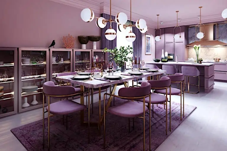
And then there’s purple – the color of mystery and regal elegance. As purple and cream intertwine, it is as if twilight has painted its delicate hues across the canvas. This partnership evokes an air of sophistication, a sense of luxury that, when paired with an experienced touch, is both understated and captivating. The result is an ambiance that feels like the entrance to an enchanting ballroom, where elegance and intrigue intertwine.

| Color Name | Hex Code | RGB | CMYK Color Code (%) | Shade of Color |
| Cream | #fffdd0 | 255, 253, 208 | 0, 1, 18, 0 | |
| Royal Purple | #7851a9 | 120, 81, 169 | 29, 52, 0, 34 |
Within fashion, cream becomes a versatile backdrop upon which cool colors create a visual masterpiece. A blue blouse paired with cream trousers exudes a sense of calm confidence, while a green dress seems to embody the very essence of life’s vibrancy. And when purple accessories grace a cream outfit, it is as if a touch of enchantment has been sprinkled upon your ensemble. As the symphony of cool colors and cream unfolds, it becomes evident that this partnership is a dance of emotions and experiences.
The soothing notes of blue, the invigorating presence of green, and the alluring charm of purple blend seamlessly with cream’s timeless elegance, resulting in an ambiance that is both captivating and invigorating.

In design, however, cool colors find their perfect companion in cream, forming a harmonious fusion that beckons us to explore its beauty. From the tranquil embrace of blue to the vibrant allure of green and the enchanting mystique of purple, these shades craft a narrative that invites us to experience the world through a lens of serenity, vibrancy, and allure.
Bold Colors That Go With Cream
Among the captivating symphony of hues, there exists a mesmerizing realm where the richness of bold colors dances gracefully with the subtlety of cream, crafting an enchanting visual experience that is nothing short of magical. This captivating fusion of shades introduces a sensory journey that resonates deeply with our inner desire for warmth, vibrancy, and a touch of sophistication.
Imagine a canvas where the soft embrace of cream serves as the backdrop for an exhilarating showcase of vivacious colors. Bold, unapologetic, and daring, these shades burst forth with an electrifying energy, capturing attention and igniting a sense of awe.
Picture a passionate red, like the flame of an unquenchable fire, intertwining with cream to create a visual spectacle that is both intense and comforting. The contrast is striking, yet harmonious, as the two opposites find unity in their juxtaposition. This daring pairing speaks of passion, courage, and willingness to embrace the extraordinary.

| Color Name | Hex Code | RGB | CMYK Color Code (%) | Shade of Color |
| Cream | #fffdd0 | 255, 253, 208 | 0, 1, 18, 0 | |
| Burgundy Red | #800020 | 128, 0, 32 | 0, 100, 75, 50 |
Moving along the spectrum, we encounter the warmth of orange – a color that exudes a sunny radiance and a zest for life. As it intertwines with cream, a soothing balance is struck between exuberance and subtlety. The result is a fusion that radiates warmth and hospitality, making any space adorned with these hues feel inviting and spirited. It is a symphony that celebrates the beauty of contrasts, reminding us that life itself is a blend of diverse experiences.

| Color Name | Hex Code | RGB | CMYK Color Code (%) | Shade of Color |
| Cream | #fffdd0 | 255, 253, 208 | 0, 1, 18, 0 | |
| Bright Orange | #f28500 | 242, 133, 0 | 0, 45, 100, 5 |
Then there is yellow – the embodiment of joy, optimism, and sunshine. When entwined with cream, it breathes life into spaces, creating an ambiance that is cheerful and full of life. The pairing speaks to the heart, invoking memories of lazy summer afternoons and the simple pleasures of life. The harmony between the boldness of yellow and the softness of cream showcases a delicate dance between dynamism and subtlety.

| Color Name | Hex Code | RGB | CMYK Color Code (%) | Shade of Color |
| Cream | #fffdd0 | 255, 253, 208 | 0, 1, 18, 0 | |
| Sunny Yellow | #fff917 | 255, 249, 23 | 0, 2, 91, 0 |
In the world of design, the fusion of bold colors with cream is a testament to the power of balance and contrast. It is a journey that invites us to explore the depths of our emotions, daring us to step out of our comfort zones while providing a gentle cushion of familiarity. The richness of red, the warmth of orange, and the radiance of yellow – all woven seamlessly with the timeless elegance of cream – create a symphony that speaks to our innate longing for both the extraordinary and the tranquil.
Tips for Pairing Cream With Other Colors
When turning our gaze towards the realm of interior design, the question on everyone’s lips is often a harmonious chorus: “What color goes with cream?” It is a query that unveils a world of possibilities, a canvas waiting to be transformed into a masterpiece of ambiance and allure. Choosing the perfect colors to complement cream requires a delicate dance between creativity and consideration, and here, we unveil a symphony of tips to guide you on this captivating journey. Firstly, you need to consider the atmosphere you want to bring out within your space. Are you yearning for a serene oasis of calm, an energetic burst of vitality, or a fusion of both?
Cream, with its timeless elegance, serves as a versatile backdrop that adapts seamlessly to diverse palettes.
If a tranquil haven is your aim, then hues like soft pastels or gentle shades of blue can partner gracefully with cream, infusing the room with an air of tranquility. On the other hand, for those who crave vibrancy, jewel tones like emerald green or royal purple can electrify the space when paired with cream accents, creating a dynamic and opulent ambiance. Another aspect to consider where exactly, if any, natural light that filters into the room. Cream, with its warm undertones, interacts beautifully with sunlight, casting a gentle glow that can be enhanced by colors that reflect and amplify this radiance. Soft yellows or delicate shades of peach can harmonize with cream, intensifying the sunlight’s embrace and enveloping the room in a cheerful ambiance.

As you embark on this creative odyssey, remember the cardinal rule: let your personal style shine. Your space is merely an extension of your own identity, a sanctuary of self-expression. Whether your heart yearns for a symphony of soft pastels or craves the vivacious embrace of bold jewel tones, the dance between cream and complementary colors is an opportunity to transform your environment into a reflection of your essence.
In the mesmerizing world of interior design, the question of “what color goes with cream” is not merely a query; it is an invitation to embark on an artistic voyage. With these tips as your compass, navigate the waters of color with confidence and create a space that resonates with your soul – a space where cream and its companions weave an enchanting tale of beauty and harmony.
Frequently Asked Questions
What Color Is Cream?
Cream is a neutral color with slightly yellowish undertones that extends to an off-white appearance. It often resembles the color of dairy cream or the inner part of an eggshell. This presents us with a versatile hue that can be used as the foundation in various design contexts.
What Colors Go Well With Cream When Used in Interior Design?
Cream is an easily adaptable color that pairs well with a wide variety of shades. It complements pastel colors like soft pinks, blues, and greens for a serene ambiance. It can also be paired with bold shades like navy blue, deep red, or charcoal gray for a striking contrast.

Duncan graduated with a diploma in Film and TV production from CityVarsity in 2018, after which he continued pursuing film while taking on a keen interest in writing along the way. Since having graduated, he began working as a freelance videographer, filming a variety of music videos, fashion and short films, adverts, weddings and more. Throughout this, he’s won a number of awards from various film festivals that are both locally and internationally recognized. However, Duncan still enjoys writing articles in between his filming ventures, appreciating the peace and clarity that comes with it.
His articles focus primarily around helping up-and-coming artists explore the basics of certain colors, how these colors can be paired with other shades, as well as what colors are created when you mix one with another. All while relating these shades to historically significant paintings that have incorporated them into their color palette. As a lover of the arts himself, he takes great interest in the Renaissance era of paintings, an era that has directly inspired many of his favorite films.
Learn more about Duncan van der Merwe and about us.