What Colors Go With Maroon? – 28 Harmonizing Hues
This post may contain affiliate links. We may earn a small commission from purchases made through them, at no additional cost to you.
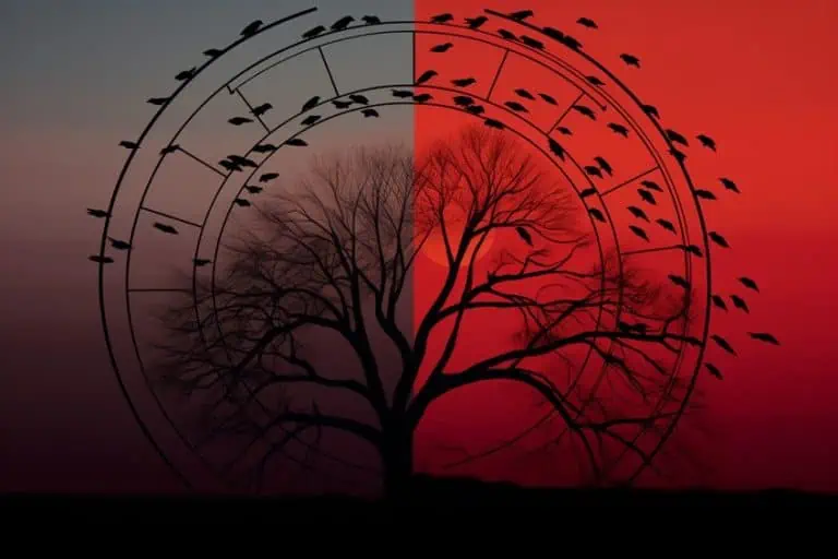
When it comes to colors that provide a sense of elegance and refinement, there may not be a color that screams louder than maroon. With shades of red imbued with purple, this deeply alluring hue can be paired harmoniously with a range of colors to accentuate a design’s depth and richness. From crisp, white shades to warm and natural hues, the possible colors that complement maroon are simply never-ending. Join us today and allow yourself to be inspired by the captivating allure of maroon, and discover 28 perfect color palettes for your next project with us!
What Color Is Maroon?
Derived from the French word for “chestnut” maroon is a deep rich color of brownish red. This is an eclectic spectrum of hues that each possess their own unique charm. With colors ranging from deep hues like burgundy to the more subdued tones of oxblood, there may always be a shade of maroon that is able to suit your needs and preferences. With the varying levels of warmth, complexity, and depth, maroon may be an ideal choice for a wide range of designs and projects.
As you may be able to tell from the table below, maroon is most certainly made up of an expansive selection of elegant shades. Ranging from pale, almost pinkish hues to much darker and deeper colors, this range has often been associated with femininity and grace as well as drama and sophistication, respectively. Lighter colors may be used to add some elegance into your outfit or interior, while deeper shades may instead be used to emphasize a statement you are wanting to make through your work.
| Maroon Color | Maroon Hex Code | RGB | CMYK Color Code (%) | Shade of Maroon |
| Maroon | #800000 | 128, 0, 0 | 10, 15, 90, 10 | |
| Burgundy | #800020 | 128, 0, 32 | 0, 24, 85, 15 | |
| Oxblood | #4a0404 | 248,222,126 | 0, 7, 33, 8 | |
| Fire Brick | #b22222 | 178, 34, 34 | 0, 8, 46, 6 | |
| Bright Maroon | #c32148 | 195, 33, 72 | 0, 14, 65, 0 | |
| Rose Vale | #ab4e52 | 171, 78, 82 | 0, 20, 80, 0 | |
| Ruby Red | #9b111e | 155, 17, 30 | 0, 20, 80, 4 | |
| Sangria | #92000a | 246, 0, 10 | 0, 10, 73, 7 | |
| Rosewood | #65000b | 101, 0, 11 | 0, 13, 100, 0 | |
| Claret | #7f1734 | 127, 23, 52 | 0, 23, 100, 1 |
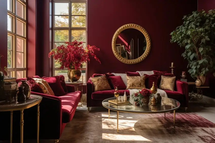
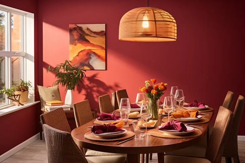
Maroon and Gold
This color combination creates a sumptuous and opulent atmosphere. For example, maroon can be used as the primary color for larger elements like walls or furniture, and incorporates gold accents through accessories, lighting, and trim. Consider gold-framed mirrors or metallic gold throw pillows to add a touch of glamour. Balance is key; use neutral tones for flooring and other large surfaces to prevent the space from feeling too overwhelming. Personal Tip: Experiment with different varieties of gold—whether it’s a soft, brushed gold or a bold metallic gold—to find the right level of richness for your space.
| Shade | Hex Code | CMYK Color Code (%) | RGB Color Code | Color |
| Maroon | #800000 | 0, 100, 100, 50 | 128, 0, 0 | |
| Gold | #FFD700 | 0, 1, 100, 0 | 255, 215, 0 |
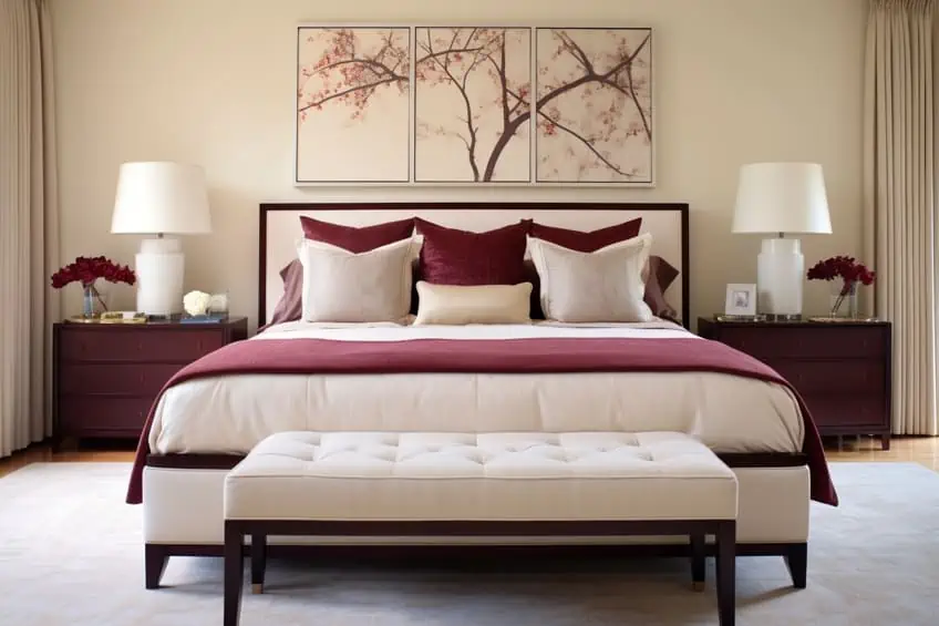
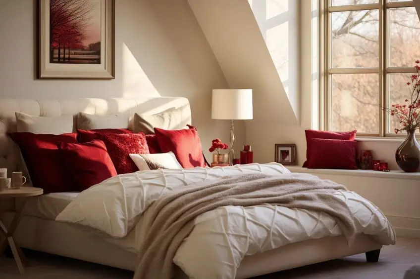
Maroon and Cream
Maroon and cream offer a timeless and sophisticated palette. Use maroon for statement furniture pieces or an accent wall, while incorporating cream for larger surfaces and textiles. This combination works well in both traditional and modern settings. Personal Tip: Introduce texture through cream-colored textiles like plush rugs to add depth and interest to the space.
| Shade | Hex Code | CMYK Color Code (%) | RGB Color Code | Color |
| Maroon | #800000 | 0, 100, 100, 50 | 128, 0, 0 | |
| Cream | #FFFDD0 | 0, 0, 14, 0 | 255, 253, 208 |
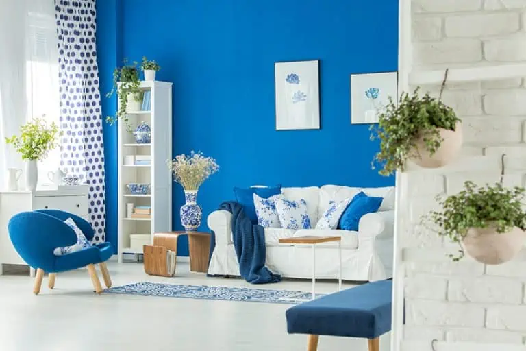
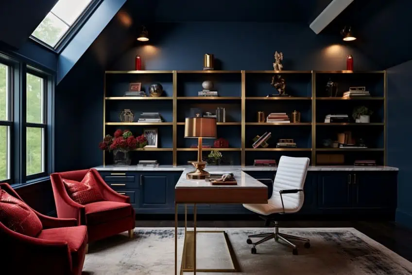
Maroon and Navy Blue
These colors create a dramatic and luxurious ambiance. Consider using maroon for upholstery and navy blue for walls or accent pieces. Metallic accents, like brass or gold, can enhance the richness of this combination. Personal Tip: Balance the dark tones with plenty of natural light and strategically placed mirrors to prevent the space from feeling too enclosed.
| Shade | Hex Code | CMYK Color Code (%) | RGB Color Code | Color |
| Maroon | #800000 | 0, 100, 100, 50 | 128, 0, 0 | |
| Navy Blue | #000080 | 100, 100, 0, 50 | 0, 0, 128 |
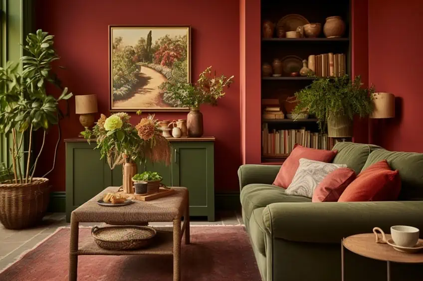
Maroon and Sage Green
Maroon and sage green offer a harmonious and calming color scheme. Use maroon for statement furniture and sage green for walls or larger surfaces. Incorporate natural elements like potted plants to enhance the calming effect. Personal Tip: Opt for muted or grayish sage greens to maintain a sophisticated and modern look.
| Shade | Hex Code | CMYK Color Code (%) | RGB Color Code | Color |
| Maroon | #800000 | 0, 100, 100, 50 | 128, 0, 0 | |
| Sage Green | #8F9779 | 35, 19, 50, 12 | 143, 151, 121 |
Maroon and Charcoal Gray
This combination creates a modern and chic aesthetic. Use maroon as an accent color against a backdrop of charcoal gray walls or furniture. Introduce metallic accents, such as silver or chrome, for a contemporary touch. Personal Tip: Experiment with patterns and textures in gray to add visual interest without compromising the color scheme’s sleekness.
| Shade | Hex Code | CMYK Color Code (%) | RGB Color Code | Color |
| Maroon | #800000 | 0, 100, 100, 50 | 128, 0, 0 | |
| Charcoal Gray | #36454F | 70, 50, 50, 60 | 54, 69, 79 |

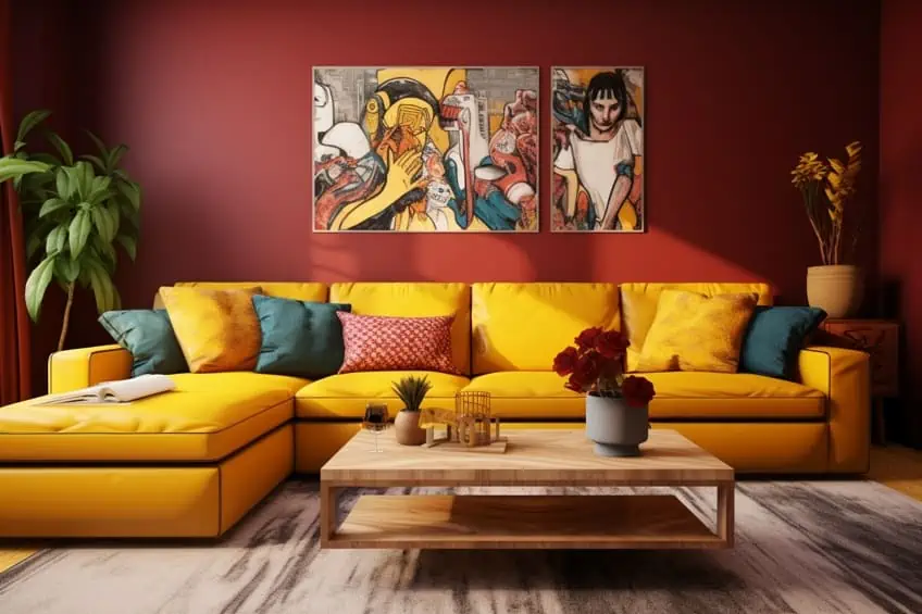
Maroon and Mustard Yellow
Maroon and mustard yellow combine for a vibrant and eclectic palette. Use maroon for larger furniture pieces or accent walls and incorporate pops of mustard yellow through accessories, artwork, or smaller furnishings. Personal Tip: Balance the boldness with neutral elements like beige or cream to prevent the space from feeling overly busy. Consider adding indoor plants for a refreshing touch.
| Shade | Hex Code | CMYK Color Code (%) | RGB Color Code | Color |
| Maroon | #800000 | 0, 100, 100, 50 | 128, 0, 0 | |
| Mustard Yellow | #FFDB58 | 0, 10, 69, 0 | 255, 219, 88 |
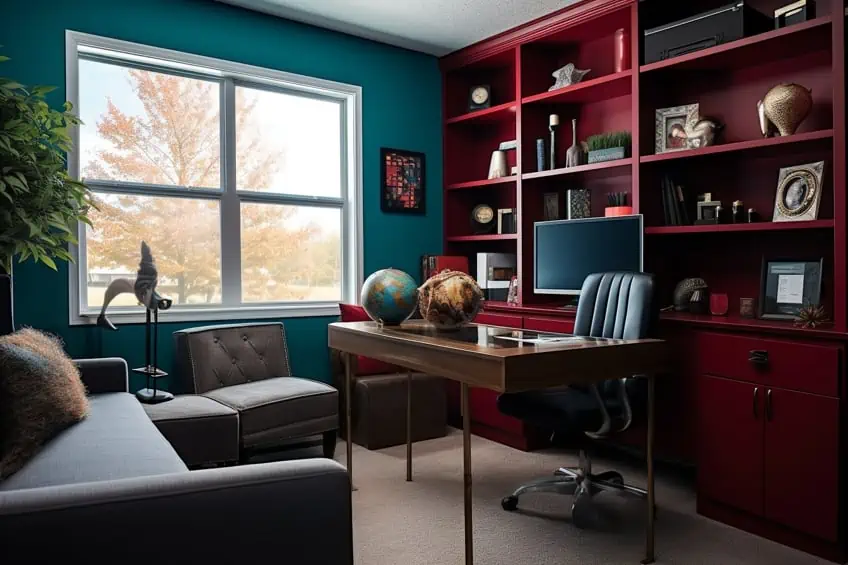
Maroon and Teal
These colors create a dynamic and energizing color scheme. Use maroon for focal points like furniture or accent walls and introduce teal through textiles and decor items. Personal Tip: Play with varying colors of teal to find the right balance—whether it’s a deep, rich teal or a more muted tone—to suit your personal style and the overall vibe of the space.
| Shade | Hex Code | CMYK Color Code (%) | RGB Color Code | Color |
| Maroon | #800000 | 0, 100, 100, 50 | 128, 0, 0 | |
| Teal | #008080 | 100, 0, 33, 50 | 0, 128, 128 |
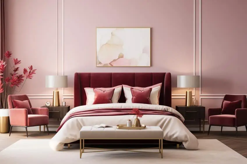
Maroon and Blush Pink
These colors bring together coziness and delicacy. Use maroon as the dominant color and incorporate blush pink through upholstery, throw pillows, or artwork. Personal Tip: To maintain sophistication, opt for muted or dusty blush tones rather than overly bright pinks. Consider incorporating metallic accents or natural textures for added depth.
| Shade | Hex Code | CMYK Color Code (%) | RGB Color Code | Color |
| Maroon | #800000 | 0, 100, 100, 50 | 128, 0, 0 | |
| Blush Pink | #FFD9DC | 0, 20, 11, 0 | 255, 217, 220 |
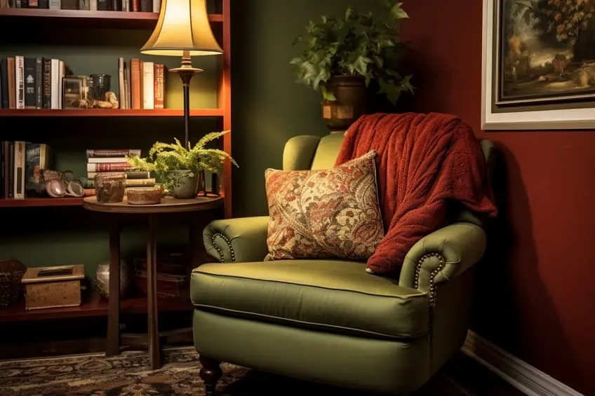
Maroon and Olive Green
This color combination offers a rich and earthy color palette. Use maroon for statement furniture or accent walls and incorporate olive green through textiles and decor. Personal Tip: Add warmth to the space with wooden elements or furniture pieces in natural finishes, creating a balanced and inviting atmosphere.
| Shade | Hex Code | CMYK Color Code (%) | RGB Color Code | Color |
| Maroon | #800000 | 0, 100, 100, 50 | 128, 0, 0 | |
| Olive Green | #556B2F | 56, 22, 100, 29 | 85, 107, 47 |
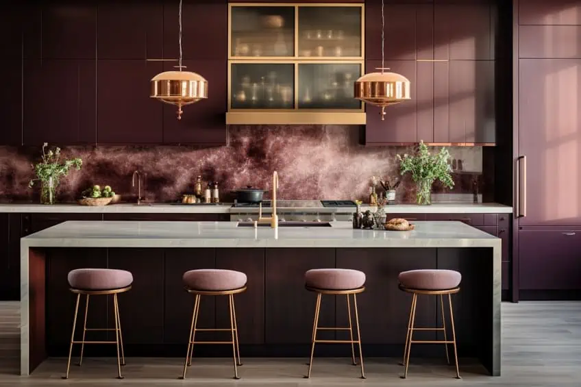
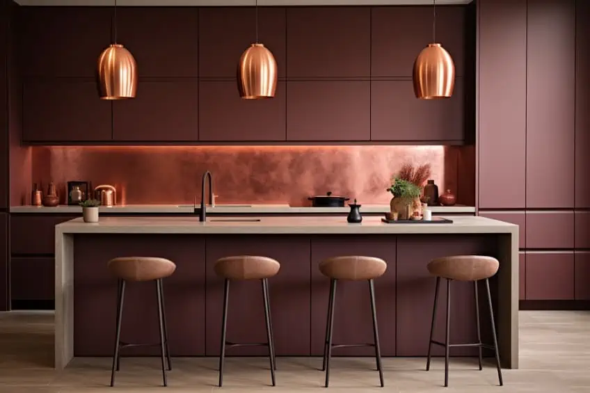
Maroon and Copper
Maroon and copper create a luxurious and warm ambiance. Use maroon as a base color and incorporate copper through lighting fixtures, decor items, and accent details. Personal Tip: Use copper sparingly to avoid overwhelming the space—think pendant lights, vases, or small metallic details for a touch of elegance. Consider incorporating warm, neutral tones to balance the overall color scheme.
| Shade | Hex Code | CMYK Color Code (%) | RGB Color Code | Color |
| Maroon | #800000 | 0, 100, 100, 50 | 128, 0, 0 | |
| Copper | #B87333 | 23, 49, 75, 9 | 184, 115, 51 |
Maroon and Turquoise
These colors create a vibrant and eclectic palette. Use maroon for larger furniture pieces or accent walls and introduce pops of turquoise through artwork or smaller furnishings. For a balanced look, incorporate neutral tones like beige or cream. Personal Tip: Experiment with patterns, combining solid maroon elements with patterned turquoise fabrics or vice versa, to add visual interest and depth.
| Shade | Hex Code | CMYK Color Code (%) | RGB Color Code | Color |
| Maroon | #800000 | 0, 100, 100, 50 | 128, 0, 0 | |
| Turquoise | #40E0D0 | 72, 0, 12, 0 | 64, 224, 208 |

Maroon and Beige
A classic and timeless combination, maroon and beige create an elegant and inviting atmosphere. Use maroon for statement pieces like a sofa or an accent wall, and employ beige for larger surfaces and textiles. Personal Tip: Add interest by layering different shades of beige and incorporating textures such as linen or wool for a sophisticated and cozy feel.
| Shade | Hex Code | CMYK Color Code (%) | RGB Color Code | Color |
| Maroon | #800000 | 0, 100, 100, 50 | 128, 0, 0 | |
| Beige | #F5F5DC | 5, 5, 20, 0 | 245, 245, 220 |
Maroon and Eggplant Purple
This color combination offers a rich and luxurious palette. Use maroon for larger elements like furniture and eggplant purple for accents such as throw pillows or artwork. Personal Tip: Balance the deep tones with neutral colors like cream or gray to prevent the space from feeling too heavy. Consider incorporating metallic accents for a touch of glamour.
| Shade | Hex Code | CMYK Color Code (%) | RGB Color Code | Color |
| Maroon | #800000 | 0, 100, 100, 50 | 128, 0, 0 | |
| Eggplant Purple | #614051 | 38, 74, 0, 49 | 97, 64, 81 |
Maroon and Coral
Maroon and coral create a lively and energetic atmosphere. Use maroon as the anchor color and infuse coral through accent walls, throw pillows, or decor items. Personal Tip: For a modern look, pair maroon and coral with metallic finishes like gold or brass. Keep the overall color scheme well-balanced by incorporating neutral tones in larger areas.
| Shade | Hex Code | CMYK Color Code (%) | RGB Color Code | Color |
| Maroon | #800000 | 0, 100, 100, 50 | 128, 0, 0 | |
| Coral | #FF6F61 | 0, 68, 57, 0 | 255, 111, 97 |

Maroon and Champagne
These colors create an elegant and sophisticated color scheme. Use maroon for focal points like furniture or accent walls and introduce champagne through metallic finishes and accessories. Personal Tip: Incorporate reflective surfaces like mirrors or glass to enhance the luminosity of the champagne tones and create a sense of glamour and refinement.
| Shade | Hex Code | CMYK Color Code (%) | RGB Color Code | Color |
| Maroon | #800000 | 0, 100, 100, 50 | 128, 0, 0 | |
| Champagne | #F7E7CE | 4, 7, 22, 0 | 247, 231, 206 |

Maroon and Forest Green
Maroon and forest green offer a cozy and rich color palette. Use maroon for furniture pieces or accent walls and introduce forest green through textiles and decor. Personal Tip: Enhance the warmth by incorporating natural elements like wooden furniture or earthy textures. Consider using both colors in patterns, such as plaids or botanical prints, for added visual interest.
| Shade | Hex Code | CMYK Color Code (%) | RGB Color Code | Color |
| Maroon | #800000 | 0, 100, 100, 50 | 128, 0, 0 | |
| Forest Green | #228B22 | 82, 0, 100, 45 | 34, 139, 34 |

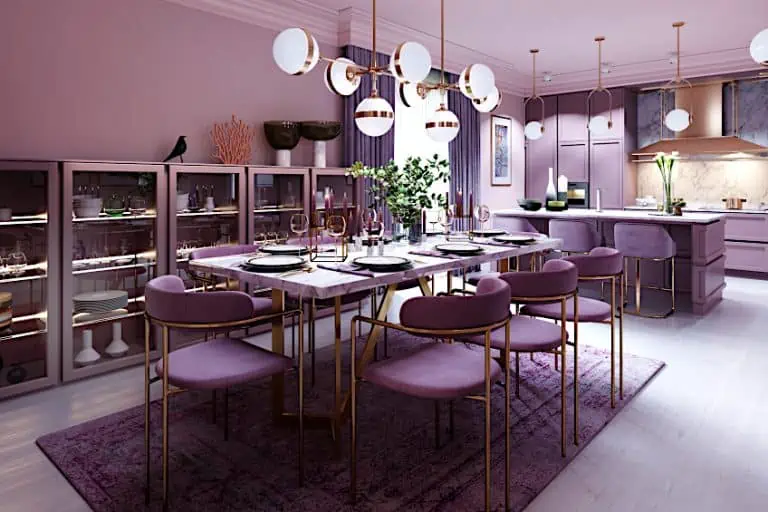
Maroon and Lavender
This color combination creates a serene and calming combination. Use maroon for larger elements and introduce lavender through softer furnishings like bedding or drapes. Personal Tip: Keep the overall atmosphere tranquil by incorporating muted tones and soft textures. Consider using lavender in upholstery for a touch of sophistication.
| Shade | Hex Code | CMYK Color Code (%) | RGB Color Code | Color |
| Maroon | #800000 | 0, 100, 100, 50 | 128, 0, 0 | |
| Lavender | #E6E6FA | 18, 18, 0, 4 | 230, 230, 250 |

Maroon and Burnt Orange
Maroon and burnt orange offer a lively and eclectic color scheme. Use maroon for larger elements and incorporate burnt orange through accent walls, throw pillows, or decor items. Personal Tip: Achieve a balanced look by introducing neutral tones like beige or gray. Consider incorporating metallic accents, such as copper, to add warmth and visual interest to the space.
| Shade | Hex Code | CMYK Color Code (%) | RGB Color Code | Color |
| Maroon | #800000 | 0, 100, 100, 50 | 128, 0, 0 | |
| Burnt Orange | #CC5500 | 0, 60, 100, 20 | 204, 85, 0 |

Claret and Deep Plum
Claret and deep plum create a rich and luxurious ambiance. These deep, sophisticated tones work well in spaces where you want to evoke a sense of opulence and warmth. Personal tip: Use claret and deep plum in upholstery, accent walls, or statement furniture pieces. Balance these dark hues with neutral tones like beige or light gray to prevent the space from feeling too heavy.
| Shade | Hex Code | CMYK Color Code (%) | RGB Color Code | Color |
| Claret | #7F1734 | 0, 94, 78, 69 | 127, 23, 52 | |
| Deep Plum | #45104F | 57, 80, 0, 69 | 69, 16, 79 |
Sangria and Ivory
Sangria paired with ivory creates a vibrant and lively atmosphere. This combination is perfect for spaces where you want to add energy and a touch of playfulness. Personal tip: Use sangria as an accent color in furnishings or decor items against a backdrop of ivory walls or furniture. Introduce metallic accents like gold or brass to enhance the richness of the color scheme.
| Shade | Hex Code | CMYK Color Code (%) | RGB Color Code | Color |
| Sangria | #92000A | 0, 100, 92, 36 | 146, 0, 10 | |
| Ivory | #FFFFF0 | 0, 0, 4, 0 | 255, 255, 240 |
Ruby Red and Charcoal Gray
The pairing of ruby red and charcoal gray is a classic and sophisticated combination. It exudes elegance and can be used to create a timeless look in various design styles. Personal tip: Use ruby red in statement furniture pieces or as an accent wall and complement it with charcoal gray upholstery or curtains. Incorporate reflective surfaces like mirrors or metallic finishes for added glamour.
| Shade | Hex Code | CMYK Color Code (%) | RGB Color Code | Color |
| Ruby Red | #E0115F | 0, 79, 28, 11 | 224, 17, 95 | |
| Charcoal Gray | #36454F | 68, 47, 45, 66 | 54, 69, 79 |

Ruby Red and Cream
Ruby red and cream offer a harmonious blend of warmth and softness. This combination is ideal for creating a cozy and inviting atmosphere in living spaces. Personal tip: Use ruby red in accessories or textiles, such as throw pillows or rugs, against a backdrop of cream-colored walls. Introduce natural textures like wood or rattan to add warmth and balance.
| Shade | Hex Code | CMYK Color Code (%) | RGB Color Code | Color |
| Ruby Red | #E0115F | 0, 79, 28, 11 | 224, 17, 95 | |
| Cream | #FFFDD0 | 0, 0, 14, 0 | 255, 253, 208 |
Rose Vale and Blush Pink
These colors create a delicate and romantic color palette. This combination is perfect for creating a soft and feminine look in bedrooms or living rooms. Personal tip: Use rose vale as a base color on walls or larger furniture items, and incorporate blush pink through decor accents like pillows or artwork. Opt for soft fabrics like velvet to enhance the tactile appeal.
| Shade | Hex Code | CMYK Color Code (%) | RGB Color Code | Color |
| Rose Vale | #AB4E52 | 0, 57, 46, 32 | 171, 78, 82 | |
| Blush Pink | #FFB6C1 | 0, 24, 14, 0 | 255, 182, 193 |

Bright Maroon and Silver
These colors create a bold and modern aesthetic. This combination is suitable for those who want to make a statement and add a touch of glamour to their space. Personal tip: Use bright maroon as a focal point in furniture or accent walls, and complement it with silver accents through metallic finishes or accessories. Keep the rest of the palette neutral to let these colors shine.
| Shade | Hex Code | CMYK Color Code (%) | RGB Color Code | Color |
| Bright Maroon | #C32148 | 0, 83, 73, 21 | 195, 33, 72 | |
| Silver | #C0C0C0 | 0, 0, 0, 25 | 192, 192, 192 |

Fire Brick and Terracotta
Fire brick and terracotta bring warmth and earthiness to a space. This combination is perfect for creating a cozy and inviting atmosphere in rustic or Mediterranean-inspired designs. Personal tip: Use fire brick and terracotta in textiles, such as throw blankets or pottery, and pair them with natural materials like wood and stone. Consider incorporating indoor plants to enhance the earthy vibe.
| Shade | Hex Code | CMYK Color Code (%) | RGB Color Code | Color |
| Fire Brick | #B22222 | 0, 80, 80, 31 | 178, 34, 34 | |
| Terracotta | #E2725B | 0, 49, 38, 11 | 226, 114, 91 |

Oxblood and Navy Blue
Oxblood paired with navy blue creates a sophisticated and regal atmosphere. Use navy blue for larger elements and oxblood for accent pieces. Personal Tip: Incorporate patterns like stripes or chevrons in the two colors for added visual interest, and use gold or brass accents for a touch of glamour.
| Shade | Hex Code | CMYK Color Code (%) | RGB Color Code | Color |
| Oxblood | #4A0000 | 0, 100, 100, 53 | 74, 0, 0 | |
| Navy Blue | #000080 | 100, 100, 0, 50 | 0, 0, 128 |

Burgundy and Sage Green
Burgundy and sage green offer a harmonious and nature-inspired combination. Use sage green for walls and burgundy for furnishings or textiles. Personal Tip: Bring in natural textures like wood and incorporate botanical elements to enhance the organic and calming feel of the space.
| Shade | Hex Code | CMYK Color Code (%) | RGB Color Code | Color |
| Burgundy | #800020 | 0, 100, 80, 69 | 128, 0, 32 | |
| Sage Green | #9FA27F | 32, 15, 53, 0 | 159, 162, 127 |
Rose Vale and Champagne
This pairing creates an elegant and serene atmosphere. Use rose vale for walls and larger surfaces, and champagne for metallic accents or smaller decor elements. Personal Tip: Choose soft, flowing fabrics in rose vale to enhance the serene ambiance, and incorporate mirrors to reflect light and add a touch of glamour.
| Shade | Hex Code | CMYK Color Code (%) | RGB Color Code | Color |
| Rose Vale | #AB4E52 | 0, 57, 46, 32 | 171, 78, 82 | |
| Champagne | #F7E7CE | 4, 7, 22, 0 | 247, 231, 206 |

Ultimately, the key to finding the perfect complementary colors to maroon is to experiment with different hues and combinations. However, you should not forget to trust your instincts when it comes to what feels both visually appealing and true to your personal style. With a little creativity and a keen eye for color theory and combinations, you will be sure to discover a whole slew of palettes that will take your breath away! We hope that you have enjoyed this deep dive on what colors go with maroon as much as we have, and we hope to have you join us again soon.
Frequently Asked Questions
What Colors Complement Maroon?
Maroon pairs well with neutral tones such as beige, gray, and white. Earthy tones like olive green and mustard yellow also complement maroon nicely.
What Colors Can I Match With My Maroon Decor?
When matching your maroon decor with other colors, you need to remember to choose colors that complement or balance out maroon’s warm, rich, and deep shade. Colors that do a great job of doing just that would include green shades like olive, forest, and sage, as well as blue shades such as navy, cobalt, or powder blue.
What Are Some Unexpected Color Combinations That Work Well With Maroon?
Unexpected pairings, like teal or sage green, can create a unique and eye-catching look when combined with maroon. Don’t be afraid to experiment with less conventional color choices.

Duncan graduated with a diploma in Film and TV production from CityVarsity in 2018, after which he continued pursuing film while taking on a keen interest in writing along the way. Since having graduated, he began working as a freelance videographer, filming a variety of music videos, fashion and short films, adverts, weddings and more. Throughout this, he’s won a number of awards from various film festivals that are both locally and internationally recognized. However, Duncan still enjoys writing articles in between his filming ventures, appreciating the peace and clarity that comes with it.
His articles focus primarily around helping up-and-coming artists explore the basics of certain colors, how these colors can be paired with other shades, as well as what colors are created when you mix one with another. All while relating these shades to historically significant paintings that have incorporated them into their color palette. As a lover of the arts himself, he takes great interest in the Renaissance era of paintings, an era that has directly inspired many of his favorite films.
Learn more about Duncan van der Merwe and about us.