Shades of Pink – An Extended Pink Color Palette
This post may contain affiliate links. We may earn a small commission from purchases made through them, at no additional cost to you.
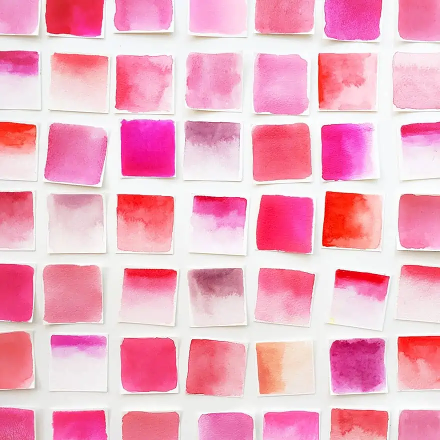
When it comes to a pink color, most of us associate it with femininity. A cheerful, sweet, and romantic color that comes in a range of different shades of pink, from a baby pink color to a hot pink color and many more variations. We will be exploring various shades of pink names, discovering a little history about the color and how some pink shades can be used around the home.
Table of Contents
Shades of Pink: A Brief History
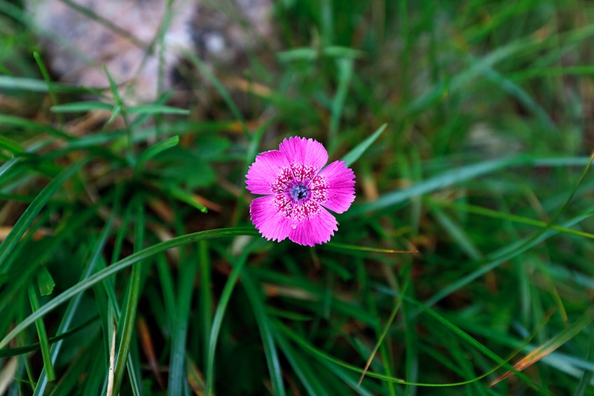
The color pink has had a diverse history, with society forming different perspectives and associations of the color. Pink has not always been associated with feminism, which only developed in more recent history. The name pink was first used near the end of the seventeenth century and was derived from a flower with the same name, the Dianthus plumarius, which is also known simply as pink, garden pink, wild pink, or common pink. This is why so many shades of pink have natural, floral names, like wild orchid pink, french fuchsia, cherry pink, or carnation pink.
During the middle ages and the Renaissance, pink shades like rouge were used more in religious art and the color only stepped out of the shadows in eighteenth-century Europe. Men and women during this time, mostly European aristocrats, wore soft light pink colors as an indication of status and extravagance. A chief mistress of Louis XV, Madame de Pompadour adored the color. In time, a particular pink known as “Rose Pompadour” was named after her by the Sevres porcelain manufacturer.
During the 19th century, pink was still not associated with girls only, and if a boy wore a shade of pink, it was considered a lighter color to red, which had a more masculine connection as red was associated with the military. In fact, most children only wore white in those times because any color would wash out too easily. This was before the discovery of chemical dyes.
Later during the 19th century, the change in the perception of pink started to become more pronounced. Western world men began wearing more neutral or darker colors, and pastels or brighter colors were worn by women. During this time pink also gained a more sensual representation, as it was used in the creation of lingerie. The gradual move of pink becoming more of a feminine color continued during the twentieth century, due to designers of the time creating dresses in shades of pink. This perception was boosted due to various female icons of the time, who chose to wear pink attire. For example, Mamie Eisenhower wore a pink dress to the inauguration ceremony of her husband Dwight D. Eisenhower, who then became the US President in 1953.
During the 1930s and 1940s, inmates who were branded as homosexuals and were kept in concentration camps in Nazi Germany were forced into wearing a pink triangle.
Over the years, this has become an emblem of gay rights. Other causes have also taken up the color pink, the color has become quite familiar in the fight against breast cancer. After the 1940s, pink has become a color that separates the sexes. This societal misconception developed into a general way people view pink. So, pink has become more of a color for girls, while blue has become a color for boys. This is ultimately a form of bias or sexism, and unfortunately, many of us do not even realize this. Ideally, we should not gender colors as it only perpetuates this type of thinking.
When considering the world, many other cultures have embraced the pink color and have not labeled it a female-only color. Various cultures are more open to the use of pink and its various shades. Men in India are commonly seen wearing pink items of clothing or turbans, as the color is used by both males and females. In recent years, in the modern western world, thankfully, pink has become a color that is evolving and reaching new perceptions in fashion and other areas.
The Color Pink: Psychology and Meaning
All colors have meaning and can have an effect on emotions, and as we have already learned, are associated with femininity, romance, calmness, and tenderness. The different shades of pink take the power of red and soothe it with the addition of white. This is why pink is strongly connected to being able to calm aggressiveness. The pale or light pink color varieties provide the most calming effects, whereas the brighter pink shades have the opposite effect and are more stimulating.
A certain pink color known as “drunk tank pink” has been known to be used in certain prison cells, because of its calming effects. When looking at the psychology of colors, it has more to do with each individual’s experiences. Some positive links could include youthfulness, happiness, or a sense of joy. A pink color palette could inspire creativity and soften designs that might be too intense. Some negative associations can include frivolity or a lack of seriousness. Pink can be seen as a weak color that exhibits timidity, or something that is not important.
Pink combined with white can be seen as portraying innocence while combining black with pink can be more evocative.
Sometimes, pink can be unremarkable, but on other occasions pink can be extravagant and in the spotlight. For example, consider Elvis Presley’s 1955 pink Cadillac, a car that most definitely got noticed. Some people might have pleasant memories associated with the color, while others could have unpleasant connections to the color. So, you should really answer the question of how you feel about the color pink yourself.
Different Shades of Pink
Shades of pink can be used in every area of life, from the workplace to your home and what you wear. Graphic design plays an important role in the digital world of advertising, and colors can influence the way you look at things. Painting is another way to express oneself and understanding how colors work together plays a pivotal role in how an art piece comes to life.
The decision to use pastel pink or a hot neon pink shade can alter the way that you present yourself in life or the way that you feel in your space.
Color Theory
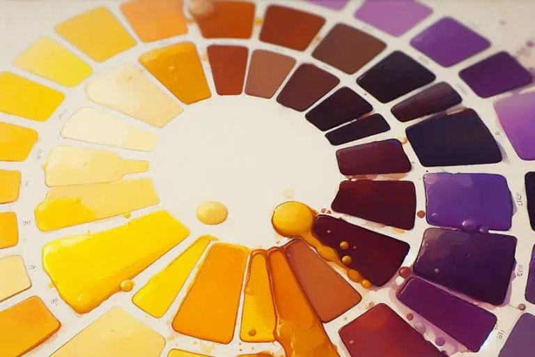
The main color when creating pink is red, and when looking at a more detailed color wheel, you will notice many shades of pink that range from cooler to warmer reds. This “temperature” difference is known as a color bias. So, the type of red you choose as your main color will determine the shade of pink you will make. Cooler reds will favor purple, as they contain a little blue, while warmer reds will lean towards orange. Some examples of warmer reds include cadmium and scarlet red, and these will create pink shades that are similar to peach and coral. Cooler reds include vermilion, or alizarin red, and are more likely to produce your hot pink color as well as magenta.
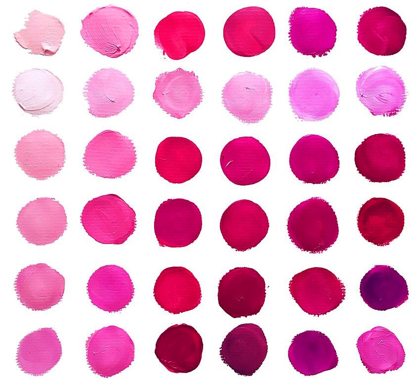
Since white is also used to produce pink shades, the type of white can play a similar role as red when creating pink. Titanium white is a well-known option, and is more opaque, while your zinc white is more transparent. Ultimately, choosing the correct red and mixing in small amounts of white, will be what determines the shade of pink created. When painting, you will most likely want to create some depth and dimension, so you will need to lighten or darken your pink color. To tone down a pink hue, the ideal option is to make use of a complementary color. On the color wheel, complementary colors lay across from each other.
In this case, adding a small amount of green-yellow should mute your bright pink color. Remember to only use small amounts.
To create a darker pink, you can also try and add in more of the same red you are using for the pink color. You may even want to try adding a little purple for a darker pink color. To create a light pink color, it is simply a matter of adding in small amounts of white. You can also attempt creating shades of pink without white, which involves using a light shade of yellow blended with red. This is why experimenting and creating a pink color swatch with a range of pink shades and hues can be helpful before you start painting
Names of Different Shades of Pink
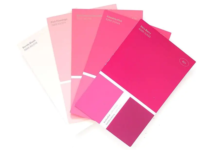
Shades of pink are generally lighter shades of red, which can also be created on television screens and computers. There is a scientific formulation that helps in the creation of the various shades of pink and other colors. When it comes to computers, this is known as the RGB (Red, green, and blue) model, while in printing, it is represented as the CMYK (Cyan, Magenta, Yellow, and Black) model. These models show the percentages of the mentioned colors, or how much of each color is needed to create a shade of pink. Below we are going to be looking at the various popular shades of pink names and their scientific hex codes.
Fuchsia
French fuchsia is named after the flower of the same name and is a cool purple pink with hints of warmth. Some might describe it as a vivid or hot pink color. When this color is overused, it can be a bit overpowering and works well with cooler, darker colors. The name comes from a German botanist, Leonhard Fuchs, who discovered the plant. Fuchsia is said to encourage confidence and represent maturity. You can use the color in design together with a lighter gray or tan for a sophisticated look. To grab attention, try using it with black for contrast and bright green for a burst of colors.
| Color Shade | Hex Code | CMYK Code | RGB Code | Pink Color |
| Fuchsia | #c154c1 | 0, 56, 0, 24 | 193, 84, 193 |
Carnation Pink
This pink color is softer, and lighter, and is similar in appearance to the carnation flower. Carnation falls close to baby pink but is slightly darker in color. The name carnation, as a color, was first recorded in 1535. This soft pink represents a certain sophistication and also gratitude. Colors that compliment carnation lay on the opposite side of the color wheel and include colors like your mint greens. A pink color palette is often used for weddings, and this particular shade of blush pink would work nicely.
It is a romantic light shade of pink that would work alongside champagne pink nicely.
| Color Shade | Hex Code | CMYK Code | RGB Code | Pink Color |
| Carnation | #ffa6c9 | 0, 35, 21, 0 | 255, 166, 201 |
Hot Pink Color
Hot pink is a bright and warm color that can be found between dark pink and light pink. Most pinks are associated with calmness; however, hot pink is the opposite and is more of an energetic deep pink shade and has a rebellious nature. The color is bold and stands out, it is vibrant and is a color that represents youth. The color can be paired with black, but it can also work well with yellows and various cyan colors. Lighter pinks and white can help to tone it down. Hot pink can also be thought of as Barbie pink, as it has a stylistic flair and clean appearance.
| Color Shade | Hex Code | CMYK Code | RGB Code | Pink Color |
| Hot Pink Color | #ff69b4 | 0, 59, 29, 0 | 255, 105, 180 |
Magenta
Magenta can be found halfway between blue and red and is quite bright with a slight purple undertone. As a result, magenta is often called a purple shade like violet. The color is said to represent emotional balance and also elicits a sense of energy. The color can help to promote compassion and is thought of as a cheerful color. Sometimes fuchsia and magenta are confused with each other, this is because it is a similar color when looking at them from the RGB color code perspective. However, they are completely separate colors when it comes to printing and painting. Magenta is more red-blue, while fuchsia is more red-purple.
| Color Shade | Hex Code | CMYK Code | RGB Code | Pink Color |
| Magenta | #ff00ff | 0, 100, 0, 0 | 255, 0, 255 |
Baby Pink Color
Baby pink is a more delicate and lighter shade of blush pink. The color was first recorded in 1928 and is associated more with baby girls. However, this association was not always so, and many boys in the past wore pink as it was seen as a strong color. Today, baby rooms and little girls wear baby pink, but it can easily be added to a pink color palette for all kinds of design purposes.
| Color Shade | Hex Code | CMYK Code | RGB Code | Pink Color |
| Baby Pink Color | #f4c2c2 | 0, 20, 20, 4 | 244, 194, 194 |
Coral
Coral seems to be quite a popular color as it is vibrant, bold, and can be either soothing or stimulating. The color can be described as an orange or sometimes reddish-pink shade, and is very similar to a salmon pink. The name was first used early on during the sixteenth century. Coral combines nicely with colors like Tiffany blue as well as white. Coral is a versatile color, and some shades contain more orange, while others contain more yellow and pink. The shades of coral that appear deeper in color tend to appear more like the actual coral in the ocean and can contain purple and red undertones. Whatever shades of coral are chosen, this will influence how you pair with its complementary color. The deeper shades go best with teal blue and green, while the more vibrant shades go well with tiffany blue, and aqua blue. In design, when it comes to evoking feelings of summer and sun, shades of coral and blue are the perfect combination.
| Color Shade | Hex Code | CMYK Code | RGB Code | Pink Color |
| Coral | #f88379 | 0, 47, 51, 3 | 248, 131, 121 |
Peach
Peach is a softer light orange-pink, named after the color of the peach fruit’s skin. In designs, the color helps to produce feelings of joy, warmth, and a sense of comfort. The color is associated with spring and is the perfect warm color to use that will brighten up your day all year round. Peach is a subtle color that can be used similar to your neutral colors. When combined with cream, gold, or beige, it can lend a certain amount of elegance as well as sophistication to a room. The color can be used in smaller rooms, like a bathroom, as it works well with all skin tones.
There are many amazing shades of peach, with names like peach puff, papaya whip, and marshmallow snow.
| Color Shade | Hex Code | CMYK Code | RGB Code | Pink Color |
| Peach | #fad1af | 0, 16, 30, 2 | 250, 209, 175 |
Light Pink Color
There are so many light shades of pink, the light pink color in the table below is slightly darker than the pale pink. The light pink shades are considered more relaxing and calming, while the darker, more vibrant shades do the exact opposite and are more stimulating. A combination of light pink and gray will go well in a bedroom to provide a calming effect.
| Color Shade | Hex Code | CMYK Code | RGB Code | Pink Color |
| Light Pink Color | #ffb6c1 | 0, 29, 24, 0 | 255, 182, 193 | |
| Pale Pink | #fadadd | 0, 13, 12, 2 | 250, 218, 221 |
Watermelon
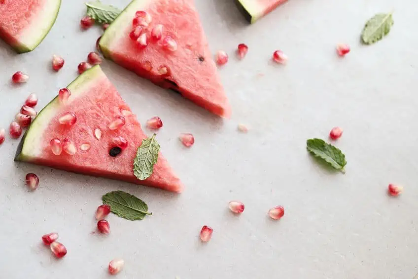
Watermelon is a warm, medium pink that is similar to the flesh color of watermelon. Watermelon is a truly aptly named shade of sweet pink, it makes you think of warm summer days full of sweet fruit. A fun pink shade that is invigorating and lively. You can use the color on its own but can be paired with neutral spring colors like Sahara or a mist gray. The color also works well with all shades of pink for a more monochromatic effect.
| Color Shade | Hex Code | CMYK Code | RGB Code | Pink Color |
| Watermelon | #ff6b6d | 0, 58, 57, 0 | 255, 107, 109 |
Rose Pink
Rose pink is a vibrant purple-pink that was first recorded as a color name in the 1760s. The color is a symbol of joy, gratitude, and grace, a more gentle color when compared to red. Seen as more of a feminine color, it can lend a certain romantic and playful mood. A pink color palette, including rose pink, can work well with your taupe, and soft green tones. Rose pink can vary from very light dusty shades to a more brilliant rose with a deeper red tone.
| Color Shade | Hex Code | CMYK Code | RGB Code | Pink Color |
| Rose Pink | #ff66cc | 0, 60, 20, 0 | 255, 102, 204 |
A few More Amazing Shades of Pink
There are many shades of pink and some of them have the most unusual names, like Mexican pink or Schauss pink! I have listed a few of the more common pink colors above, but here are a few more you might recognize. Many of the shades of pink names are derived from plants and animals, however, quite a few come from other sources.
For example, cotton candy pink, raspberry pink, strawberry, or the highly delicious rose bonbon pink.
| Color Shade | Hex Code | CMYK Code | RGB Code | Pink Color |
| Cotton Candy | #ffbcd9 | 0, 26, 15, 0 | 255, 188, 217 | |
| Bubblegum Pink | #f58092 | 0, 48, 40, 4 | 245, 128, 146 | |
| Baker-Miller Pink | #ff91af | 0, 43, 31, 0 | 255, 145, 175 | |
| Flamingo | #fda4ba | 0, 35, 26, 1 | 253, 164, 186 | |
| Pink Lace | #ffddf4 | 0, 13, 4, 0 | 255, 221, 244 | |
| Cherry Blossom Pink | #ffb7c5 | 0, 28, 23, 0 | 255, 183, 197 |
How to Make Shades of Pink With Acrylic Paints
A pink color palette is as important as any other color when it comes to acrylic painting. Pink can be used in anything from sunsets to flowers and skin tones. To make sure you have the best shades of pink available, it is a good idea to create some color swatches to test out and keep a record of all the pink colors.
Creating Shades of Pink
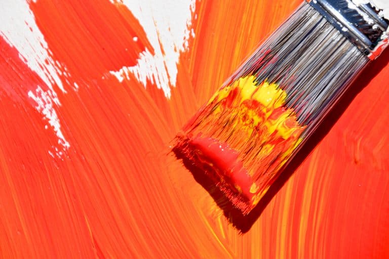
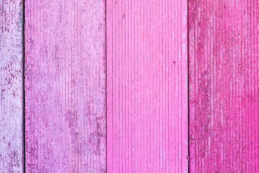
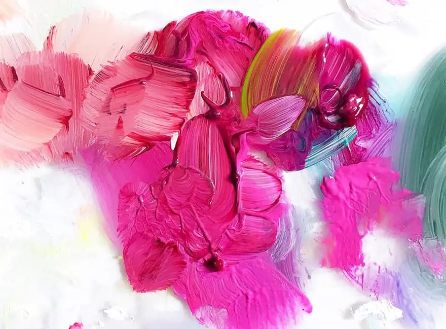
Place the colors onto a palette, a short distance from each other. Take a little red and add this to the white paint and mix. Slowly keep adding a little white paint to the red paint until you reach your desired shade of pink. Adding red paint to the white is easier and uses less paint.
When darkening or changing the color hue, many simply add in black. However, black can be a bit too aggressive in toning down a color. As a better alternative, use the complementary color of pink, which is green. You can also try using blue or navy to darken pink colors. As you mix colors, make sure to make a color swatch with the amounts of paint you used as an easy future reference.
Selecting the White Paint
As mentioned above when discussing the color theory, you also have different white colors you can choose from. When it comes to acrylics, it is best to choose a more opaque white, which is your titanium white. The zinc white does not create the best pink and may only lighten your red paint. Take note, when it comes to watercolors, you do not have to use white paints, as you can simply add more water to dilute and lighten the red paint. In addition, for a pink pearl shade, you can use a pearly white shade that includes flakes of glitter.

Selecting the Perfect Red
The shade of red you choose will affect the shade of pink that it is created. Cadmium red is a popular color and will produce more of an orange-pink, while a scarlet red will produce a more vibrant pink. You will need to try out and test a few colors to discover the pink color you are looking for.
- Naphthol Red: The pink created with this red will be more transparent but still vibrant
- Alizarin Crimson: This red leans towards purple, so the pink produced will also have traces of purple and blue
- Earthy Red Tones: These can be used to create more natural pink shades
- Quinacridone: Produces something close to a hot pink color when mixed with white. When mixed with grays or blues, you can produce a variety of beautiful shades of pink
Decorating With Pink Shades
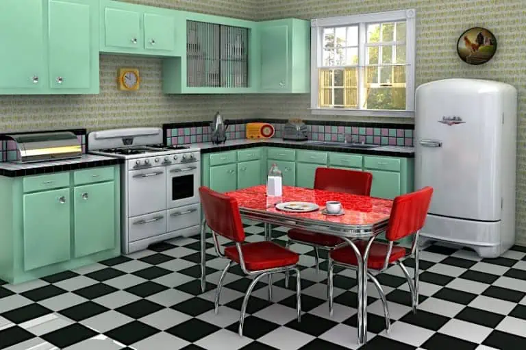
Pink is a color that can pair with most colors, and a pink color palette, with its variety and shades of pink, can create space that is either sophisticated or playful, as well as calming or stimulating. Below are a few color combinations you might want to consider when designing your next bedroom or living room.

Blue and Pink
You might not consider using blue with pink, but these two can complement each other quite nicely. You can easily create a calm space, especially for a bedroom, using softer shades of blue, pink, and white. Tone things up and make it more eccentric by combining a navy color with fuchsia.
Gray and Pink
Combining pinks and grays will lend a certain sophistication to a room. Especially, when using the soft or light pink colors with a lavish amount of gray, which will then provide a certain amount of depth to the look.
White and Pink
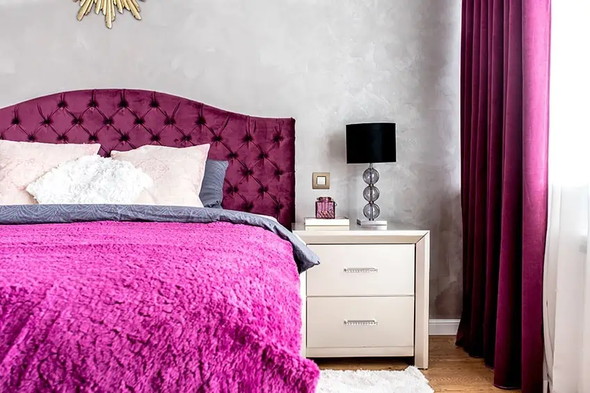
This might be an obvious choice, and it is a simple, yet elegant color combination. These colors create a warm yet fresh feeling that invites people in. You cannot go wrong with these colors, as any white should go with all shades of pink. White is a fantastic color to use alongside pink simply because it goes nicely with every shade.
From vanilla ice, rose bonbon, to valentine pink, white perfectly brings out the vibrancy of these shades.
Green and Pink
Depending on what shades of each color you use, you can create different moods. The softer colors like your pale pinks and sage green can create a more serene atmosphere while using more vibrant pinks and greens can be more exciting and invigorating.
Black and Pink
This is a more daring combination and might not be something that everybody likes. However, black and pink will create a more sophisticated look. By simply adding black or darker accents to a pink room, it can already provide more depth and character. Consider using a peach and ebony combination in a bedroom.
Peach can provide that soft color without being too feminine, and besides ebony, it combines well with dark gray and white.
Trending Shades of Pink
Every season new trends are happening in all walks of life from fashion design to home decor and design. Some of the more well-known color trends in the past include colors like millennial pink and Pantone rose quartz. Millennium pink became extremely popular as an Instagram-friendly color. However, these trends are frequently changing and evolving.

Looking at interior design and the trend towards a more holistic view of design, the move has shifted more towards the calming, softer pinks. Recently, colors like cherry blossom or Sakura. However, the more vibrant pinks have not been left out, especially in fashion design. Colors like bubblegum pink are something that many are wearing, from clothing items to accessories. In general, pink is a versatile color and is suitable for all kinds of skin tones. Pink is also slowly becoming a more universal color, and something both males and females can wear.
Hopefully, this article has opened your mind to the versatility of pink. Pink is not simply a color for young girls, but it can be used in a wide range of different settings, from prison rooms to wedding decorations. We have discussed many of the most beautiful shades of pink as well as how you can use them in home and graphic design or in your painting exploits.
Frequently Asked Questions
What Colors Make Pink?
The two colors that make pink are red and white. When mixing these two colors, the pink shade will depend on how much of these two colors are combined. The more white, the lighter the shade. You can also create a pink shade without white, by using yellow instead.
What Does Pink Represent?
In most cases, pink represents love and romance, and femininity. Other qualities associated with pink include softness, compassion, kindness, and nurturing. Pink can also have calming or stimulating effects. Light pink colors are calming, while the more vibrant colors are more energizing.
How Is a Light Pink Color Made?
A light pink color is relatively easy to create. All you need is your chosen red and white paint, then take a little red and add this to the white. This first addition of paint should give you a lighter red color. However, if you have made a darker shade of red, you then add more white paint to make a light pink color.
How To Create a Hot Pink Color?
A hot pink color is a shade of pink that is located somewhere between dark pink and a light pink color. You can make it by combining some red, blue as well as purple, then add white to achieve the desired hot pink color.
What Colors Complement Pink?
When looking at the color wheel, green is the complementary color of pink. However, there are many shades of pink, as it is considered a versatile color that can work with most colors. For example, light pink goes well with yellow, and pink can also work with oranges and reds. You can even use pink with blues and black, depending on the shade of pink. Ultimately, there should be a pink color palette that can suit everybody.
Duncan graduated with a diploma in Film and TV production from CityVarsity in 2018, after which he continued pursuing film while taking on a keen interest in writing along the way. Since having graduated, he began working as a freelance videographer, filming a variety of music videos, fashion and short films, adverts, weddings and more. Throughout this, he’s won a number of awards from various film festivals that are both locally and internationally recognized. However, Duncan still enjoys writing articles in between his filming ventures, appreciating the peace and clarity that comes with it.
His articles focus primarily around helping up-and-coming artists explore the basics of certain colors, how these colors can be paired with other shades, as well as what colors are created when you mix one with another. All while relating these shades to historically significant paintings that have incorporated them into their color palette. As a lover of the arts himself, he takes great interest in the Renaissance era of paintings, an era that has directly inspired many of his favorite films.
Learn more about Duncan van der Merwe and about us.
