What Colors Make Orange? – How to Mix Different Shades of Orange
This post may contain affiliate links. We may earn a small commission from purchases made through them, at no additional cost to you.
Orange is an incredibly loved color among artists throughout history. Some cultures consider orange to be a sacred hue, and others associate it with royalty. As a secondary color, orange is created by mixing two primary shades. Dynamic, warm, and bold, knowing how to blend vibrant oranges is worth your while.
Table of Contents
- 1 A Brief History of the Color Orange
- 2 The Ancient World and Orange
- 3 What is in a Name Orange?
- 4 Orange as a Spiritual Color
- 5 Other Meanings of the Color Orange
- 6 How to Mix Orange Colors
- 7 Creating a Vibrant Orange
- 8 Creating Muted Shades of Orange
- 9 How to Make Orange with Tints and Shades
- 10 A Scientific Model for Creating Different Shades of Orange
- 11 Our Final Tips and Tricks for Mixing and Using Orange in Paintings
- 12 Frequently Asked Questions
A Brief History of the Color Orange
The warm and bold impression of orange has made it a significant color throughout history. Orange, even before it got its name, has had a strong impact on many ancient cultures. Whether a deep red fiery orange or a golden shade, artists throughout the ages have loved to use orange.
The Ancient World and Orange
The history of the color orange is a long one, dating back many centuries. Ancient Egyptian artists used the realgar mineral to create a beautiful yellow-orange shade used in tomb paintings. Realgar, like many pigment-making minerals, is highly toxic because it contains arsenic. While the Egyptians used the mineral to make paint, the Chinese used it to deflect snakes. The Ancient Romans used a different but equally toxic mineral to create their own shade of golden orange. The Romans prized orpiment as a trade item. Medieval artists used both the orpiment and realgar pigments in their illuminated manuscripts.
What is in a Name Orange?
Did orange receive its name because of the fruit? Or did the fruit receive its name because of the color? These questions are as old and as hotly debated as the chicken or egg argument. Let us find out the answer, shall we? Before the 16th century, European artists called orange hues yellow-red as there was no official term for the color yet. This deep yellow-orange shade was often called saffron before the word orange entered the English language. When Portuguese merchants first began bringing orange trees from Asia to Europe, everything changed. The color orange got its name from the ripe orange fruit, which had various names in various languages.
Orange as a Spiritual Color
We have briefly hinted at some of the beliefs surrounding the color orange. The color is multifaceted and has different meanings across cultures. Asian religions use orange a lot, with many holy men and monks choosing to wear orange robes. For practitioners of Confucianism, the color orange represents transformation, perhaps because it is a prominent color in the sky during the shift between day and night. The naming of orange shades as saffron in China and India highlights the richness these cultures associate with the hue.
The Buddist religion uses the color orange or saffron a lot. For the Buddhists, orange represents the highest state of illumination with connections to perfection. Sometimes, the orange color symbolizes a journey for knowledge. We can also find the color orange extensively throughout the Hindu religion.
Other Meanings of the Color Orange
After 1809, following the first western produced synthetic orange pigment, western artists began to use orange extensively. Impressionist and Pre-Raphaelite painters particularly loved orange hues, using them to capture natural light effects. In the natural world, we associate orange hues with excitement and warmth.
Many artists have used the color orange to great effect. Toulouse-Lautrec painted the frenetic dance halls of Paris using various shades of orange, while Monet was fond of using orange in his sunsets. Vincent van Gogh is possibly the artist who loved orange more than anything. Using vibrant orange hues to contrast with his dark purples and blues, van Gogh demonstrates a mastery of this color.
Today, different orange shades have various connotations. While a bright yellow-orange makes us think of summer, a deep pumpkin orange makes us feel cozy, imagining Halloween nights and falling autumn leaves. Finding the perfect shade of orange can completely change to the emotions a painting produces.
How to Mix Orange Colors
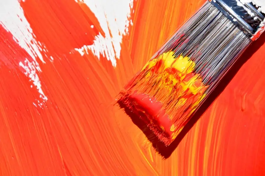
At a surface level, making an orange shade is as simple as combining red and yellow. Things do get a little more complicated when you want to know how to mix different orange shades. Do you want a brighter and lighter yellow-orange or a deep red-orange? The answer lies in the values of red and yellow you choose to use. In this next section, we are going to go back to the basics of color theory so that you have the skills and knowledge to mix an orange of any value.
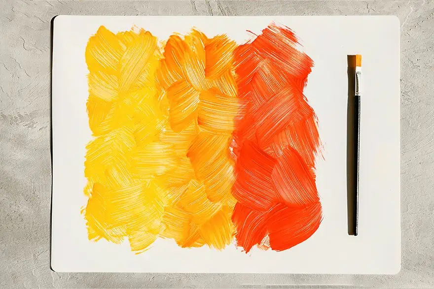
Tertiary, Secondary, and Primary Colors
The color wheel has three different classes of color; tertiary, secondary, and primary. Primary colors are the fundamental colors that you cannot create by combining other colors. Red is a primary color, as is blue, and also yellow. Mixing any two of these three colors together makes a color we call secondary. Orange is a secondary color, and you can make it by combining a shade of yellow with a shade of red. Although orange is a singular color, there are so many different shades and tones of orange. Knowing how to make variations in orange shades requires an understanding of color bias.
What you need to Know About the Color Bias to Make Orange
Creating the perfect orange is not as simple as grabbing the closest yellow and red and mixing them. Try gathering together all the different red and yellow paints in your collection. You will see that there is a great variety in the warmth of these different colors. Some cool reds are rich and deep, almost purple, while other warm reds seem to be almost orange. Some cool yellows tend towards green, while other warm yellows lean towards orange. You can mix any red with any yellow, and you will get an orange, but you need to look a little closer if you want to control the exact shade of your orange.
Vibrant secondary colors can only include two primary colors, or else they will become muddied up. If you combine a cool red with a cool yellow, you will get a muddy orange because these cooler primary colors both contain a little of the third primary color, blue. For example, cadmium lemon is a cooler yellow with a little bit of blue, while a warm Naples yellow has a little bit of red pigmentation. In terms of red, a vibrant and bright coquelicot red includes some yellow. In contrast, vermilion red is deeper and contains some blue. If you were to combine a warm red like vermillion with a cold yellow like cadmium lemon, your orange will contain some blue and appear muddy.
Ranking Yellow Shades from Warm to Cool
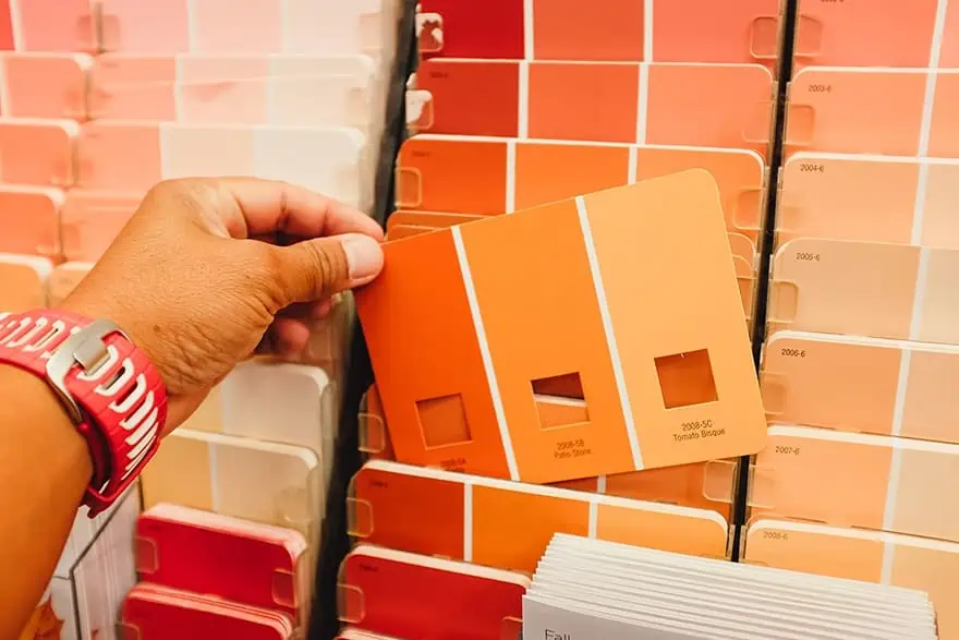
It is pretty easy to tell the relative temperature of a yellow color just by looking at it. Yellows that appear closer to orange are warmer in relation to yellows that seem a little more green. Color temperature is not absolute. Here, we have ranked the common yellow shades from warm to cool as follows:
- Yellow ochre
- Mustard yellow
- Saffron yellow
- Golden yellow
- Canary yellow
- Cadmium yellow
- Cadmium lemon
Ranking Red Shades from Warm to Cool
You can also tell the warmth of a red with relative ease. Reds that seem to lean closer to purple are the cooler shades, while reds that seem more like orange are warmer. Here is a ranking of popular red colors from warm to cool:
- Coquelicot red
- Scarlet
- Light red
- Venetian red
- Cadmium red
- Carnelion red
- Vermillion
- Magenta
- Alizarin crimson
Creating a Vibrant Orange
Ultimately, the lesson of color bias is that to create vibrant orange color, we need to use a warm red and a warm yellow. Cadmium yellow and cadmium red lean heavily towards orange, so mixing them creates a bright and vibrant shade. Cadmium yellow and alizarin crimson also create a beautiful and robust orange, but it is not as warm as the cadmium yellow and red combination. This difference in temperature makes sense because alizarin crimson is a much cooler red than cadmium. The orange you create also depends on the ratio of red and yellow you use. If you want to know how to make red orange, try experimenting with adding a little redder than yellow.
Creating Muted Shades of Orange
When painting, we need various shades of color to create depth and dimension. While it is essential to know how to create vibrant oranges, it is just as important to understand how to mix more muted tones. It is very rare for any artist to use a lot of true orange in a painting because it can be overwhelming. There are several ways that you can either blend a muted orange or mute an orange you already have.
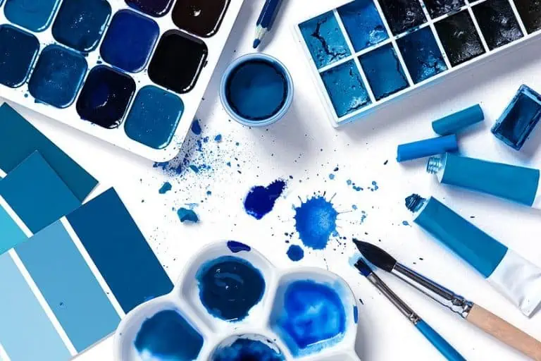
The first step in muting a color is to find the color that complements it or the color that sits across from it on the wheel. The complementing colors cancel each other out. Orange is complemented by blue, so this is the first choice for muting. You can also use shades of green to mute orange, just play around and see what works best for the color you desire.
Muting Orange with Blue
We are going to use the warm and rich orange created with cadmium yellow and cadmium red as the basis for our muting experiments. Blue is the best option for creating a muted neutral orange, but there are so many different blues! The relative temperature of your blue will affect your orange outcome, so there is room for experimentation. Using a warm blue, like cobalt blue, will translate into a warm, but muted, orange. If you choose to use a cooler blue, like ultramarine blue, your muted orange will be slightly cooler too. You may be wondering how to make dark orange. If you choose to mute your orange with a dark and cool blue, it will end up with a small amount of green in it.
Muting Orange with Green
Green is close to blue on the color wheel, so it also complements orange to a degree. You can create beautiful muted oranges ranging from robust deep shades to light brown oranges using green as a muting agent. The more variations of color you can create, the more believable and dimensional your painting. Muting some of your orange paint with green is a wonderful way to create a more diverse color palette.
Mixing our cadmium orange with a pthalo green shade will create a cooler and darker shade of orange, while a Veronese green will be much lighter. If you want a warmer and more robust muted orange, try mixing your cadmium shade with some cadmium green.
How to Make Orange with Tints and Shades
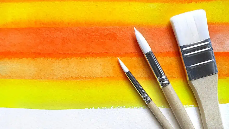
Tinting and shading are basically lightening and darkening a color. The value of a particular hue refers to how light or dark it is. Artists often use different values of color to create contrast and definition in their work. For example, say you are painting a spooky Halloween pumpkin with a light inside. The places where the light hits the inside of the pumpkin will be a much lighter orange than the rest of the pumpkin. Using lighter and darker shades of color can also create dimension. Returning to our pumpkin example, using a darker orange towards the edges of the pumpkin will make it appear more three-dimensional. You could also use a darker value of orange in between the ridges and a lighter shade at the top of each ridge to create the dimension.
How to Make Light Orange
White is the most common color used to create tints of any color. Adding white to our cadmium orange will lighten it to a shade similar to a creamsicle. Using white does make the color less vibrant, however, so there is another option. You can also add a little more yellow to your orange shade to make it lighter but retain the brightness. Experiment with adding different yellows and white to find the exact shade you are looking for.
How to Make Dark Orange
To make any color darker, you can add a small amount of black. Black can be a little dangerous, however, for two reasons. The first reason is that a little bit of black goes an incredibly long way, and adding too much can be difficult to fix. The second reason why some artists prefer to steer away from using black is that it often has a green base. Adding black that contains green to your orange is likely to make it muddy and brownish. You can try adding dark shades of red to your orange to darken it. As always, keep experimenting.
A Scientific Model for Creating Different Shades of Orange
We have only scratched the surface of color theory so far. There are a lot more technicalities involving different proportions of various pigments, but you do not need to understand these to successfully mix many orange shades. Nevertheless, if you do understand the technicalities of color theory, we have created a reference table to help you.
| Orange Shade | Hex Number | % Red, Yellow, Blue, Green | Proportion of Colors |
| True Orange | #FC6600 | 252% Red, 102% Green, 0% Blue | ½ red and ½ yellow |
| Bronze | #B1560F | 177% Yellow, 86% Red, 15% Blue, a tiny bit of black | ½ yellow, more red than blue, and a small amount of black |
| Rust | #b7410e | 183% Red and Yellow, 14% Blue, a tiny bit of black | ½ yellow, ½ red, and a small amount of blue and black |
| Apricot | #EF820D | 239% Yellow, 130% Red, 13% Blue | ⅔ yellow, ⅓ red, and the smallest amount of blue |
| Goldenrod | #DBA520 | 219% Yellow, 165% Red, 32% Blue | Mostly yellow, a small amount of red, a tiny bit of blue and black |
| Honey | #EB9605 | 235% Yellow, 150% Red, 5% Blue | ⅔ yellow, ⅓ red, a tiny bit of blue |
| Firebrick | #B22222 | 178% Red and Yellow, 34% Blue | Equal parts yellow and red, a touch of blue and black |
| Salmon | #FA8072 | 250% Red, 128% Yellow | Just over half red and slightly less than half yellow |
Our Final Tips and Tricks for Mixing and Using Orange in Paintings
Knowing what colors two colors make orange is an important skill. Not only will it help you add more life, vibrancy, and dimension to your paintings, but it is also a gateway into understanding the complexities of color theory. Although this post has provided instructions for making a vivid shade of orange, you are unlikely to use such a bright shade very often.
When mixing and muting any color, the temperature is an essential consideration. To make orange, always aim to use a warm red and a warm yellow because they lean towards orange and each other. Although orange is typically seen as a warmer color, you do get cooler variations which can be made using cooler primary colors.
Have fun and experiment. We find keeping a record of your color experiments by swatching and recording the composite colors very helpful for future reference. There is almost no end to the color variations you can achieve in orange, and each shade lends your painting a slightly different emotional atmosphere.
Frequently Asked Questions
What Color Complements Orange?
True orange is complemented by true blue because the two sit opposite one another on the color wheel. You can use these complementing colors to mute each other or for added contrast. The reason why colors are said to complement each other is that they make each other seem more vibrant when placed side by side. It is possible to make multiple different shades of orange, and each one will have a specific shade of blue as a compliment. For example, a salmon-orange complements a teal better.
Can you use Orange and Green to Make Brown?
Yes, you can! One of the best ways to make brown is to combine green and orange. Brown is a tertiary color created by mixing any two colors that are secondary. The relative temperature of the green and orange shades you mix will determine the exact shade of brown you make.
How can you Make Orange Lighter?
If you have quite a dark and bright orange color and you want to make it a little lighter, the easiest method is to add a little bit of white. White can make the color a little dull, however, so we suggest also trying some yellow. The addition of yellow may change the tone of the orange slightly, but it will retain the bright vibrancy.
How can you Darken Orange?
There are three different methods you can use to make a shade of orange darker. The first is to use a tiny amount of black. Sometimes the black can make your orange slightly green depending on the brand. You can also use a little blue to darken your orange. Blue is probably the safest option because it does not change the value and quality of your orange shade.
How do you Tone Down Bright Orange Paint?
Toning down or muting a color is actually very easy. All you need is the complementing color. In the case of orange, blue is the complementing color. Start by adding the smallest amount of blue to your orange and gradually add more until you are happy with your shade.
Duncan graduated with a diploma in Film and TV production from CityVarsity in 2018, after which he continued pursuing film while taking on a keen interest in writing along the way. Since having graduated, he began working as a freelance videographer, filming a variety of music videos, fashion and short films, adverts, weddings and more. Throughout this, he’s won a number of awards from various film festivals that are both locally and internationally recognized. However, Duncan still enjoys writing articles in between his filming ventures, appreciating the peace and clarity that comes with it.
His articles focus primarily around helping up-and-coming artists explore the basics of certain colors, how these colors can be paired with other shades, as well as what colors are created when you mix one with another. All while relating these shades to historically significant paintings that have incorporated them into their color palette. As a lover of the arts himself, he takes great interest in the Renaissance era of paintings, an era that has directly inspired many of his favorite films.
Learn more about Duncan van der Merwe and about us.
