Muted Colors – Complete Guide About Desaturated Color Palette
This post may contain affiliate links. We may earn a small commission from purchases made through them, at no additional cost to you.
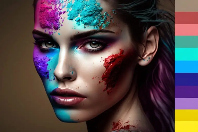
Vibrant colors are attractive and eye-catching; however, they can be used a lot more effectively when combined with muted tones. Bright colors draw your attention, but if used excessively, they can become uncomfortable to look at. Even though more vibrant colors have their place, so do muted colors, which have a more subtle and calming effect. Understanding what is involved in a dull color palette can help with a variety of applications from painting to graphic design and even fashion.
What is a Muted Color?
Muted colors are those colors that are opposite of bright and possess a low saturation. The muted tones have a duller and more subdued or gray appearance. Think of a bright and sunny day and the appearance of colors versus a cloudy day. The brightness and intensity of the color have been muted. Muted colors are classified as desaturated. When describing saturation, you are looking at the level of purity, where a pure color is measured at 100 percent and moves down the scale to zero percent or gray. So, colors that lean more towards the grayscale are considered muted colors.
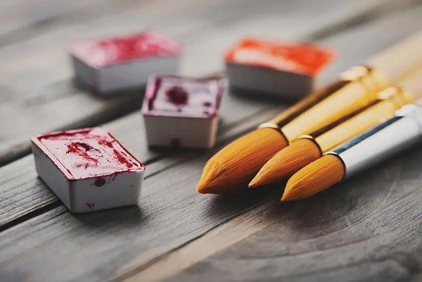
In many cases, to mute a paint color, you can simply add in small amounts of black, gray, or white. Another popular method is to add complementary colors. For example, you can desaturate a red color by blending in some green. However, this could change the temperature of your color, making it cooler or warmer. Unlike vibrant colors that pop out at you, designs, or images with muted colors, can be easier to look at.
Creating Muted Colors
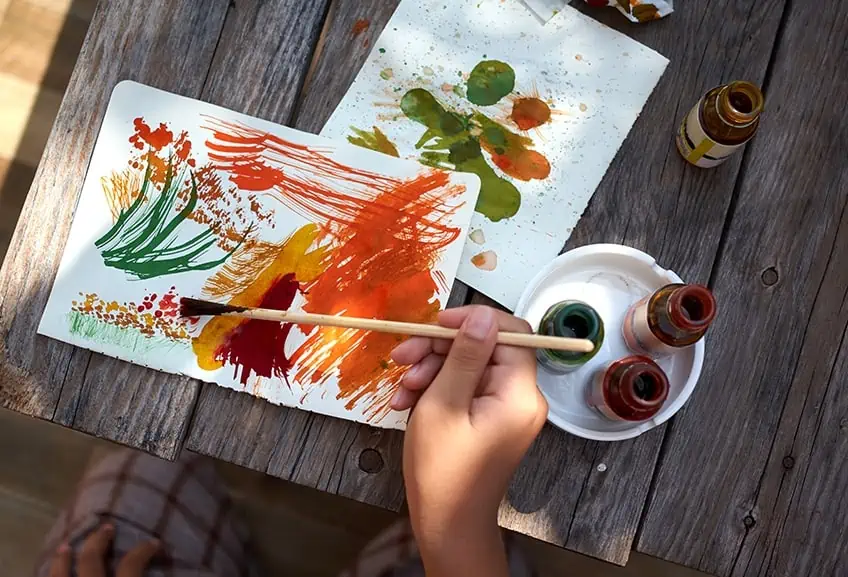
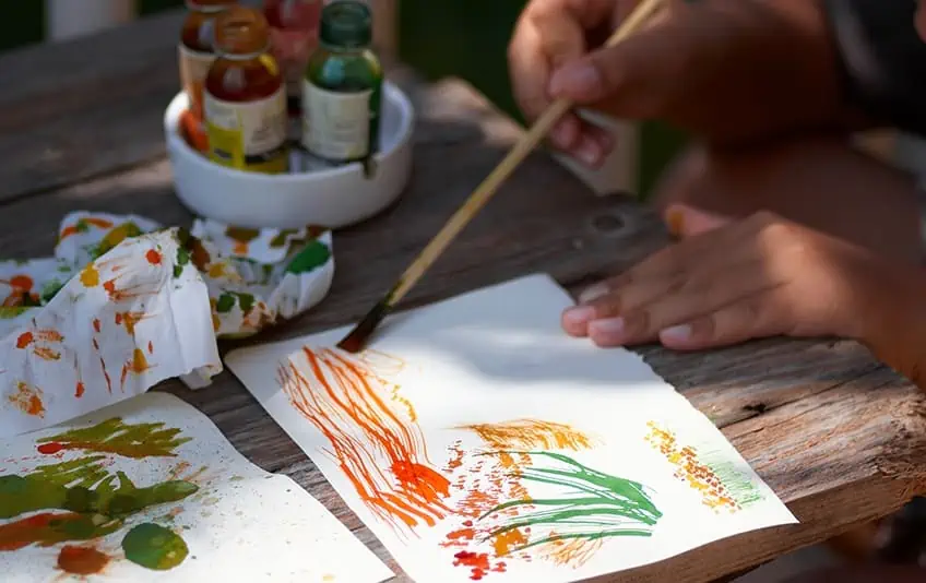
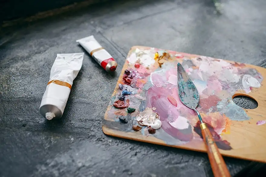
As an artist who is just starting, maybe you find yourself using more vibrant colors and failing to properly utilize a muted color palette. The process of creating muted colors is not difficult and can easily be done by doing the following.
- Mix in a little black paint, which should darken and mute a color
- Blend in a little white paint, which should also mute the color and lighten it
- For something in-between, mix in some gray, which should create another hue
- Take the complementary color and use it to blend with your chosen color. For example, mix in a little orange to mute blue. You can also use colors like burnt sienna or raw umber
- You can also use brown or other earth color tones
Black and white are contrasting colors, which is what you sometimes want in your paintings. When you have too much of the same hue, it can become difficult to observe different aspects of a painting. When adding black or white, you help to create more contrast by either making something lighter or darker. These colors also automatically provide muted tones. Experiment with all the above methods to see what results occur, however in every case, you will create a desaturated color palette. One of the more popular methods is to use a complementary color as it will create a richer tone when compared to using only black or white paint.
Every design or situation will require a variety of colors. The most reliable way to reproduce colors is to create a desaturated color palette. Creating different muted colors and making notes so you can replicate the colors in the future when you need them.
Using Muted Tones
Depending on what you want to achieve, it may improve the whole effect by including a balance of vibrant and muted colors. When you create a design that contains vibrant colors that are surrounded by more vivid colors, it can greatly lessen the overall effect. For example, take two colors, a vibrant red and vibrant green. When looking at these colors, each one will be vying for attention, it might even be unpleasant to look at. The brightness can be particularly unpleasant with computer graphics.
An answer to the above issue is to use a vibrant red alongside a desaturated green. This helps the red stand out, while the green is easier on the eyes, creating a little bit more depth and dimension to the image.
When painting and you use an entire vibrant color palette, what will the focus point be as everything will be on the same brightness level? The intended focal point is overwhelmed by all the surrounding colors, your attention is drawn all over the place. However, if you add in some muted tones from a dull color palette, it should create more contrast and certain aspects of the painting will stand out. An observer now has a point of focus, and the painting becomes more visually attractive. Of course, that is not to say you should not ever have a dominantly vibrant painting. There are times when this effect is what you will be looking for. Our main point is to bring appreciation to what muted colors can achieve for a painting.
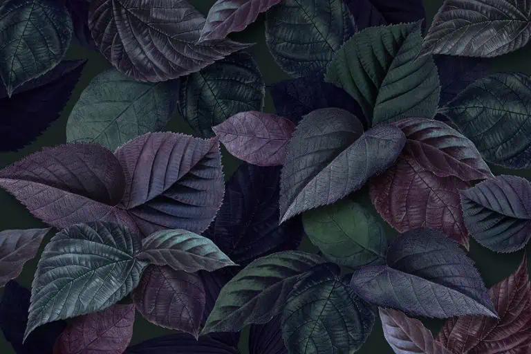
Subtleness is what makes muted colors so effective. They are not attention grabbers; they are happy to stay in the background and create a more interesting visual experience. Muted tones can provide a more harmonious blend of colors, encouraging the viewer to take a closer look. You can create more realistic shadows and natural landscape scenes. Muted colors can also be used as an underpainting, to set the mood for the rest of your painting. For example, when creating misty ocean landscapes. Muted tones are the perfect way to demonstrate a cold and rainy day or a mysterious forest scene.
Famous Paintings and a Muted Color Palette
Everybody has their own style of painting, so one way of painting is not necessarily better than another. As we have mentioned, some have and will create vibrant color-dominant paintings that are quite beautiful and expressive. For example, Vincent Van Gogh’s Fishing Boats On The Beach At Saintes-Maries-de-la-Mer (1888). This painting stands out for its vibrant orange, yellow and blue colors.
A muted color palette is just as fascinating. There is a popular painting technique that involves using a base of muted colors, for example, muted browns, purples, and blues. This is combined with small areas of vibrant color that provide a focus. An example of this would be George Henry’s River Landscape By Moonlight (1887).
In Gustav Klimt’s The Kiss (1908), he uses a varied color palette including muted colors to create a feeling of intimacy. The muted yellow tones that form the background help to make the purples, reds, greens, and blues stand out without making the painting appear overly vibrant.
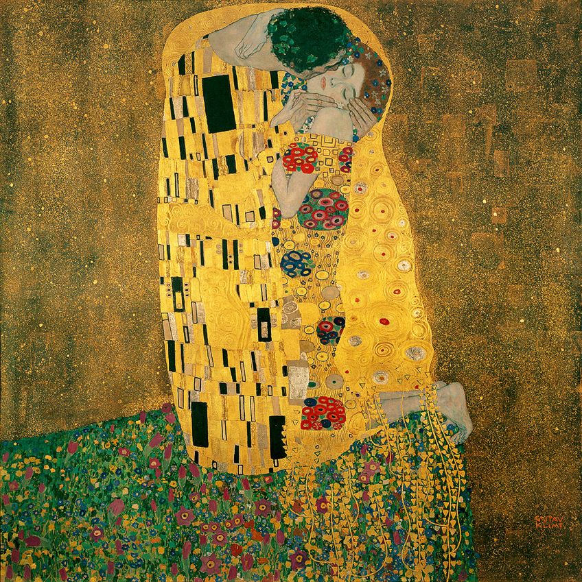 The Kiss (1907-1908) by Gustav Klimt; Gustav Klimt, Public domain, via Wikimedia Commons
A painting that creates a visible contrast is Johannes Vermeer’s Girl with a Pearl Earring (1665). The image created provides a high level of contrast with the vibrant whites of the collar and eyes. All of this is in contrast to the darker background with muted and cooler colors. Below are a few more examples of artists using a muted color palette.
- George Inness, Home At Montclair (1892)
- Vilhelm Hammershoi, Interior from Strandgade with Sunlight on the Floor (1901)
- Childe Hassam, Late Afternoon, New York, Winter (1900)
- Edgar Degas, L’Etoile (The Star) (1878)
- George Inness, Home At Montclair (1892)
Popular Muted Colors
Muted colors are used successfully in paintings, but muted tones are also used in computer graphics. Certain color tones can help to get a message across when marketing a product or service. Sometimes colors can do a better job at conveying a message than words, or at least enhances the overall effect. Many of the graphics online today prefer muted designs as it is easier on the eyes. Below are some popular muted colors along with their hex codes and percentage of colors for graphics and printing.
Warm Reds
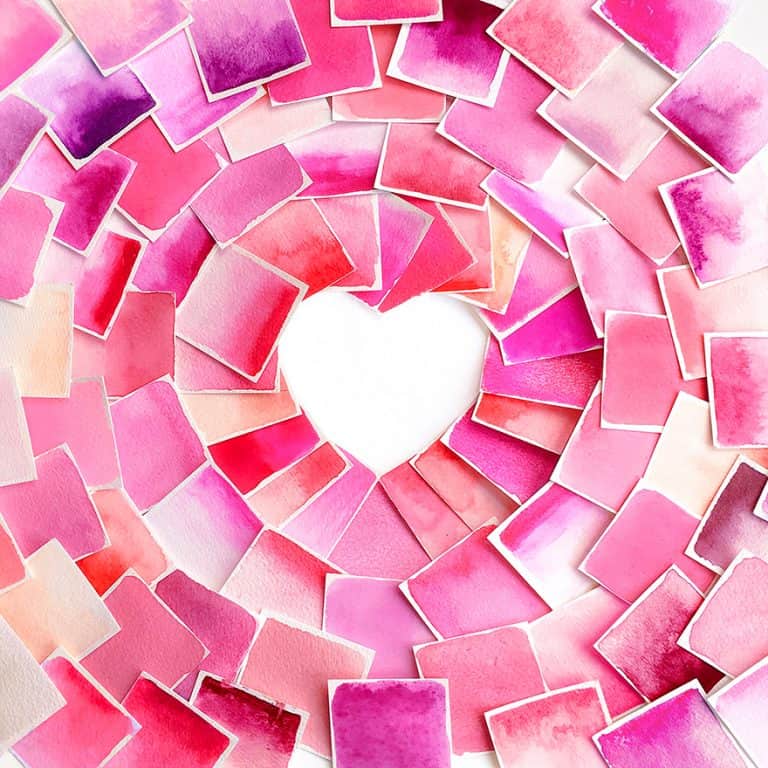
All shades of red can be associated with romance and love, and there are many shades as well as muted tones available. Not only are there vibrant reds but consider the softer pink tones that inspire warmth, serenity, and happiness. These colors have been used in art, interior design, clothing design, and make-up.
| Color Name | Muted Color | Hex Code | RGB % | CMYK % |
| Fire Opal | #E96245 | 91.4, 38.4, 27.1 | 0, 58, 70, 9 | |
| Vivid Tangerine | #F4AC90 | 95.7, 67.5, 56.5 | 0, 30, 41, 4 | |
| Champagne | #F1E6CD | 94.5, 90.2, 80.4 | 0, 5, 15, 5 |
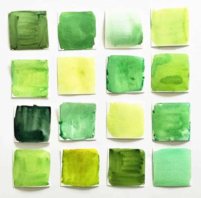
Soft Green and Minty Hues
Popular colors that have surfaced include a variety of shades of green. The muted colors have a fresh, yet calming effect and can be used in a nursery or a bathroom. These colors can easily be used with more vibrant colors, or as a muted color palette for a softer and more luxurious feel.
| Color Name | Muted Color | Hex Code | RGB % | CMYK % |
| Sherwood Green | #035229 | 1.2, 32.2, 16.1 | 96, 0, 50, 68 | |
| Lime Green | #08CE67 | 3.1, 80.8, 40.4 | 96, 0, 50, 19 | |
| Soft lime Green | #6AFAAF | 41.6, 98, 68.6 | 58, 0, 30, 2 |
Gray Muted Tones
These are maybe the most important muted colors and come in a range of shades and hues. You can use these muted gray colors to mix into the saturated and brighter colors, which will then give you a muted tone. When you have a dull color palette of grays, then you have more control over how dark or light you want to make your muted color.
| Color Name | Muted Color | Hex Code | RGB % | CMYK % |
| Charcoal | #232023 | 13.7, 12.5, 13.7 | 0, 9, 0, 86 | |
| Dark Gray | #808080 | 50.2, 50.2, 50.2 | 0, 0, 0, 50 | |
| Gray | #A9A9A9 | 66.3, 66.3, 66.3 | 0, 0, 0, 34 |
Brown Muted Colors
A muted brown palette can be used to change the hue of a color, which creates muted tones. There is a huge variety of muted tones, which makes it possible for creating some wonderful landscapes as well as other natural settings.
| Color Name | Muted Color | Hex Code | RGB % | CMYK % |
| Raw Umber | #826644 | 51, 40, 26.7 | 0, 22, 48, 49 | |
| Toast | #997864 | 60, 47.1, 39.2 | 0, 22, 35, 40 | |
| Pastel Brown | #836953 | 51.4, 41.2, 32.5 | 0, 20, 37, 49 |
Muted Blue Colors
Blue is a useful color and, in most cases, presents a sense of tranquility and calm. A muted blue-gray is quite versatile in décor as it can fit in with most styles and can be used on walls, trims, doors, and cabinets. A muted blue can also add a nice background color to certain paintings, especially ocean or sky settings.
| Color Name | Muted Color | Hex Code | RGB % | CMYK % |
| Dark moderate blue | #436E91 | 26.3, 43.1, 56.9 | 4, 24, 0, 43 | |
| Muted Blue | #3B719F | 23.1, 44.3, 62.4 | 63, 29, 0, 38 | |
| Light Slate Blue | #5889B1 | 53.7, 53.7, 100 | 46, 46, 0, 0 |
Creating a Muted Underpainting With Acrylics
You can experiment and have fun with colors you want to use for your underpainting to see what happens and what effects are created. You can use this technique on canvas, watercolor, or canvas paper. However, is underpainting necessary? The answer to this question is up to you, some would highly recommend it, while others do not feel it is necessary.
An underpainting helps to cover a bright white canvas and provides a starting point for the rest of the painting. You can also create dimension and depth and it can provide a base onto which you can add lighter and darker areas. Highly saturated colors like bright oranges might not be a good idea, rather consider muted colors that will enhance the painting more. What color will be the most prevalent in your painting? This color would then be the best choice for your underpainting. During the process, make sure to record your muted color palette so you can come back to it in the future. To follow are a few techniques you can use to create a good underpainting.
Color Wash
This involves covering the entire surface of the canvas. This uses some diluted paint to subtly create an underpainting. When using acrylics, you can simply add water to the mix. The dilution can be anything from 30 to 60 percent. Using less water will create a more opaque wash, while more water will create a watercolor or more transparent effect. You can also use an acrylic medium for a color wash. To get the correct mixing ratio, make sure to read the direction on the bottle.
Grisaille Underpainting
This is an underpainting done in shades of gray. You can use darker grays for areas of shadow and apply lighter tones where more light is expected. You can use a brush and paint to “draw” on the canvas. The color is easy to work with, so if you do make a mistake, you can simply paint over the area. After you are done and the layer has dried, you can then layer colors over the gray.
Creating Darker and Lighter Areas
This is also known as the tonal value, which is what an underpainting can achieve before you even begin painting. Start by applying the darker layers of your chosen color, which will help to create the areas of shadow or darkness. You can then add some general shapes to create a basic idea of where objects will be located. Continue to add thin lighter tones. When applying an underpainting, you can use more than one color. For example, earthy or neutral muted underpainting and brighter background color. You can also leave areas of the canvas open so that these appear brighter when painted. This can also be done with the underpainting, leaving areas of underpainting open so that they come through in the final painting.
Muted Colors in Design
Many of us do not fully appreciate the role color plays in our everyday lives. Do you stop to admire the colors of a beautiful sunrise or sunset? When walking in nature, how do the surroundings and the colors make you feel? In the design field, be it graphic or interior design, colors play a role in creating an atmosphere and can profoundly affect your mood. Muted colors have become quite popular everywhere, creating a way to connect with people.
Website Design
There is an art to web design when creating appealing websites and advertisements. Digital art has become fashionable to create printable versions as well as online digital art pieces. Many who are involved with website design, have fallen into the trend of flat designs. This means images with no shading or gradient, which eliminates any dimension. This is supposed to create more of a simplistic, clean look.
However, today many realize the effects colors have on people and how they can influence the content and usability of a site. Muted tones have added a new dimension while improving the overall functionality of a website. Instead of all bright colors, which can be hard on the eyes, muted tones provide a calmer and more modern approach.
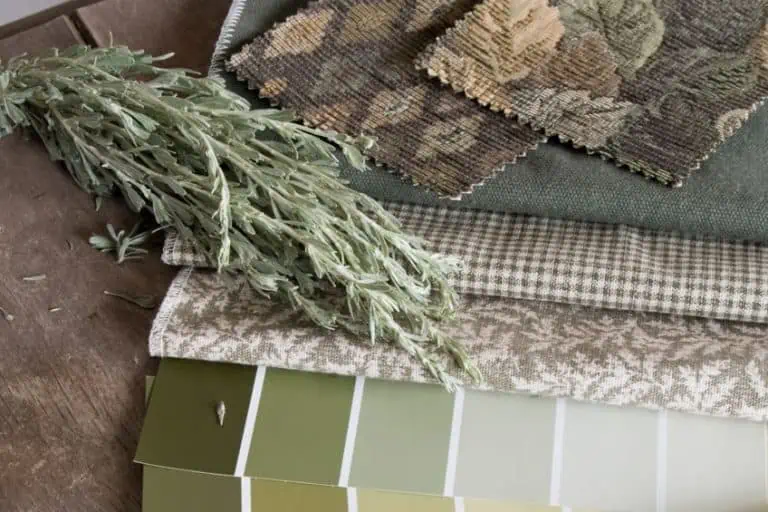
Interior Décor
Some enjoy the vibrant and bold colors for their homes, while others prefer the more muted tones, or maybe a combination of these colors. Muted tones do provide a calmer, yet fresh appeal and are easier on the eyes. Of course, the decision is up to each individual and their unique tastes. However, muted colors are not always bland, you can easily create any number of different color hues that suit your needs. Select your favorite color and choose a muted version, easily pair it with other neutral colors to create a sophisticated and elegant look. You can also choose cooler or warmer colors, add in patterns or accessories to enhance the look. Painting walls a muted color can also set a mood, for example, try muted colors in the bedroom to create a calming atmosphere. The bedroom especially is a room where you do not want any overpowering and bright colors. A muted color palette can successfully be used in any room of the home.
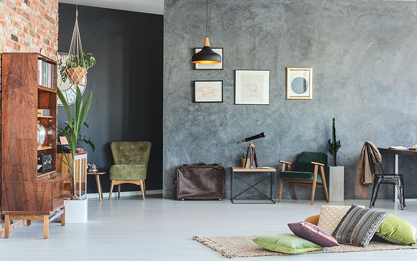
Small spaces could pose a problem when painting and decorating a room. Choosing incorrect colors or design ideas can make a room seem even smaller. Neutral colors are a good choice, however, even here your choice can affect the outcome. A neutral color that is overly muted, might make a smaller space seem darker. Warm neutral colors and colors that reflect light are better choices and add white accents to create a more spacious look. You can also choose another color, which can also be slightly muted. This can include neutral furnishings and accessories.
Muted Colors in Fashion
In color type consulting, there are different categories in which people are classified, based on their natural colors and which colors suit them best. The “Soft Autumn” and the “Soft Summer” are two of these categories.
- The “Soft Autumn” has a warm skin tone with golden undertones and eye colors that can range from brown to green to blue. Muted colors that go well with this color type are warm and natural, such as beige, olive green, brown, burgundy and orange.
- “Soft Summer” has a cool skin tone with rosy undertones and eye colors that can range from blue to gray to green. Muted colors that go well with this color type are cool and soft, such as gray, blue, lavender, rose and light blue.
Find out more about it in this soft autumn vs soft summer color palette article.
Frequently Asked Questions
What Is a Muted Color?
Muted tones can have different hues and values and are not limited to dull grays and other dark colors. Colors can still be warm or cool, anything from a dull purple to light brown, or muted blue. The colors have a low saturation or are desaturated and have a dull or gray appearance. The opposite of muted colors is bright and saturated colors.
What Makes a Muted Color Tone?
When muting colors, you usually add white, black, or gray to create a muted tone. To create a rich muted tone, add complementary colors. The best way to describe it, is you are “diluting” the color to stand out as much as a bright and vibrant color.
Can Muted Tones Be Warm Or Cool?
When you mute a color, the color is toned down by using gray, black, white, or its complementary color. So, if you add a bit of red to blue, it will come out a warmer color than the original color. On the other hand, adding blue to tone down red will make it cooler. If you use gray, it all depends on the undertones it possesses.
Why Use Muted Colors In Art?
Muted colors provide a certain subtlety and help to draw one’s attention to certain areas. Sometimes, a vibrant color painting is what you are going for, but in other cases, using muted tones creates more of a harmonious fusion of colors. You can also use muted colors as a background or base color from which to work.

Duncan graduated with a diploma in Film and TV production from CityVarsity in 2018, after which he continued pursuing film while taking on a keen interest in writing along the way. Since having graduated, he began working as a freelance videographer, filming a variety of music videos, fashion and short films, adverts, weddings and more. Throughout this, he’s won a number of awards from various film festivals that are both locally and internationally recognized. However, Duncan still enjoys writing articles in between his filming ventures, appreciating the peace and clarity that comes with it.
His articles focus primarily around helping up-and-coming artists explore the basics of certain colors, how these colors can be paired with other shades, as well as what colors are created when you mix one with another. All while relating these shades to historically significant paintings that have incorporated them into their color palette. As a lover of the arts himself, he takes great interest in the Renaissance era of paintings, an era that has directly inspired many of his favorite films.
Learn more about Duncan van der Merwe and about us.