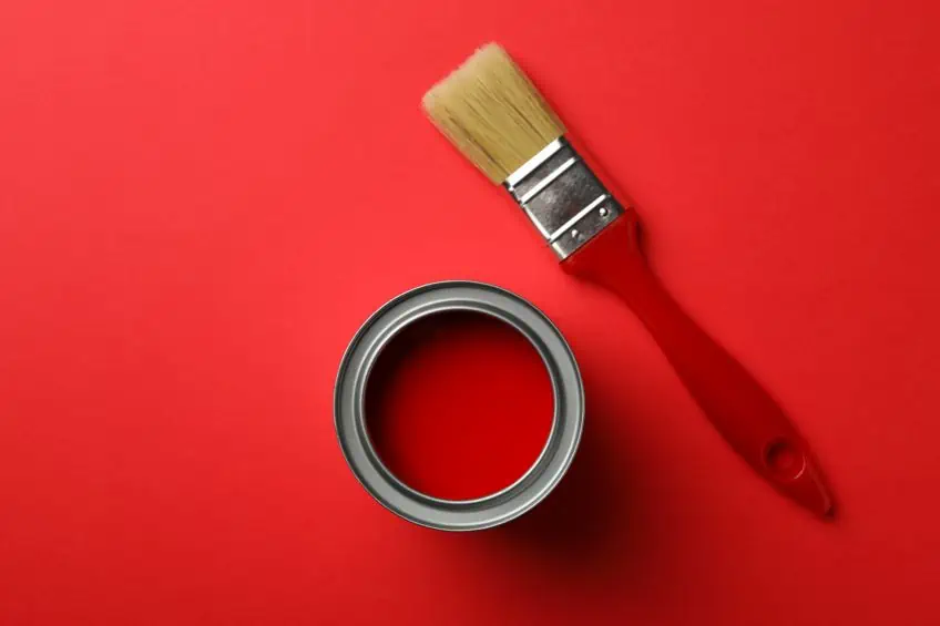
Shades of Red – Exploring the Variety in Hues of Red Color
This post may contain affiliate links. We may earn a small commission from purchases made through them, at no additional cost to you.
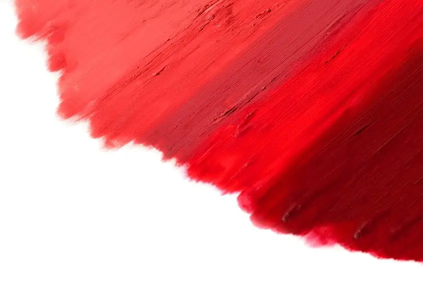
As with all colors, there are so many different types of red from light and dark red to more descriptive names like cherry red or wine red. All these variations of red color can almost seem infinite. However, do all these colors come entirely from red? Since many of us see colors differently, there might be some debate on what a certain red color is. Where did the red color come from and how can it influence our emotions? We will try to answer all these questions below and we will be taking a look at some of the more popular shades of the red color spectrum.
Shades of Red: A Brief History
Red colors have been around since ancient times, ochre is a natural clay pigment that was discovered in prehistoric art. Another form of red was obtained from a mineral known as hematite. There have been discoveries of late stone age people who used the ground hematite to paint their bodies. This red color, along with black and white were mostly used in the paleolithic age, as these colors were the easiest to obtain from nature.
Ancient Egyptians as well as Mayans were known to use red pigments on their bodies in ceremonies and celebrations. In most cases, the red color was linked to victory and health. Egyptian women also used red pigment colors as cosmetics to brighten and stain their lips and to redden their cheeks. Roman generals also followed the same practice of coloring their bodies to celebrate their victories in battle. Red was also a favorite color in China, used to make pottery. The color was also used to paint the walls and gates of palaces.
Over the years, red has become a symbol of courage and sacrifice and has been associated with martyrs who gave their lives for their beliefs. In the early Middle Ages, the Pope, as well as Cardinals from the Roman Catholic Church, were dressed in red, which is a symbol of the blood of Christ. Kermes, a crimson red color dye, was obtained from an insect known as Kermes vermilion. This dye was used by many of the ancients including the Egyptians, Greeks, Romans, Mesopotamians, Iranians, and Indians. The dye had excellent colorfastness and was often used to color wool and silk.
Later, this particular dye was replaced by other types of red dye from cochineal insects, which are native to Mexico. This became quite a profitable enterprise from the 16th to the 19th century, as the dye was exported from Mexico to Europe and became nearly as valuable as gold and silver. The dye was worn by many European aristocrats and became a symbol of wealth.
Another natural red dye was obtained from the madder plant. This dye has also been used since ancient times and was found in dyed cloth that was discovered in Tutankhamun’s tomb. The dye was also found within the Pompeii ruins, as well as in ancient Corinth. Charles the Great or Charlemagne cultivated the madder plant during the Middle Ages to produce the red dye.
The Chinese are said to have manufactured what is known as red lead, also known as “minimum” during the Han Dynasty (202 BC-220 AC). This toxic substance may be one of the first synthetic pigments developed and was made from roasting white lead pigment. The longer the roasting, the more orange-red the substance became. This pigment cost less than those made from cinnabar and was used in manuscripts during medieval times. It is said that Vincent van Gogh favored the red lead and he used it often in his paintings. However, the pigment turns white on exposure to light and so the red in his paintings would have faded over time.
Many wealthy, as well as nobles from the Renaissance period, had their clothes dyed from both the kermes and cochineal red dyes. The first synthetic red dyes were only brought in later during the 19th century, and these eventually replaced the more natural and traditional red dyes. Also, during the Renaissance period, many artists used red to draw the attention of the viewer to a particular part of a painting. For example, the red color was often used to paint the cloak of Christ or the Virgin Mary. A Venetian painter during this period, known as Titian, was considered a master of the use of red colors, specifically the vermilion shade of red.
He painted layers of color pigment and combined it with a semi-transparent glaze. This allowed the light to play on the painting, making it more incandescent. An example of one of his paintings, The Assumption 1516-18, shows how he used red colors. In the painting, you will be drawn to the two apostles, the Virgin Mary, and the figure of God, all draped in vermilion red. Later during the mid-17th century, Vermeer painted Women with a wine glass 1659-60. He used various hues of red vermilion for the lady in the red dress. Another famous artist from the 20th century was Henri Matisse. In his painting, Music 1910, he uses bold, primary red colors for the figures.
Shades of red color have played a big role in politics, religion, and various cultures. The color red can be seen as a sign of communism, for example, Russia embraced a red flag after the Bolshevik Revolution in the early 20th century. Other countries, including China, also adopted the red color into their national flags. Red, is in fact, one of the more common colors found on national flags all around the world. Alizarin red was the first synthetic dye that was created by a German chemist in the late 19th century. This synthetic dye was similar in appearance to the madder plant dye, however, it lasted longer and was a lot cheaper to manufacture. Two synthetic pigment colors were also manufactured in Germany at this time, namely cadmium red and mars red. The mars red, which was the synthetic version of red ochre, while the cadmium red was similar to vermilion.
Red also became part of military uniforms, and later up until more recently, red has been incorporated into many sporting uniforms. Whatever the uses for the color red, it is a color that grabs your interest and attention. It is a color that has been used throughout history and will undoubtedly still have influence well into the future.
The Psychology and Meaning of Red Colors
In history, red has been the color of danger, sacrifice, and courage since it is the color of blood and fire. Various studies done have shown that red is associated with activity, passion, love, heat, anger, joy, and sexuality. Red has become a type of symbol for some, red poppy flowers are worn by many on Remembrance Day. This is to honor those who gave their lives during the First World War. Of course, different cultures all over the world might see the color red differently. For example, in most Asian countries, red is a color for good fortune, good luck, beauty as well as happiness. The red color is used in celebrations, weddings, and other significant events.
Although red has quite a few positive attributes like love, it is also heavily associated with emotions like anger, aggression, and hatred. There are even sayings that describe how somebody is feeling, for example, if someone is angry, they may describe it as “seeing red.” Red colors are also associated with sexuality, passion, and seduction. Certain areas in Europe where prostitution is legal are known as the Red District. Others associate red with feelings of guilt or violence, sayings like “caught red-handed” coming from this connection.
Red is one of the more visible colors in the spectrum, which is most probably why it can grab your attention so quickly. This is why red is used in many cases where warnings are placed, for example, stop signs, traffic lights, and fire engines. Red is a powerful color and is often worn by those who wish to be seen and feel confident. Consider luxury red sports cars, which are associated with both power and confidence, or rolling out the red carpet, at movie premieres, bringing attention and lending importance to those who walk on it.
As with any other color, the associations and responses to the color red can be different. This is due to certain factors such as cultural influences and personal experiences. So, think about how the various red shades affect you and you may even discover something about yourself you never thought of before.
Exploring Various Shades of Red Color
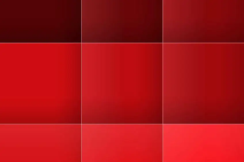
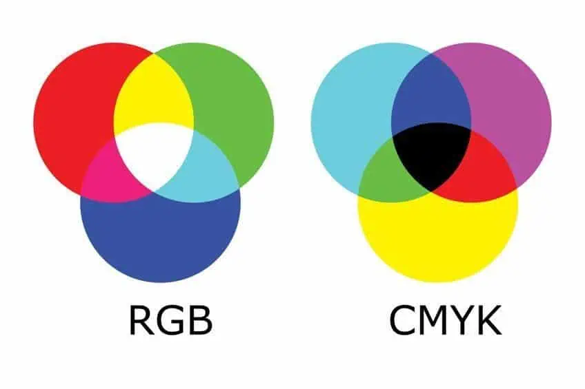
The color red has a dominant and long wavelength of about 625 to 740 nanometers and sits next to the color orange and is opposite to the color violet. Red is a primary color when considering pigments and the RGB (Red, Green, Blue) color model. However, it is a secondary color when looking at the CMYK (Cyan, Magenta, Yellow, and Black) color model. There are many shades of red names and hues of red to choose from scarlet to burgundy and many variations in-between.
Red Color Variations
The colors we are going to be discussing below, are all considered a red color; however, they are all slightly a different type of red. Let us have a look at a few of these before moving on to more exotic shades of red names. The first is the webpage red and is one of the basic additive primary colors in this color model, the other two colors being green and blue. In the table below you will find the appropriate hex codes so you can easily look up the color online.
Next, pigment red, which is used for printing, is part of the subtractive color model. Crayola, the company famous for its crayons also comes up with its own colors, and this color red was first made in 1903.
The Munsell color system is designed to portray the three color dimensions of color hue, value, and chroma (purity of color). The system is used to describe colors on surfaces and makes use of a three-dimensional color space. Then you have your Natural Color System, which is based on the four psychological primary colors of blue, green, red, and yellow, and the opponent-process theory. This system is commonly used in Scandinavia. Finally, the Pantone company also has its version of red color.
| Red Shade | Red Hex Code | CMYK Red Color Code | RGB Red Color Code | Red Color |
| Webpage Red | #ff0000 | 0, 100, 100, 0 | 255, 0, 0 | |
| Pigment Red | #ed1b24 | 0, 89, 85, 7 | 237, 27, 36 | |
| Crayola Red | #ee204e | 0, 87, 67, 7 | 238, 32, 78 | |
| Munsell Red | #f2003c | 0, 100, 75, 5 | 242, 0, 60 | |
| Psychological Primary Red | #c40234 | 0, 99, 73, 23 | 196, 2, 52 | |
| Pantone Red | #ed2839 | 0, 83, 76, 7 | 237, 40, 57 |
Cinnabar
There are different hues of red when it comes to the color cinnabar, from a bright red color to a deeper brick color or reddish-brown, and is also closely associated with the color vermilion. The name is derived from a mineral that was used in the past as a pigment. The substance was made from mercuric sulfide, which is toxic. Thankfully, it was eventually discontinued because of the discovery of other types of pigment.
However, it was still used by the Ancient Egyptians and Romans and was also used extensively in China in the creation of lacquerware. The cinnabar color has the energy of orange and the earthiness of brown working together. The color combines well with other oranges, neutral colors, and even shades of yellow. When paired with blues, it helps the colors stand out.
| Red Shade | Red Hex Code | CMYK Red Color Code | RGB Red Color Code | Red Color |
| Cinnabar | #e34234 | 0, 71, 77, 11 | 227, 66, 52 |
Crimson
This shade of red color has a purple undertone and was obtained from the dried bodies of certain scale insects from the Kermes species. This was eventually replaced with another color known as carmine which was obtained from other cochineal insects as it cost less to produce. To avoid any confusion, the kermes variety was named natural crimson.
Later, synthetic pigments were developed, and Alizarin crimson was made. When used for interior decorating, it can be paired nicely with cool neutral colors like beige, tan, chocolate brown, or even shades of pink. Crimson can be a different type of red as shown below in the table.
| Red Shade | Red Hex Code | CMYK Red Color Code | RGB Red Color Code | Red Color |
| Crimson Red | #990000 | 0, 100, 100, 40 | 153, 0, 0 | |
| Crimson | #dc143c | 0, 91, 73, 14 | 220, 20, 60 | |
| Alizarin Crimson | #e32636 | 0, 83, 76, 11 | 227, 38, 54 |
Carmine
As mentioned above, carmine was obtained from cochineal insects and is not of mineral origin like many other pigments and dyes. It was used as a pigment to dye clothing and paint with, however, with the development of synthetic paints and dyes that are easier and cheaper to make, it became less common. Today, it is still used in cosmetics and as a food dye, to make food appear redder and more vibrant. You can mute this beautiful shade with a touch of green paint.
Carmine is a deep, bright red color with cool undertones. The color can be used in the marketing of female products. The color can add a pop of color to any room or design project. Carmine can work well with pinks, blues, and pastel shades of these colors, as well as neutral colors.
| Red Shade | Red Hex Code | CMYK Red Color Code | RGB Red Color Code | Red Color |
| Carmine | #ff0038 | 0, 100, 78, 0 | 255, 0, 56 |
Maroon
Maroon is a deeper and dark red color, and the color name was first used in the English language in the late 18th century. Maroon is derived from the word marron, which is French for chestnut. Maroon is a classic color that can work well if placed as a background color on websites. The color is extremely close to the color firebrick and dark red. When creating maroon with paints, you can use the primary colors of blue and red. Mix your blue into your red in a ratio of 5:1.
Once the paint appears darker, you can add in a small amount of yellow to achieve a maroon color. You can easily adjust the ratios until you reach the desired color.
The maroon color is quite versatile and is used in a variety of applications online, in interior decorating, and with clothing. Many school uniforms are a shade of this color. Adding in your home will bring a sense of warmth into the space and is the perfect accent color. You might even find that maroon is often used for certain documents such as passports. Colors that work well with maroon include your neutrals such as white, as well as cool grays and dusty pinks. The color teal will create a beautiful contrast when used with maroon as they are complementary colors.
| Red Shade | Red Hex Code | CMYK Red Color Code | RGB Red Color Code | Red Color |
| Maroon | #800000 | 0, 100, 100, 50 | 128, 0, 0 |
Scarlet
This is a bright red color with orange undertones and was often used in the Catholic Church, where it was worn by cardinals. The color has a connection with religion, martyrs, and sacrifice. As with most hues of red, it is linked to feelings of passion, heat, courage, and joy.
In the home, the color combines well with neutral colors like beige or sand, or with more earthy colors like chocolate brown or seafoam green. The neutral tones will help to tone down the vibrant color. In other design applications like web design, to make a bold statement, combine scarlet with shades of orange and yellow.
| Red Shade | Red Hex Code | CMYK Red Color Code | RGB Red Color Code | Red Color |
| Scarlet | #ff2400 | 0, 86, 100, 0 | 255, 36, 0 |
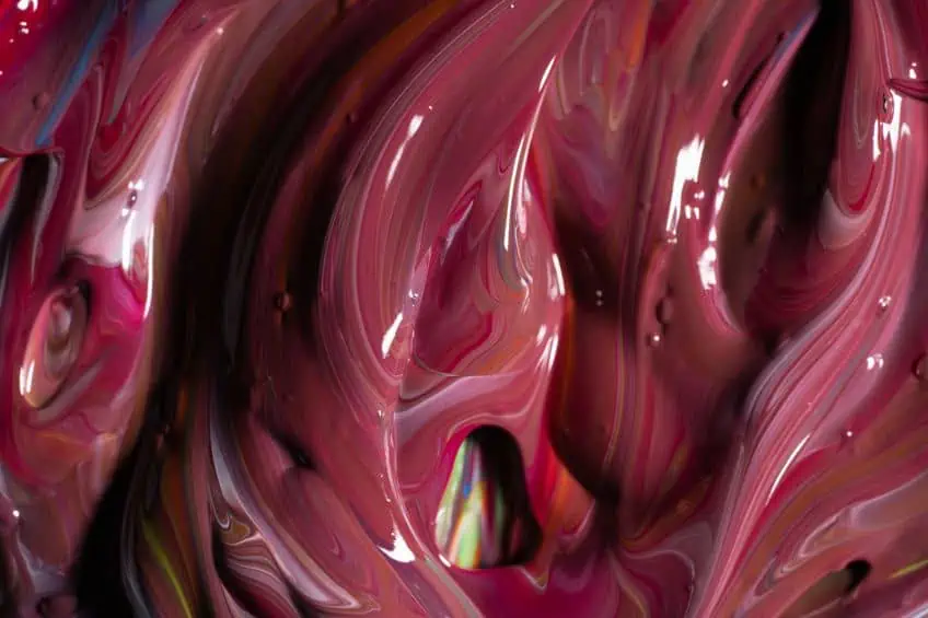
Burgundy
Burgundy is a dark red color and is not to be mistaken for maroon. Burgundy has more of a red-purple appearance than reddish-brown. The name is derived from burgundy wine, which is from a region in France and can sometimes also be referred to as wine red. The color is sophisticated and is often related to ambition, power, and wealth.
Burgundy is a beautiful rich color that can work well with white and various gray hues. You can also combine burgundy with umber, golden yellow, and turquoise. You can keep the surrounding colors cool, or for a warmer more autumnal effect, use shades of brown and orange.
| Red Shade | Red Hex Code | CMYK Red Color Code | RGB Red Color Code | Red Color |
| Burgundy | #800020 | 0, 100, 75, 50 | 128, 0, 32 |
Chili Pepper Red
Chili peppers make you think of red-hot sensations, so there must be a color of the same name. Chili pepper red was the color of the year in 2007, chosen by the company known as Pantone. The color is exciting and dangerous and can be used to invigorate when combined with other colors like yellow and other red shades.
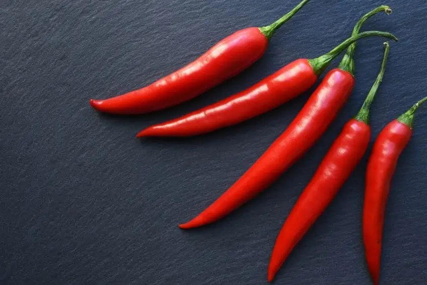
To create an effective and attractive contrast, pair this color with green. You can use chili pepper red to create colorful and bold designs that can be used for many different purposes.
| Red Shade | Red Hex Code | CMYK Red Color Code | RGB Red Color Code | Red Color |
| Chili Pepper Red | #e32227 | 0, 85, 83, 11 | 227, 34, 39 |
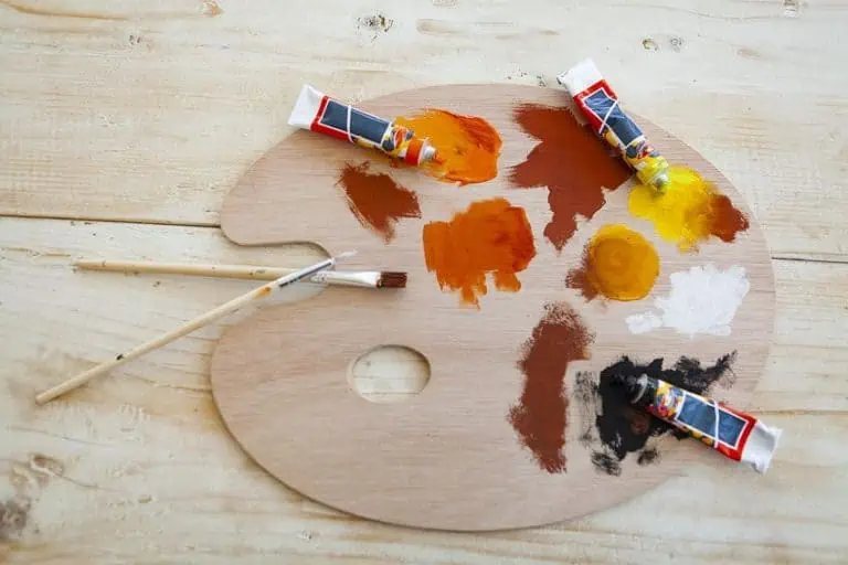
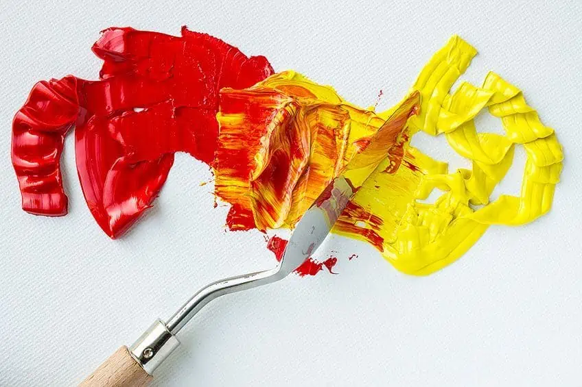
Shades of Red With Acrylic Paints
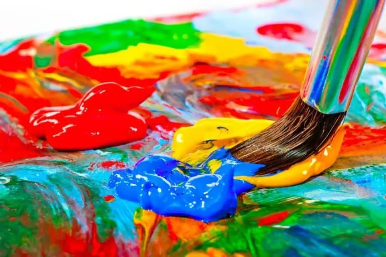
To create different red shades of paint, it is necessary to understand a bit of color theory. You can take a look at a color wheel, which will show you the different primary, secondary and intermediary colors, and this will help to show you how all these colors work together. You will learn that mixing all your primary colors will form brown color hues and that any color that sits opposite another, is its complementary color. Complementary colors placed side-by-side create contrast and allow the colors to stand out.
When using pigments, red is a primary color, and the color that forms its complement is green. There are many colors in-between the primary and secondary colors, and each of these sits closer to a specific primary color, creating a color bias. This also means a color can appear to be warmer or cooler, depending on where it sits on the color wheel. This is why you can get a warmer shade of blue, and a cooler shade of red. Once you gain an understanding of colors, you will be able to make a variety of shades of red. Experiment and create your own palette of shades of red, just remember to make swatches so you can create the same color in the future.
Creating Warmer Red Shades
To blend a warmer red color, it is best to add yellow. However, since there are different types of yellow and some have a blue bias, you will need a yellow that does not have any blue and does not lean towards green. If you choose the wrong yellow, you might create a muddy color as all the primary colors are present. So, to make the best warm red shade, cadmium red and cadmium yellow will work. Cadmium yellow has warmer undertones of red. To create a darker red shade, try yellow ochre which also has warmer undertones.
Yellow is also used to brighten and lighten red and is a better option than using white.
Creating Cooler Shades of Red
The same applies here: to make a deep, dark red color that has cooler undertones, try using ultramarine blue. Only add in very small amounts of this color to your red as blending in too much will create more of a purple color. To make a lighter a cooler red shade, use cerulean blue, which is similar to a cornflower blue.
Muting Red Colors
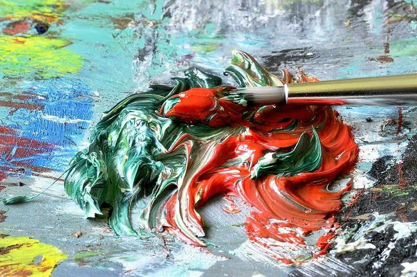
Maybe the red color you have is too vibrant and bold and you would like to mute the color. To mute red, you can use green which is its complementary color. There are a variety of red shades and each of these shades of red has its own complementary color and makes the color red less bright. The type of green you choose will determine if it is a darker or lighter muted shade.
Black can also be used to darken red, however, green is a better choice. Remember to always add in small amounts.
Using Red Shades Web and Business Design
Red can be a color that can portray passion, adventure, motivation, and confidence. However, it can also become overwhelming and can produce feelings connected to a lack of control, agitation, and untrustworthiness. Red can be challenging to use in business, and you should be certain of the message you want to display. There are positive connotations concerning the color read, but there are also many negative associations, and you need to find a balance so you can produce the correct effect.
The simplest way to incorporate red is to use it in small amounts, which help attract attention without overpowering anything. Red can be successfully used to create excitement and inspires clients to take some form of action. Choosing lighter shades of red might also help to bring across your message without seeming too domineering or aggressive about it. Darker shades of red can provide more of a commanding and trustworthy effect. In design, red is an excellent color to grab attention, but using it properly is important to make it work for you.
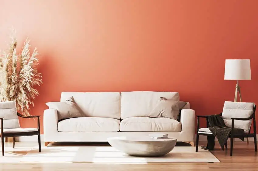
Red Shades and Interior Design
Red is a bold color, and some like to go all out and paint an entire room with red colors, while others prefer to add in accents of red color. Sometimes, less is more, and adding a pop of red color can add in that play of vibrant color that is not overstated.
Whatever your preferences, there are a few things to consider before painting your wall or room red.
Choosing a Red Color Paint
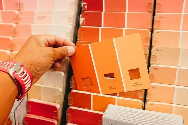
There are many different shades of red to choose from and can be challenging to choose the right one for your particular purpose. Just viewing the color online or at the store will not be accurate, even color swatches might not be effective when choosing a paint color. The best method is to buy some paint samples and to test them out. You can either paint the sample paint on some paper to compare or paint a section of the wall you wish to paint. When painting a part of the wall, you can also view the color in different lighting, which can make a big difference in how the paint looks.
Deciding What Room to Paint Red
Color affects our mood and red is considered a vibrant color that is stimulating and energizing. So, painting a bedroom red might not be the best option. However, adding in accents of red might work in this room. Various shades of red can work better in spaces where there are more social gatherings, like the living room, kitchen, or dining area. When using red, painting the molding and baseboards white can add a nice contrast. Red colors can also be a perfect accent color on a single wall, paired with neutral colors, or even a navy blue.
Why not paint your front door a red color, bringing attention to the entranceway, instead of the usual brown or white.
Applying a Primer or Base Coat
You might think red paint would cover walls well without the need for a primer. However, a white wall requires several red paint layers before it looks the proper color and tone. Applying a primer first will ensure even coverage and some recommend a gray primer as the base coat for best results. To make it easy to select the correct primer, many paint brands provide the perfect primer option for the particular paint color you choose. You could also always opt for a professional painter so the job can be done correctly.

Shades of Red Combinations
There are many tried and tested color combinations when it comes to various red shades. Since colors can affect the atmosphere of a space, it is important to do a little research before jumping into your design project. Let us take a look at a few suggested red color combinations.
- Combine red with white or any shade of gray
- Black, white, and red. You can also change the black for blue
- Beige, cream, and neutral colors
- Teal and red
- Bright warm colors of red, yellow, and white
- A dark red color can pair well with navy blue and gold
- Earthy tones of brown and red with white
- Shades of blue with red accents
- Green and shades of red
Shades of red color are vibrant, warm, and inviting. However, your opinion of the color red will depend on your experiences and each person will have their own opinion. Whatever your thoughts on red colors, there are many exotic and descriptive names for red and hopefully, these will inspire great ideas for your next creative project.
Frequently Asked Questions
Is There a Name for a Dark Red Color?
There are many shades of red, but one of the more common dark red color names is maroon. Another term used for some deep red colors is carmine.
What Shade Is Purple?
When looking at the color wheel, purple can be located midway between red and blue. So, depending on how you view colors, you could say purple is a shade of red and a shade of blue.
Why Is Red Sometimes Considered Undesirable?
There are many positive connotations to the color red such as it is energizing, exciting and bold. However, there are also bad feelings linked to red colors. This includes feelings of anger, agitation, aggression, and violence. Since red is a bold color, it is used as a warning color, even in nature some animals have a bright red color on their bodies, and this is a warning for predators to stay away as they might be poisonous.
Can You Mix Two Colors to Create Red?
When using paint pigments to mix colors, red is one of the primary colors so there are no other colors you can mix to make red. However, it is possible to add other colors to make different hues of red. You can also try mixing magenta and yellow, which is what creates red in the CMYK color model.

Duncan graduated with a diploma in Film and TV production from CityVarsity in 2018, after which he continued pursuing film while taking on a keen interest in writing along the way. Since having graduated, he began working as a freelance videographer, filming a variety of music videos, fashion and short films, adverts, weddings and more. Throughout this, he’s won a number of awards from various film festivals that are both locally and internationally recognized. However, Duncan still enjoys writing articles in between his filming ventures, appreciating the peace and clarity that comes with it.
His articles focus primarily around helping up-and-coming artists explore the basics of certain colors, how these colors can be paired with other shades, as well as what colors are created when you mix one with another. All while relating these shades to historically significant paintings that have incorporated them into their color palette. As a lover of the arts himself, he takes great interest in the Renaissance era of paintings, an era that has directly inspired many of his favorite films.
Learn more about Duncan van der Merwe and about us.