Pastel Red – A Look at Bright and Gentle Shades of Pastel Reds
This post may contain affiliate links. We may earn a small commission from purchases made through them, at no additional cost to you.
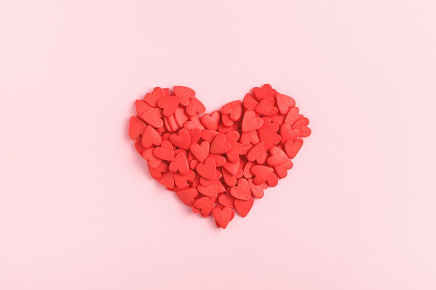
Pastel red, a delicate and ethereal shade, is an exotic blend of passion and allure, one that whispers sweet nothings. This is a shade that brings a sense of playfulness and energy, while still reminding us of the warmth of a sunset and the softness of a rose, making it the perfect choice for clothing and home decor. Its timeless appeal makes it a classic that never goes out of style, leaving a lasting impression on all who behold it. Join us as we take some time to uncover the many aspects of pastel red, including its history leading into our modern times, how to mix your own shade of pastel red, and how to attain your own pastel red aesthetic, among much more!
What Is Pastel Red?
Woven with passion and romance, pastel red is a shade that instantly reminds us of a sun-stricken evening sky, blushing cheeks during intimate moments, and the soft glow of a rose. Its energy is equal parts vibrant and subdued, providing a soft intensity that seems somewhat playful yet calming.
| Color Name | Pastel Red Hex Code | RGB | CMYK Color Code (%) | Shade of Pastel Red |
| Pastel Red | #ff6961 | 255, 105, 91 | 0, 59, 62, 100 |

Pastel Reds in History and Modern Times
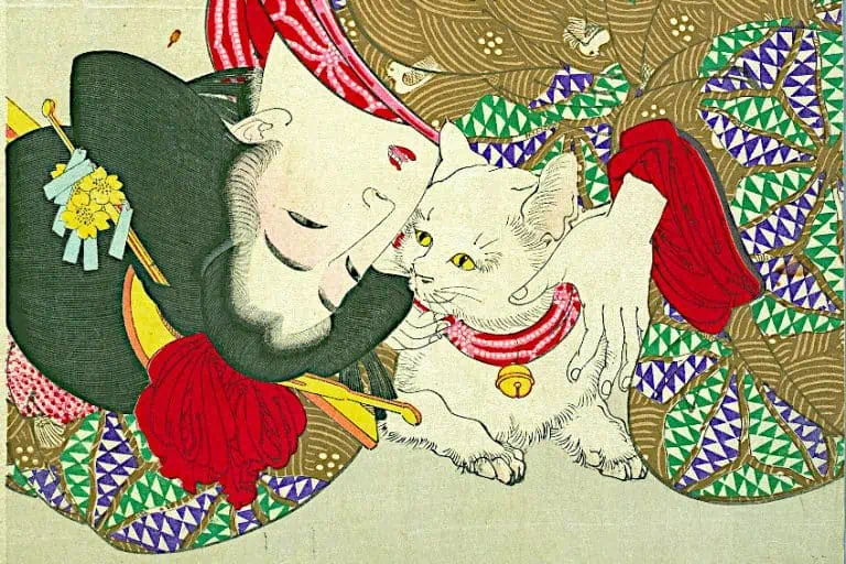
Pastel red’s journey through time is a story of love, passion, and artistry. This delicate hue has been used throughout the ages to convey the subtle nuances of human emotions. From the many great ancient civilizations through to our modern era, pastel reds have been a favorite among artists, artisans, and designers alike. From the Egyptians to the Greeks and Romans, pastel red and its varying shades were held in high regard. So much so, in fact, that it was used to depict the gods and goddesses of the time in the form of vibrant murals and frescoes.
The shade was also used to create pottery and textiles, where it began to attain associations with wealth and prosperity.
The use and appeal of pastel reds would continue into the Renaissance period, where it was used to capture the essence of beauty and grace in the form of portraits and frescoes. Revered artists of the time, such as Raphael and Botticelli, would use the color to create many of their masterpieces that still inspire awe to this day. Similarly, the color was also used in the creation of ornate cathedrals and churches, where it was used in the form of stunningly detailed stained-glass windows. While still remaining a significant part of the time’s current cultures, its symbolism would evolve to represent the feminist movement and the independence of women. Used in clothing and accessories, the color was used to create bold and striking designs in order to make a statement about the ever-changing role of women in society.
Pastel red remained a popular color through to the 20th century, where it became a mainstay in the fashion and home decor industries. Creating elegant and timeless designs, the color found great success in the architectural styles of both Art Deco and Bauhaus. This is not all, however, as marketing agencies of the time found that pastel red aided in the creation of bold and striking designs that caught the eye, and was thus used on posters and billboards.
Shades of Pastel Red
Upon looking at pastel red’s alluring nature, you may be interested to know that this is not the only shade that is able to provide the same level of intrigue and exoticism. Pastel red blends into a wide variety of equally passionate hues, each providing their own story to tell.
Coral
As a fusion of pink and orange, coral represents the perfect balance of warmth and vitality. Reminiscent of a tropical paradise, as well as the natural reefs it is named after, coral is able to evoke feelings of joy, optimism, and adventure.
Whether used as a bold statement or as a subtle accent color, coral can be used to add some charm and elegance to any setting.
| Color Name | Pastel Red Hex Code | RGB | CMYK Color Code (%) | Shade of Pastel Red |
| Coral | #ff7f50 | 255, 127, 80 | 0, 50, 69, 0 |
Salmon
This is a more muted blend of pastel red that becomes more reminiscent of the soft glow of a sunset. Providing a warmer and more serene look, salmon presents itself as the perfect choice for home decor and clothing. When used correctly, it can accentuate and exude the natural beauty of any space.
| Color Name | Pastel Red Hex Code | RGB | CMYK Color Code (%) | Shade of Pastel Red |
| Salmon | #fa8072 | 250, 128, 114 | 0, 49, 54, 2 |

Burnt Sienna
This deeper and more earthy color evokes feelings of grounding and stability, and is reminiscent of the natural tones that surround us during fall. Its strong associations with nature bring with it a depth and richness that makes it perfect as a statement or an accent color alike.
To add a rustic charm to your design, do not forget about burnt sienna.
| Color Name | Pastel Red Hex Code | RGB | CMYK Color Code (%) | Shade of Pastel Red |
| Burnt Sienna | #e97451 | 233, 116, 81 | 0, 50, 65, 9 |
Pastel Red Color Combinations
If you are looking to combine your pastel red aesthetic with other colors, the options are truly endless. There are a variety of shades that blend particularly well with pastel red, creating a look that is as enchanting as it is cohesive.

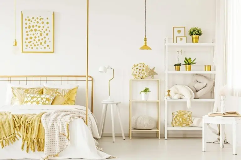
First up, we have pastel blue. With its rather soft and ethereal quality, it helps to add a touch of serenity to any pastel red space. Creating a fresh and inviting look, this could be the perfect combination for bedrooms or living rooms.
| Color Name | Color Hex Code | RGB | CMYK Color Code (%) | Shade of Color |
| Pastel Red | #ff6961 | 255, 105, 91 | 0, 59, 62, 100 | |
| Powder Blue | #b6d0e2 | 182, 208, 226 | 19, 9, 0, 11 |
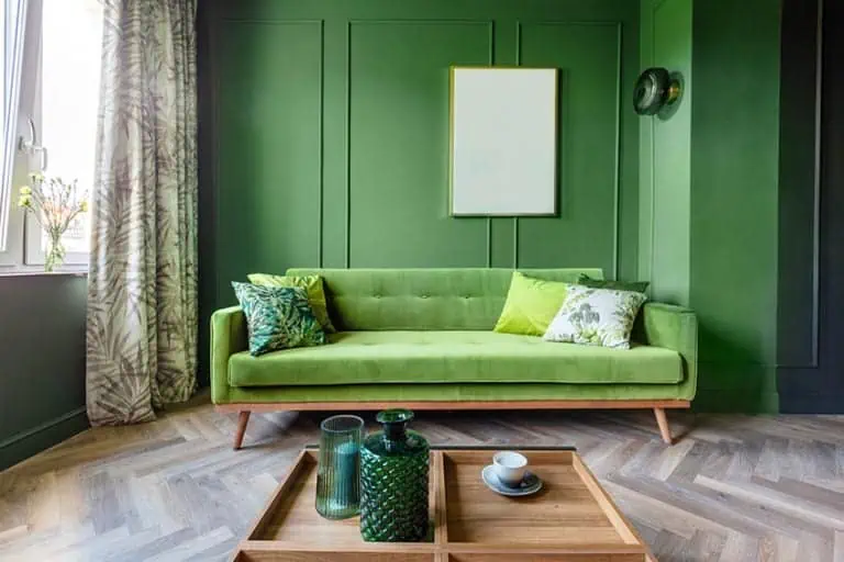
Another great pairing would include a soft shade of mint green, which works to create a look that is both fresh and invigorating. Thanks to its cheerful look being complemented by its playful energy, such a combination could make the perfect fit for nurseries and kids’ bedrooms.
| Color Name | Color Hex Code | RGB | CMYK Color Code (%) | Shade of Color |
| Pastel Red | #ff6961 | 255, 105, 91 | 0, 59, 62, 100 | |
| Mint Green | #98fb98 | 152, 251, 152 | 39, 0, 39, 2 |
How to Mix Your Own Pastel Red Paint
With the right paints by your side, along with some patience, and precision, you may soon find yourself creating the perfect shade of pastel red for your own designs and artworks. Before you get started, you will need to gather the following supplies:
- Red, white, and yellow paint
- A palette
- A mixing tray
| Color Name | Hex Code | RGB | CMYK Color Code (%) | Shade of Color |
| Red | #ff0000 | 255, 0, 0 | 0, 100, 100, 0 | |
| White | #ffffff | 255, 255, 255 | 0, 0, 0, 0 | |
| Yellow | #ffff00 | 255, 255, 0 | 100, 100, 0, 0 |

First, you will need to place some red paint onto your palette. Next, you will need to mix in some white paint. This will lighten the color dramatically, so it is important that you take this step with patience and caution in order to attain your desired shade of pastel red. If your shade comes out too light, then mix in some more red paint. If your shade is too dark, however, then adding in some more white should do the trick. Lastly, if you are looking to provide your shade of pastel red with a subtle glow, then adding in the smallest amount of yellow paint can work wonders and elevate your shade to a whole new level.
In closing, it is clear to see why exactly this color simply evokes feelings of romance, passion, and warmth within the viewer, leading to its prevalence in some of history’s most beautiful and iconic artworks. Its delicate nature makes it perfect for creating outfits, artworks, and spaces that feel soft and cozy. Pastel red is more than just a color, it is an experience, an emotion, a feeling, and a captivating symphony of passion and romance in equal parts.
Frequently Asked Questions
Can Pastel Red Be Paired With Other Colors?
Pairing pastel red with the right color is an easy task, as it can be used to create a variety of different moods and looks. Softer shades, such as pale blue and pink, mint green, or lavender, can be used to create a more harmonious look, while metallic tones like gold and silver can create a more opulent and luxurious look.
What Are Some Popular Shades of Pastel Red?
There is no shortage of popular pastel red colors. Some of the most widely used may include blush, salmon, coral, terracotta, and burnt sienna. Different in their appearance, these shades each provide a flavor of passion and elegance that contrasts against the last.

Duncan graduated with a diploma in Film and TV production from CityVarsity in 2018, after which he continued pursuing film while taking on a keen interest in writing along the way. Since having graduated, he began working as a freelance videographer, filming a variety of music videos, fashion and short films, adverts, weddings and more. Throughout this, he’s won a number of awards from various film festivals that are both locally and internationally recognized. However, Duncan still enjoys writing articles in between his filming ventures, appreciating the peace and clarity that comes with it.
His articles focus primarily around helping up-and-coming artists explore the basics of certain colors, how these colors can be paired with other shades, as well as what colors are created when you mix one with another. All while relating these shades to historically significant paintings that have incorporated them into their color palette. As a lover of the arts himself, he takes great interest in the Renaissance era of paintings, an era that has directly inspired many of his favorite films.
Learn more about Duncan van der Merwe and about us.