What Colors Make Purple? Creating Different Shades of Purple
This post may contain affiliate links. We may earn a small commission from purchases made through them, at no additional cost to you.
To be an artist, it is vital to understand colors and how to blend them. There are so many colors and shades that it is a vast subject, but today we are going to deal with the purple color. Purple represents many things, one of them being royalty and creativity. As with all colors, there are a great many variations or shades of purple. Knowing how to make purple and its various shades can be challenging but worthwhile. Read further to discover what colors make purple and how you can make them yourself.
Table of Contents
The Color Purple and Times Past
All colors, but particularly the purple color, have had a big part to play in history. The first colors were obtained from the earth or by grinding berries to extract the natural pigments within. Throughout history, in China, Rome, Europe, and around the world, the color purple has left a significant trail behind. Many believe that understanding the where, when, and how of colors should have a profound effect on art created today.
Purple Color: Tyrian
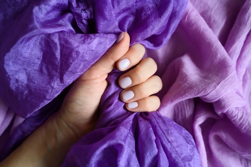
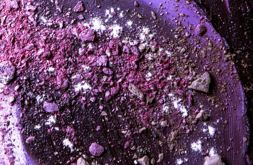
The color purple first came into the spotlight thousands of years ago during the Neolithic period. Archeologists have discovered paintings that were created by using hematite powder as well as manganese powder. Tyrian is a deep purple color that was harvested from the mucus of a certain species of snail in the Mediterranean and then processed using extremely difficult and expensive methods. This made any material dyed in purple expensive and was, therefore, only worn by the wealthy.
This is why the color purple is associated with nobility, royalty, priests, kings, and anybody who had money and status.
The Color Purple and China
In China, the purple color was obtained from the roots of the purple gromwell plant. Unfortunately, the dye did not adhere to well to fabrics which made it quite expensive to use. During this time, a ruler in one of the states in China grew fond of the color and purple became extremely popular. This inflated the purple fabric prices, making it five times more expensive than other fabrics. In Ancient China, colors were ranked according to importance and respectability and the primary colors were most admired. This is why crimson was seen as the most popular, however, purple soon overtook crimson around the 6th century.
The Color Purple Through the Middle Ages and During the Renaissance
Tyrian purple was used for a long time by the clergy and church leaders. In 1464, however, Pope Paul II announced that Tyrian purple should not be worn by the cardinals since the dye was not obtainable any longer, and instead, scarlet robes were introduced. Church leaders of a lower status wore cheaper cloth that was first dyed with indigo blue and then covered with red obtained from kermes dye (a dye obtained from an insect that is found in the Mediterranean).
Numerous religious paintings during the Renaissance period contain the color purple.
The Virgin Mary was often depicted wearing purple robes. During this time royalty wore the color purple less, however, professors and students, especially those of religious studies, began wearing purple. This is where purple began to be seen or associated with knowledge and wisdom.
Moving through the 18th and 19th Century
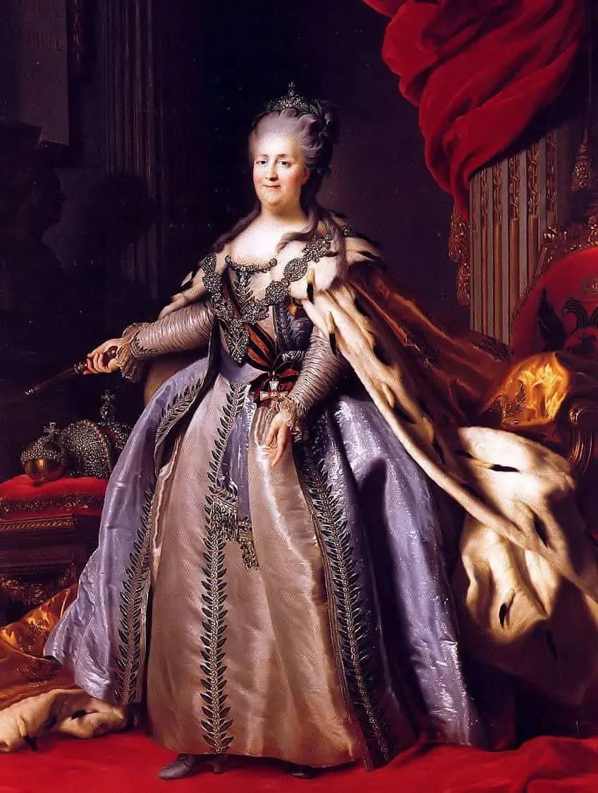
The color purple was still being worn by those with wealth and authority all through the 18th century. As the 19th century came around, something occurred that changed the tide of the color purple. A British chemistry student was experimenting with creating synthetic quinine. As with many things, the experiments led to the discovery of what is known as a synthetic aniline dye. The dye color was named mauveine, and we know it as mauve. This new color became popular quite quickly, and with new production processes available, the color could be mass-produced. This forever changed the course of the fashion industry.
The Meaning of the Color Purple
As we have seen, purple is associated with wealth, nobility, royalty, and power. However, it also represents creativity, mystery, and independence. The red within connects with the idea of knowledge and wisdom, while the blue within purple brings peace and stability. Purple has many associations, from wealth and prosperity to bravery and wisdom. The symbolism of bravery can be seen in the purple heart medal awarded to soldiers. In terms of spirituality, different purple shades can be understood in different ways.
Darker purple shades tend to be associated with death and mourning, while light shades are associated with romance and fun.
Creating the Color Purple
What two colors make purple? The simple answer is, of course, red, and blue. However, if you are an artist, you will understand that it is not as simple as that. You will have to decide on things like the type of purple you are looking for. Do you want a light purple, a blue-purple, or a dark purple color? Are you going to need to create highlights or shadows of purple? As you can see, it is not simply just mixing two colors, there is a lot more involved.
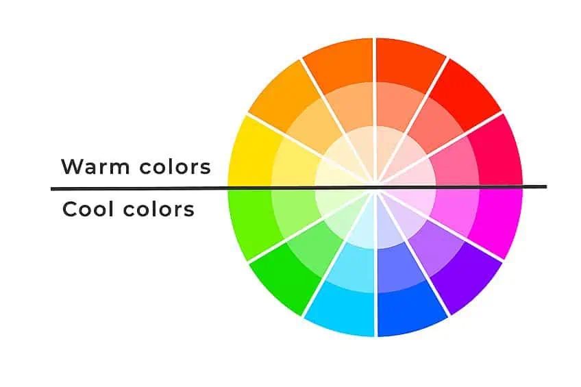
You have primary and secondary colors, purple is classified as one of the secondary colors, the same as green or orange. When mixing colors, it helps to have a color mixing chart handy, as you can then see what colors are made when combining them. For example, Combining two colors that are found on the opposite end of the chart, creates a color that can be found between them. Red and blue are found on opposite sides, then create purple which can be found between these two colors.
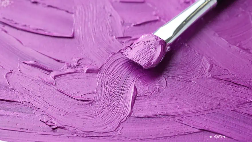
That is the easy part, to create the various shades of purple can get a little complicated. To produce different shades of purple, you will have to consider the color temperatures. For example, green and blue colors are considered cool colors, while the reds and orange colors are warm. This is where it gets more complicated, as you will find within each of these categories warm and cool colors. This means some red colors will be warmer and others cooler, while various blue shades can also be warmer or cooler than others.
When it comes to different shades of purple, you will find that there are cooler red colors that contain small amounts of blue. Warmer reds lean towards orange as they have small amounts of yellow. The term for a color that leans towards a certain tendency is called a color bias. To create the perfect shade, understanding color bias is important. It all comes down to your color temperature, which directly impacts the properties of your chosen purple color.
How to Make Purple by Understanding Color Bias
Creating a purple color is not a one-dimensional process, it is not about simply blending red and blue. You need to look at color as having many facets, you need a more multidimensional perspective. If you are a painter and you have to look at all the blue and red colors you have, you will begin to understand the potential for all the color variations. Ultimately, a simple blue and red does make purple. However, depending on the type of red and blue you use, it opens the door to different shades of purple.
Purple is known as a secondary color and requires two primary color shades. When combining a warm red that has a small amount of yellow with a cool blue that also has a small amount of yellow, means you are combining three primary colors. By doing this, you are going to create a purple shade that is muddy in appearance, leaning towards a brown. To create a brilliant purple color, you should blend a cooler red with a warmer blue.
Classifying Blue and Red Shades
In most cases, you can visually observe the temperature of the blue-purple shade. Cooler blue colors, for example, manganese blue, will have a green tint. Warmer blue colors, for example, ultramarine blue, already lean towards a purple color. We have been comparing various colors with temperature, so here is a list of shades of blue organized from cool to warm:
| Color | HEX # | RGB | CMYK | Shade |
| Cerulean Blue | #2A52BE | 16, 32, 74 | 78, 57, 0, 26 | |
| Phthalo Blue | #040967 | 3, 8, 89 | 96, 91, 0, 60 | |
| Cobalt Blue | #0047AB | 0, 29, 71 | 100, 59, 0, 33 | |
| Indanthrone Blue | #144069 | 20, 64, 105 | 97, 83, 0, 70 | |
| Ultramarine Blue | #1E367B | 30, 54, 123 | 76, 56, 0, 52 |
If you want to create a more brilliant purple color, using indanthrone and ultramarine blue are your best options. This is one side of the color equation; you now need to consider your reds. Here are shades of red from cool to warm:
| Color | HEX # | RGB | CMYK | Shade |
| Spectrum Crimson | #CD2244 | 205, 34, 68 | 14, 99, 72, 2 | |
| Quinacridone Rose | #C32474 | 76, 14, 45 | 11, 100, 60, 1 | |
| Permanent Carmine | #D8255D | 216, 37, 93 | 10, 98, 49, 1 | |
| Alizarin Crimson | #E32636 | 89, 14, 21 | 0, 83, 76, 11 | |
| Naphthol Red | #C12026 | 193, 32, 38 | 16, 100, 100, 7 | |
| Cadmium Red Light | #E30022 | 89, 0, 13 | 0, 100, 85, 11 | |
| Vermillion | #DC4133 | 220, 65, 51 | 10, 90, 90, 0 | |
| Cadmium Scarlet | #EA4B2E | 234, 75, 46 | 2, 86, 93, 0 |
The shade of purple can be altered by using the different reds and blues. More brilliant or vibrant purple shades need cooler shades of red and warmer shades of blue. To create a pure purple shade, you can use reds like alizarin crimson, permanent carmine, spectrum crimson, and quinacridone rose. All of these, when combined with a warm blue shade, create an amazingly pure and vibrant purple.
Adapting Purple Shade Temperatures
When dealing with color temperatures, you can create cool and warm purple colors. You can produce a wonderful diverse purple palette. When painting flowers or fabrics, you want to get as close to the real thing as you can, and adapting your purple shades can help get you there. Going further in this article, we will be using a pure purple combination of ultramarine blue and alizarin crimson as our purple base.
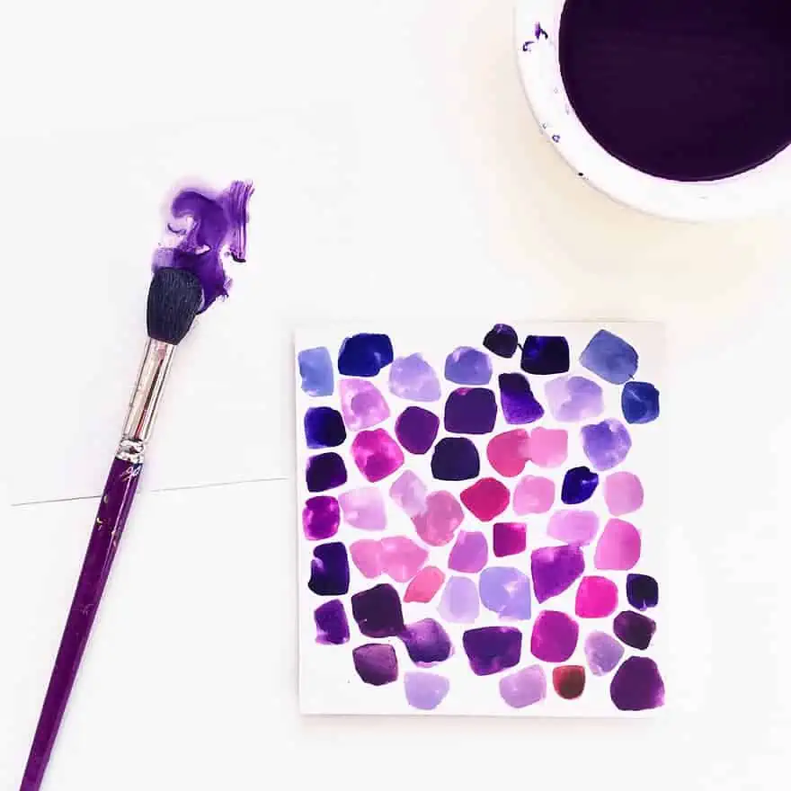
How to Make Purple Colors Warmer?
If you are following along, you will know that to make a warmer shade of purple, you need to add red. Again, add the same red you used in the original base purple color. The red shade should be a cooler version, otherwise, you will land up with a muddy color. The same applies here, add small amounts so as not to drastically alter the color.
Add tiny amounts until you reach the shade of purple you want.
How to Make Purple Colors Cooler?
To make a purple color cooler, simply put in more blue color. However, you need to consider which blue to choose. The best way to do this is to use the same color blue you chose to make your original purple. Remember, the blue shade needs to be a warmer blue to avoid creating a muddy color. When mixing colors, always use small amounts as you do not want to add too much. If you add too much, you might have to then adjust the color again by adding more red to achieve the color you are looking for.
Softening Bright Pure Purple Shades with Complementing Hues
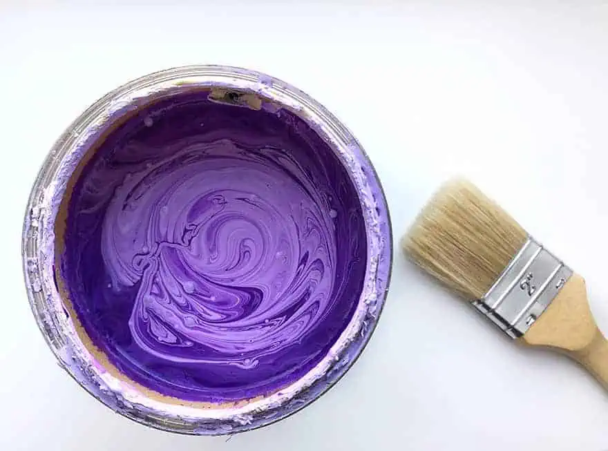
Maybe you do not want a bright purple color? You might be looking for a more realistic purple color to match the scenery. Softer or light purple colors are essential to enhance brighter colors. Learning how to soften bright purple shades can create just what you are looking for. To do this, you need to add a small amount of a complementary color. This is where you need to use a color wheel. The complement of a particular color is the color that sits opposite on the wheel. For example, the color that complements purple is yellow.
The process of softening your purple color is then simple, slowly add a little yellow until you have the color you want.
Color temperature again plays an important role, if you are looking for a softer earthy purple, you should consider using a bit of yellow ochre. On the other hand, if you want a warmer color, using a yellow that leans towards orange is a good way to go. A cooler purple will need a cooler yellow color, so using a color like cadmium yellow should work. Again, it is not as simple as blending two colors like yellow and purple. Each color has its own unique color shades. So, it is important to understand color theory and how the color wheel works to achieve the most realistic colors for your artwork.
Producing Different Shades of Purple
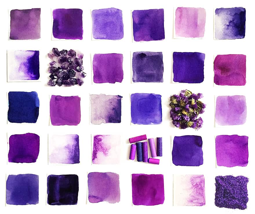
When wanting to create different shades and tints of purple, you will need to consider blending a light purple and dark purple color. Blue Purple, deep purple color, or lighter shades of purple are all necessary to create depth and other features to an art piece. We have already gone over adapting colors, which is not that simple. The same process applies to different shades of purple. In the table below, you will see some of the many varied shades of purple.
| Purple Color | Hex Number | % Yellow, Cyan, Black, Magenta | % Blue, Red, Green | Shade |
| Amethyst | #9966CC | 25, 50, 0, 20 | 153, 102, 204 | |
| Munsell | #9F00C5 | 19, 100, 0, 23 | 159, 0, 197 | |
| Plum | #DDA0DD | 0, 28, 0, 13 | 221, 160, 221 | |
| Mauve | #E0B0FF | 12, 31, 0, 0 | 224, 176, 255 | |
| Razzmic Berry | #8D4E85 | 0, 45, 6, 45 | 141, 78, 133 | |
| Languid Lavender | #D6CADD | 3, 9, 0, 13 | 214, 202, 221 | |
| Pure Purple | #FAE6FA | 0, 8, 0, 2 | 250, 230, 250 | |
| Mulberry | #C54B8C | 0, 62, 29, 23 | 197, 75, 140 | |
| Iris | #9867C5 | 152, 103, 197 | 23, 48, 0, 23 | |
| Vivid Reddish | #870074 | 0, 100, 14, 47 | 135, 0, 116 | |
| Aztech | #893BFF | 46, 77, 0, 0 | 137, 59, 255 |
Creating Light Purple Shades
To portray the effects of light and its varying depths, you will need to create different highlights, tints, and shades of your purple color. Purple naturally leans towards a darker color, so you will most probably need to lighten the purple often to achieve the color or look you want on a painting. There are a few ways to do this. The easiest way to lighten your purple color is to add a bit of white. When adding white to purple, is the best way to create a light purple without affecting the hue. In other words, you will be creating a lighter version of your original pure base purple.
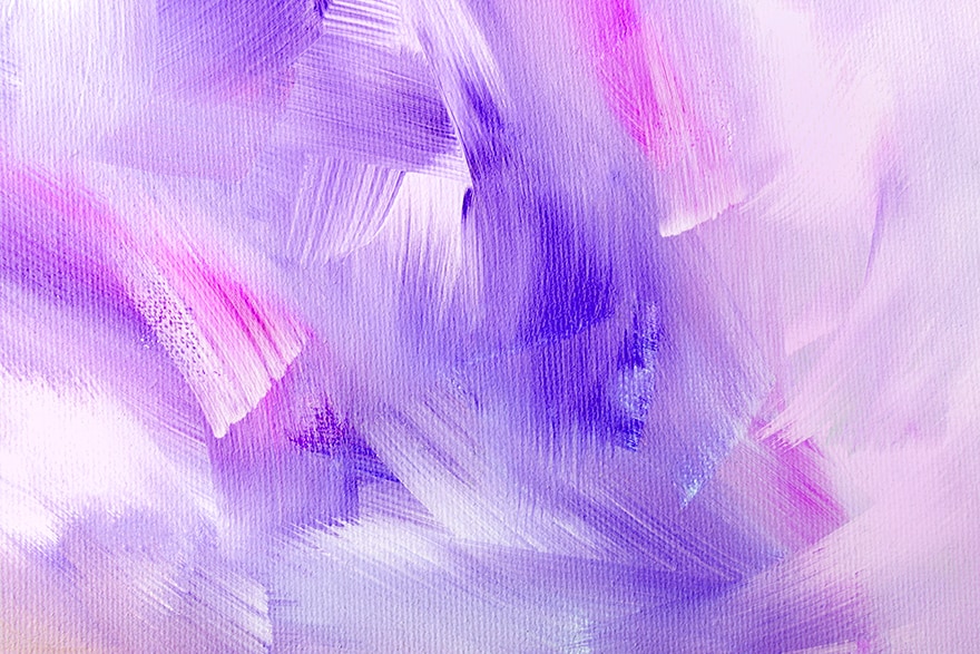
Another method is to add a bit of light yellow. We have already discussed how yellow can soften a vibrant purple, so naturally using a light yellow can help to create a softer and lighter purple tint. We suggest using cadmium yellow and cadmium lemon yellow for the best results. The cadmium lemon yellow would be the first choice for a lighter purple hue. Whenever you are creating different shades of purple, or for any color, it is generally a personal choice. So, to get the color you want, you might have to experiment to get the color shade you are looking for.
| Color | HEX # | RGB | CMYK | Shade |
| Lavender Blush | #FFF0F5 | 255, 240, 245 | 0, 6, 4, 0 | |
| Little Princess | #E9DCE5 | 233, 220, 229 | 0, 6, 2, 9 | |
| Thistle | #D8BFD8 | 216, 191, 216 | 0, 12, 0, 15 | |
| Middle | #D982B5 | 217, 130, 181 | 0, 40, 17, 15 | |
| African Violet | #B284BE | 178, 132, 190 | 6, 31, 0, 25 | |
| Good Tax | #C9A0FF | 201, 160, 255 | 21, 37, 0, 0 | |
| Periwinkle | #BE93E4 | 190, 147, 228 | 17, 36, 0, 11 |
Creating Dark Purple Color Shades
As mentioned, purple does naturally lean towards the darker color. So, it should not be hard to make it a little darker. The darker purple color lends itself to creating shadows and also adding dimension to the artwork. The purple shade needed all depends on how complex your composition is, you might need to create multiple dark purple color shades. When painting, it is recommended you create a variety of light and dark shades of your base color. There are a few ways to do this.
| Color | HEX # | RGB | CMYK | Shade |
| Vivid Reddish | #870074 | 135, 0, 116 | 0, 100, 14, 47 | |
| Mauveine | #8D029B | 141, 2, 155 | 9, 99, 0, 39 | |
| Traffic | #913073 | 145, 48, 115 | 0, 67, 21, 43 | |
| Eminence | #6C3082 | 108, 48, 130 | 17, 63, 0, 49 | |
| Mythical | #53277E | 83, 39, 126 | 34, 69, 0, 51 | |
| Ultraviolet | #645394 | 100, 83, 148 | 32, 44, 0, 42 | |
| Rustic | #593163 | 89, 49, 99 | 10, 51, 0, 61 |
The most obvious answer to making purple darker is to add black. However, this is not the best way as it is rare to get pure black paint pigments. Many of the black tubes contain various black pigments and usually have a green pigment base. You can test this out by taking some black paint and mixing it with a little white. If you look closely, the color that is created has more of a green tinge to it than being a pure grey color.
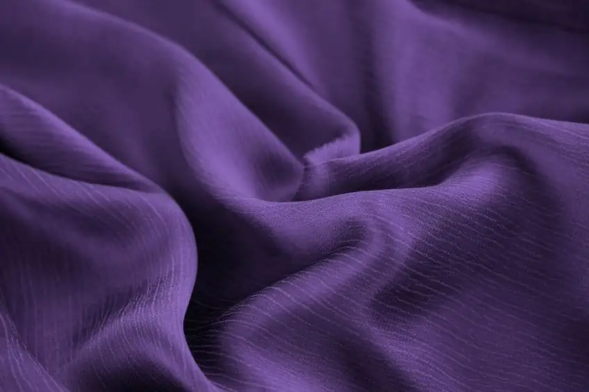
When darkening purple with black, it could cause unwelcome shades of color. We do recommend using some burnt umber to darken your purple color. This dark and reddish-brown color when blended into purple creates a soft deep purple color. The burnt umber is considered a warmer color and will, therefore, create a warmer purple shade. Another alternative is to use phthalo green to create a full-bodied dark purple color. You can also use this green and combine it with alizarin crimson to create a dark black. This black shade can then be blended with your base purple to create the darkest purple you can get.
How to Mix Purple with Watercolor
Mixing a beautiful purple with watercolor is quite easy, if you use the correct color tones to mix them:
- Start using ultramarine blue and crimson: To get a perfect purple, you need to use a ratio of one part ultramarine blue and one part crimson. These two colors are the best to get a purple with watercolors.
- Add a little indigo: Indigo is a pure, dark color that can help darken the purple. Add just a little, as it can make the mixture too dark.
- Add a little white: If the mixture is too dark, you can add some white to make the color lighter.
- Mix the colors well: Use a brush or a piece of sponge to mix the colors well.
- Test the paint: Apply the paint to a piece of paper and see if the purple you get matches your expectations. If not, try changing the mixture by adding more ultramarine blue or indigo until you get the perfect color.
All colors are needed to create beautiful pieces of art. However, purple has a special place because of its place in history and without it, a painted picture will simply not be the same. There are so many variations of purple, all enhancing and complementing each other. There is no limit to the combinations of colors you can make. So, fire up your imagination and get painting.
View our How To Make Purple web story here.
Frequently Asked Questions
How is a Vivid Purple Achieved?
This is a simple color to achieve, you will need equal amounts of both pure blue and red paint. To create a lighter variation, you can add white, and to darken the color you can add burnt umber. To help with creating different shades of purple, understanding color theory and bias is important.
What Two Colors Make Purple?
The simple answer is blue and red, however, there are many variations, shades, and tints. You can create a dark purple, a light purple, or even create cooler and warmer color options. There are no limits to what you can do.
Does Purple Have a Complementary Color?
When you take a look at your color wheel, you will notice that there are colors opposite each other. The color that is found opposite another color is called a complementary color. When it comes to purple, yellow is the complementary color. By blending purple and yellow, you will be enhancing the color. The blended purple color will be brighter and stand out more.
Is There a Specific Blue Needed to Create Purple?
When it comes to color theory, the blue needed should have a color bias leaning towards the color purple. For example, the warmer blues such as indanthrone blue or ultramarine are both great for creating a vibrant purple color.
Duncan graduated with a diploma in Film and TV production from CityVarsity in 2018, after which he continued pursuing film while taking on a keen interest in writing along the way. Since having graduated, he began working as a freelance videographer, filming a variety of music videos, fashion and short films, adverts, weddings and more. Throughout this, he’s won a number of awards from various film festivals that are both locally and internationally recognized. However, Duncan still enjoys writing articles in between his filming ventures, appreciating the peace and clarity that comes with it.
His articles focus primarily around helping up-and-coming artists explore the basics of certain colors, how these colors can be paired with other shades, as well as what colors are created when you mix one with another. All while relating these shades to historically significant paintings that have incorporated them into their color palette. As a lover of the arts himself, he takes great interest in the Renaissance era of paintings, an era that has directly inspired many of his favorite films.
Learn more about Duncan van der Merwe and about us.
