Shades of Nude Color – Learn to Gracefully Blend Shades of Nude
This post may contain affiliate links. We may earn a small commission from purchases made through them, at no additional cost to you.
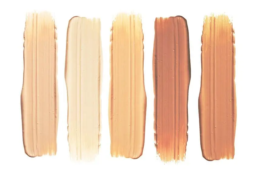
In the enchanting world of fashion and aesthetics, the allure of nude colors reign supreme, transcending time and trends. Often praised for their timeless elegance, these hues gracefully blend with every skin tone, leaving a trail of admiration wherever they go. But have you ever wondered, “What are nude colors?”. Delve into the captivating realm of the color nude as we explore the delicate interplay of shades that create the perfect balance between subtlety and sophistication. From the deep richness of a dark nude color to the delicate radiance of a light nude color, discover the artistry behind these versatile tones that effortlessly celebrate individuality and beauty in its most natural form.
Table of Contents
What Are Nude Colors and Their History
It should come as no surprise that the allure of nude colors has endured throughout the ages, captivating hearts with their timeless elegance and versatility, especially within the beguiling world of art and fashion. So, what are nude colors? These enchanting hues represent a delicate dance between subtlety and sophistication, as they effortlessly blend with various skin tones, creating a sense of harmony and balance. Their history, intertwined with the evolution of art, societal norms, and the pursuit of inclusivity, is a fascinating journey that takes us from ancient civilizations to the modern runways of high fashion.
The concept of color nude has long been a part of human history, even in the ancient world. Ancient Egyptian art, for example, often depicted figures with skin tones in earthy hues, symbolizing a connection to nature and the divine.
Similarly, ancient Greek sculptures adorned their masterpieces with pale and naturalistic tones, aiming to evoke a sense of realism and human beauty. As societies progressed, so did the perception of color nude. During the Renaissance, artists like Leonardo da Vinci and Michelangelo brought a newfound fascination with human anatomy and expression, refining their skills in portraying the human form with lifelike colors and subtle gradations. Their masterpieces showcased a range of shades of nude color, capturing the essence of the human spirit in its most vulnerable yet captivating form.

| Nude Color Name | Nude Color Hex Codes | RGB | CMYK Color Code (%) | Shades of Nude Color |
| Nude | #e3bc9a | 227, 188, 154 | 0, 17, 32, 11 | |
| Dark Nude | #ccb3a3 | 204, 179, 163 | 0, 12, 20, 20 | |
| Light Nude | #e6ddd8 | 230, 221, 216 | 0, 4, 6, 10 | |
| Nude Brown | #bc9e82 | 188, 158, 130 | 0, 16, 31, 26 | |
| Pink Nude | #ddc0b4 | 221, 192, 180 | 0, 13, 19, 13 | |
| Camel | #c19a6b | 193, 154, 107 | 18, 31, 63, 24 | |
| Chai Tea | #bd8d46 | 189, 141, 70 | 27, 47, 85, 9 | |
| Cinnamon Roll | #8a4b08 | 138, 75, 8 | 27, 58, 100, 22 | |
| Espresso Shot | #4b3832 | 75, 56, 50 | 0, 25, 33, 71 | |
| Nut Pudding | #97694f | 151, 105, 79 | 20, 47, 63, 15 | |
| Roasted Cocoa | #6f4e37 | 111, 78, 55 | 40, 56, 83, 48 |
However, the concept of nude colors was not limited to artistic representations alone; it was deeply ingrained in societal norms and expectations. In the 18th and 19th centuries, European high society often associated pale, light nude colors with aristocracy and refinement. These colors were considered elegant and pure, and they were favored for their ability to evoke a sense of delicacy and innocence. As the world moved into the 20th century, the perception of color nude underwent a transformative shift. The emergence of fashion and beauty industries prompted a new exploration of diverse skin tones and their representation in clothing and makeup.
This marked a significant turning point in the history of nude colors, as designers and makeup artists began to recognize the beauty of embracing a broader spectrum of hues that could complement and celebrate all skin tones.
Fast-forward to the present day, and we witness a glorious celebration of inclusivity in the fashion world. The shades of nude color have expanded exponentially to encompass a vast array of skin tones, ranging from the deep richness of dark nude colors to the ethereal charm of light nude colors. Designers now strive to offer a diverse range of “nude” options, acknowledging that the traditional concept of nude is not one-size-fits-all. The quest of diversity and representation has led to groundbreaking changes in the fashion industry.
Brands have become more conscious of the need to provide a broad palette of shades to cater to people of all backgrounds, celebrating their unique beauty and individuality. This evolution has transformed the way we perceive nude colors, turning them into a symbol of empowerment and inclusivity rather than a restrictive and exclusive ideal. In recent years, the fashion world has witnessed the rise of many designers and brands that champion diversity and inclusivity, making “nude” a powerful statement of embracing all skin colors and breaking away from conventional norms.
It is no longer about adhering to a singular definition of beauty but embracing the magnificent diversity that makes humanity so extraordinary.
The Psychological Effects of Nude Colors
By turning towards color psychology, it becomes clear that nude colors hold a profound and intriguing influence on our emotions, perceptions, and overall well-being. Often associated with elegance, simplicity, and timelessness, these stubble hues have a unique power to shape our moods and mental states. Exploring the psychological effects of nude colors unveils a fascinating interplay of feelings and sensations, where the delicate tones blend seamlessly with our subconscious, leaving a lasting impact on our daily lives. The psychological effects of nude colors begin with their ability to evoke a sense of calm and tranquility. Light nude colors, reminiscent of soft sand or warm beige, create a soothing and serene ambiance that helps alleviate stress and anxiety.
These shades have a grounding effect, akin to the feeling of walking barefoot on a sandy beach, allowing our minds to unwind from the chaos of modern life.
Conversely, dark nude colors, such as rich chocolate brown or deep mahogany, can exude a sense of sophistication and stability. These deeper tones resonate with feelings of security and strength, providing a comforting anchor during times of uncertainty. In interior design, dark nude colors can be used to create cozy and intimate spaces, encouraging relaxation and introspection. The versatility of nude colors extends beyond their calming properties; they also possess the remarkable ability to amplify other emotions and attributes. When paired with vibrant or bold accents, nude colors act as a canvas that allows the accompanying hues to shine brightly.

Whether it is a pop of fiery red or a burst of cheerful yellow, the presence of nude colors enhances the impact of surrounding colors, creating a harmonious and visually appealing environment. Moreover, nude colors have a profound impact on our perceptions of space and size. In fashion, lighter nude tones are often used to create the illusion of elongation and slimness, giving rise to the popular “nude heels” trend that seemingly elongates the legs. In interior design, lighter shades can make a room feel more spacious and open, while darker nude colors can add a sense of coziness and intimacy to larger spaces. Beyond the realm of aesthetics, the psychological effects of nude colors also extend to our self-perception and confidence.
When we wear clothing or accessories in nude colors that complement our skin tone, we often feel a heightened sense of comfort and attractiveness. These hues act as a mirror, reflecting back our natural beauty and enhancing our sense of self-assurance.
The psychological effects of nude colors also intersect with the concept of mindfulness and present-moment awareness. These calming tones encourage a sense of mindfulness by promoting a connection to the present and grounding us in the here and now. By surrounding ourselves with these serene hues, we can cultivate a greater awareness of our thoughts and emotions, fostering a deeper connection with ourselves and the world around us.

In art therapy, nude colors are utilized to evoke emotions, facilitate self-expression, and aid in emotional healing. The soothing and neutral nature of these hues provides a safe and comfortable space for individuals to explore their feelings and emotions, creating a sense of balance and harmony within themselves.
What Colors Compliment Nude?
Despite their seemingly understated appearance, the allure of nude tones opens up the door to a breathtaking realm of complementary colors. Like a delicate dance of harmony and contrast, these captivating pairings accentuate the natural beauty of nude hues, revealing a mesmerizing palette that celebrates the power of color harmony.
Nude Complementary Color
Nude, with its timeless elegance and subtle charm, serves as the perfect canvas for the ethereal allure of pale cerulean. The gentle warmth of nude tones enhances the delicate serenity of pale cerulean, while the celestial hue adds a touch of dreamlike magic to the understated simplicity of nude. When brought together in fashion ensembles, the pairing of nude and pale cerulean creates a visual masterpiece that exudes sophistication and grace.
In interior design, this harmonious combination transforms living spaces into serene sanctuaries, where the tranquil allure of pale cerulean blends seamlessly with the timeless elegance of nude.
In art and aesthetics, the captivating interplay of these complementary colors unlocks a world of endless possibilities, inviting us to bask in the mesmerizing beauty of harmony and contrast. The union of nude and pale cerulean celebrates the delicate balance between subtlety and serenity, leaving a lasting impression that lingers in the heart and mind like a gentle whisper from the heavens.

| Color Name | Hex Codes | RGB | CMYK Color Code (%) | Shades of Color |
| Nude | #e3bc9a | 227, 188, 154 | 0, 17, 32, 11 | |
| Pale Cerulean | #9ac1e3 | 154, 193, 227 | 32, 15, 0, 11 |
Nude Split Complementary Colors
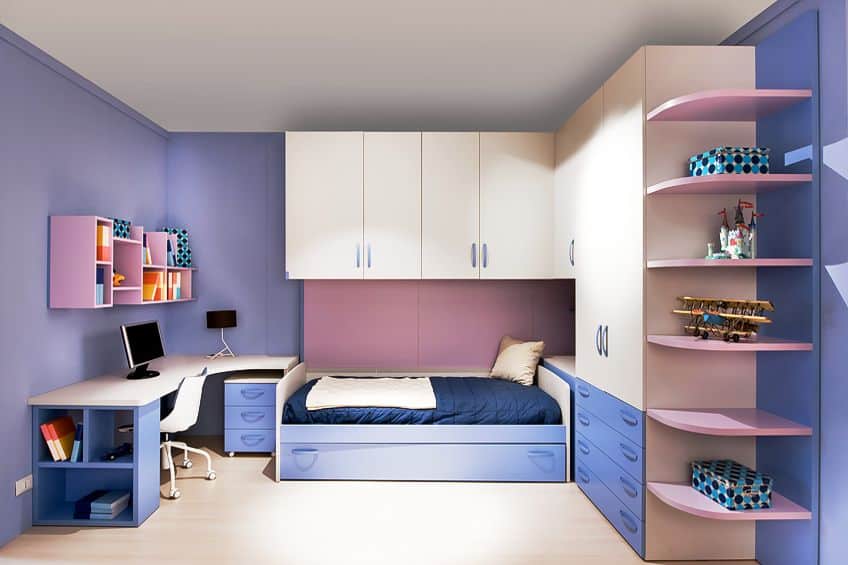
By turning to split complementary colors, you will find that nude finds itself in the company of dull lavender and morning glory blue. Like a harmonious trio of sophistication and serenity, these hues create a mesmerizing symphony of visual delight. Nude is able to set the stage for the delicate dance of dull lavender and morning glory.
The warm neutrality of nude tones beautifully complements the soft charm of dull lavender, while the vibrant morning glory adds a touch of captivating contrast to the palette.
In fashion ensembles, the interplay of nude, dull lavender, and morning glory creates a breathtaking ensemble that exudes sophistication and modern allure. In interior design, this harmonious trio transforms living spaces into serene sanctuaries, where the tranquil charm of dull lavender and morning glory blend seamlessly with the timeless elegance of nude.
| Color Name | Hex Codes | RGB | CMYK Color Code (%) | Shades of Color |
| Nude | #e3bc9a | 227, 188, 154 | 0, 17, 32, 11 | |
| Dull Lavender | #9a9de3 | 154, 157, 227 | 32, 31, 0, 11 | |
| Morning Glory | #9ae3e1 | 154, 227, 225 | 32, 0, 1, 11 |
Nude Triadic Colors
Embracing the thrilling dance with its captivating triadic partners, the trio of nude, bright lavender, and light teal creates a mesmerizing symphony of visual delight. With nude as the centerpiece of this harmonious trio once again, bright lavender is able to add a splash of energy and playfulness, while light teal brings a refreshing sense of serenity to the palette. In fashion ensembles, the interplay of nude, bright lavender, and light teal creates a stunning visual composition that exudes sophistication and modernity.
In interior design, this harmonious trio transforms living spaces into captivating retreats, where the tranquil charm of nude harmonizes with the vivacity of bright lavender and the calming essence of light teal.
| Color Name | Hex Codes | RGB | CMYK Color Code (%) | Shades of Color |
| Nude | #e3bc9a | 227, 188, 154 | 0, 17, 32, 11 | |
| Bright Lavender | #bc9ae3 | 188, 154, 227 | 17, 32, 0, 11 | |
| Light Teal | #9ae3bc | 154, 227, 188 | 32, 0, 17, 11 |
Nude Monochromatic Colors
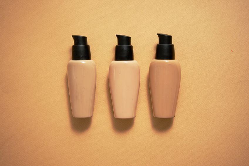
Reigning as the understated queen of elegance, and its monochromatic companions amplify its timeless allure. Like a symphony of subtlety, the monochromatic palette embraces a harmonious dance of shades and tints, unveiling the enchanting versatility of nude. At the heart of this captivating ensemble lies nude itself, with its soft warmth and graceful simplicity. As the central hue, nude serves as a canvas for the variations of its own family – the pale whispers white rock, the gentle caress of desert sand, and the warm whispers of persian orange. In fashion, the monochromatic allure of nude creates a chic and sophisticated look that transcends time and trends.
Layering different shades of nude in varying textures adds depth and dimension to an ensemble, transforming simplicity into a captivating statement of style.
| Color Name | Hex Codes | RGB | CMYK Color Code (%) | Shades of Color |
| Persian Orange | #d2945e | 210, 148, 94 | 0, 30, 55, 18 | |
| Whiskey | #d8a272 | 216, 162, 114 | 0, 25, 47, 15 | |
| Very Light Brown | #ddaf86 | 221, 175, 134 | 0, 21, 39, 13 | |
| Nude | #e3bc9a | 227, 188, 154 | 0, 17, 32, 11 | |
| Desert Sand | #e9c9ae | 233, 201, 174 | 0, 14, 25, 9 | |
| Double Spanish White | #eed6c2 | 238, 214, 194 | 0, 10, 18, 7 | |
| White Rock | #f4e4d6 | 244, 228, 214 | 0, 7, 12, 4 |
How to Make Nude Paint
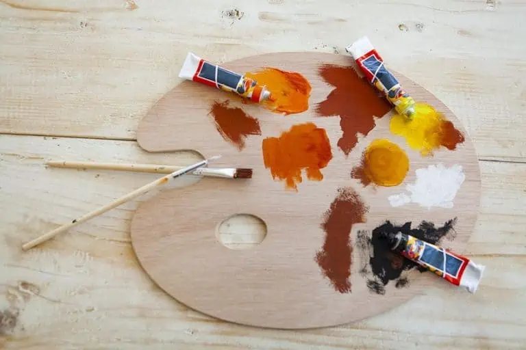
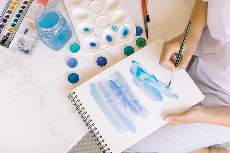
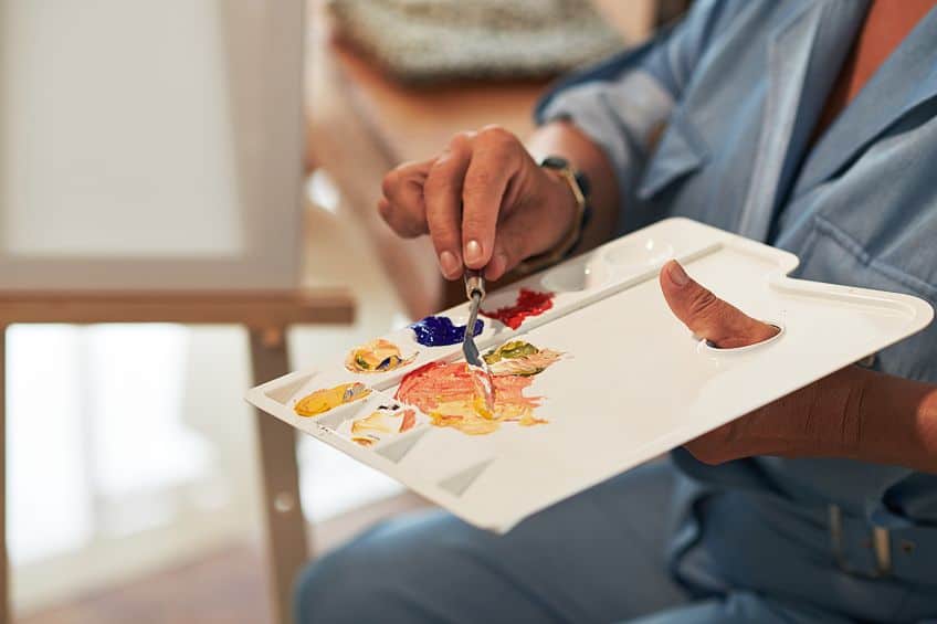
Mixing your own nude color paint is a journey of creativity and self-expression. Like an alchemist blending delicate hues, this artistic endeavor allows you to craft a unique and personalized palette that celebrates the beauty of subtlety and elegance. Whether you seek a warm and inviting beige or a soft and ethereal blush, mastering the art of creating your own nude color paint opens a world of endless possibilities. To embark on this captivating journey, begin with a basic understanding of color theory. Nude colors are essentially warm neutrals that complement various skin tones, creating a sense of balance and harmony.
As you delve into the art of mixing, consider the primary colors, red, blue, and yellow, which form the foundation of color creation.
To create a warm nude tone, start with a base of white paint, and add a touch of yellow and a hint of red. Experiment with different ratios until you achieve the desired warmth and depth. For a cooler nude, begin with the same white base but add a touch of blue and a dash of red. Again, explore various proportions until you find the perfect balance that resonates with your artistic vision. Remember, the captivating allure of mixing your own nude color paint lies in the freedom to tailor the palette to your preferences. Play with different combinations and variations of colors, and let your artistic intuition guide you. Be adventurous and embrace the unexpected, for the beauty of art lies in its ability to surprise and delight.
| Color Name | Hex Codes | RGB | CMYK Color Code (%) | Shades of Color |
| White | #ffffff | 255, 255, 255 | 0, 0, 0, 0 | |
| Red | #ff0000 | 255, 0, 0 | 0, 100, 100, 0 | |
| Blue | #0000ff | 0, 0, 255 | 100, 100, 0, 0 | |
| Yellow | #ffff00 | 255, 255, 0 | 0, 0, 100, 0 |
Beyond the primary colors, consider the vast array of earthy tones and muted hues that can enrich your nude palette. Ochre, sienna, and burnt umber are excellent choices to add depth and warmth to your creations. Experimenting with these earthy tones will allow you to refine your nude color paint, adding richness and complexity to your artistic repertoire. As you delve deeper into the art of mixing nude color paint, remember to keep a journey or sketchbook to record your discoveries and color combinations. This captivating record will become a treasure trove of inspiration, guiding your future artistic endeavors and refining your understanding of color harmony.
In addition to experimenting with color combinations, consider the texture and opacity of your paint. Mixing acrylic paint with acrylic mediums create subtle variations in sheen and texture, adding a captivating dimension to your nude palette.
Alternatively, blending oil paints with linseed or walnut oil can create luscious and velvety hues, inviting your brush to glide across the canvas with effortless grace. The captivating allure of mixing your own nude color paint lies in its versatility and adaptability. Whether you are an experienced artist or a novice, this artistic journey invites you to explore the beauty of subtlety and simplicity. From creating delicate skin tones in portraiture to crafting serene landscapes, your customized nude color palette will become an essential tool in your artistic repertoire.

As you immerse yourself in this captivating process, remember that art is a reflection of the soul, a language of emotions and ideas. Embrace the journey of mixing your own nude color as an expression of your unique perspective and creativity. Allow your imagination to soar and let the colors on your palette dance in harmony, for in the realm of art, there are no limits to the captivating magic you can create.
Using Shades of Nude in Fashion and Interior Design
Like a delicate ballet of soft hues, these versatile tones create a symphony of elegance that transcends the boundaries of trends and seasons. From the ethereal grace of light nudes to the captivating depth of dark nudes, the artful interplay of these shades opens a world of endless possibilities, allowing creativity to flourish on a canvas of subtlety and refinement. In the realm of fashion, the magic of nude colors lies in their ability to blend seamlessly with an array of captivating color combinations. The fusion of soft blush and warm sand tones creates a palette of delicate femininity, enveloping the wearer in a gentle and romantic embrace.
A blush-toned dress adorned with sand-colored accessories exudes an ethereal charm that is both chic and subtly glamorous.

| Color Name | Hex Codes | RGB | CMYK Color Code (%) | Shades of Color |
| Soft Blush | #e3bcbc | 227, 188, 188 | 0, 17, 17, 11 | |
| Sand | #c2b280 | 194, 178, 128 | 0, 8, 34, 24 |
For those seeking a bolder statement, the tantalizing blend of dark nudes with hints of mocha and cocoa reveals a world of modern sophistication and confidence. A rich mocha-toned blouse paired with dark nude trousers creates an alluring and contemporary ensemble that exudes power and elegance. The addition of cocoa-hued accessories, such as a leather belt or clutch, adds depth and warmth to the overall look, making it a striking and stylish choice for both day and evening wear.

| Color Name | Hex Codes | RGB | CMYK Color Code (%) | Shades of Color |
| Dark Nude | #ccb3a3 | 204, 179, 163 | 0, 12, 20, 20 | |
| Mocha | #967969 | 150, 121, 105 | 0, 19, 30, 41 | |
| Cocoa | #35281e | 53, 40, 30 | 0, 25, 43, 79 |
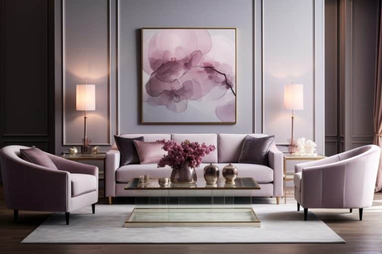
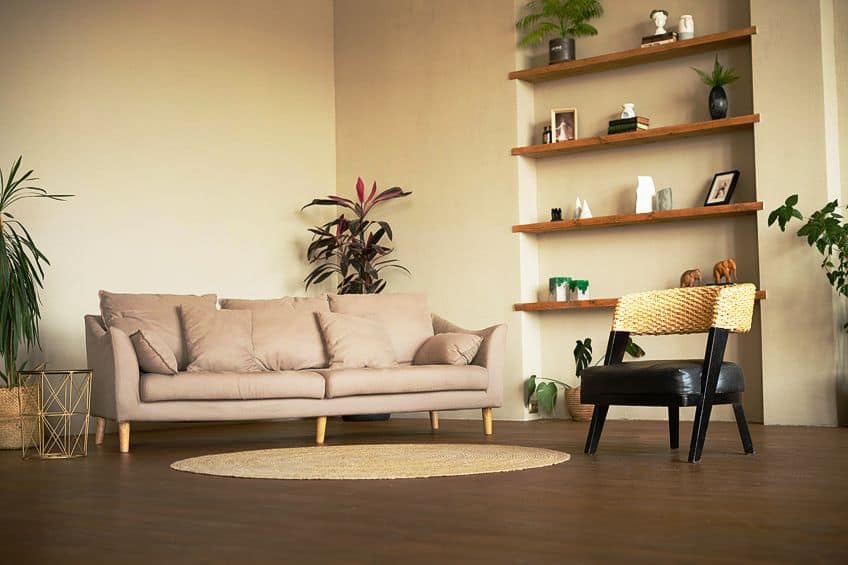
The allure of nude colors in interior design is equally captivating, as they harmonize effortlessly with a variety of captivating color palettes. A combination of light nudes, such as warm beige and soft cream, with accents of subtle rose or peach, creates a calming and inviting atmosphere in bedrooms and living rooms. These soothing hues reflect natural light, infusing the space with a gentle radiance that fosters tranquility and relaxation.

| Color Name | Hex Codes | RGB | CMYK Color Code (%) | Shades of Color |
| Warm Beige | #d8bcab | 216, 188, 171 | 0, 13, 21, 15 | |
| Soft Cream | #f5efd6 | 245, 239, 214 | 0, 2, 13, 4 | |
| Delicate Rose | #fbb9b9 | 251, 185, 185 | 0, 26, 26, 2 | |
| Peach | #f6b092 | 246, 176, 146 | 0, 28, 41, 4 |
To add a touch of opulence and sophistication to interiors, the fusion of dark nudes like rich taupe and velvety brown with accents of gold or brass infuses a sense of warmth and grandeur to living spaces or dining areas. A luxurious taupe-toned sofa adorned with plush brown cushions and gold-trimmed accessories creates a sumptuous retreat that exudes timelessness appeal and regal elegance.
| Color Name | Hex Codes | RGB | CMYK Color Code (%) | Shades of Color |
| Taupe | #483c32 | 72, 60, 50 | 0, 17, 31, 72 | |
| Velvety Brown | #63473a | 99, 71, 58 | 0, 28, 41, 61 | |
| Gold | #ffd700 | 255, 215, 0 | 0, 16, 100, 0 | |
| Brass | #b5a642 | 181, 166, 66 | 0, 8, 64, 29 |
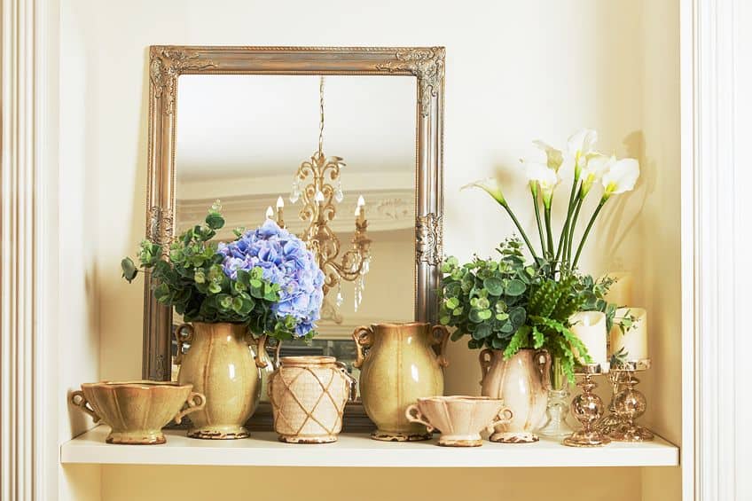
In both fashion and interior design, the charm of nude colors lies in their versatility to harmonize with vibrant accents and patterns. For a chic and contemporary look, the artful use of nude shades creates a neutral backdrop that allows for the integration of lively colors, creating a fresh and modern ambiance. The fusion of light nudes with accents of azure blue or emerald green infuses a sense of energy and vibrancy to living spaces, making them visually captivating and inviting.
| Color Name | Hex Codes | RGB | CMYK Color Code (%) | Shades of Color |
| Nude | #e3bc9a | 227, 188, 154 | 0, 17, 32, 11 | |
| Azure Blue | #007fff | 0, 127, 255 | 100, 50, 0, 0 | |
| Emerald Green | #50c878 | 80, 200, 120 | 60, 0, 40, 22 |
For those with a penchant for bohemian chic, the combination of nude colors with earthy tones like terracotta and ochre creates an inviting and warm atmosphere that celebrates the beauty of nature. Layers of nude-hued textiles, such as curtains and rugs, complemented by terracotta pottery and ochre-colored furnishings, create a bohemian oasis that is both cozy and stylish. In the enchanting world of using shades of nude, there are no limits to creativity and self-expression. Whether draped on our bodies or adorning our living spaces, these soft hues continue to captivate, allowing us to weave a story of elegance and sophistication.
The allure of nude colors invites us to slow down, appreciate the beauty around us, and find inspiration in the exquisite simplicity that surrounds us every day.

| Color Name | Hex Codes | RGB | CMYK Color Code (%) | Shades of Color |
| Nude | #e3bc9a | 227, 188, 154 | 0, 17, 32, 11 | |
| Terracotta | #e2725b | 226, 114, 91 | 0, 50, 60, 11 | |
| Ochre | #cc7722 | 204, 119, 34 | 0, 42, 83, 20 |
In the mesmerizing world of shades of nude color, the allure of understated elegance and timeless beauty prevails. Like a delicate dance of subtlety and sophistication, these captivating hues transcend trends and seasons, celebrating the power of simplicity in its purest form. Whether adorning our bodies or transforming living spaces, the magic of nude colors invites us to embrace the beauty of the present, finding inspiration in the exquisite harmony of colors that surround us every day. From the soft whispers of light nudes to the deep allure of dark nudes, the captivating charm of shades of nude color continues to enchant.
Take a look at our skin color shades webstory here!
Frequently Asked Questions
What Colors Make Nude Paint?
When looking at what colors make nude paint, you can mix various colors to achieve the desired tone. Start with a base of white paint and add small amounts of yellow and red to create a warm nude color. For a cooler nude, add a touch of blue instead of red. Experiment with different ratios until you achieve the perfect balance of warmth and subtlety that resonates with your artistic vision.
What Are Nude Colors?
Nude colors are warm, neutral hues that closely resemble human skin tones. They typically include variations of beige, taupe, blush, and other earthy tones. The term nude in the context of color refers to shades that harmonize well with various skin tones, making them versatile and universally flattering.
Are Nude Colors Considered Timeless in Fashion and Design?
Yes, nude colors are considered timeless in both fashion and design. Their understated elegance and versatility ensure that they remain relevant and stylish across different eras and trends. Nude-toned clothing and accessories are often considered wardrobe staples, while nude shades in interior design create a sense of timeless sophistication.
Can Nude Colors Be Used in Artworks and Paintings?
Absolutely! Nude colors are commonly used in art and painting to create natural-looking skin tones in portraits. Artists often use various shades of beige, pink, and brown to capture the subtle nuances of skin. Additionally, nude colors can be used in landscapes and still-life paintings to add warmth and balance to the overall composition.
Duncan graduated with a diploma in Film and TV production from CityVarsity in 2018, after which he continued pursuing film while taking on a keen interest in writing along the way. Since having graduated, he began working as a freelance videographer, filming a variety of music videos, fashion and short films, adverts, weddings and more. Throughout this, he’s won a number of awards from various film festivals that are both locally and internationally recognized. However, Duncan still enjoys writing articles in between his filming ventures, appreciating the peace and clarity that comes with it.
His articles focus primarily around helping up-and-coming artists explore the basics of certain colors, how these colors can be paired with other shades, as well as what colors are created when you mix one with another. All while relating these shades to historically significant paintings that have incorporated them into their color palette. As a lover of the arts himself, he takes great interest in the Renaissance era of paintings, an era that has directly inspired many of his favorite films.
Learn more about Duncan van der Merwe and about us.
