Shades of Orange – Exploring the Versatility of the Orange Palette
This post may contain affiliate links. We may earn a small commission from purchases made through them, at no additional cost to you.
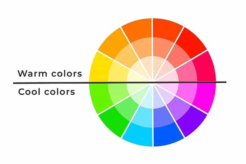
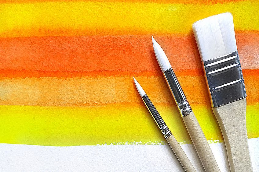
Orange colors are warm and bring to mind sunsets, autumn leaves, pumpkins, and fruit. The different shades of orange are located between red and yellow on the color wheel and generally are associated with feelings of joy and happiness. There are many orange hues, and some of the color names include exotic names like papaya whip, mango tango, or tangerine. Whether it is for web design, interior design, or any other creative project, there are bound to be shades of orange you can use.
Orange Color: A Brief History
Different types of orange color can be found abundantly in nature from pumpkins, carrots, oranges, and other fruits to the sun and flowers. Learning how to use pigments and other sources of color, people have been using the orange color in their day-to-day lives for many years. The Ancient Egyptians initially used a pigment known as realgar to paint on tomb walls. In Ancient Rome, a mineral known as orpiment was used as an orange and yellow color. However, the mineral contained arsenic and was quite toxic. Even so, the mineral was also used in Chinese medicine. The orange-yellow color of the mineral was sought after by alchemists, whose quest it was to search for ways to create gold.
The first recorded use of the name orange as a color in English was recorded in 1502, where a description of the color was noted in clothing purchased by Margaret Tudor, the Queen consort of Scotland. Before this time, the color was referred to as yellow-red, or the term saffron was used to define the color. This is because saffron, which is a spice that comes from the Middle East and certain areas in Europe, has a deep orange-red color. However, this changed due to the orange fruit trees that were brought over to Europe from Asia. The color orange was then named after the citrus orange fruit.
The orange color or saffron color is closely associated with Buddhism and the pigments used to color their robes. The color is symbolically linked to perfection and a search for knowledge. The orange color can also be found in Hinduism, where Krishna, a Hindu deity, can often be seen depicted wearing the yellow-orange color.
The Netherlands has also played a part in the progression of the color orange, which is featured in the country’s old national flag. Over the years, the orange color has remained a national favorite. This all originated in the 16th and 17th centuries, from one of the old important royal houses in the country, known as the House of Orange-Nassau. This royal house played a major role in religion as well as politics over the years. One of the major influences was William III of Orange, who became the ruler of both the Netherlands and England.
In the late 18th century, Louis Vanquelin, who was a scientist from France came across a mineral known as crocoite, and this eventually led to the creation of a synthetic type of pigment known as chrome orange. This was soon followed by other synthetic pigments like cobalt orange.
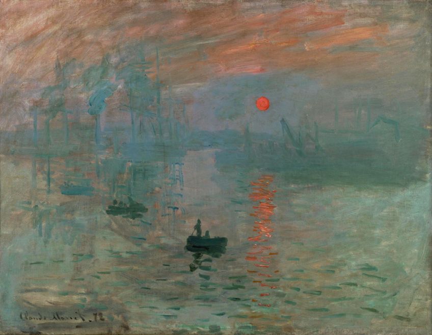 Impression, Sunrise (1872) by Claude Monet; Claude Monet, Public domain, via Wikimedia Commons
An orange palette was often used by many famous artists like Van Gogh, who mixed his own orange palette to create his amazing work. For example, Still Life with Basket and Six Oranges 1888. Claude Monet also produced some beautiful artwork that used various orange hues. For example, his impressionist contribution was called Impression, Sunrise 1872. Another famous art piece known as Flaming June 1895, was done by Sir Frederic Leighton and depicts a woman in a vivid orange dress who is sleeping beneath a canopy on a hot summer day.
Orange is a color that stands out, which is why it has been used in certain equipment and clothing over the years. American Navy pilots were given orange life jackets during the Second World War. After the war, this became a common sight on naval as well as civilian vessels. If you look at pictures of crew members from the International Space Station, they are all wearing orange suits.
There are many other places where orange plays an important role, especially in the advertising and marketing sector.
The Psychology and Meaning of Orange Colors
In general, an orange color brings about feelings of warmth and happiness and is seen as a positive color. The color also provides a sense of excitement, energy, movement as well as amusement. There are many varieties and types of orange colors from bright orange colors to softer colors like coral. Below are a few more associations concerning the color orange.
- Joy
- Creativity
- Health
- Fun
- Freedom
- Success
- Enthusiasm
- Compassion
- Stimulating and vibrant
- Adventurous
The orange color in nature, as seen in various fruits and vegetables, comes from what is known as carotenes, which is a kind of photosynthetic pigment. The pigments convert the light energy into chemical energy the plants can absorb. The same thing occurs in the various shades of orange leaves on trees. So, the various shades of orange can be associated with both summer and autumn. In autumn, in many forests around the world, you will be able to witness the abundance of orange hues when the leaves start to turn. The color is definitely something that draws your attention.
The color orange is made from blending red and yellow but is less aggressive than red as the yellow calms everything down. All colors can elicit certain physical effects, the same with an orange color. Orange can help to improve appetite, may help to improve concentration, and can aid in improving the oxygen supply to the brain, and provide a sense of contentment. The color orange can also help with improving confidence and may even help in the decision-making process. Many restaurants use the color orange to help stimulate the appetite and create a happy and fun atmosphere. On the other side, too much of a good thing can help to create negative associations. An overwhelming amount of orange can create feelings of self-centeredness, pride, and arrogance.
Different shades of orange can also have different meanings. For example, bright orange colors can be linked to passion, and taking action, while a more golden orange can represent wealth, wisdom, and quality. Darker orange colors can be seen as something that signifies distrust. Lighter orange hues are soothing and signify friendliness and trust.
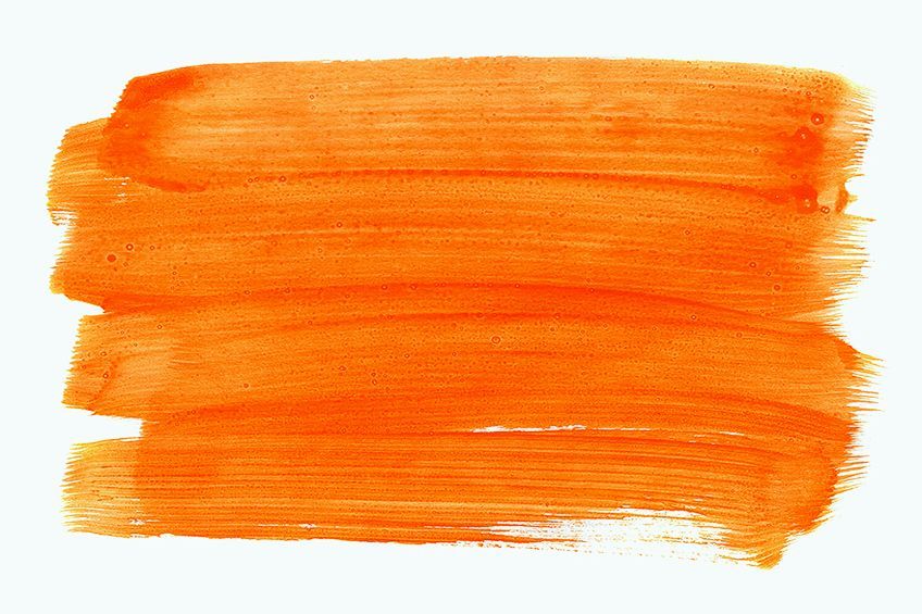
Different Shades of Orange
When seeing light and color, orange can be found at a wavelength of about 585 and 620 nanometers in the visible spectrum. When painting, it is known as a secondary color, created when blending red and yellow. When looking at an RGB (red, green, and blue) model, mostly for computer graphics, it is a tertiary color.
The different shades of orange can vary in hue, saturation or chroma, and tone or value. The shades of orange can also be a mixture of two or three of these variations. When selecting the correct orange hue you want, it is best to understand the response or effect you wish to achieve.
Types of Orange Color
Before we get into the more exotic orange color names, there are a few shades of orange that share the same name. However, each of these orange colors comes from a different source. First, you have your color wheel orange or pure orange and is located precisely midway between yellow and red. Next, is a web color orange color, used mainly in website graphics. Next, you have your safety orange which is used mostly as a warning color in clothing, warning notices, and road cones.

The following two orange colors are different tones of what is called International Orange. The one orange hue is used in the aerospace sector, for example, the pressure suits worn by crew members. The second is an orange hue that was used on the Golden Gate Bridge, helping to increase the bridge’s visibility to ships passing by.
The well-known Pantone company also has its own orange variety, along with the Crayola company.
| Orange Shade | Orange Hex Code | CMYK Orange Color Code | RGB Orange Color Code | Orange Color |
| Orange: Color Wheel | #ff8000 | 0, 50, 100, 0 | 255, 128, 0 | |
| Web Color Orange | #ffa500 | 0, 35, 100, 0 | 255, 165, 0 | |
| Safety Orange | #ff7900 | 0, 53, 100, 0 | 255, 121, 0 | |
| International Orange: Aerospace | #ff4f00 | 0, 69, 100, 0 | 255, 79, 0 | |
| International Orange: Golden Gate Bridge | #f04a00 | 0, 69, 100, 6 | 240, 74, 0 | |
| Pantone Orange | #ff5800 | 0, 65, 100, 0 | 255, 88, 0 | |
| Crayola Orange | #ff7538 | 0, 54, 78, 0 | 255, 117, 56 |
Tangerine
Tangerine is a vibrant and happy color that is named after the tangerine fruit. The saturated and bold orange color is associated with energy and youthfulness and helps to produce an invigorating effect.
The color can also be used to help stimulate the appetite, which makes it an ideal color for marketing. The tangerine can be a wonderful accent color when used with neutral colors such as gray and cream.
| Orange Shade | Orange Hex Code | CMYK Orange Color Code | RGB Orange Color Code | Orange Color |
| Tangerine | #f78702 | 0, 45, 99, 3 | 247, 135, 2 |
Papaya Whip
This color name is quite exotic and is a mixture of orange and brown. The combination forms an extremely light orange color, however, there are more shades of this particular orange color available. When used in marketing, the color is meant to elicit feelings of friendliness, health and can also be associated with a home as well as travel.
The complementary color for papaya whip is paction blue and its hex code is #35b1e6.
| Orange Shade | Orange Hex Code | CMYK Orange Color Code | RGB Orange Color Code | Orange Color |
| Papaya Whip | #ffefd5 | 0, 6, 16, 0 | 255, 239, 213 | |
| Paction Blue | #35b1e6 | 77, 23, 0, 10 | 53, 177, 230 |
Carrot Orange and Pumpkin Orange
This particular orange hue is quite saturated and provides a certain warmth and energy. The carrot orange is close to a yellow-orange but is a little darker.
The color orange can be used to great effect in marketing and website design, depending on what message you wish to express. Another orange hue that resembles a vegetable is pumpkin orange, which is often used in fall and Halloween-themed décor and art.
| Orange Shade | Orange Hex Code | CMYK Orange Color Code | RGB Orange Color Code | Orange Color |
| Carrot Orange | #ed9121 | 0, 39, 86, 7 | 237, 145, 33 | |
| Pumpkin Orange | #f5761a | 0, 52, 89, 4 | 245, 118, 26 |
Dark Orange
This orange hue is a bit darker than the more basic orange and in a CMYK (Cyan, Magenta, Yellow, and Black) color space for printing, it has more of a magenta undertone.
This particular orange color can also lean more towards a brown color.
| Orange Shade | Orange Hex Code | CMYK Orange Color Code | RGB Orange Color Code | Orange Color |
| Dark Orange | #ff8c00 | 0, 45, 100, 0 | 255, 140, 0 |
Burnt Orange
Burnt orange is a darker orange color and was first named in 1915. The color can be associated with autumn, fire, warmth, and bringing people together. However, it also has a few negative connotations including pride and stubbornness.
Deep blue colors and gray colors work well with burnt orange. If you wish to create a more contrasting orange palette, combine burnt orange with colors like mint blue or peach.
| Orange Shade | Orange Hex Code | CMYK Orange Color Code | RGB Orange Color Code | Orange Color |
| Burnt Orange | #cc5500 | 0, 58, 100, 20 | 204, 85, 0 |
Vermilion
The vermilion pigment was first obtained from powdered mercury sulfide, also known as cinnabar. This deep red-orange shade pigment contained mercury, which made it toxic and many of those who mined the mineral lost their lives in the process. Thankfully, the toxic pigment was eventually replaced by synthetic pigments like cadmium red, which has a similar color.
The vermilion color also played a large role in Chinese culture, where a shade of vermilion color was used on lacquerware and became known as “Chinese red.”
| Orange Shade | Orange Hex Code | CMYK Orange Color Code | RGB Orange Color Code | Orange Color |
| Vermilion | #e34234 | 0, 71, 77, 11 | 227, 66, 52 | |
| Chinese Red | #aa381e | 0, 67, 82, 33 | 170, 56, 30 |
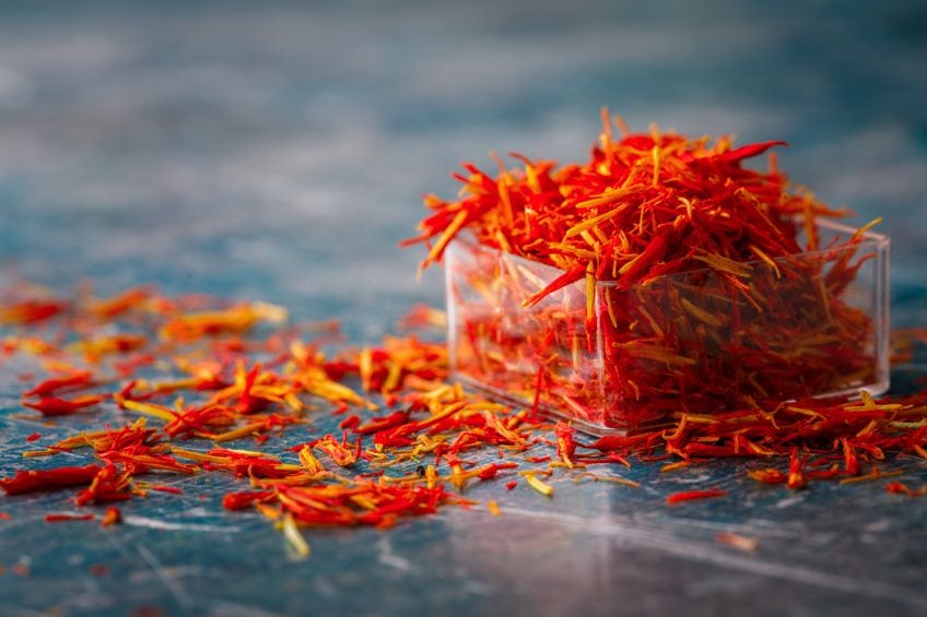
India Saffron
Saffron is an expensive spice that consists of bright orange colors with hints of yellow. India saffron is the color you find in the Indian flag and signifies strength and courage. The color is also sometimes known as Kesari in Indian culture.
| Orange Shade | Orange Hex Code | CMYK Orange Color Code | RGB Orange Color Code | Orange Color |
| Indian Saffron | #ff9933 | 0, 40, 80, 0 | 255, 153, 51 |
Apricot
Apricot, the paler yellowish-orange color, shares its name with the fruit it represents. The color code for apricot derives from the Arabic word “Al-birquq.” Interestingly, variations of this term were found in 16th-century English, but it was not until 1851 that the word “apricot” was first used to describe this specific color. Apricot can be best described as a light shade of orange, distinct from the skin or flesh of the fruit.
| Orange Shade | Orange Hex Code | CMYK Orange Color Code | RGB Orange Color Code | Orange Color |
| Apricot | #fbceb1 | 0, 30, 30, 0 | 251, 206, 177 |
Amber
The name “Amber” finds its origin in a remarkable material, known for being a window into ancient times – a transparent biological fossil, a fossil of resin. As the light source shifts and the surrounding environment alters its colors, amber unveils a kaleidoscope of tones, each unique and enchanting. At times, it embraces a gentle, mellow demeanor, while on other occasions, it blazes with fiery and vibrant intensity.
| Orange Shade | Orange Hex Code | CMYK Orange Color Code | RGB Orange Color Code | Orange Color |
| Amber | #ffbf00 | 0, 25, 100, 0 | 100, 74.9, 0 |
Deep Saffron
In the tapestry of colors, Deep Saffron emerges as a captivating member of the Orange family. A delightful dance of hues, it gracefully weaves together the essence of orange and brown, forming a mesmerizing fusion of warmth and depth.
| Orange Shade | Orange Hex Code | CMYK Orange Color Code | RGB Orange Color Code | Orange Color |
| Deep Saffron | #ff9933 | 0, 40, 80, 0 | 255, 153, 51 |
Gamboge Orange
Gamboge color belongs to the Yellow color family and is predominantly composed of a blend of orange and brown hues.
| Orange Shade | Orange Hex Code | CMYK Orange Color Code | RGB Orange Color Code | Orange Color |
| Gamboge | #e49b0f | 0, 32, 93, 11 | 228, 155, 15 |
Rajah Orange
Rajah color falls within the Orange color family and is characterized as a distinctive hue resulting from the blending of orange and brown colors. The color’s appearance is reminiscent of a harmonious combination of these two pigments, resulting in a warm and earthy tone.
| Orange Shade | Orange Hex Code | CMYK Orange Color Code | RGB Orange Color Code | Orange Color |
| Rajah | #faba5f | 0, 26, 62, 2 | 250, 186, 95 |
Halloween Orange
When it comes to Halloween, orange takes on a significant role in representing the essence of the occasion. It symbolizes fire, evoking feelings of warmth, energy, and excitement during this festive time of the year.
| Orange Shade | Orange Hex Code | CMYK Orange Color Code | RGB Orange Color Code | Orange Color |
| Halloween Orange | #ee5921 | 0, 63, 86, 7 | 238, 89, 33 |
Some Tips on Using Orange in Web Design
Orange can be an effective color when it comes to design, helping to elicit certain feelings. Depending on how you use the different shades of orange, you can conjure up feelings associated with autumn, or summer and tropical fruits. How you use the colors will be dependent on what you want to achieve.

Orange is a color that will add energy and fun to any design, as long as you use the color and its color combinations wisely. It is possible to incorrectly use an orange color, and it can become too overwhelming. However, orange is a versatile color that, when used properly, can work amazingly well.
Orange is Best Used in Small Amounts
When adding some orange colors to a design online, smaller touches of orange can be used to create interest and will draw the viewers’ eyes towards certain areas on the screen. If you would like to add in more orange colors, try to use more muted colors so as not to create a message that is too garish.
When using too much orange, it can get a bit overwhelming, and can then seem more aggressive and too bright. You can use an orange color that forms most of a design, as long as you want to make a bold statement.
Orange and Cooler Colors
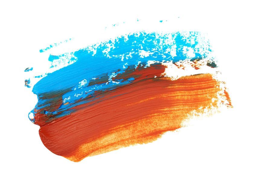
Orange pairs well with cooler colors like blue, and green, and works great as an accent color. Blue is the complementary color for orange, so the colors will stand out nicely. The orange adds in that needed touch of warmth, as blue and green can sometimes appear overly cool when they are the only colors being used. This is, of course, okay if you are wanting to create this type of look. However, all these colors are quite versatile and appeal to most people.
Using Warm Colors With Orange
When working with orange colors, it can be challenging to combine them with other warm colors. When using a warm color palette that includes orange, red, and yellow, you might find that your eyes do not find rest. A cooler color is needed to break up the design.
As with using too much orange, too many warm colors can also become overwhelming.
Using Orange Color for Effect
The various shades of orange are associated with energy, warmth, fun, and it is an exciting color. When using orange in a design, it should be used within the context and make overall sense in the design. A young and trendy health food company might do well with these colors, however, something like an architectural company or bank might want to consider calmer color choices. When used properly, orange can be used in almost any application, it all depends on what message you want to send to your viewers.

Orange Text
Orange might not be the best choice as text unless it is used as a background color instead. You might notice many buttons or headlines like this. Also, blue and orange colors work well together, however, not when the two colors are placed on top of each other or layered. Each color is eye-catching, so they will compete for attention, which can make things difficult on the eyes.
Some are color blind and might find it even more challenging to see clearly.
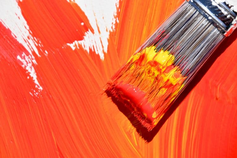
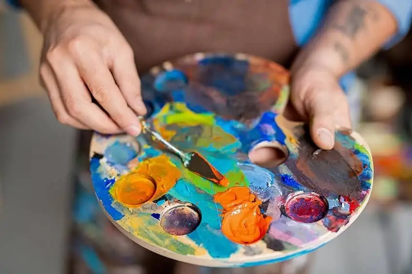
Creating a Color Palette Orange With Acrylics
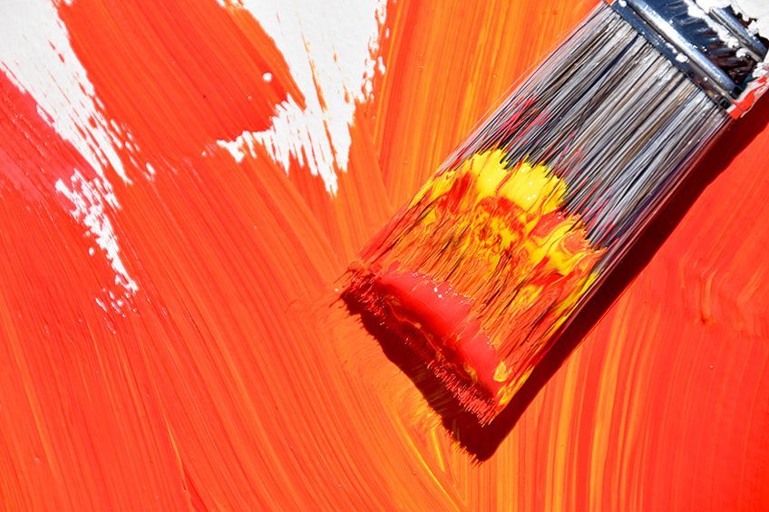
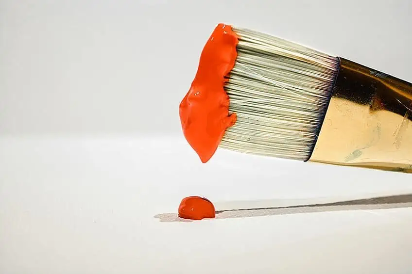
To find a color online is relatively easy and with the information provided, you can replicate it for websites and other graphics. However, how easy is it to make an orange palette with acrylic paints? Mixing paint colors goes a lot easier if you have a basic knowledge of color theory. An understanding of primary, secondary, tertiary, and complementary colors, warm and cool colors, and how to create different shades and tints. The easiest way to create orange is to mix red and orange paint. To create the best and most bright orange colors, use cadmium yellow and cadmium red. Always add the red paint to the yellow paint in small amounts, until you reach the desired color.
You can also use a small amount of cadmium orange and add this to the cadmium yellow for different shades of orange. You should take note when purchasing paint colors in the tube, as manufacturers do not all have the same ingredients. So, you need to understand what pigments and other ingredients make up the paint color you wish to use. Some red paint colors can have a blue bias and vice versa, so again, understanding basic color theory is important. When mixing, this helps you avoid creating a dull color, and instead, you will be able to create more vivid orange colors.
When choosing your red and yellow colors, you should know that the complementary color for red is green, while for yellow it is purple. For example, if you choose a red like alizarin red, this paint color has a blue bias. We know that in color theory when combining all three primary colors, or its complementary color, it creates a dull brown color. So, if you combine alizarin red, which has a blue bias with yellow, you will create a dull orange to brown color. The same can be said of lemon yellow, which contains a greenish undertone.
Sometimes, the color bias is not obvious, which is why knowing how to read the ingredients on the tube will help, or you will simply find out when mixing your colors.
How to Create Warm and Cool Orange Colors
Once you have mixed your orange color, you might want to make it warmer or cooler. Warmer colors include orange, red, and yellow, while cooler colors include green, blue, and purple. The best way to get a pure warm color is to combine cadmium red and cadmium yellow.
To get a cooler orange color, simply use a color like lemon yellow. You can also use green to make a cooler more muted orange color. For example, cadmium orange and phthalo green. Remember, to always add small amounts of green to the orange.
Creating Darker and Lighter Shades of Orange
To darken orange, you can add in small amounts of black or its complementary blue color. The blue would provide a richer and bolder darker color than black, which might create a dull orange. There are many shades of orange and blue and picking one directly opposite your specific orange color might be best. For example, to darken a yellow-orange, use a blue-violet, or if you have a red-orange, use a blue-green.
Burnt orange leans more towards brown and is also a darker orange, so you can add any of the following paint colors to your orange. These colors will tone your orange down and create that orange-brown effect. Remember to use warm browns or blues in small amounts if you want a warm burnt orange. Black can be used; however, it is not the best option.
| Orange Shade | Orange Hex Code | CMYK Orange Color Code | RGB Orange Color Code | Orange Color |
| Burnt Umber | #6e260e | 0, 65, 87, 57 | 110, 38, 14 | |
| Burnt Sienna | #e97451 | 0, 50, 65, 9 | 233, 116, 81 | |
| Dark brown | #5c4033 | 0, 30, 45, 64 | 92, 64, 51 | |
| Blue | #0000ff | 100, 100, 0, 0 | 0, 0, 255 |
You can lighten orange by simply adding white or more yellow. The preferred method is to add more colors you are using, which is yellow as white tends to make a color look a bit chalky. To create a light orange color, be sure to add small amounts of your orange paint to your yellow paint.
Different Shades of Orange Around the Home
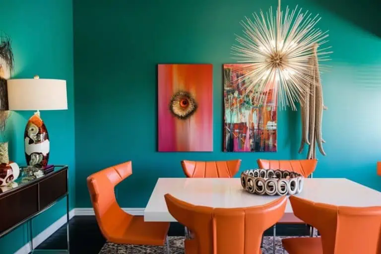
A color palette orange can help to bring a warm and energizing atmosphere into any room. Orange is a great color for classrooms as it inspires creativity and may also help to increase oxygen levels in the brain. When working with shades of orange, to create contrast, various blue hues should work well with the orange color. This helps to create feelings of fun and summer, with both warm and refreshing cool colors. Orange and green can also work together and produce thoughts of tropical destinations.

When painting it is a good idea to view real paint swatches or make sure to get a sample of your chosen color to test out before purchasing. Most of the colors online or even on paper can be different when painted on a wall. There should also be plenty of lighting in a room, as bold orange colors can overwhelm a space, especially if it is a smaller room.
Creating an Accent Wall With a Bold Orange Color
For this idea, you can make use of different shades of orange. Choose a bright orange color to create an accent wall to draw attention to an architectural element in a room, for example, a fireplace. The toned-down orange can then cover the other walls, combined with white trim and ceiling.
These colors can then be combined with neutral colors found in the furniture, accessories, and curtains. This creates a more multi-dimensional look and feel.
Decorating With Warm Shades
Orange is a warm color, so pairing it with other warm colors should be easy. When considering a bold statement, try using orange with other bright colors. Remember, you can use accessories or textiles to bring in your colors. Consider a beautiful red Moroccan rug and an orange hue throw pillow, set against a neutral color background.
Orange and Black
You might be thinking more along the lines of Halloween décor for this color combination. However, combining these colors can create a contemporary or even an elegant look when done properly. The trick is to use this combination in small amounts, so it does not overwhelm a space. You also have a lot of various shades of orange and black that can work together. You can also try swapping out the black for a darker shade of blues like Navy or Indigo.
Since the complementary color of orange is blue, they will work even better together for greater contrast.
Orange and White or Neutrals
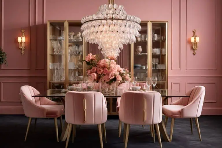
Neutral colors are always easy to use as they are so versatile and can be paired with most colors. White and neutrals add a softer more sophisticated look. However, paired with brighter orange, can add a nice pop of color that does not overwhelm the space. For example, use taupe which is a natural gray-brown color, and pair it with touches of bold orange colors throughout the room. This can be used in the living room, bedroom, and even the kitchen. Pair your neutrals with darker shades of orange for a more rustic look and feel.
There are many more color combinations and ideas for your home using shades of orange. Any room where you want to create a warm and fun atmosphere, where people gather like the kitchen or living areas, will do well with orange palette options. Bedrooms would do best with softer shades of orange that are not too stimulating.
The different shades of orange are quite versatile in all aspects of design from websites to home décor. Effectively using shades of orange will depend on each individual as everybody experiences and sees color differently. However, this warm and fun color is sure to brighten up almost everybody’s day.
Frequently Asked Questions
What Colors are Needed to Make Orange?
The two colors that make orange include red and yellow. When using paints, you can add an equal amount of these colors to create orange. You can then adjust the color to make different shades of orange.
What Does the Color Orange Mean?
Orange is a warm color and is associated with joy, happiness, excitement, enthusiasm, health, and more. In certain cultures, it is closely connected to spatiality as seen with the Buddhist monks. The different shades of orange can even elicit certain physical responses like stimulating the appetite.
What Colors Work Best With an Orange Color?
There are many orange palette options for all areas of application including web design and interior design. A bold orange can work well with many colors to form a color palette orange that is geared towards autumn. Oranges can go with browns, reds, cream, and certain greens. To soften an orange color, pair it with neutral colors. To make it stand out, use various shades of blue.
Does Blue Work Well With Orange?
Yes, all the different shades of blue work well with the color orange. Blue is the complementary color for orange, and they are positioned on opposite sides of the color wheel. When placed side-by-side, these colors create a beautiful contrast, and the colors stand out more.

Duncan graduated with a diploma in Film and TV production from CityVarsity in 2018, after which he continued pursuing film while taking on a keen interest in writing along the way. Since having graduated, he began working as a freelance videographer, filming a variety of music videos, fashion and short films, adverts, weddings and more. Throughout this, he’s won a number of awards from various film festivals that are both locally and internationally recognized. However, Duncan still enjoys writing articles in between his filming ventures, appreciating the peace and clarity that comes with it.
His articles focus primarily around helping up-and-coming artists explore the basics of certain colors, how these colors can be paired with other shades, as well as what colors are created when you mix one with another. All while relating these shades to historically significant paintings that have incorporated them into their color palette. As a lover of the arts himself, he takes great interest in the Renaissance era of paintings, an era that has directly inspired many of his favorite films.
Learn more about Duncan van der Merwe and about us.