Cool Colors – What are Cool Tones and How to Use Cool Colors in Art
This post may contain affiliate links. We may earn a small commission from purchases made through them, at no additional cost to you.
Imagine there was no color in the world; how sad and depressing the world would be! Color brings life and meaning into art, design, and even your home. Even though there are only a handful of primary and secondary colors, there are amazing and vast assortments of different shades and hues. Amongst these are your cool tones and warm colors, all of which can have a tremendous effect on your emotions and how you see things. Today, we are going to be dealing with cool or cold colors, discovering what they are and what they mean.
What Are Cool Colors?
The best way to understand cool colors is to have a visual example. The color wheel is a visual representation of all your colors including your primary, as well as your secondary colors, and all other colors in-between. Within this wheel, you will be able to determine what are cool colors, and what are warmer colors. You most probably have an idea already about warm and cold, and what these colors are. Your red, yellow, and orange colors evoke a sense of excitement and warmth.
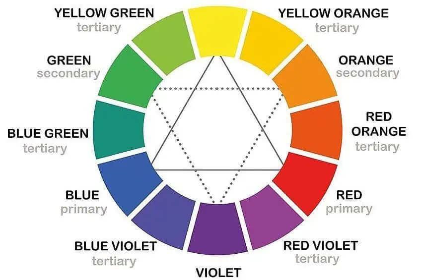
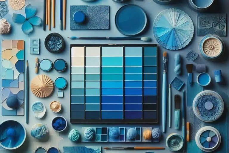
Cold colors, on the other hand, will remind you of nature, freshness and usually have a more calming effect. The cool tones or cool color names include blue, green, and indigo or violet colors. When looking at color as light, cold colors tend to have shorter wavelengths than warm colors. This makes blue a difficult color to see when you compare it to red or green. So, that is your basic cool colors definition. Cool colors tend to withdraw into the background and do not stand out as much as warm colors do. This comes in handy for smaller rooms, making it seem like the area is larger than it is. Your neutral colors like white or gray can also lean towards a blue undertone. We will be dealing with the color temperature a little later.
For now, let us look at the different cool tones and their meaning.
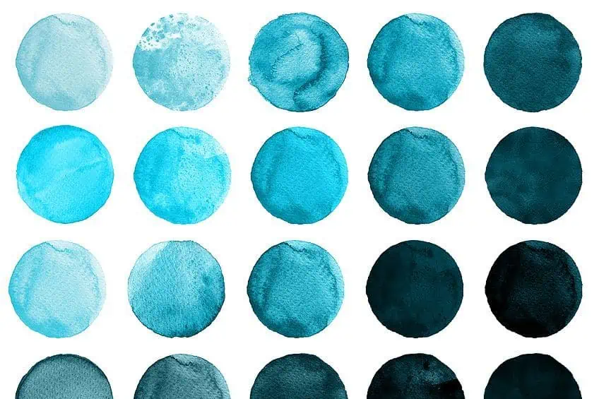
Blue Cool Colors
Blue is chosen by many as their favorite color. When thinking of blue, you may be considering the sky, the ocean, or some type of animal or flower. Blue is seen as calming or serene and can aid concentration. The cool tone is also linked to feelings of safety or feeling secure and can help to lower body temperature. Since color can play a role in body temperature and lowering blood pressure, the color is popular in bedrooms.
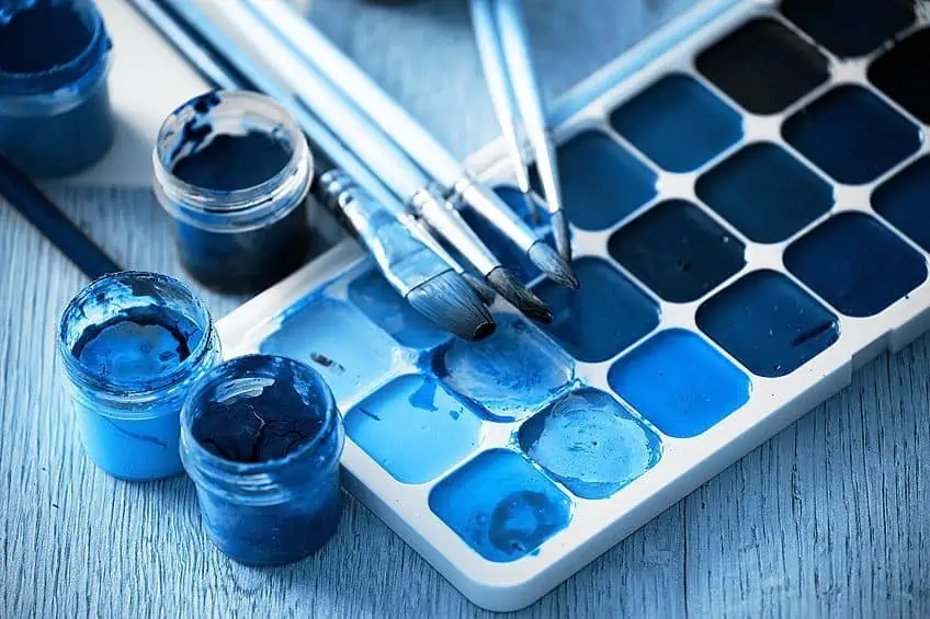
The color blue is also related to things like freedom, open spaces, imagination, inspiration, loyalty, faith, confidence, and intelligence. However, the color is also linked to depression, sadness, or “feeling blue”. Overusing the color blue can make it seem cold and distant. Sometimes, it all depends on individual life experiences and how you see the color blue.
Violet Cool Colors
Violet is a color that can lean towards the calmness of blue or the warmth and energy of red. Purple or violet shades of color are historically linked to represent luxury, power, nobility, and royalty. However, it is also associated with creativity, ambition, spirituality, and imagination.
Some of the negative associations include arrogance, indifference or immaturity, and cynicism.
Green Cool Colors
Green is a color that mainly represents renewal, health, wealth, growth, freshness, and has a connection to nature, conjuring images of trees, forests, and nature. As with blue, green is also linked to feelings of calmness and relaxation. Green is the color that the eye can see the most and is, therefore, soothing to the eyes. Green provides a gentle level of energy and is perfect for use with artistic activities like dancing. On the negative side, green can be associated with illness or feelings of jealousy.

Scientific Hex Codes for Cool Tones
Computer graphics is something that has become an everyday occurrence, whether you work with it or watch your computer or television screen. In this area, you have ways of describing and labeling colors so that they can easily be categorized. Using the RGB (Red, green, and blue) or CMYK (Cyan, Yellow, Magenta, and Black) code system, you can determine the amount of color used for graphics and printing. Below are a few cool color names with their color codes.
| Shade | Cool Colors Hex Code | CMYK Cool Color Code | RGB Cool Color Code | Cool Colors |
| Blue | #3944bc | 70, 64, 0, 26 | 57, 68, 188 | |
| Navy | #081172 | 93, 85, 0, 55 | 8, 17, 114 | |
| Green | #3cb043 | 66, 0, 62, 31 | 60, 176, 67 | |
| Juniper | #3a5311 | 30, 0, 80, 67 | 58, 83, 17 | |
| Violet | #8f00ff | 44, 100, 0, 0 | 143, 0, 255 | |
| Iris | #5d3fd3 | 56, 70, 0, 17 | 93, 63, 211 |
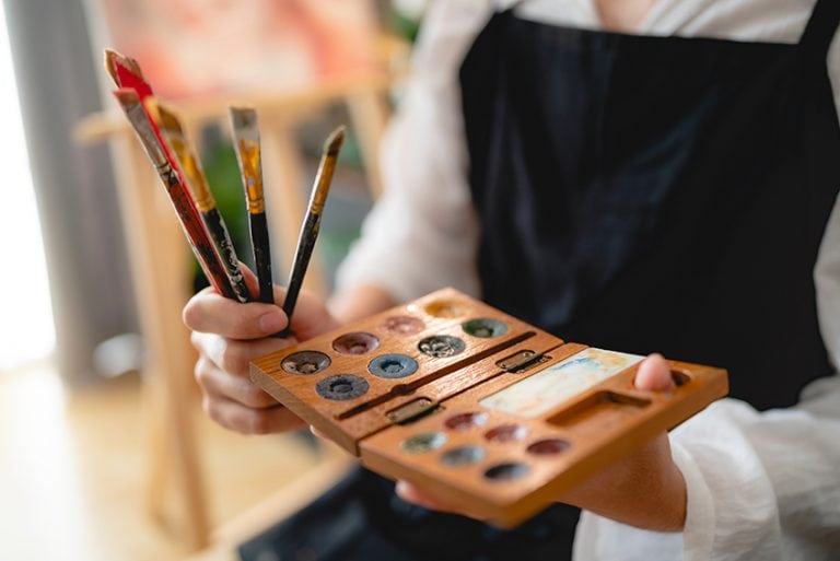
Using Cool Colors in Art
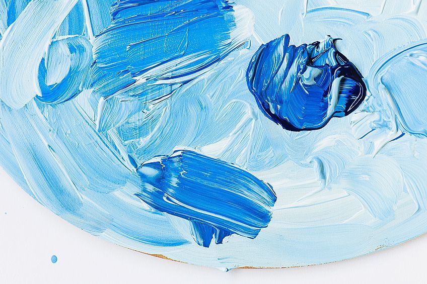
When mixing paints, it is important to understand how cool colors work. Colors can elicit various emotions, creating feelings of warmth or coolness. Colors can also alter your perception of large and small as well as your awareness of distance. Creating various shades of colors can also be affected by the color temperature. To make pure and bright colors, it is best to mix colors that have similar qualities or color biases. Otherwise, combining certain colors can create a muddy color mixture. This is because colors can have a color bias, meaning they can lean towards cooler or warmer colors. For example, you might think ultramarine is a cool color, however, it is a warm blue as it leans more towards your purples than greens.
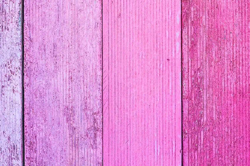
Even traditionally warm colors can be cool. For example, the pink shades above lean a little more towards purple, indicating that they are on the cooler side of the spectrum. This explains why you might create a muddy color because the color you choose could have a specific color bias, and if you do not consider this, it could affect the color outcome. You might mistakenly be mixing all three of your primary colors because of the paint’s color bias. For example, reds are warm colors but a paint color like alizarin crimson is a cool red and can safely be mixed with blues to create pure purple colors.
Even neutral colors and earthy tones may seem to have cool tones; however, they can also have color temperature differences.
The Importance of Color Temperature in Art
As mentioned, color bias or color temperature plays a vital role in art. The color temperature helps with creating mood and perceptions of depth, distance, and movement. When painting you usually have both warm and cool tones. However, we suggest you do not use these color temperatures in equal measure. Consider green trees and leaves, you cannot paint a flat wash of a similar color, you need to add in cool and warm colors to provide contrast. Another example is water, you can use color temperature to create depth.
Rather, decide on the chief color temperature you wish to use and then make sure to use more of these. Often, when painting warmer colors in the foreground and using cool colors as the background, it helps to produce dimension as well as distance and depth as in the example for water above. Also, using cold colors and warmer colors together in painting can add a focal point. Remember, that it is simpler to change a warm color to a cool color, however, it is a little more difficult to make cool colors warmer.
It is important to note that color temperature is also relative and can be affected by the surrounding colors and what the surrounding lighting is like. For example, a beautifully bright lemon yellow is considered a cool color. However, if you placed this color next to blue cool tones, the yellow would appear warmer.
Discerning color temperature can be challenging, so to train your mind on what to look for, you can try the following exercise. Choose a simple scene you would like to paint, then paint it a couple of times. First, paint with only cool colors, then only warm colors, and then paint the scene with one dominant color temperature. You can paint another fourth scene only using equal portions of each warm and cool color. You should then study these paintings to help discern the differences.
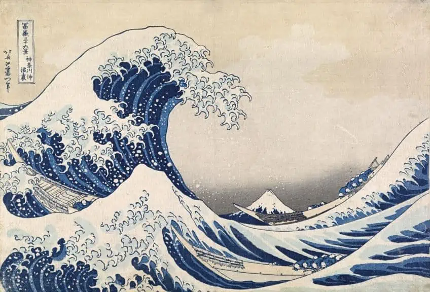 The Great Wave off Kanagawa (1830) by Katsushika Hokusai; Katsushika Hokusai, Public domain, via Wikimedia Commons
You can also study other famous artists and how they incorporate cool and warm colors into their art pieces. One example is The Great Wave off Kanagawa by Katsushika Hokusai (1820-31). This image portrays an immense wave or tsunami heading for the much smaller Mt, Fuji. The image portrays the beauty and power of nature using colors like indigo and Prussian blue.
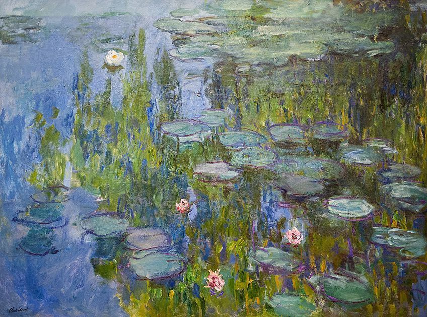 Water Lilies (1915) by Claude Monet; Claude Monet, CC BY-SA 4.0, via Wikimedia Commons
Other paintings like the Water Lilies by Monet (1915) use vibrant and cool colors to capture the essence of light and how it can change from moment to moment. Monet painted over 250 water lily scenes, however, many places this specific one at the top with its blues, purples, and blue-green colors. A more modern painting from this century is by Lee Haber, entitled East Side Gang, Central Park, and portrays a beautiful winter scene, mostly incorporating cool tones. This can evoke feelings of winter cold, but still happy moments enjoyed outside in the cold weather. Colors used include cool tones of red-violet and greens and blues.
Cool Colors vs. Warm Colors
Below is a table that shows the differences between warm and cool colors in art. Remember, that color temperature is relative to the colors you place it next to and the color bias. So, there are cool colors like blue that can have a red bias or a cool color that might appear warmer next to another color.
| What Are Cool Colors? | What Are Warm Colors? |
| Include blue, green, violet, or purple | Include red, orange, and yellow |
| Blue is the only primary cool | Yellow and red are primary warm colors, with orange somewhere in the middle |
| Cooler colors appear further away | The warmer colors appear closer |
| Makes you think of cold, nature, water, and the sky | Makes you think of sunshine and heat |
| Colors are cooling and refreshing as well as calming | Colors are stimulating and associated with joy and energy |
The Use of Warm Colors in Your Home
The fun part of moving into a new home or renovating is that you get to design and decorate new spaces. It is almost like painting on a blank canvas, and you have the chance to create something wonderful. Color can be a powerful thing, evoking emotions, and creating an atmosphere that is energizing or relaxing. However, choosing and combining colors can either be a huge success or, sometimes, a complete failure. So, many choose the usual neutral colors like beige. Although this color is okay, it may not be the best idea to allow it to be the dominant color throughout the home.

When deciding on what to do when attempting to design a room, it is a good idea to work things out in advance. Today, there are also so many apps and ways you can test the colors and designs you choose. One of the choices should be if you want your overall effect to mostly be cool colors or warm colors, and then run with this throughout the design process. An easy and simple color palette is best for those just starting. When using colors, many recommend you use about eighty percent neutral colors and then add in the rest with stronger or bolder colors. However, a balanced cool and warm palette can create a more unconventional or stylish look.
Let us now see what the differences are between cool colors vs warm colors in a design.
| Cool Colors | Warm Colors |
| Cool colors are more calming and refreshing | These colors are linked to feelings of happiness, and energy |
| Helps to create a tranquil environment | Helps to form an environment that is intimate and comfortable |
| Colors are popular for bedrooms and bathrooms | These colors are popular in living rooms as well as kitchens |
| Smaller spaces are made to feel bigger than they are | Larger spaces feel more welcoming |
Too many cold colors can make a room less inviting, so creating a balanced look is what you should be aiming for. When using cool colors in the bedroom, they produce more vibrant and fresh energy and are calming yet revitalizing. You should consider the lighting in a room, as this can affect the color. Try to test out your paint sample in various lighting to help avoid any surprises. A nice white trim is a classic look in any home, but you should always take note of any undertones these colors might have. Neutrals can also have a color bias, which could affect your overall look.
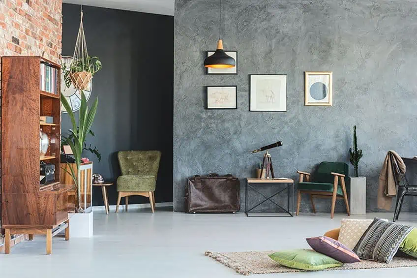
Finishes in a room can also give off an impression of warm or cool colors. For example, gold finishes like on a mirror frame can produce warmer tones. Finishes that seem to produce cool tones include brushed nickel and chrome. Here are a few color combinations with some cool color names you might want to consider for your next home interior design. When considering color combinations, try using colors with the same temperature. You can also try using a monochromatic palette, or for contrast, use complementary colors. How about royal blue and orchid for bold colors and adding in white trim and finishes?
| Shade | Colors Hex Code | CMYK Color Code | RGB Color Code | Colors |
| Royal Blue | #4169e1 | 71, 53, 0, 12 | 65, 105, 225 | |
| Orchid | #da70d6 | 0, 49, 2, 15 | 218, 112, 214 |
Next, try using turquoise with a cream color. Turquoise can be both warm and cool and can be used in combination with many colors. Turquoise works well with browns and neutrals to add some color, while it complements reds and pink colors. The color also works well with deep blues and helps to liven up green colors.
Cream is a popular warm, neutral color.
| Shade | Colors Hex Code | CMYK Color Code | RGB Color Code | Colors |
| Turquoise | #40e0d0 | 71, 0, 7, 12 | 64, 224, 208 | |
| Cream | #fffdd0 | 0, 1, 18, 0 | 255, 253, 208 |
Blue and white is a classic combination and is popular as a bedroom color palette. The combination offers a fresh and clean look and can be paired with more natural wood tones. The Rhinestone white has a cool undertone, which is a combination color with similar temperatures.
| Shade | Colors Hex Code | CMYK Color Code | RGB Color Code | Colors |
| Blue | #3944bc | 70, 64, 0, 26 | 57, 68, 188 | |
| Rhinestone White | #dee0de | 1, 0, 1, 12 | 222, 224, 222 |
Once you have a basic understanding of how colors work and how to combine them effectively, it should be a simple matter of creating a cool color palette. Cool tones tend to be well-balanced, with an inherent connection to nature, and can be used in a variety of projects from painting an art piece to designing your living room.
Frequently Asked Questions
How Would You Describe a Cool Colors Definition?
Cold colors include green, blue, and violet, or purple. These colors, along with all the primary, secondary, and intermediary colors can be found on the color wheel. Cold colors are close to nature and produce feelings of calm, freshness, and can also be revitalizing.
Is Blue Easy on the Eyes?
Considering the light spectrum, blue has a short wavelength and can be harder on the eyes than other colors. Blue light tends to flicker a lot on the computer and other screens and can cause some eye fatigue and strain the eyes. This is why many now use blue-light-blocking glasses to help prevent this.
Is Gray a Cool Color?
All neutral colors like gray can have undertones of either cool or warm tones. Grays have cool undertones if it contains a hint of blues and greens, while warmer tones will have red or pink undertones.
Can Red Be a Cool Color?
Yes, you can have cool reds, which can be found more on the purple side of the color wheel. The red should have a blue or purple bias. If you want to create a cool red, always remember to use a blue or purple and not green, which will create more of a muddy color.

Megan is a writer and researcher who graduated from the University of Cape Town with a degree in Social Sciences, specializing in Psychology and Environmental Science. Her passion for knowledge and leaving a positive impact has fueled her current work in conscious and sustainable growth in Southern Africa. Megan’s love of nature has also led her to train as an animal behaviorist. She works part-time training and rehabilitating dogs. Megan is interested in the physical and psychological effects of colors in our environment on our mood and well-being. In addition, she is concerned with how art and creativity have been an integral part of human society. Megan van Schoor has been writing blog posts on the topics of painting, drawing, and color theory for acrylgiessen since 2021.
Learn more about Megan van Schoor and about us.