Color in Art – The History and Development of Pigments
This post may contain affiliate links. We may earn a small commission from purchases made through them, at no additional cost to you.
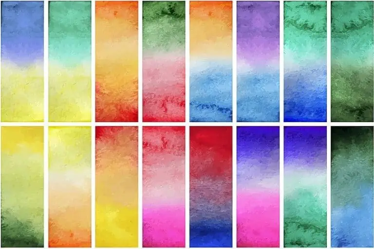
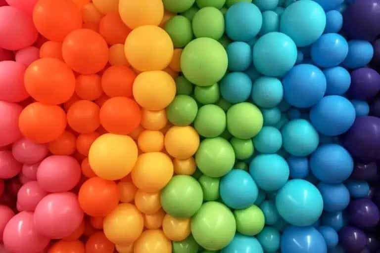
What is color in art? Based on the definition of color in art, color is defined as the perception of various light wavelengths that produce a distinct tone or hue, and is one of the elements of art. Red ochre is an example of color in art that was utilized by ancient people, as the pigment could be made from natural materials. Let us find out more about the history of color in art, and how it is effectively applied by artists in their works!
What Is Color in Art and How Is It Used?
It is one of the visual elements of art and plays an important part in how artists express their thoughts and emotions in their works. Colors can be utilized to achieve a variety of effects, such as expressing the atmosphere and mood or emphasizing or downplaying certain components of a piece.
Color can be produced in art using a number of techniques such as pastels, ink, paint, dyes, encaustic, digital media, and so on.
 Salon at the Rue des Moulins by Henri de Toulouse-Lautrec (1894); Henri de Toulouse-Lautrec, Public domain, via Wikimedia Commons
The History of Color in Art
Ancient painters developed the first color pigments around 40,000 years ago, a composition of animal fat, soil, charcoal, and chalk, establishing a simple color palette of five hues: red, brown, yellow, white, and black.
 Minoan period depiction of a girl picking saffron for use in cooking and making dye from a wall painting at Akrotiri (1600-1500 BCE); Akrotiri, Public domain, via Wikimedia Commons
The history of color has been one of constant discovery, whether accidentally or through scientific progress.
The discovery of new pigments coincided with the emergence of art history’s major trends, from the Renaissance period through to the Impressionist movement, when painters experimented with hues never seen before.
Red
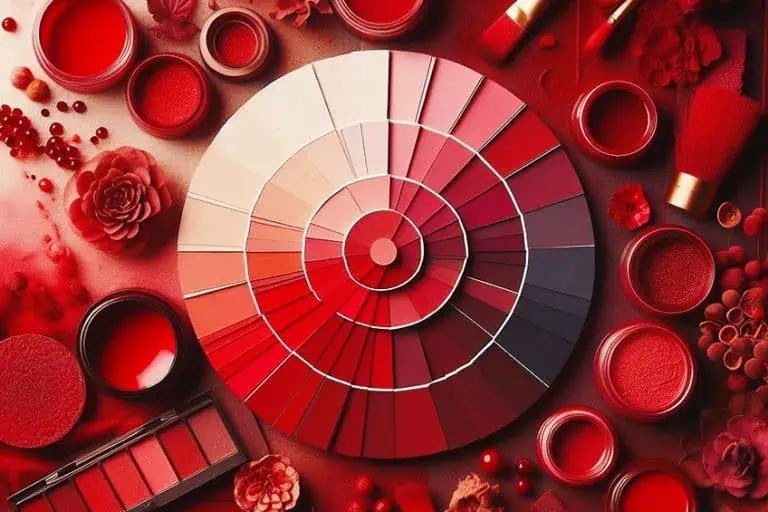
Red ochre is one of the oldest pigments currently in use, having been discovered in iron-rich soil and initially used as an artistic substance in prehistoric cave drawings. Thousands of years later, in the 16th and 17th centuries, the most fashionable red color was derived from a cochineal bug, a species found exclusively on prickly-pear cacti in Mexico. These white insects created a strong red dye that was so sought after by painters and customers that it rapidly became the New World’s third most valuable commodity after silver and gold.
Cochineal was employed as a glaze by Rembrandt, Raphael, and Rubens, who layered the pigment on other reds to intensify their vibrancy. The cochineal insect, a non-toxic source of red pigment, continues to be utilized to color blush and lipstick today.
In Japanese art, a red ink used predominantly in woodblock printing known as Tan was developed using an orange-red mineral which contains the chemical compound lead tetroxide.
 Teasing the Cat by Tsukioka Yoshitoshi (1888); Yoshitoshi, CC0, via Wikimedia Commons
Blue
For several centuries, the price of lapis lazuli equaled that of gold. From the Medieval era, artists have represented the Virgin Mary in a vivid blue garment, symbolizing her status as the Queen of Heaven. Mary’s distinctive color, ultramarine blue, is derived from lapis lazuli, a gemstone that was once exclusively obtained from a mountain range in Afghanistan. This valuable substance rose to worldwide prominence, gracing Persian Qur’ans, Egyptian funeral pictures, and, subsequently, renowned paintings by various Masters.
 Rest during the Flight into Egypt by the Circle of Domenichino (early 17th Century). Instead of using ground lapis lazuli as a pigment, this miniature was painted directly onto a lapis lazuli ground; Domenichino, CC BY 3.0, via Wikimedia Commons
Yves Klein partnered with a paint supplier in Paris in the 1950s to create a synthetic form of ultramarine blue, which became the French artist’s signature hue. Klein explained the attraction of this ancient color by saying, “Blue is without boundaries. It transcends dimensions”.
Yellow
Few painters in history have been noted for their utilization of yellow, with Vincent van Gogh, Johannes Vermeer, and Joseph Mallord William Turner standing out as noteworthy exceptions. Turner was so obsessed with color that contemporaneous reviewers criticized him, stating that his paintings were “beset with jaundice” and that the painter may have a visual condition.
Turner employed the innovative water paint color Indian Yellow – a bright dye created from the urine of mango-fed cows for his exquisite seascapes.
 Arundel Castle, with Rainbow by J. M. W. Turner (c. 1824); J. M. W. Turner, Public domain, via Wikimedia Commons
Turner employed synthetic Chrome Yellow, a lead-based color that has been linked to delirium, for brighter accents. Vincent van Gogh used this vibrant and cheerful color in his paintings of starry evenings as well as his famous sunflowers.
Green
Although the color green represents nature and rejuvenation, its pigments have historically been some of the most deadly. Carl Wilhelm Scheele, a Swedish scientist, produced Scheele’s Green, a vivid green pigment tainted with the dangerous chemical arsenic, in 1775. Scheele’s Green, which was inexpensive to manufacture, became a phenomenon during the Victorian era, despite widespread suspicion that the hue was toxic to both painters and customers.
 A Table Corner by Paul Cézanne (between 1895 and 1900); Paul Cézanne, Public domain, via Wikimedia Commons
Napoleon Bonaparte’s wallpaper in his bedroom on the island of St Helena where he had been exiled, had Scheele’s Green on it. It was long believed that this pigment poisoned him, leading to his death in 1821.
By the final years of the 19th century, Paris Green – a comparable arsenic and copper mixture – had superseded Scheele’s Green as a more permanent alternative, allowing Paul Cézanne, Claude Monet, and Pierre-Auguste Renoir to paint vibrant, green landscapes. Paris Green, used as both an insecticide and rodenticide, was nevertheless very poisonous and may have contributed to Cézanne’s diabetes and Monet’s eyesight. Unsurprisingly, it was finally prohibited in the 1960s.
Purple
The lavender flecks of light and purple-colored shadows that enlivened Monet’s water lilies and haystacks owe much to John Goffe Rand, a somewhat obscure American portraitist. Rand became dissatisfied with the unpleasant process of keeping paint in a pig’s bladder, which was the prevalent way of conserving pigments at the period, and devised a more convenient and portable alternative: a tin collapsible paint tube.
The development of complex, pre-mixed pigment hues in tin tubes, like Manganese Violet, the first readily available mauve-colored paint, indicated that creatives no longer would have to mix blue and red to create purple. This allowed painters such as Monet to produce art in Plein air, conveniently carrying their colors to open-air locations to capture their impressions of the surroundings.
 On the Boat by Claude Monet (1887); Claude Monet, Public domain, via Wikimedia Commons
Black
The darkest pigment used in the artworks of the Old Masters is called “bone black”, and it is made by smoldering animal bones in an airless chamber. Whereas the Impressionists eschewed black paint, preferring to cover regions of darkness with dark color, American painters in the 1950s and 1960s reverted to black with great passion.
Richard Serra, Frank Stella, and Ad Reinhardt all made monochromatic black canvases, removing any subject matter from the canvas save the paint itself.
Considered collectively, these artists demonstrate that black is a hue with as many variations, textures, and tones as those of any other color. Commenting on his approach in 1967, Reinhardt recalled the Japanese artist and printer Katsushika Hokusai, saying, “There is a type of black which is ancient and a type of black which is youthful. Black in brightness and black in shade, glossy black and drab black”.
 Hibiscus and Sparrow by Katsushika Hokusai (c. 1830); Sailko, CC BY 3.0, via Wikimedia Commons
White
Among all the forbidden pigments, the hue most missed by artists is most certainly Lead White. Its color could absorb and reflect light unlike any other, despite the fact that its manufacture was far from beautiful. This pigment was created in the 17th century by stacking bovine and equine excrement over vinegar and lead. After three months in an enclosed chamber, these elements would mix to form pure white flakes.
 The Baptism of Christ by Piero della Francesca (1450’s); Piero della Francesca, Public domain, via Wikimedia Commons
Although tests revealed lead as toxic in the late 1800s, it wasn’t until 1978 that America prohibited the manufacture of leaded white paint.
During this time period, artists like Robert Ryman, Robert Rauschenberg, and Agnes Martin used zinc and titanium whites to produce monochromatic white paintings, whilst Dan Flavin avoided using colors entirely in sculptures that projected white light directly.
Elements of Art Overview
As one of the elements of art, color has had a long and strange history. Scheele’s Green, for instance, is an example of color in art that was pretty to look at, but dangerous to deal with. In fact, many colors were often manufactured for use by artists that proved to be toxic and often even deadly. Yet, artists are infamous for suffering for their art, and perhaps they just saw this as another hazard of their occupation that needed to be negotiated. Luckily, over time, these have been replaced with far safer substances that do not put artists’ lives at risk. But, can these new colors ever compare to the enticing and forbidden colors of the past? No matter their source of origin, color in art is utilized to enrich artworks, by imbuing them with life and meaning. Every color plays a specific role that, if used correctly, can enhance artwork and make it feel like a scene you can step into – whether realistic or otherwise.
Frequently Asked Questions
What Is Color in Art?
While charcoal and pencil drawings can look extremely life-like and engaging, adding color to artworks elevates them to a whole other level. Color can provide artwork with a sense of mood and ambiance. It can make certain aspects stand out, while subduing others. Each color is associated with a different meaning, and by understanding how to use them effectively, you can take people on a psychological and emotional journey.
What Is the Definition of Color in Art?
The objective definition of color is that it is one of the elements of art which is formed when light strikes an item and is reflected back to the eye of the observer. Yet, color has a myriad of subjective aspects in art creation. These include things like harmony, when a couple or more colors are combined and generate a pleasant effect, as well as temperature. For example, blue is regarded as a warm hue or cool depending of course upon whether it tends to lean towards green or purple, and red is regarded either cool or warm depending on whether or not it leans toward blue or yellow.


