Value in Art – The Role of Light and Shade in Art
This post may contain affiliate links. We may earn a small commission from purchases made through them, at no additional cost to you.
What is value in art and what are the notable value in art examples? There are various types of value in art, such as when we discuss art with value (either cultural or financial). Yet, as an element of art, tonal value refers to how light or dark a color is. This article will explore value in art and how it can be used effectively as an element of art.
What Is Value in Art?
While the color you choose for an art piece is important, the value of the color could be said to be of even more importance. In art, value refers to how dark or light an object is on a spectrum of white to black. While it is easy enough to picture the various gray values in a spectrum of black to white, once we try and do the same with color, it becomes more challenging.
 Señora de Sorolla in White by Joaquín Sorolla (1902); Joaquín Sorolla, Public domain, via Wikimedia Commons
While two colors could usually appear very different under normal circumstances, once rendered to a black-and-white image, many have the exact same value. Every color has a range of tonal values which are produced by adding either black or white. They are also known as shades and tints.
Understanding the Value Scale
Denman Ross, an American artist, art collector, and art history and theory expert, established a value system in 1907 that is still being used today. In art, the value scale describes the spectrum of tones from light to dark, which is typically depicted as a sequence of gray shades. It is a vital component of art because it contributes to the sense of texture, depth, and three-dimensional form. A value scale can be utilized in many different types of art, such as painting, sketching, printing, and photography.
 Nocturnal, Blue and Silver, Chelsea by James Abbott McNeill Whistler (1871); Sailko, CC BY 3.0, via Wikimedia Commons
Using tonal values is a vital skill for artists to learn because it allows them to add visual appeal to their work by creating a sense of shadows and light, depth, and contrast.
To produce value scales, artists apply a wide range of techniques, including hatching, and cross-hatching in drawing and etching, to mention a few. To create distinct effects, they may also combine other materials like graphite, charcoal, ink, or paint. Artworks with a broader range of values are generally regarded as particularly appealing.
 The Open Window by Juan Gris (1921); Juan Gris, Public domain, via Wikimedia Commons
It makes no difference what kind of art you’re making, your art will most likely be more aesthetically satisfying as long as there are dark values that contrast with light values. You can ensure that you produce a complete range of values by using a value scale. Many artists work using a value scale, finding certain values and placing them in suitable places.
The best way to see the values of an image is to render it in black and white. This will allow you to see the grayscale value of red or green, for example.
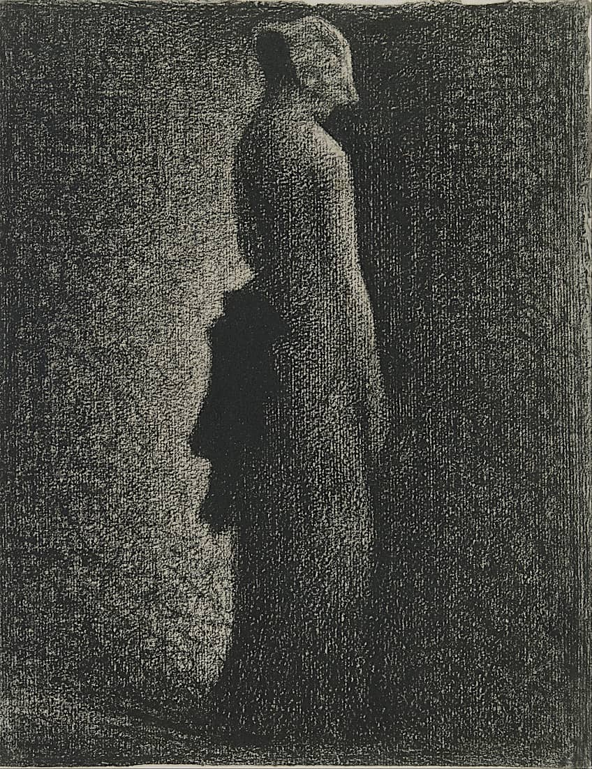 The Black Bow by Georges Seurat (1882); Georges Seurat, Public domain, via Wikimedia Commons
The Relationship Between Color and Value
Every hue has an underlying value that ranges from white to black. Study a color wheel and then look at the same wheel in black and white. Take note of how the values of different hues vary. In terms of darkness and lightness, not all colors are created equal. You may now have a separate value scale for each of these colors, with shades going all the way down to black and tints going all the way up to white.
Take note of how many colors on the color wheel have similar values despite their widely varied hues.
 Schematic showing the different types of color values; Stock image
When these colors are positioned near one another, there is very little value difference, and your eye may struggle to determine which hue is more important in the image. When compared to the colors you utilize, value is actually a far more significant structural element in your paintings. In truth, the colors you employ have little bearing on the overall structure of your works. This is not to imply that color is unimportant – color has a huge physiological impact on your artwork.
Artists of the fauvism movement knew this, and Henri Matisse would employ radically incorrect colors, but the values were typically correct, and his paintings therefore accurately captured the quality of light that he observed.
 Collioure in August by Henri Matisse (c. 1911); Henri Matisse, Public domain, via Wikimedia Commons
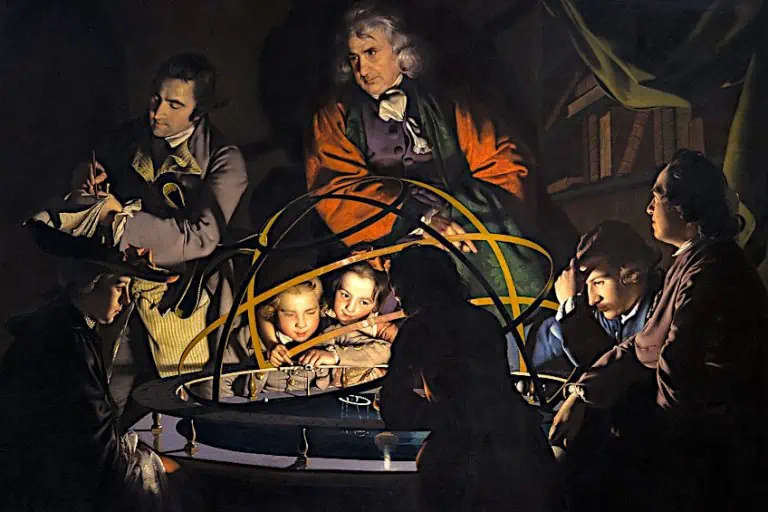
How Artists Use Value in Art
The use of value in two-dimensional artworks may serve to create a shape, and the appearance of volume or it can give the entire piece a sense of illumination and depth. Artists influence the viewer’s eye and strive to direct it to the focal point of the artwork by experimenting with shade and contrast effects.
It is a well-known truth that placing the lightest object against a dark background is the easiest approach to draw the eye. This not only establishes a focal point of interest, but it also has the potential to produce a dramatic effect.
However, if skillfully handled, the inverse can be equally effective. In Emanuel de Witte’s Interior of the Portuguese Synagogue in Amsterdam (1680), the two figures bathed in light in the foreground stand out when the image is first viewed, but the composition and tonal values eventually draw the eye to the silhouette of the figure at the lectern in front of the central vertical window.
 Interior of the Portuguese Synagogue in Amsterdam by Emanuel de Witte (1680); Emanuel de Witte, Public domain, via Wikimedia Commons
Chiaroscuro
The chiaroscuro technique was used in Baroque art to create very dramatic results. A distinct tonal contrast, demonstrated by very high-keyed whites set immediately against very low-keyed darks, defines the method. Contrast can be generated not only by the colors we use but the value of those colors.
Several masters of the past gravitated to this method due to the emotional tension and visual drama that could be created using this technique.
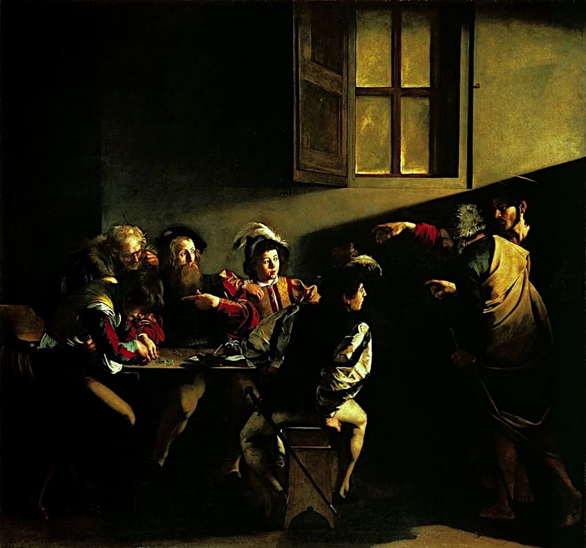 The Calling of Saint Matthew by Caravaggio (1599 or 1600); Caravaggio, Public domain, via Wikimedia Commons
Caravaggio is, of course, the most renowned of the artists who specialized in Chiaroscuro. He made some of the most powerful and dramatically loaded artworks by focusing on the extreme contrast between the colors and values in his palette. In the The Calling of Saint Matthew (1599 or 1600) for example, he uses tonal values metaphorically to suggest the saint’s sinful life with shadow, and his divine calling as the beam of light that flows towards him above the outstretched arm of Christ.
Using Limited Value Ranges
Many painters choose to use a narrow range of values in their work. This can contribute to the establishment of harmony in artworks since it is easier to maintain a degree of consistency with a narrow value range. Claude Monet utilized just a small number of high values. This can give a shimmering impression and is ideal for bright, dazzling environments.
John Sargent also often used a limited value range, such as in A Dinner Table at Night (1884) in which the limited value palette effectively provides the scene with an overall sense of warmth.
 A Dinner Table at Night by John Singer Sargent (1884); John Singer Sargent, Public domain, via Wikimedia Commons
Value in Art Examples
The artistic language of each artist is defined by how they draw their lines, produce varied textures, or which media they use. This is particularly crucial in the discussion over value in art, and black-and-white photography is typically chosen to best demonstrate value in action.
It is best observed in photography how the infinite variations of gray indicate surfaces and textures, and how, through them, the concept of value, defined by contrast, is achieved. However, value in art can equally be observed in sketches and paintings.
 Ship in a Storm by J. M. W. Turner (1823); J. M. W. Turner, Public domain, via Wikimedia Commons
While some artists concentrated on color contrast on their palettes, artists such as Claude Monet and James Abbott McNeill Whistler preferred to concentrate on different extremes of color values.
Many Monet landscape paintings were produced by manipulating high-key color values, offering the painting a dynamic vitality and life. In contrast, the mood of Whistler’s iconic paintings was achieved by the use of low-key color values. These examples demonstrate how important value is as an element of art in the formation of mood and a specific narrative of an artwork.
Migrant Mother (1936) by Dorothea Lange
| Artist | Dorothea Lange (1895 – 1965) |
| Date | 1936 |
| Medium | Black-and-white photograph |
| Dimensions (cm) | 28 x 21 |
| Location | Museum of Modern Art, New York City, United States |
This famous photo, which depicts a mother with her children, is regularly used to depict the hardships endured by migrant workers during the Great Depression. It is a well-known example of how the art element “value” may be utilized to highlight the subject’s emotional condition and evoke empathy and connection from the audience.
 Migrant Mother by Dorothea Lange (1936); Dorothea Lange, Public domain, via Wikimedia Commons
Lange used black and white photography to produce a spectrum of contrasts and values that accentuate the woman’s facial characteristics and emotional condition. The deep shadows surrounding the woman’s eyes and mouth evoke sorrow and struggle, while the brighter values on her brow and cheeks suggest hope and perseverance.
The woman’s expression and body language indicate vulnerability and fatigue, making her situation understandable and relatable. Lange creates an emotionally charged and poignant portrait by accentuating the woman’s emotional condition by effectively employing value.
Moonrise, Hernandez, New Mexico (1941) by Ansel Adams
| Artist | Ansel Adams (1902 – 1984) |
| Date | 1941 |
| Medium | Photograph |
| Dimensions | 40 x 49 |
| Location | Museum of Modern Art, New York City, United States |
Adams’ use of tone complements his use of value. The photograph is in black and white, allowing for a wider variety of contrasts and values than color would. Adams’ work is distinguished by its use of deep blacks and dazzling whites, which give a feeling of intensity and tension. The image depicts a moon rising over a little settlement in New Mexico, with a graveyard and a few dwellings in the foreground.
The photograph’s most prominent feature is its utilization of contrast between bright and dark values. The moon is significantly brighter in the backdrop than in the foreground, which is depicted in deep shadows.
This produces a striking contrast that attracts the attention of the viewer to the moon, which is the photo’s focal point. The brilliant moon adds depth by appearing to be on the horizon behind the houses and graves. Yet, Adams’ use of value isn’t restricted to the contrast between the moon and the foreground. The foreground is similarly rich in dark tones, lending a feeling of mystery and menace. The shadows in the graveyard imply mortality and the passage of time, while the structures in the backdrop symbolize society and continuity.
The tension created by the contrast between these two components contributes to the overall tone of the image.
Nighthawks (1942) by Edward Hopper
| Artist | Edward Hopper |
| Date | 1942 |
| Medium | Oil on canvas |
| Dimensions (cm) | 84 x 152 |
| Location | School of the Art Institute of Chicago, United States |
Nighthawks is a superb demonstration of how to use the element of art “value” to create atmosphere and ambiance in an artwork. The famous artwork portrays a group of individuals dining at an all-night café on a deserted city street at night. The artwork’s use of value is subtle, yet quite effective in evoking a feeling of loneliness.
 Nighthawks by Edward Hopper (1942); Edward Hopper, Public domain, via Wikimedia Commons
The artwork is mostly produced in subdued hues and low values. The somber backdrop contrasts with the light inside the diner, which is lit artificially. This contrast enhances the feeling of detached isolation within the diner’s restricted environment.
The individuals in the artwork are sitting alone or in couples, with their faces veiled. Hopper’s use of subdued hues and subtle value contrasts also produces a sense of suspense in the artwork, drawing the spectator in and creating an emotional connection with the subject matter.
Elements of Art Overview
That concludes our look at the element of art, value. As we have discovered, value is important in establishing realistic structures and forms in art. By changing a color picture into a grayscale, we can see which colors actually hold which value within the spectrum. By knowing what value they hold in the value scale, we can use different values to make objects look more three-dimensional by knowing which values will add depth and shadow, and which values will enhance and illuminate an object.
Frequently Asked Questions
What Is Value in Art?
One way we talk about art with value is by discussing the monetary or cultural value an art piece has. But as an element of art, value refers to how dark or light a shade or tint of a specific color is. With a better understanding of value in art, you can create works that appear more life-like and three-dimensional by knowing which values will serve as shadows and which will highlight an object. You can also impart a certain mood or ambiance to a piece using varying values.
What Is the Value Scale in Art?
It is the scale from white to black, with varying increments of gray in-between. Each color will have an associated grayscale value. If you take a color wheel and render it as a black-and-white image, you will be able to get a better idea of what value each color represents on the value scale. You can then create interesting works that use unconventional colors, whose values still complement and fit each other.

In 2005, Charlene completed her wellness degrees in therapeutic aromatherapy and reflexology at the International School of Reflexology and Meridian Therapy. She worked for a company offering corporate wellness programs for several years before opening her own therapy practice. In 2015, she was asked by a digital marketer friend to join her company as a content creator, and it was here that she discovered her enthusiasm for writing. Since entering the world of content creation, she has gained a lot of experience over the years writing about various topics such as beauty, health, wellness, travel, crafting, and much more. Due to various circumstances, she had to give up her therapy practice and now works as a freelance writer. Since she is a very creative person and as a balance to writing likes to be active in various areas of art and crafts, the activity at acrylgiessen.com is perfect for her to contribute their knowledge and experience in various creative topics.
Learn more about Charlene Lewis and about us.