Aesthetic Color Palettes – Most Beautiful Color Combinations
This post may contain affiliate links. We may earn a small commission from purchases made through them, at no additional cost to you.
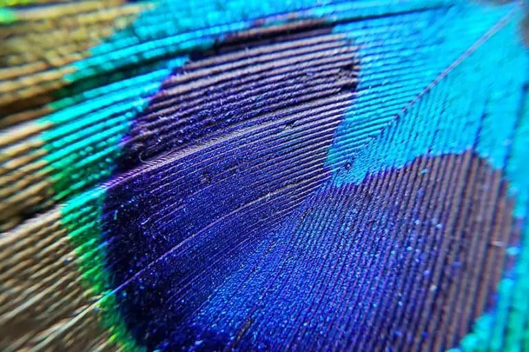
Color can stimulate your imagination and mood, and colors from the aesthetic color palette, which are artistically and visually appealing, will bring beauty to a room, an outfit, a photograph, or a garden. Aesthetic colors do not follow any popular visual combination but stand out as eclectic personal choices. Wanting to use an aesthetic color palette in your room will show off your creativity and your emotions. As we delve more into the world of the aesthetic color palette, you will be able to understand color combinations a little more. When it comes to aesthetic colors, your imagination should be your guide.
Aesthetic Color Schemes
When we use the word aesthetic, we are trying to describe something beautiful or appealing. This is what aesthetic color palettes are, a combination of colors that complement each other and are pleasing to the eye.
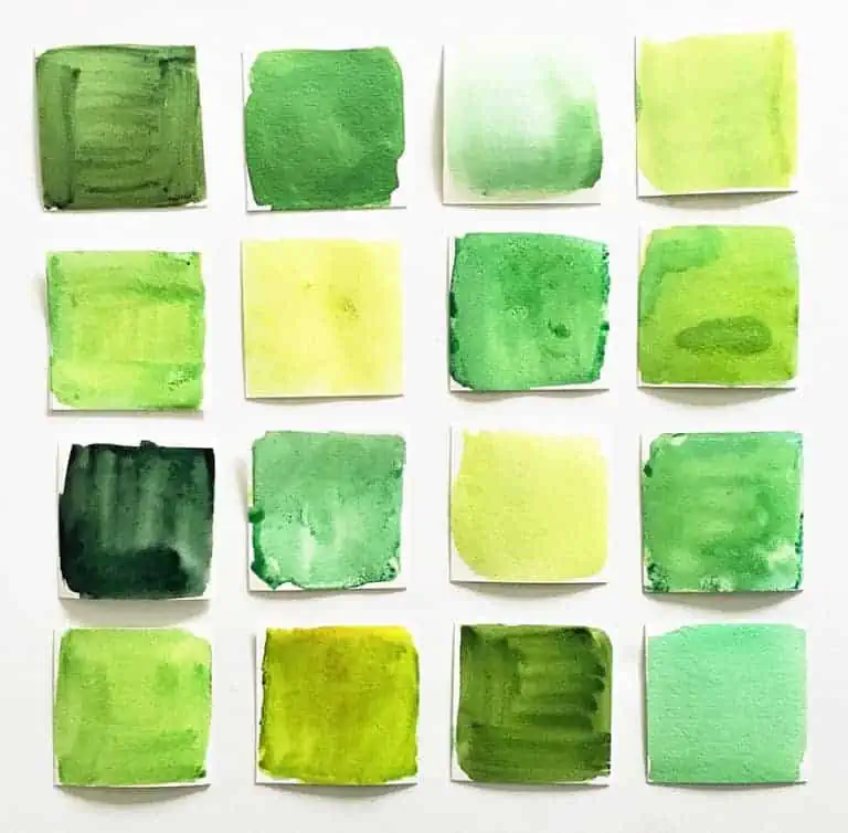
Choosing color combinations for your aesthetic color palette is easy because there are no set rules to follow. If you think two colors work together, then go ahead and start experimenting. Aesthetic colors are all about capturing moods, for instance, vintage, beachy vibe, or even a retro style. As mentioned previously, there are no real rules when it comes to the aesthetic color palette – whatever colors take your fancy can be paired. Simply put, you will select the aesthetic color scheme’s colors according to the mood you hope to create.
Creating Aesthetic Color Schemes
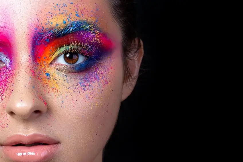
Whether you are a novice or a seasoned designer, no matter what you are designing, be it a corporate logo for a company, a website, or even a bedroom, the nature of the design is created by using colors. To use colors together, a better understanding of color theory and how to pair the best color combinations will showcase your personality and how the colors affect others when seeing them.

Below, we have listed a few of the two-color combinations that work if paired together in an outfit. We list briefly the description of the feelings that these color combinations would evoke when seeing them paired together.
- A deep purple paired up with blue will off the emotion of being serene and dependable.
- The pairing up of yellow and blue gives off a playful yet authoritative emotion.
- Navy and teal should be soothing yet striking.
- Maroon and peach will give off the emotion of elegance yet tranquility.
- Navy and orange evoke the feeling of entertaining yet also credible at the same time.
- Black and orange will tell the world that you are lively and powerful.
Color Theory and Psychology
When it comes to understanding color, the first thing we need to learn is color theory and the lingo used when describing certain aspects thereof. Of course, colors all have meaning and affect us differently, too.
Color Theory
Color theory is the foundation from which all ideas are formed. Once you know the basics of color theory, you can experiment with various color combinations and understand the aesthetic color palette. Color theory helps to guide you on what colors work well together. Understanding the “lingo” used with color will also assist with this exciting journey.
| Tint | This means adding white to the color |
| Lightening | This is when you lighten a color, and is not to be confused with brightening the color. |
| Shade | This refers to the color’s shade, which is the addition of black to a color. This creates a darker color which becomes more intense |
| Hue | The hue of the color is the actual pure color that contains no additions of black or white. |
| Tone | The tone refers to the hue and is achieved when gray is added to the mix. |
Color Psychology
When choosing color combinations, there is always more than meets the eye. While we are probably not even very aware of it, color does indeed affect our mood. This is due to the association that we may have with color. There are also personal meanings and preferences of color and it could also be cultural.

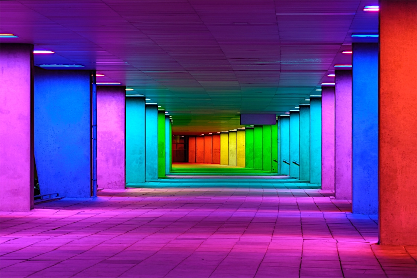
Studying the different effects of what color can play in our lives is color psychology where understandings are being reached on why certain colors affect emotions, behaviors, and emotions as well as decisions. Colors can have physiological effects; this means that colors can stimulate appetite. Colors also have different effects on different aspects of our lives, such as culture, age, gender, and individual experiences. Colors can be used as a way of communication. Just think about when we look at flag colors, it is easy to identify different countries without seeing the name of the country.
Popular Aesthetic Color Palettes
Understanding color theory and color psychology will assist when dealing with some of the technical issues around creating an aesthetic color palette. As mentioned before, there are so many different color combinations under the aesthetic color palette, we will explore the more popular aesthetic color palettes when combining more than two colors.
Two- and Three-Color Combinations
Whether you are creating a design for a clothing line, a website, a corporate logo, or even a bedroom, the design is personal however there is a big difference between interior home designs and marketing material. Whilst one is for personal use, the other is more formal. The rule in both cases is not to go overboard. Less is often more – always remember this simple golden rule.

Green and Blue
Green is associated with the growth and renewal of life. It is a refreshing color. Blue is popular throughout the world and is a color that people trust. There are numerous blues and greens available in the market so choosing the best blue or green depends on your needs and what it is you are trying to achieve. The color combination of mint green and navy blue is a bold and sophisticated pairing. Navy blue will stand out and mint green will tone down the colors. Lighter shades of pastel colors such as lemon yellow or lace pink also match up very well with navy blue.
| Shade | Hex Code | CMYK Color Code (%) | RGB Color Code | Color |
| Navy | #000080 | 100, 100, 0, 50 | 0, 0, 128 | |
| Mint Green | #3EB489 | 32,0,33,0 | 162,228,184 | |
| Lemon Yellow | #FFF44F | 0, 4, 69, 0 | 255, 244, 79 | |
| Pink Lace | #FFDDF4 | 0, 13, 4, 0 | 255, 221, 244 |
Yellow and Violet
Yellow and violet are complete opposites on the color wheel. Pairing up these two colors adds contrast and is very striking. Canary yellow and violet are both associated with optimism and confidence, both colors are uplifting and motivating. This color combination is often used by sports teams.
| Shade | Hex Code | CMYK Color Code (%) | RGB Color Code | Color |
| Violet | #EE82EE | 0, 0.45, 0, 0.07 | 238, 130, 238 | |
| Canary Yellow | #FFEF00 | 0, 6, 100, 0 | 255, 239, 0 |

Lavender and Indigo
The two colors lavender field and indigo are similar and could even be mistaken for each other. The lavender has a purple undertone and the indigo leans more towards a blue undertone. The lavender color gives a sense of purity and calmness and indigo brings a hint of flair and is bold. Lavender and indigo have become increasingly popular choices for wedding decor.
| Shade | Hex Code | CMYK Color Code (%) | RGB Color Code | Color |
| Lavender Field | #754C78 | 3, 37, 0, 53 | 45.9, 29.8, 47.1 | |
| Indigo | #4B0082 | 0.42, 1, 0, 0.49 | 75, 0, 130 |
Yellow, Red, and Blue
Known as the primary colors, these three colors make a striking and classic combination. They work well together and create a colorful appearance. Red grabs your attention, and yellow inspires and encourages whilst blue is calming. The pure primary colors will work well together in a company logo but it could be a challenge when using these three colors in interior design. One vibrant color is usually used with two other colors to tone the bright color down.
| Shade | Hex Code | CMYK Color Code (%) | RGB Color Code | Color |
| Canary Yellow | #FFEF00 | 0, 6, 100, 0 | 255, 239, 0 | |
| Red | #FF0000 | 0, 100, 100, 0 | 255, 0, 0 | |
| Blue | #0000FF | 1, 1, 0, 0 | 0, 0, 255 |

Purple, Green, and Orange
Purple, forest green, and orange are an aesthetic color combination that works very well together and creates a balance as well as a good contrast. As with the yellow, red and blue color combination, it is suggested that you use one main color with the other two as accent colors. This will prevent all three colors from becoming too bold in an area.
| Shade | Hex Code | CMYK Color Code (%) | RGB Color Code | Color |
| Purple | #800080 | 0, 1, 0, 0.5 | 128, 0, 128 | |
| Forest Green | #228B22 | 76, 0, 76, 45 | 34, 139, 34 | |
| Yellow-Orange | #FFAA33 | 0, 33, 80, 0 | 255, 170, 51 |
Seafoam Green, Lilac, and Amethyst Purple
These three colors are a combination of the aesthetic color palette. This combination incorporates a more vibrant purple with a more toned-down version of purple. To add variation to the two purples, the seafoam green will provide contrast. Typically, this aesthetic color palette is normally seen in spas or wellness centers. The combination is relaxing and brings a bit of creativity to an area. Lighter shades of purple help reduce stress.

| Shade | Hex Code | CMYK Color Code (%) | RGB Color Code | Color |
| Seafoam Green | #93E9BE | 0.37, 0.00, 0.18, 0.09 | 147, 233, 190 | |
| Lilac | #C8A2C8 | 32, 30, 37 | 220, 208, 255 | |
| Amethyst | #562F7E | 33.7, 18.4, 49.4 | 32, 63, 0, 51 |
Natural Light
Combining natural light into an aesthetic color palette is a no-brainer. The physical benefits of enhancing natural light in surroundings have been established time and time again. Natural light gives off an energy aesthetic and has become essential more than ever with more and more people spending so much time at home instead of venturing out.
Incorporating natural light into a room will add to the aesthetic color palette and will help natural colors stand out and create a vibrant and calming ambiance.
Aesthetic Color Schemes
The aesthetic color schemes are so vast and because of this, we cannot possibly mention every color combination in this article. We will cover the popular color schemes that are grabbing everybody’s attention.
Landscapes
Not all landscape colors need to be brown, for example using the sky-blue color, together with a forest green and white color palette will work well in any photos or paintings.
| Shade | Hex Code | CMYK Color Code (%) | RGB Color Code | Color |
| Sky Blue | #87CEEB | 0.43, 0.12, 0, 0.08 | 135, 206, 235 | |
| Forest Green | #228B22 | 76, 0, 76, 45 | 34, 139, 34 | |
| White | #FFFFFF | 0, 0, 0, 0 | 255, 255, 255 |
Femininity
Having a combination of carnation pink, dark silver, and periwinkle colors will create a stunning feminine vibe. These aesthetic colors can be used when dressing for a business meeting and even using them in your corporate packaging for gifts.

| Shade | Hex Code | CMYK Color Code (%) | RGB Color Code | Color |
| Carnation | #FFA6C9 | 0, 35, 21, 0 | 255, 166, 201 | |
| Dark Silver | #706E72 | 2, 4, 0, 55 | 112, 110, 114 | |
| Periwinkle | #CCCFF | 20, 20, 0, 0 | 204, 204, 255 |
Retro Sunset
The aesthetic color palette used to portray a retro sunset is made up of mauve, purple, gray, yellow-orange, and peach. Typically, all these colors represent a sunset and it evokes feelings of fun and serenity.
| Shade | Hex Code | CMYK Color Code (%) | RGB Color Code | Color |
| Mauve | #E0B0FF | 0.12, 0.31, 0, 0 | 224, 176, 255 | |
| Purple | #800080 | 0, 1, 0, 0.5 | 128, 0, 128 | |
| Dim Gray | #696969 | 0, 0, 0, 59 | 105, 105, 105 | |
| Yellow-Orange | #FFAA33 | 0, 33, 80, 0 | 255, 170, 51 | |
| Peach | #FAD1AF | 0, 16, 30, 2 | 250, 209, 175 |
Vintage Hues
The vintage aesthetic color palette can be made up just by looking at an old library, including the various colors of books, the ceilings, and the rich dark wooden floors. Black, brown, burgundy, and copper shades are blended to form a sophisticated palette. The vintage aesthetic color palette is elegant.
| Shade | Hex Code | CMYK Color Code (%) | RGB Color Code | Color |
| Black | #000000 | 0, 0, 0, 100 | 0, 0, 0 | |
| Dark Brown | #654321 | 0, 34, 67, 60 | 101, 67, 33 | |
| Burgundy | #800020 | 0, 100, 75, 50 | 50.2, 0, 12.5 | |
| Copper | #B87333 | 0, 38, 72, 28 | 184, 115, 51 |
Minimalistic Hues
Achieving the look of a minimalist color palette is when shades of beige, camel, and brown are combined. This has become a very popular aesthetic color palette for interior home décor, made every popular from watching superstars on social media platforms. This specific color palette has become very trendy with decorators. It is a classic aesthetic color. Another type of minimalistic color palette could be simple white and black or gray.
| Shade | Hex Code | CMYK Color Code (%) | RGB Color Code | Color |
| Beige | #F5F5DC | 0, 0, 10, 4 | 245, 245, 220 | |
| Camel | #C19A6B | 0, 20, 45, 24 | 193, 154, 107 | |
| Saddle Brown | #8B4513 | 0, 20, 45, 24 | 139, 69, 19 |

Pastel Hues
You might have noticed how pastel colors such as soft pink, lavender, green and yellow have become a very popular choice for an aesthetic color palette. What this tells us is that people are less afraid of bolder looks, so they are more willing to experiment. Lilac is a great feminine aesthetic color choice with its gorgeous pastel hue which pairs well with all other pastel colors.
| Shade | Hex Code | CMYK Color Code (%) | RGB Color Code | Color |
| Lilac | #C8A2C8 | 32, 30, 37 | 220, 208, 255 | |
| Baby Pink | #F4C2C2 | 0, 20, 20, 4 | 244, 194, 194 | |
| Lemon Yellow | #FFF44F | 0, 4, 69, 0 | 255, 244, 79 | |
| Pistachio | #93C572 | 25, 0, 42, 23 | 147, 197, 114 |
Ash Tones
Taking a photograph of the escarpment, which shows off mountains, mountain roads, and its surroundings, will be enhanced when paired up with ash-tone aesthetic colors, such as cerebellum gray, heather gray, slate gray, white, and gold. The ash tones are aesthetic colors that bring out the vibrance that nature offers.
| Shade | Hex Code | CMYK Color Code (%) | RGB Color Code | Color |
| Cerebellum Gray | #C8C7C9 | 0, 1, 0, 21 | 200, 199, 201 | |
| Heather Gray | #9C9DA4 | 5, 4, 0, 36 | 156,157,164 | |
| Slate Gray | #778899 | 22, 11, 0, 40 | 119, 136, 153 | |
| White | #FFFFFF | 0, 0, 0, 0 | 255, 255, 255 | |
| Gold | #FFD700 | 0, 16, 100, 0 | 255, 215, 0 |
Beach Getaway
Strolling along the beach always brings a pleasure fest to the eyes, as not only are you captured by the wonders of the waters, the shells, and the sand but there are also small flowers that are found higher up in the beach foliage. These various colors add to the beachy-vibe color palette where sandy camel brown, ivory white, and denim blue are paired together.
| Shade | Hex Code | CMYK Color Code (%) | RGB Color Code | Color |
| Denim Blue | #2F6479 | 61, 17, 0, 53 | 47, 100, 121 | |
| Camel | #C19A6B | 0, 20, 45, 24 | 193, 154, 107 | |
| Ivory | #FFFFF0 | 0, 0, 6, 0 | 100, 100, 94.1 |
Rustic Living
The aesthetic color palette for rustic living is made up of colors that embody a mood and muted tones of brown, maroon, and gray form a almost washed palette. To some, this palette may seem bland but it is a classy color scheme and keeps one thinking out of the box when exploring this theme as an aesthetic color palette.
| Shade | Hex Code | CMYK Color Code (%) | RGB Color Code | Color |
| Charcoal Gray | #36454F | 0.32, 0.13, 0, 0.69 | 54, 69, 79 | |
| Maroon | #800000 | 0, 100, 100, 50 | 128, 0, 0 | |
| Dark Brown | #654321 | 0, 34, 67, 60 | 101, 67, 33 |
Pink Weddings
Where it may be thought that the aesthetic color palettes are generally neutrals, they don’t always have to be. It turns out that using soft pink and soft blue can turn the aesthetic color palette around. If you are planning a pink wedding, you will look at colors such as coral pink, Georgia peach, mauve, dim gray, and even dark silver.
| Shade | Hex Code | CMYK Color Code (%) | RGB Color Code | Color |
| Coral Pink | #f88379 | 0, 47, 51, 3 | 248, 131, 121 | |
| Georgia Peach | #f97272 | 0, 54, 54, 2 | 249, 114, 114 | |
| Mauve | #E0B0FF | 0.12, 0.31, 0, 0 | 224, 176, 255 | |
| Dim Gray | #696969 | 0, 0, 0, 59 | 105, 105, 105 | |
| Dark Silver | #706e72 | 2, 4, 0, 55 | 112, 110, 114 |

Choosing Your Aesthetic Color Palette
To assist you with choosing your very own aesthetic color palette we have outlined the emotions associated with different colors. Remember that your choice of color inside a room can affect your mood quite a bit!
Happy Colors
All happy colors are warm, bright colors. Some examples of happy colors include canary yellow, pink, amber orange, and lime green. These colors will uplift the mood when walking into a room. Bright colors make us feel optimistic and happy.
| Shade | Hex Code | CMYK Color Code (%) | RGB Color Code | Color |
| Canary Yellow | #FFEF00 | 0, 6, 100, 0 | 255, 239, 0 | |
| Pink | #FFC0CB | 0, 25, 20, 0 | 255, 192, 203 | |
| Amber | #FFBF00 | 0, 0.25, 1, 0 | 255, 191, 0 | |
| Lime | #32CD32 | 0.76, 0, 0.76, 0.2 | 50, 205, 50 |

Fun Colors
The sensation of fun can be evoked by using orange. Orange is considered to be a fun color as it is flamboyant and makes us feel energetic. Other colors associated with fun are yellow-orange, coral pink, red, purple, and sky blue. Combining each color will be a personal choice.
| Shade | Hex Code | CMYK Color Code (%) | RGB Color Code | Color |
| Yellow-Orange | #FFAA33 | 0, 33, 80, 0 | 255, 170, 51 | |
| Coral Pink | #F88379 | 0, 47, 51, 3 | 248, 131, 121 | |
| Red | #FF0000 | 0, 100, 100, 0 | 255, 0, 0 | |
| Purple | #800080 | 0, 1, 0, 0.5 | 128, 0, 128 | |
| Sky Blue | #87CEEB | 0.43, 0.12, 0, 0.08 | 135, 206, 235 |
Sad Colors
The sad aesthetic colors are normally those colors that are dark and muted. Gray and brown are sad colors, however, both your sad and happy colors are closely related to culture. Whilst some cultures consider black as a color of mourning, other cultures consider white as a color of mourning.
| Shade | Hex Code | CMYK Color Code (%) | RGB Color Code | Color |
| Charcoal Gray | #36454F | 0.32, 0.13, 0, 0.69 | 54, 69, 79 | |
| Dark Brown | #654321 | 0, 34, 67, 60 | 101, 67, 33 | |
| Black | #000000 | 0, 0, 0, 100 | 0, 0, 0 | |
| Ghost White | #F8F8FF | 3, 3, 0, 0 | 248, 248, 255 |
Negative Colors
Although it is not scientifically proven, many believe that colors such as violet, blue, and purple will help create negative space and summon negative feelings. It is felt that these colors can also denote depression or sadness. Lower brightness and lower saturation are how we define negative colors.
| Shade | Hex Code | CMYK Color Code (%) | RGB Color Code | Color |
| Violet | #EE82EE | 0, 0.45, 0, 0.07 | 238, 130, 238 | |
| Midnight Blue | #08113B | 78, 78, 0, 56 | 8, 17, 59 | |
| Amethyst | #562F7E | 33.7, 18.4, 49.4 | 32, 63, 0, 51 |
Positive Colors
Positive colors, such as red, orange, and yellow are deemed to be energetic and therefore give off positivity. These colors bring joy and excitement. Positive colors are defined by their high brightness and high saturation.
| Shade | Hex Code | CMYK Color Code (%) | RGB Color Code | Color |
| Canary Yellow | #FFEF00 | 0, 6, 100, 0 | 255, 239, 0 | |
| Red | #FF0000 | 0, 100, 100, 0 | 255, 0, 0 | |
| Orange | #FFA500 | 0, 0.35, 1, 0 | 255, 165, 0 |
Powerful Colors
Burgundy, black, brown, and deep bottle green are all considered to be power colors. These deep and robust colors are ones that will convey authority. These colors are often used in the business world.
| Shade | Hex Code | CMYK Color Code (%) | RGB Color Code | Color |
| Burgundy | #800020 | 0, 100, 75, 50 | 50.2, 0, 12.5 | |
| Black | #000000 | 0, 0, 0, 100 | 0, 0, 0 | |
| Dark Brown | #654321 | 0, 34, 67, 60 | 101, 67, 33 | |
| Bottle Green | #0F472C | 79, 0, 38, 72 | 15, 71, 44 |
The Cottagecore Color Palette
What exactly is the cottagecore color palette and what embodies the cottagecore aesthetic? In simple terms, it is a feeling, such as the coziness in a home, or bringing natural elements indoors such as dried flowers and combining them with a natural palette of warm tones. Combining nature with a floral tea set is the quintessential look of the cottagecore color palette.
Cottagecore is a concept that embraces simple living, which is in harmony with nature. When we think of cottage living, we have nostalgic feelings about the countryside and peasant dresses. Cottagecore is a movement taking us back to the English countryside where everything appeared romantic. Without even realizing it, you may have even used this cottagecore color palette in photographs In an aesthetically pleasing way, you can add a backdrop of floral print material to add to the overall effect.

The activities and aesthetics that cottagecore embraces are wide and very complex and it covers all spheres of life, such as gardening to cooking as well as fashion. Social media platforms such as Instagram and TikTok brought the cottagecore into sharp focus where the famously started color combinations to grab instant attention. Typically, a cottagecore aesthetic color palette captures nature earth tones. Muted brown and green colors look stunning together.
| Shade | Hex Code | CMYK Color Code (%) | RGB Color Code | Color |
| Amazon Green | #3B7A57 | 52, 0, 29, 52 | 59, 122, 87 | |
| Deep Coffee Brown | #704241 | 0, 41, 42, 56 | 112, 66, 65 |
Fun Facts About Aesthetic Colors
Listed below are colors that you may have not heard of before, these colors are obscure and are considered to be old-fashioned.
| Shade | Hex Code | CMYK Color Code (%) | RGB Color Code | Color |
| Celadon | #ACE1AF | 24, 0, 22, 12 | 172, 225, 175 | |
| Coquelicot | #FF3800 | 0, 78, 100, 0 | 255, 56, 0 | |
| Glaucous | #6082B6 | 47, 29, 0, 29 | 96, 130, 182 | |
| Amaranth | #E52B50 | 0, 81, 65, 10 | 229, 43, 80 | |
| Vermilion | #E34234 | 0, 71, 77, 11 | 227, 66, 52 | |
| Aureolin | #FDEE00 | 0, 6, 100, 1 | 253, 238, 0 | |
| Gamboge | #E49B0F | 0, 32, 93, 11 | 228, 155, 15 | |
| Burlywood | #DEB887 | 0, 17, 39, 13 | 222, 184, 135 |
The rarest color seen in nature is blue. The few animals and plants that may appear to be blue do not contain the color blue instead vibrant organisms have developed unique features over time and use the different plays of light which may give off the blue color.
The aesthetic color palette gives plenty of food for thought. It often seems there are no boundaries or limits when it comes to aesthetic colors and you are so right, there aren’t! What pleases the eye should be the same thing that pleases the soul. We hope you have enjoyed taking this unique aesthetically pleasing journey with us.
Frequently Asked Questions
What Does Aesthetically Pleasing Mean?
The word aesthetic means that you are concerned with beauty. You have an appreciation of beauty. The picture is pleasing to the eye. The color combination of lavender and teal is the quintessential color for all things aesthetically pleasing.
What Are Aesthetic Colors?
When we talk about aesthetic colors, we are referring to a combination of colors that pair beautifully and work well together. They create a balanced and harmonious look. Aesthetic color palettes are easy to look at and are easy on the eye. Color combinations should be appealing.

Why Do I Like Aesthetics?
Aesthetics made us happy. On an emotional level, aesthetics can elicit feelings of happiness. They connect us to our ability to appreciate the world around us and this gives us a feeling of hope and contentment.
What Is Considered the Most Aesthetic Color?
Everybody has a favorite color or combination of colors and will differ from person to person. It is difficult to point out the most popular color however we understand that the best or most aesthetic color right now at this point is YInMn blue.

Duncan graduated with a diploma in Film and TV production from CityVarsity in 2018, after which he continued pursuing film while taking on a keen interest in writing along the way. Since having graduated, he began working as a freelance videographer, filming a variety of music videos, fashion and short films, adverts, weddings and more. Throughout this, he’s won a number of awards from various film festivals that are both locally and internationally recognized. However, Duncan still enjoys writing articles in between his filming ventures, appreciating the peace and clarity that comes with it.
His articles focus primarily around helping up-and-coming artists explore the basics of certain colors, how these colors can be paired with other shades, as well as what colors are created when you mix one with another. All while relating these shades to historically significant paintings that have incorporated them into their color palette. As a lover of the arts himself, he takes great interest in the Renaissance era of paintings, an era that has directly inspired many of his favorite films.
Learn more about Duncan van der Merwe and about us.