What Colors Go With Red? – 20 Stylish Combinations
This post may contain affiliate links. We may earn a small commission from purchases made through them, at no additional cost to you.
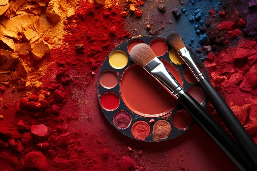
Evoking feelings of energy, power, and love simultaneously, this fierce and passionate hue is the color of fire and blood, and of sunsets and sunrises. Red simply demands attention and cannot be ignored, standing as a symbol of courage and strength. Join us as we come to terms with the expansive variety of colors that go with red. However, to take full advantage of this alluring color, we first need to take a closer look at the many shades that are found within red itself! Read along as we explore 20 dynamic color schemes that go with red.
What Color Is Red?
As is immediately apparent upon observation, the color red is a vibrant and striking color that ignites the soul and envelopes the senses, bringing up feelings of both excitement and desire within the observer. From the fiery glow of the sunset to the deep, rich tones of fine wine, this is a color that is as rich in symbolism and meaning as it is in variety and use. Each shade is able to hold its own story and significance, as scarlet, a fiery shade that brings a sense of fun and joy, or maroon, a much deeper and subdued red that possesses an air of elegance and sophistication.
No matter where you look, each shade of red is its own masterpiece, inspiring us with its raw beauty and abundant depth.
| Red Color | Red Hex Code | RGB | CMYK Color Code (%) | Shade of Red |
| Red | #FF0000 | 255,0,0 | 0, 100, 100, 0 | |
| Auburn | #922724 | 146, 39, 36 | 0, 0, 75, 43 | |
| Scarlet | #FF2400 | 255, 36, 0 | 0, 86, 1, 0 | |
| Maroon | #800000 | 128, 0, 0 | 0, 50, 50, 0 | |
| Blood Red | #8A0707 | 136, 7, 7 | 0, 95, 95, 46 | |
| Alizarin Crimson | #E32636 | 227, 38, 54 | 0, 83, 76, 11 | |
| Wine | #722F37 | 114, 47, 55 | 0, 59, 52, 55 | |
| Pastel Red | #FF6961 | 255, 105, 97 | 0, 59, 62, 0 | |
| Carmine | #FF0038 | 225, 0, 56 | 0, 100, 78, 0 | |
| Ruby | #9B111E | 15, 17, 30 | 0, 89, 81, 39 |
What Colors Go With Red?
What colors go well with red? Red, with its invigorating qualities, is an excellent choice for the kitchen, whether applied subtly or as the dominant background. Particularly suitable for spaces aiming to convey energy, warmth, and hospitality, red can enhance environments like the study, kitchen, and living room. Its versatility extends beyond walls; you can enhance the impact by integrating red into details such as baseboards, window frames, and front doors. Explore specific shades of red paired with different colors, considering color theory and connotations. Experiment with these combinations to achieve the desired aesthetic for each room.
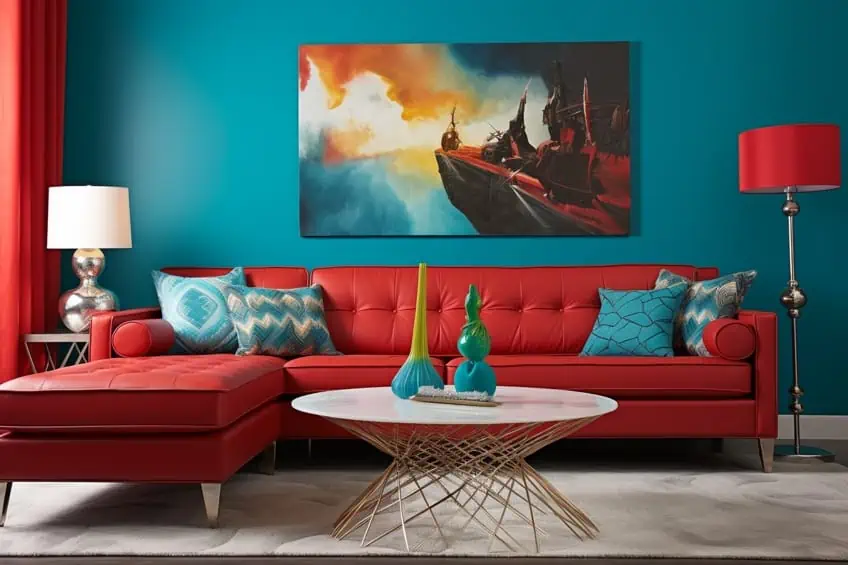
Red and Cyan
Imagine, for a moment, a lush, red rose against the backdrop of a clear blue sky. The combination can be truly breathtaking. However, it is not always about how these two colors work together, it is often more about the emotions that they are able to evoke within the observer. With the passionate fire that brews within red being paired with the inviting and rather refreshing qualities of cyan, these shades somehow create a harmonious balance that keeps us mesmerized. As such a combination is able to evoke feelings of warmth and serenity, while sparking the imagination and igniting the senses, it may be perfect for room design, fashion statements, and even a piece of art. Both bold and beautiful, the frenetic yet elegant dance between red and cyan is sure to leave your audience with a lasting impression.
| Color | Hex Code | RGB | CMYK Color Code (%) | Shade of Color |
| Red | #FF0000 | 255,0,0 | 0, 100, 100, 0 | |
| Cyan | #00FFFF | 0, 255, 255 | 100, 0, 0, 0 |
Red and Yellow
If you are looking to go outside the above-listed criteria of colors that match with red, then you should ensure to keep the following in mind. Your partnering hue should straddle the line between being just as striking as red itself and being subdued to allow red’s true qualities to shine. This can help you achieve a more balanced look, while still giving you enough space to get as creative as necessary. By looking at golden yellow, this warm and inviting color is able to add a touch of positivity to offset red’s boldness. This combination creates a lively and dynamic palette that is able to draw in your audience’s attention that is sure to bring up a sense of confidence and awe.
| Color | Hex Code | RGB | CMYK Color Code (%) | Shade of Color |
| Red | #FF0000 | 255,0,0 | 0, 100, 100, 0 | |
| Golden Yellow | #FFC000 | 255, 192, 0 | 0, 25, 100, 0 |
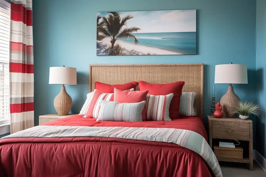
Red and Soft Blue
Alternatively, matching red with a light shade of soft blue, you may be surprised by how well its soothing traits are able to balance out the more aggressive tendencies of red. By creating a rather playful and inviting combination, this may serve as the perfect addition to any design that requires a sense of levity.
| Color | Hex Code | RGB | CMYK Color Code (%) | Shade of Color |
| Red | #FF0000 | 255,0,0 | 0, 100, 100, 0 | |
| Soft Blue | #93CAED | 147, 202, 237 | 38, 15, 0, 7 |
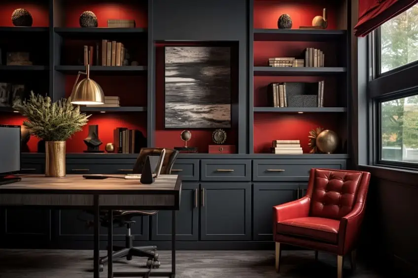
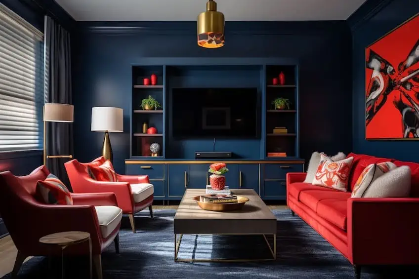
Red and Charcoal
If you are looking to attain a bold yet exquisite combination, red and charcoal may be right up your alley. While the fiery red may evoke a sense of passion and vitality, charcoal instead exudes a cool and refined sense of style. Together, it creates a visually captivating contrast that remains as dynamic as it is harmonious. As charcoal provides a sense of balance and grounding to the palette, red adds just the right amount of color and energy, making the pair perfect for bold statements while maintaining a sense of refinement throughout.
| Color | Hex Code | RGB | CMYK Color Code (%) | Shade of Color |
| Red | #FF0000 | 255,0,0 | 0, 100, 100, 0 | |
| Charcoal | #36454F | 54, 69, 79 | 32, 13, 0, 69 |
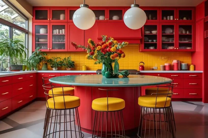
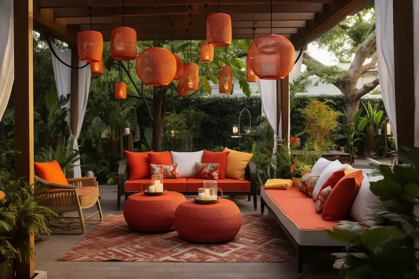
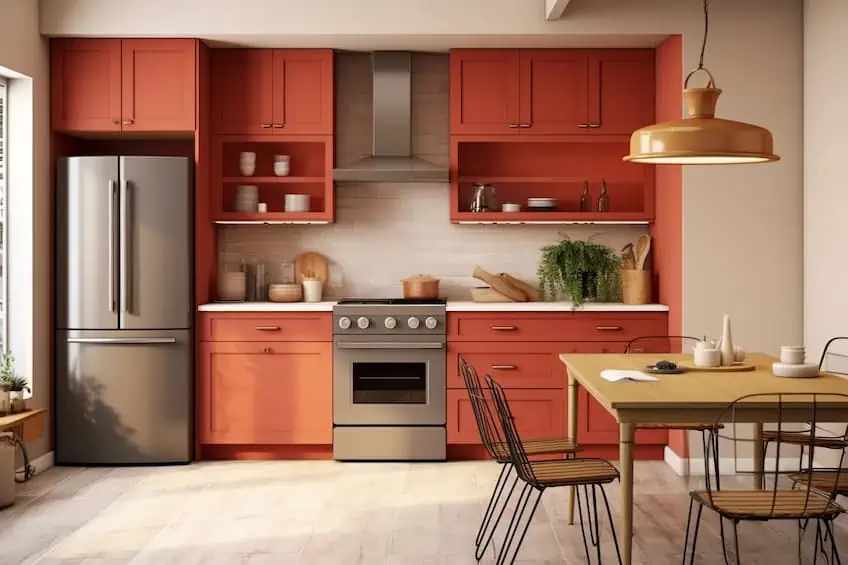
Red and Orange
Similar to golden yellow, however, we have a blend of red with tawny orange, an exceptionally warm and vibrant combination that can be used to make your designs appear more inviting to the eye. Thanks to tawny orange’s invigorating friendliness, and with our shade of red infusing a sense of excitement and energy, this pairing simply exudes feelings of warmth and liveliness.
| Color | Hex Code | RGB | CMYK Color Code (%) | Shade of Color |
| Red | #FF0000 | 255,0,0 | 0, 100, 100, 0 | |
| Tawny-orange | B25A38 | 178, 90, 56 | 0, 49, 69, 30 |
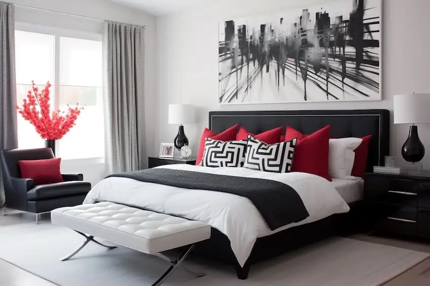
Red and White
If you are instead looking for a flair of elegance in a timeless manner, the combination of white and red simply screams modern simplicity at its finest. In contrast to red’s fiery personality, white is able to provide a crisp balance that exudes feelings of purity and innocence. As the epitome of elegance and refinement, this may just be the perfect pairing for those who are looking to create a sophisticated and timeless aesthetic within their works.
| Color | Hex Code | RGB | CMYK Color Code (%) | Shade of Color |
| Red | #FF0000 | 255,0,0 | 0, 100, 100, 0 | |
| White | #FFFFFF | 255, 255, 255 | 0, 0, 0, 0 |
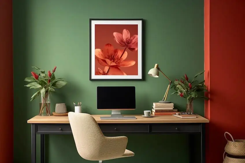
Red and Forest Green
Red and green create a classic and vibrant color combination, reminiscent of the holiday season. The energetic contrast between the two can be balanced by using deeper shades of red and pairing them with muted or pastel greens. In interior design, consider incorporating red and green through accessories like throw pillows, rugs, or artwork. For a more subtle approach, use red as an accent color against a predominantly green backdrop, such as with green walls or furniture.
| Shade | Hex Code | CMYK Color Code (%) | RGB Color Code | Color |
| Brick Red | #B25444 | 0, 53, 62, 30 | 178, 84, 68 | |
| Forest Green | #475222 | 13, 0, 59, 68 | 71, 82, 34 |
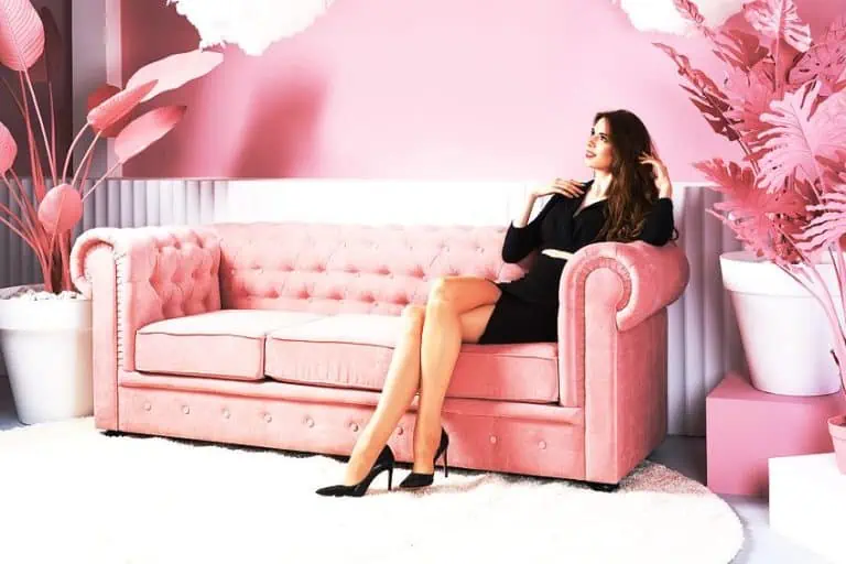
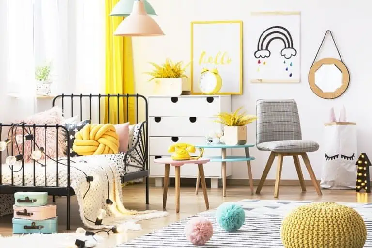
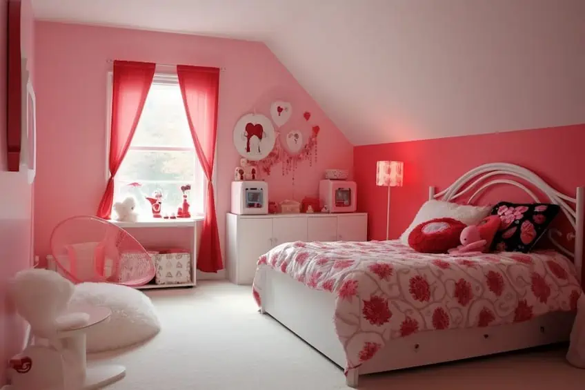
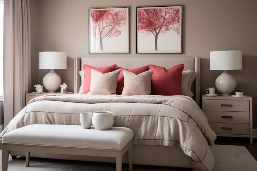
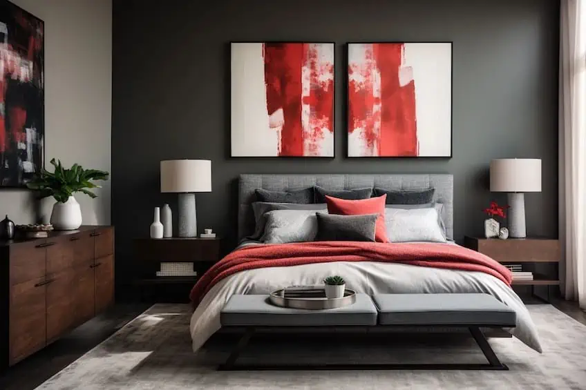
Red and Blush Pink
Red and pink together create a bold and playful ambiance. To avoid an overly vibrant look, use varying shades of red and pink, combining deep reds with soft pinks. As a personal tip, consider using red as the primary color in larger furniture pieces and introducing pops of pink through accessories. This combination is particularly effective in spaces like bedrooms or living rooms, adding a touch of romance and modernity.
| Shade | Hex Code | CMYK Color Code (%) | RGB Color Code | Color |
| Pure Red | #FF0000 | 0, 100, 100, 0 | 255, 0, 0 | |
| Blush Pink | #FF9999 | 0, 40, 40, 0 | 255, 153, 153 |
Red and Navy Blue
Red and blue form a classic and timeless color scheme. This combination works well in various design styles, from traditional to nautical themes. As an interior designer, I recommend balancing the intensity by choosing a muted or deep shade of blue to complement a vibrant red. Consider using blue as a dominant color in larger elements like furniture or walls, with red accents through decor items such as throw blankets, pillows, or artwork.
| Shade | Hex Code | CMYK Color Code (%) | RGB Color Code | Color |
| Red | #FF0000 | 0, 100, 100, 0 | 255, 0, 0 | |
| Navy Blue | #002060 | 100, 67, 0, 62 | 0, 32, 96 |
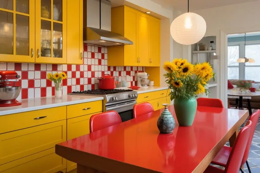
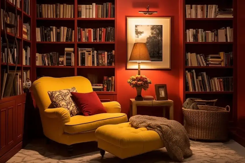
Cherry Red and Mustard
The combination of red and mustard brings warmth and sophistication to a space. This pairing works well in both traditional and contemporary settings. As an interior design expert, I recommend using mustard as the dominant color, perhaps on walls or large furniture pieces, and introducing red as accents through smaller decor items like cushions, vases, or wall art. This creates a balanced look that is visually appealing without being overpowering.
| Shade | Hex Code | CMYK Color Code (%) | RGB Color Code | Color |
| Cherry Red | #960000 | 0, 100, 100, 41 | 150, 0, 0 | |
| Mustard | #E6BA00 | 0, 19, 100, 10 | 230, 186, 0 |
Soft Red and Greige
Soft red and greige (a blend of gray and beige) create a calming and sophisticated atmosphere. For a harmonious look, use soft red as an accent against a neutral greige backdrop. As a personal touch, incorporate textures such as plush rugs or velvet cushions in soft red to add depth to the design. This combination is ideal for creating a cozy and inviting ambiance in living spaces.
| Shade | Hex Code | CMYK Color Code (%) | RGB Color Code | Color |
| Soft Red | #C14B4B | 0, 61, 61, 24 | 193, 75, 75 | |
| Greige | #E0D8D6 | 0, 4, 4, 12 | 224, 216, 214 |
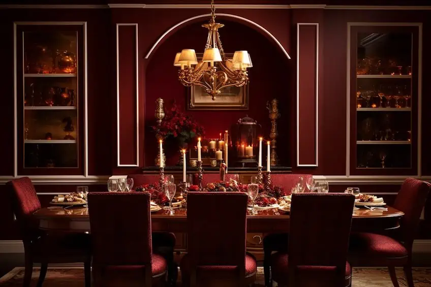
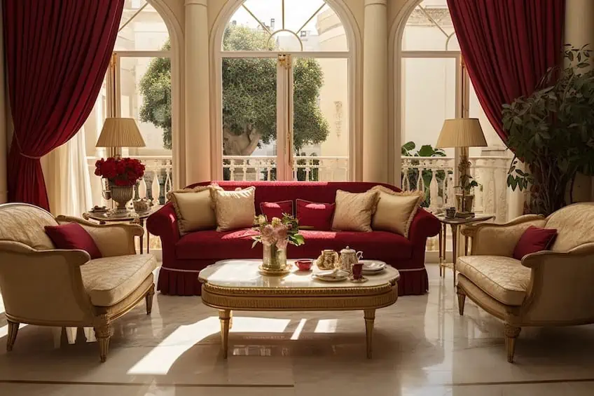
Burgundy and Gold
Burgundy and gold evoke a sense of luxury and opulence. As an interior design expert, I recommend using burgundy as a rich, statement color in furniture or accent walls, complemented by gold accents in lighting fixtures, decorative objects, or trim. This combination is perfect for creating a regal and sophisticated atmosphere in spaces like dining rooms or home offices.
| Shade | Hex Code | CMYK Color Code (%) | RGB Color Code | Color |
| Burgundy | #800020 | 0, 100, 75, 50 | 128, 0, 32 | |
| Gold | #FFD700 | 0, 0, 100, 0 | 255, 215, 0 |
Cherry Red and Charcoal Gray
Cherry red paired with charcoal gray creates a bold and contemporary look. As a designer, I suggest using cherry red as a focal point, such as on an accent wall or furniture piece, and incorporating charcoal gray as a grounding neutral. This combination is versatile and works well in modern living spaces, providing a balance between warmth and sophistication.
| Shade | Hex Code | CMYK Color Code (%) | RGB Color Code | Color |
| Cherry Red | #DE3163 | 0, 80, 45, 18 | 222, 49, 99 | |
| Charcoal Gray | #36454F | 60, 40, 35, 85 | 54, 69, 79 |
Crimson and Cream
Crimson and cream combine to create a refined and elegant color palette. To achieve a sophisticated look, use crimson as a dominant color in upholstery or drapery and balance it with cream-colored walls or furniture. As a personal tip, incorporate metallic accents like gold or brass to add a touch of glamour to the design. This combination is well-suited for formal living rooms or dining areas.
| Shade | Hex Code | CMYK Color Code (%) | RGB Color Code | Color |
| Crimson | #DC143C | 0, 100, 70, 15 | 220, 20, 60 | |
| Cream | #FFFDD0 | 0, 0, 12, 0 | 255, 253, 208 |
Rust Red and Beige
Rust red and beige create a warm and earthy color scheme. To enhance the cozy feel, use rust red as an accent color through textiles or statement furniture against a neutral beige backdrop. As an interior designer, I recommend incorporating natural materials like wood or woven textures to complement this combination, adding a touch of rustic charm to the space.
| Shade | Hex Code | CMYK Color Code (%) | RGB Color Code | Color |
| Rust Red | #B7410E | 0, 67, 89, 28 | 183, 65, 14 | |
| Beige | #F5F5DC | 0, 0, 16, 4 | 245, 245, 220 |
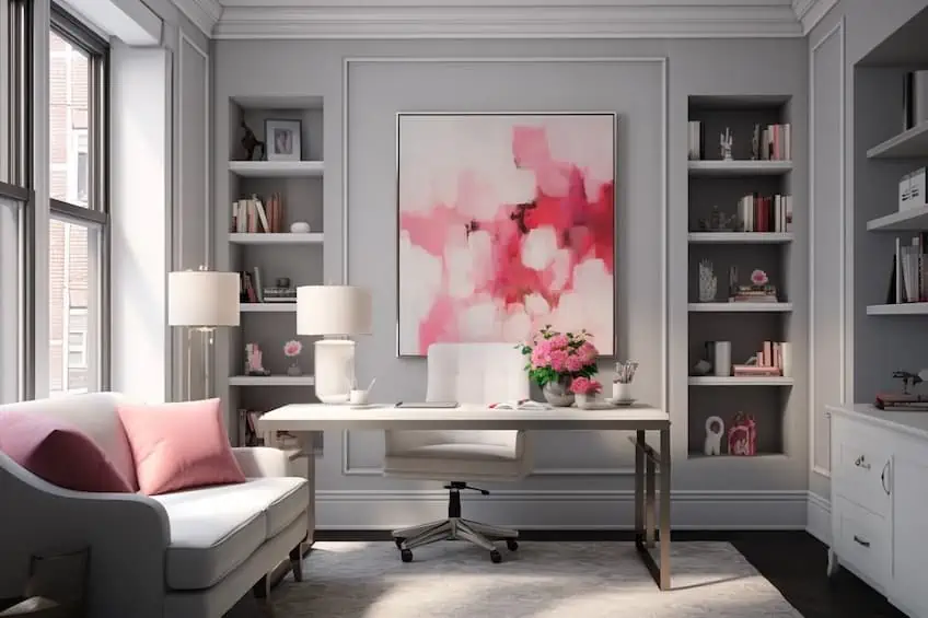
Rose Red and Soft Gray
Rose red paired with soft gray achieves a delicate and sophisticated aesthetic. As a design expert, I recommend using rose red in smaller doses, such as in throw pillows, rugs, or artwork, against a backdrop of soft gray walls or furniture. This combination is perfect for creating a serene and modern atmosphere in bedrooms or home offices.
| Shade | Hex Code | CMYK Color Code (%) | RGB Color Code | Color |
| Rose Red | #C21E56 | 0, 80, 30, 20 | 194, 30, 86 | |
| Soft Gray | #B0C4DE | 34, 13, 0, 13 | 176, 196, 222 |
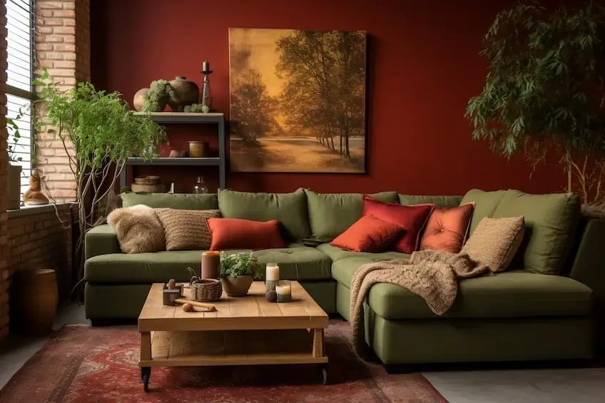
Brick Red and Olive Green
The combination of brick red and olive green brings warmth and depth to a space. To achieve a balanced look, use brick red as a focal point in larger elements like furniture or accent walls, complemented by olive green as a neutral backdrop. As a personal touch, consider incorporating natural elements like plants or wooden accents to enhance the organic feel of this color combination.
| Shade | Hex Code | CMYK Color Code (%) | RGB Color Code | Color |
| Brick Red | #8B0000 | 0, 100, 100, 55 | 139, 0, 0 | |
| Olive Green | #808000 | 30, 0, 100, 50 | 128, 128, 0 |
Tomato Red and Navy Blue
Tomato red and navy blue create a bold and sophisticated contrast. As an interior designer, I recommend using tomato red as a statement color in focal points like accent walls or furniture, balanced by navy blue in surrounding elements. This combination works well in creating a dynamic and visually appealing atmosphere in spaces like home offices or entertainment areas.
| Shade | Hex Code | CMYK Color Code (%) | RGB Color Code | Color |
| Tomato Red | #FF6347 | 0, 68, 76, 0 | 255, 99, 71 | |
| Navy Blue | #000080 | 100, 100, 0, 50 | 0, 0, 128 |
Ruby Red and Turquoise
Ruby red and turquoise form a vibrant and eclectic color pairing. To achieve a cohesive look, use ruby red as an accent color in smaller decor items against a backdrop of turquoise walls or furniture. As a personal tip, incorporate metallic accents like silver or chrome to add a touch of modern flair to this energetic combination. This pairing is ideal for creating a lively and cheerful atmosphere in spaces like kitchens or playrooms.
| Shade | Hex Code | CMYK Color Code (%) | RGB Color Code | Color |
| Ruby Red | #E0115F | 0, 87, 38, 12 | 224, 17, 95 | |
| Turquoise | #40E0D0 | 65, 0, 27, 0 | 64, 224, 208 |
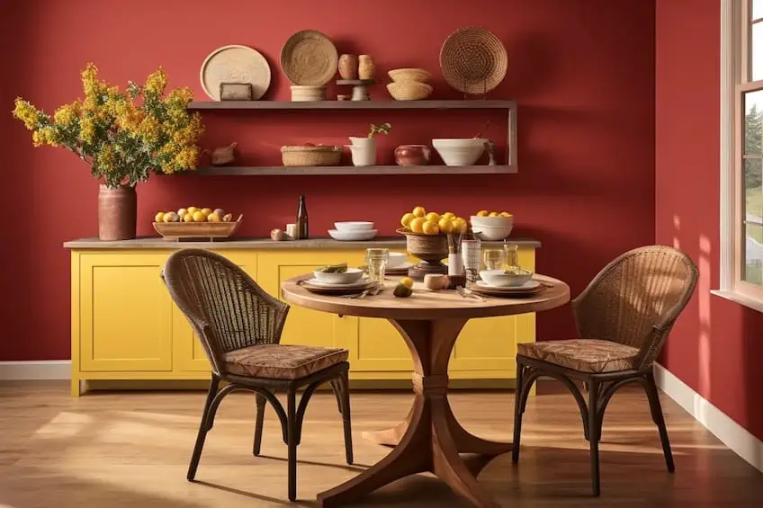
Cranberry Red and Mustard Yellow
Cranberry red and mustard yellow create a warm and inviting color scheme. As an interior design expert, I recommend using cranberry red as an accent color in textiles or smaller decor items against a dominant backdrop of mustard yellow. To enhance the cozy feel, incorporate natural materials like wooden furniture or woven textures. This combination is well-suited for creating a welcoming and cheerful ambiance in living rooms or dining areas.
| Shade | Hex Code | CMYK Color Code (%) | RGB Color Code | Color |
| Cranberry Red | #DB143C | 0, 100, 70, 18 | 219, 20, 60 | |
| Mustard Yellow | #FFDB58 | 0, 5, 57, 0 | 255, 219, 88 |
Closing off, there is a nearly endless supply of colors and specific shades that pair well with red. However, it is important to find color matches with red that are able to elevate the boldness and intensity of this alluring hue. As each color holds its own range of associated emotions and visual experiences, you should never forget to remind yourself of the goal and themes of your specific design, as well as what emotions you wish to bring out of your audience.
Frequently Asked Questions
What Color Matches With Red?
There are countless different color pairings that go well with red. By looking at red’s analogous, triadic, complementary, and split complementary colors, you will find a range of hues that include magenta pink, spring green, cyan, sky blue, and far more. Each of these colors creates the perfect balancing act when contrasted against red’s bold appearance.
What Are Some Common Uses of Red in Art and Design?
In art, red is most commonly used as an accent color, as it possesses an enhanced ability to add drama and emotion to a piece. In design, however, red can help to grab your audience’s attention and create a sense of increased energy and allure.
Are There Specific Shades of Red That Work Better With Certain Colors?
Lighter reds, like coral or pink, can pair well with pastels, while deeper reds, like burgundy or maroon, work harmoniously with rich tones such as navy, forest green, or gold.

Duncan graduated with a diploma in Film and TV production from CityVarsity in 2018, after which he continued pursuing film while taking on a keen interest in writing along the way. Since having graduated, he began working as a freelance videographer, filming a variety of music videos, fashion and short films, adverts, weddings and more. Throughout this, he’s won a number of awards from various film festivals that are both locally and internationally recognized. However, Duncan still enjoys writing articles in between his filming ventures, appreciating the peace and clarity that comes with it.
His articles focus primarily around helping up-and-coming artists explore the basics of certain colors, how these colors can be paired with other shades, as well as what colors are created when you mix one with another. All while relating these shades to historically significant paintings that have incorporated them into their color palette. As a lover of the arts himself, he takes great interest in the Renaissance era of paintings, an era that has directly inspired many of his favorite films.
Learn more about Duncan van der Merwe and about us.