Bordeaux Color – Using Shades of Bordeaux in Art and Design
This post may contain affiliate links. We may earn a small commission from purchases made through them, at no additional cost to you.
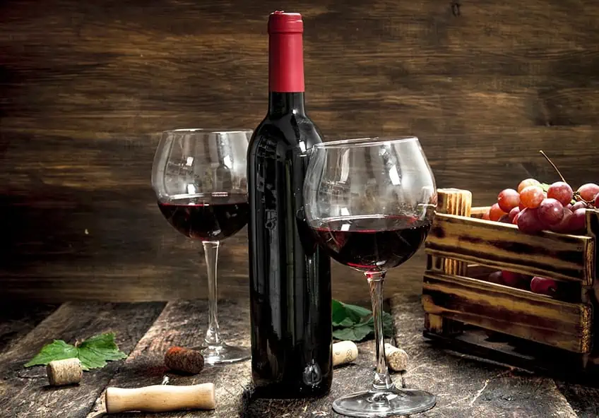
Bordeaux! Difficult to spell – yes. Challenging to pronounce – yes again! But it is not hard to imagine what the Bordeaux color might be. As we learn more about the different shades of Bordeaux, we are confident that your question of what color is Bordeaux will be answered very quickly. Just talking about the Bordeaux color brings images of walking in wine fields and picking off a few luscious grapes before harvesting. It all sounds very decadent, so why not just dive right in as we explore this beautiful world of Bordeaux color in more detail?
What Color Is Bordeaux?
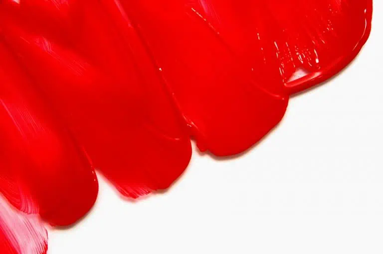
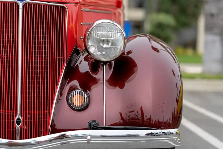
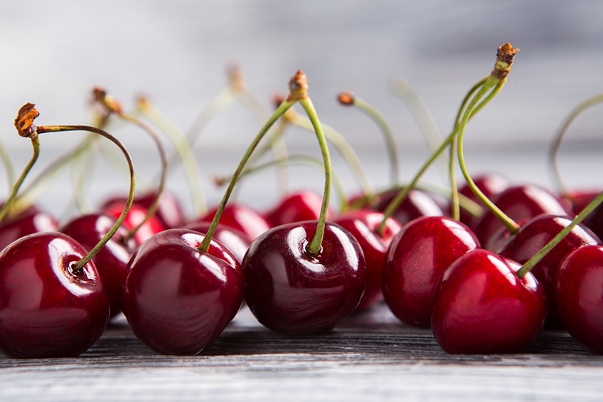
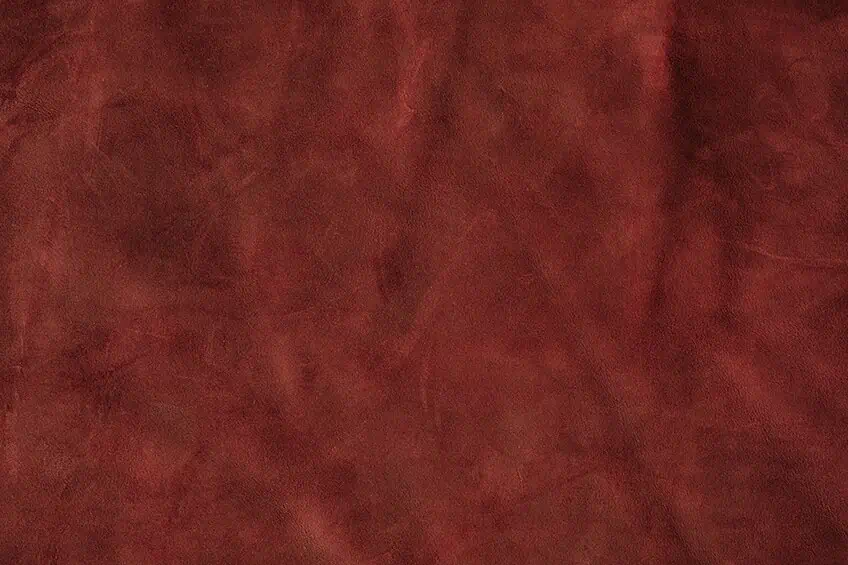
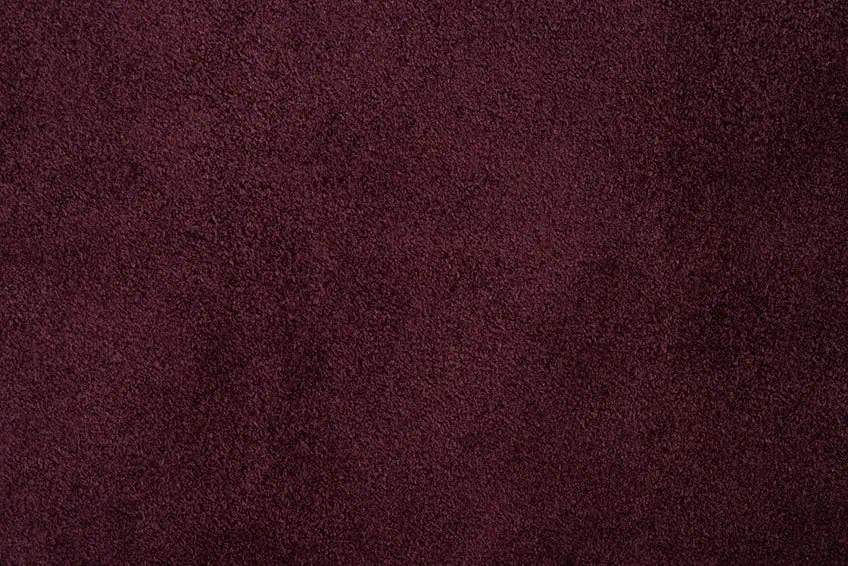
The Bordeaux color is often confused with burgundy or maroon. Different shades of Bordeaux color, a dark, solemn shade of red, have been elected as the season’s color. The color of Merlot wine mixed with an earthy oak undertone perfectly explains the question, what color is Bordeaux? Making a statement in your house with the color Bordeaux will set you apart from the rest of your friends. The official color of Bordeaux got its name from the dark red French wine in 1891. The rich, dark wine color known as Bordeaux is often called Claret. The Bordeaux color belongs to the red color family on the color wheel.
| Shade | Hex Code | CMYK Color Code (%) | RGB Color Code | Color |
| Bordeaux | #5F021F | 0, 98, 67, 63 | 95, 2, 31 |
The Meaning and Psychology of the Bordeaux Color
The color Bordeaux is, without a doubt, a stunning color, and those who love the rich hue often have a sense of grandeur. The person attracted to the light Bordeaux colors usually has a good work ethic and is mature in their outlook on life. The Bordeaux color symbolizes respectability and force and can be a little playful.
Because of the rich look of the Bordeaux color, people may naturally be drawn to you when worn in an outfit. You may receive more hugs than expected when wearing Bordeaux colors to work, so be warned!
How to Make Bordeaux Colored Paint
Combine three parts of brilliant red pigment with one part of a dark blue, and once those are mixed well, add a small drop of yellow to the mix. The effect will be a warm and intense shade of the color Bordeaux. In ancient times, the rulers of the land wore the Boudreaux colors, and today it is still regarded as a regal color that denotes power and wealth.
Bordeaux Color: A Brief History
The Russian name for the Bordeaux red color is Chermny. The Bordeaux color is a rich, deep reddish-brown color known as a claret color. In the late 1800s, the Bordeaux color was named in honor of the dark red color of the wine harvested in the fields of France. The color Bordeaux represents confidence and stability. It was the color worn by kings and rulers in ancient times, and the word power is often related to all shades of Bordeaux.
Bordeaux Used in Famous Paintings
Bordeaux is a color utilized by many artists throughout history. This rich and beautiful color can be found in countless artworks. We have listed just two prominent artists who utilized Bordeaux colors in their work.
Portrait of Man (1433) by Jan van Eyck
| Artist | Jan van Eyck (1390 – 1441) |
| Date Completed | 1433 |
| Medium | Oil, panel |
| Location | National Gallery, London, United Kingdom |
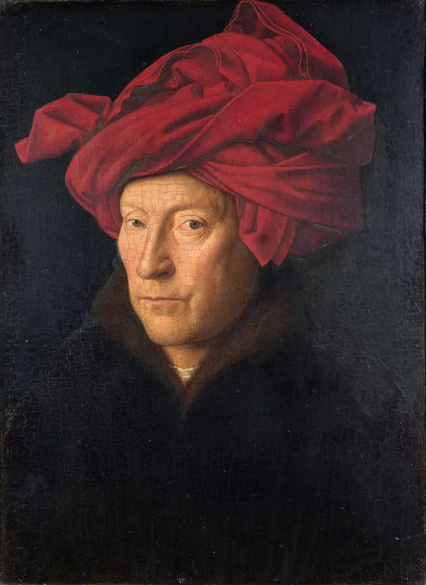 Portrait of a Man in a Red Turban (1433) by Jan van Eyck; Jan van Eyck, Public domain, via Wikimedia Commons
The painter Jan van Eyck, who painted realistic oil paintings, used both Bordeaux colors and burgundy colors in his paintings. Van Eyck died in 1441. The exact year of his birth is unknown, but it was assumed he was in his early 50s when he died. Van Eyck completed a total of 20 well-known oil paintings. For many years, people believed that he was the person who invented oil paints, but this was disputed a while ago, as oil paintings first came into being at least a century before he became a painter.
Van Eyck was credited with the invention of the oil glazing technique, which replaced the egg-tempera method of creating color. Van Eyck belonged to a very famous family of painters, of which he became the most famous. His paintings of the medieval arts can be seen in museums around the world. His Portrait of Man is probably his most iconic use of Bordeaux and burgundy colors and was completed in 1433.
Red Shift (1990) by Helen Frankenthaler
| Artist | Helen Frankenthaler (1928 – 2011) |
| Date Completed | 1990 |
| Medium | Acrylic, canvas |
| Location | Whitney Museum of American Art, New York, United States |
A painter by the name of Helen Frankenthaler was one of the pioneers of abstract paintings and, in 1970, created what we know today as the “color field movement”. She used different colors with each picture that she completed. Frankenthaler used nature-inspired colors for her pieces and incorporated her emotions into her artwork. Her work features many colors, but she has incorporated Bordeaux colors into some of her more well-known pictures, such as the one titled Red Shift, painted in 1990. She continues to inspire young artists today precisely because of her natural spontaneity when working on canvas.
Frankenthaler uses a technique that the media have called “soak stain.” She simultaneously creates paintings that are somehow ethereal yet appealing and soft yet bold. Her pictures are modern and spark various emotions when viewing her artwork.
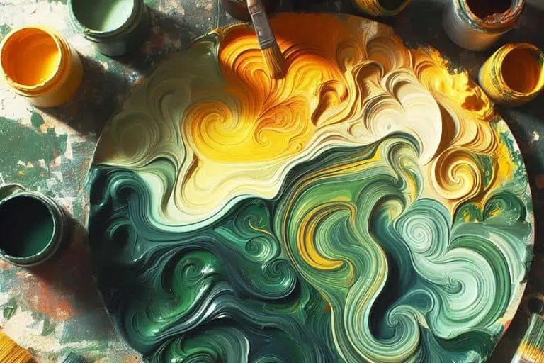
The Various Shades of Bordeaux
When we speak of either Bordeaux vs. burgundy colors, we undoubtedly have to talk about the wine because this is where these two colors got their official names. The burgundy wines and Bordeaux wines are regarded as the highest quality and are produced in France. You will no doubt find exceptional winemakers on both sides of the spectrum, and when comparing the two, you may think one is better than the other.
Of course, this may only be relative to the time and place when tasting the wines, and no matter what the argument is, shouldn’t we enjoy the moment when we realize that both are delicious and can be appreciated equally? Just as we should enjoy the colors, both should be enjoyed and respected equally. Each shade is slightly different, but not very apparent to the naked eye. So, while you may argue that there is no real difference between Bordeaux vs. burgundy, you would be very wrong. Bordeaux’s color leans more towards a red color, and the burgundy has more of a purple hue to it.
| Shade | Hex Code | CMYK Color Code (%) | RGB Color Code | Color |
| Bordeaux | #5F021F | 0, 98, 67, 63 | 95, 2, 31 | |
| Burgundy | #800020 | 0, 100, 75, 50 | 50.2, 0, 12.5 |
Deep rich red shades will forever remain a favorite – from beautiful, burgundy-colored hair to deep merlot-colored wine. Many people are confused when it comes to Bordeaux vs. burgundy vs. other deep red shades, however, each has its own unique qualities. Many other shades of Bordeaux lend their names from the wines of the same name. Let us have a look at some of these deep dark shades of red that belong to the Bordeaux family.
Garnet
This shade is not named after a wine, but it is named after the stone of the same name! The semi-precious gemstone known as garnet is a beautiful reddish-brown shade. To the naked eye, garnet is extremely similar looking to the original Bordeaux shade
| Shade | Hex Code | CMYK Color Code (%) | RGB Color Code | Color |
| Garnet | #610C04 | 0, 88, 96, 62 | 97, 12, 4 |
Maroon
The Maroon color name is derived from the French word marron, which means “chestnut”. Maroon is created by mixing red and violet. The maroon shade is often used in restaurants because of its ability to spark a good appetite.
| Shade | Hex Code | CMYK Color Code (%) | RGB Color Code | Color |
| Maroon | #800000 | 0, 100, 100, 50 | 128, 0, 0 |
Merlot
If you are a wine connoisseur, you will know the rich and beautiful color it possesses. Merlot is a grape of purplish-red color. The merlot color we have listed is actually considered to be a deep pink shade.
| Shade | Hex Code | CMYK Color Code (%) | RGB Color Code | Color |
| Merlot | #541E1B | 0, 64, 68, 67 | 84, 30, 27 |
What Colors Go With Bordeaux?
Bordeaux shades will pair up well with many others, such as black, dim-gray, and bottle green when worn as part of an outfit. If this color palette is used in large doses, it can appear gloomy, and a person may seem to be under the weather, so using Bordeaux colors as accent pieces will be recommended.
| Shade | Hex Code | CMYK Color Code (%) | RGB Color Code | Color |
| Bordeaux | #5F021F | 0, 98, 67, 63 | 95, 2, 31 | |
| Black | #000000 | 0, 0, 0, 100 | 0, 0, 0 | |
| Dim Gray | #696969 | 0, 0, 0, 59 | 105, 105, 105 | |
| Bottle Green | #0F472C | 79, 0, 38, 72 | 15, 71, 44 |
Another popular color combination to try with Bordeaux is gold and blush pink. Blush pink will brighten up the deep Bordeaux color, and gold accent pieces will help create a stunning palette for your home.
| Shade | Hex Code | CMYK Color Code (%) | RGB Color Code | Color |
| Bordeaux | #5F021F | 0, 98, 67, 63 | 95, 2, 31 | |
| Blush | #DE5D83 | 0, 58, 41, 13 | 222, 93, 131 | |
| Gold | #FFD700 | 0, 16, 100, 0 | 255, 215, 0 |
Bordeaux in Interior Design
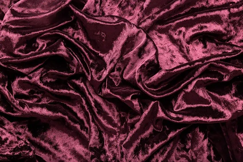
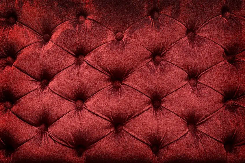
Using the dark rich red Bordeaux color in the home should be done with caution. The bold rich Bordeaux color falls under the red umbrella of colors, and red, in particular, can elevate feelings of unrest or anxiety. Even the light Bordeaux color can become overpowering if used in a room as a base color. It is much more effective as an accent color in a room that has been furnished with beige or tan colors. The Bordeaux color is directly related to feelings of romance and comfort, so wanting to incorporate the paint into a bedroom would be ideal.
In a bedroom, rich Bordeaux-colored curtains will act as an accent piece. Incorporating pillows and blankets with different shades of Bordeaux colors into a bedroom can be done effortlessly. A chair covered in a dark rich velvet Bordeaux color that stands in the corner of the room will also be pleasing to the eye. The linen and walls should remain soft beige or off-white so that the Bordeaux colors pop. All shades of Bordeaux color pair up beautifully with natural colors as well as light gray. Pairing the Bordeaux color with black will create more drama in a room.
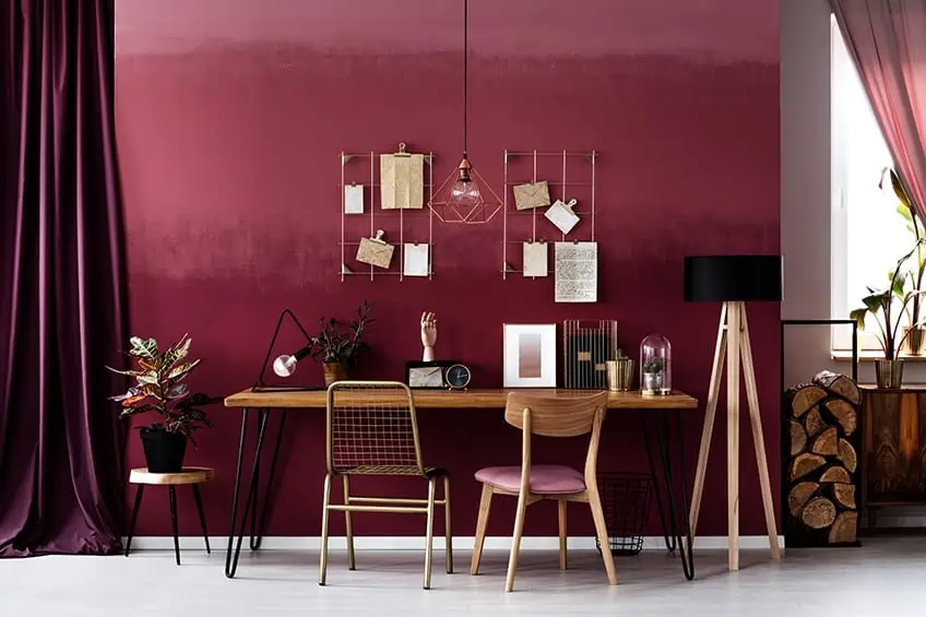
Incorporating the Bordeaux color into a home will lend sophistication to the house, especially if you pair it up with gold or even a hunter-green color. Dining rooms are the perfect place in the home to decorate in the Bordeaux colors.
For those of us who are city dwellers, it isn’t easy to imagine a life surrounded by the wonders of the beautiful Bordeaux colors in its natural and majestic environment, but how wonderful that we can still bring the color into our homes and our lives. Just the sheer luxurious look of Bordeaux colors will make you want to lie on the sofa and let your mind wander into a world of make-believe. Now that you know more about the beautiful rich Bordeaux colors, we hope you can let your imagination open up to the possibilities of dreams coming true.
Frequently Asked Questions
What Color Is Bordeaux?
The question of what color is Bordeaux comes up frequently. In simple terms, it is rich and a little more decadent than bright red. It is often confused with burgundy colors, which is not too much of a train smash because these colors are considered to be warm and complement each other if paired together.
What Is the Difference Between Bordeaux and Burgundy?
If you look at the color wheel, the Bordeaux color leans more towards a red color, and the burgundy has more of a purple hue to it. The difference is not glaringly obvious. Both the Burgundy and Bordeaux colors are rich, beautiful, and almost velvety.

Duncan graduated with a diploma in Film and TV production from CityVarsity in 2018, after which he continued pursuing film while taking on a keen interest in writing along the way. Since having graduated, he began working as a freelance videographer, filming a variety of music videos, fashion and short films, adverts, weddings and more. Throughout this, he’s won a number of awards from various film festivals that are both locally and internationally recognized. However, Duncan still enjoys writing articles in between his filming ventures, appreciating the peace and clarity that comes with it.
His articles focus primarily around helping up-and-coming artists explore the basics of certain colors, how these colors can be paired with other shades, as well as what colors are created when you mix one with another. All while relating these shades to historically significant paintings that have incorporated them into their color palette. As a lover of the arts himself, he takes great interest in the Renaissance era of paintings, an era that has directly inspired many of his favorite films.
Learn more about Duncan van der Merwe and about us.