Warm Colors Palette – What Are Warm Colors?
This post may contain affiliate links. We may earn a small commission from purchases made through them, at no additional cost to you.
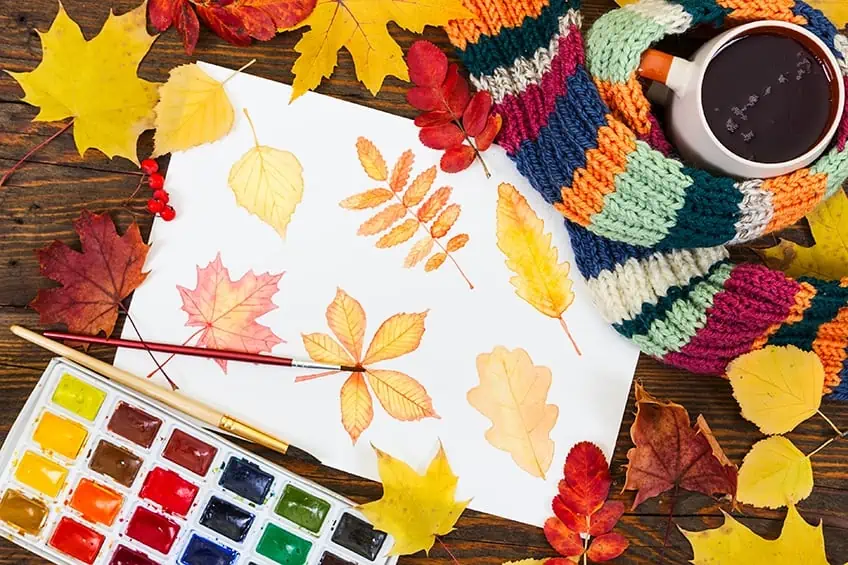
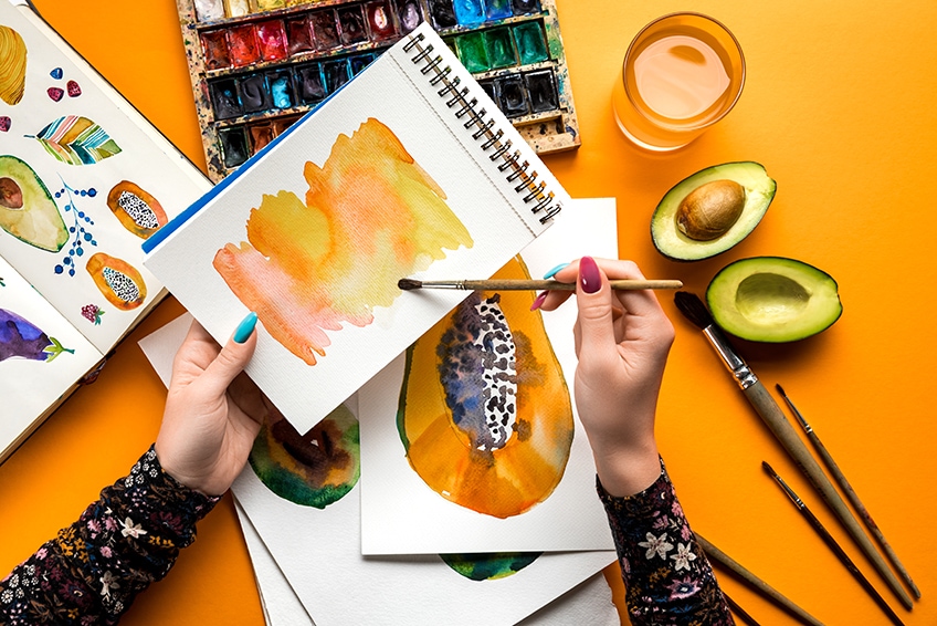
We are going to be taking a closer look at cool and warm colors and what effect they may have on us. Colors are quite powerful and can have the effect of making you feel warm or cool. Think about the colors used to paint the walls of your home or the décor of each room. Walls painted with oranges and yellows make you feel warmer, but walls painted with blues can have a cooling effect. You can also achieve this effect in paintings, for example, warm sunset vistas, or cool ocean scenes. However, in this article, we will be delving into what warm colors are and how to use them.
What are Warm Colors?
Every color in the spectrum can be classified as either cool or warm colors, which means they have a visual temperature. However, they can elicit a physical temperature that makes us feel warm or cool. Color can also affect our emotions, which can evoke soothing, or stimulating effects. Colors can trigger certain memories or influence moods. For example, think of memories of a vacation by the sea, what colors come to mind? Colors can also relieve stress after a hard day’s work, or help you fall into a peaceful night’s sleep. Many people do not understand the meaning or the effect of cool or warm colors in the home, so they just stick to using white or beige, which are neutral colors.
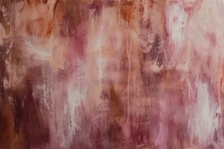
When painting, warm, and cool colors can follow a similar path of creating a sense of warmth or coolness. Warm colors can also provide an awareness of brightness and contrast. So, a warm color palette is important.
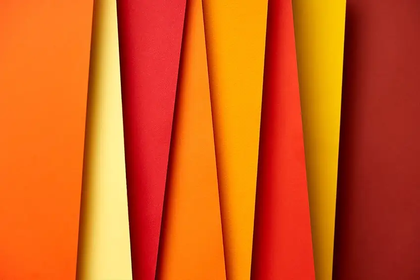
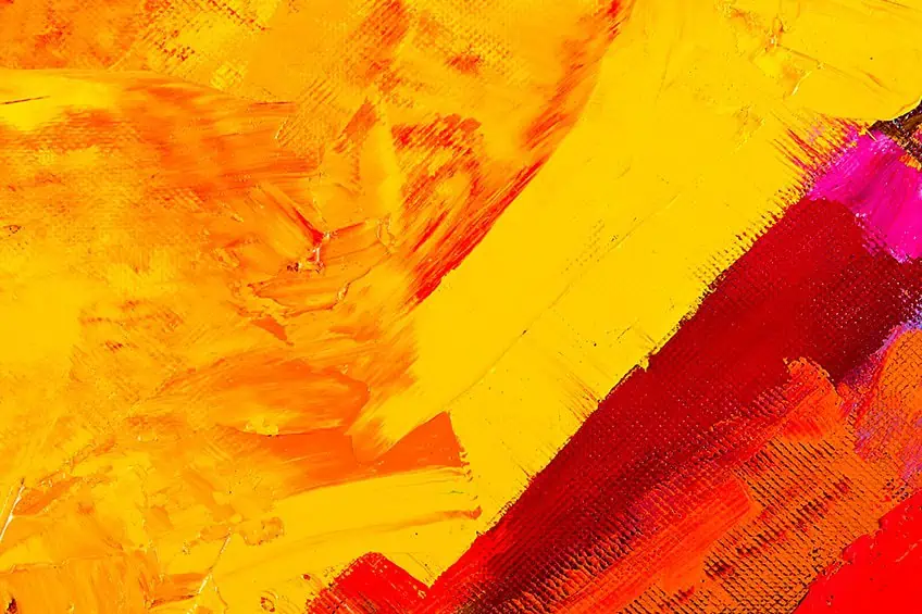
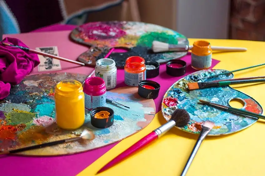
On the color wheel, warm colors include orange, red, and yellow as well as the various shades and tones in-between. These colors can be associated with things like fire, the sun, and warmth, and are referred to as warm colors because they stir up feelings of warmth and heat. Across from these colors on the color wheel, you will find cooler colors like purple, blue and green. Next, we are going to look at three of the main warm colors.
Yellow
Yellow is a color that can attract your attention and is also used to create highlights and to lighten other colors. Amongst all the colors, yellow is the color your eyes are extremely sensitive to. Yellow is also a color that can stimulate your brain and intensify your brain activity. The color also has a certain charm and is a great color to help with improving concentration. Yellow allows you to focus on your work and stimulates memory.
Yellow is also a color that couples and relates to entertainment, happiness, and enjoyment. The warm color has a positive effect on children around the age of 7, especially children that suffer from breathing problems like asthma. Studies conducted at an elementary school have found that the color yellow has strong ties with honesty.
Yellow is the most radiant and brightest of all the other colors, and if used liberally, can cause a feeling of nervousness, and may also unsettle the eyes. Out in the world, yellow and black are used as an announcement or a warning. Think of all the yellow and black signs on the side of roads.
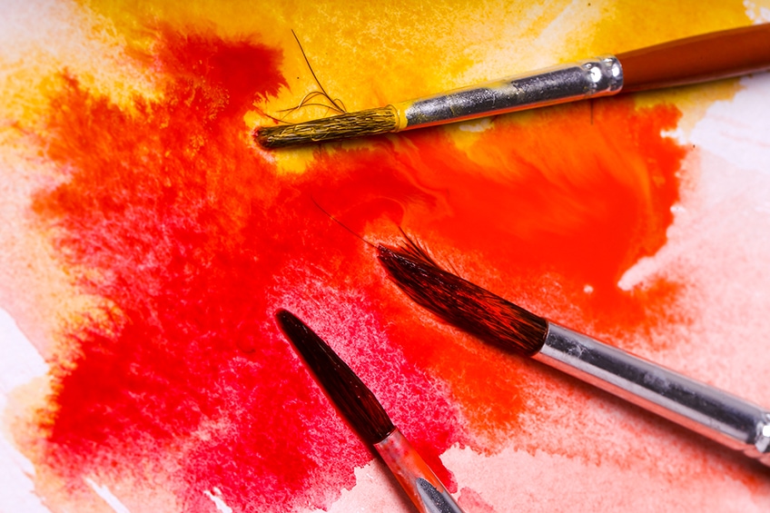
Red
The color red is a very dominant color and is a sign of alarm, as it attracts attention. Objects painted red appear to be closer than objects that are painted in other colors. Red arouses feelings of happiness and excitement; it also increases heart rate and blood pressure as well as the sense of smell.
The emotional impact of the color red is the most of all the colors and arouses the feeling of excitement. Red is the color connected to anger, love, and pain. The color is closely related to sports, as it is coupled with feelings of strength and power.
As red is an energetic color and induces action, it can help motivate people to take action, and also assists in bringing emotions to the surface. For all of its energy and motivating aspects, if used in excess, this may lead to a sense of discomfort, uneasiness, and anger. For this reason, it is not a suitable color to be used on the walls of a school classroom.
Orange
The color orange is an entertaining color and can improve your appetite. Orange is a color that can effectively boost and revitalize as well as help to keep your morale high, providing an optimistic outlook. Orange can keep your memory positive, and also aids with critical thinking skills. The color orange appears to be the color that is preferred by children between the ages of 5 to 8 and has a marked effect with children that have socializing problems, and also proves effective with children that are introverts. Orange is a bold color that has been used successfully by many famous artists like Van Gogh.
Scientific Hex Codes for Warm Colors
So far, we have learned that the warm colors are red, orange, and yellow, and cool are blue, purple, and green. However, is it possible to get warm cool colors and cool warm colors? Color temperature, also known as color bias, explains to us that there are warm blues and there are also cool reds. The cool blues are created by mixing a warm red color, similarly, a warm yellow can be made cooler by mixing it with a cool green color.
The following warm colors are identified by a hex code, RGB (Red, Green, and Blue) Code, and a CMYK Code. The RGB is an indication of what percentage of color has been included to produce that color on computer screen graphics. The CMYK code is used for the printing process referring to the four main colors cyan, magenta, yellow, and key or black. The table below shows a selection of warm and cool warm colors.
| Color Name | Warm Color | Hex Code | RGB % | CMYK % |
| Red | #ff0000 | 100,0,0 | 0,100,100,0 | |
| Orange | #ff7f00 | 100,49.8,0 | 0,50,100,0 | |
| Peach | #fef0db | 99.6,94.1,85.9 | 0,6,14,0 | |
| Gold | #ffd700 | 100,84.3,0 | 0,16,100,0 | |
| Beige | #d8bcab | 84.7,73.7,67.1 | 0,13,21,15 | |
| Bright Pink | #ff007f | 100,0,49.8 | 0,100,50,0 | |
| Yellow | #fff000 | 100,94.1,0 | 0,6,100,0 | |
| Maroon | #800000 | 50.2, 0, 0 | 0,100,100,50 | |
| Ultramarine Blue | #4166f5 | 25.5,40,96.1 | 73,58,0,4 | |
| Pistachio | #93c572 | 57.6,77.3,44.7 | 25,0,42,23 |
Using Warm Colors in Art
Are all orange, red or yellow colors warm, or is every blue, purple, or green color cool? There are a lot of aspects involved when dealing with color temperature. This means that there are warm reds, however, you can also get cool reds, likewise, there are blues that are cool but there are also warmer blue tones. You can take a cool blue color and mix it with a warm red, and so produce a warm blue. Similarly, by taking a warm yellow and mixing it with a cool green color, you create a cool yellow. It is impossible to try and identify a color’s temperature by itself, and you need to be able to compare it with another color. For example, a yellow can be seen as cool when placed next to a warm yellow color.
How Important is Color Temperature in Art?
Color temperature is very important in any art piece, as it can have the effect of making your painting warm or cool. Being able to control your color temperature, you can produce the following effects in your art:
- You can impart or produce a particular mood
- You can give objects in your painting perspective and scope
- In landscape scenes, you can portray depth
- You can integrate an awareness of light or sunlight in your colors
Color Temperature Can Produce an Illusion of Space
Color temperature plays a vital role when it comes to creating illusions of space, where warm colors will have the illusion of bringing the object forward and cool colors will recede in space. Warm colors have the illusion of expanding, while cool colors tend to contract. So, you can warm up certain areas of your painting that appear too small, and you can also cool down areas that appear too big.
This is a great concept that plays a major role when painting landscape scenes. Take, for example, a scene of an open field with mountains in the distance; you will observe that the mountains in the distance are a lot cooler than the field in the foreground, which shows a much warmer temperature.
Bridge at Narni a Painting by Jean-Baptiste-Camille Corot (1826)
The Painting Bridge at Narni was painted by the artist Jean-Baptiste-Camille Corot in 1826 and is an excellent illustration of the effect of color temperature in art, as well as the spatial concept. The spatial concept is defining the relationship that a human being has with an object or the relationship that one object has with another object. In simple terms, it means behind, on top, over, under, in front of, between, and so on.
When you take a closer look at this particular painting, you will notice the colors used for objects in the distance are much cooler than the colors used for objects in the foreground. This is seen when looking at the mountains, which have a bluish or cooler color. However, the objects in the foreground show much warmer colors like yellowish red to your left, and yellowish beige to the far right. The green colors used in the foreground are fairly warm as well.
So too with your paintings, whether they are still life, abstract, or landscape, attempt to apply color temperature as well as the spatial concepts, which will give them a sense of illusion of space. Finally, let us summarize these thoughts of the effects warm and cool colors can play in art.
- Remember the temperature of any particular color is not absolute, in other words, blue is not always regarded as a cool color, and red is not always regarded as a warm color
- By making use of cool and warm colors, you can add dimension and space to your painting, especially when painting landscape scenes
- Color temperature is always relative and must be determined by the color or object that is next to it
- By using warm colors, you will be able to create amazing illusions of space
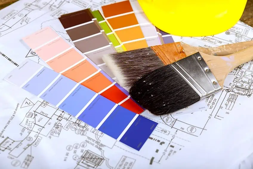
The Use of Warm Colors in Your Home
When decorating your home, warm colors like red, yellow, orange, and all other shades and tones, can give your room positive energy and an awareness of sunshine. On the other hand, cool colors like purple, blue, and green can give the room a feeling of calm and relaxation. Some other popular warm paint colors you can use when decorating your home are mannequin cream, muslin, Hawthorne yellow, and Italianate. By making use of warm colors in your home, you can produce some of the following effects:
- Warmer brighter colors are linked with happiness and playfulness. Some of these colors include Orange Burst, Million Dollar Red, and Sundance
- Warm colors are also used to create intimate and cozy spaces
- When warm colors are used in larger rooms and spaces, they have an inviting effect
- Warm paint colors like Stardust can provide a comfortable and welcoming feeling and can effectively be used in your living rooms
- For the bedroom, a warm Mellow Pink will give you softness and a restful feeling
When you paint your home, you need to take into consideration what warm and cool colors can do for you and your family. Warm colors like red, yellow, and orange give the quality of warmth and are best used for rooms like the living room, kitchen, and dining rooms. Cool colors like browns, greens, and blues are best used in rooms like bedrooms, bathrooms, and nurseries.
Another aspect you should consider is the effect that natural, as well as artificial light, will have on the undertones of the paint, which could cause them to lean more to cool than warm colors. In rooms where certain walls face a window and allow sunlight to enter may have the effect of changing a cool color to a warm color. Walls that do not have sunlight shining on them could cause warm colors to look cool.
Warm and Cool Paint Color Palettes
Understanding the color bias plays a vital role when mixing colors, and can result in a muddy or a clean color. We have all learned that when mixing complementary colors, they cancel each other out. For example, mixing green with red, the red color starts to lose its intensity and becomes a cooler dull color. This is also true if red is mixed with green, the green loses its brightness and the green now becomes a warmer color. The same result will be obtained if you mix some of the other complementary colors, like yellow with purple or blue with orange. If you mix a green-yellow with a green-blue you will create a warm bright spring green, because neither the yellow nor the blue contain any red. However, if you mix red-blue with an orange-yellow, you will produce a dull or cool green because red is found in both of them.
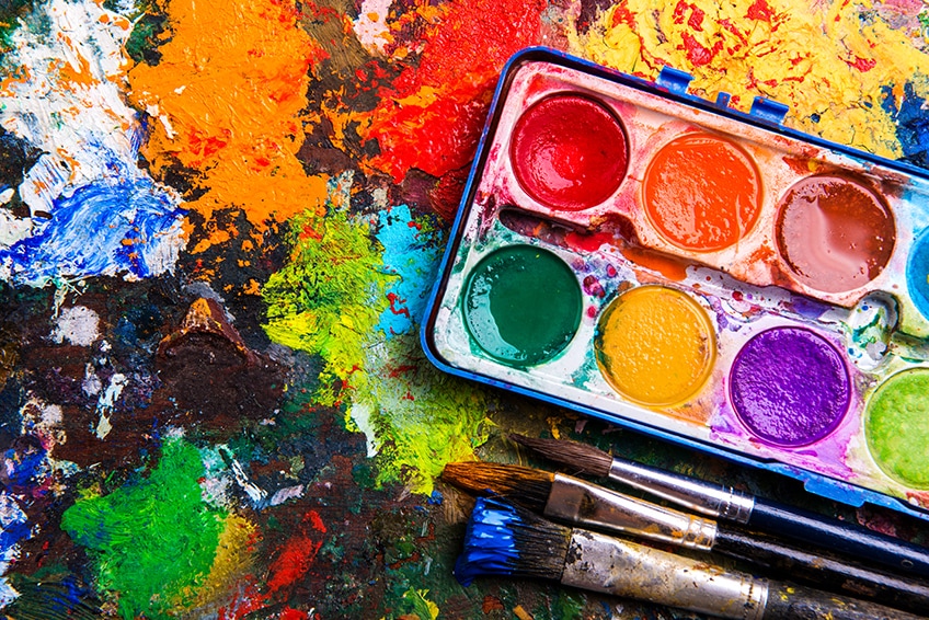
When organizing your warm color palette, it is better to confine yourself to no more than five key colors, which can include ultramarine blue, titanium white, and burnt sienna. Then learn and understand all of their individual properties. This principle is referred to as a limited color palette and it will give your paintings more balance and unity. When writing her book “Classical Painting” by Juliet Aristides, she commented that most of the ancient Greek painters limited their warm color palette to only four colors, as they found that limiting their resources brought out the true value of their genius. When using a limited color palette, it can be very efficient as you can use the limited number of colors more consistently, and you will get to know those colors very well. This means that the better you get to know your few pigments, you will be able to control your color mixes much better. There are many benefits you can acquire by learning the art of painting with a limited color palette.
- Easier color coordination
- Ability to paint faster
- Better balance of your paintings
- You can convert the principles easily to oil or acrylic paints
- Will give your paintings a more professional look
- Forces you to adapt to using warm or cool colors instead of just adding a brighter color
- Makes you think more about composition and tone
Conclusion
As you can see, warm colors play an important role in art and in many other areas like interior design and even marketing. Colors have the power to influence your emotions as well as how you see a certain piece of art or design. So, understanding how to work with warm colors can only benefit and improve your art work, and create inviting spaces in your home.
View our Warm Color Palette web story here.
Frequently Asked Questions
Is Pink a Warm Color?
Pink has a tint of red in it, so we can conclude pink is a warm color. However, you can also get cool pinks. It all depends on the color that is next to it, for example, if magenta is next to pink, it will appear cool, but if Prussian blue is found next to pink, it appears warm.
Is Green a Warm or Cool Color?
When referring to the color wheel, red, yellow, and orange are warm colors. Blue, green, and gray are cool colors, however, colors can be influenced by how you mix them. Lime green, for example, has a good deal of yellow and is referred to as warm, but Kelly green contains more blue and is referred to as cool.
Is Gray a Warm Color?
Everybody regards gray as a cool color, as it appears to be cloudy and dull. However, once again, you also have warm gray colors. A cool gray color will have more of a blue undertone, whereas a warm gray color will have more yellow or brown undertones.
What Color Attracts Your Eye The Most?
It has been accepted for years now that traffic officers and emergency workers need to be highly visible, so they wear orange vests. However, research has discovered that bright green is the most visible color. The rods in your eyes get stimulated by light wavelengths and the light wavelength of bright green is 555 nanometers, making it the most sensitive and visible of all colors. Bright green can be seen as having a warm bias.

Duncan graduated with a diploma in Film and TV production from CityVarsity in 2018, after which he continued pursuing film while taking on a keen interest in writing along the way. Since having graduated, he began working as a freelance videographer, filming a variety of music videos, fashion and short films, adverts, weddings and more. Throughout this, he’s won a number of awards from various film festivals that are both locally and internationally recognized. However, Duncan still enjoys writing articles in between his filming ventures, appreciating the peace and clarity that comes with it.
His articles focus primarily around helping up-and-coming artists explore the basics of certain colors, how these colors can be paired with other shades, as well as what colors are created when you mix one with another. All while relating these shades to historically significant paintings that have incorporated them into their color palette. As a lover of the arts himself, he takes great interest in the Renaissance era of paintings, an era that has directly inspired many of his favorite films.
Learn more about Duncan van der Merwe and about us.