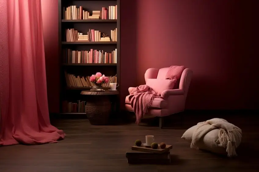
What Colors Go With Pink? – 25 Perfect Pairings
This post may contain affiliate links. We may earn a small commission from purchases made through them, at no additional cost to you.
Step into a world where the color pink isn’t just a hue but an expression of style and emotion. Personally, I’ve always been drawn to the soft, soothing tones of pink that effortlessly blend warmth with sophistication. In the realm of interior design, pink serves as a versatile muse, adapting to diverse aesthetics and moods. Join me on a journey as we explore 25 enchanting color combinations, each a brushstroke in the canvas of design, where the color pink becomes a catalyst for creativity and personal expression.
Key Takeaways
- Pink is portrayed as a versatile and timeless element in interior design, capable of harmonizing with various hues to create personalized and elegant spaces.
- There is a diverse spectrum of pink with a range of shades, each carrying unique charm and symbolism.
- 25 specific color combinations involving pink, provided insights into the aesthetics and moods they can create.
Combining 25 Ideal Shades with Pink
In my personal journey through interior design, the magic lies in combining 25 ideal shades with the timeless allure of pink. Whether it’s the soft blushes of a bedroom sanctuary or the vibrant accents in a lively living space, the versatility of pink harmonizes effortlessly with a spectrum of hues, creating spaces that resonate with warmth and personality. Join me in exploring the artistry of interior design, where the delicate dance between 25 perfect shades and the enchanting touch of pink transforms every room into a canvas of personalized elegance.
What Color Is Pink?
Much like a fleeting sunbeam, pink comes in a multitude of shades, each imbued with its own unique charm and charisma while still symbolizing tenderness, love, and warmth. From the delicate blush of a rose petal, to the vibrant fuchsia of a flamingo’s feather, pink encompasses a diverse range of shades. At one end of the spectrum is the pale, almost ethereal hue of baby pink, which is imbued with a sense of innocence and serenity. As we move further along, we will encounter the soft and romantic hue of blush, which may be perfect for embodying grace and elegance.
However, regardless of your preferred choice of pink, the sheer variety of various shades can help you create a visual feast for the senses, each evoking its own character, allure, and charm.
| Pink Color | Pink Hex Code | RGB | CMYK Color Code (%) | Shade of Pink |
| Pink | #ffc0cb | 255, 192, 203 | 0, 25, 20, 0 | |
| Watermelon | #fc6c85 | 252, 108, 133 | 0, 57, 47, 1 | |
| Coral | #f88379 | 248, 131, 121 | 0, 47, 51, 3 | |
| Pastel Pink | #ffd1dc | 255, 209, 220 | 0, 18, 14, 0 | |
| Cherry Blossom | #ffb7c5 | 225, 183, 197 | 0, 28, 23, 0 | |
| Baby Pink | #f4c2c2 | 244, 194, 194 | 0, 20, 20, 4 | |
| Rouge | #a94064 | 169, 64, 100 | 0, 62, 41, 34 | |
| Blush | #de5d83 | 222, 93, 131 | 0, 58, 41, 13 | |
| Carnation | #ffa6c9 | 225, 166, 201 | 0, 35, 21, 0 | |
| Tulip Pink | #ff8e8e | 255, 142, 142 | 0, 44, 44, 0 |
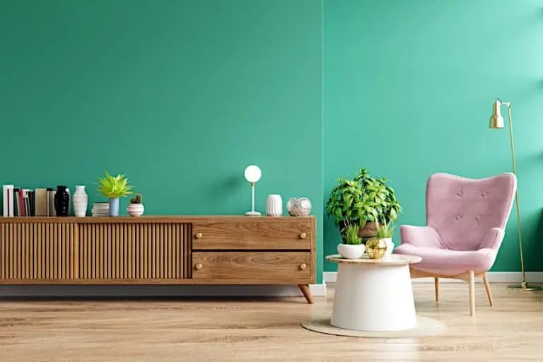
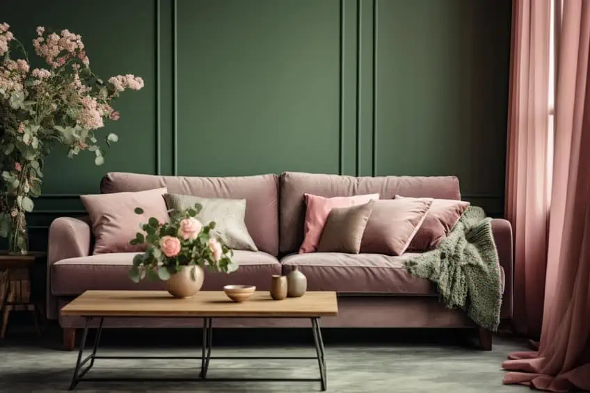
Dusty Rose and Sage Green
The pairing of Dusty Rose and Sage Green creates a harmonious blend of muted elegance. In my experience, these colors work exceptionally well in bedrooms or living rooms. Use Dusty Rose for accent pieces like throw pillows or a cozy rug, while Sage Green can dominate larger areas like walls or furniture. This combination exudes a serene and sophisticated atmosphere, perfect for creating a calming retreat within your home.
| Shade | Hex Code | CMYK Color Code (%) | RGB Color Code | Color |
| Dusty Rose | #D4A5A5 | 0, 27, 18, 17 | 212, 165, 165 | |
| Sage Green | #8A9A5B | 27, 12, 52, 0 | 138, 154, 91 |
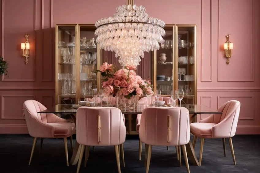
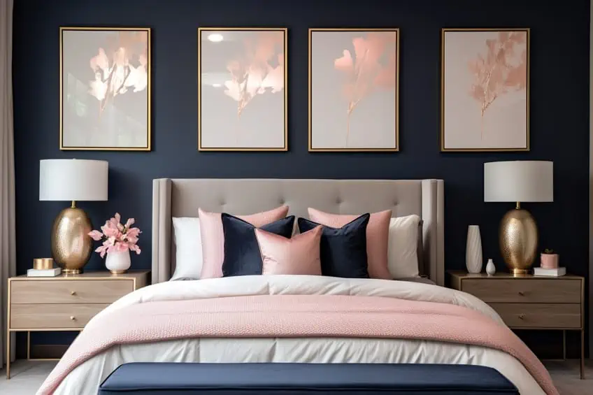
Blush Pink and Navy Blue
Blush Pink and Navy Blue strike a perfect balance between softness and depth. As a tip, incorporate Navy Blue as a grounding element in furniture or statement pieces, while Blush Pink can be introduced through textiles and accessories. I often suggest this combination for a chic and timeless look in bedrooms or even home offices, providing a sense of tranquility and style.
| Shade | Hex Code | CMYK Color Code (%) | RGB Color Code | Color |
| Blush Pink | #F6BDC0 | 0, 29, 18, 4 | 246, 189, 192 | |
| Navy Blue | #001F3F | 100, 51, 0, 0 | 0, 31, 63 |
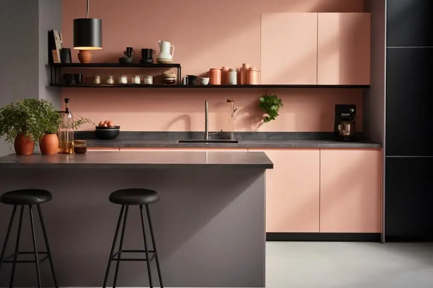
Salmon Pink and Charcoal Gray
Salmon Pink and Charcoal Gray create a contemporary and cozy ambiance. For a personal touch, consider using Salmon Pink as an accent color in furnishings or statement artwork, and let Charcoal Gray dominate larger areas like walls or key furniture pieces. This combination works wonders in living rooms, offering a modern and inviting atmosphere.
| Shade | Hex Code | CMYK Color Code (%) | RGB Color Code | Color |
| Salmon Pink | #FFA07A | 0, 27, 30, 0 | 255, 160, 122 | |
| Charcoal Gray | #36454F | 68, 44, 38, 72 | 54, 69, 79 |
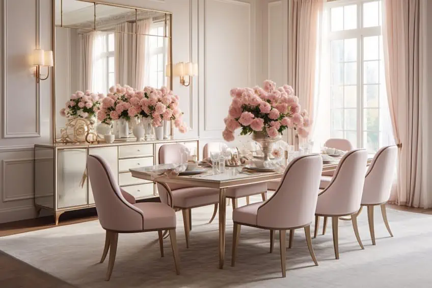
Rose Gold and Cream
Rose Gold and Cream bring a touch of glamour and sophistication to any space. Personally, I love incorporating Rose Gold in lighting fixtures or decorative accents, while Cream serves as a versatile backdrop on walls or larger furniture items. This combination is perfect for creating a luxurious and refined atmosphere in areas like dining rooms or home libraries.
| Shade | Hex Code | CMYK Color Code (%) | RGB Color Code | Color |
| Rose Gold | #B76E79 | 0, 35, 25, 29 | 183, 110, 121 | |
| Cream | #FFFDD0 | 0, 1, 15, 0 | 255, 253, 208 |
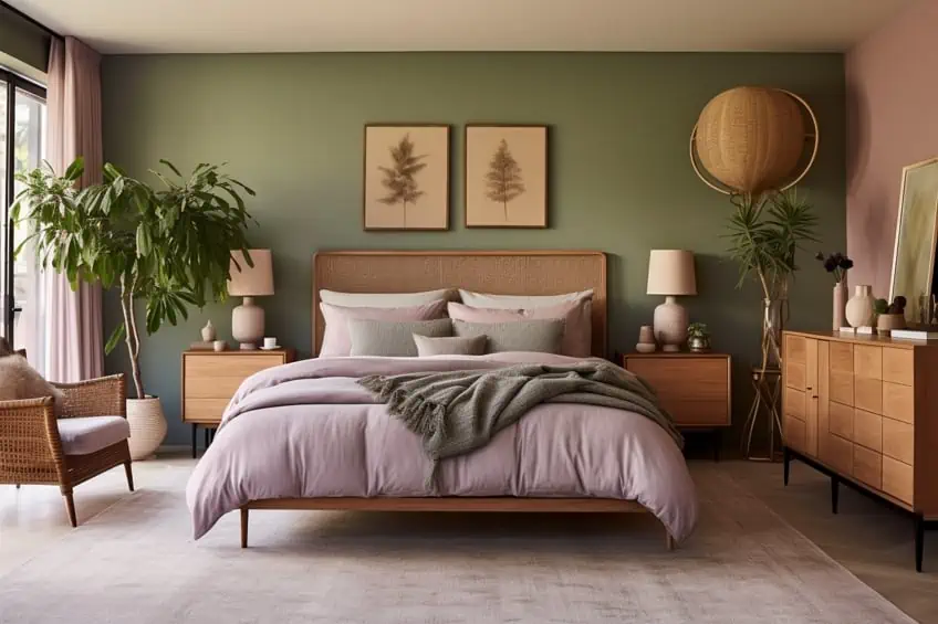
Mauve and Olive Green
Mauve and Olive Green introduce a sophisticated and calming vibe. For a personal touch, incorporate Mauve in upholstery or drapes, while Olive Green can dominate larger surfaces like walls or carpets. This combination works well in creating a cozy atmosphere in bedrooms or study areas, offering a unique blend of warmth and tranquility.
| Shade | Hex Code | CMYK Color Code (%) | RGB Color Code | Color |
| Mauve | #E0B0FF | 13, 32, 0, 0 | 224, 176, 255 | |
| Olive Green | #BCCB7A | 30, 0, 52, 19 | 188, 203, 122 |
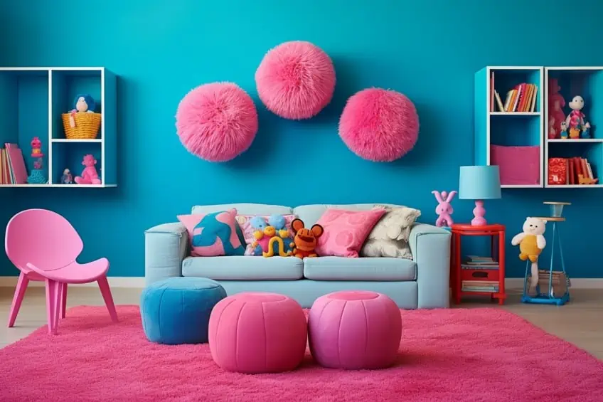
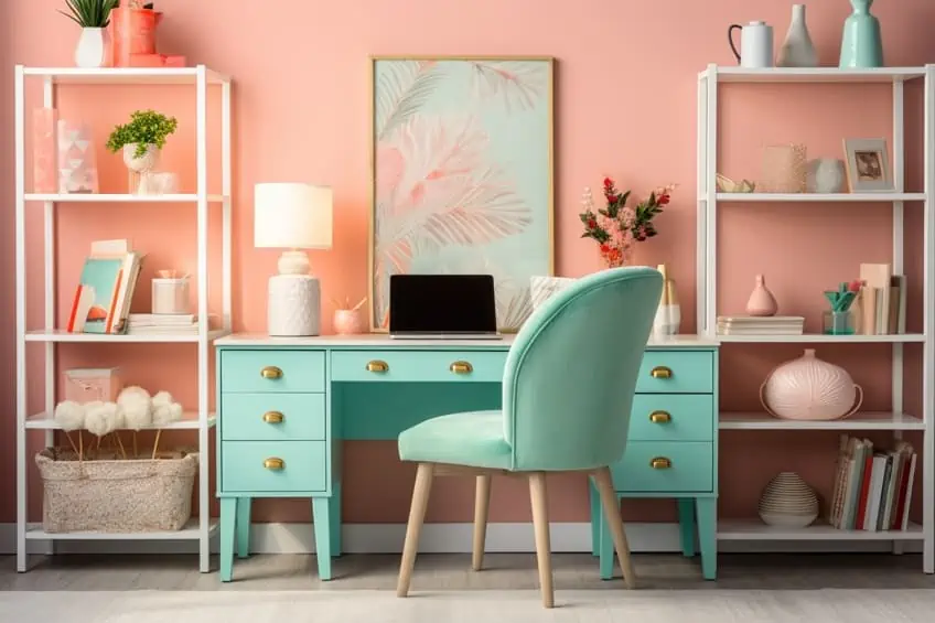
Bubblegum Pink and Turquoise
The vibrant duo of Bubblegum Pink and Turquoise adds a playful and energetic element to interiors. Personally, I suggest using Bubblegum Pink in smaller doses, like accent furniture or throw pillows, while Turquoise can make a bold statement on walls or larger furnishings. This combination is perfect for injecting a sense of fun and liveliness into spaces like playrooms or creative studios.
| Shade | Hex Code | CMYK Color Code (%) | RGB Color Code | Color |
| Bubblegum Pink | #FF69B4 | 0, 76, 0, 0 | 255, 105, 180 | |
| Turquoise | #40E0D0 | 73, 0, 34, 0 | 64, 224, 208 |
Coral Pink and Teal
Coral Pink and Teal create a lively and tropical atmosphere. In my experience, I recommend incorporating Coral Pink through accessories or small decor items, while Teal can dominate larger surfaces such as curtains or accent walls. This pairing is ideal for spaces like kitchens or dining areas, infusing a refreshing and inviting feel.
| Shade | Hex Code | CMYK Color Code (%) | RGB Color Code | Color |
| Coral Pink | #FF6F61 | 0, 62, 50, 0 | 255, 111, 97 | |
| Teal | #008080 | 100, 0, 33, 50 | 0, 128, 128 |
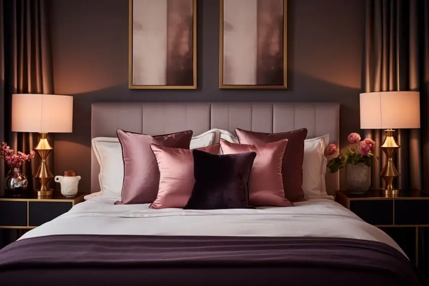
Peachy Pink and Deep Plum
Peachy Pink and Deep Plum strike a balance between warmth and richness. To personalize, use Peachy Pink in furnishings or smaller accessories, and let Deep Plum make a statement on feature walls or statement furniture. This combination adds a touch of luxury to spaces like master bedrooms or elegant living rooms.
| Shade | Hex Code | CMYK Color Code (%) | RGB Color Code | Color |
| Peachy Pink | #FFDAB9 | 0, 20, 30, 0 | 255, 218, 185 | |
| Deep Plum | #7D427B | 45, 85, 0, 49 | 125, 66, 123 |
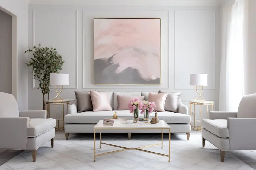
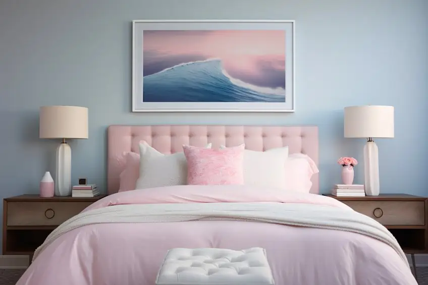
Ballet Slipper Pink and Soft Gray
The delicate pairing of Ballet Slipper Pink and Soft Gray creates a serene and timeless ambiance. In my design approach, I recommend using Soft Gray as a neutral base on walls or larger furniture, allowing Ballet Slipper Pink to shine in soft furnishings and accents. This combination is perfect for bedrooms or reading nooks, providing a soothing and sophisticated retreat.
| Shade | Hex Code | CMYK Color Code (%) | RGB Color Code | Color |
| Ballet Slipper Pink | #FFB6C1 | 0, 24, 13, 0 | 255, 182, 193 | |
| Soft Gray | #D3D3D3 | 0, 0, 0, 16 | 211, 211, 211 |
Raspberry Pink and Chocolate Brown
Raspberry Pink and Chocolate Brown bring a rich and indulgent feel to interiors. Personally, I suggest incorporating Raspberry Pink in statement furniture or artwork, while Chocolate Brown can ground the space in larger elements like flooring or accent walls. This combination is ideal for creating a luxurious and inviting atmosphere in living rooms or dining areas.
| Shade | Hex Code | CMYK Color Code (%) | RGB Color Code | Color |
| Raspberry Pink | #E30B5C | 0, 89, 6, 11 | 227, 11, 92 | |
| Chocolate Brown | #3D1C02 | 37, 68, 100, 68 | 61, 28, 2 |
Rose Quartz and Serene Blue
The combination of Rose Quartz and Serene Blue offers a delicate and calming palette. For a personal touch, introduce Rose Quartz in textiles or decor items, while Serene Blue can dominate larger areas like walls or statement furniture. This pairing works well in bedrooms or bathrooms, providing a serene and tranquil escape within your home.
| Shade | Hex Code | CMYK Color Code (%) | RGB Color Code | Color |
| Rose Quartz | #FAD0C9 | 0, 27, 18, 9 | 250, 208, 201 | |
| Serene Blue | #98D8D8 | 30, 0, 10, 13 | 152, 216, 216 |
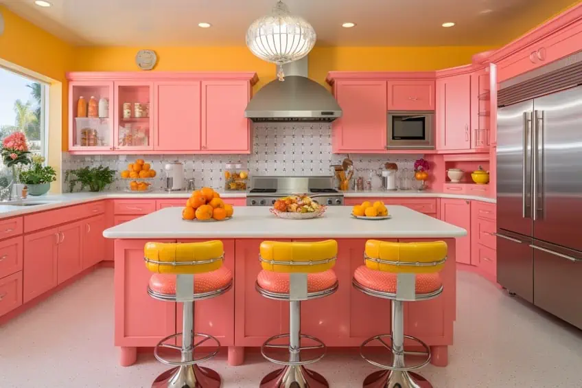
Watermelon Pink and Citrus Orange
Watermelon Pink and Citrus Orange create a lively and energetic atmosphere. In my design experience, I recommend using Watermelon Pink in smaller doses like accessories or accent furniture, while Citrus Orange can make a bold statement on feature walls or larger furnishings. This combination is perfect for injecting a burst of energy into spaces like kitchens or playrooms.
| Shade | Hex Code | CMYK Color Code (%) | RGB Color Code | Color |
| Watermelon Pink | #FFC3A0 | 0, 35, 35, 0 | 255, 195, 160 | |
| Citrus Orange | #FFA07A | 0, 27, 30, 0 | 255, 160, 122 |
Strawberry Ice and Mint Green
The refreshing combination of Strawberry Ice and Mint Green brings a touch of whimsy and freshness to interior spaces. Personally, I recommend using Mint Green as a soothing backdrop on walls or larger furniture pieces, allowing Strawberry Ice to shine in smaller details like decor items or upholstery. This pairing is ideal for creating a light-hearted and invigorating atmosphere in spaces like bedrooms or home offices.
| Shade | Hex Code | CMYK Color Code (%) | RGB Color Code | Color |
| Strawberry Ice | #FFB6C1 | 0, 24, 13, 0 | 255, 182, 193 | |
| Mint Green | #98FB98 | 14, 0, 21, 0 | 152, 251, 152 |

Pastel Pink and Lavender
Pastel Pink and Lavender create a dreamy and calming aesthetic. To personalize this combination, introduce Pastel Pink in soft furnishings or smaller decor items, while Lavender can take center stage in larger elements like walls or bedding. This soothing palette is perfect for bedrooms or cozy reading corners, providing a serene and enchanting retreat.
| Shade | Hex Code | CMYK Color Code (%) | RGB Color Code | Color |
| Pastel Pink | #FFD1DC | 0, 24, 10, 0 | 255, 209, 220 | |
| Lavender | #E6E6FA | 10, 10, 0, 0 | 230, 230, 250 |

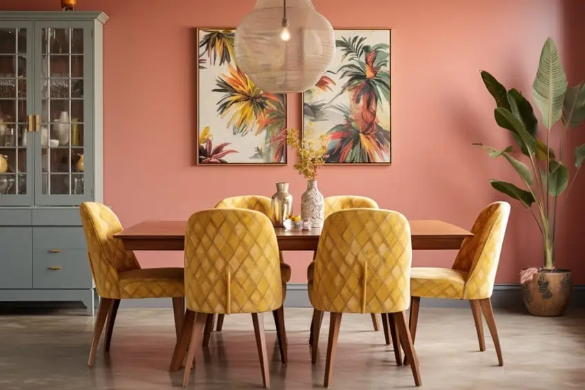
Fuchsia Pink and Lemon Yellow
Fuchsia Pink and Lemon Yellow form a vibrant and energetic duo. In my design expertise, I suggest using Fuchsia Pink in statement pieces or smaller accents, allowing Lemon Yellow to add a pop of brightness in larger areas like walls or furniture. This lively combination is well-suited for spaces like children’s playrooms or areas where creativity and energy are encouraged.
| Shade | Hex Code | CMYK Color Code (%) | RGB Color Code | Color |
| Fuchsia Pink | #FF00FF | 0, 100, 0, 0 | 255, 0, 255 | |
| Lemon Yellow | #FFF44F | 0, 0, 69, 0 | 255, 244, 79 |

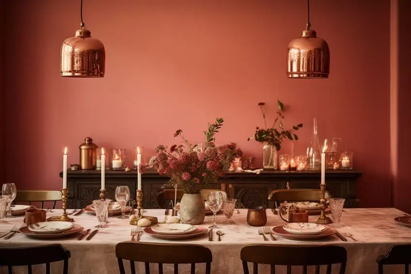
Antique Rose and Copper
The timeless combination of Antique Rose and Copper exudes warmth and sophistication. Personally, I recommend using Antique Rose in textiles or smaller accessories, while incorporating Copper in lighting fixtures or statement furniture. This pairing is perfect for creating a cozy and elegant atmosphere in living rooms or dining spaces, adding a touch of vintage charm.
| Shade | Hex Code | CMYK Color Code (%) | RGB Color Code | Color |
| Antique Rose | #C39999 | 0, 34, 34, 21 | 195, 153, 153 | |
| Copper | #B87333 | 0, 36, 71, 28 | 184, 115, 51 |
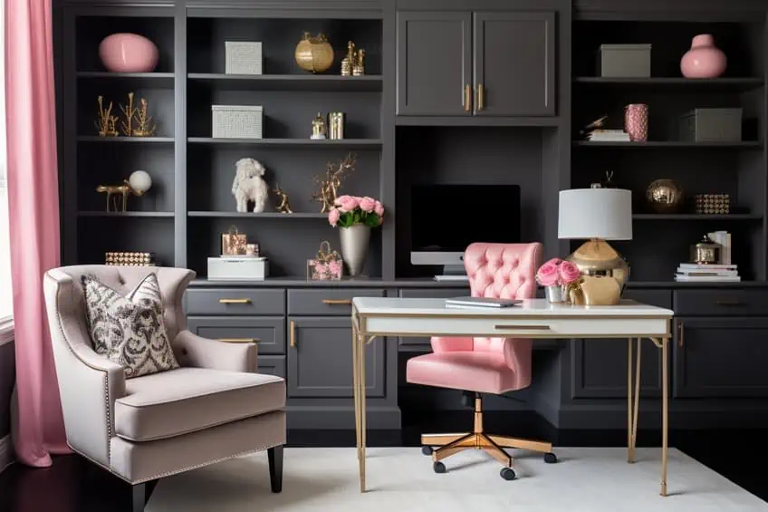
Carnation Pink and Steel Gray
Carnation Pink and Steel Gray bring a modern and sophisticated touch to interior design. In my experience, I suggest using Steel Gray as a sleek and neutral base on larger surfaces or furniture, allowing Carnation Pink to make a statement in accents or smaller decor items. This combination is well-suited for contemporary living rooms or home office spaces, offering a chic and stylish ambiance.
| Shade | Hex Code | CMYK Color Code (%) | RGB Color Code | Color |
| Carnation Pink | #FFA6C9 | 0, 35, 9, 0 | 255, 166, 201 | |
| Steel Gray | #A9A9A9 | 0, 0, 0, 40 | 169, 169, 169 |
Terracotta Pink and Beige
Terracotta Pink and Beige create a warm and earthy atmosphere. Personally, I recommend using Terracotta Pink in furnishings or statement decor, while Beige can serve as a calming backdrop on walls or larger furniture. This pairing is perfect for creating a cozy and inviting feel in living rooms or dining areas, evoking a sense of natural beauty and comfort.
| Shade | Hex Code | CMYK Color Code (%) | RGB Color Code | Color |
| Terracotta Pink | #E2725B | 0, 60, 47, 10 | 226, 114, 91 | |
| Beige | #F5F5DC | 0, 0, 11, 4 | 245, 245, 220 |

Petal Pink and Sky Blue
The delicate combination of Petal Pink and Sky Blue evokes a sense of tranquility and charm. To personalize this pairing, introduce Petal Pink in textiles or smaller decor elements, while allowing Sky Blue to dominate larger areas like walls or furnishings. This gentle palette works wonders in bedrooms or nurseries, creating a serene and dreamy environment.
| Shade | Hex Code | CMYK Color Code (%) | RGB Color Code | Color |
| Petal Pink | #FDBFB7 | 0, 24, 18, 0 | 253, 191, 183 | |
| Sky Blue | #87CEEB | 30, 5, 0, 11 | 135, 206, 235 |

Dusty Cedar and Mustard Yellow
Dusty Cedar and Mustard Yellow bring a warm and inviting energy to interior spaces. In my design approach, I recommend using Dusty Cedar in statement furniture or accents, while Mustard Yellow can add a pop of brightness in smaller details or decor items. This combination is ideal for creating a cozy and eclectic feel in living rooms or reading nooks, infusing the space with a touch of vintage charm.
| Shade | Hex Code | CMYK Color Code (%) | RGB Color Code | Color |
| Dusty Cedar | #DAA520 | 0, 25, 45, 16 | 218, 165, 32 | |
| Mustard Yellow | #E34234 | 0, 76, 93, 11 | 227, 66, 52 |
Orchid Pink and Charcoal Blue
Orchid Pink and Charcoal Blue create a sophisticated and contemporary palette. To personalize this combination, use Orchid Pink in statement pieces or smaller decor items, allowing Charcoal Blue to set a refined tone on larger surfaces or furnishings. This pairing is perfect for adding a touch of elegance to spaces like dining rooms or home offices, striking a balance between boldness and subtlety.
| Shade | Hex Code | CMYK Color Code (%) | RGB Color Code | Color |
| Orchid Pink | #DA70D6 | 0, 49, 0, 14 | 218, 112, 214 | |
| Charcoal Blue | #36454F | 67, 43, 38, 77 | 54, 69, 79 |

Baby Pink and Gold
The timeless combination of Baby Pink and Gold brings a touch of glamour and sophistication to any interior. Personally, I recommend using Baby Pink in soft furnishings or smaller details, allowing Gold to shine in larger elements like lighting fixtures or accent furniture. This pairing is well-suited for creating a luxurious and refined atmosphere in bedrooms or living rooms, adding a sense of opulence to the space.
| Shade | Hex Code | CMYK Color Code (%) | RGB Color Code | Color |
| Baby Pink | #FFB6C1 | 0, 24, 13, 0 | 255, 182, 193 | |
| Gold | #FFD700 | 0, 0, 100, 0 | 255, 215, 0 |

Cranberry Pink and Forest Green
Cranberry Pink and Forest Green offer a rich and festive color palette. In my design experience, I suggest using Cranberry Pink in accents or statement pieces, while Forest Green can dominate larger surfaces like walls or furniture. This combination is ideal for creating a vibrant and inviting feel in spaces like dining rooms or entertainment areas, infusing the space with a sense of celebration.
| Shade | Hex Code | CMYK Color Code (%) | RGB Color Code | Color |
| Cranberry Pink | #DB5079 | 0, 74, 28, 14 | 219, 80, 121 | |
| Forest Green | #228B22 | 81, 0, 100, 65 | 34, 139, 34 |

Pink Champagne and Champagne Gold
Pink Champagne and Champagne Gold create an elegant and sophisticated atmosphere. To personalize this pairing, use Pink Champagne in textiles or smaller decor items, allowing Champagne Gold to add a touch of luxury in larger elements like furniture or lighting fixtures. This combination is perfect for creating a glamorous and refined ambiance in living rooms or dining spaces, evoking a sense of celebration and indulgence.
| Shade | Hex Code | CMYK Color Code (%) | RGB Color Code | Color |
| Pink Champagne | #F1DDCF | 0, 9, 16, 6 | 241, 221, 207 | |
| Champagne Gold | #D4AF37 | 0, 10, 43, 17 | 212, 175, 55 |

Raspberry Sorbet and Deep Indigo
The dynamic combination of Raspberry Sorbet and Deep Indigo adds a bold and captivating element to interior spaces. In my design approach, I recommend using Raspberry Sorbet in accents or smaller decor elements, while Deep Indigo can create a striking contrast in larger areas like walls or furnishings. This pairing is well-suited for creating a dramatic and modern feel in spaces like home theaters or eclectic living rooms, making a bold statement with a touch of sophistication.
| Shade | Hex Code | CMYK Color Code (%) | RGB Color Code | Color |
| Raspberry Sorbet | #FF4466 | 0, 80, 29, 0 | 255, 68, 102 | |
| Deep Indigo | #2E294E | 68, 74, 0, 81 | 46, 41, 78 |

As we conclude this colorful journey through 25 stunning pink-centric combinations in interior design, I hope this article has served as a source of inspiration for readers seeking to infuse their living spaces with the timeless charm of pink. From the delicate balance of Ballet Slipper Pink and Soft Gray to the bold statement of Raspberry Sorbet and Deep Indigo, each combination is a brushstroke in the canvas of personal expression. Drawing from my own experiences as an interior design expert, I encourage you to embrace the beauty of color, trust your instincts, and transform your space into a haven that truly reflects your unique style and personality. May your design endeavors be as vibrant and fulfilling as the colors that now grace your home.
Frequently Asked Questions
What Colors Go With Pink?
Pink is a versatile color that pairs well with a range of options. Neutrals like white, gray, and beige offer a classic look, while bolder choices such as navy, emerald green, or mustard can add vibrancy and sophistication to your ensemble.
Can You Pair Pink With Other Bright Colors?
Certainly! Pink pairs well with other bright colors, creating lively and energetic combinations. Consider experimenting with bold hues like yellow, turquoise, or coral for a vibrant and eye-catching ensemble.
Are There Specific Colors That Complement Light Pink Versus Dark Pink Shades?
Light pink pairs well with pastels and softer tones, while dark pink can be complemented with richer colors such as navy, emerald green, or even mustard for a balanced and harmonious look.

Duncan graduated with a diploma in Film and TV production from CityVarsity in 2018, after which he continued pursuing film while taking on a keen interest in writing along the way. Since having graduated, he began working as a freelance videographer, filming a variety of music videos, fashion and short films, adverts, weddings and more. Throughout this, he’s won a number of awards from various film festivals that are both locally and internationally recognized. However, Duncan still enjoys writing articles in between his filming ventures, appreciating the peace and clarity that comes with it.
His articles focus primarily around helping up-and-coming artists explore the basics of certain colors, how these colors can be paired with other shades, as well as what colors are created when you mix one with another. All while relating these shades to historically significant paintings that have incorporated them into their color palette. As a lover of the arts himself, he takes great interest in the Renaissance era of paintings, an era that has directly inspired many of his favorite films.
Learn more about Duncan van der Merwe and about us.