What Colors Go With Orange? – 25 Vibrant Combinations
This post may contain affiliate links. We may earn a small commission from purchases made through them, at no additional cost to you.
Named after the fruit of the same shade, orange is a bold and energetic color that can add life and warmth to any space. When paired with the right counterpart, it can create a combination that is simply visually striking while remaining harmonious throughout. Join us on a journey exploring 25 colors that effortlessly complement orange, providing valuable insights into creating captivating color combinations. Keep reading to uncover the art of harmonizing colors with orange!
What Color Is Orange?
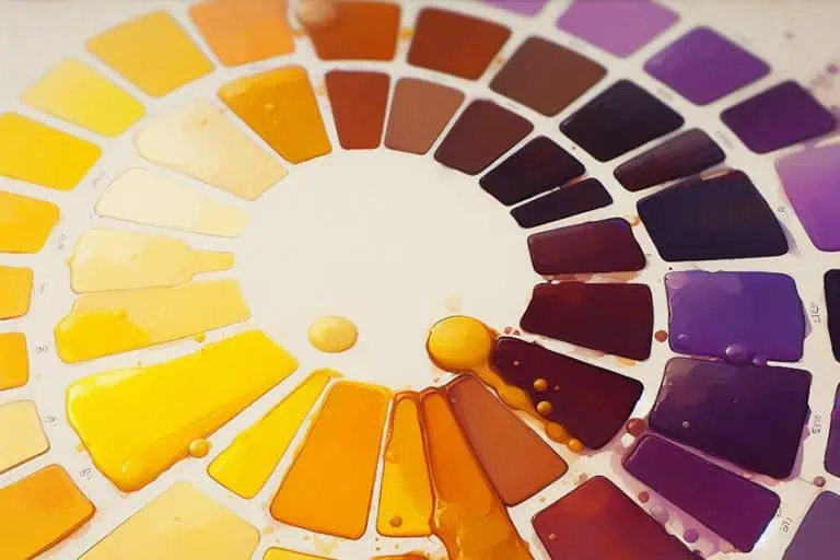
As you may tell, the sheer range of oranges is far more diverse than the fruit may have you believe. Starting from almost pale and softer hues like tangerine, which can add a touch of delicacy and sweetness to your designs, to much bolder and more exciting hues such as tiger that create a sense of energy and enthusiasm. On the darker end of the spectrum, however, we have ginger and fire, that can be utilized to create an air of elegance and sophistication, whether it be in the form of orange decor or an orange painting. To many, orange may seem like a fairly difficult color to work with, but rest assured that with the right combination of colors, you can be sure to impress without much-added stress.
| Orange Color | Orange Hex Code | RGB | CMYK Color Code (%) | Shade of Orange |
| Orange | #FFA500 | 255, 165, 0 | 0, 35, 100, 0 | |
| Tiger | #FC6A03 | 252, 106, 3 | 0, 58, 99, 1 | |
| Fire | #DD571C | 221, 87, 28 | 0, 61, 87, 13 | |
| Carrot | #ED7117 | 237, 113, 23 | 0, 52, 90, 7 | |
| Apricot | #ED820E | 237, 130, 14 | 0, 45, 9, 7 | |
| Honey | #EC9706 | 236, 151, 6 | 0, 36, 97, 7 | |
| Marmalade | #D16002 | 209, 96, 2 | 0, 54, 99, 18 | |
| Marigold | #FCAE1E | 252, 174, 30 | 0, 31, 88, 1 | |
| Tangerine | #FA8128 | 250, 129, 40 | 0, 48, 84, 2 | |
| Ginger | #BE5504 | 190, 84, 4 | 0, 55, 98, 25 |
What Colors Go With Orange?
If you are looking to utilize accent colors for orange that are not within the traditional range of color schemes, you may find that specific colors such as burgundy or vivid blue provide an interesting contrast to our primary orange. However, more than just the specific options listed above, orange has been known to work well with other varieties of blues, greens, purples, and so on.
To keep your color scheme consistent and harmonious, you should remember to match paler shades of orange with other pale colors, and vice versa.
Orange and Mimosa
Orange has been known to work fairly well with mimosa. While these two shades may appear quite similar, they both give off different energies that loop back around to complement one another in a wonderful fashion. While our orange embodies a sense of warmth and enthusiasm, mimosa exudes a sense of joy and optimism. Together, they create an uplifting contrast that can be used to create a brighter and much livelier atmosphere.
| Color | Hex Code | RGB | CMYK Color Code (%) | Shade of Color |
| Orange | #FFA500 | 255, 165, 0 | 0, 35, 100, 0 | |
| Mimosa | #FFCA4B | 255, 174, 129 | 0, 21, 71, 0 |
Orange and Olive Green
For a more natural pairing, these colors create a harmonious blend of warm and earthy tones. With orange’s enthusiasm mixing with the green’s stability, this pairing creates a combination that is both soothing and dynamic. In interior design, such colors can help any space appear warmer while promoting comfort and relaxation.
| Color | Hex Code | RGB | CMYK Color Code (%) | Shade of Color |
| Orange | #FFA500 | 255, 165, 0 | 0, 35, 100, 0 | |
| Olive Green | #BAB86C | 186, 184, 108 | 0, 1, 42, 27 |
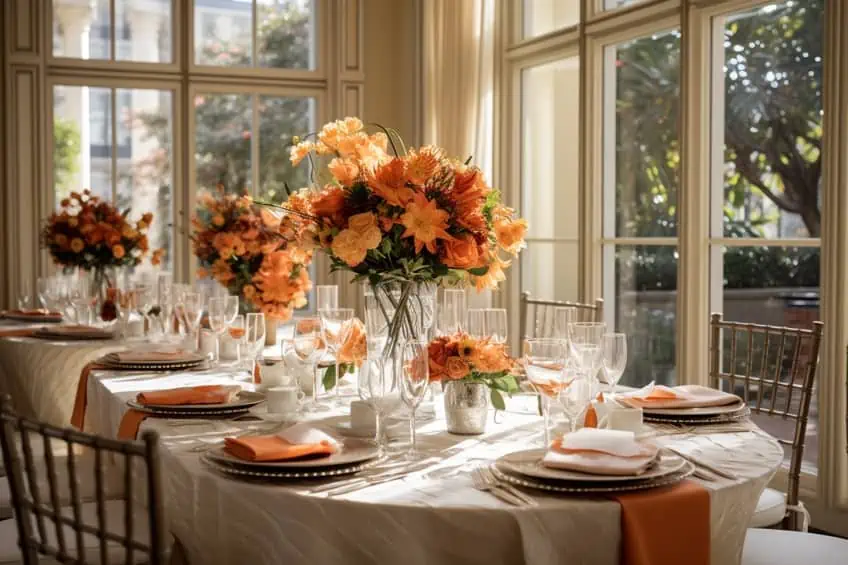
Orange and Cream
If you are looking for a more simplistic and elegant combination, however, then cream may be your best bet. This creamy texture adds a sense of refinement and purity to the relative boldness that orange provides. This creates some much-needed balance while still allowing orange’s enthusiastic shade to run wild. This can be a great aesthetic to decide on when hosting dinner parties or other social gatherings.
| Color | Hex Code | RGB | CMYK Color Code (%) | Shade of Color |
| Orange | #FFA500 | 255, 165, 0 | 0, 35, 100, 0 | |
| Cream | #FFFDD0 | 255, 253, 208 | 0, 1, 18, 0 |
Orange and Burgundy
For a richer and deeper blend of warmth and depth, the pairing of orange and burgundy simply works wonders. With a flair of elegance, these colors create a striking contrast that balances sophistication against playfulness in a stunning manner. While the orange may seem quite harsh in comparison, burgundy tempers this with a sense of maturity and refinement. For an inviting design with a touch of class, burgundy, and orange may be the only choice.
| Color | Hex Code | RGB | CMYK Color Code (%) | Shade of Color |
| Orange | #FFA500 | 255, 165, 0 | 0, 35, 100, 0 | |
| Burgundy | #800020 | 128, 0, 32 | 0, 100, 75, 50 |

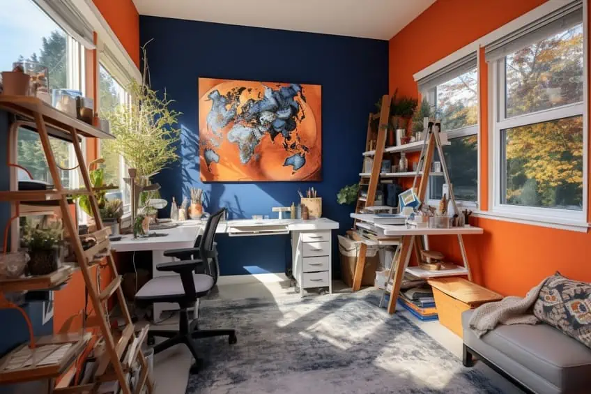
Orange and Blue
Despite this shade’s stark coldness being contrasted by orange’s warmth, we must remember that vivid blue is just simply a different shade of orange’s complementary color. With this, it creates a captivating and dynamic blend that somehow remains grounded and balanced. For bold and energetic designs that maintain harmony throughout, vivid blue and orange is a sure-fire way to get heads to turn.
| Color | Hex Code | RGB | CMYK Color Code (%) | Shade of Color |
| Orange | #FFA500 | 255, 165, 0 | 0, 35, 100, 0 | |
| Vivid Blue | #0080FF | 0, 128, 255 | 59, 25, 0, 15 |

Orange and Beige
Combining orange with beige creates a warm and inviting atmosphere. The earthy tones of beige complement the vibrant energy of orange, resulting in a balanced and cozy feel. In design, consider using beige as the primary color for larger surfaces like walls or furniture, and introduce pops of orange through accessories or accent pieces. My personal tip is to incorporate textured beige fabrics and use orange in small doses to avoid overwhelming the space.
| Shade | Hex Code | CMYK Color Code (%) | RGB Color Code | Color |
| Burnt Orange | #cc5500 | 0, 58, 100, 20 | 204, 85, 0 | |
| Warm Beige | #cfb997 | 0, 11, 27, 19 | 207, 185, 151 |

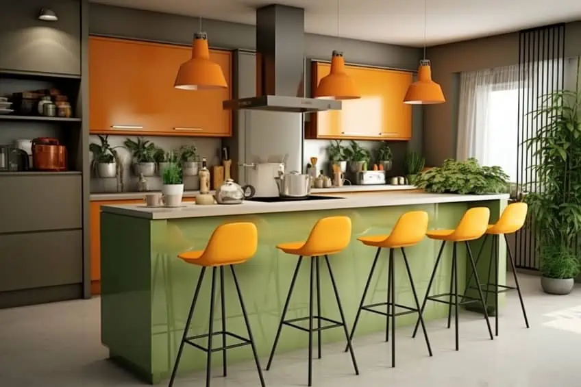
Orange and Gray
Orange and gray form a modern and sophisticated color combination. Gray provides a neutral backdrop, allowing orange to stand out as a bold accent color. For instance, use gray as the dominant color for walls or larger furniture items and introduce orange through throw pillows, artwork, or decor. Balance is key; consider using a different variety of gray to add depth, and my personal suggestion is to opt for sleek, metallic finishes in accessories to enhance the contemporary vibe.
| Shade | Hex Code | CMYK Color Code (%) | RGB Color Code | Color |
| Light Orange | #ff9a4e | 0, 40, 69, 0 | 255, 154, 78 | |
| Oslo Gray | #8a8c8d | 2, 1, 0, 45 | 138, 140, 141 |

Orange and Brown
Pairing orange with brown creates a warm and earthy palette. Brown acts as a grounding element, while orange adds vibrancy. In interior design, use brown for foundational pieces like furniture and flooring, and incorporate orange through textiles, decor, and artwork. To prevent the space from feeling too heavy, my tip is to choose a lighter shade of brown, and experiment with different textures to add visual interest.
| Shade | Hex Code | CMYK Color Code (%) | RGB Color Code | Color |
| Brown | #b06a3b | 0, 40, 66, 31 | 176, 106, 59 | |
| Bright Orange | #eb8540 | 0, 43, 73, 8 | 235, 133, 64 |
Orange and Black
Combining orange and black creates a high-contrast and dramatic look. Black serves as a bold backdrop, allowing orange to pop. For example, use black sparingly to avoid a dark and heavy atmosphere. Consider black furniture or accent pieces paired with orange decor items or textiles. My personal advice is to introduce metallic finishes, like gold or brass, to add a touch of glamour and sophistication to the space.
| Shade | Hex Code | CMYK Color Code (%) | RGB Color Code | Color |
| Black | #1f1f1f | 0, 0, 0, 88 | 31, 31, 31 | |
| Burnt Orange | #cc5500 | 0, 58, 100, 20 | 204, 85, 0 |

Orange and Turquoise
Orange and turquoise create a lively and energetic color scheme. Turquoise tones down the intensity of orange, creating a balanced and refreshing ambiance. In interior design, use turquoise for larger elements such as walls or furniture, and incorporate pops of orange through accessories like throw pillows or artwork. My suggestion is to bring in natural elements like plants to enhance the vibrant and harmonious feel of the color combination.
| Shade | Hex Code | CMYK Color Code (%) | RGB Color Code | Color |
| Turquoise | #48d1cc | 66, 0, 2, 18 | 72, 209, 204 | |
| Orange | #d18848 | 0, 35, 66, 18 | 209, 136, 72 |

Peach and Coral
Peach and coral evoke a soft and charming aesthetic. This color combination works well in creating a light and airy atmosphere. Consider using peach for larger surfaces such as walls or upholstery, and introduce coral through accents like cushions, vases, or small furniture items. My personal tip is to play with varying shades of peach and coral to add depth and interest to the space, creating a soothing and welcoming environment.
| Shade | Hex Code | CMYK Color Code (%) | RGB Color Code | Color |
| Peach | #FFDAB9 | 0, 15, 26, 0 | 255, 218, 185 | |
| Coral | #FF6F61 | 0, 60, 61, 0 | 255, 111, 97 |
Tangerine and Aqua
Tangerine and aqua bring a playful and energetic vibe to a space. Aqua provides a cool contrast to the warmth of tangerine, creating a visually dynamic setting. In interior design, use aqua for larger elements like furniture or accent walls, and incorporate pops of tangerine through accessories or textiles. To maintain balance, my suggestion is to include neutral elements like white or beige to prevent the space from feeling too busy.
| Shade | Hex Code | CMYK Color Code (%) | RGB Color Code | Color |
| Tangerine | #FFA07A | 0, 29, 47, 0 | 255, 160, 122 | |
| Aqua | #00FFFF | 100, 0, 0, 0 | 0, 255, 255 |

Burnt Orange and Sage Green
Burnt orange and sage green create a rich and harmonious palette inspired by nature. Sage green serves as a calming backdrop, allowing burnt orange to add warmth. For example, consider using sage green for walls or larger furniture pieces, and bring in burnt orange through decorative items, upholstery, or artwork. My personal tip is to incorporate natural textures like wooden elements or woven fabrics to enhance the organic feel of this color combination.
| Shade | Hex Code | CMYK Color Code (%) | RGB Color Code | Color |
| Burnt Orange | #CC5500 | 0, 56, 100, 20 | 204, 85, 0 | |
| Sage Green | #8F9779 | 32, 18, 56, 18 | 143, 151, 121 |

Apricot and Charcoal Gray
Apricot and charcoal gray combine for a sophisticated and elegant look. Charcoal gray provides a neutral base, allowing apricot to shine as a delicate accent. In interior design, use charcoal gray for foundational elements like furniture or walls, and introduce apricot through soft furnishings, decor, or artwork. To add a touch of luxury, my suggestion is to incorporate metallic accents in gold or silver.
| Shade | Hex Code | CMYK Color Code (%) | RGB Color Code | Color |
| Apricot | #FBCEB1 | 0, 23, 31, 0 | 251, 206, 177 | |
| Charcoal Gray | #36454F | 68, 45, 32, 77 | 54, 69, 79 |

Terracotta and Olive Green
This color combination creates a warm and earthy palette inspired by Mediterranean aesthetics. Olive green acts as a grounding color, while terracotta adds warmth and depth. In home design, use olive green for larger elements such as walls or furniture, and bring in terracotta through textiles, ceramics, or accent pieces. My personal advice is to incorporate natural materials like stone or wood to enhance the rustic charm of this color combination.
| Shade | Hex Code | CMYK Color Code (%) | RGB Color Code | Color |
| Terracotta | #E2725B | 0, 56, 44, 10 | 226, 114, 91 | |
| Olive Green | #556B2F | 45, 0, 79, 73 | 85, 107, 47 |

Mango and Navy Blue
Mango and navy blue create a striking and sophisticated combination. Navy blue provides a timeless backdrop, allowing mango to add a bold and energetic touch. In interior design, use navy blue for larger surfaces like walls or upholstery, and incorporate mango through accessories, artwork, or accent furniture. My personal tip is to balance the intensity of these colors by including neutral elements like white or beige to create a harmonious and balanced look.
| Shade | Hex Code | CMYK Color Code (%) | RGB Color Code | Color |
| Mango | #FFC300 | 0, 7, 100, 0 | 255, 195, 0 | |
| Navy Blue | #001F3F | 100, 52, 0, 87 | 0, 31, 63 |

Cantaloupe and Lavender
Cantaloupe and lavender bring a soft and serene ambiance to a space. Lavender adds a calming touch, while cantaloupe introduces warmth and brightness. In interior design, use lavender for larger elements like walls or bedding, and bring in cantaloupe through decor items, upholstery, or small accessories. To enhance the tranquil atmosphere, my suggestion is to incorporate natural light and soft textures like linen or cotton.
| Shade | Hex Code | CMYK Color Code (%) | RGB Color Code | Color |
| Cantaloupe | #FFA07A | 0, 29, 47, 0 | 255, 160, 122 | |
| Lavender | #E6E6FA | 8, 8, 0, 4 | 230, 230, 250 |

Rust Orange and Teal
Rust orange and teal create a rich and inviting color scheme. Teal provides a cool and calming contrast, allowing rust orange to stand out as a warm accent. In interior design, use teal for larger elements such as furniture or walls, and bring in rust orange through textiles, artwork, or decorative items. My personal tip is to introduce metallic finishes like copper or gold to add a touch of luxury to this dynamic color combination.
| Shade | Hex Code | CMYK Color Code (%) | RGB Color Code | Color |
| Rust Orange | #B7410E | 0, 68, 87, 28 | 183, 65, 14 | |
| Teal | #008080 | 100, 0, 33, 50 | 0, 128, 128 |

Sunset Orange and Indigo
These colors combine for a vibrant and bold palette reminiscent of a colorful sunset. Indigo acts as a deep and grounding element, allowing sunset orange to shine as a vivid accent. In interior design, consider using indigo for larger surfaces like walls or upholstery, and incorporate sunset orange through artwork, cushions, or small decor items. To create a visually stimulating space, my suggestion is to experiment with patterns and textures in these bold colors.
| Shade | Hex Code | CMYK Color Code (%) | RGB Color Code | Color |
| Sunset Orange | #FD5E53 | 0, 75, 72, 1 | 253, 94, 83 | |
| Indigo | #4B0082 | 74, 100, 0, 49 | 75, 0, 130 |
Coral and Mint Green
Coral and mint green bring a fresh and lively feel to a space. Mint green provides a cool and soothing backdrop, allowing coral to add a pop of warmth. In interior design, use mint green for larger elements such as walls or furniture, and introduce coral through accessories, textiles, or small decor items. To enhance the playful atmosphere, my personal advice is to include natural elements like potted plants or botanical prints.
| Shade | Hex Code | CMYK Color Code (%) | RGB Color Code | Color |
| Coral | #FF6F61 | 0, 60, 61, 0 | 255, 111, 97 | |
| Mint Green | #98FF98 | 10, 0, 10, 0 | 152, 255, 152 |

Pumpkin Spice and Beige
Pumpkin spice and beige create a cozy and autumnal color palette. Beige serves as a neutral foundation, allowing pumpkin spice to bring warmth and vibrancy. In interior design, use beige for larger surfaces like walls or furniture, and incorporate pumpkin spice through cozy textiles, throw blankets, or decorative pumpkins. My personal tip is to embrace natural textures like woven fabrics and wooden elements to enhance the inviting feel of this color combination.
| Shade | Hex Code | CMYK Color Code (%) | RGB Color Code | Color |
| Pumpkin Spice | #FF7518 | 0, 60, 75, 0 | 255, 117, 24 | |
| Beige | #F5F5DC | 4, 4, 21, 0 | 245, 245, 220 |

Blood Orange and Charcoal Gray
Blood orange and charcoal gray offer a bold and dramatic contrast. Charcoal gray provides a sleek and sophisticated backdrop, allowing blood orange to make a powerful statement. In interior design, use charcoal gray for larger elements like furniture or walls, and introduce blood orange through artwork, accent chairs, or decor items. To maintain a cohesive look, my suggestion is to include metallic accents in silver or chrome to add a touch of glamour.
| Shade | Hex Code | CMYK Color Code (%) | RGB Color Code | Color |
| Blood Orange | #D1001C | 0, 100, 98, 19 | 209, 0, 28 | |
| Charcoal Gray | #36454F | 68, 45, 32, 77 | 54, 69, 79 |

Cinnamon and Forest Green
Cinnamon and forest green create a warm and nature-inspired color scheme. Forest green serves as a grounding color, while cinnamon adds spice and energy. In interior design, use forest green for larger elements like walls or upholstery, and bring in cinnamon through textiles, throw pillows, or small decor items. To enhance the natural feel, my personal advice is to incorporate botanical prints and real or faux plants.
| Shade | Hex Code | CMYK Color Code (%) | RGB Color Code | Color |
| Cinnamon | #D2691E | 0, 49, 76, 18 | 210, 105, 30 | |
| Forest Green | #228B22 | 82, 0, 100, 50 | 34, 139, 34 |

Amber and Slate Blue
Amber and slate blue combine for a rich and sophisticated palette. Slate blue provides a calming base, allowing amber to add warmth and elegance. In interior design, use slate blue for larger surfaces like walls or furniture, and introduce amber through decor items, upholstery, or artwork. My suggestion is to incorporate natural materials like wood or stone to add texture and balance to this refined color combination.
| Shade | Hex Code | CMYK Color Code (%) | RGB Color Code | Color |
| Amber | #FFBF00 | 0, 20, 100, 0 | 255, 191, 0 | |
| Slate Blue | #6A5ACD | 50, 50, 0, 18 | 106, 90, 205 |

Honey and Eggplant
Honey and eggplant create a luxurious and regal color palette. Eggplant adds depth and richness, while honey brings warmth and brightness. In interior design, use eggplant for larger elements like furniture or accent walls, and incorporate honey through textiles, decorative items, or lighting. To elevate the opulence, my personal tip is to include metallic finishes in gold or brass, creating a sophisticated and harmonious atmosphere.
| Shade | Hex Code | CMYK Color Code (%) | RGB Color Code | Color |
| Honey | #FFC300 | 0, 7, 100, 0 | 255, 195, 0 | |
| Eggplant | #614051 | 29, 65, 0, 61 | 97, 64, 81 |

Ultimately, the key to finding a successful pairing with orange is to experiment and find the combination that suits your desired atmosphere best. Whether it is a bold and striking composition or one that is more subtle in its approach, orange is versatile enough to be used to great effect in practically any design.
Frequently Asked Questions
Are There Specific Color Combinations Suitable for Orange?
Orange pairs well with various color combinations. For a vibrant look, consider combining it with teal or navy, while earthy tones like brown or olive create a warm and balanced palette.
Can Orange Be Used in Minimalist Designs?
Despite its somewhat energetic appearance, orange can still be used in minimalist designs in the form of an accent color. This can add some much-needed warmth and visual interest when used in neutral spaces.
Does the Shade of Orange Matter When Choosing Complementary Colors?
The shade of orange can influence color choices. Bright oranges pair well with crisp whites or cool blues, while deeper oranges complement warm neutrals and earthy tones.

Duncan graduated with a diploma in Film and TV production from CityVarsity in 2018, after which he continued pursuing film while taking on a keen interest in writing along the way. Since having graduated, he began working as a freelance videographer, filming a variety of music videos, fashion and short films, adverts, weddings and more. Throughout this, he’s won a number of awards from various film festivals that are both locally and internationally recognized. However, Duncan still enjoys writing articles in between his filming ventures, appreciating the peace and clarity that comes with it.
His articles focus primarily around helping up-and-coming artists explore the basics of certain colors, how these colors can be paired with other shades, as well as what colors are created when you mix one with another. All while relating these shades to historically significant paintings that have incorporated them into their color palette. As a lover of the arts himself, he takes great interest in the Renaissance era of paintings, an era that has directly inspired many of his favorite films.
Learn more about Duncan van der Merwe and about us.