Ochre Color – How to Create and Use your Ochre Color Palette
This post may contain affiliate links. We may earn a small commission from purchases made through them, at no additional cost to you.
What color is ochre? This question comes up time and time again when discussing color in the paint world. It is not a color that is spoken of very often but is certainly a color that is commonly used, especially when discussing the interior and exterior of our homes. The ochre color is versatile and very often used in Renaissance times. Many famous painters used ochre colors in their paintings, in particular, yellow ochre color was used extensively in expensive masterpieces. This article will explore the ochre color palette in more detail and outline the ochre hex code. Once you have finished reading this informative article, you will be in a much better position to answer the question of what color is ochre.
An Introduction to the Ochre Color
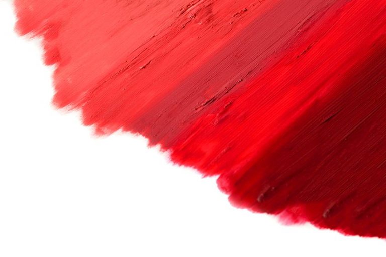
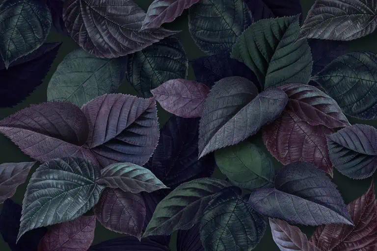
The word ochre is a Greek name that means pale yellow. Even though it is described as a pale color, there is nothing pale about the ochre color. The ochre color ranges from very light yellow to a rich red and brown color and there is also a violet color ochre color that belongs to the ochre color palette. Shades of ochre colors are warm and have a rich earthy tone, reminiscent of the great plains of Australia and South Africa. Ochre pigments are within the same sphere of color as burnt umber and rust, both natural pigments. From painting and home decor to cosmetics, you will find that ochre has many varied uses in our lives. Here is a table showing the ochre hex code, the CMYK, and the RGB color codes.
| Shade | Ochre Hex Code | CMYK Color Code (%) | RGB Color Code | Color |
| Ochre | #CC7722 | 0, 42, 83, 20 | 204, 119, 34 |
The History of Ochre Color
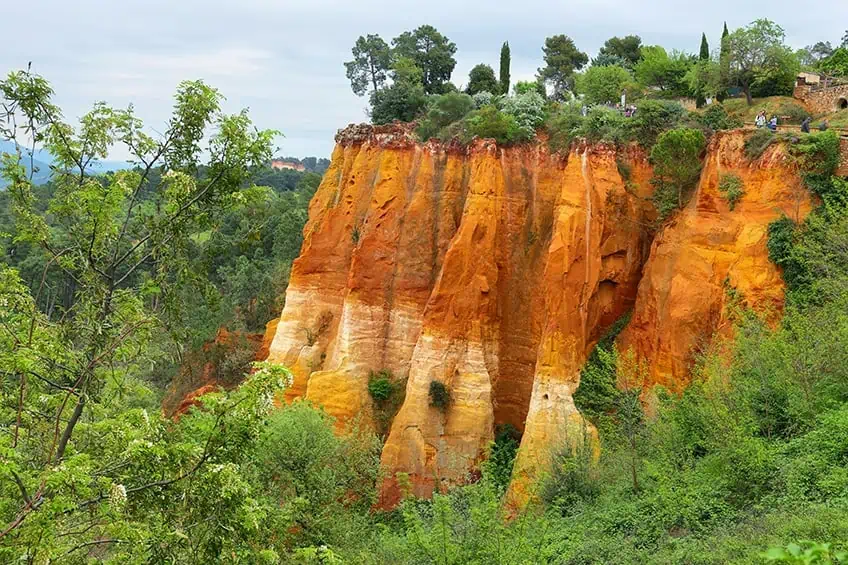
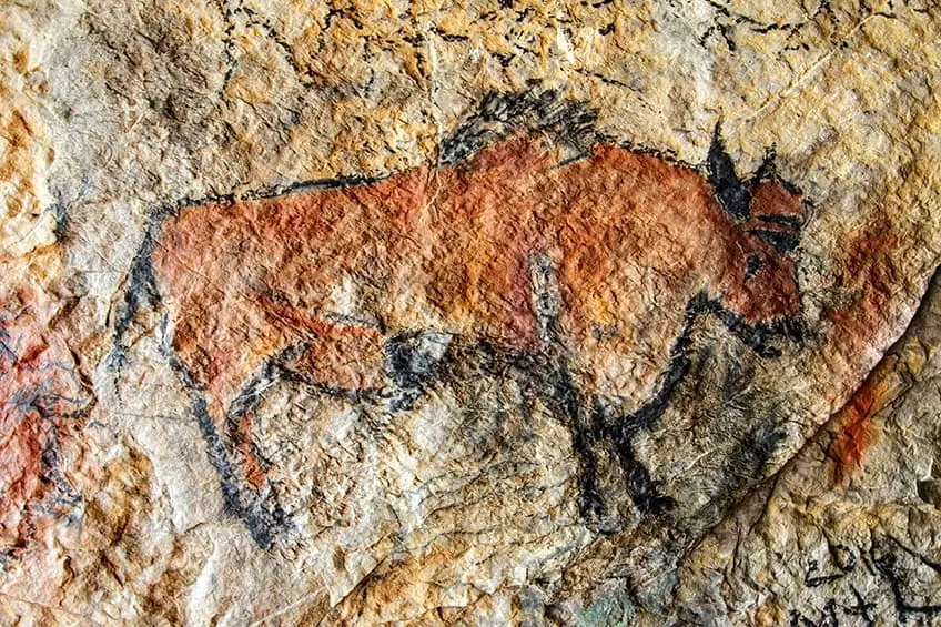
The ochre pigment is one of the oldest powders in human history and has been used for various purposes. From as early as the Palaeolithic era, ochre has been used to decorate the bodies of the deceased before burial. Evidence of this has recently been discovered in Cape Town South Africa. Archaeologists have discovered what is potentially the first painting kit that included ochre pigment and tools to crush and use it in the Blombos Caves. The cave walls are covered in paintings demonstrating their use of ochre as paint. Ochre and hematite are natural occurring minerals used to create pigment powders by grinding stones and sand. Hematite is very similar to ochre, while ochre is iron oxide that is hydrated, hematite is dehydrated and produces a pigment called sinopia. The color comes from hydrated iron oxide, and ranges from yellow ocher to a deep red color. This is why it was easily accessible as one of the first types of dye and paint.
From the first homo sapiens to the Romans, Egyptians, and classical era artists, natural ochres have been an essential element of painting and cultural rituals, like the fertility ritual of the middle stone age in Africa.
Fast forward to the Renaissance era, ochre was one of the limited 15 color palettes used by artists like Rembrandt and Michelangelo. These artists used ochre in tempera murals or frescos and later in oil paintings. Yellow ochre has always been popular as a color for plastering houses, particularly in Mediterranean and European countries like Italy and Turkey. This is thought to be because it keeps houses nice and cool during hot and sweaty summers. So, from cave walls to canvas, and from Ancient Egypt to Pompeii, ochre has wended its way through human history in the art we create.
Colors That Go with Ochre
There are various color schemes that can be incorporated to make ochre pop. Colors that go well with ochre colors are shades of blue such as periwinkle, denim blue, or teal, which were also often used in paintings. The yellow ochre colors remind us of the rich golden floors made from oak or even the golden hues in a field of wheat, as the sun sets for the night. Because blue is the complementary color for ochre, the two colors work in perfect harmony together. Purples are also fantastic compliments for different shades of rust and ochre.
| Shade | Hex Code | CMYK Color Code (%) | RGB Color Code | Color |
| Periwinkle | #CCCCFF | 20, 20, 0, 0 | 204, 204, 255 | |
| Denim Blue | #2F6479 | 61, 17, 0, 53 | 47, 100, 121 | |
| Teal | #008080 | 100,0,42,25 | 0,124,128 |
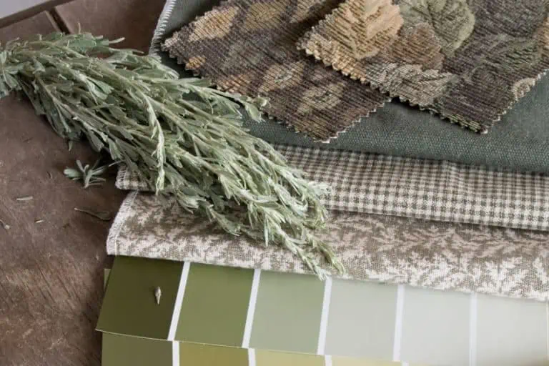
The ochre color hues and tones are varied and are golden brownish colors that can range from light to dark. The ochre color works very well with other rich colors of the earth, such as burgundy and kingfisher daisy, and is most complimentary when paired with shades of blue, such as navy, and dark silver gray.
Because of the earthy tone, the ochre color palette matches up perfectly with terra-cotta colors such as saddle brown or el Salva, making it the most versatile color to use in a home or a garden.
| Shade | Hex Code | CMYK Color Code (%) | RGB Color Code | Color |
| Burgundy | #800020 | 0, 100, 75, 50 | 50.2, 0, 12.5 | |
| Kingfisher Daisy | #2B173F | 32, 63, 0, 75 | 43, 23, 63 | |
| Dark Silver | #706E72 | 2, 4, 0, 55 | 112, 110, 114 | |
| Navy | #000080 | 100, 100, 0, 50 | 0, 0, 128 | |
| Saddle Brown | #8B4513 | 0, 20, 45, 24 | 139, 69, 19 | |
| El Salva | #903523 | 0, 63, 76, 44 | 144, 53, 35 |
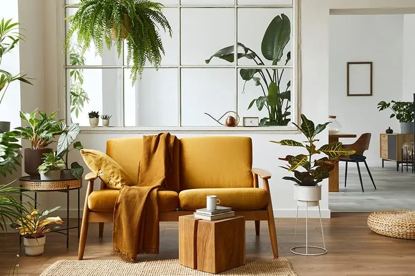
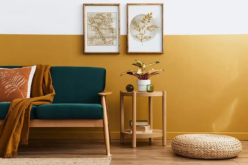
The yellow-ochre color can range anywhere from gold to light brown. Mustard colors are often confused with ochre colors, but the mustard color is actually a much lighter shade than an ochre color. The ochre yellow color is much darker when compared to the mustard yellow color and yes, both of these colors belong to the same yellow family on the color wheel. The ochre yellow color has been used in the last few centuries for adding color to the exterior of people’s homes. This color can still be seen today in the streets of Florence Italy. The ochre color is making a big comeback in the world of interior design, particularly in furniture pieces such as stand-alone wing-back chairs, sofas, and velvet curtains.
| Shade | Hex Code | CMYK Color Code (%) | RGB Color Code | Color |
| Ochre | #CC7722 | 0, 42, 83, 20 | 204, 119, 34 | |
| Mustard | #FFDB58 | 0, 14, 65, 0 | 255, 219, 88 |
Ochre Color in Painting
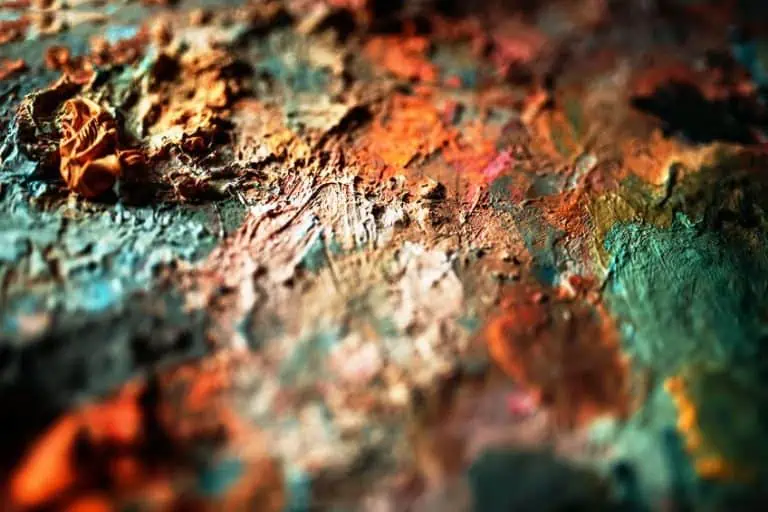
There are various types of ochre paint available in the marketplace today. The red ochre paint is a shade of the ochre color that is achieved when red and orange pigments are mixed when ochre is heated. This particular shade of ochre is known as orange-yellow ochre color and orange-red ochre color. Light ochre colors and dark ochre colors are those sold as yellow and yellow-orange.
These paint colors are usually only used when working with watercolor paints.
| Shade | Hex Code | CMYK Color Code (%) | RGB Color Code | Color |
| Yellow-Orange | #FFAA33 | 0, 33, 80, 0 | 255, 170, 51 |
A gold ochre color is achieved when a ochre is mixed with other shades of yellow chrome. This kind of ochre color is sold in the marketplace and described as yellow or yellow-orange ochre shades, these can also be bought in light and dark colors. Then we get what we call the ochre meat color paints, which are a combination of red to orange-red ochre colors. These can be purchased in semi-dark to dark colors and are natural shades of ochre color paints known as sienna.
| Shade | Hex Code | CMYK Color Code (%) | RGB Color Code | Color |
| Raw Siena | #D68A59 | 0, 36, 58, 16 | 214, 138, 89 | |
| Burnt Sienna | #EA7E5D | 0, 46, 60, 8 | 234, 126, 93 | |
| Dark Siena | #3C1414 | 0, 67, 67, 76 | 60, 20, 20 |
When looking at the ochre range of paints to decide on what colors to incorporate into the interior of a home, there are so many different shades of ochre to choose from. The color is a natural earth pigment and ranges from yellow right through to deep orange, as well as various tones of brown. The ochre color palette is versatile and is the more popular color palette used in most homes today, so go ahead and experiment with the color of your choice. You cannot go wrong no matter what ochre color you decide to use, you are almost guaranteed, that the color will be inviting and will bring warmth to the room that you are painting.
Using Ochre Color in Interior Design
Ochre color is a trendy color to use for the interior of the home and even in offices. Other colors that go with ochre make the ochre color a versatile color to use because it pairs up beautifully with gray tones and will make a room appear rich and full of energy but at the same time, the colors are toned down to ensure comfort and elegance. While yellow may often represent a color of cowardice, ochre and its compliments tend to be more grounded and strong, giving your home a sense of vitality and optimism. Rather than having raw cement in your living space, why not consider using this natural pigment to create a more earthy environment?
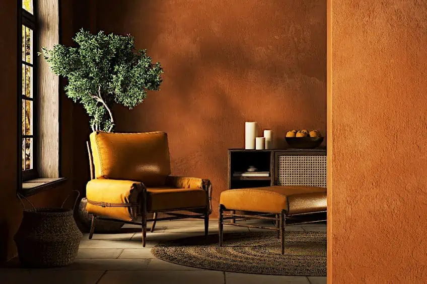
Using ochre colors on walls will add warmth to any room in the home. The orangery ochre tones, because of their ancient look, add richness to a room when paired up with dim gray or black. Using ochre colors to paint a room can go a far way to brighten up a room rather than painting an entire room with one ochre color. Instead, paint one accent wall which will bring a nice dark richness to the room. The lighter greenish ocher tones will add light to a room but will still make a room feel intimate.
A feeling of grace is achieved when pairing the more ochre colors with white in a room.
| Shade | Hex Code | CMYK Color Code (%) | RGB Color Code | Color |
| Dim Gray | #696969 | 0, 0, 0, 59 | 105, 105, 105 | |
| Black | #000000 | 0, 0, 0, 100 | 0, 0, 0 | |
| White | #FFFFFF | 0, 0, 0, 0 | 255, 255, 255 |
If wanting to use an ochre color in the kitchen to give a modern fresh look, the ochre colors will do this but be careful, it has been known that the ochre colors in a kitchen stimulate the appetite! So, if you do use these ochre colors in the kitchen, you may want to prepare yourself to start cooking some big meals that your family is going to demand.

Shades of ochre color can be incorporated into a kitchen and will compliment exposed brick or even beautiful rich terra-cotta tiles on the floor. This versatile color can be found in many kitchens around the world, such as in Spain and California. In other rooms of the home, the ochre color is the perfect color for bottle green sofas and rich dark-purple velvet curtains, this will always add comfort to any home. All shades of ochre give the feeling of being safe. It is a color that enfolds you and makes you want to sit back and relax.
| Shade | Hex Code | CMYK Color Code (%) | RGB Color Code | Color |
| Bottle Green | #0F472C | 79, 0, 38, 72 | 15, 71, 44 | |
| Dark purple | #301934 | 8, 52, 0, 80 | 18.8, 9.8, 20.4 |
In the garden setting, the ochre colors are a perfect color palette as using pots or fencing will not take away from the natural look of a garden but will blend in with its surroundings and will complement the plants and trees.
Try using some pots in contrasting colors such as cyan, pistachio, or lavender field.
| Shade | Hex Code | CMYK Color Code (%) | RGB Color Code | Color |
| Cyan | #00FFFF | 100, 0, 0, 0 | 224,255,255 | |
| Pistachio | #93C572 | 25, 0, 42, 23 | 147, 197, 114 | |
| Lavender Field | #754C78 | 3, 37, 0, 53 | 45.9, 29.8, 47.1 |
Ochre Color in Famous Paintings
Famous painters used ochre colors in many of their paintings. The color palettes are made up of various shades, but in particular, the yellow ochre, red ochre, and brown ochres were more popular. These colors are paired with all shades of blue and as we mention a few of the masters in painting, you will get a better idea of how the ochre color is incorporated into masterpieces during the Renaissance. Of the most famous painters, Rembrandt van Rijn will probably be most remembered for his frequent use of ochre color in his paintings. The earthy tones of the ochre color palette were very important for him.
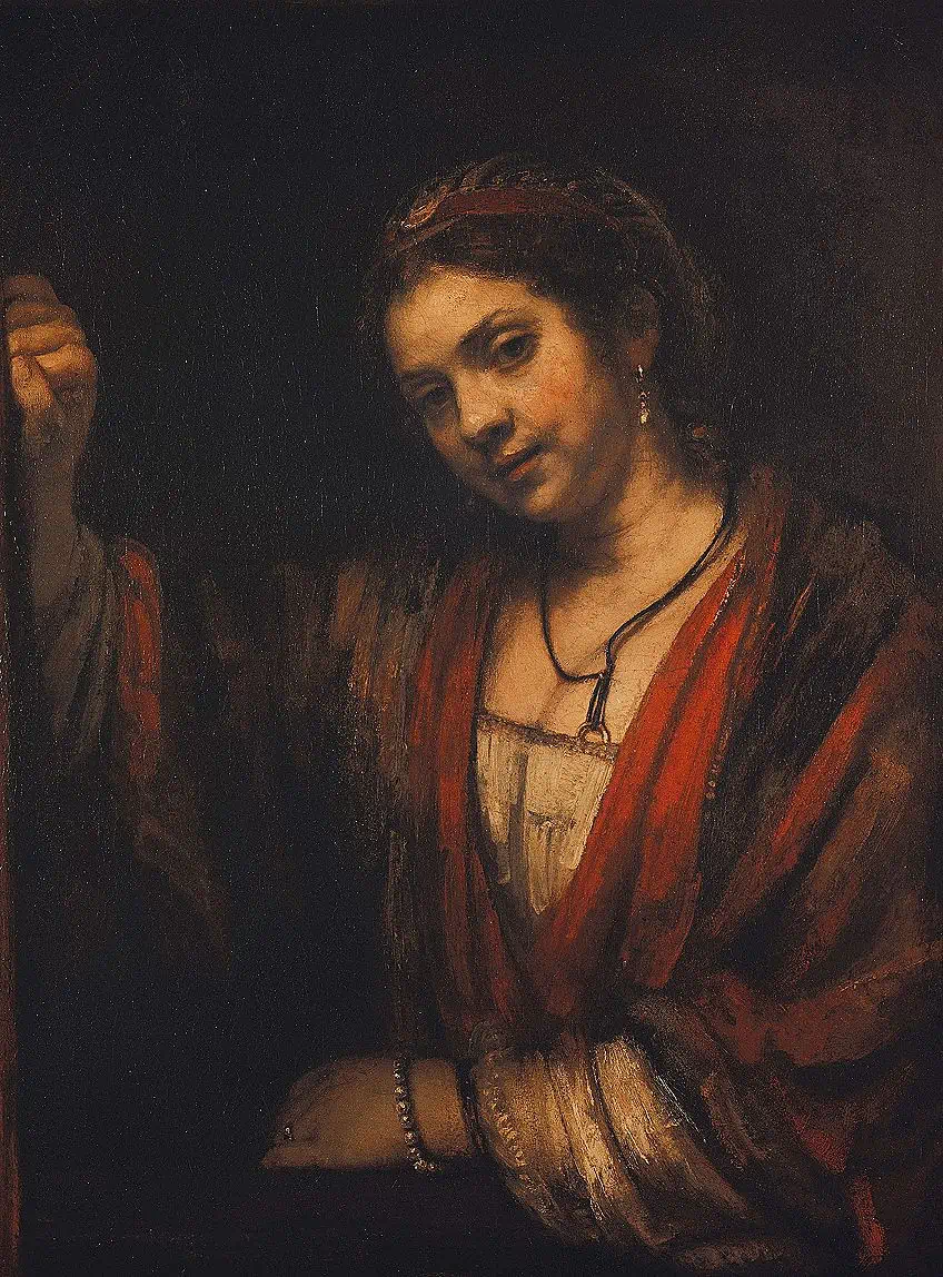 Portrait of Hendrickje Stoffels (1626) by Rembrandt; Rembrandt, Public domain, via Wikimedia Commons
Because earth tones are a very stable color and mix well with other pigments, they became the color of choice for artists to use especially when painting with oils. In his famous painting called A Woman Bathing in a Stream (1654), the ochre colors are evident in the red ochre, yellow ochre, and orange ochre tones, and in the Portrait of Hendrickje Stoffels (1626), the famous painter used what we call a pure ochre color for the arms of the chair that Stoffels was sitting on. The pure ochre color is a color that enhances the natural beauty of indigenous art, where the richness of the land is celebrated.
Because of Rembrandt’s love of the ochre color palette, in almost all of his paintings, the earth tones and shades of ochre can be seen. He used the ochre color in backgrounds as well as in pieces of jewelry that his subject was wearing.
The ochre color and shades of ochre colors have continued to be very popular throughout modern history, and Amedeo Modigliani used the ochre yellows to add to the vibrancy of his paintings. This can be seen in The Yellow Sweater (1918) where his lover Jeanne Hebutern sat for him as he transformed her into a woman with curves. In this painting, you can see that he also paired the ochre yellow with a beautiful shade of blue, which complements the overall look. Vermeer was another artist to appreciate the possibilities of ochre in painting, using it in The Milkmaid (1660) and The Girl with the Pearl Earring (1665).
Vincent van Gogh who was thought to be the modern master of yellow, used ochre colors together with shades of blue and black in a lot of his paintings. Sunflowers (1887) is a good example of Van Gogh’s love for the color yellow. These colors became almost a comfort for Van Gogh through the most troubling times in his life. They can also be seen in his self portrait, always paired with a complementary shade of blue.
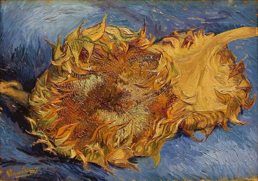 Sunflowers (1887) by Vincent van Gogh; Vincent van Gogh, Public domain, via Wikimedia Commons
Now that we have seen the monetary figures of the world’s most famous paintings, the ochre color palette certainly doesn’t seem boring anymore. If anything, it just makes you want to pick up a paintbrush and start dabbling in the ochre color palette with the added hope of making a few million on the side. We hope you have enjoyed reading about the humble ochre color which ultimately can make dreams come true. We hope you have a completely new take on the ochre color and as you go and experiment with the different shades of ochre, all that is left for us to do, is wish you good luck on your ochre journey.
Frequently Asked Questions
What Color Is Ochre?
The question of what color is ochre does come up time and time again. The simple answer is that the ochre color is an earth color with hydrated iron oxide. Shades of ochre will vary from pale yellow colors right through to deep red. Browns and violets also belong to the ochre color palette. When thinking about the ochre color, the best way to describe the color is to think about all the earthy tones you would see while taking a long walk up a mountain pass.
What Are the Colors That Go With Ochre?
Without a doubt, the best colors that go with ochre are gray and blue. One of the more common color combinations with ochre would be gray and all shades of ochre. The lighter hues of grays will bring out the vibrant shades of ochre. If darker gray tones are used, these will add a sophisticated finish when paired up with ochre. For a little bit of drama, adding an ochre color to any shade of blue will help you achieve your end goal. Ochre also pairs beautifully with magenta and other deep earthy red shades like burnt sienna.
How to Make Ochre Color?
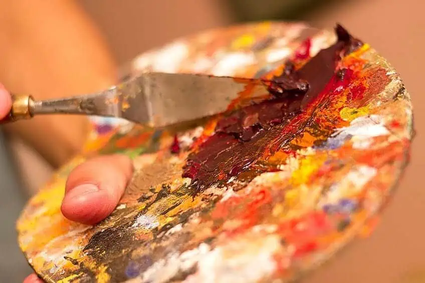
Mixing colors to get an ochre color can seem quite involved but when asking the question of how to make ochre colors, the answer is quite simple and easy to achieve. When mixing our ochre colors, it is recommended to start with a yellow base. Once you have the base color chosen then add a little red which will darken and warm up the color. Once that is mixed, add some blue which will also darken the color. Make adjustments to the colors as you mix. Mixing earth tones directly onto a palette and adding either black or white will also achieve the ochre color that you are looking for.
Where Does Yellow Ocher Come From?
Ochre is one of the natural earth pigments derived from iron oxide. Hematite and goethite are two forms of naturally occuring iron oxide that can be ground down to form an ochre powder pigment. The ferric oxide needed to create ochre can be found all over the world, from the coastal regions of Europe and Newfoundland to South Korea.

Duncan graduated with a diploma in Film and TV production from CityVarsity in 2018, after which he continued pursuing film while taking on a keen interest in writing along the way. Since having graduated, he began working as a freelance videographer, filming a variety of music videos, fashion and short films, adverts, weddings and more. Throughout this, he’s won a number of awards from various film festivals that are both locally and internationally recognized. However, Duncan still enjoys writing articles in between his filming ventures, appreciating the peace and clarity that comes with it.
His articles focus primarily around helping up-and-coming artists explore the basics of certain colors, how these colors can be paired with other shades, as well as what colors are created when you mix one with another. All while relating these shades to historically significant paintings that have incorporated them into their color palette. As a lover of the arts himself, he takes great interest in the Renaissance era of paintings, an era that has directly inspired many of his favorite films.
Learn more about Duncan van der Merwe and about us.