Analogous Colors – What Are Analogous Colors?
This post may contain affiliate links. We may earn a small commission from purchases made through them, at no additional cost to you.
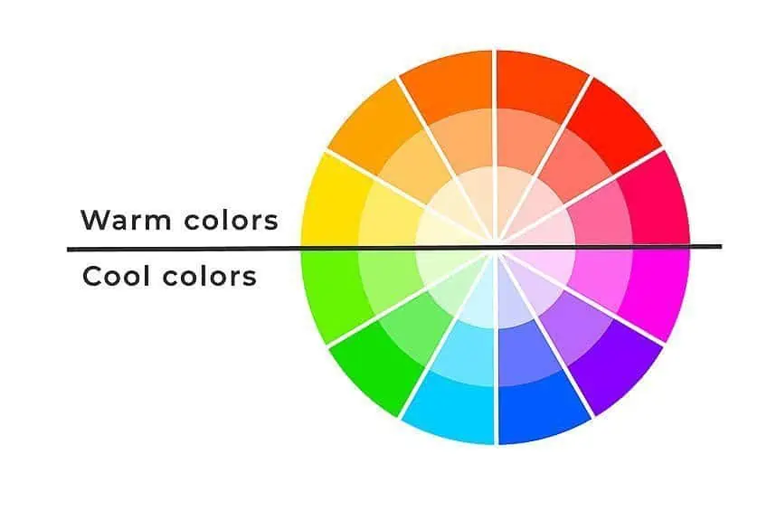
For some of us still finding our bearings in the world of art and design, the term “analogous colors” may seem foreign and maybe even overwhelming. The concept itself is far from difficult to understand as simply put, analogous colors are those that share a profound sense of camaraderie and connection, or rather, they can be found side by side on the color wheel. The harmony and continuity that are created have allowed artists and designers to imbue their works with a dynamic equilibrium, captivating the viewer with seamless blends of complementary tones. This article will be asking, “what are analogous colors?”, while exploring the history, color combinations, as well as the many uses behind this relatively unknown concept.
What Are Analogous Colors?
Analogous colors can be seen as a symphony of hues, blending together seamlessly in a way that takes over the senses. Sitting next to one another on the color wheel, they complement one another naturally in a way that creates a visually stunning display. As our ancestors and artistic forefathers have discovered time and time again, these colors can be used to create a sense of movement and emotion, while also evoking feelings of tranquility and harmony.
They are found throughout nature, blending from one color to the next, and by understanding and utilizing their relationship with one another, we can create works of art that resonate with the viewer on a deeper and more emotional level. In the hands of a skilled artist, this is a tool that can be used to move and inspire us.
Analogous Colors in History and Modern Times
The history of analogous colors is a tale woven with the threads of human curiosity and creativity. For centuries, artists and designers have remained captivated by the beauty of these complementary hues, using them to create works of art that resonate with our emotions and have played a crucial role in our visual storytelling. From the earliest cave paintings to the avant-garde movements of the 20th century, these combinations continue to evoke feelings of equal parts warmth and cold.
All while still conveying the majesty of nature, creating a sense of harmony and balance in all settings.
History
In the earliest days of human civilization, when mankind first began to express themselves through art, they turned to the natural world for inspiration. And so, in the dimly lit caves and rock shelters that dotted the landscape, they painted the animals that they hunted, the landscapes they called homes, and the world around them, using the pigments that nature provided. Despite their primitive lifestyles, our ancestors would use analogous colors with a masterful touch to bring their creations to life, creating a sense of depth and movement.
These ancient cave paintings not only give us a glimpse into the lives and beliefs of our ancestors, but stand as a testament to the enduring power of art to move and inspire us.
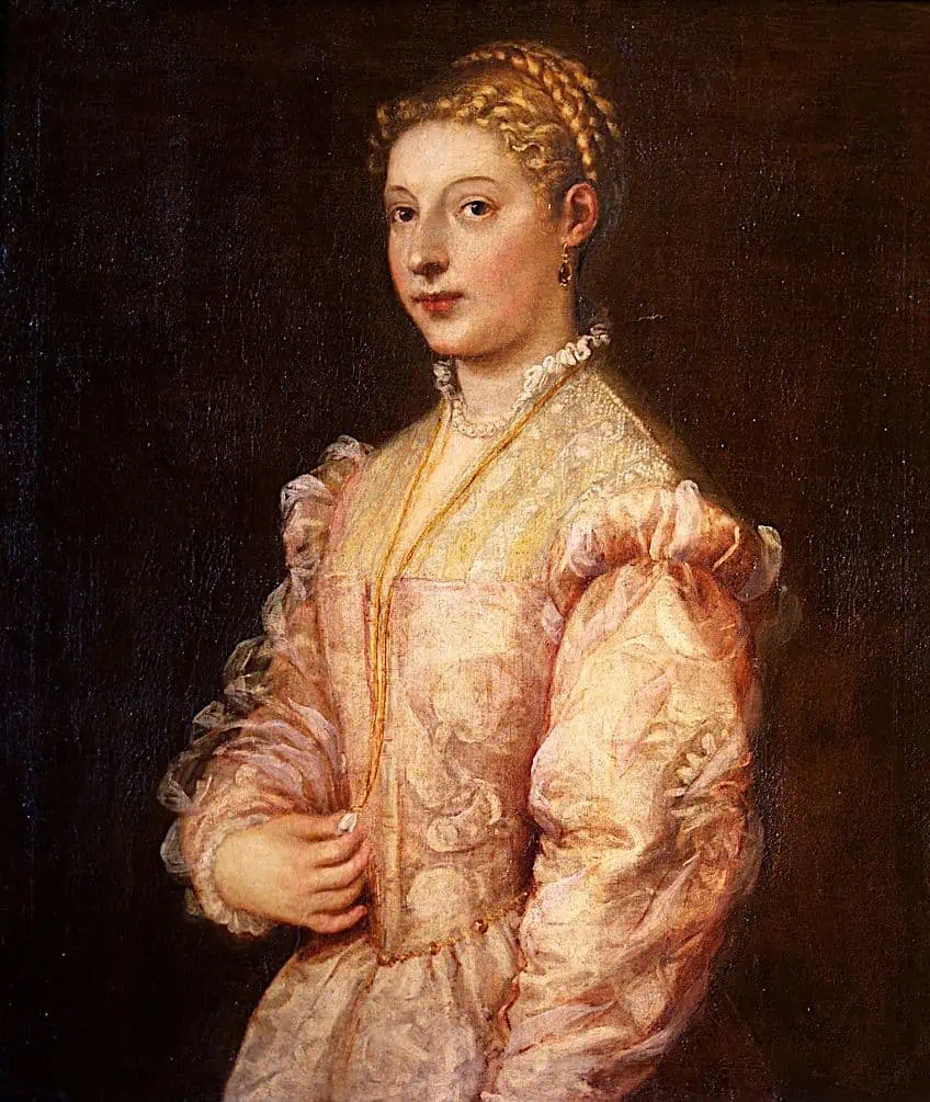 Portrait of a young woman (c 1545) by Titian; Titian , CC BY-SA 4.0, via Wikimedia Commons
From a story of artistic creation, we move to a story of artistic innovation as later in the Renaissance, masters like Michelangelo, da Vinci, and Raphael would begin to rediscover the classical knowledge of past artists. With a newly developed oil painting technique, which aided in creating a more realistic representation of the subject, analogous colors were used to further strengthen the illusion of depth and light.
These artists would also go on to employ the concept of ‘color temperature’ to create varying contrasts and moods in their works. For instance, warm colors like red or yellow were used to indicate light sources, while cooler colors like blue and green would indicate shadows. This would help to create a more three-dimensional representation of the subject, enhancing its realistic qualities tenfold. The use of analogous colors in the Renaissance was a crucial step forward in the development of western art, helping artists create works of art that were as beautiful as they were true to life.
Later still, the 20th century had a surge in artistic experimentation, as many artists began to push the boundaries and turned to color as a means of expression, leading avant-garde movements such as German Expressionism and American Abstract Expressionism.
Early on, Fauvists like Matisse and Derain would use wild and expressive brushstrokes with the aid of vibrant analogous hues to convey feelings of joy and freedom. However, staunch expressionists from either of the two previously mentioned movements would use analogous colors and related theories to express their inner turmoil as a result of their current times. The powerful and dynamic use of color in their works was able to portray the deep complexities of the human experience.
This was a groundbreaking development in artistic history, allowing artists to break free from traditional color constraints and representation. Instead, they were able to use it as a means of expression in its own right, marking a shift towards ideas of ‘nonobjective art’. This meant that artists were free to express their own emotions and ideas through the medium of color alone.
Modern Times
The wide use of analogous colors in our modern times is a reflection of our continuous fascination and exploration of color in art and design. The concept alone still holds a powerful appeal for artists of all kinds, as analogous hues remain an effective way of conveying mood, emotion, and expressiveness.

Such combinations of colors can be found in all manner of fields and industries, as it creates a sense of harmony and cohesiveness that just simply flows throughout the project. In graphic design industries, having such harmonious elements run through typography, imagery, and layout can create a seamless experience for the viewer. In contemporary art, analogous colors are used in a variety of ways, and are often employed to create a sense of movement and emotion, while architecture would use these pairings to provide a cozy and soothing effect. Analogous colors in our modern times continues to be used as a powerful tool to create visually pleasing and emotive designs throughout a number of fields and industries.
Whether it is through a website, a painting, a photograph, or even an outfit, analogous colors continue to captivate us with their beauty and versatility.
Analogous Color Combinations
The relationship between analogous colors is effortless, with one color acting as the lead and the others providing a complementing accompaniment. Just like the melody and harmony found in music, the lead color takes center stage, while the accompanying colors provide support and emphasis. This creates a sense of balance in the composition, making the art easier and far more pleasing to the eye, while evoking different moods and emotions, depending on the colors selected.

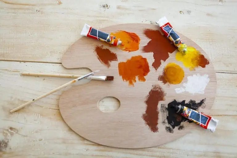
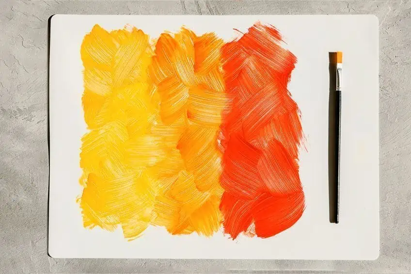
For example, one popular combination would include the “Autumn” combo, which consists of reds, oranges, and yellows. This combination evokes feelings of warmth and nostalgia, and is reminiscent of the changing leaves that are found throughout fall. By creating a sense of movement and energy, the Autumn combo is perfect for when you want to convey passion and excitement in your designs.
| Color Name | Hex Code | RGB | CMYK Color Code (%) | Shade of Color |
| Red | #ff0000 | 255, 0, 0 | 0, 100, 100, 0 | |
| Orange | #ff7900 | 255, 121, 0 | 0, 53, 100, 0 | |
| Yellow | #fff200 | 255,255,0 | 0, 0, 100, 0 |
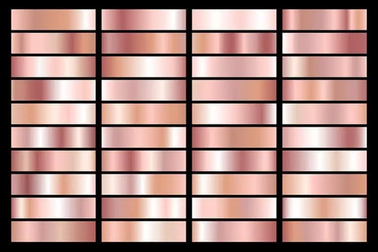
Another popular combination is the “Sunset” pairing, which is made up of red, magenta, and violet hues to evoke feelings of serenity and tranquility.
Closely associated with sunsets stretched across a clear sky, this color palette evokes feelings of warmth, bringing in a sense of finality as it creeps into its colder tones.
| Color Name | Hex Code | RGB | CMYK Color Code (%) | Shade of Color |
| Red | #ff0000 | 255, 0, 0 | 0, 100, 100, 0 | |
| Magenta | #ff00ff | 255, 0, 255 | 0, 100, 0, 0 | |
| Violet | #ee82ee | 238, 130, 238 | 0, 45, 0, 7 |
One last color pairing would have to include the “Spring” combination, which consists of blue-green, yellow, and yellow-green hues that inspire a sense of renewal and freshness. Reminiscent of blooming flowers in spring, this pairing can aid in rejuvenating your designs, adding a sense of growth where needed.
| Color Name | Hex Code | RGB | CMYK Color Code (%) | Shade of Color |
| Yellow | #fff200 | 255,255,0 | 0, 0, 100, 0 | |
| Yellow-green | #9acd32 | 154, 205, 50 | 25, 0, 76, 20 | |
| Green | #00ff00 | 0, 255, 0 | 100, 0, 100, 0 |

Each analogous color combination has its own set of unique characteristics, bringing out different emotions in the viewer that are highly dependent on the chosen colors. They can be seen as a kaleidoscope of varying hues, and their respective emotions should be used as a tool to create depth and balance in your art while providing a beauty like no other. With the right combination, you can expect to convey incredibly specific emotions and feelings in your own artworks.
Contrasting Against Analogous Colors
Certain colors can be used to create a striking contrast against specific analogous color combinations, adding depth and interest to a composition. These contrasting hues, when placed strategically and with meaning, can draw the viewer’s attention and evoke powerful emotions.
One example of a contrasting color that can be used to captivate your audience is the use of black and white against analogous colors, like blue and blue-violet.
The stark contrast between the darkness and lightness of these respective colors creates a striking visual effect that highlights the subtle variations in our analogous colors, creating a sense of depth and drama. With this strong visual contrast, details of the image are highlighted and draw in the viewer’s attention to the piece’s focal point.
| Color Name | Hex Code | RGB | CMYK Color Code (%) | Shade of Color |
| Black | #000000 | 0, 0, 0 | 0, 0, 0, 100 | |
| Blue-violet | #8a2be2 | 0, 255, 0 | 100, 0, 100, 0 | |
| Blue | #0000ff | 0, 0, 255 | 100, 100, 0, 0 | |
| White | #ffffff | 255, 255, 255 | 0, 0, 0, 0 |
Another great example of contrasting against analogous colors would be the use of bolder tones, such as red, juxtaposed against neighboring colors like purple and pink. The intensity presented by red contrasts against our softer analogous colors, which works to create a dynamic visual effect that evokes feelings of energy and passion.
| Color Name | Hex Code | RGB | CMYK Color Code (%) | Shade of Color |
| Red | #ff0000 | 255, 0, 0 | 0, 100, 100, 0 | |
| Purple | #800080 | 128, 0 128 | 0, 100, 0, 50 | |
| Pink | #ffc0cb | 255, 192, 203 | 0, 25, 20, 0 |

Ultimately, the use of contrasting colors is a powerful tool in creating compositions that remain captivating and are able to evoke certain emotions within the viewer. The key is to understand the emotional and psychological associations of the colors being used and how they each interact with one another. Not only this, but you then need to position them in a manner that guides the viewer’s attention through the composition and accentuates your subject.
Analogous colors are a beautiful and captivating aspect of color theory, providing its users with a sense of harmony and balance within each composition. These colors can elevate a composition and take it from the ordinary to the extraordinary, through visually thrilling experiences that are both aesthetically pleasing and emotionally resonant. We hope that you enjoyed our exploration of the many aspects of analogous colors, and look forward to having you again as we continue to journey through the multi-shaded world of colors.
Frequently Asked Questions
What Are Analogous Colors?
Analogous colors are shades that are located next to one another on the color wheel. Typically, they are made of a primary color and the colors that are directly adjacent to it. These colors tend to blend with one another quite well, creating a sense of harmony and visual cohesion.
How Can I Use Analogous Colors in Design?
Analogous colors can be used in various design projects such as web, graphic, fashion, and interior design, amongst countless more. They can be used to create a sense of depth and movement in a composition, and can help to guide the viewer’s attention to the design’s focal point. Such colors can also be used to evoke specific emotions, depending on the colors chosen.

Duncan graduated with a diploma in Film and TV production from CityVarsity in 2018, after which he continued pursuing film while taking on a keen interest in writing along the way. Since having graduated, he began working as a freelance videographer, filming a variety of music videos, fashion and short films, adverts, weddings and more. Throughout this, he’s won a number of awards from various film festivals that are both locally and internationally recognized. However, Duncan still enjoys writing articles in between his filming ventures, appreciating the peace and clarity that comes with it.
His articles focus primarily around helping up-and-coming artists explore the basics of certain colors, how these colors can be paired with other shades, as well as what colors are created when you mix one with another. All while relating these shades to historically significant paintings that have incorporated them into their color palette. As a lover of the arts himself, he takes great interest in the Renaissance era of paintings, an era that has directly inspired many of his favorite films.
Learn more about Duncan van der Merwe and about us.