Emerald Green – Learn to Use Popular Shades of Emerald Green
This post may contain affiliate links. We may earn a small commission from purchases made through them, at no additional cost to you.
Green, a color often associated with life, wealth, and nature, is available in a variety of shades. This makes it ideal for home decor, fashion, and pretty much any application that you can think of! In this segment, we will be taking a look at emerald green, one of the most popular shades of green, and everything about it, including how it is mixed, the history surrounding the color, and so on. To get the most out of this unique color, keep reading to find out more!
What Is Emerald Green?
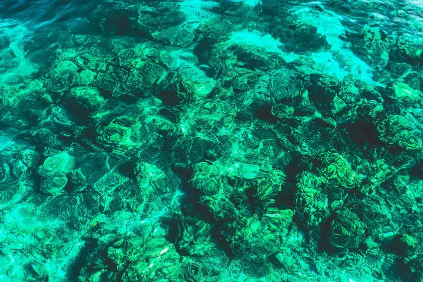
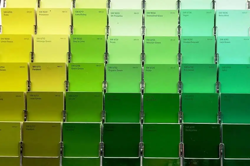
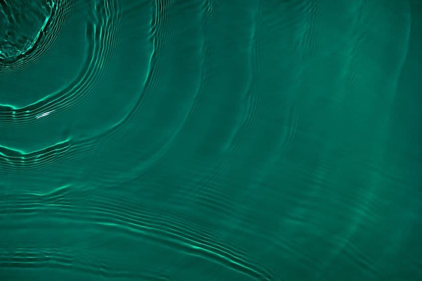
Also known as Veronese green, Paris green, Imperial green, Vienna green, and Schweinfurt green, emerald green is named after the precious stone that possesses the same blue-green hue. This is a color that has been used throughout history, but for a long time, there was a lot of controversy surrounding it. Emerald green is darker than neon and lime green, yet lighter than olive green and teal.
| Shade | Hex Code | CMYK Color Code (%) | RGB Color Code | Color |
| Emerald | #50c878 | 60, 0, 40, 22 | 80, 200, 120 |
Technical Specifications
When looking at this color on an RGB (red, green, blue) color space you will have a clear understanding of how to make emerald green. Hex #50C878 is manufactured or digitally created with 47.1% blue, 78.4% green, and 31.4% red. When printing in a CMYK (cyan, magenta, yellow, black) color space, the color is made with 22% black, 40% yellow, and 60% cyan, with no magenta. Overall, emerald green has a 140-degree hue angle, a 52.2% saturation, as well as a lightness consisting of 54.9%.
This is not a very complicated color to recreate and if you would like to know more, there is a color conversion chart provided below, which should help you when learning how to make emerald green.
Shades of Emerald
Like all other colors, there are different shades of green that are similar to emerald. This includes seafoam, forest, neon, lime, and teal green. Each shade has a specific hex code, RGB color code, and CMYK color code percentage. Take a look at the table below to analyze the differences between each of the colors.
| Shade | Hex Code | CMYK Color Code (%) | RGB Color Code | Color |
| Emerald | #50c878 | 60, 0, 40, 22 | 80, 200, 120 | |
| Seafoam | #93e9be | 37, 0, 18, 9 | 147, 233, 190 | |
| Forest | #228b22 | 76, 0, 76, 45 | 34, 139, 34 | |
| Neon | #33ff00 | 18, 0, 92, 0 | 57, 255, 20 | |
| Lime | #32cd32 | 76, 0, 76, 20 | 50, 205, 50 | |
| Teal | #003d5b | 100, 0, 17, 57 | 0, 109, 91 |
The History of Emerald Green
Emerald Green was initially commercially created as a pigment in 1814 by chemists Russ and Sattler from the Bavarian region of Schweinfurt, Germany. The material was ground in linseed oil after combining and heating copper verdigris mixed with white arsenic and vinegar. The new pigment, which was initially marketed as a more solid, lightfast variant of Scheele’s Green, possessed a brightness unlike any previous copper green. When blended with sulfur-containing colors like Ultramarine, Vermillion, and Cadmium Yellow, it exhibited the same propensity to blacken.
Worse, because of its arsenic level, Emerald Green was extremely toxic.
Toxicity
The toxicity of the pigment was recognized when its constituents were divulged in an 1822 paper, but its widespread usage in paints and dyes remained. This was most likely owing to a combination of reasons, including the fact that Emerald Green was both inexpensive and popular, and the color green was difficult to achieve. Despite its poisonous properties, arsenic was regarded as a miraculous commodity in the Victorian era, found in many products but mainly green dye, and produced in large quantities and revered by society.
It was widely employed not just in the artist’s studio, but also in the home, in everything from paints to textiles to decorative wallpapers.
Deaths
The dye’s side effects were heinous, producing ulcers and blisters on the skin and, once in the bloodstream, organ failure, hair loss, and vomiting. The exposure significantly lowered the life expectancy of people who made the dye in factories, and several of them lost their fingers and hands in the manufacturing process. Emerald Green Victorian costumes may still be found in exhibitions across the globe, and their unusual coloration is as vibrant as ever.
The Meaning of Emerald Green
Emerald green, named after the rare gemstone after which the color was named, represents refinement, affluence, royalty, status, elegance, and grandeur. It is no accident that green is connected with opportunities for growth and prosperity in health and money in feng shui. Green is said to regulate emotions and generate a sense of serenity and mental clarity in color psychology.
The secondary hue is created by combining yellow and blue and hence possesses both the energetic properties of yellow as well as the relaxing properties of blue.

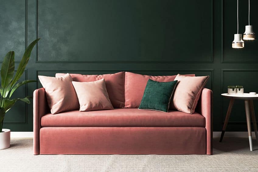
Emerald green is a highly relaxing and rejuvenating hue with a pronounced blue undertone. The color represents harmony and equilibrium, making it ideal for peaceful rooms such as bedrooms and living rooms. Its direct visual link to the natural environment accentuates these traits even further.
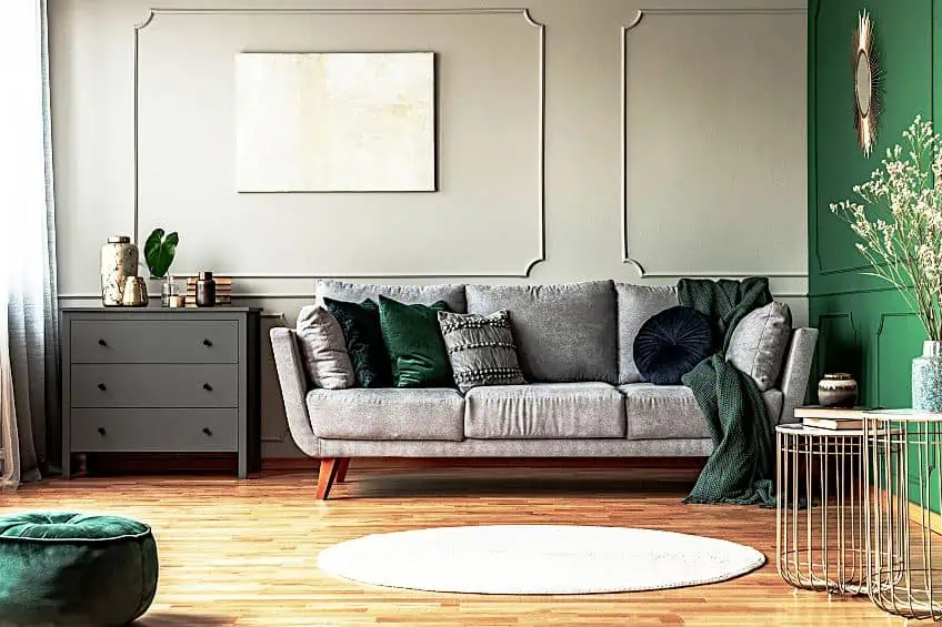
How You Should Use Emerald Green
So, you have asked the question “what is emerald green”, but you should also know how to use it. While there are plenty of uses for this unique color, we have narrowed it down to two main categories; interior design and fashion.
Interior Design
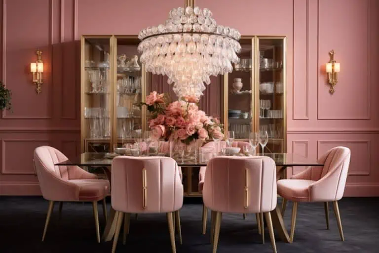
If the dining space of your home is more formal, consider using contrasting colors in the wall decor to contrast with the wood’s grain or muted colors in the area. Lighter hues of emerald may gravitate toward pastel, so including some interesting color pairings such as pink and green or blue and green into your patterned or striped wallpaper will liven up the space. A broad emerald tile backsplash may actually enchant a kitchen.
Make this eye-catching backsplash a part of a distinctive color scheme such as fuchsia cabinets, or primrose chairs to produce a vibrant dining environment that will not disappoint.
Fashion
Emerald green will always have a place in your wardrobe, which is largely due to its elegance. Despite being a cooler color, it is ideal for winter coats but also has its place at formal events if you would like to bring something chic to the ballroom or nightclub. When paired with different colors, you can also use emerald green accessories to highlight your outfit. This can be a handbag, scarf, or even emerald jewelry. Emerald green cardigans, jackets, t-shirts, and shirts are perfect for any wardrobe and you are more than likely to stand out when wearing them.
This color is timeless, as it has been the color of the season in different years over the last two decades.

Emerald Green in Paintings
In the early 1900s, the original shade of Emerald Green was outlawed. Despite this, numerous painters, including JMW Turner, Van Gogh, Gauguin, Renoir, and Cézanne, used it. This was a prominent color in the palettes of the oil on canvas paintings. Below you will find a table with a few of the most prominent oil paintings that featured emerald green.
| Artist | Painting | Description |
| Vincent van Gogh | The Arlesienne (1888) | Madame Ginoux, proprietor of Arles’ Café de la Gare, is seen in this picture. |
| Pablo Picasso | The Blue Room (1901) | ‘The Blue Room’ by Pablo Picasso is a mature piece from the young artist’s Blue era. A concealed portrait of a fashionable man was revealed below the face of the image by a recent scientific examination using a number of approaches. The sitter’s identity is still unknown. |
| Edvard Munch | The Sick Child (1907) | The Sick Child is inspired by Munch’s sister’s death from TB when she was 15. Munch had seen the model, a little girl, sitting sadly while accompanying his father, a physician, to heal her brother’s fractured leg. Munch focused on the oil painting for an entire year, perfecting the quick brushwork and vibrant colors that represent the terrible recollection of a tragic event. |
| Kazimir Malevich | Suprematist Painting (1917) | This is an investigation into pure light as well as the pure color within the theoretical context of then-current color theories. Malevich showed optical effects such as color perception when staring straight into a strong light source like the sun. |
| Paul Cézanne | Hillside in Provence (1892) | This painting’s angular, protruding rock formations could symbolize a quarry, with the incisions exposing geological layers. Although the hillside is in Cézanne’s home Provence, the precise location has yet to be determined. |
Color Combinations
Emerald green goes well with peach, ruby red, aubergine, pink, and rose. It also looks good with various shades of green, such as lime green. Combine emerald green and neutrals such as gray or beige for a new appearance. Colors that complement emerald green include the following:

- Beige
- Black
- Lime green
- Yellow-green
- Ivory
- Rose quartz
- Scallop seashell
Emerald green is a surprisingly versatile shade of green that can be used to paint, decorate your home, or wear. While it has dark origins, the color remains very popular and can often be found in modern homes and in high-fashion magazines. Needless to say, if you are looking for the next shade of green, give emerald a try!
Frequently Asked Questions
Does Emerald Green Still Contain Arsenic?
Not at all! Emerald green is completely safe to use and wear, as none of the paints or dyes contain arsenic.
What Does Emerald Green Symbolize?
Emerald green symbolizes harmony and balance, along with being associated with luck and nature.
Are There Colors Similar to Emerald Green?
Yes, colors such as teal and forest green are similar to emerald green.

Duncan graduated with a diploma in Film and TV production from CityVarsity in 2018, after which he continued pursuing film while taking on a keen interest in writing along the way. Since having graduated, he began working as a freelance videographer, filming a variety of music videos, fashion and short films, adverts, weddings and more. Throughout this, he’s won a number of awards from various film festivals that are both locally and internationally recognized. However, Duncan still enjoys writing articles in between his filming ventures, appreciating the peace and clarity that comes with it.
His articles focus primarily around helping up-and-coming artists explore the basics of certain colors, how these colors can be paired with other shades, as well as what colors are created when you mix one with another. All while relating these shades to historically significant paintings that have incorporated them into their color palette. As a lover of the arts himself, he takes great interest in the Renaissance era of paintings, an era that has directly inspired many of his favorite films.
Learn more about Duncan van der Merwe and about us.