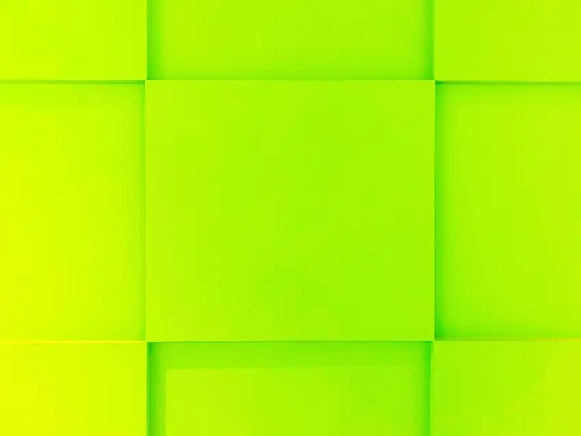
Chartreuse Color – A Deep Dive Into Chartreuse Color Palette
This post may contain affiliate links. We may earn a small commission from purchases made through them, at no additional cost to you.
Unless you are a seasoned and well-versed painter of many years, the words chartreuse color will rarely be heard in general conversation. It is a historical color, dating back to 1892 when chartreuse yellow was first recorded in American English. The question then arises, what color is chartreuse? Although the explanation is not simple, let’s see if we can simplify it for you enough to grab your attention. The chartreuse color is a shade between green and yellow. It is a sub-category under the green color umbrella. Fascinatingly, a liqueur was made by the Carthusian monks in France in 1605 but was not known until the mid-1700s. Read on as we explore this most unusual yet captivating chartreuse color and learn more about the chartreuse color palette.
What Color Is Chartreuse?
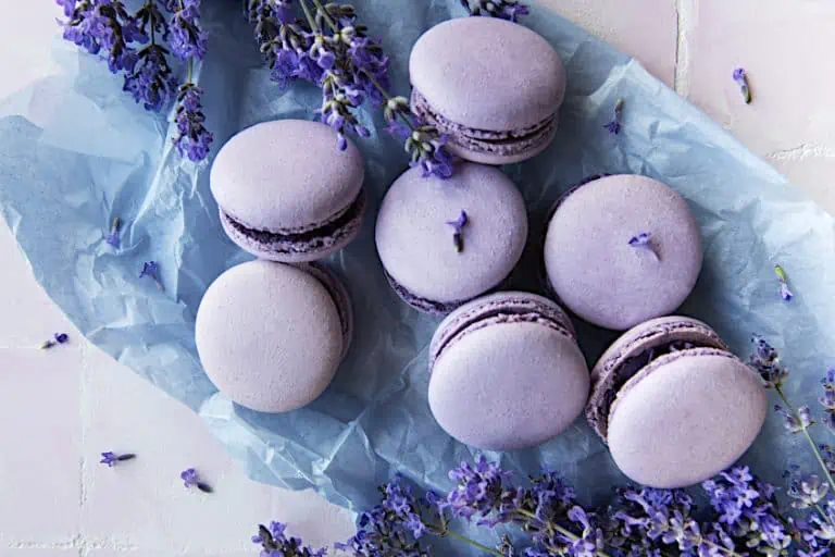
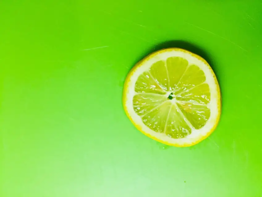
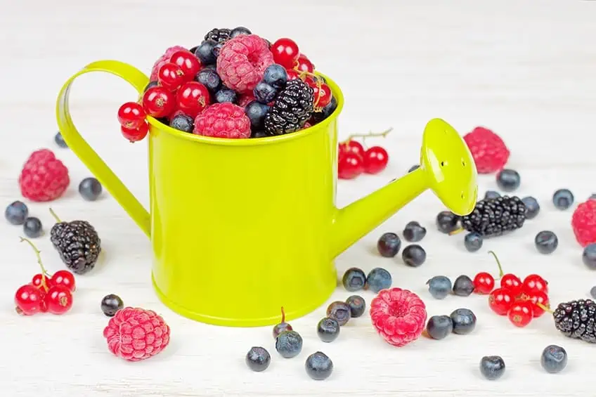
Describing the chartreuse color in simplified terms can be pretty tricky, but if we had to ask you to look around when you next walk up a hill or a mountain, there are so many different plant species that contain the chartreuse color in them. Food such as green apples, pistachio nuts, limes, avocado, and pears also carry this chartreuse color. Even though you may not use the words chartreuse color when describing the color of pistachio nuts, for example, you have held it in your hands, and using these foods as an example of precisely what the chartreuse color is, will then become so easy.
| Shade | Chartreuse Hex Code | CMYK Color Code (%) | RGB Color Code | Color |
| Chartreuse | #7FFF00 | 50, 0, 100, 0 | 127, 255, 0 |
The Meaning of the Chartreuse Color
The chartreuse color palette is associated directly with the blossoming of spring and therefore, the feeling of being alive and enthusiastic. Although it is widely known that green is a calming color, chartreuse green color is not associated with serenity or calmness. Still, it is a vibrant color where individual creative thoughts are encouraged.
People attracted to the chartreuse color are usually optimistic about life and attract people from all walks of life. Sometimes, however, on the other hand, the person attracted to the chartreuse color can appear to struggle to find balance in their lives. Just like chartreuse green and chartreuse yellow colors, they are caught between the green’s calm and the yellow’s lively feel, which could also lead to different levels of anxiety.
How to Make the Chartreuse Color
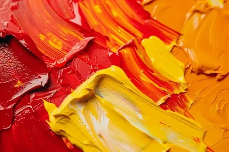
If you are wondering how to make the chartreuse color, it is quite simple. In the chartreuse color, yellow would be the primary color, with green being considered the secondary color. To make your chartreuse color using acrylic paints, take the green color as your base color and mix a bit of yellow to it; you will now have a color called green-yellow, and by adding a little white to the mix, you will get to the shade of chartreuse that you will want to achieve.
The chartreuse color is achieved when yellow and green are mixed, and the final color of chartreuse green is found. Adding more green will give a green hue and adding more yellow will naturally give a more yellow tint.
The History of the Chartreuse Color
The first clue of what we know as the chartreuse color today stems back to the 17th century when it got its name from a French liqueur. The color is precisely between the yellow and green on the color wheel, and the color resembles enthusiasm and joy; however, it has a very nasty and somewhat sad past.
Although chartreuse liqueur goes back many centuries, the recipe for this particular liqueur is still a highly regarded secret. It is only made under the direct supervision of the Carthusian monks in France. It contains a secret blend of up to 130 different herbs. In 1605, only two monks knew the recipe and the secret ingredients used to make the liqueur. The ingredients were first mixed and used as medicine. The taste was described as an “elixir of long life,” and it was only consumed as a beverage in later years.
After the liqueur was introduced to the public in the mid-1700s, chartreuse color followed on its heels soon afterward. It was introduced to the fashion industry, and the fabrics were run off the production line. Factories started producing toys, paint, and wallpaper very quickly after that.
Chartreuse dye was made with arsenic, and at that time of the century, arsenic was not known to be the killer it is today. As a result, those working with the dye died horrific deaths. The paint was eventually recalled, and the chartreuse color’s death was swift. Superstitions around the actual chartreuse color still exist in the fabric industry today.
The Chartreuse Color in Historical Paintings
Shades of chartreuse have been identified in many paintings throughout art history. These include works by Vincent van Gogh and Thomas Wilmer Dewing.
Café Terrace at Night (1888) by Vincent van Gogh
| Artist | Vincent van Gogh (1853 – 1890) |
| Date Completed | 1888 |
| Medium | Oil on canvas |
| Location | Kröller-Müller Museum, Otterlo, Netherlands |
Although chartreuse colors are not explicitly mentioned, it is believed that chartreuse colors influenced the painting called the Café Terrace at Night. It is an oil painting by the famous painter Vincent van Gogh, who is of Dutch descent and was painted in 1888. The picture was also not signed by van Gogh in his usual style, but the three initials appear on this beautiful painting, depicting the color of chartreuse green or yellow in all their glory. The image can be seen in the Netherlands at the Kröller-Müller Museum.
The Starry Night (1889) by Vincent van Gogh
| Artist | Vincent van Gogh (1853 – 1890) |
| Date Completed | 1890 |
| Medium | Oil on canvas |
| Location | Museum of Modern Art, New York, United States |
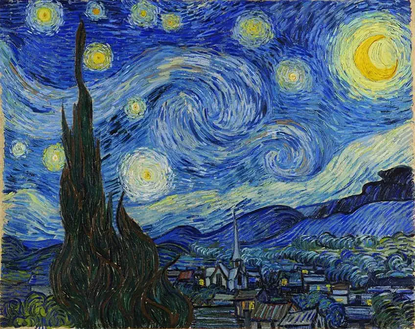
The Starry Night (1889) by Vincent van Gogh; Vincent van Gogh, Public domain, via Wikimedia Commons
Vincent van Gogh was a Dutch painter born in the Netherlands and was considered to be the greatest after Rembrandt van Rijn and one of the greatest of the Post Impressionists. In the painting, we see the view from the east-facing window of the asylum at Saint-Rémy-de-Provence, just before sunrise.
Summer (1890) by Thomas Wilmer Dewing
| Artist | Thomas Wilmer Dewing (1851 – 1938) |
| Date Completed | 1890 |
| Medium | Illustration |
| Location | Smithsonian American Art Museum, Washington D.C., United States |
An American painter named Thomas Wilmer Dewing was schooled in Paris and died in 1938. His work comprised mostly figure paintings of aristocratic women in different poses. While there is no known record of the other colors that Dewing enjoyed, the artwork, Summer, was completed in 1890 carried the green-yellow tones of the chartreuse color palette.
Is the Chartreuse Color Still Used Today?
In the early 2000s, chartreuse color became popular, but it was also rumored that the chartreuse color had reached its popularity peak. Amongst the different tech companies, it was popular and was used extensively as a vibrant color for office interior design. It is a color that is associated with creative thinking and individual personalities. In the 1980s and 2020, the chartreuse color palette was a noticeable color in fashion runways, where it made a brief re-appearance. At that time, the general population thought only women with bold personalities would wear the color.
The green hue in the chartreuse color is believed to be directly linked to terrible luck, and it is widely thought that anybody who works with fabrics carrying the chartreuse colors will fall on hard times. The famous Chanel brand is particularly cautious when working with this color fabric as most seamstresses still believe in this superstition.
When we talk about the chartreuse color in modern language, it is a color that grabs the eye, and it is thought by many that it should have been named Pantone’s Color for the year 2020 because of its striking hue, but sadly it was not. It lost out to the color of blue in that particular year.
The Various Shades of Chartreuse
Chartreuse green carries various hues of green, depending on the chartreuse shade you prefer. Below, we have listed various shades of chartreuse along with various chartreuse color codes and chartreuse hex codes for each. Let’s discover some of the different shades available today in the chartreuse color palette.
Chartreuse Green
Chartreuse green is a color exactly halfway between the yellow and green color on the color wheel; chartreuse green is made up of mixing 50% green and 50% yellow. The Oxford English Dictionary describes the word chartreuse as a pale apple-green color. In 1885, the chartreuse color was described as pale green with a yellow tint. The new shades of chartreuse color vary between light and dark, and in the fashion industry in 1898, the chartreuse color was described as moss green. In 1988, the chartreuse color was voted the hottest color of the year and was described as an ugly green.
| Shade | Hex Code | CMYK Color Code (%) | RGB Color Code | Color |
| Chartreuse | #7FFF00 | 50, 0, 100, 0 | 127, 255, 0 |

Bright Green
The bright green color is almost one-third of the way between green and harlequin on the color wheel. The bright green color is used in the Viridian Design Movement, a concept named after bright green environmentalism. This particular shade of green is not considered to be a natural color.
| Shade | Hex Code | CMYK Color Code (%) | RGB Color Code | Color |
| Bright Green | #66FF00 | 60, 0, 100, 0 | 102, 255, 0 |
Green Yellow
The green-yellow is a tint of light green and yellow. Green yellow is an official name of a Crayola crayon color, named in 1958. The green-yellow color is popular in that it catches the eye. If you look at emergency workers’ uniforms, this color is easily noticeable as an emergency color.
| Shade | Hex Code | CMYK Color Code (%) | RGB Color Code | Color |
| Green Yellow | #ADFF2F | 32, 0, 82, 0 | 173, 255, 47 |

Lime Green
Certain citrus fruits are referred to as being a lime green color. The very first time that lime green was recorded and noted as a formal color was in the late 1800s. The Samara fruits carry the color of lime green.
| Shade | Hex Code | CMYK Color Code (%) | RGB Color Code | Color |
| Lime | #00FF00 | 100, 0, 100, 0 | 0, 255, 0 |
Reseda Green
Reseda green or reseda Chartreuse color is found under the chartreuse color umbrella. It derives its name from the green color of leaves, which will include every different color of leaf found on both trees and bushes, ranging from darker greens to lighter, almost translucent greens.
| Shade | Hex Code | CMYK Color Code (%) | RGB Color Code | Color |
| Reseda Green | #697D58 | 16, 0, 30, 51 | 105, 125, 88 |
Rifle Green
The first recording of the official rifle’s green color was in the mid-1800s. It was named because of the distinct color the riflemen wore in different regiments. Several European countries use the rifle green name to distinguish the foreign armies within the commonwealth. This rifle green color is popular in men’s pants and is seen as a color of choice for men to wear as casual outfits.
| Shade | Hex Code | CMYK Color Code (%) | RGB Color Code | Color |
| Rifle Green | #414833 | 10, 0, 29, 72 | 65, 72, 51 |
Yellow Green
A bottle of Chartreuse Liqueur is a chartreuse yellow color. The yellow-green color is a medium shade of chartreuse color and is often regarded as a dull color. Before the chartreuse name was labeled as a color, the color was only referred to as yellow-green, and it was only in 1987 that the chartreuse name was designated as an actual color in web design.
| Shade | Hex Code | CMYK Color Code (%) | RGB Color Code | Color |
| Yellow Green | #9ACD32 | 25, 0, 76, 20 | 154, 205, 50 |

What Colors Go With Chartreuse?
You may see the chartreuse color and feel intimidated by its bright and bold hue. Interestingly, the chartreuse color pairs well with many colors, making for a fun and interesting color palette. Let’s explore some of the best combinations to use with this exciting green shade.
Chartreuse, Navy, and Mint
The vivid green chartreuse shade works beautifully when used sparingly in a dark navy blue space. Adding small accents of mint and even cerebellum gray and teal can turn a boring room into an exciting space.
| Shade | Hex Code | CMYK Color Code (%) | RGB Color Code | Color |
| Chartreuse | #7FFF00 | 50, 0, 100, 0 | 127, 255, 0 | |
| Navy | #000080 | 100, 100, 0, 50 | 0, 0, 128 | |
| Mint Green | #3EB489 | 32,0,33,0 | 162,228,184 | |
| Cerebellum Gray | #C8C7C9 | 0, 1, 0, 21 | 200, 199, 201 | |
| Teal | #008080 | 100,0,42,25 | 0,124,128 |
Chartreuse and Purple
We know what you are thinking – how could these colors possibly work well together? Well, because purple and yellow are on opposing sides of the color wheel, chartreuse and purple can be used as a beautiful contrasting combination. Add some rough pink for even more contrast.
| Shade | Hex Code | CMYK Color Code (%) | RGB Color Code | Color |
| Chartreuse | #7FFF00 | 50, 0, 100, 0 | 127, 255, 0 | |
| Purple | #800080 | 0, 1, 0, 0.5 | 128, 0, 128 | |
| Rouge Pink | #A94064 | 0, 62, 41, 34 | 169, 64, 100 |
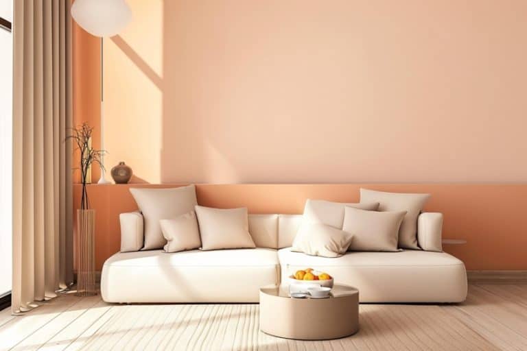
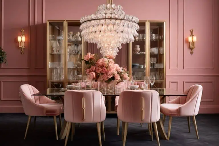
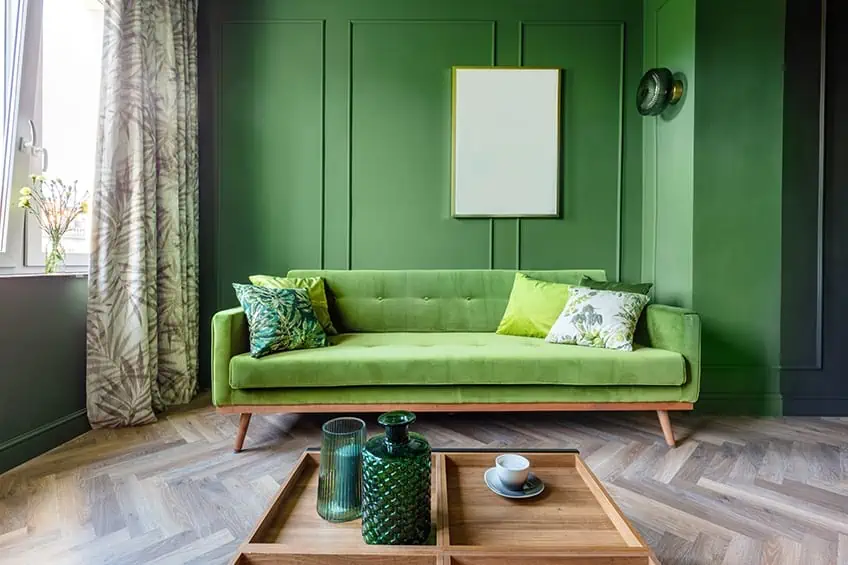
Using the Chartreuse Color in Interior Design
As chartreuse is not a color that trends in the marketplace quickly, it is not a go-to color. However, incorporating small amounts into the home’s interior will work wonderfully. In interior design specifically, designers will not use chartreuse color as the main feature, but it has become trendy to add pops of color to white rooms or bland rooms.
Decorating a dining room using the chartreuse color palette and pairing it up with bright white will bring elegance to a space, creating a feeling of richness, especially in different textures such as heavy velvet curtains or chairs.
In the mid-1930s, the chartreuse color was trendy in furniture pieces such as sofas and stand-alone chairs for the living room. A great furniture designer named Eero Saarinen became very popular during that time because he created the Womb Chair made in chartreuse colors, and the color was then dubbed “acid green”.
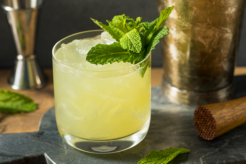
The word chartreuse is phonetically spelled out as” sh-ah-r-t-r-ew-s-sh-ah-r-r-ew-s”. That is certainly a mouthful, and while we can appreciate that it does not roll easily off the tongue, the name and the color remain fascinating today. It is a color not easily seen in the street, but oh boy, walking into a pub or restaurant, it is quite noticeable all around in the colors of different liqueurs. Wouldn’t it just become a great talking point when you next met up with friends for a drink, and you were able to tell them about this truly unique color? We hope that with all this newfound knowledge about the chartreuse color palette, that is what you do!
Frequently Asked Questions
What Colors Go With Chartreuse?
Because the chartreuse color can vary between yellow-green to green-yellow, it will pair up beautifully with white and black. The white and black will ensure that the chartreuse color palette pops in any room of the house or with any outfit. Muted gray colors will also pair up well with the chartreuse color and various shades of tan colors.
What Color Is Chartreuse?
So, the question again arises, is chartreuse green or yellow? The answer to this is it is both green and yellow, and the color best suited to you is the color you can use to incorporate into your home. The green and yellow hues give warmth to any home space when used minimally. The chartreuse color is made up of equal parts yellow and green. If you want a chartreuse green color, you will add green to the mix, and if you wish a chartreuse yellow color, you will add more yellow to the mix, or even add a dash of white.
Is Chartreuse Green or Yellow?
The chartreuse hex code is #DFFF00. It is a vivid green color combined with a warm yellow color. The web color is found precisely halfway between the yellow and green color, meaning it has a 50% ratio of green and 50% yellow. Chartreuse is a tertiary color in the color wheel. It can be considered as either yellow or green. If the chartreuse color is paired up with another color, you may see different hues of the chartreuse color – it may appear greener or more yellow, but this depends entirely on the color that you pair it up with.

Duncan graduated with a diploma in Film and TV production from CityVarsity in 2018, after which he continued pursuing film while taking on a keen interest in writing along the way. Since having graduated, he began working as a freelance videographer, filming a variety of music videos, fashion and short films, adverts, weddings and more. Throughout this, he’s won a number of awards from various film festivals that are both locally and internationally recognized. However, Duncan still enjoys writing articles in between his filming ventures, appreciating the peace and clarity that comes with it.
His articles focus primarily around helping up-and-coming artists explore the basics of certain colors, how these colors can be paired with other shades, as well as what colors are created when you mix one with another. All while relating these shades to historically significant paintings that have incorporated them into their color palette. As a lover of the arts himself, he takes great interest in the Renaissance era of paintings, an era that has directly inspired many of his favorite films.
Learn more about Duncan van der Merwe and about us.