Secondary Colors – What Are Secondary Colors and How to Use Them?
This post may contain affiliate links. We may earn a small commission from purchases made through them, at no additional cost to you.
Colors are remarkable and interesting, and everybody sees color in different ways. We were all taught about primary and secondary colors in school, so most of us should have a fair idea of the subject. An artist, when selecting a certain color or shade for their work, needs to consider if the color matches the tone they have set for their painting. Colors can also stir up our emotions, or even activate certain responses, or convey a message. This is why you should consider and understand what secondary colors are.
What Are Secondary Colors?
Design, as well as art, requires an understanding of what makes up secondary colors. Artists will deal with pigments using the subtractive color model, where you have a set of primary colors from which you can create the secondary colors. When it comes to computer graphics and light, you work with the additive color model. This is because colors get darker when mixing color pigments, while mixing light, the colors get lighter. Let us now consider these terms in more detail below.
What Are Primary Colors?
For the artist working with paint pigments, the primary colors are red, yellow, and blue (RYB), while for the designer working with the light spectrum, the primary colors are red, green, and blue (RGB), and all other colors are derived from these primary colors. They are the building blocks for any other color you can think of. A painting artist uses the RYB palette because it illustrates better the association or link that the physical colors have with each other in the paint mixing process. The designer, on the other hand working with the digital medium, makes use of the RGB model as those colors are picked up by the photoreceptors of your eyes.
Just like the artist can mix any color or shade by adding other colors to the primary colors red, yellow, and blue, so can the computer create different shades of red, green, and blue.
Secondary Colors Definition
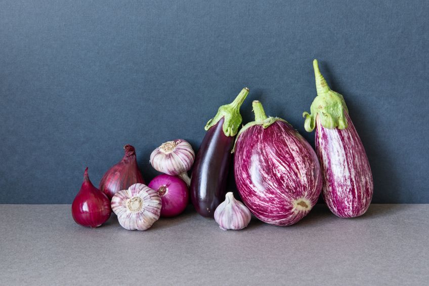
Unlike primary colors that cannot be created as they are pure colors, secondary colors need to be created. So, how do you create secondary colors? For the artist working with paint pigments, the secondary colors are green, purple, and orange, while for the designer working with the light spectrum, magenta, yellow and cyan are the secondary color, and all other colors are derived from them.
Creating Secondary Colors From Paint Pigments
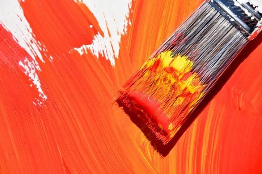
The basis of creating secondary colors for the artist using paint pigments is to start with the three primary colors red, yellow, and blue first. For example, you take two of the primary colors like blue and yellow then combine them to create the color green. To create purple, you blend red and blue, or to create orange, you blend red and yellow. These colors including green, purple, and orange are all secondary colors. When mixing primary colors it is important to take an equal amount of both colors, creating a pure hue that you can then alter. You can do this by making it lighter or darker and adding black, gray, or white.
The three primary colors red, blue, and yellow create the secondary colors of green, purple, and orange through the blending of these color pigments.
Creating Secondary Colors From Light
From the information above, we have seen that you can create secondary colors using pigments. However, visible light is another means whereby you can create secondary colors. This can be seen from the display on your cell phone or your television screen. In this case, the three primary colors you use are green, blue, and red (RGB).
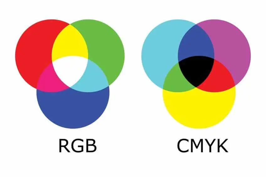
When you combine green and red you create yellow, or mixing blue and red you create magenta, and combining green and blue you create cyan. All of these colors are secondary colors created by using the effects of visible light and not pigments.
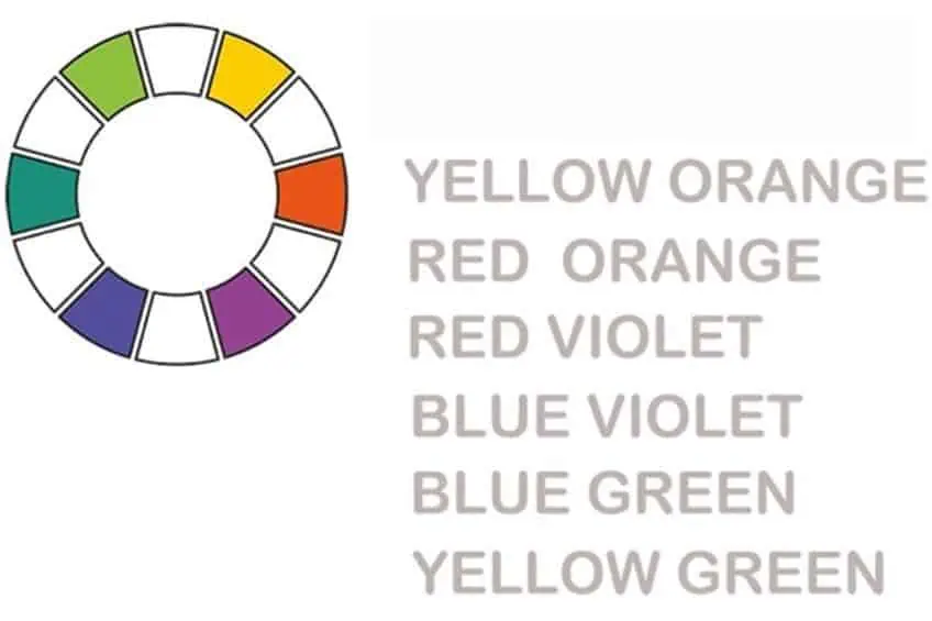
What About Tertiary Colors?
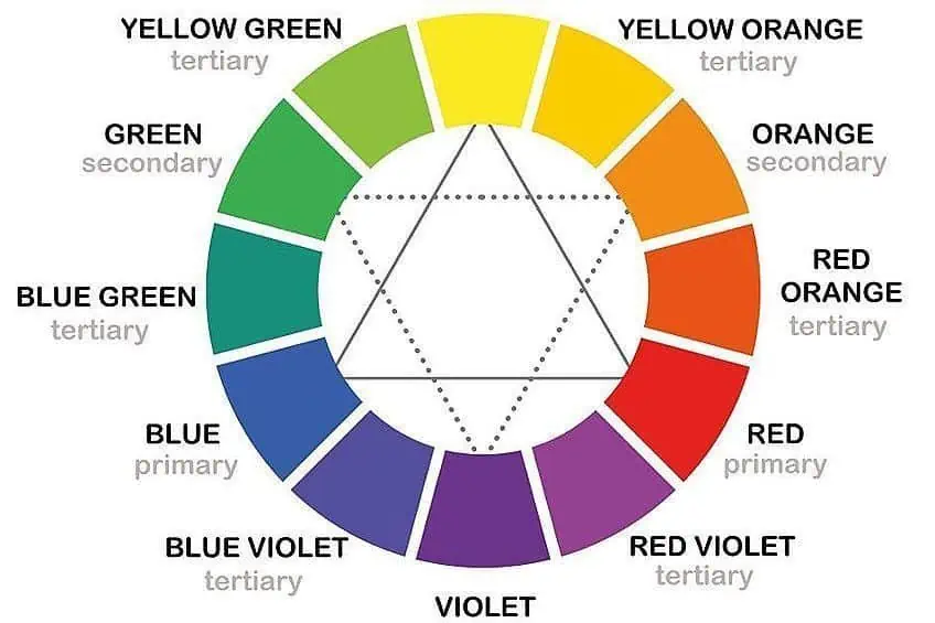
We have already dealt with the secondary colors definition, but we also need to make mention of tertiary or intermediate colors, which are a combination of primary as well as secondary colors. Some of these combinations can include blue and violet, green and yellow, red and orange, blue and green, and yellow and orange. When observing the color wheel, tertiary colors can be found in the middle of the primary and secondary colors.
However, many would see these only as intermediate colors, while tertiary colors are more a combination of two secondary colors.
Secondary Color Names
We have seen from the information above that the three secondary pure colors are orange, green, and purple when dealing with paint pigments, but there are hundreds of different shades and tones of these colors that you can mix yourself. For example, take the pure secondary color of green and add some white paint to create a lighter shade of green.
Adding some black paint will give you a darker shade of green. You can continue doing this with other colors as well, so the shades and tones you can create become endless. We have drawn up some secondary colors and their names below. These show the many different tones and shades of the secondary colors with their Hex codes and information for graphics and printing purposes.
Peach
The color of peach is a very unique mixture of white, orange, and yellow, and the name is derived from the fruit of the same name. The warm orange and bright yellow are softened by the neutral white color, and since the color comes from nature, it has a comforting effect and produces a sense of joy. Peach is a lighter shade and is not as intense as the color orange. You can use peach as a background color as it pairs well with most blues, and can also work well with gold and mint green to give you a sophisticated feminine palette.
If you want to create a different hue, then the following colors interact well with peach; yellow, orange, and white.
| Shade | Hex Code | CMYK Color Code | RGB Color Code | Color |
| Peach | #ffe5b4 | 0, 10, 29, 0 | 255, 229, 180 |
Burnt Orange
This color was officially named burnt orange in 1915 and is viewed differently because many people or organizations define the color differently. For example, Auburn University has included a touch of blue to the color burnt orange, and the University of Texas leaves out the blue altogether. The color burnt orange can be described as a medium-dark orange that brings to mind images of flames.
Many people regard the color burnt orange as a symbol of negative emotions like pride, aggression, or selfishness, while others depict it as an autumn color that depicts feelings of comfort and warmth. Burnt orange combines well with grays as well as dark blues to provide emphasis, and also with peach and mint green for a lively palette. If you want to create a different hue, then the following colors interact well with burnt orange; orange, and red-orange.
| Shade | Hex Code | CMYK Color Code | RGB Color Code | Color |
| Burnt Orange | #cc5500 | 0, 58, 100, 20 | 204, 85, 0 |
Tangerine
Tangerine is a bold, saturated orange hue that appropriately describes the outer appearance of the tangerine fruit from which its name is derived. It is interesting to note that iMac G3 Macintosh personal computers were all named after certain types of fruit and the tangerine was one of them.
Similar to all of the orange hues, tangerine is related to feelings of happiness, youth, and energy. The tangerine color combines well with other colors that depict sunsets, like blues, yellows, and purples, providing a lively and cheerful palette.
Tangerine makes a beautiful emphasis when it is combined with creams and grays, giving you an elegant and conservative look. If you want to create a different hue, then the following color interacts well with tangerine; orange and red-orange.
| Shade | Hex Code | CMYK Color Code | RGB Color Code | Color |
| Tangerine | #f28500 | 0, 45, 100, 5 | 242, 133, 0 |
Mauve
Mauve is regarded as a bluish, pale purple that is found between pink and violet on the color wheel. The name “Malva” is taken from French, which represents the mallow flower. In 1856 it was accidentally discovered by William Perkin, who was an English chemist. This was the very first dye that was mass-produced. This unusual purple shade revolutionized the fashion world and became very popular in the 1890s.
The color mauve arouses feelings of nostalgia, sentimentality, and romance. Mauve stabilizes its complementary color of yellow and combines well with other shades of purple. If you want to create a different hue, then the following color interacts well with mauve; blue, pink, violet, and purple.
| Shade | Hex Code | CMYK Color Code | RGB Color Code | Color |
| Mauve | #b784a7 | 0, 28, 9, 28 | 183, 132, 167 |
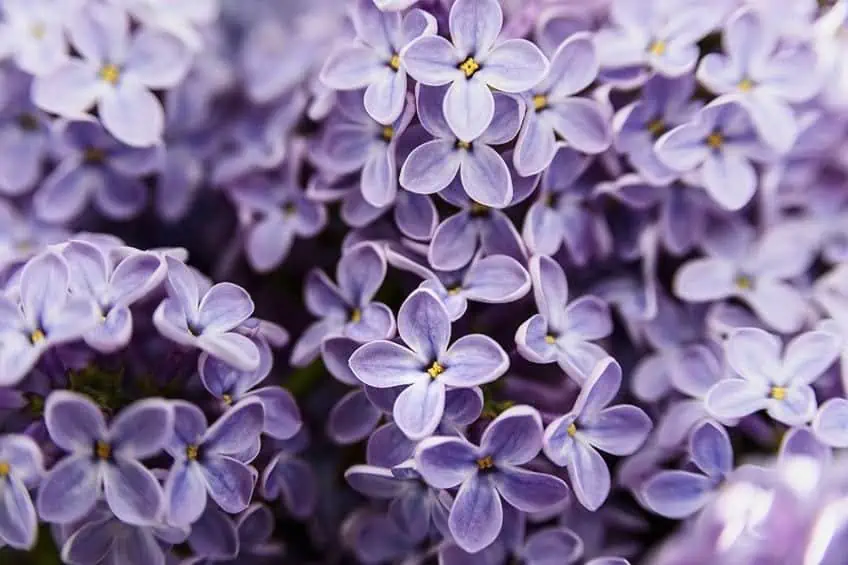
Lilac
Lilac was first named in 1775 and the name is derived from the lilac flowers, which are often associated with mourning. Britain in the 1800s allowed women to wear lilac at the end of their mourning period when they no longer needed to wear black. The purple dye was very expensive before 1856 and was, therefore, a shade associated with power and wealth, and worn mainly by royalty like the queen of England, Julius Caesar, and the Russian empress Catherine the Great. Lilac is a pale and soft shade of purple and is made by mixing blue and red.
If you add a little white paint, you lighten the shade and create a lilac pastel hue. Lilac is considered a warm color as more red than blue is added to it, and the lilac-pink tints put it at the warm end of the color wheel.
Lilac is considered a graceful and feminine color, and due to its connection with the flower. The color is associated with affection and romance, and the pastel shades of lilac invoke youth, nostalgia, and innocence. On the psychological side, lilac is considered to be a color that is soothing and encourages emotional expression. To create a bright palette the following color combines well with lilac, gray, yellow, olive green, white, rose quartz, and orange. However, the color can also mix well with soft pinks and purples.
| Shade | Hex Code | CMYK Color Code | RGB Color Code | Color |
| Lilac | #b666d2 | 13, 51, 0, 18 | 182, 102, 210 |
Indigo
Indigo can be located between violet and blue on the color wheel and is traditionally regarded as one of the seven spectral colors. The natural pigment of indigo is derived from plants. Indigo is considered a color of justice, devotion, higher knowledge, and wisdom, and is also considered a spiritual color.
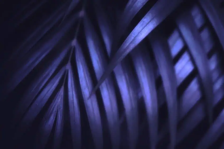
To be able to find combinations for indigo, we should look to nature and wisely pick a color palette. Indigo combines well with most greens, reds, and yellows, and its deep hue combines well with yellows and oranges for highlighting colors. If you want to create a different hue, then the following colors interact well with indigo; violet and blue.
| Shade | Hex Code | CMYK Color Code | RGB Color Code | Color |
| Indigo | #4b0082 | 42, 100, 0, 49 | 75, 0, 130 |
Teal
Teal is a fairly deep blue-green color, and its name is derived from the colored area that is around the eye of the teal bird. Teal blends the calming properties of the color blue and the renewal qualities of the color green.
It is a rejuvenating and revitalizing color and depicts clarity of thought and open communications. For the Tibetan monks, teal symbolizes the infinity of the sky and the sea, while for the Egyptians, it is the color of faith and truth.
Teal goes well with coral and bright white and also works well with browns, pinks, navy, and cream. Teal can set off some metallic colors like gold and silver. If you want to create a different hue, then the following colors interact well with teal; blue-green, blue, and green.
| Shade | Hex Code | CMYK Color Code | RGB Color Code | Color |
| Teal | #008080 | 100, 0, 0, 50 | 0, 128, 128 |
Lime Green
Lime green is a lovely bright green color and is derived from the lime fruit. Lime green has a close association with nature and promotes high energy and confidence, and also conveys feelings of freshness, liveliness, and creativity.
Lime green is found right between yellow and yellow-green on the color wheel, and mixed with these two hues makes it a distinctive yellow-toned green color. The color works well with both cool and warm tones like blues and yellows, which makes it a great addition to anyone’s color palette. If you want to create a different hue, then the following colors interact well with lime green; neon green, seafoam green, green, and Kelly green.
| Shade | Hex Code | CMYK Color Code | RGB Color Code | Color |
| Lime Green | #32cd32 | 76, 0, 76, 20 | 50, 205, 50 |
Turquoise
The meaning of turquoise is connected to open communication and clarity of thought; it helps to open the communication lines between the spoken word and the heart and is regarded as a friendly and happy color. Psychologically it heals the emotions and creates stability and emotional balance. Turquoise is a combination of pale blue and green or blue with a small amount of yellow and is located between the blue and green on the color wheel.
The blue color provides calm, tranquility, and peace, and the yellow gives you the uplifting energy and also combines well with grays, deep oranges, and yellows.
The name turquoise is derived from the gemstone found in nature, which makes it easy to match other colors on your palette and pair it with neutral shades of wood tones and darker shades of blue. Turquoise can also be combined with one or more complementary colors like tangerine and coral. If you want to create a different hue, then the following colors interact well with turquoise; blue, yellow, and green.
| Shade | Hex Code | CMYK Color Code | RGB Color Code | Color |
| Turquoise | #30d5c8 | 77, 0, 6, 16 | 48, 213, 200 |
Mixing Paint Using Secondary Colors
By now you will understand that by mixing equal parts of two of the primary colors, which are red, yellow, and blue, then you will have created your three secondary colors which are green, purple, and orange. However, if you do not mix equal portions of your primary colors, using more red you will have created a red-orange, or by using more yellow, you will have created a yellow-orange. You can then even use your secondary colors to produce tertiary colors too.
If by chance, you mix all of the primary colors, then you will end up having a shade of brown paint. To understand mixing paint, you need to understand the pigments contained in the paint. The primary colors of red, blue, or yellow all have only one pigment as they are unmixed and cannot be created by mixing other colors. However, there are many red, blue, yellow, and other color paints today that have more than one pigment as paints are made with chemical and organic pigments.
Artists like to start from scratch when blending colors, meaning they prefer to start with mixing the primary colors and moving on to create colors from there, instead of purchasing a specific color paint product that is already blended.
Types of Secondary Color Paint
There are many options when it comes to choosing primary colors, and this will automatically affect the hue of the secondary color. Take, for example, a purple color that was created by using medium cadmium red and a cerulean blue. This will give you a color purple that is completely different from the purple created by mixing cadmium red with cobalt blue.
These differences may appear to be negligible, but you must be made aware of them. One tip when you mix your paints is to keep a record of the colors and ratios you used in your mix, which will be of great help to you later when you need to reproduce that same color.
Secondary Colors and Temperature
On the color wheel, you will notice that all the colors are arranged with the warm colors on the left side, based on the color red, and the cool colors on the right side, based on the color blue. This may be true, however, the classification becomes more subtle where you find warm colors are considered cool and cool colors considered warm, which is dependent on the relationship with its neighboring color. This means that colors that have the same hue can be regarded as cool or warm, depending on what color they appear next to. So, before you create any particular color, take some time to consider what it is you want to do. Cool colors can have a calming effect, while warm colors can have a happy and energizing effect.
The object you are painting will appear closer to you if you use warm colors, and further away if you use cool colors.
We all know that the color red is a warm color, but you can alter the temperature by adding a cooler or warmer hue. If you are looking for a fiery and hot red color, you need to mix it with some orange, which means you are mixing a warm color with another warm color. You can use this when painting a beautiful sunset or fire with its glowing embers. On the other hand, if you need a cooler red color, you can mix it with some blue which leans more to the purple side, as blue is a cool color that can be used when painting the red hue on an autumn leaf. This fact proves the importance of color and its relation to temperature and the effects it has.
A Few Painting Tips When Using Secondary Colors
When using secondary colors in a painting, it is not necessary to go out and buy the secondary colors you need, all you have to do is mix your own. It is possible to mix a wide variety of secondary colors by taking three cool primary colors and mixing them with three warm primary colors. However, while busy with your painting project, mixing your secondary colors may prove to be too much work and take up too much of your time, making it a lot easier to buy the secondary colors you need.
When mixing your secondary colors, we also suggest that you have a minimum of one pure orange, one pure green, and one pure purple on your mixing palette. Of these colors mentioned above, it is best to have three that lean towards the cool side and three leaning towards the warm side. Remember, that when mixing your colors, it is recommended that you stick with pure pigment paint colors to avoid any surprises in the outcome of colors.
When thinking about your next project, let your imagination run free and try playing around with several different color combinations to come up with a color scheme that fits in perfectly with your project. Using secondary colors can open a door, revealing many interesting color combinations.
View our What Are The Secondary Colors web story here.
Frequently Asked Questions
What Are Secondary Colors?
By combining an equal amount of any two of the three pure primary paint colors, you form a secondary color, which includes orange, green, and purple. When you look at the color wheel you will notice that the secondary colors are found between the primary colors of red, blue, and yellow. Traditionally on the color wheel yellow together with red create orange, blue combined with red creates purple, and yellow and blue make green. However, for the visible light colors, magenta, cyan, and yellow, are known as the secondary colors.
Is Green a Warm or a Cool Color?
The color green is a secondary color and is situated on the color wheel with colors like blue and purple. There are various shades of these colors, all of which are considered cool.
What Are Warm Colors?
Warm colors are associated with the sun, fire, and warmth and produce feelings of comfort and warmth and you can easily notice them because of their lively colors. Warm colors are yellow, red, and orange, and are colors you use in the forefront of your painting to give the perception of largeness.
What Are Cool Colors?
Cool colors are associated with water and grass and they produce feelings of calm, indifference, and sadness and are normally used for things like water and grass. Cool colors like green, blue and purple can be used in your paintings to show depth, like distant mountains but can also give the perception of smallness.

Megan is a writer and researcher who graduated from the University of Cape Town with a degree in Social Sciences, specializing in Psychology and Environmental Science. Her passion for knowledge and leaving a positive impact has fueled her current work in conscious and sustainable growth in Southern Africa. Megan’s love of nature has also led her to train as an animal behaviorist. She works part-time training and rehabilitating dogs. Megan is interested in the physical and psychological effects of colors in our environment on our mood and well-being. In addition, she is concerned with how art and creativity have been an integral part of human society. Megan van Schoor has been writing blog posts on the topics of painting, drawing, and color theory for acrylgiessen since 2021.
Learn more about Megan van Schoor and about us.