What Colors Make Red? – How to Make Different Shades of Red
This post may contain affiliate links. We may earn a small commission from purchases made through them, at no additional cost to you.
Red is one of the more popular colors used by artists, thanks to it being a bold, bright, and vibrant color. As red is a primary color in theory this means you shouldn’t be able to mix red, but there are certain techniques you can use to form several different red hues. This guide will assist you in mixing red shades and how and where to use them in your projects and creations.
Table of Contents
What Does Red Mean?
Colors bring out emotions in humans even if we are not consciously aware of the colors can impact our moods in several ways. As artists, it is important to be aware of the emotions colors create and the emotions associated with each color to be able to use them in their work accordingly. Depending on the hue and our culture impacts the feelings and ideas that are associated with red. Red is linked to many emotions from love and passion to heat and fire let us look into the different feelings that the color red can evoke.
Strength and Dominance
Red is used for stop signs and traffic lights for a reason as bright colors carry with them a certain level of authority; you can use this to your advantage to convey strength in your artwork. Red can be linked to dominant and strong feelings and anger which is why there is the expression, ‘red hot anger. Another well-known phrase is ‘seeing red’ when someone is angry. To make a bull angry you taunt them with red handkerchiefs.
Heat and Warmth
Red makes you think of fire, heat, and warmth, and as per the color, theory red is the warmest color you can find. Your red hue is associated more with warmth and fire if the shade leans closer to orange. Through using these shades of red you can add passion, movement, and heat to your art piece.
Love and Passion
Love and passion tend to be the most common associations with the color red this is due to red being linked with warmth and fire translating directly to the heat of passion. Valentines’ day’s main color that it is associated with is a hot and warm red. Valentine’s day sees dozens of red roses, heart pumping blood and red décor make red an essential element of the special day which translates to us automatically think about love when we see red.
What Colors Make Red?
Red is one of the basic colors, according to the color theory foundation. We need to understand color theory a little better before continuing, it is necessary to mix different red hues that you understand the temperatures of the color wheel.
Understanding Color Theory
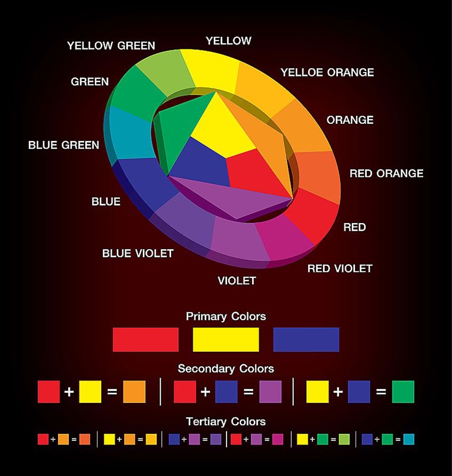
Most of us learn as children at school about the basics of color theory, but let’s go over it again. We need to know about the colors linked to each other before we can mix any color. The color wheel represents the primary, secondary, and tertiary shades. You can find simpler color wheels which only reflect the primary colors, but we have selected one which also shows the family of colors.
All the colors on the spectrum of visible light are reflected on the color wheel. There are 12 colors in the tertiary color wheel. You will note that the three primary color shades used in a variety of combinations create the three secondary shades.
When mixing colors, you should consider that should you combine all three primary shades you will in all likelihood create a shade of brown. Therefore, when mixing tertiary hues, you should stick to combining one primary hue within the secondary hue instead of the one you did not use. This rule will allow your mixed colors to stay bright and crisp.
On the color wheel, some colors sit directly opposite each other, for example, red and green, these colors are called complementary colors. If you use these two colors side by side will brighten each color and make them appear bolder.
There is one more important aspect to note about the color wheel, being that there is a large variety in the secondary and tertiary shades. Purples range from bright and pinkish hues to deep blueish purples; the variety is thanks to color bias. A color bias concerns which certain shades are underlain by which color, for example, the warmer and brighter purples veer towards red, and the cooler and deeper purples have more blues in the mix.
You need to have an understanding of the color bias to be able to mix different shades of red, we will look a bit deeper into the color bias.
How the Color Bias Affects Red Shades
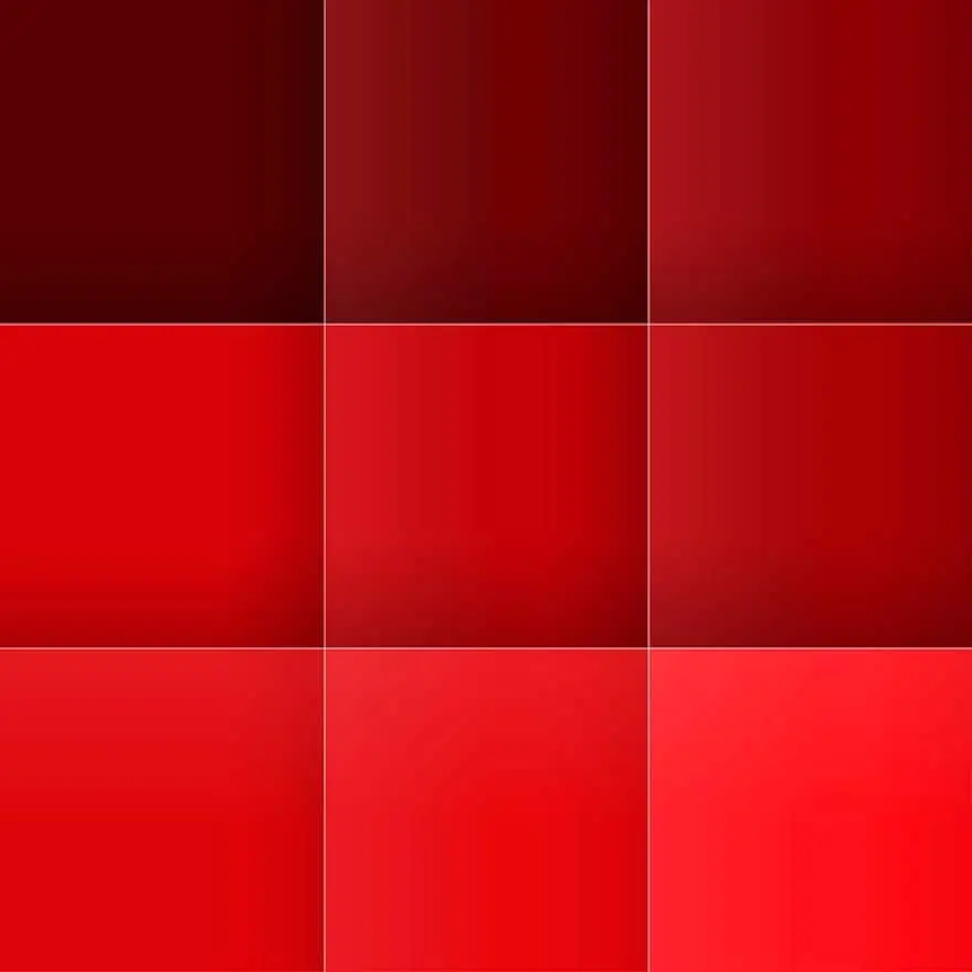
The color bias is evident in all secondary and tertiary hues, as well as primary shades. Color temperature is the largest element of color bias, meaning that color is either cool such as aquamarine blue, or very hot like bright red. In order to form different shades of red you can adjust the temperature of your red by simply adding cooler or warmer colors. A true, bright red is very warm, but you can achieve an even hotter red when it leans more towards oranges. To achieve a fiery and hot red hue you can combine a warm red with the likes of an equally warm yellow. The warmer red tones are associated with a burning sunset or the glowing embers of a fire.
On the other hand, you can get much cooler red hues that lean much closer to purple than orange, to achieve this cooler red you simply need to add a small amount of blue. To cool any shade down you can simply add blue as it is the coolest color. We think of cozy weather and autumn leaves when we look at cooler reds such as aubergine and maroon which are not as fiery and hot. When mixing shades of red, as you can see temperature is an important consideration. To achieve the ideal emotional reaction from your art piece you need to understand the impact of temperatures.
How to Create Different Shades of Red
Now that we have explained temperatures in terms of colors, we can move on the process required to mix different reds. We will assist you to create an assortment of reds, whether you want to mix a pale red, light red, or even a crimson red. To begin with, we will look at creating warm and cool shades of red.
Using Yellow to Make Reds Warmer
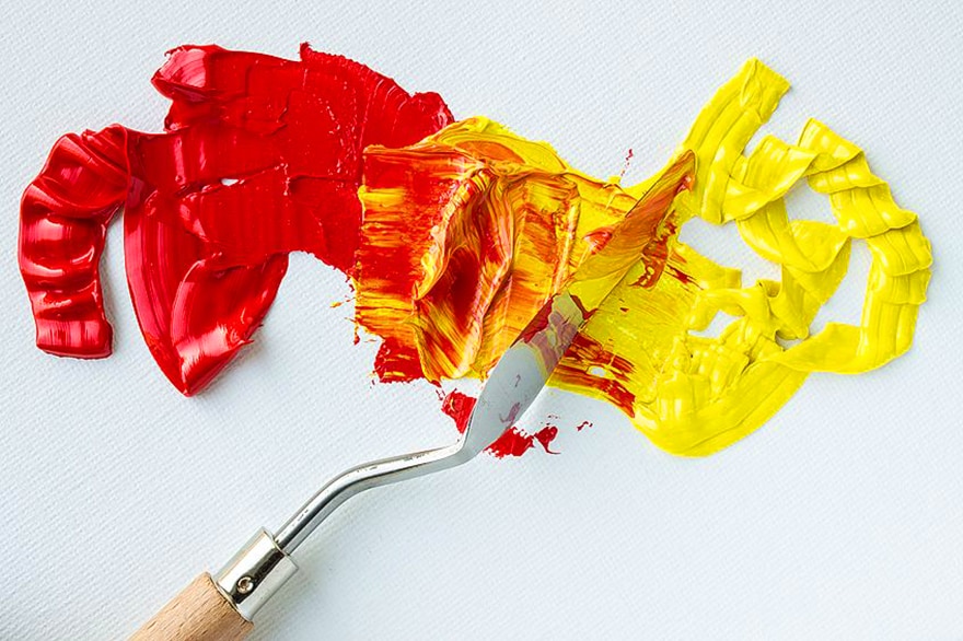
Now that we have some insight into color theory we are aware that by combining all three primary colors you will get a brownish and dull tertiary shade. Following on from this, when you add yellow to a red shade to attempt to make it warmer you need to ensure you are using a yellow that does not contain any blue. If you add a yellow which contains some blue (a yellow which leans towards green) your red will turn out to be muddy in color.
Cadmium Yellow
Cadmium yellow is a yellow with undertones of red that is a very warm shade, making it a great option to assist in creating a fiery, vibrant red. Take your paints, paintbrushes, and a piece of paper and you can experiment with each combination. Draw several squares on the paper and then with your pure cadmium red fill in the first square. Add a little yellow to your cadmium red and fill the squares one by one. You will note that cadmium yellow is relatively light-yellow despite being warm this means that adding it to cadmium red lightens the red hue whilst making it warm.
Yellow Ochre
Another option to the red achieved from cadmium yellow which is light and warm is to use some yellow ochre. Yellow ochre is a much darker yellow, while at the same time still being warm. You will achieve a stunningly warm and deep red hue when you combine cadmium red and yellow ochre.
Using Blue to Make Red Color
While we selected cadmium yellow due to it lacking blue, we here need to select a blue that lacks yellow. There are two possible options Ultramarine Blue and Cerulean Blue.
Ultramarine Blue
This blue contains a little red already making ultramarine quite a warm blue. We want to ensure that no yellow is added to our cool shade of red. Ultramarine will provide a stunning deep shade of a cool red thanks to it being a dark blue hue. As per the previous exercise, you can follow the same steps to make your red cooler by drawing squares on a piece of paper and get your brushes and paints. Be careful when adding your ultramarine blue, you will only need a small amount of the blue to cool down the red, if you add too much you will turn red to purple!
Cerulean Blue
A shade that is similar to cornflower blue, cerulean blue is a beautiful hue and it is a great option to add to red to create a cool and light shade of red. When combining your cerulean blue and cadmium red you need to do so carefully (just like when you were working with the ultramarine blue) test out adding different quantities to see what color you like best.
How to Make Muted Shades of Red?
Sometimes bright red, while being warm and lovely, can be slightly too bold for your project. you may require a palette of many red hues to add variety and depth to your work. Such as if you were to paint a rose you would require more than just one shade of red. You will require the initial red shade but then in addition you would need lighter hues of red for the highlights and muted hues to create the shadows. You can use a color complement to mute it.
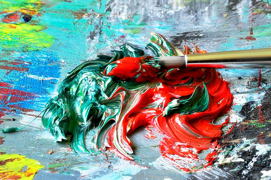
Red’s complement is green and while this may seem like a basic strategy you need to take into consideration that every unique hue of red has a complementary unique shade of green. Depending on how dark or light you are wanting your muted red to be will impact which green you use. The red is muted by green as combining them results in a mixture that has all three primary colors. You will end up with a red hue which is less vivid and bright and rather slightly more brownish.
Muting Red with Forest Green
For a muted red which is lighter, we recommend using a small amount of forest green as it is a stunning light hue. The red will become slightly brownish and a little less bright when you combine forest green with cadmium red.
Muting Red using Phthalo Green
Using phthalo green will provide you with a muted, darker red as phthalo green is a cool and dark green hue. The muted red you will achieve will be brownish-purple and dark, great to use to create shadows.
Creating Red Tints and Shades
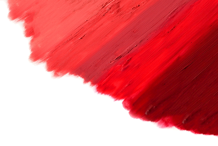
Another important aspect of your color pallet aside from muted hues are shades and tints. To create your shadow hues, you can use muted shades of red or you can simply add a small portion of black to your red. Black as a color is strong so be very careful when adding it to any other color and make sure to do so in small quantities.
You have two options when it comes to making red tints, firstly you can simply lighten the red to a pinkish shade by just adding some white. Keep in mind that white will slightly dull the color so rather use the second option if you wish to maintain the vibrancy of your red shade. The other option is to combine your red with a small amount of a very light yellow, this will give you a peachy shade of red while leaving your color vibrant.
A New Way of Looking at Color
The color theory which we discussed at the start of the article defines red as a primary shade and therefore you are unable to combine other shades to make red. There is a new alternative way to look at colors though in which you can make red by combining two other shades, which two colors are these you may ask?
Based on the system utilized by inkjet printers, the new color theory states there are three different shades which are the fundamentals, namely, Cyan, Magenta, and Yellow, referred to as the CMY model. With the same basis as the basic color theory, these three colors can be combined to create every other possible shade. While not one of the primary colors, black is also considered part of the model.
If you follow this model, you would then be able to create red by simply combining yellow and magenta. Like when mixing any colors, the ratio of magenta and yellow you choose to use will determine the shade of red you get
Red Shades From a Technical Basis
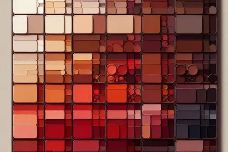
The table we have put together assists you to determine the different ratios required of colors to create an assortment of shades of red. We have assisted with the traditional ratio, being red, green, and blue, and the more modern CMY ratio. You will be able to create an assortment of red hues with the assistance of this table.
| NAME | HEX CODE | RGB | CMYK |
| Chili Red | #e23d28 | 226, 40, 61 | 0, 73, 82, 11 |
| Chocolate Cosmos | #58111a | 88, 26, 17 | 0, 81, 70, 65 |
| Dark Red | #8b0000 | 139, 0, 0 | 0, 100, 100, 45 |
| Coral Pink | #f88379 | 248, 121, 131 | 0, 47, 51, 3 |
| RBG Red | #ff0000 | 255, 0, 0 | 0, 100, 100, 0 |
| Scarlet | #ff2400 | 255, 0, 36 | 0, 86, 100, 0 |
| Cardinal Red | #c41e3a | 196, 58, 30 | 0, 85, 70, 23 |
There are so many shades of red you can mix and all of them have different uses.
| NAME | HEX CODE |
| Chili Red | This shade is a bright and warm red, which has strong orange undertones. It is ideal for creating a glorious sunset sky or capturing a roaring bonfire. |
| Chocolate Cosmos | This shade is dark plum and is named chocolate cosmos as it is similar to the delicious delicacy. A full-bodied color that is dark and rich making one think of dark berries, red wine, and good times. |
| Dark Red | This gorgeous shade provides a feeling of hot-blooded passion and is ideal for use when painting a rose or another image of love. It would also make for a stunning lipstick color. |
| Coral Pink | Giving you a light peachy shade, while it is closer to pink than to read it makes a great addition to your red pallet. |
| RBG Red | Made up of an equal portion of yellow and magenta giving you a stunning, bold, and bright color, it can be classified as the purest form of red available. |
| Scarlet | Scarlet provides a vibrant and bright orange-red and is great to create the center of a fire. |
| Cardinal Red | A cooler red and slightly lighter than the likes of chocolate cosmos, aubergine, or maroon. |
Creating Art With the Use of Red
It is one thing to know how to mix an array of shades of red but you also need to know how to make them stand out and pop otherwise what is the use. We have already noted that placing green and red next to each other is a great idea as they are each other’s complementary colors. Over and above green there are a few other colors you can use in combination with red that will create a stunning impact and make your artwork eye-catching.
Mustard Yellow
By using a little mustard yellow next to your shades of red you will create a warm and cozy atmosphere to your painting. If you are using quite warm shades of red it is very effective to add mustard yellow alongside and can be used when creating a sunset or a fire scene. You need to ensure that you do not overdo it with the mustard yellow as the warmth will then be too overpowering.
Army Green
Army green is a popular shade that is quite effective. As a more muted green option, army green when placed next to a red which is vibrant will bring more attention to the red hue. Using army green alongside red is most effective when working with a maroon or burgundy red.
Neutral Shades
Neutral and muted colors such as grey and beige work well with red thanks to it being such a bold and warm color. The vibrancy of the red is balanced out by these colors and they assist in creating contrast. Beige and grey are great options as neither of them will compete for your attention with the red.
If you are looking to create the warmth of an autumn evening or the fiery heat from a burning fire, there exists the correct shade of red. We have gone into detail in terms of the different meanings of red in this article as well as how to assist in making your red pop and how to create different shades of red.
View our How To Make Red web story here.
Frequently Asked Questions
Which Color Works Well with Dark Red?
An assortment of colors works alongside dark red making it a great color to use in your artwork. A great option alongside shades of red is that of green and in particular dark green hues (ie. Army green). Other color options include beige and grey which would both make your red pop.
To Make the Color Red What Two Colors Can I Combine?
Using yellow and magenta you will be able to create pure red. Depending on the shade of red you are looking to create will determine the ratio you use and you can further alter this shade by adding an assortment of different colors.
Can One Mix Red?
Definitely, red can be mixed with two possible color theories. The basic color theory which is the well know one states that red is one of the primary colors and by adding other colors you can alter the shade. When considering the CMY model you can create red simply by mixing magenta and yellow.
Duncan graduated with a diploma in Film and TV production from CityVarsity in 2018, after which he continued pursuing film while taking on a keen interest in writing along the way. Since having graduated, he began working as a freelance videographer, filming a variety of music videos, fashion and short films, adverts, weddings and more. Throughout this, he’s won a number of awards from various film festivals that are both locally and internationally recognized. However, Duncan still enjoys writing articles in between his filming ventures, appreciating the peace and clarity that comes with it.
His articles focus primarily around helping up-and-coming artists explore the basics of certain colors, how these colors can be paired with other shades, as well as what colors are created when you mix one with another. All while relating these shades to historically significant paintings that have incorporated them into their color palette. As a lover of the arts himself, he takes great interest in the Renaissance era of paintings, an era that has directly inspired many of his favorite films.
Learn more about Duncan van der Merwe and about us.
