What Does Red and Yellow Make? – The Vibrant World of Orange
This post may contain affiliate links. We may earn a small commission from purchases made through them, at no additional cost to you.
As a color theory enthusiast, I’ve always been captivated by the magical world of hues and their interplay. Today, let’s embark on an exciting journey to unravel one of the most vibrant mysteries: what happens when red and yellow collide? Picture the fiery passion of red dancing with the cheerful brightness of yellow – it’s like watching a spectacular fireworks show in the sky of creativity! Together, these colors hold the potential to ignite our imaginations and paint our world with boundless possibilities. So, grab your palette, and let’s dive into the fascinating fusion where red meets yellow!
Key Takeaways
- Mixing red and yellow results in the secondary color orange.
- The specific shade of orange depends on the specific red and yellow hues used.
- Understanding color mixing is essential for art, design, and the science of perception.
A Look at Color Theory
When red and yellow are mixed, the resulting color is orange. This happens in both additive and subtractive color mixing systems where red and yellow, both primary colors, blend to create a secondary color. My understanding of color theory confirms that the specific shade of orange achieved can vary depending on the shades of red and yellow used, allowing for a spectrum ranging from dark, rich orange to paler, more pastel variations.
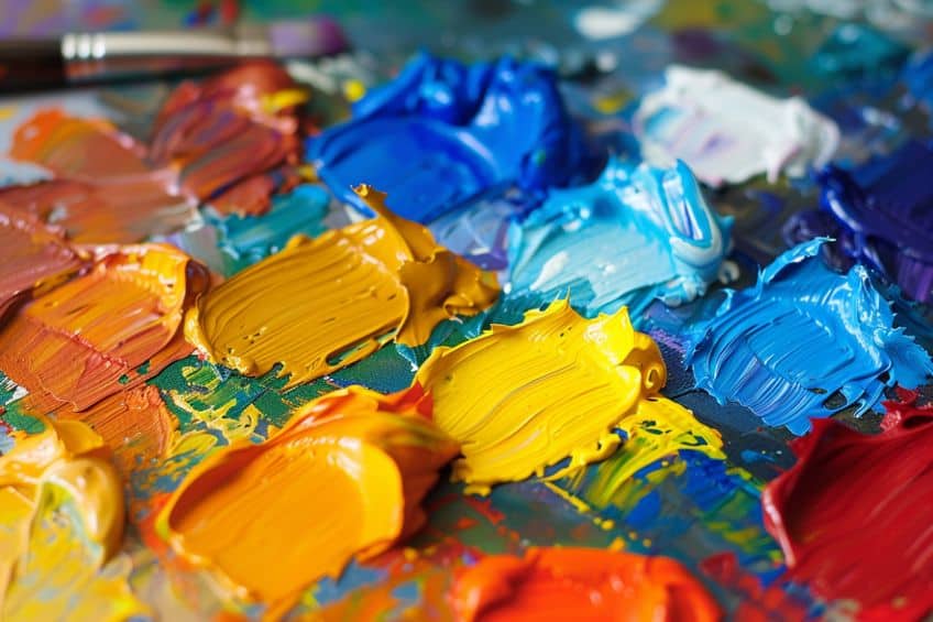
Color mixing is not only a fundamental aspect of art and design but also a fascinating glimpse into the science of light and perception. While mixing red and yellow to make orange may seem simple, the process involves an understanding of the relationship between colors and the influence of pigments. This knowledge is crucial for artists who need to create various hues and for designers looking to convey a particular mood or message through color.
When I discuss the principles of color theory, I center around how colors interact, combine, and influence perception, particularly focusing on how red and yellow interact within different color models.
Basics of Color Mixing
To understand how red and yellow interact, it’s fundamental to grasp the concept of primary and secondary colors. I view primary colors as the building blocks of the color spectrum. In traditional color mixing using pigments, such as paint, red and yellow are two of the three primary colors in the RYB color model; the third is blue. When these primary colors mix, they create secondary colors. For instance, when I mix red and yellow, the result is orange. In contrast, the RGB color model, which stands for red, green, and blue, is used for light-based colors like those on computer screens. Here, red and yellow are still primary colors, but the mixing principles are different due to the additive nature of light.
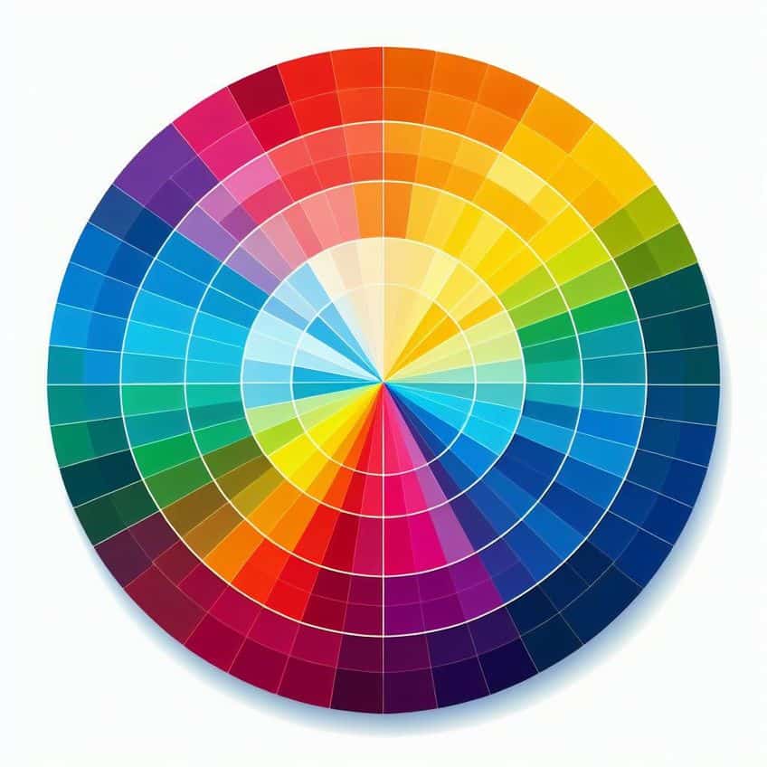
The Color Wheel and Color Models
A color wheel is a circular diagram that represents the relationships between colors. I use it to understand how different hues relate to one another. The RGB color wheel maps colors in a way reflective of how light mixes, while the more traditional RYB color wheel is based on the subtractive mixing of pigments.
- RGB color model: This model is additive, meaning that combining all colors together yields white. It is utilized in digital screens and lighting.
- RYB color model: This is a subtractive model where the combination of all primary colors results in black or brown. It’s the model I apply when dealing with tangible mediums like paints.
The CMY color model (cyan, magenta, yellow) is another subtractive model commonly used in color printing. This model represents the CMYK system, where “K” stands for key (black), providing a complete color range for printed material. In each model, red and yellow maintain their status as primary colors, essential to creating a diverse palette.
On a fundamental level, whether additive or subtractive, these two hues demonstrate the core of color theory’s practical application.
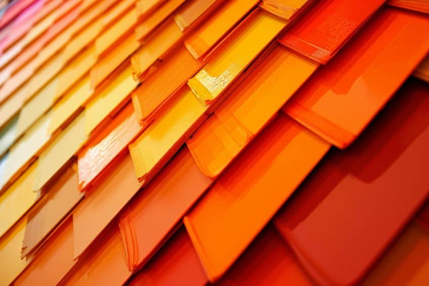
What Does Red and Yellow Make?
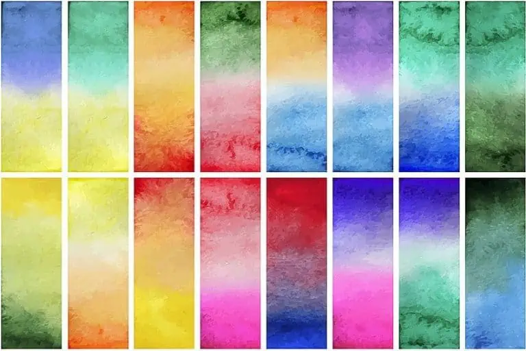
When mixed together, red and yellow yield a specific secondary color that varies by the application method and the shades used. This offers a kaleidoscope of oranges ranging from fiery tangerine to mellow apricot, each with its own personality and charm.
Understanding Red
| Shade | Hex Code | CMYK Color Code (%) | RGB Color Code | Color |
| Red | #FF0000 | 0, 100, 100, 0 | 255, 0, 0 |
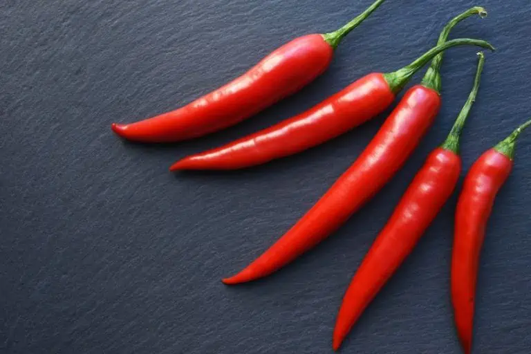
Red is one of the primary colors in the color spectrum, meaning it cannot be created by mixing other colors. It’s a color of intensity and can vary in shade from a bright, fiery red to a deeper, more muted maroon. When using the additive color model — as in light — red contributes to the creation of new colors when combined with others.
In color theory, red symbolizes a spectrum of emotions, from passion and love to power and intensity.
It commands attention and signifies vitality, courage, and strength, while also carrying connotations of danger and aggression. Red’s meanings vary across cultures, representing luck, celebration, or prosperity. Overall, it’s a color that ignites the senses and holds deep emotional and cultural significance.
Understanding Yellow
| Shade | Hex Code | CMYK Color Code (%) | RGB Color Code | Color |
| Yellow | #FFFF00 | 0, 0, 100, 0 | 255, 255, 0 |
Yellow, another primary color, is often associated with brightness, like red. Its tones can range from a deep gold to a light, pastel lemon. In both paint and digital media, yellow provides a vibrant element that, when mixed with other colors, will dictate the resulting color’s brightness and warmth. In color theory, yellow symbolizes happiness, optimism, and energy. It evokes feelings of joy, sunshine, and warmth, and is associated with creativity, intellect, and renewal.
Yellow’s meanings may vary across cultures, but overall, it radiates brightness and positivity, influencing mood and perception in diverse ways.
The Color Orange
| Shade | Hex Code | CMYK Color Code (%) | RGB Color Code | Color |
| Orange | #FFA500 | 0, 50, 100, 0 | 255, 165, 0 |
When I mix red and yellow, the resulting color is orange. This color signifies warmth, energy, and creativity. It embodies the essence of sunsets, autumn leaves, and ripe citrus fruits, evoking emotions of joy and adventure. From fiery intensity to gentle glows, orange captivates with its versatility and uplifting presence, making it a dynamic addition to any visual composition or design palette.
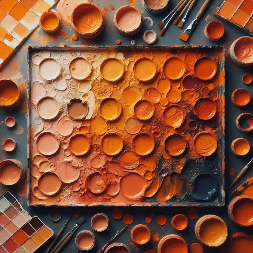
The specific shade of orange depends on the ratio and the saturation levels of the red and yellow used. Here’s a basic guide for mixing these colors:
- 1:1 ratio of red to yellow: A balanced, vibrant orange.
- More red than yellow: A redder, perhaps rustier shade of orange.
- More yellow than red: A yellower, more golden orange.
The color orange itself can be further modified by adding more red or yellow, adjusting the hue to the desired saturation and warmth.
Exploring the Color Mixing Results
When I mix red and yellow, the primary outcome is orange, but the exact shade of orange can vary based on several factors. These nuances are critical to understand when achieving the desired color in any artistic endeavor.
Different proportions of red and yellow yield various shades of orange, a hue that is fundamentally a mid-point on the spectrum between the two.
Variations in Shade and Tint
If I add more red than yellow, the resulting color becomes a deeper, warmer shade of orange. Conversely, increasing the yellow creates a lighter, brighter tint. Furthermore, by incorporating white, I can lighten the orange color further, creating a range of pastel oranges that possess a softness and subtlety distinct from the vibrant original mixture.
- More red: Results in a richer, fiery orange.
- More yellow: Yields a brighter, sunnier orange.
- Addition of white: Lightens the color to softer pastel tones.
Effects of Light on Perceived Color
The lighting conditions under which I view the mixed color can significantly alter its appearance. Light waves within the visible spectrum interact with the pigments, and this interaction affects how I perceive the color. Under natural sunlight, the orange will appear differently than under artificial light, which can change the color’s tone. In essence, light and pigment work together to determine the final appearance of orange when red and yellow are mixed.
Through careful adjustment of shade, tint, and an understanding of lighting effects, I can manipulate these factors to achieve the precise color required for any project.
- Natural sunlight: Tends to enhance the vibrancy of orange.
- Artificial light: May alter the hue, sometimes casting a different tone.
The Symbolism of Orange
When red and yellow are combined, they create orange, a color that embodies the warmth of red and the cheerfulness of yellow. Orange is a warm color that curiously straddles the energy of red and the happiness of yellow, carrying implications in various aspects of life, from interior design to psychology and cultural contexts.
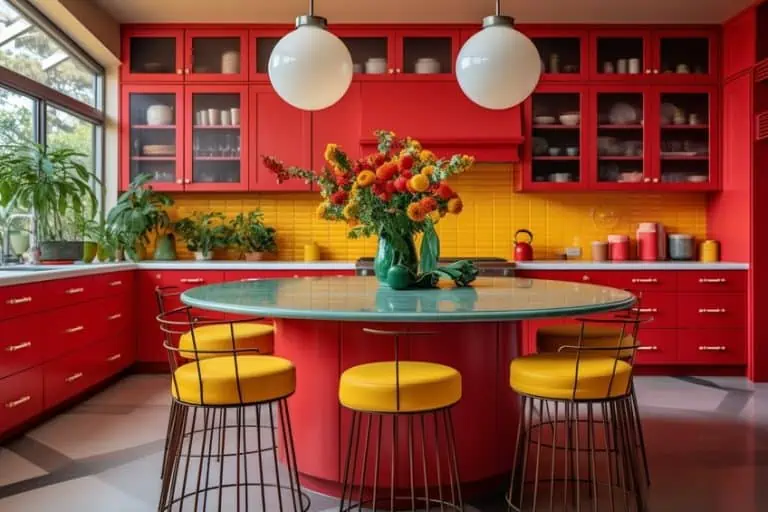
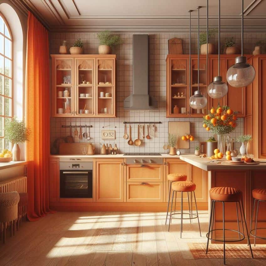
In Interior Design
Utilizing orange in interior design brings a sense of vitality and playfulness. I consider orange a versatile color that can add a touch of vibrancy when used in accents or envelop a room with cozy warmth if applied more generously.
It’s commonly used to inject a lively spark into living spaces.
- Accent pieces: Cushions, artwork, and area rugs
- To stimulate: Activity rooms such as gyms and playrooms
- In moderation: to avoid overwhelming with too much energy
Influence on Mood and Emotion
Orange’s influence on mood and emotion is both fascinating and significant. It can stimulate feelings of enthusiasm and excitement, often invoking a sense of creativity and adventure.
Yet, this must be balanced, as too much orange may lead to feelings of frustration or frivolity.
- Stimulating: Encourages activity and appetite
- Mood-enhancing: Can promote socialization and evoke joy
- Caution: Overuse may trigger overstimulation or irritation
Different Meanings in Various Cultures
The color orange carries distinct meanings across various cultures. In the Eastern traditions, orange is often associated with spirituality and is seen as a spiritual color, especially within Hinduism where it represents fire and purity. Conversely, orange can signal caution or denote danger in a Western context.
It also embodies change and movement, as seen in seasonal changes or social movements.
- Eastern cultures: Spirituality, harmony, sacredness
- Western cultures: Caution, enthusiasm, social change
- Specific instances: Royal family in the Netherlands, bravery in Ukraine
In conclusion, the fusion of red and yellow is nothing short of a chromatic adventure! As we’ve explored, their combination yields the radiant hue of orange, a color bursting with energy, warmth, and zest for life. Through the lens of color theory, we’ve glimpsed the harmonious dance of pigments and the way they invigorate our senses. Whether in art, design, or the natural world around us, the magic of red and yellow coming together as orange reminds us of the endless creativity and vibrancy that color brings to our lives. So, let’s continue to embrace the kaleidoscope of colors that surrounds us, each shade telling its own unique story in the grand tapestry of existence.
Frequently Asked Questions
How Do You Mix Paint to Get Different Shades of Orange?
To achieve different shades of orange, I start by mixing equal parts of red and yellow paint to create a basic orange. For a lighter shade, I add more yellow. Conversely, for a deeper, more burnt orange, I gradually mix in more red. Adding a touch of white paint can yield a pastel orange, while a hint of blue can create a more earthy, subdued tone.
What Are the Outcomes When Mixing Red and Yellow in Different Proportions?
When I mix red and yellow in different proportions, the result is a spectrum of oranges. A higher proportion of yellow will give me a vivid, bright orange, reminiscent of citrus fruits. On the other hand, a more red-dominant mix produces a richer, warmer shade, closer to the colors of autumn leaves. The precise outcome depends on the exact hues of red and yellow used, as well as their relative quantities in the mix.

Duncan graduated with a diploma in Film and TV production from CityVarsity in 2018, after which he continued pursuing film while taking on a keen interest in writing along the way. Since having graduated, he began working as a freelance videographer, filming a variety of music videos, fashion and short films, adverts, weddings and more. Throughout this, he’s won a number of awards from various film festivals that are both locally and internationally recognized. However, Duncan still enjoys writing articles in between his filming ventures, appreciating the peace and clarity that comes with it.
His articles focus primarily around helping up-and-coming artists explore the basics of certain colors, how these colors can be paired with other shades, as well as what colors are created when you mix one with another. All while relating these shades to historically significant paintings that have incorporated them into their color palette. As a lover of the arts himself, he takes great interest in the Renaissance era of paintings, an era that has directly inspired many of his favorite films.
Learn more about Duncan van der Merwe and about us.