What Colors Go With Gray? – 25 Perfect Color Matches
This post may contain affiliate links. We may earn a small commission from purchases made through them, at no additional cost to you.
Despite its somewhat dull complexion, gray is an extremely versatile color. Gray is not only able to stand on its own as a bold and interesting color, but it is one that is able to complement countless others to create striking gray color schemes. You may be surprised as to how vital such a shade has become throughout the art and design industry, and see why so many artists rely on its subtle yet dominating appearance. Come along as we take a closer look at what colors go with gray, as well as the many gray color schemes and accent colors for gray that you can incorporate into your own designs or outfits at home.
What Color Is Gray?
When I first started exploring the world of interior design, I’ll admit, gray didn’t immediately catch my eye. But over time, I’ve come to appreciate its timeless elegance and the serene sophistication it brings to any space. For me, gray is the ultimate neutral, a bridge between the stark contrasts of black and white. It’s a color with incredible depth and variety, ideal for diverse settings. I often think of gray as a ‘cool’ color, reminiscent of the sky on an overcast day or the raw surface of stone. This association with nature’s calm elements is probably why I find it so soothing, both for the mind and the body. It’s no surprise that gray has become a staple in interior design, offering a tranquil ambiance in any room.
But gray isn’t just a single hue; it’s a spectrum that ranges from soft, almost white tones to deep, near-black shades.
This vast range makes it incredibly versatile, effortlessly pairing with both warm and cool colors. And the undertones! Sometimes, they lean towards blue, other times green or purple, subtly altering the color’s character. One thing that fascinates me about gray is its chameleon-like ability to adapt to its surroundings. It’s why I often use gray as a neutral backdrop in my designs, allowing other colors to shine while maintaining a sense of balance and harmony. Gray’s adaptability is truly its strength, making it an indispensable tool in my design palette.
| Gray Color | Gray Hex Code | RGB | CMYK Color Code (%) | Shade of Gray |
| Gray | #808080 | 255,215,0 | 0, 0, 0, 50 | |
| Dark Gray | #828282 | 130, 130, 130 | 0, 0, 0, 49 | |
| Mink | #88807b | 136, 128, 123 | 0, 6, 10, 47 | |
| Fossil | #787276 | 120, 114, 118 | 0, 5, 2, 53 | |
| Pearl River | #d9dddc | 217, 221, 220 | 2, 0, 0, 13 | |
| Abalone | #d6cfc7 | 214, 207, 199 | 0, 3, 7, 16 | |
| Thunder | #bebdb8 | 189, 183, 171 | 0, 1, 3, 25 | |
| Pewter | #999da0 | 153, 157, 160 | 4, 2, 0, 37 | |
| Steel | #777b7e | 119, 123, 126 | 6, 2, 0, 51 | |
| Charcoal | #222021 | 34, 32, 33 | 0, 6, 3, 87 |
25 Colors That Elevate Gray
In my journey as an interior designer, I’ve discovered the transformative power of color, especially the understated elegance of gray. In this exploration, I’ve curated a list of 25 colors that, when paired with gray, create magic. These are not just colors; they are stories waiting to be told, emotions waiting to be felt. From the warmth of burnt orange that brings a cozy autumnal feel to the refreshing touch of teal reminiscent of tranquil oceans, each color combination with gray offers a unique mood and ambiance. This list is a result of my passion and countless hours of experimentation, aiming to inspire and ignite creativity in your own spaces. It’s more than a guide; it’s an invitation to explore and embrace the beauty of gray in a spectrum of stunning collaborations.
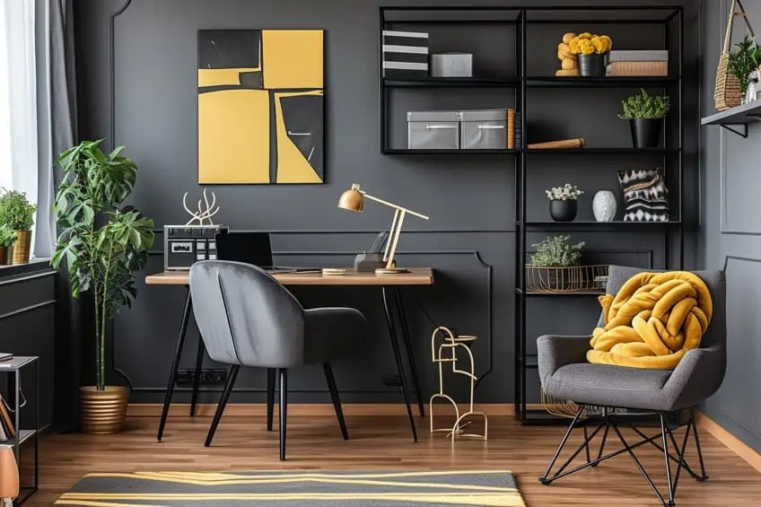
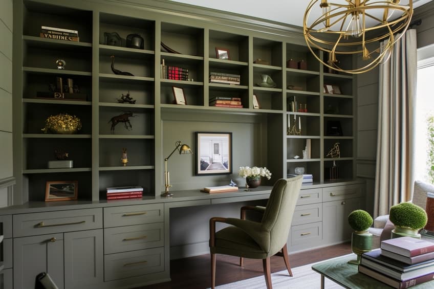
Charcoal Gray & Mustard Yellow
This combination brings a modern and sophisticated edge to any space. Charcoal gray provides a strong, grounding effect, while mustard yellow adds a pop of vibrant energy. I recommend using charcoal gray on larger pieces like sofas or walls, and mustard yellow for accents like cushions or artwork. This pairing works well in living rooms or home offices, creating a space that’s both stylish and invigorating.
| Shade | Hex Code | CMYK Color Code (%) | RGB Color Code | Color |
| Charcoal Gray | #36454F | 71, 35, 26, 69 | 54, 69, 79 | |
| Mustard Yellow | #FFDB58 | 0, 15, 65, 0 | 255, 219, 88 |
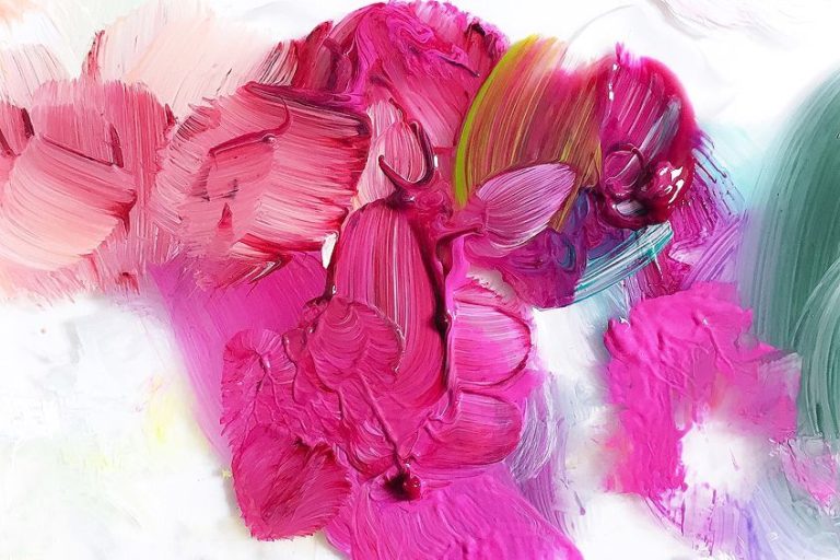
Light Gray & Soft Pink
Ideal for creating a serene and calming environment. Light gray’s neutrality balances the soft femininity of pink, making it perfect for bedrooms or nurseries. Use light gray as your base color on walls or large furniture, and accentuate with soft pink in textiles or wall art. This combination is also excellent for a minimalist style, adding subtle color without overwhelming the space.
| Shade | Hex Code | CMYK Color Code (%) | RGB Color Code | Color |
| Light Gray | #D3D3D3 | 0, 0, 0, 17 | 211, 211, 211 | |
| Soft Pink | #FFB6C1 | 0, 29, 24, 0 | 255, 182, 193 |

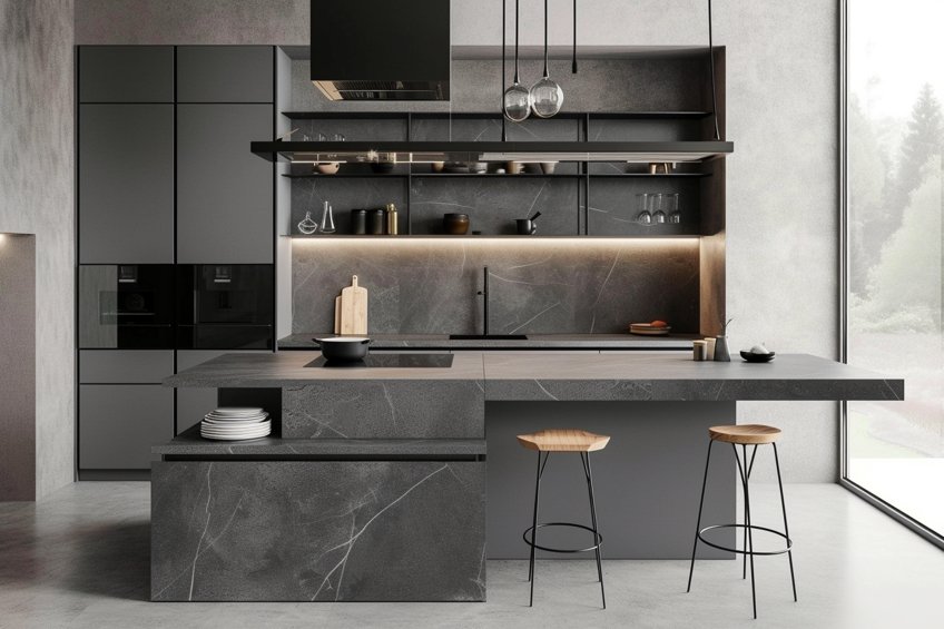
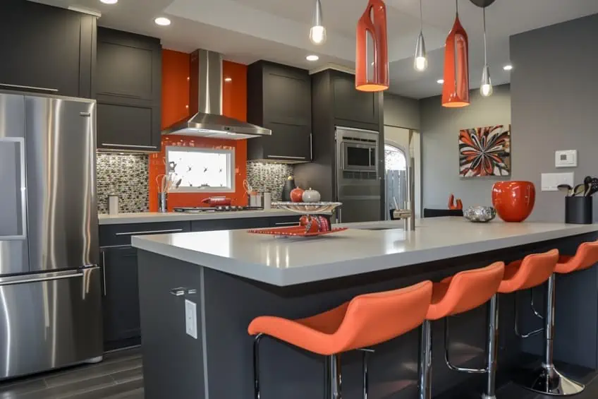
Slate Gray & Burnt Orange
A warm, inviting combination that’s great for spaces where you entertain, like dining rooms or kitchens. Slate gray is a robust and versatile backdrop, while burnt orange brings warmth and liveliness. Incorporate slate gray in larger elements like cabinetry or flooring, with burnt orange in decorative accents, tableware, or a feature wall. This pairing is perfect for creating a cozy, yet contemporary atmosphere.
| Shade | Hex Code | CMYK Color Code (%) | RGB Color Code | Color |
| Slate Gray | #708090 | 30, 12, 0, 44 | 112, 128, 144 | |
| Burnt Orange | #CC5500 | 0, 50, 100, 20 | 204, 85, 0 |
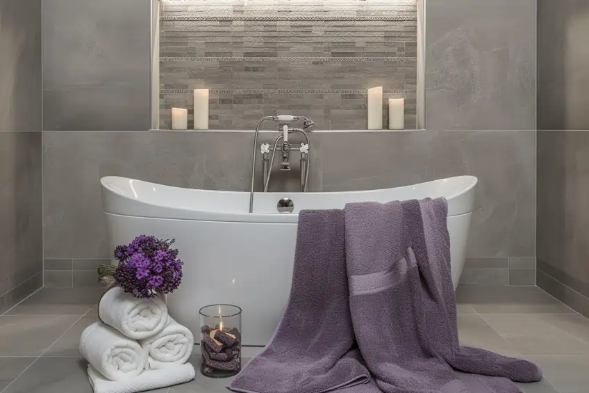
Dove Gray & Lavender
A soft, dreamy pairing that exudes tranquility. Dove gray’s understated elegance complements the soothing nature of lavender, making it ideal for bedrooms or bathrooms. Use dove gray for larger fixtures and lavender for towels, bedding, or decorative items. Incorporating natural materials like wood or stone can also enhance the organic feel of this combination.
| Shade | Hex Code | CMYK Color Code (%) | RGB Color Code | Color |
| Dove Gray | #696969 | 0, 0, 0, 59 | 105, 105, 105 | |
| Lavender | #E6E6FA | 6, 6, 0, 2 | 230, 230, 250 |
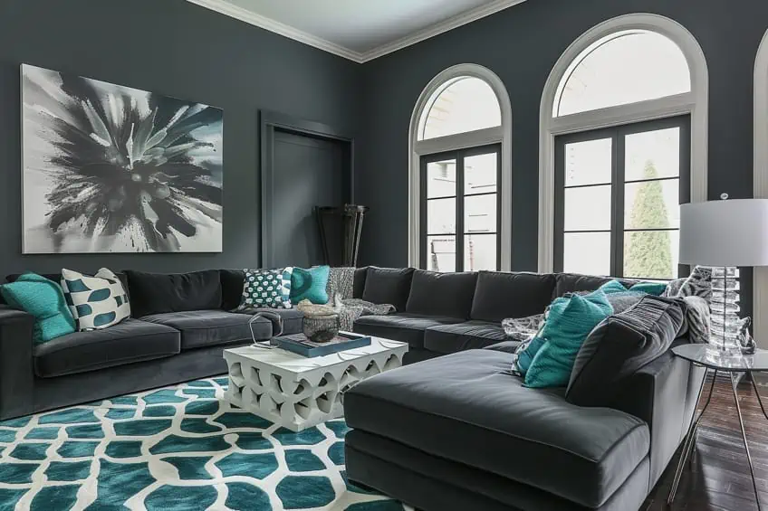
Gunmetal Gray & Teal
This is a bold, modern pairing that makes a statement. Gunmetal gray brings an industrial edge, while teal adds a splash of vivacity. In living spaces or offices, use gunmetal gray on walls or furniture, accentuating with teal in accessories like vases, cushions, or a feature wall. This combination works well with metallic accents, like chrome or silver, for a sleek look.
| Shade | Hex Code | CMYK Color Code (%) | RGB Color Code | Color |
| Gunmetal Gray | #2A3439 | 70, 40, 30, 78 | 42, 52, 57 | |
| Teal | #008080 | 100, 0, 33, 50 | 0, 128, 128 |
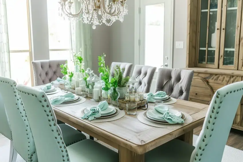
Ash Gray & Mint Green
Fresh and clean, this combination creates a restful and airy atmosphere. Ash gray’s muted tone pairs beautifully with the gentle vibrancy of mint green. Ideal for bathrooms or kitchens, use ash gray for cabinets or tiles, and mint green for walls or backsplash. Incorporating plants or herbal motifs can enhance the fresh, natural vibe.
| Shade | Hex Code | CMYK Color Code (%) | RGB Color Code | Color |
| Ash Gray | #B2BEB5 | 10, 0, 5, 30 | 178, 190, 181 | |
| Mint Green | #98FF98 | 39, 0, 39, 0 | 152, 255, 152 |
Steel Gray & Coral
This energetic yet balanced pairing is perfect for injecting life into a space. Steel gray offers a sophisticated backdrop, while coral adds a playful and lively touch. Use steel gray in living areas on larger furniture items, with coral accents in throw pillows, rugs, or artwork. This combination works well with geometric patterns to add a contemporary twist.
| Shade | Hex Code | CMYK Color Code (%) | RGB Color Code | Color |
| Steel Gray | #4682B4 | 64, 31, 0, 29 | 70, 130, 180 | |
| Coral | #FF7F50 | 0, 50, 69, 0 | 255, 127, 80 |

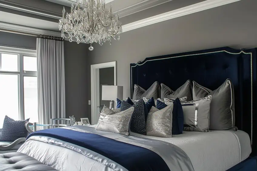
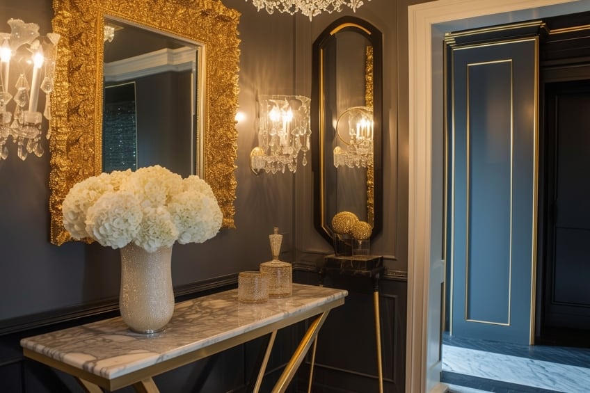
Pewter Gray & Sapphire Blue
Deep, luxurious, and regal, this combination is suited for spaces where you want to make an elegant statement, like a formal living room or master bedroom. Pewter gray can be used on walls or large furniture pieces, with sapphire blue accents in curtains, bedding, or upholstery. Adding velvet or silk textures can enhance the luxurious feel of this palette.
| Shade | Hex Code | CMYK Color Code (%) | RGB Color Code | Color |
| Pewter Gray | #96A8A1 | 10, 0, 5, 35 | 150, 168, 161 | |
| Sapphire Blue | #0F52BA | 93, 54, 0, 27 | 15, 82, 186 |

Cloud Gray & Beige
A harmonious and earthy blend that creates a neutral, soothing space. Cloud gray’s light tone pairs seamlessly with the warmth of beige, ideal for living rooms or bedrooms. Use cloud gray on walls and larger items, with beige accents in textiles or wooden furniture. This combination benefits from natural textures like linen or jute to add depth.
| Shade | Hex Code | CMYK Color Code (%) | RGB Color Code | Color |
| Cloud Gray | #B6B6B4 | 0, 0, 0, 30 | 182, 182, 180 | |
| Beige | #F5F5DC | 0, 0, 14, 4 | 245, 245, 220 |
Elephant Gray & Olive Green
Sophisticated and nature-inspired, this palette brings an elegant yet organic feel. Elephant gray is a strong, neutral base, while olive green adds a touch of nature. Use elephant gray in living spaces on walls or large furniture, with olive green in plants, cushions, or artwork. Natural materials like leather or wool work well with this combination to emphasize an earthy feel.
| Shade | Hex Code | CMYK Color Code (%) | RGB Color Code | Color |
| Elephant Gray | #123456 | 85, 54, 0, 66 | 18, 52, 86 | |
| Olive Green | #808000 | 0, 0, 100, 50 | 128, 128, 0 |
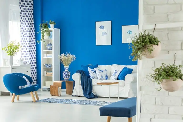
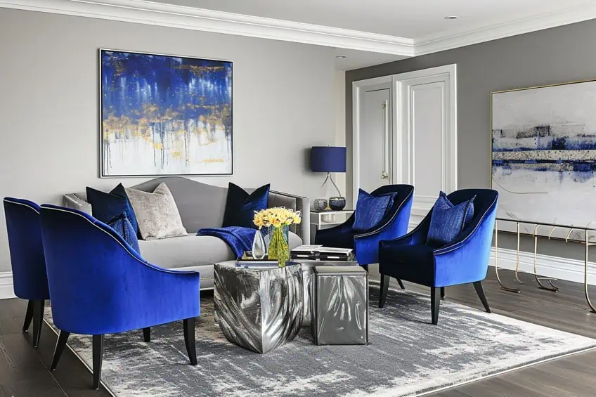
Silver Gray & Navy Blue
Timelessly elegant, this combination brings a chic, sophisticated look to any room. Silver gray provides a light, reflective base, complemented by the depth of navy blue. In bedrooms or living rooms, use silver gray on walls or large pieces, with navy blue in textiles, rugs, or wall art. Adding metallic accents in silver or gold can further enhance the elegance of this pairing.
| Shade | Hex Code | CMYK Color Code (%) | RGB Color Code | Color |
| Silver Gray | #C0C0C0 | 0, 0, 0, 25 | 192, 192, 192 | |
| Navy Blue | #000080 | 100, 100, 0, 50 | 0, 0, 128 |
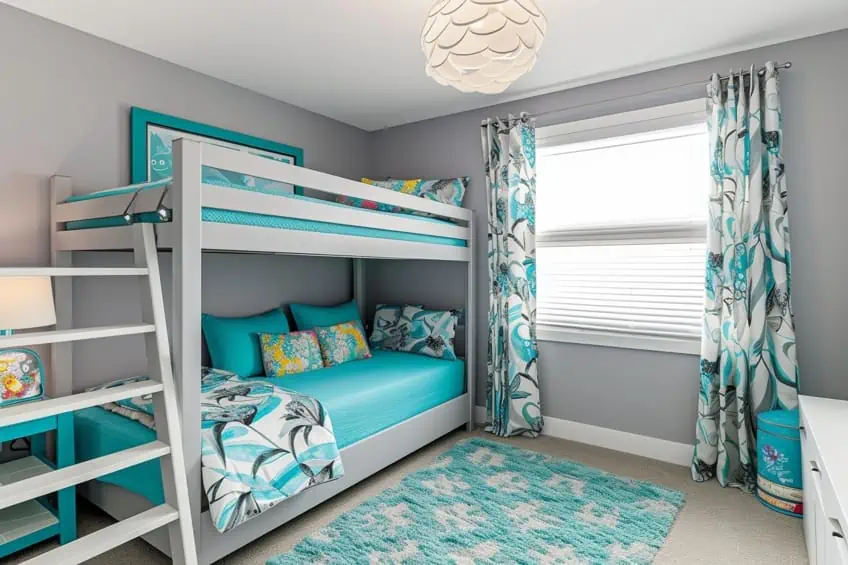
Fog Gray & Turquoise
Vibrant and lively, this contrast adds a playful yet sophisticated touch. Fog gray’s muted tone balances the brightness of turquoise, making it suitable for bathrooms or children’s rooms. Use fog gray on larger surfaces, with turquoise accents in towels, toys, or decorative pieces. Incorporating white can help maintain a fresh, clean look.
| Shade | Hex Code | CMYK Color Code (%) | RGB Color Code | Color |
| Fog Gray | #D1D1D1 | 0, 0, 0, 18 | 209, 209, 209 | |
| Turquoise | #40E0D0 | 71, 0, 18, 12 | 64, 224, 208 |
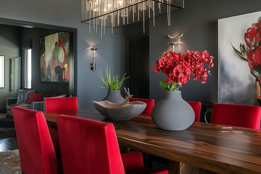
Graphite Gray & Crimson Red
Bold, dramatic, and perfect for making a statement. Graphite gray’s deep tone sets a serious mood, while crimson red adds a burst of energy. Ideal for dining rooms or home theaters, use graphite gray on walls or large furniture, with crimson red in accents like cushions, curtains, or artwork. This pairing is great for a modern look with clean lines and minimal clutter.
| Shade | Hex Code | CMYK Color Code (%) | RGB Color Code | Color |
| Graphite Gray | #474A51 | 25, 19, 0, 68 | 71, 74, 81 | |
| Crimson Red | #DC143C | 0, 100, 71, 14 | 220, 20, 60 |
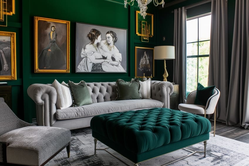
Heather Gray & Emerald Green
Luxurious and rich, this combination brings a touch of elegance to any space. Heather gray is soft and versatile, while emerald green adds a regal feel. Use heather gray in living rooms or bedrooms on larger items, with emerald green in accents like throw pillows, vases, or a feature wall. Adding gold or brass elements can enhance the luxurious feel.
| Shade | Hex Code | CMYK Color Code (%) | RGB Color Code | Color |
| Heather Gray | #B6B6B4 | 0, 0, 0, 30 | 182, 182, 180 | |
| Emerald Green | #50C878 | 69, 0, 47, 22 | 80, 200, 120 |
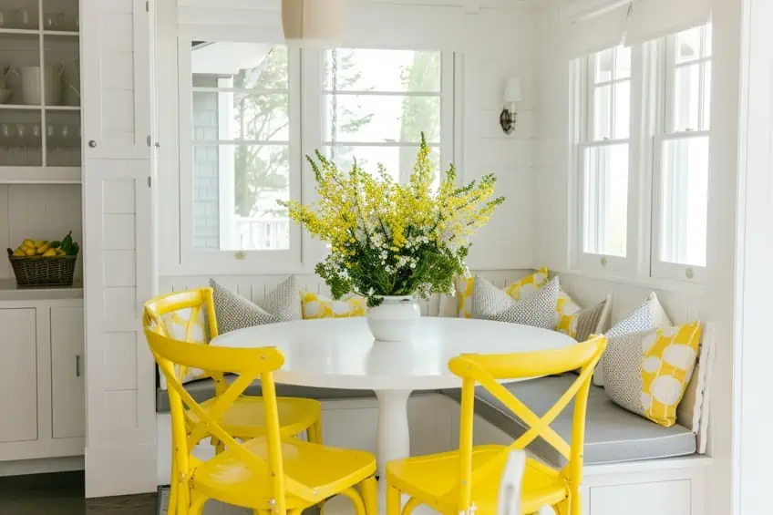
Oyster Gray & Lemon Yellow
Bright, cheerful, and perfect for adding a playful twist. Oyster gray’s soft tone is an ideal backdrop for the vibrancy of lemon yellow. Use this combination in kitchens or children’s rooms, with oyster gray on cabinets or walls and lemon yellow in accessories, light fixtures, or artwork. This pairing works well with fun patterns and textures to add a sense of playfulness.
| Shade | Hex Code | CMYK Color Code (%) | RGB Color Code | Color |
| Oyster Gray | #D4D4D4 | 0, 0, 0, 17 | 212, 212, 212 | |
| Lemon Yellow | #FFF44F | 0, 0, 70, 0 | 255, 244, 79 |
Thunder Gray & Powder Blue
Soft and peaceful, this combination is great for creating a relaxing environment. Thunder gray offers a strong base, while powder blue adds a gentle touch. Use thunder gray in bedrooms or bathrooms on walls or larger items, with powder blue accents in towels, bedding, or decorative objects. Incorporating fluffy textures like shaggy rugs or plush cushions can enhance the coziness of this palette.
| Shade | Hex Code | CMYK Color Code (%) | RGB Color Code | Color |
| Thunder Gray | #A09F9C | 0, 2, 3, 37 | 160, 159, 156 | |
| Powder Blue | #B0E0E6 | 26, 0, 5, 10 | 176, 224, 230 |

Iron Gray & Blush Pink
Trendy and romantic, this pairing adds a modern, feminine touch. Iron gray provides a contemporary base, while blush pink brings softness and warmth. Ideal for bedrooms or living spaces, use iron gray on larger pieces or walls, with blush pink in textiles, wall art, or accessories. Mixing in some geometric patterns can add a contemporary twist to this romantic combination.
| Shade | Hex Code | CMYK Color Code (%) | RGB Color Code | Color |
| Iron Gray | #43464B | 26, 19, 0, 71 | 67, 70, 75 | |
| Blush Pink | #FF6B6B | 0, 58, 58, 0 | 255, 107, 107 |

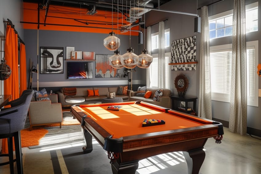
Smoky Gray & Tangerine
Vivid and full of energy, this duo is great for spaces where you want to create a lively atmosphere. Smoky gray’s subtle tone balances the brightness of tangerine. Use this combination in living rooms or playrooms, with smoky gray on larger items and tangerine in accents like cushions, rugs, or wall art. Incorporating playful textures and patterns can enhance the fun and energetic vibe.
| Shade | Hex Code | CMYK Color Code (%) | RGB Color Code | Color |
| Smoky Gray | #605E5C | 0, 2, 3, 62 | 96, 94, 92 | |
| Tangerine | #F28500 | 0, 50, 100, 5 | 242, 133, 0 |
Granite Gray & Aqua
Cool and calming, reminiscent of sea and sky. Granite gray offers depth, while aqua adds a refreshing touch. This palette is perfect for bathrooms or bedrooms, with granite gray on walls or fixtures and aqua in towels, bedding, or decorative items. Adding elements like glass or mirrored accents can enhance the water-inspired feel of this combination.
| Shade | Hex Code | CMYK Color Code (%) | RGB Color Code | Color |
| Granite Gray | #676767 | 0, 0, 0, 59 | 103, 103, 103 | |
| Aqua | #00FFFF | 100, 0, 0, 0 | 0, 255, 255 |

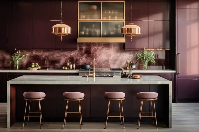
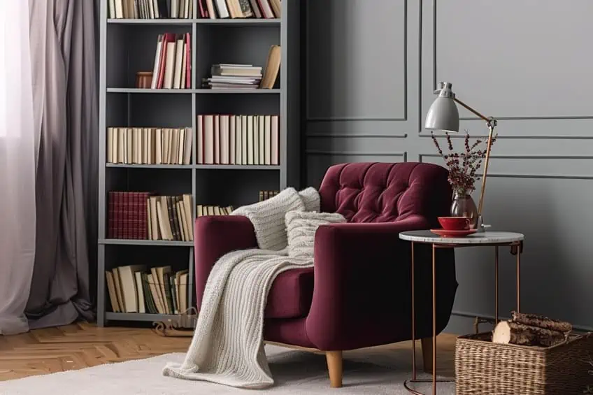
Misty Gray & Maroon
Deep, moody, and cozy, this combination is ideal for creating an intimate space. Misty gray provides a soft backdrop, while maroon adds richness and warmth. Use this pairing in bedrooms or dens, with misty gray on walls or larger items and maroon in textiles or upholstery. Incorporating plush fabrics like velvet can add to the cozy, luxurious feel.
| Shade | Hex Code | CMYK Color Code (%) | RGB Color Code | Color |
| Misty Gray | #999999 | 0, 0, 0, 40 | 153, 153, 153 | |
| Maroon | #800000 | 0, 100, 100, 50 | 128, 0, 0 |
Stone Gray & Gold
Luxurious and elegant, this combination adds a touch of opulence. Stone gray is a versatile base, while gold brings glamour and warmth. Ideal for formal living rooms or master suites, use stone gray on walls or furniture, with gold accents in lighting fixtures, mirrors, or decorative objects. This pairing works well with rich textures like silk or brocade.
| Shade | Hex Code | CMYK Color Code (%) | RGB Color Code | Color |
| Stone Gray | #8A7F80 | 0, 11, 9, 45 | 138, 127, 128 | |
| Gold | #FFD700 | 0, 16, 100, 0 | 255, 215, 0 |
Wolf Gray & Amethyst Purple
Mystical and striking, this combination creates a unique and sophisticated look. Wolf gray is a deep, neutral base, while amethyst purple adds a touch of luxury. Use this pairing in living spaces or bedrooms, with wolf gray on larger items and amethyst purple in accents like cushions, curtains, or artwork. Incorporating crystal or glass elements can enhance the mystical feel of this palette.
| Shade | Hex Code | CMYK Color Code (%) | RGB Color Code | Color |
| Wolf Gray | #848482 | 0, 2, 0, 48 | 132, 132, 130 | |
| Amethyst Purple | #9966CC | 38, 60, 0, 20 | 153, 102, 204 |

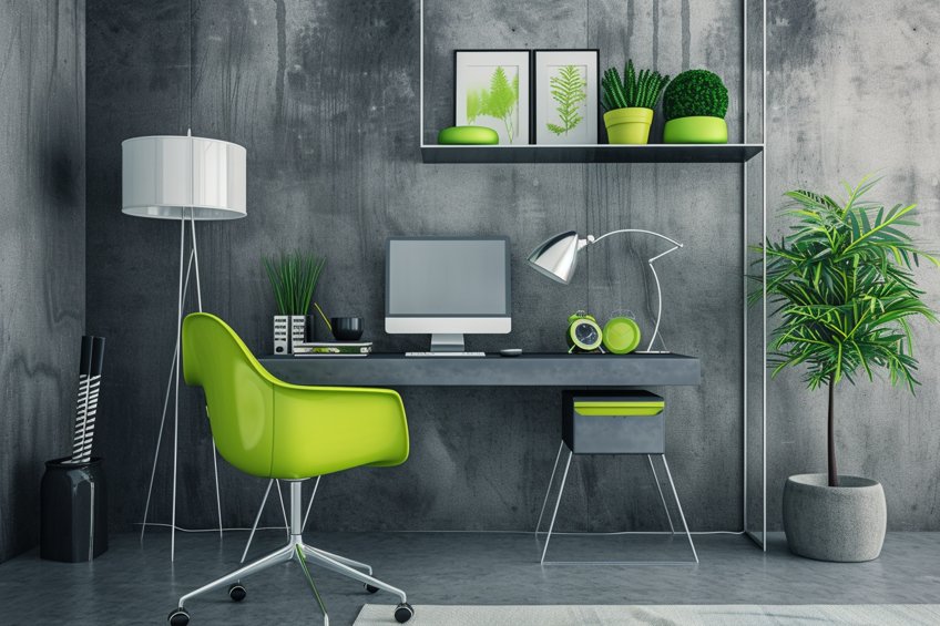
Concrete Gray & Lime Green
Zesty and full of life, this combination brings energy to any space. Concrete gray is a solid, contemporary base, while lime green adds vibrancy and freshness. Ideal for kitchens or children’s rooms, use concrete gray on walls or cabinets, with lime green in accents like chairs, storage containers, or artwork. This pairing benefits from clean lines and minimal clutter to maintain a fresh, modern look.
| Shade | Hex Code | CMYK Color Code (%) | RGB Color Code | Color |
| Concrete Gray | #95A5A6 | 11, 4, 4, 35 | 149, 165, 166 | |
| Lime Green | #32CD32 | 75, 0, 75, 20 | 50, 205, 50 |
Shadow Gray & Cherry Red
Classic and powerful, this contrast creates a dynamic and impactful space. Shadow gray is a strong, neutral backdrop, while cherry red adds intensity and passion. Use this combination in dining rooms or living areas, with shadow gray on larger pieces and cherry red in accents like table settings, cushions, or wall art. Incorporating glossy or reflective surfaces can add to the dramatic effect of this pairing.
| Shade | Hex Code | CMYK Color Code (%) | RGB Color Code | Color |
| Shadow Gray | #778899 | 14, 10, 0, 40 | 119, 136, 153 | |
| Cherry Red | #D2042D | 0, 87, 82, 17 | 210, 4, 45 |

Flint Gray & Royal Blue
Bold and sophisticated, this combination is perfect for a dynamic and elegant space. Flint gray provides a muted, modern base, while royal blue adds depth and richness. Ideal for office spaces or formal living areas, use flint gray on walls or furniture, with royal blue in accents like upholstery, rugs, or curtains. Adding metallic accents, particularly in silver or chrome, can enhance the sophistication of this palette.
| Shade | Hex Code | CMYK Color Code (%) | RGB Color Code | Color |
| Flint Gray | #6F6F6F | 0, 0, 0, 56 | 111, 111, 111 | |
| Royal Blue | #4169E1 | 71, 57, 0, 12 | 65, 105, 225 |
Concluding this exploration of pairing 25 colors with gray in interior design, I feel a deep sense of satisfaction in guiding readers through this versatile palette. Through this article, I hope I’ve illuminated the myriad of possibilities that gray offers, enabling you to confidently infuse elegance and balance into your spaces. The journey of discovering the perfect companions for gray should now feel less daunting and more like an exciting creative endeavor. I am thrilled at the thought of these insights inspiring beautifully harmonized and personalized interiors in your homes.
Frequently Asked Questions
How Does One Create the Best Color Combination With Gray?
Creating the best color combination with gray is a matter of balance and personal preference. I often start with a neutral gray base and add complementary colors that match the desired mood. For a serene look, I pair gray with soft blues or greens, while for a vibrant feel, bold accents like red or blue work well. Trust your instincts, experiment with shades, and let your creativity guide you to find the perfect gray combination that suits your style and vision.
What Are Some Tips for Using Different Shades of Gray in a Cohesive Design?
Incorporating various shades of gray into a cohesive design requires a keen eye for contrast and harmony. I often start with a neutral gray as a base and then layer in lighter grays for contrast and darker grays for depth. This creates a sense of balance and visual interest, whether in a room’s color palette or a fashion ensemble. The key is to experiment and find the right balance to achieve the desired look and feel.
What Are the Best Complementary Colors for Gray in Interior Design?
In my experience with interior design, I’ve found that pairing gray with soft and calming colors like muted blue or sage green can create a tranquil and inviting atmosphere. These combinations work wonders in bedrooms and living rooms, fostering a sense of relaxation. Additionally, adding pops of vibrant colors like mustard yellow or deep burgundy as accents can infuse energy and personality into a space, making it feel dynamic and stylish.

Duncan graduated with a diploma in Film and TV production from CityVarsity in 2018, after which he continued pursuing film while taking on a keen interest in writing along the way. Since having graduated, he began working as a freelance videographer, filming a variety of music videos, fashion and short films, adverts, weddings and more. Throughout this, he’s won a number of awards from various film festivals that are both locally and internationally recognized. However, Duncan still enjoys writing articles in between his filming ventures, appreciating the peace and clarity that comes with it.
His articles focus primarily around helping up-and-coming artists explore the basics of certain colors, how these colors can be paired with other shades, as well as what colors are created when you mix one with another. All while relating these shades to historically significant paintings that have incorporated them into their color palette. As a lover of the arts himself, he takes great interest in the Renaissance era of paintings, an era that has directly inspired many of his favorite films.
Learn more about Duncan van der Merwe and about us.