What Does Purple and Pink Make? – Creating Deep Magenta
This post may contain affiliate links. We may earn a small commission from purchases made through them, at no additional cost to you.
As a color enthusiast with an insatiable curiosity for chromatic mysteries, I’ve always been captivated by the magical transformations that occur when hues collide! Today, let’s embark on a whimsical journey into the realm where purple and pink converge. Picture the regal elegance of purple mingling with the delicate sweetness of pink – it’s like witnessing a fanciful ballet of colors! Together, these hues hold the promise of unlocking a world of enchantment and wonder. So, grab your brushes and join me as we dive into the delightful blend where purple meets pink, unveiling the spellbinding concoction that awaits our artistic exploration!
Table of Contents
Key Takeaways
- Mixing pink and purple typically results in a magenta hue, representing a balance of red and blue characteristics.
- Variations in shade and tint can affect magenta’s brightness and saturation.
- The color magenta carries distinct psychological and cultural significance.
The Basics of Color Theory
Mixing colors is a basic component of visual arts and design that can yield an array of hues, shades, and tints, each evoking different moods and effects. When I blend the colors purple and pink, I am combining the calming presence of blue with the energetic vibrancy of red, resulting in various shades of magenta. This color can be adjusted by altering the amount of pink or purple, thus affecting its intensity and brightness.

The outcome of mixing purple and pink depends also on the specific shades used. Lighter shades of pink and purple tend to produce softer versions of magenta, while darker shades may yield a richer, more saturated hue. Understanding the principles of color theory and the impact of different color combinations is crucial to achieving the desired result in any creative project. The tint, shade, and hue achieved will have psychological and cultural implications, resonating with its viewers on different levels. Before we explore how purple and pink interact, it’s crucial to understand their origins in color theory.
Color theory is the framework that I use to understand the relationships between colors and the visual impact they have when combined.
Understanding Primary and Secondary Colors
Primary Colors: In color theory, primary colors are the foundation from which other colors are made. These are colors that cannot be created by mixing other colors together. The primary colors are red, blue, and yellow.
- Red: A primary color that evokes warmth and energy.
- Blue: Another primary color, known for its calming and serene qualities.
- Yellow: The final primary color, often associated with happiness and vibrancy.
Secondary Colors: When I mix two primary colors together, I get a secondary color. Here’s the breakdown:
- Green: Made by mixing blue and yellow.
- Orange: Created by combining red and yellow.
- Purple: A result of mixing red and blue.

The Role of Tertiary Colors
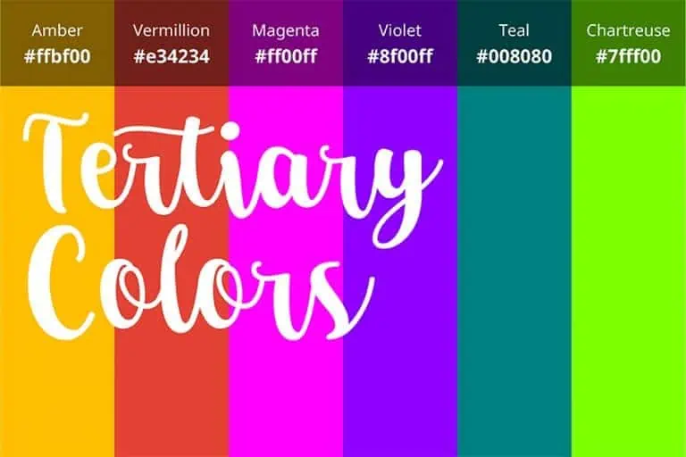
Tertiary colors arise when I mix a primary color with a neighboring secondary color, resulting in more nuanced hues. On the color wheel, there are six tertiary colors:
- Red-Orange
- Yellow-Orange
- Yellow-Green
- Blue-Green
- Blue-Purple
- Red-Purple
These tertiary colors bridge the gap between primary and secondary colors, expanding the palette for more complex color work. Purple, found as both a secondary and tertiary color, plays a significant role in the outcomes of color mixing.
What Does Purple and Pink Make?
When purple and pink are mixed, the result is often a variant of magenta—a vibrant and vivid color with a blend that depends on the specific shades used, offering a mesmerizing spectrum from subtle lilac-infused hues to striking, electric purples tinged with the warmth of pink.
The beauty of this fusion lies in its endless possibilities, inviting us to explore the nuances of color and the wonders they unveil in our artistic endeavors.
Understanding Purple
| Shade | Hex Code | CMYK Color Code (%) | RGB Color Code | Color |
| Purple | #800080 | 0, 100, 0, 50 | 128, 0, 128 |
I recognize purple as a secondary color, which means it’s created by mixing two primary colors—in this case, red and blue. The particular shade of purple depends on the balance between these two colors. A greater proportion of blue yields a cooler, deeper purple, whereas more red creates a warmer, lighter purple.

In color theory, purple symbolizes royalty, luxury, and spirituality. It blends the stability of blue with the energy of red, creating balance. Historically associated with power and wealth, purple also sparks creativity and mystery. Across cultures, it signifies spiritual enlightenment and transformation.
Overall, purple embodies nobility, elegance, and introspection.
Understanding Pink
| Shade | Hex Code | CMYK Color Code (%) | RGB Color Code | Color |
| Pink | #FFC0CB | 0, 25, 15, 0 | 255, 192, 203 |
Pink, meanwhile, can be considered a tint of red, achieved by adding white to pure red. It’s a color that represents softness and tenderness, and it’s lighter in hue compared to solid red. The specific kind of pink—whether it’s a soft pastel or a neon bright—alters dramatically based on how much white is mixed in.

In color theory, pink symbolizes love, compassion, and tenderness. It evokes feelings of sweetness, innocence, and affection, fostering a sense of connection and harmony. Pink also represents youthfulness, playfulness, and optimism, bringing joy and positivity to its surroundings.
Overall, pink embodies a gentle energy that resonates with emotions of love, care, and happiness.
The Magenta Color
| Shade | Hex Code | CMYK Color Code (%) | RGB Color Code | Color |
| Magenta | #FF00FF | 0, 100, 0, 0 | 255, 0, 255 |
Magenta sits between red and blue on the color wheel, and it’s a primary color in the CMYK color model. When I mix purple and pink, I am essentially blending blue, red, and white, which together tend to produce various shades of magenta. This color is especially known for its vibrancy and is often associated with fuchsia or a deep hot pink. Here’s how differing amounts of each color can affect the final shade:
- More pink (red and white): The magenta will be lighter, leaning towards a pastel tone.
- More purple (red and blue): The magenta will be darker and richer.
By adjusting the ratio of purple to pink, I can create a spectrum of magenta shades suitable for different purposes and aesthetics. In color theory, magenta represents passion, creativity, and individuality. It exudes intensity and vibrancy, encouraging innovation and emotional depth. Magenta symbolizes boldness and originality, inspiring us to embrace our true selves and celebrate life’s richness.
Effects of Mixing Different Shades and Tints
When I mix different shades and tints of purple and pink, the hues and saturation levels change, leading to a variety of unique colors.

Color Outcomes of Purple and Pink Blends
The color outcomes of mixing purple and pink vary based on the shades and tints used. Magenta is a common result; it is in the middle spectrum between purple and pink.
- Equal proportions: A balanced, vibrant magenta
- With lighter tints of pink: A paler, more pastel magenta
- With darker shades of purple: A richer, more subdued magenta
By adding tints (white) to these mixes, I can lighten the color, yielding a higher tint and decreasing the intensity of saturation. If I introduce shades (black), however, the resulting colors become darker, the saturation is lessened, and the tones (gray) I add adjust the color’s vividness and depth.
Influence of Proportions and Medium
The proportions of pink and purple I use directly affect the final color. In a paint medium, if I mix a higher proportion of pink, made up of red and white, the resultant color is a light red-purple tint, indicative of a higher saturation level and brightness.
Conversely, when I increase the proportion of purple, a mix of blue and red, the resulting color shifts darker, producing a deep magenta with a reduced saturation.
- Pink majority: A lighter, more saturated red-purple tint
- Purple majority: A darker, less saturated deep magenta
The Symbolism of Magenta
Magenta, a rich blend of purple and pink, carries distinct symbolism in various contexts. I find it signifies a balance of masculine and feminine energies, often associated with creativity and uniqueness.

Influence on Mood and Emotion
Magenta influences mood and emotions by fostering a sense of optimism and emotional balance. I find it particularly helpful in spaces designed for reflection and creativity, as it can motivate action and encourage deep thought.
However, it’s vital to use magenta sparingly to avoid overwhelming a space and causing restlessness.
In Interior Design
In interior design, I use magenta to introduce vibrancy and warmth into space. It’s a versatile accent color that can energize a room while still maintaining harmony. In practice, magenta pairs well with neutrals to create a pop of color, or with similar hues for a monochromatic scheme that radiates creativity.

Different Meanings in Various Cultures
Magenta’s meanings vary across cultures. In Western cultures, it is seen as a color of compassion and kindness, often associated with nurturing qualities. Conversely, in Eastern cultures, magenta can represent harmony and emotional balance, symbolizing a blend of tranquility and inner peace. Despite cultural nuances, magenta’s versatile symbolism underscores its ability to evoke profound emotions and perceptions across diverse societies.
It’s intriguing how magenta can symbolize both innovation and non-conformity. In design, I consider these cultural associations to ensure my work resonates appropriately with its intended audience.
Psychological and Cultural Significance of Magenta
Magenta, a hue born from the combination of purple and pink, carries a rich psychological and cultural tapestry that informs its perception in society. Psychologically, I understand magenta to embody balance since it merges the calm stability of blue inherent in purple with the fierce energy of red found in pink.
In this blend, the comforting connotations of purple and the nurturing quality of pink consolidate, creating a sense of emotional harmony and fostering kindness in interpersonal interactions.
Culturally, magenta often holds a place in the notion of royalty and luxury, thanks to its purple component, historically a color of the noble class due to the rarity and cost of purple dye in antiquity. On the other hand, it’s the femininity commonly associated with pink that shines through in magenta, reflecting a feminist ethos of strength and complexity.

From a cultural viewpoint, I perceive the color to frequently evoke a forward-thinking spirit, as magenta is not traditionally bound by the color expectations of many cultures, which allows it to symbolize a progressive mindset and originality. It’s a color that I see rebelling against conformity, often used to signify movements that embrace change and innovation.
Through the lens of symbolism, I view magenta as a color that speaks to both the heart and the mind, encouraging a balance between emotional responsiveness and thoughtful reflection. When I see magenta, I’m reminded of both serenity and a spark of creativity, serving as a bridge between introspective thought and passionate action.
The journey into the fusion of purple and pink has been nothing short of a chromatic adventure! As we’ve explored, their blend unveils a delightful array of hues, from soft lavender whispers to vibrant magenta melodies. It’s like discovering a treasure trove of colors that spark joy and creativity! Whether in art, fashion, or the whimsical landscapes of our imagination, the amalgamation of purple and pink reminds us of the boundless possibilities that emerge when colors unite. So, let’s continue to paint our world with hues that reflect the magic and vibrancy of life, one stroke at a time. After all, in the palette of existence, every color tells its own enchanting tale!
Frequently Asked Questions
What Result Do You Get When Combining Purple and Pink in Acrylic Paints?
When I mix purple and pink acrylic paints, the result is typically a variant of light purple. This shade may lean towards lilac or a muted magenta, depending on the specific tones and proportions of pink and purple used in the mixture.
How Do Pink and Purple Colors Interact to Influence Fashion and Styling Choices?
In fashion, the combination of pink and purple often results in a playful and vibrant aesthetic. These colors are known to complement each other, and their interaction can introduce a sense of creativity and individuality to styling choices. Whether used in garments, accessories, or thematic color schemes, pink and purple together can make a statement that is both stylish and expressive.
Duncan graduated with a diploma in Film and TV production from CityVarsity in 2018, after which he continued pursuing film while taking on a keen interest in writing along the way. Since having graduated, he began working as a freelance videographer, filming a variety of music videos, fashion and short films, adverts, weddings and more. Throughout this, he’s won a number of awards from various film festivals that are both locally and internationally recognized. However, Duncan still enjoys writing articles in between his filming ventures, appreciating the peace and clarity that comes with it.
His articles focus primarily around helping up-and-coming artists explore the basics of certain colors, how these colors can be paired with other shades, as well as what colors are created when you mix one with another. All while relating these shades to historically significant paintings that have incorporated them into their color palette. As a lover of the arts himself, he takes great interest in the Renaissance era of paintings, an era that has directly inspired many of his favorite films.
Learn more about Duncan van der Merwe and about us.
