Ivory Color – How to Use This Rich Shade of White
This post may contain affiliate links. We may earn a small commission from purchases made through them, at no additional cost to you.
What color is ivory and how can the ivory color be used in home decor? Today, we will explore the ivory shade by comparing the ivory color to the cream color and the difference between ivory and white. We will also provide you with the ivory hex code and the ivory color code. By the end of this article, you will know everything there is to know about which colors mix with the ivory color, which ivory hex codes and ivory color codes to use for your projects as well as how it has been used in art.
Table of Contents
The Color Ivory
The ivory shade is a timeless color that appears frequently in home decor. Because of this color’s versatility, it may be employed in any environment – a kitchen, living, bedroom, or even a bathroom. Additionally, due to its being so soft, it is commonly used in nurseries. Ivory is a particularly light color created by blending beige and white together.
Exact ratios are critical here; if you don’t pay close attention, you’ll get ecru rather than ivory, which is a common mistake.
| Shade | Ivory Hex Code | CMYK Color Code (%) | RGB Color Code | Color |
| Ivory | #FFFFF0 | 0, 0, 6, 0 | 100, 100, 94.1 |
The Meaning of the Color Ivory
Pure crisp white is associated with purity, tranquility, spirituality, and holiness in color psychology. And although ivory has a little amount of yellow, it can symbolize comparable sentiments to pure white, such as tranquility and clarity. With its richer tone, ivory color is less stark and severe than pure white, and because of this difference, ivory further evokes notions of elegance, luxury, and wealth.

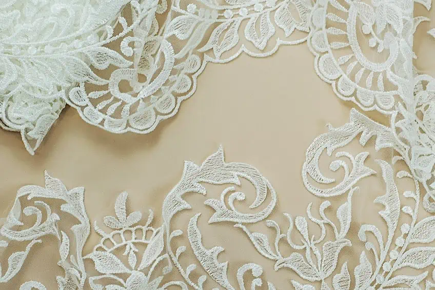
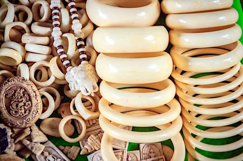
When it comes to weddings, many women prefer to select an ivory wedding gown rather than a pure white gown to communicate a feeling of elegance or timelessness. Ivory is a soothing neutral hue. Even though it has some of the same purity, smoothness, and clarity as white, it is significantly richer and deeper.
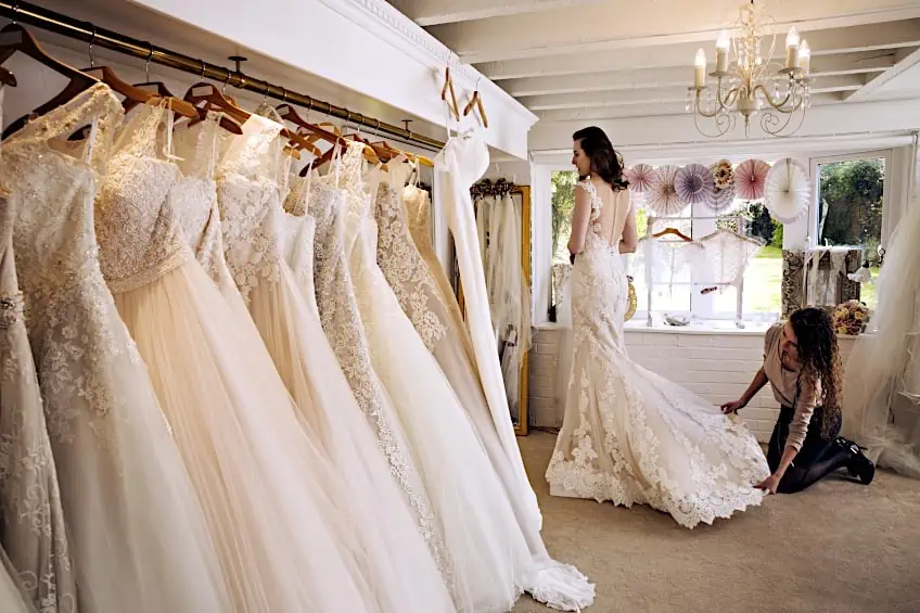
Ivory tusks have long been coveted and utilized in jewelry, home decor, and furniture decorating. The use of the word ivory in popular language can assist us in seeing how the ivory color is regarded by people, both positively and negatively. For example, the phrase “ivory tower” means different things to different people.
To some it is a haven, a place of isolation, or a refuge from the outside world.
Others view it negatively; somebody who resides in an ivory tower may be deemed physically or emotionally out of contact with reality. The insinuation is that the inhabitant of the ivory tower is oblivious to reality, which is why the phrase is used dismissively of theoreticians.
Ivory Color vs. Cream Color
Though the hues of cream and ivory may look similar to the untrained eye, the distinctions are extremely evident when selecting home decor or paint in any color. Because the colors should not be mixed, the impact of both will be rather dramatic if applied wrong. Here are our thoughts on the two colors to assist you in understanding what makes them distinct despite their similarities in hue.

Ivory is a gentler hue than cream because of its rich brown undertone, making it pleasant and relaxing on the eyes. While having warm yellow undertones, the cream hue is incredibly eye-catching. Ivory is a popular fabric color, whether for pants, blouses, or even bridal gowns—the soft hue flatters individuals of all skin tones. Nevertheless, after a few years, ivory paint may take on a yellowish tone similar to cream. The cream color is mostly utilized in wall painting and home decor.
It is also used in fabric, but it is important to apply it sparingly since the yellowish tone can make items seem worn or boring.
| Shade | Hex Code | CMYK Color Code (%) | RGB Color Code | Color |
| Cream | #fffdd0 | 0, 1, 18, 0 | 255, 253, 208 |
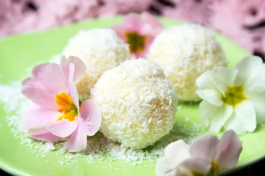
Another way you can tell them apart is that ivory is a hue that mimics elephant tusks. This color works well with other colors with similar undertones, such as grey and cobalt blue. In comparison, and as the name implies, the color cream is one that matches the tint of butterfat found in milk. The color cream is a warm golden color that is commonly used in wall paint and kitchen equipment. Though the color is classified as white, it may also be defined as a blend of pale soft yellow, and white.
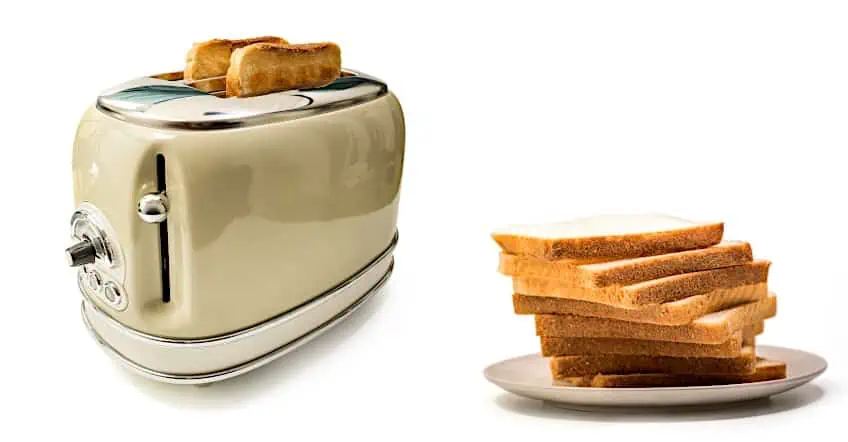
You may be wondering why cream and ivory, two distinct hues of white, should not be used on the very same color palette. The reason for this is that choosing colors with similar undertones is essential for toning out a palette. Besides cream, another color that often gets confused for ivory is beige. Consider blending a little gray or brown with white to get a sense of the color beige. It is a mellow, neutral color that is frequently used as an overarching word for a range of colors ranging from mild yellow-brown to lighter brown-gray.
Khaki, tan, buff, and Loden yellow are the most frequent hues that fit under the beige category.
| Shade | Hex Code | CMYK Color Code (%) | RGB Color Code | Color |
| Khaki | #f0e68c | 0, 4, 42, 6 | 240,230,140 | |
| Tan | #d2b48c | 0, 14, 33, 18 | 210,180,140 | |
| Buff | #f0dc82 | 0, 8, 46, 6 | 240,220,130 | |
| Loden Yellow | #b69915 | 0, 16, 88, 29 | 182,153,21 |
Suitable Color Combinations With Ivory
Blending the ivory color with the other shades in the color wheel follows the same principle as blending ivory with other ornamental decor elements – ivory is a versatile color that fits numerous colors. However, what are the most effective combinations? Let us now take a look at how you can use the ivory shade with various complementary colors.

White
With regards to ivory vs. white, the two are quite complementary. Try layering the two to provide depth without using too much color. It’s an excellent backdrop color if the things in the foreground are darker. Find a happy medium while dealing with white and ivory. It is preferable to utilize one as the dominant neutral and the other to highlight or darken it.
This will provide dimension and balance while eliminating the need for saturation.

| Shade | Hex Code | CMYK Color Code (%) | RGB Color Code | Color |
| White | #ffffff | 0, 0, 0, 0 | 255, 255, 255 |
Blue
Ivory goes well with any light blue, but softer blues are preferable over bright blues. Combine ivory linens with light blue pillows, or place an arrangement of lovely lighter blue flowers on a tabletop. If you enjoy blue but don’t favor lighter tones, navy blue or midnight blue paired with ivory is your best choice. Navy is a beautiful color to combine with an ivory wedding gown for example. They look great together and mix nicely.
You may also use black if you want, but navy blue is a preferable option if you plan to use a lot of this dark shade.
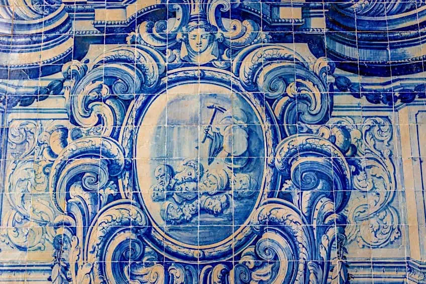
| Shade | Hex Code | CMYK Color Code (%) | RGB Color Code | Color |
| Midnight Blue | #08113B | 78, 78, 0, 56 | 8, 17, 59 | |
| Alice Blue | #F0F8FF | 6, 3, 0, 0 | 240, 248, 255 |
Dark Brown
Dark brown is another good substitute for black. If you want a particular brown, then try chocolate brown to complement ivory beautifully. Another suitable brown to use is chestnut brown.

| Shade | Hex Code | CMYK Color Code (%) | RGB Color Code | Color |
| Chocolate Brown | #411900 | 60, 70, 70, 70 | 65,25,0 | |
| Chestnut Brown | #5D2F27 | 0, 50, 58, 64 | 93, 47, 39 |
Purple
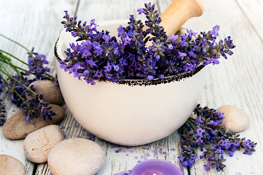
Purple has a greater RGB value, therefore it may be used with ivory effectively. Darker purple hues, on the other hand, complement ivory better. Light purples seem to blend into the white. While they are pleasant enough together, you need to provide a juxtaposition with the ivory, or else it will be too light and not strong enough.
| Shade | Hex Code | CMYK Color Code (%) | RGB Color Code | Color |
| Studio | #674ea7 | 38, 53, 0, 35 | 103,78,167 | |
| Fuchsia Nebula | #7618a9 | 30, 86, 0, 34 | 119,25,169 |
Olive
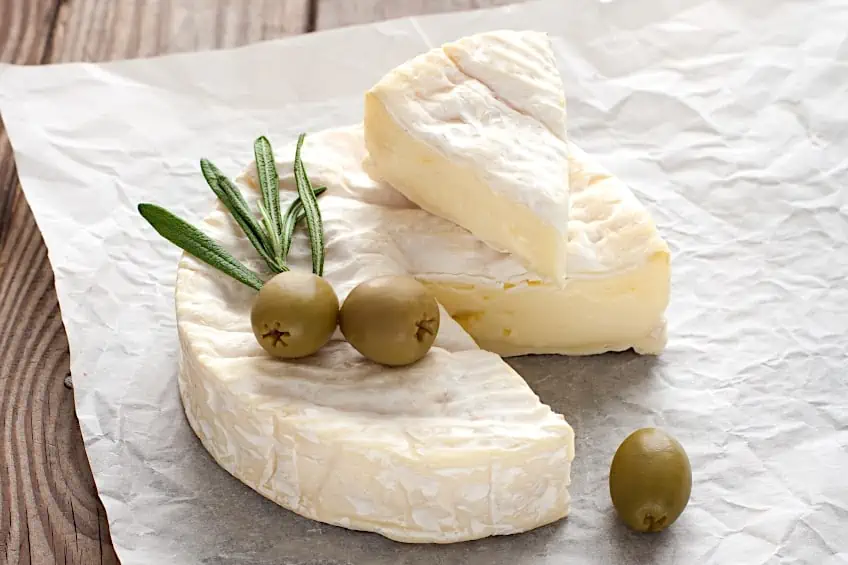
Olive can also be used with purple. You may also choose sage, which is comparable but slightly more beige and gentler, making it suitable for any kitchen. Many rooms are painted in olive or green, and adding ivory enhances them, therefore the olive color grounds the ivory color, so the two combined can produce a wonderful equilibrium in any environment.
| Shade | Hex Code | CMYK Color Code (%) | RGB Color Code | Color |
| Sage | #87ae73 | 22, 0, 34, 32 | 135,174,115) | |
| Olive | #808000 | 0, 0, 100, 50 | 128,128,0 |
Mint
Mint color is also compatible with the ivory shade. If you wish to repaint a room, one of the various neutrals might be an excellent choice for a third color. What type of atmosphere do you want to set? The rest will be simple to figure out once you have the answer.
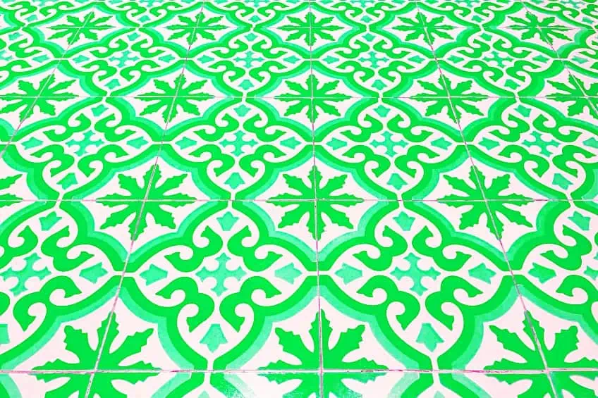
| Shade | Hex Code | CMYK Color Code (%) | RGB Color Code | Color |
| Mint | #3eb489 | 66, 0, 24, 29 | 62,180,137 |
Bottle Green
Bottle green is an excellent match with ivory. Be certain to apply it sparingly to obtain a really aesthetically pleasing look. In this sense, it serves as a focal point for the interior’s decor.
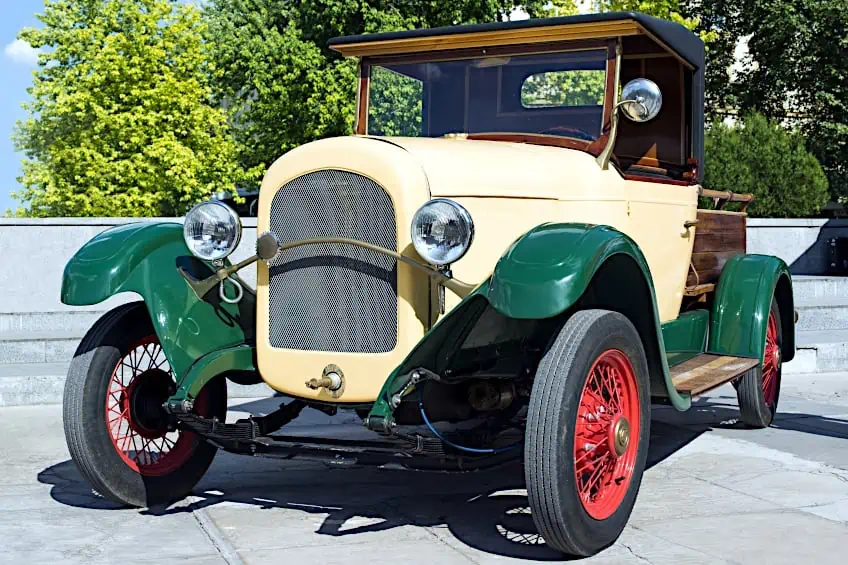
| Shade | Hex Code | CMYK Color Code (%) | RGB Color Code | Color |
| Bottle Green | #0f472c | 79, 0, 38, 72 | 15, 71, 44 |
Other Potential Combinations
Gray appears dignified and traditional when coupled with ivory. Choose pink or classic gold to spice up such a design. The combination of red and ivory is most likely to appeal to sensitive homeowners who want to express themselves in their furnishings but are wary of overly exaggerated designs.
Fuchsia may brighten up and characterize an ivory-colored room, it’s a common mix in spaces intended for relaxing.
Turquoise, like fuchsia, enlivens the lackluster ivory tone and such a mix is common in minimalist and ultramodern environments. Taupe, like ivory, is a classic hue that works well in classical settings, and they also look fantastic when paired with natural wood.
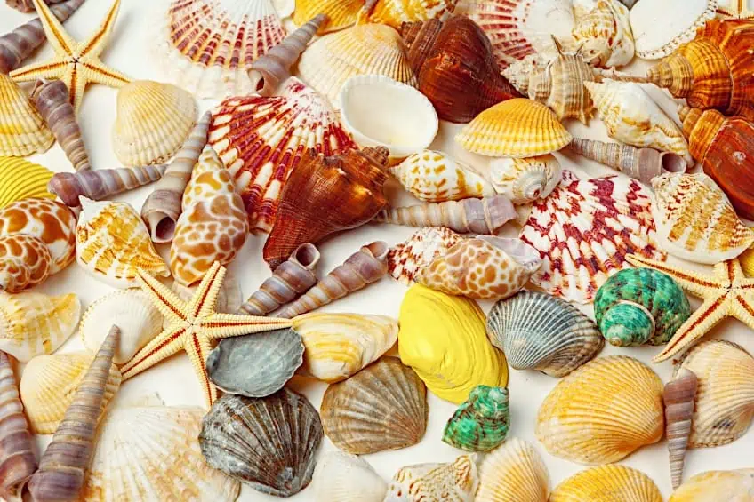
| Shade | Hex Code | CMYK Color Code (%) | RGB Color Code | Color |
| Heather Gray | #9c9da4 | 5, 4, 0, 36 | 156,157,164 | |
| Gold | #ffd700 | 0, 16, 100, 0 | 255,215,0 | |
| Pink | #ffc0cb | 0, 25, 20, 0 | 255,192,203 | |
| Fuchsia | #FF00FF | 0, 78, 28, 21 | 202, 44, 146 | |
| Red | #ac363a | 172, 54, 58 | 172, 54, 58 | |
| Taupe | #483c32 | 0, 17, 31, 72 | 72, 60, 50 | |
| Turquoise | #30d5c8 | 77, 0, 6, 16 | 48,213,200 |
Using the Ivory Shade in Your Home
The Ivory color is an exceptionally diverse hue with several qualities. First and foremost, it is quite light, so it will complement any environment. In this instance, there is no danger of making the room appear smaller. However, this is only one of the many advantages of this color. Ivory is an excellent backdrop color for a variety of designs and it goes with every style. Ivory goes well with anything from Boho to industrial designs.
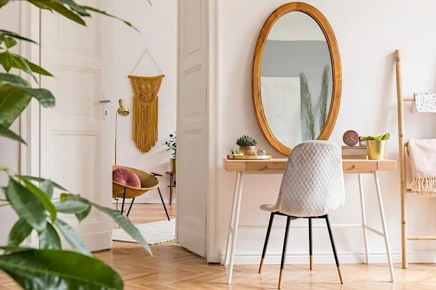
The final feel of the space is all determined by the decorations and furnishings you select. Choosing an ivory shade has another advantage: it is an easy way to rejuvenate your living space. Then simply add a handful of new items in a distinctive color and style to entirely transform the room.
There is less difficulty using ivory color paint to enliven a space, than using harsh and very saturated colors.
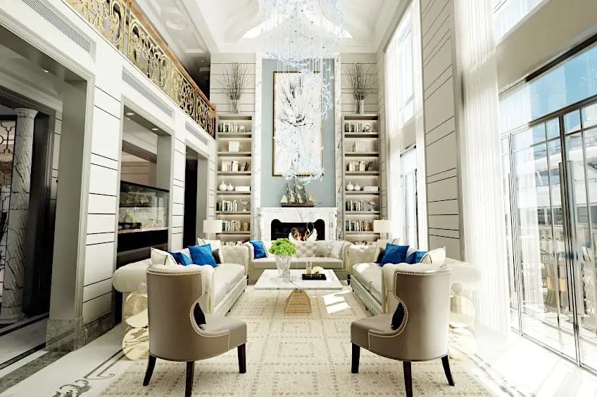
Places Where the Ivory Color Will Work Best
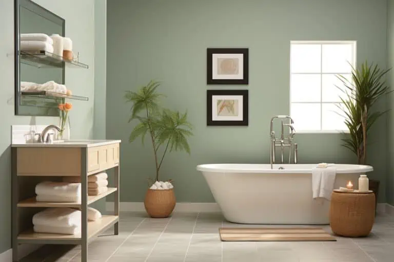
Ivory is one of the most versatile pastel hues that may be utilized in any setting. Although it is commonly used in bedrooms and living areas, these are not the only options. The ivory color is an excellent choice for a baby’s room that will change with the child over time. Whether the youngster is fascinated with cars or sports, the vibrant background provides numerous possibilities. Do you want to know what the ideal color for a hallway is?
Ivory is an excellent option for this space, particularly if the interior is somewhat small.
Ivory-Colored Furniture
Bright colors, such as ivory, were not traditionally utilized on furniture in homes or apartments. However, at one point this mindset rapidly shifted regarding furniture items, and manufacturers began selling ivory and white wardrobes and couches. Property owners, on the other hand, had to wait a little longer for changes in contemporary leisure furniture. Ivory-colored furniture is currently a fashionable choice.
Ivory is a peaceful and soothing hue. When you compare ivory vs. white, ivory color brings on feelings of purity and gentleness as a deeper and warm variation of white. Since ancient times, people have regarded ivory as a sign of virginity, richness, and morality. Because it is a neutral hue, you may simply combine it with virtually any other color. As a wedding hue, ivory is frequently used with similarly related colors such as gold and beige. It may also be used as a complement to navy blue for a more powerful palette.
Take a look at our color ivory webstory here!
Frequently Asked Questions
Is Ivory a Warm or Cool Color?
Ivory colors, due to their yellow overtones, tend to incline somewhat more toward the warm side of the color wheel. Even though the yellow undertones give off a faint warmth, ivory is usually regarded as a neutral hue that may combine well with both cold and warm colors.
What Color Is Ivory and How Is It Different From Cream?
The distinction between cream and ivory hues is mostly conceptual. The slight yellow tinge seen in each color distinguishes ivory from cream. When deciding between the two for painting or textile colors for your home or wedding decor, you must consider the proportion of yellow in the white. Avoid using bright arctic white on ivory unless you have a very limited palette and the white and ivory look like a conscious design decision.
What Is the Meaning of the Ivory Shade?
In color theory, white is connected with innocence, tranquility, devotion, and sanctity. With a yellower tone which makes it less visually harsh, ivory is used to express similar thoughts and emotions as white, such as calm and cleanliness without the sterility of pure white. The color ivory is also associated with refinement and prosperity.
Duncan graduated with a diploma in Film and TV production from CityVarsity in 2018, after which he continued pursuing film while taking on a keen interest in writing along the way. Since having graduated, he began working as a freelance videographer, filming a variety of music videos, fashion and short films, adverts, weddings and more. Throughout this, he’s won a number of awards from various film festivals that are both locally and internationally recognized. However, Duncan still enjoys writing articles in between his filming ventures, appreciating the peace and clarity that comes with it.
His articles focus primarily around helping up-and-coming artists explore the basics of certain colors, how these colors can be paired with other shades, as well as what colors are created when you mix one with another. All while relating these shades to historically significant paintings that have incorporated them into their color palette. As a lover of the arts himself, he takes great interest in the Renaissance era of paintings, an era that has directly inspired many of his favorite films.
Learn more about Duncan van der Merwe and about us.
