Pastel Colors – Creating and Using a Pastel Color Palette
This post may contain affiliate links. We may earn a small commission from purchases made through them, at no additional cost to you.
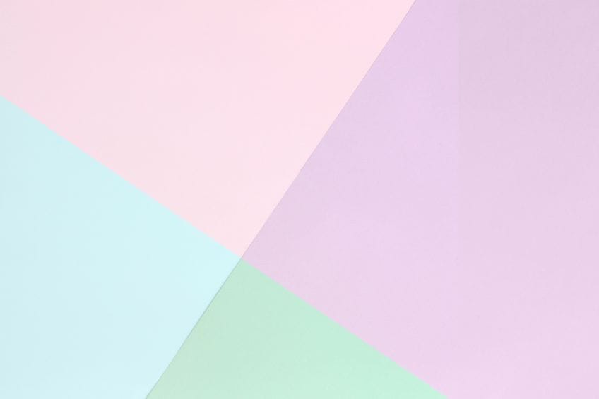
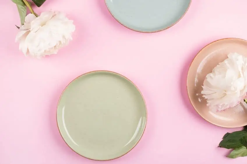
Welcome to the wonderful world of pastel colors! These lovely hues are tints of a lighter and softer shade of each color on the color wheel. In other words, pastel colors are just muted, paler, and softer versions of the brighter and more vibrant colors we use every day! While we may not realize it, colors have an impact on our emotions and feelings more than we realize, and this is understood by those in the design and the marketing industry. Pastel shades used in a room can help evoke feelings of happiness, youthfulness, fantasy, and fun! The pastel color palette is not often discussed; however, it seems to be making quite the comeback in interior design, advertising, and clothing!
The Pastel Color Palette
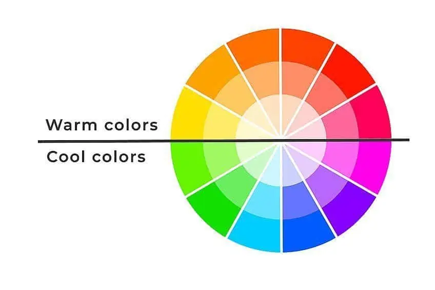
The solid pastel colors are just the lighter or diluted versions of primary and secondary colors. In other words, pastel colors are a muted version of bright colors. These hues can be created by adding white to vibrant color. A color wheel is highly beneficial when planning which colors to use for your project.
Color wheels consist of primary, secondary, intermediary, and tertiary colors.
These colors are grouped, enabling us to see how different combinations will work together, or how to mix colors when creating paint. Let us take a look at three terms used by designers:
- Hue: The hue is the actual color we see.
- Value or brightness: This term is used when determining the level of brightness of a particular color. Sometimes, the term “value” can also refer to the luminance of a color. Solid pastel colors have high luminance. The tint or shade are other ways to describe value and brightness.
- Chroma: This is a term used to describe the intensity of the color. Another word to use would be saturation. When a color is said to have a low chroma, the color will appear to be dull. Pastel colors have a low chroma.
The pastel color palette has low saturation and a high value of luminance. So, to create blue pastel colors or a light pastel purple, you would choose the corresponding shade on the color wheel and then add more white to lighten the shade, thus resulting in solid pastel colors.
If you are mixing paint, you may have noticed the word “tint” being used. Solid pastel colors are tints. What this means is that these colors are just paler or lighter versions of themselves. In other words, when creating a pastel pink-color paint, you would add white to red, thus creating a subdued version of red.
Creatives use color codes when using design programs. Glancing at the table that follows, you will notice the abbreviation “HSV” and RGB. The first color code stands for hue, saturation, and value. RGB stands for Red, Green, and blue. The HSV color scale also uses a numerical code that coincides with a specific color name. This system is used by most designers as it displays the truest form of color. The HSV system is also the preferred system to create accurate pastel colors for online media and print.
The Effect of Pastel Colors
When we look at the psychology behind pastel color palettes, we can easily associate the pastel colors with soft emotions such as peace and relaxation. Because these shades are soft on the eye, they help to create a calm and relaxed space. This is why you often see pastel light blue for baby boys and light pastel purple or pastel pinks for baby girls. The pastel color is also associated with feelings of happiness and love.
Men today often shy away from choosing to wear a pastel color due to their feminine association.
Some other feelings and situations that could be represented by pastel shades and colors include feelings of laughter and joy, love and hope, relaxation, optimism, feelings of laughter, cleanliness, freshness, and a reminder of youth and new beginnings. Pastel colors are often worn by doctors and nurses and are the perfect tone for office walls and hospitals as it conveys calmness and cleanliness. Including pastel tones for interior design in the home is perfect for uplifting the light in a space and adding a relaxing tone to the room.
The History and Meaning of Pastel Colors
Throughout time, color has played a major role in fashion. Dull colors, such as brown and gray, were worn by the poorer community. The dye used to create bright colors like blue, red, and green was expensive, so only the wealthy or religious would be able to afford them.
As many of us know, France is the home of fashion. It birthed the Rococo and late Baroque style that included a burst of ornamental architecture, sculpture molding, and the use of soft pastel shades for fabrics and textiles. The wealthier people of the 18th century quickly took to pastel shades, causing them to become very popular. Madame de Pompadour, who was the mistress of Louis XV, adored pastel colors. Blue pastel colors were later the interest of Marie-Antoinette.

During the Victorian era, the working class adopted the fashionable trend of wearing pastel colors when on holiday near the seaside. The term “the holiday” was the name given to the pastel color trend. It played an important role in the history of fashion. On the streets of busy cities, people were dressed in pretty pastel pink colors – green pastel, blue pastel colors, and soft lemon yellow. Soon this trend would appear on the shores of Italy, France, and England!
The pastel palette has maintained its holiday trend well into the 20th century, its soft shade emitting a relaxing and carefree feeling. Exactly what one needs from a vacation! As these pastel colors were experimented with in fashion, they soon transitioned from being considered “feminine” colors and became increasingly popular for men in sports. The designer Ralph Lauren first made the classic Polo brand shirt in a pastel pink color!
Of course, we cannot forget the 1980s! This is when pastel colors became a massive tendency in men’s fashion, especially in the television series Miami Vice. The show’s main characters were featured wearing green pastel color suits and clothing in other pastel hues.
Designers and artists use pastel color palettes for many reasons in interior design, fashion, and digital media. For many, it is because pastel colors bring a sense of positivity, youthfulness, and fun to everyday life!
The Various Shades of Pastel Colors
Once you start exploring the world of pastel colors, you may find it difficult to choose the hues of a regular tint! Designers use pastel hex codes and color tables to identify color names. These codes also make the mixing of paint easier. Take a look at some examples of well-known pastel shades in the tables below, each complete with pastel color codes, pastel hex codes, and RGB pastel color codes.
Pastel Millennial Pink
The social media platform Tumblr made the pastel pink color trendy in 2010, and soon, this shade became known as Tumblr Pink! From there, the pastel pink color became increasingly popular with celebrities wearing it on the red carpet. High fashion runway brands such as Gucci began using it in their fashion design garments. Eventually, it was dubbed “Millennial Pink”.
The Pantone Color of the year 2016 trademarked this pastel pink color as “Rose Quartz”.
| Pastel Color Name | Pastel Hex Codes | CMYK Pastel Color Code (%) | RGB Pastel Color Code | Pastel Color |
| Millennial Pink | #f3cfc6 | 0, 15, 19, 5 | 243, 207, 198 |
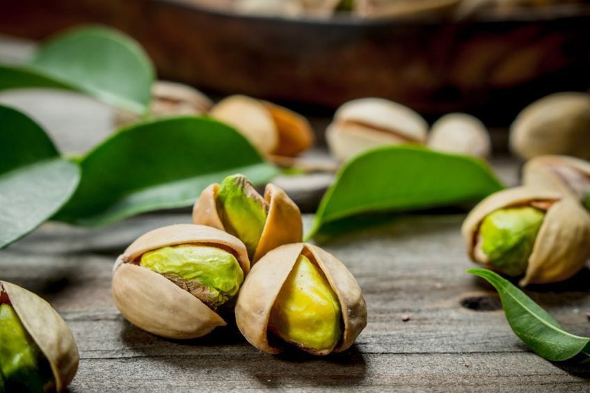
Pastel Pistachio Green
The soft pistachio green color is a pastel color that can be found in nature. This soft, green hue represents calmness, relaxation, and freshness. Green pastel colors work very well with light pastel purple hues, blue pastel colors, or darker green tones. This particular green pastel color is one of the most versatile pastel colors for your pastel palette.
| Pastel Color Name | Pastel Hex Codes | CMYK Pastel Color Code (%) | RGB Pastel Color Code | Pastel Color |
| Pistachio Green | #a9d39e | 20, 0, 25, 17 | 169, 211, 158 | |
| Light Pastel Purple | #c89ed3 | 5, 25, 0, 17 | 200, 158, 211 |
Pastel Soft Yellow
This lovely, light lemon color is often used to decorate baby rooms and is considered to be a unisex pastel hue. Sometimes, a more vibrant pastel yellow (lemon yellow) and a yellow that may be a little lighter is called lemon Chiffon. Yellow is a primary color that will become a dull and muted shade once white has been used to dilute it into a pastel shade. Pastel Yellow is associated with happiness and optimism.
The ideal color combinations with pastel yellow would be pastel light blue and light pastel purples.
| Pastel Color Name | Pastel Hex Codes | CMYK Pastel Color Code (%) | RGB Pastel Color Code | Pastel Color |
| Pastel Yellow | #fdfd96 | 0, 0, 41, 1 | 253, 253, 150 | |
| Chiffon Yellow | #fffacd | 0, 2, 20, 0 | 255, 250, 205 | |
| Lemon Yellow | #fff44f | 0, 4, 69, 0 | 255, 244, 79 |
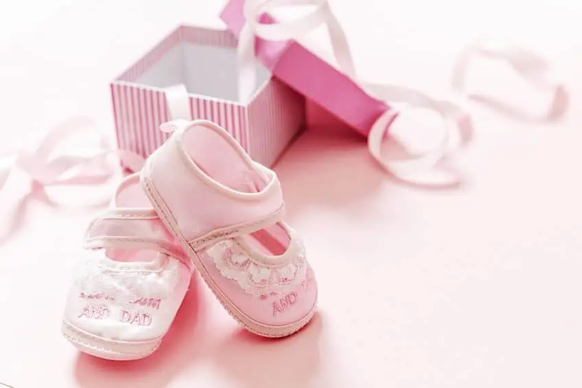
Pastel Baby Pink
Possibly the most popular of all the pastel shades, pastel baby pink, and other pastel pink colors are always in demand! For its name’s sake, it is associated with baby girls. It is seen as a pretty, feminine, loving, and playful hue. Baby pink has a pastel hex code of #f42c2.
| Pastel Color Name | Pastel Hex Codes | CMYK Pastel Color Code (%) | RGB Pastel Color Code | Pastel Color |
| Baby Pink | #f4c2c2 | 0, 20, 20, 4 | 244, 194, 194 |
Pastel Light Azure
There is a blue pastel color known as light azure with the pastel hex code #74bbfb. This pastel hue is a mixture of cyan and blue. The word azure often refers to the sky on a clear, beautiful, summer’s day.
This gorgeous blue works beautifully alongside a soft orange tone.
| Pastel Color Name | Pastel Hex Codes | CMYK Pastel Color Code (%) | RGB Pastel Color Code | Pastel Color |
| Light Azure | #74bbfb | 54, 25, 0, 2 | 116, 187, 251 | |
| Soft Orange | #fbb474 | 0, 28, 54, 2 | 251, 180, 116 |
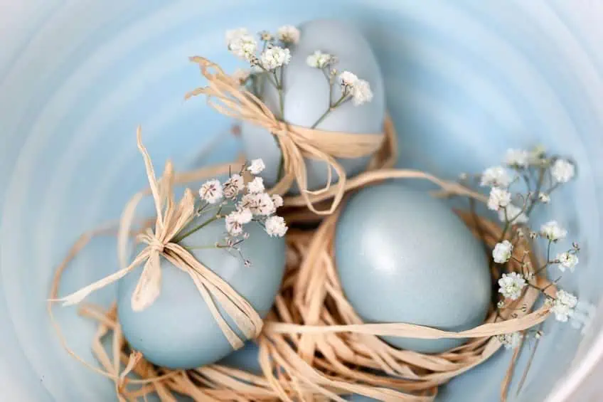
Pastel Baby Blue
As part of the blue pastel color family, the ever-popular baby blue is similar to baby pink and is named thanks to its association with baby boys – often used for boys’ clothing or in bedrooms. In the 19th century, people often referred to the eyes of a newborn as “baby blue”.
| Pastel Color Name | Pastel Hex Codes | CMYK Pastel Color Code (%) | RGB Pastel Color Code | Pastel Color |
| Baby Blue | #89cff0 | 43, 14, 0, 6 | 137, 207, 240 |
Pastel Creamy Mint
The creamy mint color is one of many beautiful green pastel shades. Paint brand Dunn-Edwards added this shade to their collection in 2006.
When comparing a creamy mint green, you will notice that creamy mint has yellow undertones.
| Pastel Color Name | Pastel Hex Codes | CMYK Pastel Color Code (%) | RGB Pastel Color Code | Pastel Color |
| Creamy Mint | #c8f3cd | 18, 0, 16, 5 | 200, 243, 205 | |
| Mint Cream | #f5fffa | 4, 0, 2, 0 | 245, 255, 250 |
Pastel Peach
Pastel peach lends its name from the fruit of the same name. To create a softer palette, peach and white make a beautiful combination! Other colors that pair well with this pastel peach hue include pastel light blue and green pastel shades. Hints of gold can complete your peach-toned palette.

| Pastel Color Name | Pastel Hex Codes | CMYK Pastel Color Code (%) | RGB Pastel Color Code | Pastel Color |
| Peach | #ffe5b4 | 0, 10, 29, 0 | 255, 229, 180 |
Pastel Light Seafoam
This extremely popular green pastel color is known as light seafoam and has more of a blueish undertone. This tone is easy to mix using white, green, and a touch of blue. This particular pastel shade helps to create a calming atmosphere in any room.
It is often used in day spas or beachside coffee shops.
| Pastel Color Name | Pastel Hex Codes | CMYK Pastel Color Code (%) | RGB Pastel Color Code | Pastel Color |
| Light Seafoam | #9fe2bf | 30, 0, 15, 11 | 159, 226, 191 |
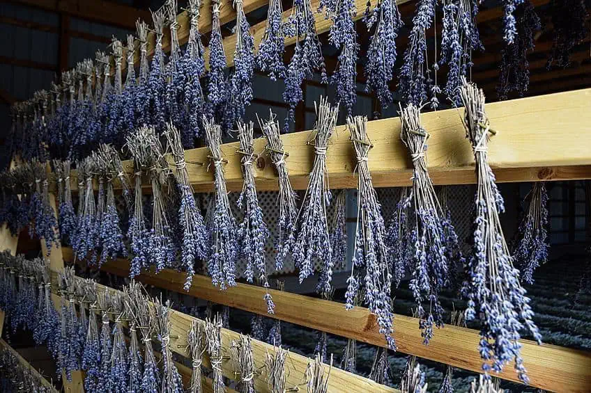
Pastel Lavender
This light, pastel purple color is known as lavender and is a very popular pastel color! This beautiful pastel hue can be linked to purity, calmness, cleanliness, and freshness. Historically, the color purple was linked to wealth and royalty, and in modern times the light pastel purple is a popular color used in wedding decor.
| Pastel Color Name | Pastel Hex Codes | CMYK Pastel Color Code (%) | RGB Pastel Color Code | Pastel Color |
| Lavender | #967bb6 | 18, 32, 0, 29 | 150, 123, 182 |
A Look at Pastel Color Combinations for Design
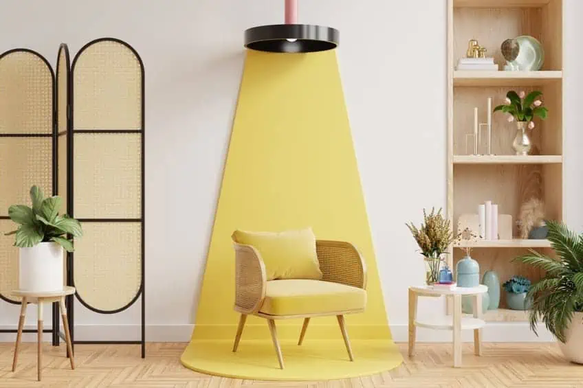
Using pastel hues, gradients, and solid pastel colors in your design project can help create a fun and whimsical look. Pastel colors are an excellent way to bring a new and unique color scheme into your work, be it fashion, interiors, or online platforms. Pastel colors are usually associated with calmness and peace; therefore, they are a popular choice for cosmetic, bathroom, and baby products. Many people enjoy using pastel hues for wedding color schemes.
For design purposes, solid pastel colors are often used for the interiors of spas, salons, and children’s décor stores, and are always a popular choice for modern branding, and the colors are easily compatible with so many other tones. Using a tone from the pastel color palette can be effective in establishing a contemporary style, especially when combined with bright and bold colors. These versatile hues work well with many different colors.
Next, we will explore the use of pastel colors when used in interior design projects.
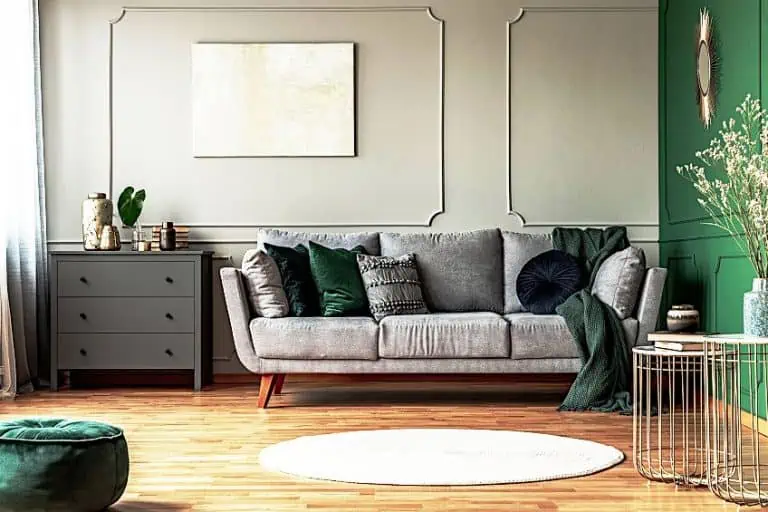
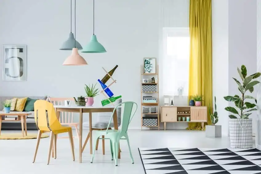
Interior Design and Pastel Shades
Using pastel color palettes for home interior design can seem different and unusual at first, perhaps even a little daunting! However, these soft hues can help you develop an inviting, relaxing, and stylish environment. That said, if used incorrectly, pastel colors can make the space feel dull, thanks to their muted tones. Combining pastel colors with other hues is easy when using complementary colors, and these can easily be found on the color wheel.

For example, you can use blue pastel colors paired with orange pastel colors, or pastel pink colors could work together with green pastel colors. Light pastel purple is a perfect complementary color to a soft pastel yellow color! The table below shows some common pastel shades and includes the pastel color codes as well as pastel hex codes.
| Pastel Color Name | Pastel Hex Codes | CMYK Pastel Color Code (%) | RGB Pastel Color Code | Pastel Color |
| Pastel Light Blue | #89cff0 | 43, 14, 0, 6 | 137, 207, 240 | |
| Pastel Orange | #ffe5b4 | 0, 10, 29, 0 | 255, 229, 180 | |
| Pastel Red | #ff6961 | 0, 59, 62, 0 | 255, 105, 97 | |
| Green Pastel | #a9d39e | 20, 0, 25, 17 | 169, 211, 158 | |
| Light Pastel Purple | #c89ed3 | 5, 25, 0, 17 | 200, 158, 211 | |
| Pastel Yellow | #fdfd96 | 0, 0, 41, 1 | 253, 253, 150 |
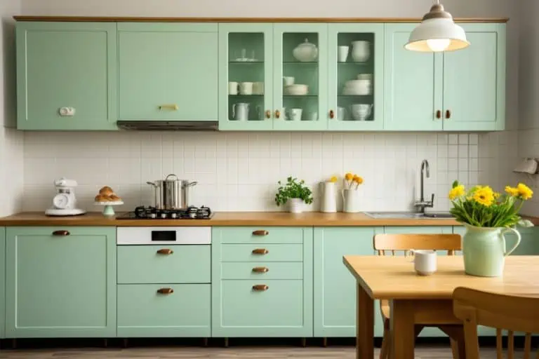
The pastel color palette has a wonderful medley of shades to choose from when redecorating your home, office, or store. As mentioned before, these soft colors are great when combined with bold colors such as burnt orange or navy blue. Using bold colors with pastel shades can create much-needed balance, whether used on walls or for accessories. Pastel colors are often reserved for bathrooms or children’s bedrooms. However, lately, they are making quite an impact, and are even being used in kitchens!
Solid pastel colors go well alongside neutral colors such as gray and white, which might be exactly what you need if you are a little scared of going “all pastel”. You can’t go wrong using pastel colors, even when used in small amounts or as accent colors!
Reserving your pastel shade as an accent wall could be a great way to break a solid white room, and dark furniture could help create a touch of contrast. By limiting the pastel colors to accent accessories or a singular wall amongst a neutral setting, you can bring these lovely hues into any space. Pastel colors look beautiful when used for pillows or throws, curtains, or even soft furniture! The options are endless! Let us explore some of the pastel color combinations:
Combinations of Lilac, White, and Pastel Yellow
Pastel yellow, white, and lilac are gorgeous color combinations. A great suggested way to use them in an interior setting would be to use the pastel shades as accent accessories. Try using white as a background color alongside gray furniture, touches of pastel yellow and lilac cushions, a lampshade, or even a throw. A bunch of yellow roses in a white vase can help to add some natural pastel color to any space. To add a little twist, paint one accent wall in a light pastel purple! This color scheme is a great way to make a small living area or reading nook look snazzy and unique.

| Color Name | Hex Codes | CMYK l Color Code (%) | RGB Color Code | Color |
| Soft White | #fbfaf5 | 0, 0, 2, 2 | 251, 250, 245 | |
| Pastel Yellow | #fdfd96 | 0, 0, 41, 1 | 253, 253, 150 | |
| Lilac | #c8a2c8 | 0, 19, 0, 22 | 200, 162, 200 |
Combining Pastel Pink With Blue
To create a contrast of color variety, combine shades of blue with pastel pink color and add white, beige, or cream for a neutral balance. Ideally, you should use white as the primary color on the wall. You could then add a beige sofa.
Touches of pastel pink or blue accent accessories, such as pillows, a throw, or even a coffee table can then be added to the space to complete the look.
| Color Name | Hex Codes | CMYK l Color Code (%) | RGB Color Code | Color |
| Light Pastel Pink | #ffeaea | 0, 8, 8, 0 | 255, 234, 234 | |
| Navy Blue | #000080 | 100, 100, 0, 50 | 0, 0, 128 | |
| Cream | #fffdd0 | 0, 1, 18, 0 | 255, 253, 208 |
Mixing and Matching the Pastel Colors
Mixing and matching solid pastel colors is a wonderful way to bring a unique look to your space! A focal point can easily be created with pastel-colored furniture or even a pastel-colored rug. If you would like to use a pastel color scheme in your bedroom, a neutral or wooden headboard, pastel walls, and brighter patterned scatter cushions can help bring in texture. Gray tones are always a winner with pastel colors and look beautiful combined with brighter tones like lemon yellow or baby blue for contrast.
| Color Name | Hex Codes | CMYK l Color Code (%) | RGB Color Code | Color |
| Lemon Yellow | #fff44f | 0, 4, 69, 0 | 255, 244, 79 | |
| Baby Blue | #89cff0 | 43, 14, 0, 6 | 137, 207, 240 | |
| Light Pastel Pink | #ffeaea | 0, 8, 8, 0 | 255, 234, 234 | |
| Gray | #d3d3d3 | 0, 0, 0, 17 | 211, 211, 211 |
The pastel color palette may seem old-fashioned or even too unusual for you to picture in your space, but the truth is that these softer hues have stood the test of time and are reinvented every decade! Solid pastel shades keep on-trend with digital designers, interior fundies, and fashionistas and will do so for years to come. Always keep in mind the humble pastel color palette when decorating a room, it could be exactly what your space needs!
Take a look at our pastel color palette webstory here!
Frequently Asked Questions
Can Pastel Colors Influence Your Emotions?
All colors of the color wheel evoke different emotions! This is a known fact. Color choice in design used to bring on different feelings has been popular for many years and is even used in advertising. Pastel shades are lighter versions of primary or secondary colors, so this concept often still applies in these lighter hues, although sometimes they do encourage a different mood when compared to their brighter counterparts.
Which Pastel Shades Work Well as a Combination?
Using the color wheel as a reference enables designers a simple way of calculating color combinations. The Complementary colors of the color wheel help match the best shades for your design project. Green is the opposite of red on the color wheel, so a soft pastel red looks lovely when combined with a pastel green hue.
Is It Hard to Mix Pastel Colors?
Mixing colors to create a pastel shade is possibly the easiest thing to do! Simply use white paint and add it to your chosen color! For example, red paint can be mixed with white to make pink. By adding more white, you can dilute the color to form a pastel shade!

Megan is a writer and researcher who graduated from the University of Cape Town with a degree in Social Sciences, specializing in Psychology and Environmental Science. Her passion for knowledge and leaving a positive impact has fueled her current work in conscious and sustainable growth in Southern Africa. Megan’s love of nature has also led her to train as an animal behaviorist. She works part-time training and rehabilitating dogs. Megan is interested in the physical and psychological effects of colors in our environment on our mood and well-being. In addition, she is concerned with how art and creativity have been an integral part of human society. Megan van Schoor has been writing blog posts on the topics of painting, drawing, and color theory for acrylgiessen since 2021.
Learn more about Megan van Schoor and about us.