Triadic Colors – What are Triadic Colors and How to Use Them?
This post may contain affiliate links. We may earn a small commission from purchases made through them, at no additional cost to you.
The world of color is boundless, yet, to the average person, colors are seen at face value. It is the moment you begin to unpeel the layers does one begin to understand the multiverse of color and how color combinations can influence and affect your mood, or completely change a space! Art students who have been studying color theory will tell you that color schemes and color trajectory form a bigger part of modern society than we realize. This is where the triadic color scheme comes into play. It can be beneficial to learn how to use the tricolor concept to create a perfect alignment of color combinations for use in art, design, and photography.
Table of Contents
What Are Triadic Colors?
Before we begin, you may be wondering “what are triadic colors?”. To describe triadic colors, you should first look at the basic color wheel, which comprises twelve blocks that form a circle. We use the color wheel as a tool to navigate what color combinations will work best together. What does this color scheme mean? The triadic color concept is derived from the word ‘tri’, meaning the number three, and uses a three-pointed triangle to create a triadic color wheel. When looking at the color wheel, you will see that the three primary colors are yellow, red, and blue and these are situated alongside the secondary colors: green, orange, purple, and pink.

You can use the color wheel to find what color scheme you hope to work with on your desired project. First, decide on the first color you plan to use. In this example, we will use orange. Starting on the orange block on your triadic color wheel, you will make an equilateral triangle to create your color trajectory. As you move along your color wheel, count three blocks in a clockwise motion. The fourth block from the first one will be the correct color possibility, in this instance, purple. Next, you can draw a line from the orange block to the purple. Again, repeat the four-block count, which will land your marker on the green block, allowing you to form a triangle between the three colors. This is how to form a simple triadic color scheme. We have listed four triadic color examples:
- Green, purple, and orange
- Yellow, red, and blue
- Red-violet, yellow, and blue-green
- Blue-violet, yellow-green, and red-orange
Professionals will agree that using color schemes is the foundation of any design concept! Interior design, web design, fashion design, and marketing concepts, all make use of color schemes. This can make any project more professional and impactful. So, what does this color scheme mean?
A color scheme is a collection of colors that complement each other when grouped.
What Is a Triadic Color Scheme?
Triadic Colors are chosen from a color wheel using an equilateral triangle system to calculate the correct opposing colors that coincide and favor each other in a design capacity. Imagine designing a room. First, you work out the desired triadic color scheme and use the three chosen colors. The best way to do this would be to choose one color as your main background or focus color, and the other two colors will be used as accent colors to create a balanced environment.
- Analogous: These are colors that are neighbors on the color wheel.
- Monochromatic: Mono means one and chroma means color. Monochromatic therefore means “one color”.
- Complementary: This is a harmony of colors, where each appears on opposite ends of the color wheel.

- Split-Complementary: This is a continuation of a complementary color scheme. Once you have allocated the chosen colors, the third choice will depend on which color sits alongside either of the complementary colors. This will determine the tri-color choice.
- Tetradic or rectangular: Instead of calculating color schemes using a triangle, this concept uses a rectangle shape. An example would be green, orange, yellow, and purple.
- Square: Use a square shape to calculate the color scheme. For example, orange, yellow, purple, and green.
The most challenging aspect of creating color schemes is finding the best color combinations that are not overbearing, thus creating color alignments that convey calming or energizing emotions. We forget how impactful color schemes can be!
What Are the Benefits of Using the Triadic Color Scheme?
Design and marketing specialists will be the first to admit that the use of color schemes is probably the most important aspect when it comes to advertising and branding. Humans are simple creatures who are unconsciously influenced either positively or negatively when exposed to specific color combinations. This is why the color theory is imperative for anyone working in the world of color!
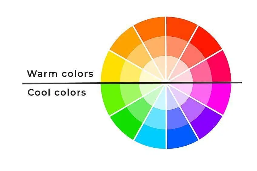
Triadic colors are determined using a triangle metric on a color wheel. Starting at a chosen color, which will be the main or focus color, then using your triangle shape, you will determine the other two colors to make up your triadic color wheel. Let’s take a look at triadic color examples using a dominant color and what would calculate as the accent colors.
- Red: Blue and yellow will be the calculated accent colors. This arrangement becomes energized when coupled with the red.
- Blue: The color blue becomes the dominant color, and red and yellow become the accent colors. This arrangement collectively creates a calming triadic color scheme.
- Yellow: The color yellow as the dominant color will switch the triadic color scheme into an energized arrangement alongside red and blue as accent colors. It can also create more vibrance depending on the shade of yellow used.
A Look at Triadic Color Combinations
Learning what triadic colors do can help you decide which colors to use when you are designing a space, platform, or anything else! You can manipulate your triadic color wheel by saturating the colors or making them brighter. Either way, you can play around to create what you like! These days, design programs have libraries of colors to choose from, plus incredible online color wheels and color calculators, making design work more efficient!

Triadic Color Combinations in Interior Design
Learning the basics of a triadic color scheme in a décor design will help you create beautiful spaces. The triadic color wheel is ideal for planning as it helps calculate the additional accent colors based on your dominant color. Considering what room you are intending to complete, you can either mute the color’s vibrancy or possibly make them into pastel shades. The possibilities are endless!
Some wonderful triadic color examples would be in the design of a little girl’s bedroom.
Try taking the red, blue, and yellow triadic color scheme and simply exchanging them for their pastel hues. The triadic color scheme would change into pastel pink, baby blue, and light-yellow shades. For example, the walls of the room could be soft yellow with pastel pink accent accessories and touches of baby blue in the pillows and lamp shades. Something along those lines can easily be manipulated to your authentic taste.
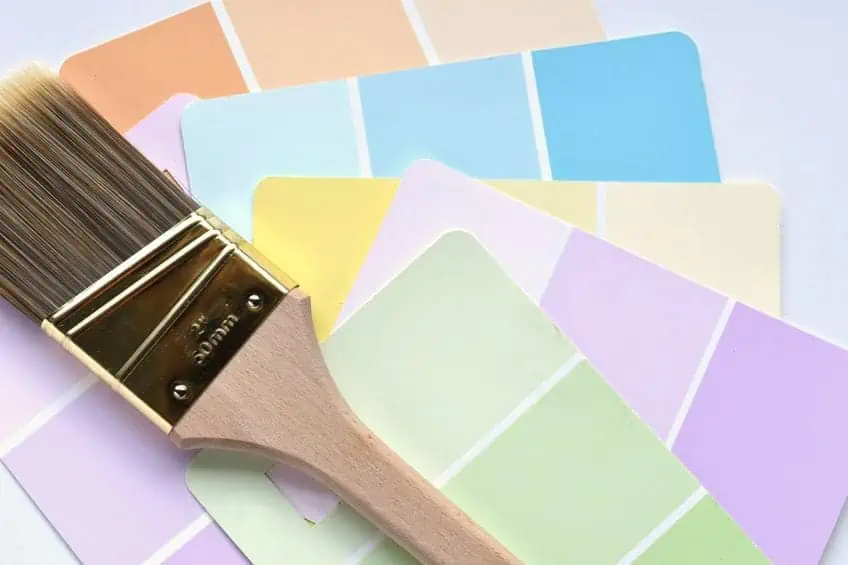
When designing a bedroom, one generally wants to create a relaxed and calm environment. Therefore, you would not choose bright, vibrant colors when creating a relaxing and soothing space. Triadic color examples could be using green, lilac, and orange as the color scheme for a bedroom. If you were to use a lilac backdrop with white undertones, accents with a touch of burnt orange, and added greenery would look lovely. Add a few scattered pillows for added accent accessories on white bedding!
When designing small spaces, one has to be attentive to the color scheme as too many colors can make the space seem chaotic. That is why the triadic color scheme method works for designers, enabling them to create spaces that do not seem crowded or overbearing. When tackling multiple colors, use a neutral shade such as gray for a background and the colors as accent accessories to compliment the space. Are you aware that artificial lighting can affect your paint color choice? For interior designers, the concept of how lighting will change the desired effect of a room is an important one! Remembering small details such as these can make or break your space.
Triadic Color Combinations in Graphic Design
A triadic color scheme is incredibly helpful for graphic designers. With today’s technology, it is understandable that tools have been created to assist designers in navigating what colors to choose from within the extensive color library on digital design programs. Top logo and marketing executives will tell you that a triadic color wheel is an important tool in working with the human psyche for marketing purposes.
Eye-catching color schemes for logos automatically remain in our minds without us realizing it. We unconsciously think of a brand when seeing a specific triadic color scheme. For a triadic example, let us use the popular chain restaurant Burger King’s logo. The triadic color scheme for this brand is red, yellow, and blue.
Triadic Color Combinations in Painting
Learning to mix colors is one of the main aspects of learning to paint. Blending, shading, and texture techniques are only half of the tasks of becoming an artist. As you mix your primary colors to make secondary shades and complementary colors, you will learn how to tone down or darken these shades using white or black paint. If you do not learn these concepts, your paint mixes could end up in a mess!

When using triadic colors in paintings, we can create an intense and eye-catching contrast with simple colors. A good triadic color example is the use of green as the dominant color, combined with various shades of purple and touches of rustic orange.
Triadic Color Combinations in Photography
When it comes to photography, it is helpful to use the concept of a triadic color scheme, but it is almost impossible to capture this in live photography. With that said, there are many types of photography, and if it is controlled styling, then the concept of a triadic color wheel is extremely helpful.
Studio photography is a great example because you can style the setting using the triadic color schemes for fashion shoots, portraits, food styling, product shots, and stills.
More attention to triadic colors could set your images apart from other photographers. Lighting also plays a massive part in studio photography, and one would need to pay attention to color changes for lighting composition.
Tips for Using a Triadic Color Scheme
With any design concept, one should decide on the mood and theme of your space and what emotional response you wish to convey. From there, you can estimate your triadic color wheel colors and design your space or platform accordingly.
- The most important thing to remember when choosing your triadic color scheme is to pick a dominant color and use the other two-color options as accents and highlights. This accentuates focus, preventing a bombardment of color.
- Continuously think of the color temperature. Greens and blues are traditionally associated with a calm and relaxing environment. Red colors create a warmer tone for an energized or romantic atmosphere.
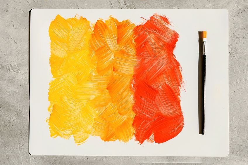
- Experimentation is fun and insightful! You can experiment using various tones, color shades, and color tints.
- When using bold triadic color schemes, should you need to create more balance, you may want to pair the focus, bold color with muted color tones.
When you first begin exploring color, the idea of calculating the triadic color wheel may seem daunting at first. The fact is, it is a helpful and very popular color scheme technique used in design practices today. Using the simple yet effective triadic color concept will raise your design work to a new level, proving to be very satisfying when your project is complete!
Frequently Asked Questions
What Best Describes Triadic Colors?
In order to understand what triadic colors are, you need to first understand the basics of color theory. The concept is to calculate what colors work well together. The triadic colors are each equally placed on the color wheel and their position forms a triangular shape. Red, blue, and yellow, are basic examples of triadic colors found on the triadic color wheel.
What Is the Triadic Color Scheme?
A basic color scheme is a concept of how colors work together and complement each other, but what is a triadic color scheme? This means that three completely different colors will be complementary due to their position on the color wheel.
Is It Challenging to Use Triadic Colors in Design?
Creating a triadic color scheme is easy when you know how to use a color wheel. Decide on your dominant color and count three blocks forward in a clockwise manner. The fourth block will be the triadic color. You are now able to decide which of the three colors will be your dominant color.
What Are the Benefits of Using the Triadic Color Scheme?
The correct tones and complementary shades will make or break your finished product, and this can influence the mood and tone of your room or project. When a triadic color scheme is used correctly, it can have a balancing and calming effect.
What Does Color Scheme Mean?
When doing interior or graphic design, we use what is known as a color scheme, These are the colors we choose to use for a specific application. The colors in your color scheme will help determine the mood and ambiance of a space or the look and feel of your website or another digital project.
Duncan graduated with a diploma in Film and TV production from CityVarsity in 2018, after which he continued pursuing film while taking on a keen interest in writing along the way. Since having graduated, he began working as a freelance videographer, filming a variety of music videos, fashion and short films, adverts, weddings and more. Throughout this, he’s won a number of awards from various film festivals that are both locally and internationally recognized. However, Duncan still enjoys writing articles in between his filming ventures, appreciating the peace and clarity that comes with it.
His articles focus primarily around helping up-and-coming artists explore the basics of certain colors, how these colors can be paired with other shades, as well as what colors are created when you mix one with another. All while relating these shades to historically significant paintings that have incorporated them into their color palette. As a lover of the arts himself, he takes great interest in the Renaissance era of paintings, an era that has directly inspired many of his favorite films.
Learn more about Duncan van der Merwe and about us.
