What Colors Go With Blue? – 25 Color Combos That Shine
This post may contain affiliate links. We may earn a small commission from purchases made through them, at no additional cost to you.
Welcome to my colorful world of interior design! Today, we’re focusing on the versatile and serene shade of blue. With my extensive experience, I’ve grown to adore blue for its adaptability and calming presence in any space. In this blog, we’ll explore the 25 best color combinations to complement various shades of blue, from classic navy to vibrant cobalt. Join me as we discover how to beautifully integrate blue into your home decor, reflecting your unique style and taste. Let’s dive into this exciting color adventure together!
What Color Is Blue?
In my exploration of blue’s spectrum, I’ve realized its incredible range—from soft, soothing tones to bold, electric hues—always evoking serenity and calm. Blue’s versatility is astounding, perfect for conveying trust and wisdom or creating a sense of spaciousness in art and interior design. Each shade has its unique charm: navy blue’s depth and formality, turquoise’s playful vibrancy reminiscent of tropical paradises, and the elegant robin’s egg blue. Even powder blue adds a touch of femininity and grace. Blue’s adaptability makes it ideal for setting various moods, from calming bedrooms to sophisticated spaces. Its vast array of shades offers endless possibilities for emotional expression and atmosphere creation.
| Blue Color | Blue Hex Code | RGB | CMYK Color Code (%) | Shade of Blue |
| Blue | #0000ff | 0, 0, 255 | 100, 100, 0, 0 | |
| Navy Blue | #000080 | 0, 0, 128 | 100, 100, 0, 50 | |
| Turquoise | #40e0d0 | 64, 224, 208 | 71, 0, 7, 12 | |
| Robin’s Egg Blue | #00cccc | 0, 204, 204 | 100, 0, 0, 20 | |
| Powder Blue | #b0e0e6 | 176, 224, 230 | 23, 3, 0, 10 | |
| Cerulean | #2a52be | 42, 82, 190 | 78, 57, 0, 25 | |
| Azure | #007fff | 0, 127, 255 | 100, 50,0, 0 | |
| Indigo | #3f00ff | 63, 0, 255 | 75, 100, 0, 0 | |
| Ocean | #009dc4 | 0, 157, 196 | 100, 20, 0, 23 | |
| Lapis | #26619c | 38, 97, 156 | 76, 38, 0, 39 |
25 Colors That Compliment Blue
In my quest to complement the versatile beauty of blue, I’ve explored an array of 25 colors that harmonize perfectly with it. Each color brings out a unique aspect of blue, enhancing its depth, brightness, or tranquility. From the warm embrace of coral that adds a playful contrast to the coolness of blue, to the earthy tones of olive green that ground its airy nature, I’ve seen how these pairings create dynamic and visually appealing combinations. Soft pastels like lavender and peach offer a delicate balance, while bold colors like gold or silver provide a luxurious backdrop, making blue pop in an elegant way.
Experimenting with these diverse colors has allowed me to appreciate the versatility and adaptability of blue, making it a go-to choice in my design projects for creating moods that range from serene and calming to vibrant and energetic. This exploration has been a journey of discovery, revealing how the right color pairings can elevate the inherent beauty of blue.
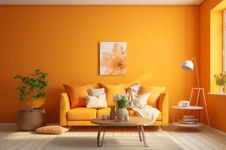
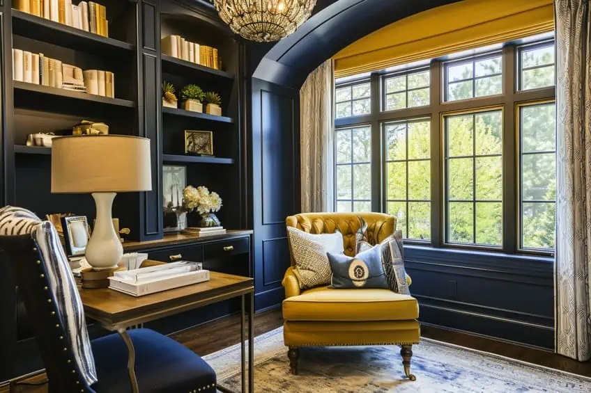
Navy Blue and Mustard Yellow
This combination brings a sense of sophistication and energy. I often use navy blue as a base color for walls or large furniture pieces, adding mustard yellow accents through throw pillows, vases, or artwork. It’s perfect for a study room or a living area, creating a dynamic yet cozy atmosphere. I personally love using brass or gold finishes with this palette to add a touch of luxury.
| Shade | Hex Code | CMYK Color Code (%) | RGB Color Code | Color |
| Navy Blue | #000080 | 100, 100, 0, 50 | 0, 0, 128 | |
| Mustard Yellow | #FFDB58 | 0, 15, 65, 0 | 255, 219, 88 |
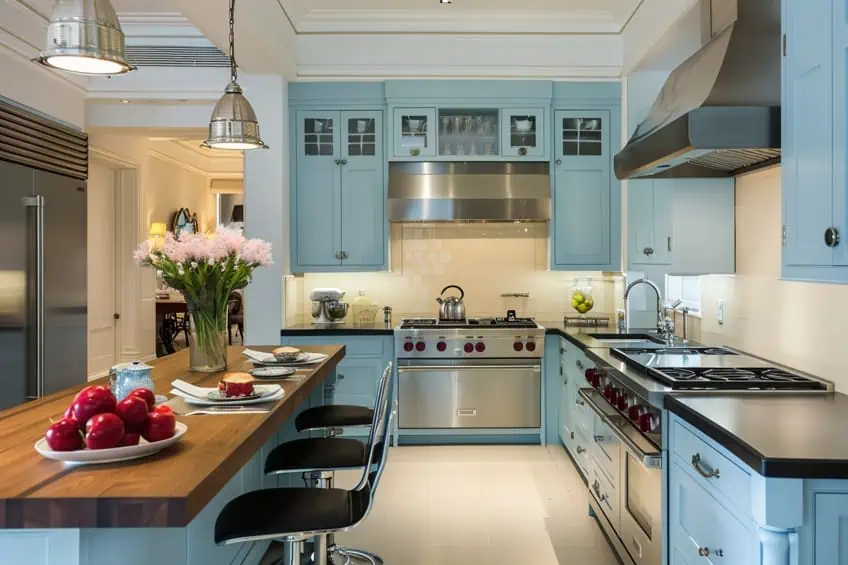
Sky Blue and Soft Gray
This pairing is all about serenity and balance. Sky blue works wonders in bedrooms or bathrooms, promoting a calm and restful environment. Pair it with soft gray in textiles, rugs, or window treatments. I recommend adding touches of white for a crisp, clean finish, perfect for achieving a tranquil, spa-like feel.
| Shade | Hex Code | CMYK Color Code (%) | RGB Color Code | Color |
| Sky Blue | #87CEEB | 48, 25, 0, 8 | 135, 206, 235 | |
| Soft Gray | #C0C0C0 | 0, 0, 0, 25 | 192, 192, 192 |
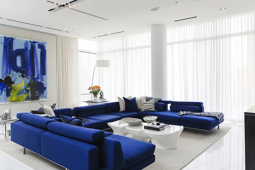
Cobalt Blue and Bright White
Ideal for creating a bold, contemporary look. Cobalt blue makes a striking statement when used in accent walls or statement furniture. Paired with bright white in trim, ceilings, or linens, it brings a fresh and invigorating feel. I love to introduce textures like white shag rugs or cobalt glass decor to add depth and interest.
| Shade | Hex Code | CMYK Color Code (%) | RGB Color Code | Color |
| Cobalt Blue | #0047AB | 100, 57, 0, 33 | 0, 71, 171 | |
| Bright White | #FFFFFF | 0, 0, 0, 0 | 255, 255, 255 |
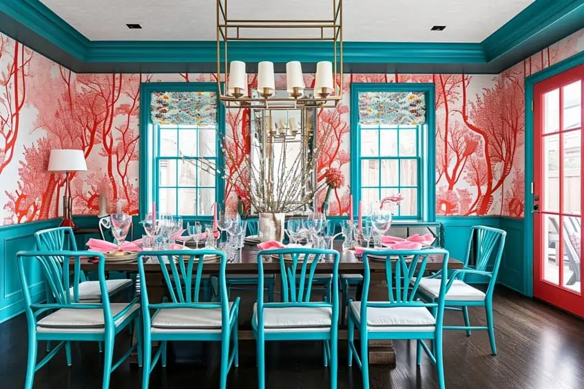
Teal Blue and Coral
This is a playful and vibrant choice. Teal blue works beautifully on walls or as a primary color for sofas or curtains, while coral accents can be introduced through cushions, art, or decorative items. It’s fantastic for a living room or a creative space. I often mix in natural wood elements to balance the brightness and add warmth.
| Shade | Hex Code | CMYK Color Code (%) | RGB Color Code | Color |
| Teal Blue | #367588 | 71, 25, 34, 47 | 54, 117, 136 | |
| Coral | #FF7F50 | 0, 50, 69, 0 | 255, 127, 80 |
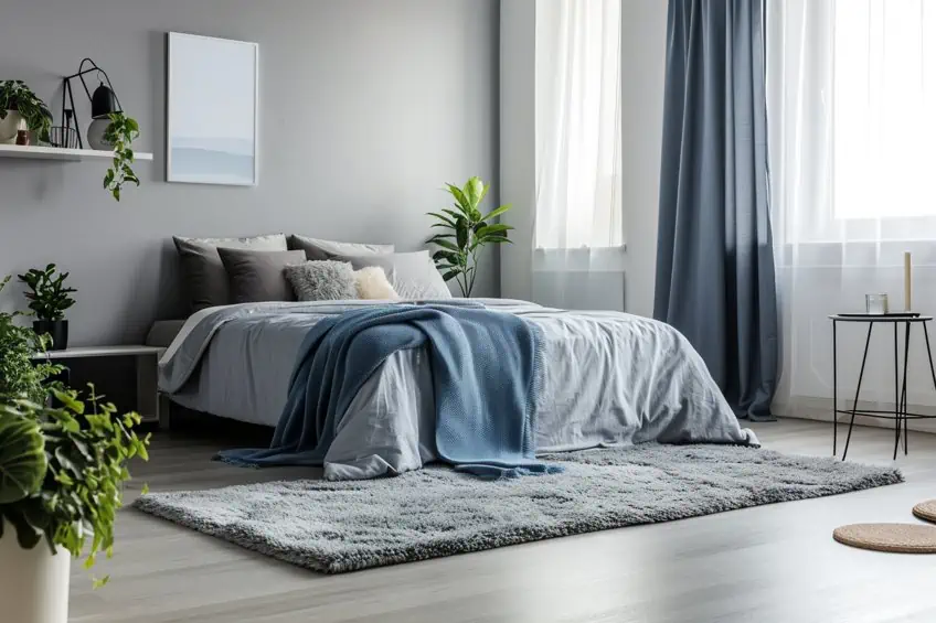
Baby Blue and Cream
For a soft, dreamy aesthetic, this combination is superb. Baby blue can be used in nurseries or bedrooms, complemented by cream furniture or carpeting. I find that adding textures like fluffy rugs or knitted throws enhances the coziness. It’s also lovely with shabby chic or vintage decor.
| Shade | Hex Code | CMYK Color Code (%) | RGB Color Code | Color |
| Baby Blue | #89CFF0 | 44, 20, 0, 6 | 137, 207, 240 | |
| Cream | #FFFDD0 | 0, 0, 18, 0 | 255, 253, 208 |
Royal Blue and Metallic Gold
This exudes luxury and opulence. Royal blue velvet sofas or curtains create a rich backdrop, enhanced by gold mirrors, lighting fixtures, or picture frames. It’s perfect for a dining room or a formal living area. I personally like adding a few black accents to ground the palette.
| Shade | Hex Code | CMYK Color Code (%) | RGB Color Code | Color |
| Royal Blue | #4169E1 | 71, 53, 0, 12 | 65, 105, 225 | |
| Metallic Gold | #D4AF37 | 0, 12, 72, 17 | 212, 175, 55 |
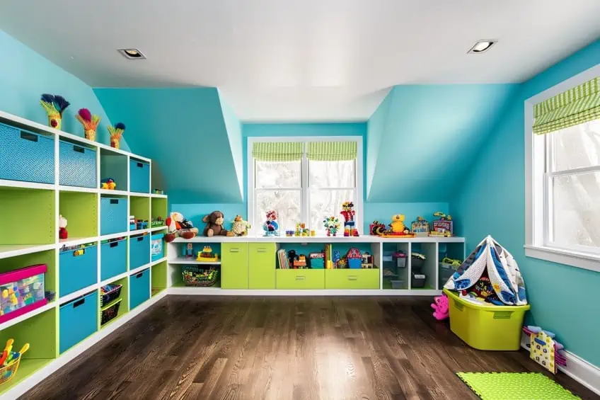
Turquoise Blue and Lime Green
Energetic and refreshing, this combo is great for invigorating a space. Use turquoise in larger elements like wall paint or an area rug, with lime green in smaller accessories. It’s ideal for a home office or a children’s playroom. I often incorporate white or light wood tones to keep it bright and airy.
| Shade | Hex Code | CMYK Color Code (%) | RGB Color Code | Color |
| Turquoise Blue | #40E0D0 | 64, 0, 18, 12 | 64, 224, 208 | |
| Lime Green | #32CD32 | 75, 0, 100, 20 | 50, 205, 50 |
Powder Blue and Taupe
For an elegant, understated look, this is my go-to. Powder blue walls with taupe furniture create a sophisticated harmony. In bedrooms or living rooms, adding silver accents or crystal chandeliers can elevate the elegance. I love using different textures in taupe, like linen or suede, for depth.
| Shade | Hex Code | CMYK Color Code (%) | RGB Color Code | Color |
| Powder Blue | #B0E0E6 | 29, 9, 0, 10 | 176, 224, 230 | |
| Taupe | #483C32 | 0, 17, 29, 71 | 72, 60, 50 |
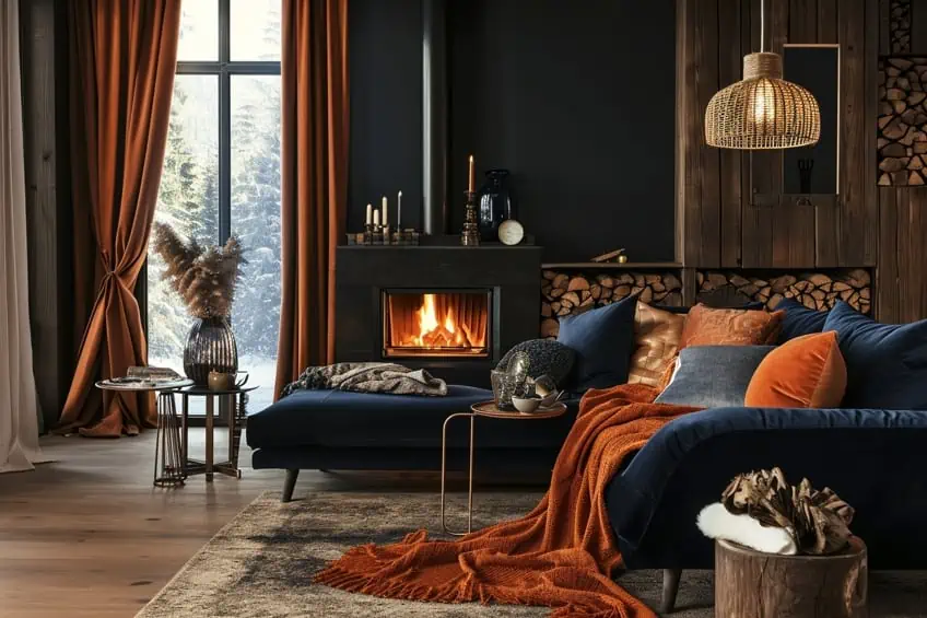
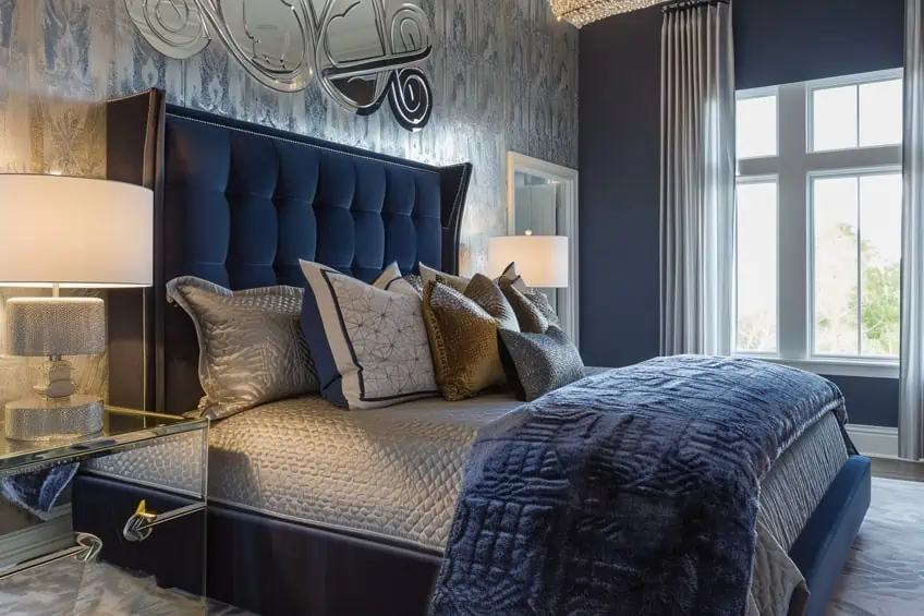
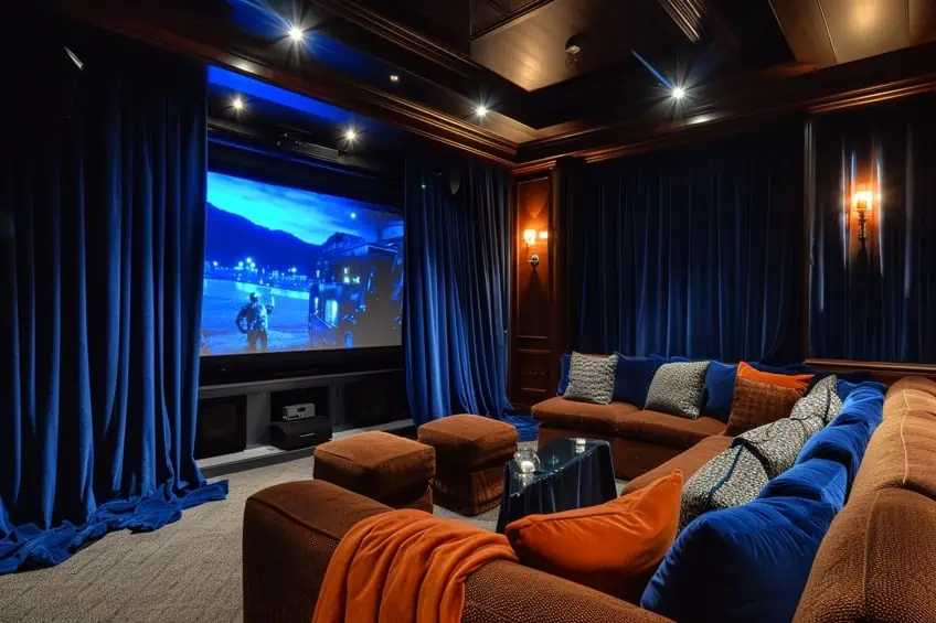
Midnight Blue and Burnt Orange
This creates a cozy, inviting ambiance. I use midnight blue for upholstery or curtains, with burnt orange in throw pillows or wall art. It’s excellent for a cozy den or a living room, especially with added wood elements or leather details for a rustic touch.
| Shade | Hex Code | CMYK Color Code (%) | RGB Color Code | Color |
| Midnight Blue | #191970 | 100, 100, 0, 56 | 25, 25, 112 | |
| Burnt Orange | #CC5500 | 0, 50, 100, 20 | 204, 85, 0 |
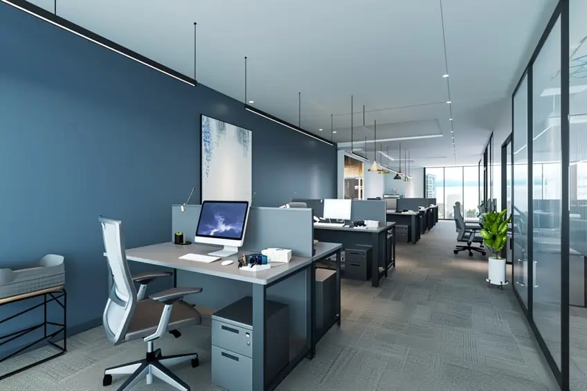
Sapphire Blue and Silver
This combination is sleek and modern. Sapphire blue in feature walls or major furniture pieces, paired with silver lighting fixtures or metal accents, creates a futuristic vibe. In living rooms or home offices, it’s a statement-maker. I like to include geometric patterns in silver for a more dynamic look.
| Shade | Hex Code | CMYK Color Code (%) | RGB Color Code | Color |
| Sapphire Blue | #0F52BA | 93, 54, 0, 27 | 15, 82, 186 | |
| Silver | #C0C0C0 | 0, 0, 0, 25 | 192, 192, 192 |
Ice Blue and Charcoal Gray
This combination is perfect for a contemporary, sophisticated space. Ice blue works well as a wall color, providing a cool, calm backdrop. Charcoal gray can be incorporated through furniture or heavy drapes. In a living room or a modern office space, this pairing is effortlessly chic. I like to add metallic accents, like stainless steel or chrome, to enhance the modern feel.
| Shade | Hex Code | CMYK Color Code (%) | RGB Color Code | Color |
| Ice Blue | #AFEEEE | 32, 0, 7, 7 | 175, 238, 238 | |
| Charcoal Gray | #36454F | 31, 19, 0, 69 | 54, 69, 79 |
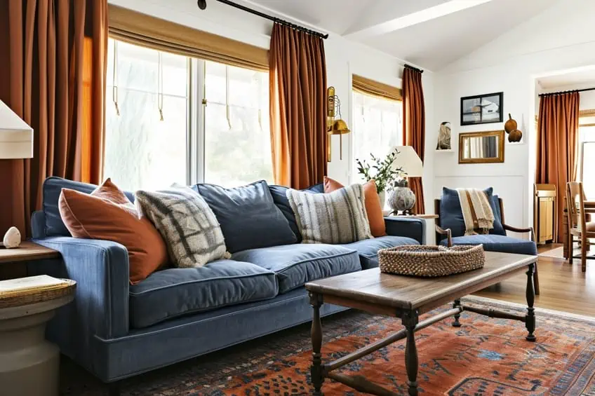
Denim Blue and Rust
A great choice for a casual yet refined look. Denim blue is wonderful for upholstery or rugs, while rust accents can come through in throw pillows or wall art. This palette is ideal for a family room or a rustic kitchen. I often use natural textures like wood or leather to complement this earthy, welcoming scheme.
| Shade | Hex Code | CMYK Color Code (%) | RGB Color Code | Color |
| Denim Blue | #1560BD | 85, 57, 0, 26 | 21, 96, 189 | |
| Rust | #B7410E | 0, 74, 92, 28 | 183, 65, 14 |
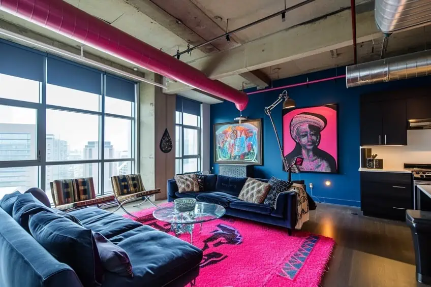
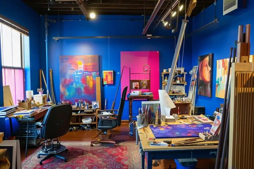
Electric Blue and Neon Pink
Bold and contemporary, this is for spaces that make a statement. Electric blue could be used for a feature wall, with neon pink in smaller accessories or artwork. It’s fantastic for a creative studio or a trendy lounge area. I recommend keeping the rest of the decor minimal to let these colors truly stand out.
| Shade | Hex Code | CMYK Color Code (%) | RGB Color Code | Color |
| Electric Blue | #7DF9FF | 51, 0, 0, 0 | 125, 249, 255 | |
| Neon Pink | #FF6EC7 | 0, 57, 22, 0 | 255, 110, 199 |
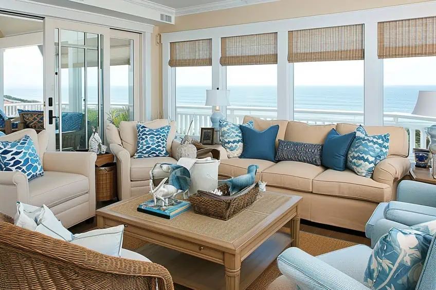
Azure Blue and Sandy Beige
This combination is reminiscent of a beachy, coastal vibe. Use azure blue in textiles or wall paint, complemented by sandy beige in furniture or flooring. Ideal for a sunroom or a bedroom, it brings a relaxed, tranquil feel. Adding elements like seashells or driftwood can enhance the seaside theme.
| Shade | Hex Code | CMYK Color Code (%) | RGB Color Code | Color |
| Azure Blue | #007FFF | 100, 50, 0, 0 | 0, 127, 255 | |
| Sandy Beige | #F4A460 | 0, 34, 71, 4 | 244, 164, 96 |
Indigo Blue and Olive Green
Deep and natural, this palette creates an earthy, grounded atmosphere. I use indigo blue for major elements like sofas or curtains, with olive green in cushions or plants. Perfect for a study or a cozy nook, it’s a palette that promotes concentration and relaxation. Mixing in wooden or earthenware accessories works well with this natural scheme.
| Shade | Hex Code | CMYK Color Code (%) | RGB Color Code | Color |
| Indigo Blue | #4B0082 | 100, 100, 0, 49 | 75, 0, 130 | |
| Olive Green | #808000 | 0, 0, 100, 50 | 128, 128, 0 |
Cerulean Blue and Tangerine
This vibrant pairing is great for injecting energy into a room. Cerulean blue can dominate in larger pieces like rugs or wall color, with tangerine accents in lampshades or artwork. It’s ideal for a dining area or a playroom. To balance the brightness, I add neutral tones like white or light gray.
| Shade | Hex Code | CMYK Color Code (%) | RGB Color Code | Color |
| Cerulean Blue | #2A52BE | 86, 69, 0, 25 | 42, 82, 190 | |
| Tangerine | #F28500 | 0, 47, 100, 5 | 242, 133, 0 |
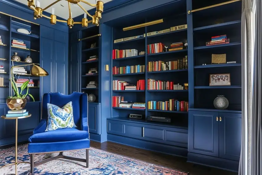
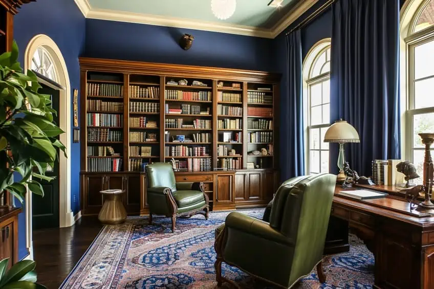
Prussian Blue and Brick Red
A classic and historical feel is what this combination brings. Prussian blue works well for walls or heavy drapery, with brick red in upholstered chairs or accent cushions. Suitable for a library or a formal living room, it brings a sense of traditional elegance. I like to add gold or brass accents for a touch of opulence.
| Shade | Hex Code | CMYK Color Code (%) | RGB Color Code | Color |
| Prussian Blue | #003153 | 100, 50, 0, 68 | 0, 49, 83 | |
| Brick Red | #CB4154 | 0, 70, 50, 20 | 203, 65, 84 |
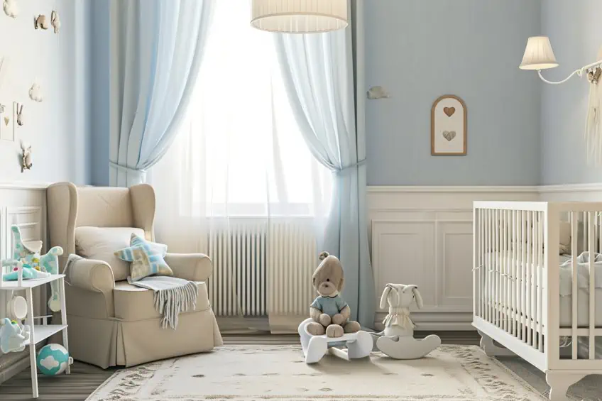
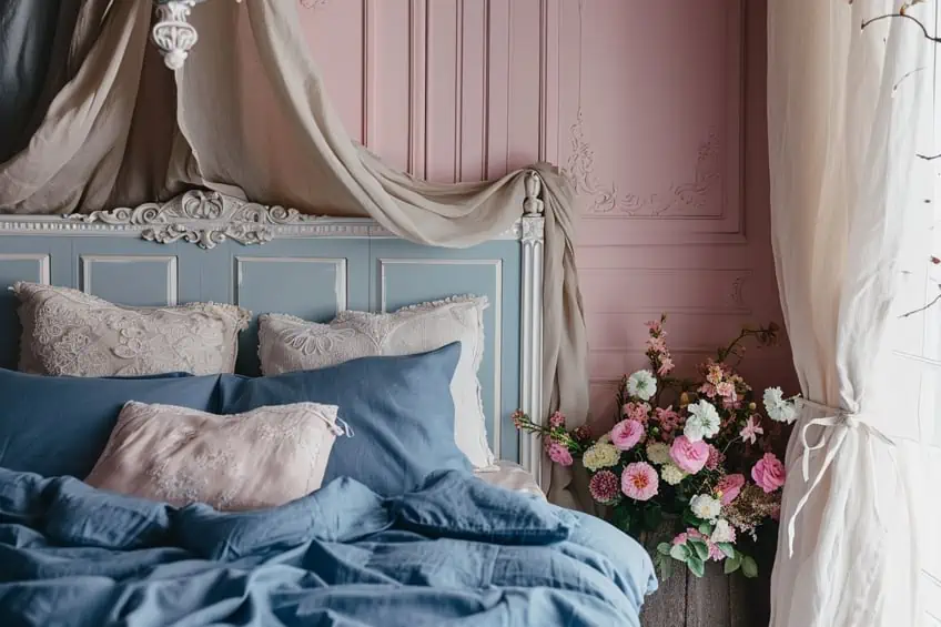
Marine Blue and Blush Pink
This soft and romantic palette is perfect for creating a gentle, soothing ambiance. Marine blue can be used in bedding or curtains, while blush pink can be introduced in wall art or a plush area rug. Ideal for a bedroom or a nursery, it’s a combination that’s calming and nurturing. I often use floral patterns to enhance the romantic feel.
| Shade | Hex Code | CMYK Color Code (%) | RGB Color Code | Color |
| Marine Blue | #01386A | 100, 50, 0, 58 | 1, 56, 106 | |
| Blush Pink | #FF6D6A | 0, 57, 58, 0 | 255, 109, 106 |
Wedgewood Blue and Ivory
Elegant and timeless, this pairing is wonderful for a refined and classy look. Wedgewood blue on walls, complemented by ivory furniture or linens, creates a sophisticated space. It’s fantastic for a dining room or a master bedroom. To add a personal touch, I use vintage or antique pieces that resonate with this classic style.
| Shade | Hex Code | CMYK Color Code (%) | RGB Color Code | Color |
| Wedgewood Blue | #4F738E | 44, 17, 0, 44 | 79, 115, 142 | |
| Ivory | #FFFFF0 | 0, 0, 6, 0 | 255, 255, 240 |
Periwinkle Blue and Lavender
Dreamy and whimsical, ideal for a creative or restful space. I use periwinkle blue for accent walls or major furniture items, with lavender accents in throw pillows or curtains. It’s great for a child’s room or a tranquil reading nook. Adding whimsical elements like fairy lights or soft, flowing fabrics enhances the dreamlike quality.
| Shade | Hex Code | CMYK Color Code (%) | RGB Color Code | Color |
| Periwinkle Blue | #CCCCFF | 20, 20, 0, 0 | 204, 204, 255 | |
| Lavender | #E6E6FA | 9, 9, 0, 2 | 230, 230, 250 |
Cornflower Blue and Mint Green
Refreshing and light, this combination gives a springtime feel. Cornflower blue can be the main color for upholstery or walls, with mint green accents in decorative items or bedding. It’s perfect for a kitchen or a bathroom, creating a fresh, clean vibe. I like to incorporate floral motifs to play up the garden-like atmosphere.
| Shade | Hex Code | CMYK Color Code (%) | RGB Color Code | Color |
| Cornflower Blue | #6495ED | 61, 44, 0, 7 | 100, 149, 237 | |
| Mint Green | #98FF98 | 39, 0, 39, 0 | 152, 255, 152 |
French Blue and Warm Brown
Rustic and chic, this is great for a country or farmhouse style. Use French blue in kitchen cabinets or a feature wall, complemented by warm brown in wooden furniture or flooring. This palette brings warmth and coziness to any space. Adding handcrafted items or rustic metal accents enhances the farmhouse aesthetic.
| Shade | Hex Code | CMYK Color Code (%) | RGB Color Code | Color |
| French Blue | #0072BB | 100, 44, 0, 27 | 0, 114, 187 | |
| Warm Brown | #964B00 | 0, 50, 100, 41 | 150, 75, 0 |

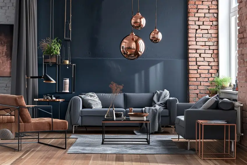
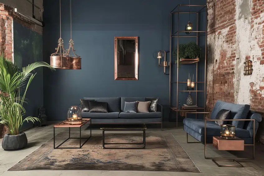
Steel Blue and Burnished Copper
Industrial and edgy, this is ideal for a modern, urban space. Steel blue can dominate in larger elements like sofas or walls, with burnished copper in lighting fixtures or hardware. It’s perfect for a loft or a modern kitchen. I often include exposed brick or concrete elements to complement this industrial look.
| Shade | Hex Code | CMYK Color Code (%) | RGB Color Code | Color |
| Steel Blue | #4682B4 | 58, 27, 0, 29 | 70, 130, 180 | |
| Burnished Copper | #A17A74 | 0, 25, 25, 37 | 161, 122, 116 |
Duck Egg Blue and Ochre
Vintage and charming, this combination offers a warm, nostalgic feel. Duck egg blue works well in wallpaper or textiles, with ochre accents in rugs or upholstered chairs. Ideal for a living room or a vintage-inspired bedroom. I love to mix in antique pieces or floral patterns to enhance the vintage charm.
| Shade | Hex Code | CMYK Color Code (%) | RGB Color Code | Color |
| Duck Egg Blue | #C0E8D5 | 25, 0, 16, 9 | 192, 232, 213 | |
| Ochre | #CC7722 | 0, 42, 85, 20 | 204, 119, 34 |

Capri Blue and Magenta
Vivid and expressive, this is for spaces full of personality and flair. Use Capri blue in large pieces like curtains or an accent wall, with magenta in cushions or art. Perfect for an entertainment room or a vibrant home office. To balance the intensity, I introduce neutral tones like black or gray.
| Shade | Hex Code | CMYK Color Code (%) | RGB Color Code | Color |
| Capri Blue | #00BFFF | 100, 25, 0, 0 | 0, 191, 255 | |
| Magenta | #FF00FF | 0, 100, 0, 0 | 255, 0, 255 |
Concluding this exploration of 25 complimentary colors of blue in interior design, I feel a profound sense of fulfillment in sharing these insights with fellow color enthusiasts. This journey has not only broadened my own understanding of blue’s versatility but hopefully has also empowered readers to confidently experiment with this hue in their spaces. Whether it’s creating a serene sanctuary or a vibrant nook, the knowledge of these color pairings provides the tools to bring a personal touch to any interior. I’m excited at the thought of these ideas inspiring unique and beautiful spaces, each telling its own story through the language of blue.
Frequently Asked Questions
What Colors Can I Match With My Blue Decor?
In interior design, you can use a variety of colors to match your blue decor. For instance, pairing blue with white can create a classic combination that feels fresh and crisp, which creates a peaceful and soothing ambiance. Another great combination may include blue and green, which works to create a natural and calming ambiance that is perfect for evoking a sense of tranquility.
What Are the Different Shades of Blue?
There are many shades of blue that one can use in their own projects, whether in isolation or alongside one another. Some of the most popular shades of blue include baby blue, powder blue, navy blue, steel blue, sky blue, and electric blue, just to name a few! The shade of blue that you choose can have a big impact on the ambiance and mood you are looking to create.
What Color Combinations With Blue Are Currently Trending in Home Decor?
In my own home decorating adventures, I’ve noticed a trend towards pairing blue with earthy tones like olive green and warm terra cotta. These combinations bring a fresh yet grounded feel to my living spaces, blending the tranquility of blue with the warmth of nature-inspired hues. It’s a harmonious mix that feels both contemporary and timeless.

Duncan graduated with a diploma in Film and TV production from CityVarsity in 2018, after which he continued pursuing film while taking on a keen interest in writing along the way. Since having graduated, he began working as a freelance videographer, filming a variety of music videos, fashion and short films, adverts, weddings and more. Throughout this, he’s won a number of awards from various film festivals that are both locally and internationally recognized. However, Duncan still enjoys writing articles in between his filming ventures, appreciating the peace and clarity that comes with it.
His articles focus primarily around helping up-and-coming artists explore the basics of certain colors, how these colors can be paired with other shades, as well as what colors are created when you mix one with another. All while relating these shades to historically significant paintings that have incorporated them into their color palette. As a lover of the arts himself, he takes great interest in the Renaissance era of paintings, an era that has directly inspired many of his favorite films.
Learn more about Duncan van der Merwe and about us.