Coral Color – Dive Into the Exciting World of Coral
This post may contain affiliate links. We may earn a small commission from purchases made through them, at no additional cost to you.
The coral color, a beguiling hue that defies easy categorization, sparks a color conversation that touches on the very essence of aesthetics. When contemplating what color is coral, and is coral pink, one may wonder if it is simply pink in disguise. Intriguingly versatile, the coral color beckons artists and designers alike with its captivating coral color palette, offering a kaleidoscope of possibilities for creative expression. Delving into what colors go with coral unveils a world of endless inspiration, where the enigmatic shade finds harmony with a vast array of companions, igniting the imagination and kindling a fervor for new coral color combinations. So, join us on a journey through the enchanting shades of coral, where the captivating allure of this hue reveals its artistry and charm.
What Color Is Coral?
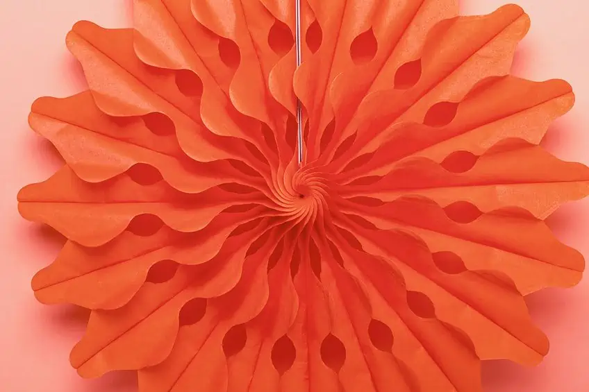
This is a question that asks us to explore the richness and complexity of this captivating hue. At first glance, one might ask, “Is coral pink?” The answer, however, is far from straightforward. Coral defies easy categorization, revealing a nuanced spectrum of colors that defy simple classification. Coral’s enchanting shades range from the delicate pastels reminiscent of a tropical sunrise to the fiery depths of a vibrant sunset. It dances between the vivacious warmth of orange and the gentle embrace of pink, never settling for one definition.
The coral color palette is a treasure trove of inspiration for artists, designers, and decorators alike. Its versatility shines as it effortlessly pairs with a myriad of other colors, offering endless possibilities for creative expression.
Whether adorning fashion runways, gracing interior decor, or appearing in nature’s own creations beneath the sea, coral showcases its alluring charm in various contexts. From the rigid coral hex code to the subtle variations that exist in the natural world, the question of “what color is coral” beckons us into a world where boundaries blur, and the beauty of this ever-alluring hue remains an enigmatic delight to discover and cherish.
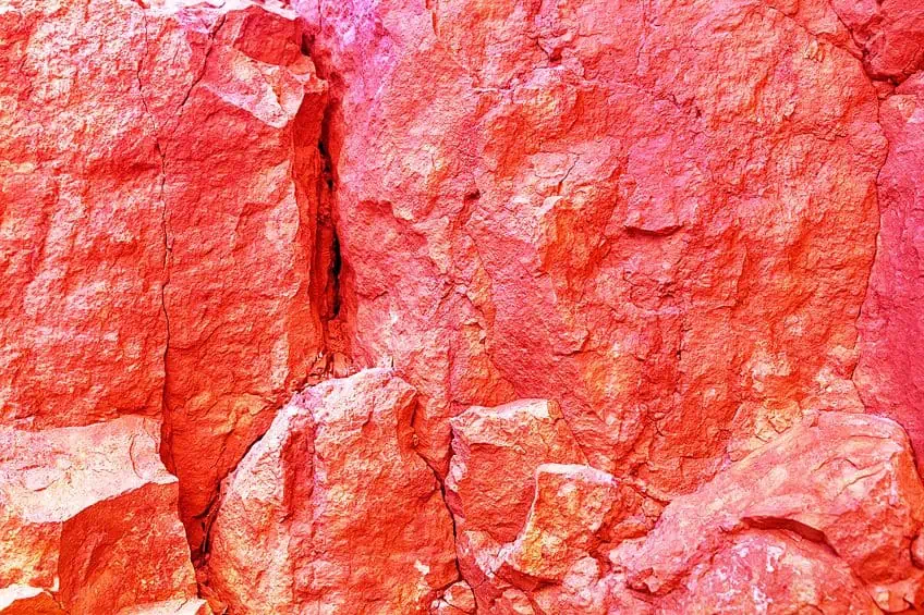
| Color Name | Coral Hex Code | RGB | Coral Color Code (%) | Shades of Coral |
| Coral | #ff7f50 | 255, 127, 80 | 0, 50, 69, 0 |
Shades of Coral
The many shades of coral paint a mesmerizing tapestry of colors that effortlessly blend the vibrancy of orange with the soft elegance of pink. Each shade within this enchanting spectrum tells a unique story, evoking emotions and conjuring vivid imagery. At the lighter end of the spectrum, pastel corals bathe the world in a gentle, almost ethereal glow. These delicate hues bring to mind serene sunrises over tranquil seas, where the first light of day caresses the water’s surface with a soft, inviting warmth.
Deeper into the coral color palette, however, we find more intense shades that ignite the senses with their fiery passion, reminiscent of a sun dipping below the horizon in a blaze of glory.
In nature, coral reefs come alive with their own unique shades, creating underwater wonderlands that showcase the brilliance of this color palette. From the softest peachy corals to the richest and most striking tangerine hues, the shades of coral celebrate the captivating diversity of the natural world, offering endless inspiration for creative expression and design.
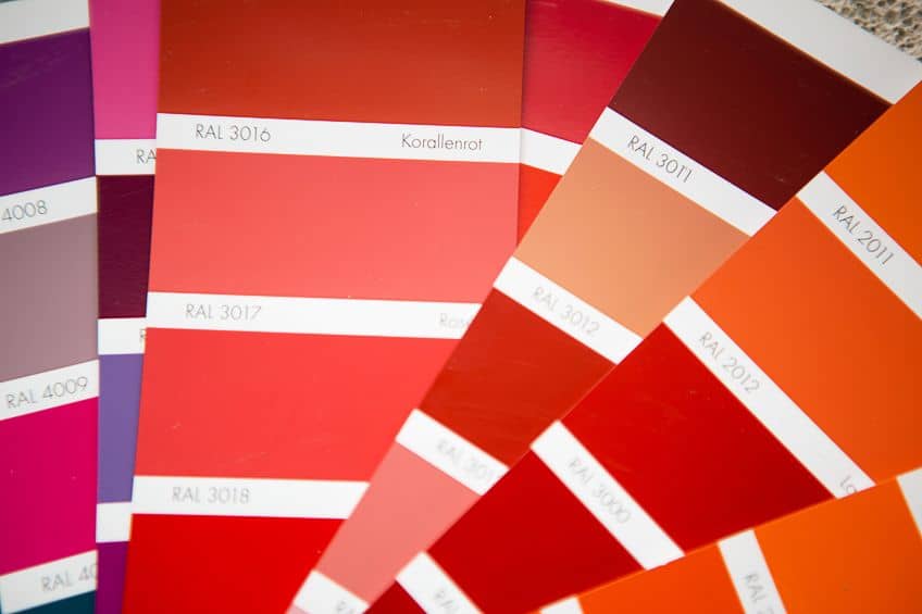
| Coral Name | Coral Hex Code | RGB | Coral Color Code (%) | Shades of Coral |
| Coral | #ff7f50 | 255, 127, 80 | 0, 50, 69, 0 | |
| Dusty Coral | #f5b7b1 | 245, 183, 177 | 245, 183, 177 | |
| Desert Coral | #d16459 | 209, 100, 89 | 0, 52, 57, 18 | |
| Coral Rose | #f3774d | 243, 119, 77 | 0, 51, 68, 5 | |
| Calypso Coral | #edb9ad | 237, 185, 173 | 0, 22, 27, 7 | |
| Opalescent Coral | #ffd2a9 | 255, 210, 169 | 0, 18, 34, 0 | |
| Coral Blossom | #f7bea2 | 247, 190, 162 | 0, 23, 34, 3 | |
| Sunkist Coral | #ea6676 | 234, 102, 118 | 0, 56, 50, 8 | |
| Australian Coral | #ef7a6c | 239, 122, 108 | 0, 49, 55, 6 | |
| Coral Red | #ff4040 | 255, 64, 64 | 0, 75, 75, 0 |
The History of the Coral Color
The history of coral color is a captivating journey through art and fashion, a tale of hue inspired by nature’s treasures became an enduring symbol of elegance and creativity. To understand the evolution of coral color, we must first delve into its roots in ancient civilizations, where this striking hue found its initial foothold. In antiquity, the ancient Egyptians were among the first to embrace coral’s beauty, using crushed coral to create pigments for their intricate frescoes and jewelry.
These vibrant coral hues adorned their tombs, invoking the essence of life and vitality, as coral was associated with the blood of their gods.
The Coral Color in Modern Times
In the vibrant tapestry of modern times, coral color emerges as a magnetic force, captivating artists and designers alike. It is a hue that transcends the boundaries of tradition, forging a path of contemporary expression that is both invigorating and timeless. One striking example of coral’s influence can be found in Mark Rothko’s abstract masterpiece, “Orange and Red on Red.” Rothko’s exploration of coral shades in this painting creates a mesmerizing interplay of warmth and depth. The coral tones in these pieces would seem to pulsate with life when viewed in person, inviting its viewers to dive into the depths of the emotions embedded within the work, as well as their own.
Similarly, Gerhard Richter, a luminary of contemporary art, has utilized coral hues in his “Abstraktes Bild” series. These works, characterized by their intricate layers and textures, showcasing coral’s ability to evoke complexity and depth, reflecting the multifaceted nature of the modern world.
In the realm of fashion, coral color has become a symbol of audacious style and self-expression. Designers like Alexander McQueen have incorporated coral into their collections, infusing a sense of vitality and power into their designs. The coral palette symbolizes confidence and individuality, embodying the spirit of a generation unafraid to push boundaries. Moreover, coral color has ventured into the world of pop culture, with films like Wes Anderson’s “The Life Aquatic with Steve Zissou” using it as a whimsical backdrop for adventure and eccentricity. The film’s iconic coral-colored submarine, the Belafonte, is a testament to the color’s enduring ability to evoke a sense of wonder and imagination.
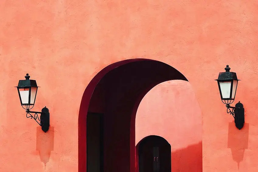
In modern times, coral color stands as a beacon of creativity and adaptability. It transcends mediums, bridging the worlds of fine art, fashion, film, and technology. It is a hue that speaks to the heart of contemporary culture, inspiring a sense of energy, individuality, and boundless potential in a world that is ever evolving. Coral color, in all its vibrancy, continues to shine brightly as a symbol of the spirit of our times.
Famous Paintings That Use the Coral Color
The coral color, a captivating and versatile hue, has left its unmistakable mark on the world of art. In the realm of famous paintings, coral takes center stage, infusing life and emotion into canvases with its warm and vibrant presence. Let us embark on a journey through renowned artworks that showcase the timeless allure of coral.
The Birth of Venus (1486) by Sandro Botticelli
| Artist | Sandro Botticelli (1445 – 1510) |
| Date Completed | 1486 |
| Medium | Tempera on canvas |
| Dimensions (cm) | 172 x 278 |
| Current Location | Uffizi Gallery, Florence, Italy |
Fast forward to the Renaissance, and we find coral color gracing the palettes of great artists such as Sandro Botticelli and Leonardo da Vinci. In Botticelli’s masterpieces, “The Birth of Venus” and “Primavera,” soft coral shades subtly illuminated the skin tones of ethereal goddesses, adding an otherworldly charm to his iconic works. Meanwhile, da Vinci, in his sublime “Mona Lisa,” used coral accents to accentuate the subject’s delicate features, revealing the enduring allure of this hue.
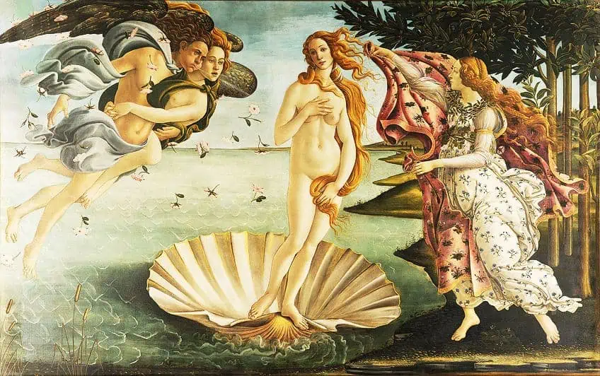 The Birth of Venus (1486) by Sandro Botticelli; Sandro Botticelli, Public domain, via Wikimedia Commons
Mona Lisa (1503) by Leonardo da Vinci
| Artist | Leonardo da Vinci (1452 – 1519) |
| Date Completed | 1503 |
| Medium | Oil on wood |
| Dimensions (cm) | 77 x 53 |
| Current Location | Louvre Museum, Paris, France |
During the 18th century, coral color experienced a resurgence in popularity. This era allowed this shade to become a symbol of wealth and prestige, as those within European aristocracy would have their gowns adorned in coral. The French Queen, Marie Antoinette, was particularly fond of coral, incorporating it into her extravagant fashion ensembles and jewelry. Her love for the color played a role in elevating coral’s status as a symbol of luxury and sophistication. The 19th century saw the emergence of coral in Impressionist paintings, where artists like Pierre-Auguste Renoir skillfully captured the fleeting beauty of everyday life. Renoir’s “Two Sisters (On the Terrace)” is a testament to the coral’s ability to evoke a sense of serenity and joy, as it bathed his subjects in the soft, warm embrace of the setting sun.
Coral color’s journey through history took a significant turn in the mid-20th century when it became synonymous with fashion and design.
Iconic fashion designer Elsa Shiaperlli, known for her audacious and imaginative creations, introduced “shocking pink,” a shade so closely related to coral, in her groundbreaking 1937 collection. Her bold designs challenged conventional notions of femininity and beauty, solidifying coral’s place as a color of daring and individuality. In the mid-20th century, coral reached the pinnacle of popularity when it graced the glamorous Hollywood screens. Stars like Marylin Monroe and Audrey Hepburn epitomized the allure of coral with their iconic red-carpet appearances, further cementing its status as a symbol of timeless elegance and glamor.
 Mona Lisa (1503) by Leonardo da Vinci; Leonardo da Vinci, Public domain, via Wikimedia Commons
What Colors Go With Coral?
Coral color combinations are a mesmerizing playground for the creative soul, where the vibrancy of coral finds perfect harmony with an array of hues, unlocking a world of visual poetry. This captivating exploration into the realm of color unveils an endless tapestry of possibilities, where the warmth and vitality of coral intertwine with complementary shades to evoke emotions, create balance, and ignite the imagination.
Coral and Turquoise
One of the most iconic and evocative coral color combinations is the pairing with turquoise. This dynamic duo conjures images of pristine tropical waters meeting the coral reefs beneath, creating a harmonious blend of warmth and coolness. The vividness of coral beautifully complements the tranquil and refreshing tones of turquoise, giving life to spaces and designs that exude a sense of relaxation and vibrancy.
This combination often finds its place in beach-themed decor, fashion, and even wedding palettes, as it encapsulates the essence of paradise.

| Color Name | Hex Code | RGB | CMYK Color Code (%) | Shades of Color |
| Coral | #ff7f50 | 255, 127, 80 | 0, 50, 69, 0 | |
| Turquoise | #40e0d0 | 64, 224, 208 | 71, 0, 7, 12 |
Coral and Navy
For a more sophisticated allure, coral’s vivacity meets the timeless depth of navy blue. This classic combination infuses spaces and wardrobes with a touch of nautical elegance. Picture a coral sunset against the darkening blue sea, and you’ll understand the allure. Coral adds a pop of energy and warmth to navy’s timeless serenity, making it a favorite for wedding color schemes, interior design, and fashion choices.
It is a pairing that effortlessly balances the fiery intensity of coral with the steadfast composure of navy.

| Color Name | Hex Code | RGB | CMYK Color Code (%) | Shades of Color |
| Coral | #ff7f50 | 255, 127, 80 | 0, 50, 69, 0 | |
| Navy | #000080 | 0, 0, 128 | 100, 100, 0, 50 |
Coral and Gold
When coral joins forces with gold, opulence and radiance take center stage. This luxurious combination exudes a sense of regal glamor, reminiscent of lavish palaces and ornate jewelry. The lustrous shine of gold beautifully enhances coral’s warmth and vivacity, creating a palette that feels rich and inviting. Coral and gold are often seen in high-end interior design, wedding decor, and fashion, where they bring an air of grandeur and timeless beauty.
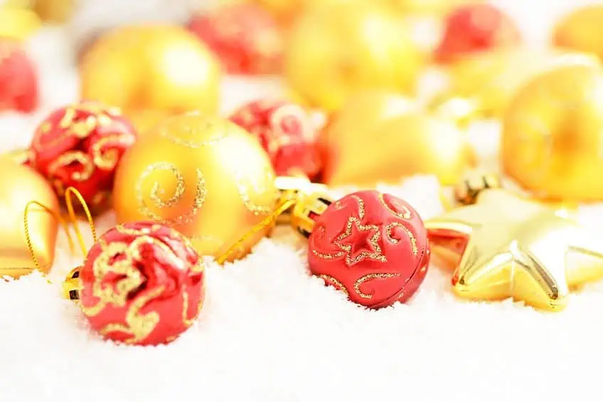
| Color Name | Hex Code | RGB | CMYK Color Code (%) | Shades of Color |
| Coral | #ff7f50 | 255, 127, 80 | 0, 50, 69, 0 | |
| Gold | #ffd700 | 255, 215, 0 | 0, 16, 100, 0 |
Coral and Mint
For a youthful and playful aesthetic, coral dances with the refreshing tones of mint green. This delightful pairing is like a breath of fresh air, evoking the carefree spirit of springtime. Coral’s exuberance contrasts harmoniously with mint’s cool, soothing qualities, making it a favorite for baby nurseries, summer fashion, and cheerful home accents.
The coral and mint combination is a testament to the way colors can evoke emotions and capture the essence of a season.
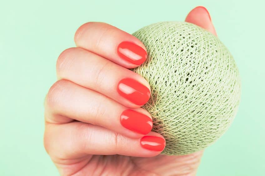
| Color Name | Hex Code | RGB | CMYK Color Code (%) | Shades of Color |
| Coral | #ff7f50 | 255, 127, 80 | 0, 50, 69, 0 | |
| Mint | #98ff98 | 152, 255, 152 | 40, 0, 40, 0 |
Coral and Teal
Coral and teal offer a unique blend of serenity and vibrancy. Teal’s calming depth serves as a perfect foil for coral’s liveliness. This combination evokes a sense of balance and harmony, making it a popular choice for interior design, particularly in bedrooms and living spaces where relaxation and rejuvenation are paramount.
Coral and teal create an atmosphere that invites both introspection and excitement, a testament to the power of color harmony.

| Color Name | Hex Code | RGB | CMYK Color Code (%) | Shades of Color |
| Coral | #ff7f50 | 255, 127, 80 | 0, 50, 69, 0 | |
| Teal | #008080 | 0, 128, 128 | 100, 0, 0, 50 |
Coral and Purple
The fusion of coral and purple is a regal partnership that exudes splendor and sophistication. Coral’s warmth complements the richness of purple, creating a combination that feels opulent and majestic. Whether in royal-themed weddings, sumptuous interiors, or fashion statements, coral and purple radiate a sense of grandeur and timeless allure.
This pairing is a testament to the way color can elevate the mood and create an atmosphere of luxury.
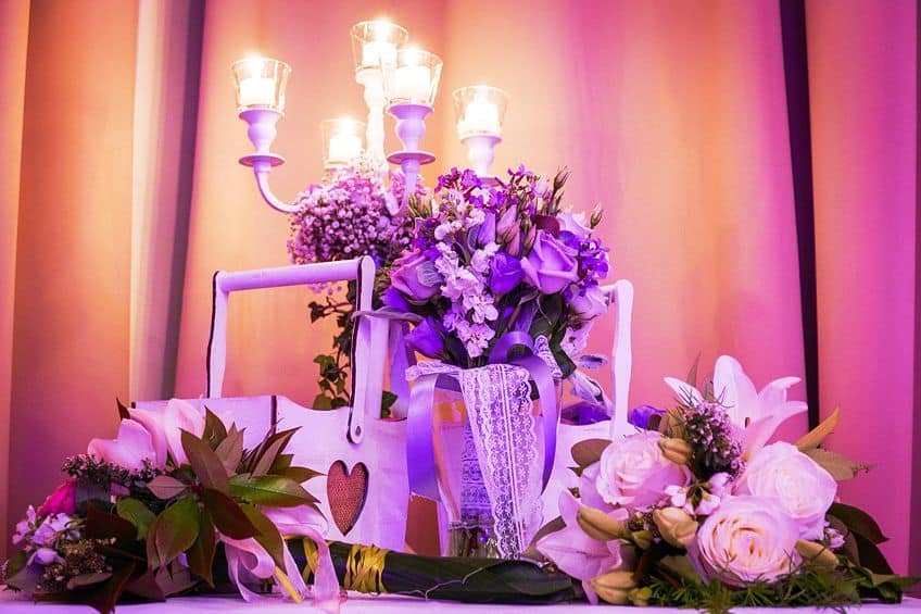
| Color Name | Hex Code | RGB | CMYK Color Code (%) | Shades of Color |
| Coral | #ff7f50 | 255, 127, 80 | 0, 50, 69, 0 | |
| Purple | #800080 | 128, 0, 128 | 0, 100, 0, 50 |
Wrapping things up, the coral color stands as a testament to nature’s beauty and humanity’s creativity. It is a hue that transcends time, invoking the warmth of sunsets, the depth of oceans, and the vibrancy of life itself. From its ancient origins in Egyptian art to its modern-day presence in fashion, design, and activism, the coral color has endured, adapted, and enchanted. It symbolizes passion, vitality, and the interconnectedness of our world. So, whether it adorns a canvas, a wedding bouquet, or a digital interface, the coral color continues to inspire and captivate, reminding us that in color, as in life, beauty knows no bounds.
Frequently Asked Questions
Is Coral Pink or Orange?
Coral is a blend of pink and orange, leaning more towards one or the other depending on the specific shade. It can range from soft pastel pinks to deeper, more orange-toned hues.
What Does the Coral Color Symbolize?
The coral color is often associated with qualities such as energy, vitality, creativity, and playfulness. It can also symbolize aspects of the natural world, including coral reefs and marine life.
What Are Some Famous Artworks That Feature the Coral Color?
Notable artworks featuring the coral color include Andy Warhol’s Marylin Monroe (1962) portraits, David Hockney’s A Bigger Splash (1967), and Sandro Botticelli’s The Birth of Venus (1486). All three incorporate soft coral tones in the background.
