What Does Orange and Yellow Make? – Creating Warm Amber
This post may contain affiliate links. We may earn a small commission from purchases made through them, at no additional cost to you.
As a color aficionado with an insatiable curiosity for chromatic alchemy, I’ve always been enchanted by the magical transformations that occur when vibrant hues collide! Today, let’s embark on an exhilarating journey into the world where orange and yellow intertwine. Picture the radiant warmth of a golden sunrise mingling with the zestful energy of a juicy orange – it’s like witnessing a joyous festival of colors! Together, these hues hold the promise of unlocking a world of boundless creativity and wonder. So, join me as we dive into the delightful blend where orange meets yellow, unraveling the delightful concoction that awaits our artistic exploration!
Key Takeaways
- Mixing orange and yellow yields a vibrant shade of orange, often called amber.
- The final hue and tone of the mixture vary with the specific shades and proportions.
- Amber’s warmth elicits certain emotions and symbolism, enhancing its usage in art and design.
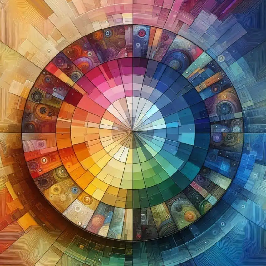
A Quick Look at Color Theory
Exploring the world of color mixing is like opening a door to endless possibilities. As an artist, I find that understanding how different hues interact on the palette enables the creation of unique shades that can bring artwork to life. Specifically, when I mix orange and yellow, which are both found on the warm side of the color wheel, I create a version of orange that is more luminous and vibrant. This shade can vary in its exact appearance depending on the precise hues and proportions used.
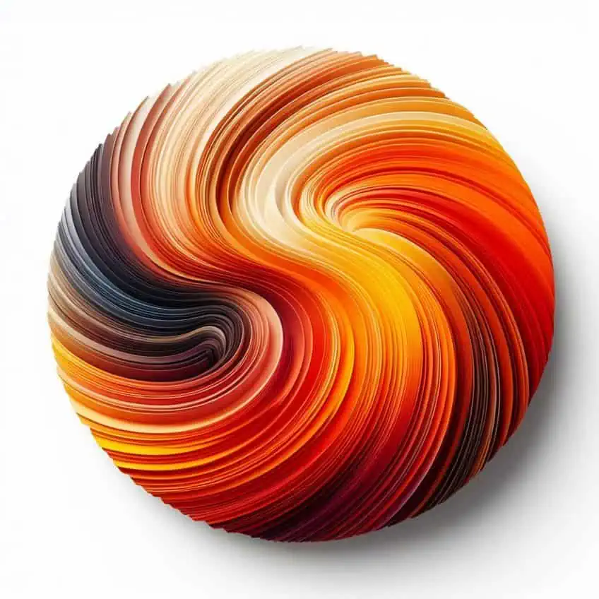
In practice, combining orange and yellow often results in a color known commonly as amber. This color conjures images of fiery sunsets and the gentle glow of morning light. It’s the meticulous blending of these two colors that gives rise to amber’s warmth and brightness. Through this process, I’ve learned that the final shade is also influenced by the type of pigment, whether it’s paint, ink, or digital color. Furthermore, the symbolism and psychological impact of the resulting color adds another layer of depth to its use in art and design. In exploring how colors combine, it’s crucial to grasp the fundamental concepts of color theory, specifically regarding primary and secondary colors, as well as the role of tertiary colors.
Understanding Primary and Secondary Colors
Primary colors are the building blocks of all other hues on the color wheel. These are colors that cannot be created through the mixing of other colors. In the traditional color wheel model, the primary colors are:
- Red
- Yellow
- Blue
Secondary colors result from the combination of two primary colors. When mixed in equal parts, these colors produce:
- Orange (red and yellow)
- Green (blue and yellow)
- Purple (red and blue)
The Role of Tertiary Colors
Tertiary colors occur when a primary color is mixed with a neighboring secondary color. This creates a more complex and nuanced spectrum on the color wheel. The tertiary colors are formed by the fusion of primary and secondary hues, resulting in a captivating array of shades that bridge the gap between their parent colors. From the rich russets of red-orange to the soothing greens of yellow-green, tertiary colors offer a tapestry of hues that expand our understanding of color relationships and possibilities.
These intermediary tones infuse depth and sophistication into our palettes, enriching our artistic expressions and visual experiences with their subtle complexities. The tertiary colors are:
| Primary Color | Secondary Color | Tertiary Color |
|---|---|---|
| Red | Orange | Red-Orange |
| Yellow | Orange | Yellow-Orange |
| Yellow | Green | Yellow-Green |
| Blue | Green | Blue-Green |
| Blue | Purple | Blue-Purple |
| Red | Purple | Red-Purple |
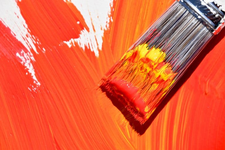
What Does Orange and Yellow Make?
When orange and yellow are mixed, they create a specific warm hue. This mixture is not just a blend of colors, but a creation of a new one that carries the vibrancy and energy of its components.
Understanding Orange
| Shade | Hex Code | CMYK Color Code (%) | RGB Color Code | Color |
| Orange | #FFA500 | 0, 50, 100, 0 | 255, 165, 0 |
Orange is a secondary color that is positioned between red and yellow on the color wheel. It combines the energy of red with the happiness of yellow. In terms of paint, orange can be made by mixing these two primary colors together. Orange as a color suggests creativity and is associated with the joyous aspects of life.
In color theory, orange symbolizes energy, warmth, and enthusiasm.
It combines the passion of red with the cheerfulness of yellow, radiating vitality and excitement. Associated with joy, creativity, and adventure, orange inspires positivity and optimism. Reminiscent of sunsets and ripe citrus fruits, it stimulates the appetite and encourages social interaction. Overall, orange embodies a dynamic energy that fosters exploration, creativity, and zest for life.
Understanding Yellow
| Shade | Hex Code | CMYK Color Code (%) | RGB Color Code | Color |
| Yellow | #FFFF00 | 0, 0, 100, 0 | 255, 255, 0 |
Yellow, a primary color, is the lightest and most vibrant hue perceivable by the human eye. It carries connotations of cheerfulness and stimulates mental activity. Yellow requires no mixing of other colors to exist. It has a high visual impact and is used to attract attention due to its brightness.
In color theory and psychology, yellow symbolizes happiness, positivity, and optimism.
It evokes the warmth of sunshine, uplifts spirits, and promotes mental clarity. Yellow represents energy, creativity, and youthfulness, sparking inspiration and encouraging innovation. Across cultures, it carries diverse meanings, from wealth and prosperity to caution or warning. Overall, yellow radiates warmth and brightness, inviting optimism into our lives.
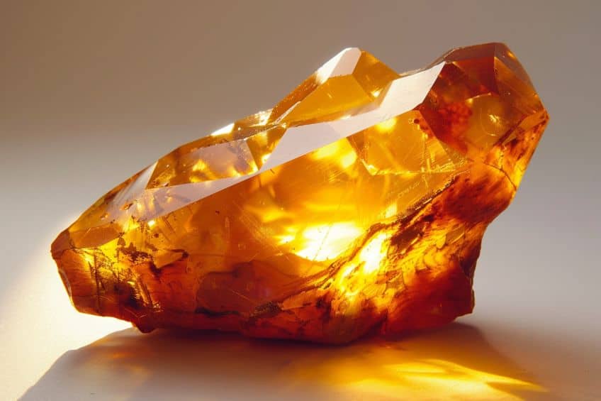
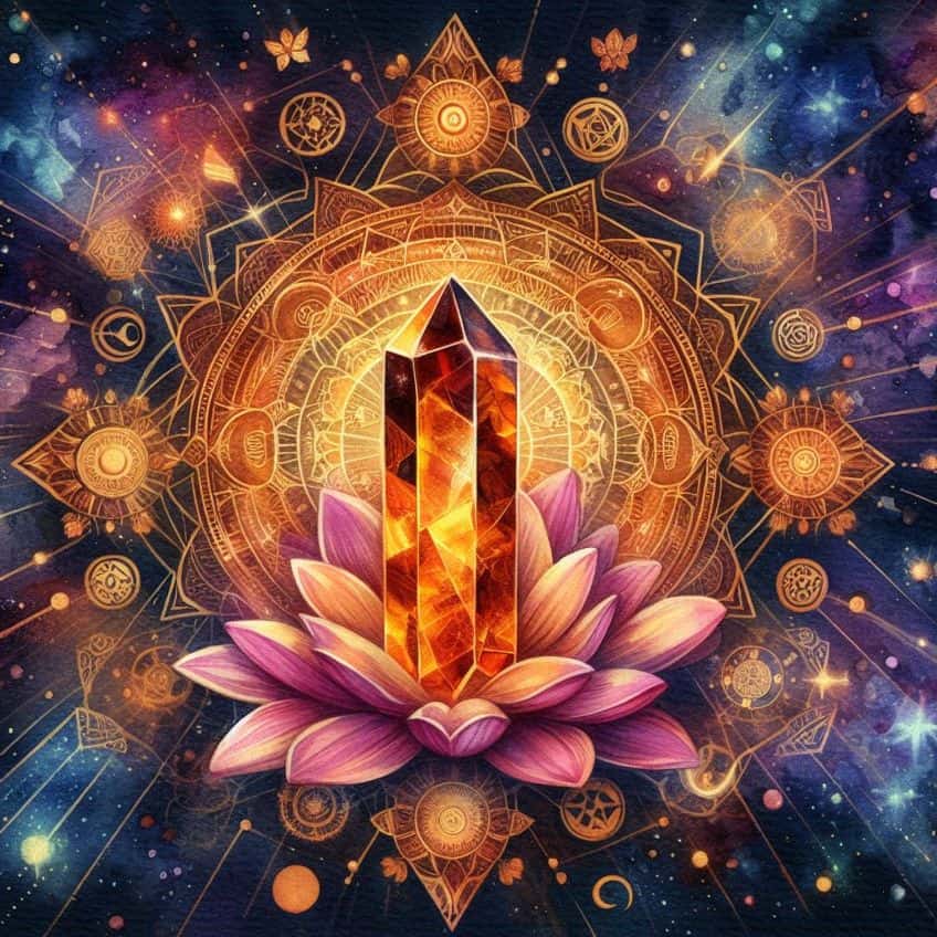
The Amber Color
| Shade | Hex Code | CMYK Color Code (%) | RGB Color Code | Color |
| Amber | #FFBF00 | 0, 20, 100, 0 | 255, 191, 0 |
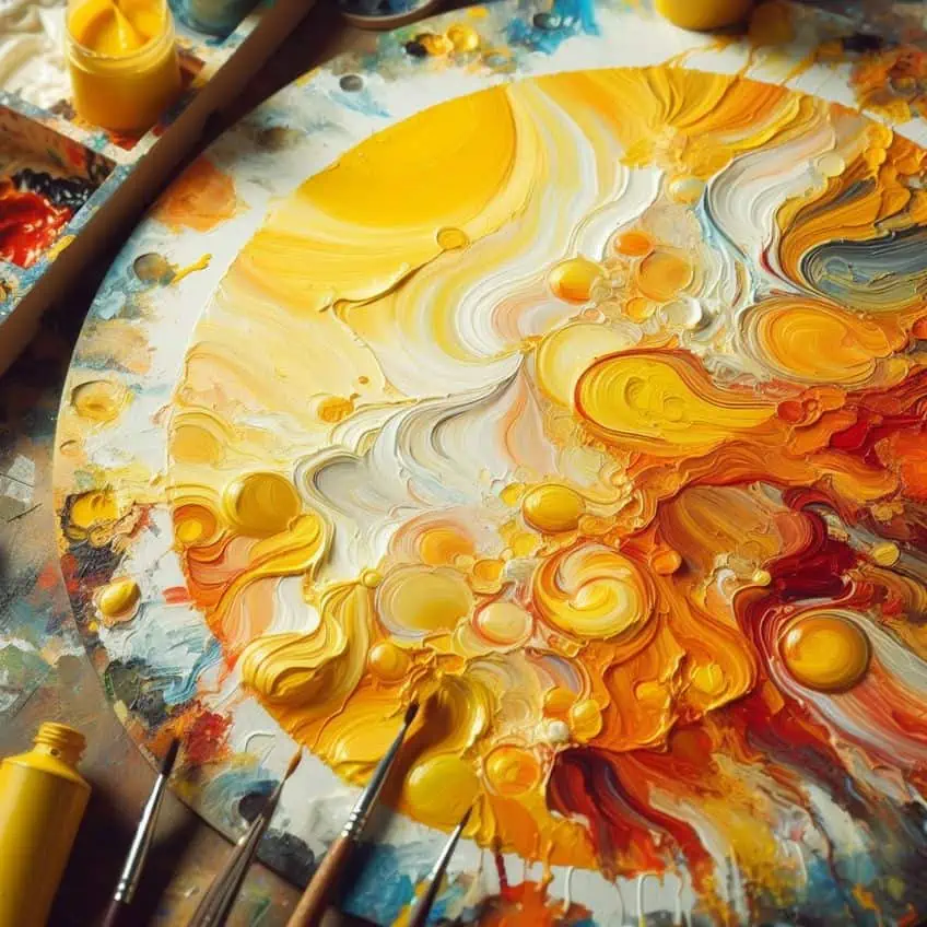
When I mix orange and yellow, the result is a vibrant, warm color known as amber. Amber retains the energy and vivacity of its component colors. Due to both orange and yellow being warm colors, their combination enhances these properties, producing a hue reminiscent of glowing sunsets and autumn leaves. In color theory and symbolism, amber represents warmth, energy, and vitality. It embodies comfort and stability, akin to glowing embers on a chilly evening. Amber symbolizes resilience and clarity of thought, evoking wisdom and creativity.
Overall, it exudes timeless beauty and strength, offering a warm embrace to those who encounter its radiant glow.
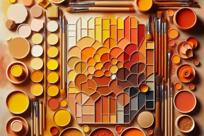
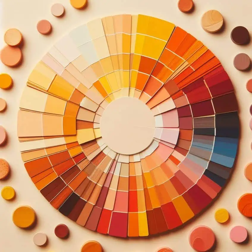
Hues and Tones Variation of Orange and Yellow
When I mix orange and yellow, I am essentially working within a warm color palette, with the expectation of creating various hues and tones that can be adjusted according to the mixing ratios and techniques I use.
Expected Color Outcome
When combining orange and yellow pigments, the expected color outcome is a range of warm hues residing between the two original colors on the color wheel. The resulting color typically leans towards a yellow-orange hue—a rich, vivid shade that retains the energetic character of its constituent colors.
Mixing Ratios and Techniques
When it comes to mixing ratios, many different amounts can be added. Experimenting with the blending of orange and yellow reveals a fascinating spectrum of colors. A 1:1 ratio of orange to yellow creates a harmonious yellow-orange blend. Adjusting the proportions allows for fine-tuning: increasing the yellow proportion retains vibrancy, while a dominance of orange leads to a deeper, slightly redder hue.
These mixing ratios offer artists the flexibility to achieve a range of tones, from the freshness of sunlit meadows to the warmth of autumnal landscapes, providing endless avenues for creative exploration and expression.
To achieve lighter tones, I incorporate white into the mixture, particularly for a yellow-orange tint where there’s more yellow than orange, along with white, resulting in a paler look. Conversely, for darker shades, I introduce black sparingly, strategically positioning it near the orange end to create a hue that is darker and more muted. However, balance is key, as excessive black can overwhelm the warmth of the hue, emphasizing the importance of moderation and precision in color blending. In my process, I ensure that changes in hue and tone are intentional, using controlled variations of orange, yellow, black, and white proportions to fulfill the desired artistic or design outcome.
The Symbolism of Amber
When I consider the color amber, I’m reminded of the warmth and historical resonance that it carries. This color symbolizes joy, positivity, and a sense of timelessness, echoing the natural and historical value of its namesake resin.
In Art
In my experience, artists often use amber as a representation of the golden hour, that brief moment before sunset or after sunrise. It’s a color that adds a sense of life and energy to artwork.
The warmth of amber can give a painting a feeling of optimism, suggesting the start of a new day or the peaceful end of one.
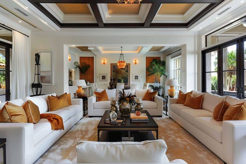
In Interior Design
Amber tones in interior design bring a welcoming warmth to a space. In my designs, I use amber to evoke comfort and a sense of belonging, ideal for communal areas like living rooms or dining spaces where warmth and interaction are paramount.
In Fashion
When I incorporate amber into fashion, it often imparts a bold statement of confidence and a bright splash of color. As an autumnal hue, it pairs well with earthy colors and can serve to transition outfits from summer vibrancy to the understated tones of fall.
As a color in fashion, amber is very versatile.
Color Psychology of Amber
Amber, a hue created by mixing orange and yellow, resonates with warmth and natural elegance. My focus here is to illuminate how amber impacts our mood and emotions, draws from seasonal and natural themes, and holds diverse meanings across cultures.

Influence on Mood and Emotion
When I consider amber, I see a color that encapsulates the energy and joy of sunshine while simultaneously providing the warmth and comfort of a glowing fire. Its link to sunrises and sunsets gives it a powerful connection to new beginnings and peaceful endings.
Here’s how amber can influence mood and emotions:
- Energizing: Just like the bright orange of a sunrise, amber can stimulate feelings of excitement and enthusiasm.
- Comforting: The red-orange tones of a cozy fire may evoke warmth and security.
Different Meanings in Various Cultures
Across cultures, amber symbolizes protection, healing, and good luck, particularly in the Baltic region where it is worn as jewelry for these purposes. In ancient civilizations like the Greeks and Romans, amber represented the sun god and enlightenment. Native American cultures view amber as spiritually significant, connecting to the earth’s life force. In Chinese culture, amber is associated with prosperity and success, used in feng shui practices to attract positive energy. These varied meanings highlight amber’s status as a prized material embodying themes of protection, vitality, spirituality, and prosperity.
- Joy and positivity: Often, this color is associated with vibrant energy and a positive outlook on life.
- Warning: In context, such as traffic lights, amber serves as a sign of caution, urging attention and awareness.
Seasonal and Natural Inspirations
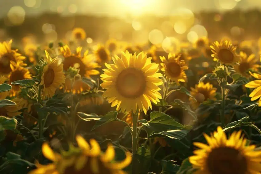
In nature, amber is the color of autumn—leaves transforming into golden hues before they fall, signifying change and preparation. It’s a color deeply tied to the cycles of the Earth:
- Autumnal: Reflects the transition from the life-filled summer to the restful winter season.
- Golden sunsets/sunrises: Reminds of the daily spectacle of the sun casting its bright orange light across the horizon.
In conclusion, our journey into the fusion of orange and yellow has been nothing short of a chromatic adventure! As we’ve discovered, their blend creates a mesmerizing spectrum of hues, from the warm glow of sunrise to the vibrant zest of citrus fruits. It’s like unlocking a treasure chest filled with endless possibilities of color and creativity! Whether in art, design, or the kaleidoscope of nature, the amalgamation of orange and yellow reminds us of the joy and vibrancy that colors bring to our lives. So, let’s continue to explore, experiment, and paint our world with the exuberant hues that ignite our imagination and fill our hearts with delight. After all, in the palette of life, every color blend tells its own unique and enchanting story!
Frequently Asked Questions
What Color Is Created by Mixing Orange and Yellow?
When I mix orange and yellow, the result is a variant of orange that’s brighter and bears a resemblance to amber. The exact shade can range from a rich, warm amber to a lighter yellow-orange, depending on the proportions used.
Can Mixing Orange and Yellow Produce a Tertiary Color?
Yes, by mixing orange and yellow—both of which are secondary and primary colors, respectively—I can create a tertiary color. This color is commonly referred to as yellow-orange and fits on the color wheel between orange and yellow.

Duncan graduated with a diploma in Film and TV production from CityVarsity in 2018, after which he continued pursuing film while taking on a keen interest in writing along the way. Since having graduated, he began working as a freelance videographer, filming a variety of music videos, fashion and short films, adverts, weddings and more. Throughout this, he’s won a number of awards from various film festivals that are both locally and internationally recognized. However, Duncan still enjoys writing articles in between his filming ventures, appreciating the peace and clarity that comes with it.
His articles focus primarily around helping up-and-coming artists explore the basics of certain colors, how these colors can be paired with other shades, as well as what colors are created when you mix one with another. All while relating these shades to historically significant paintings that have incorporated them into their color palette. As a lover of the arts himself, he takes great interest in the Renaissance era of paintings, an era that has directly inspired many of his favorite films.
Learn more about Duncan van der Merwe and about us.