Contrast in Art – How Artists Use Juxtaposed Elements
This post may contain affiliate links. We may earn a small commission from purchases made through them, at no additional cost to you.
What is contrast in art, and what are the different types of contrast? Mastering the art of creating contrast in art is used for many purposes such as drama, mood, and emphasis, which help artists create visually impactful works and hold the viewer’s attention. In this article, you will learn about contrast in art, including the different types of contrast and a few contrast painting examples that demonstrate how contrast is used strategically. Keep reading for more about the contrast art definition and the impact of contrast in art!
A Contrast Art Definition: What Is Contrast in Art?
For centuries, artists have been producing artworks that tell stories, relay emotional moods, and intrigue us with stunning striking visuals. When building a contrast art definition, one needs to consider how artists have been achieving such an impact in creating visually balanced yet striking artworks.
Contrast is a fundamental element in art that involves the use of divergent elements that are intentionally juxtaposed to stimulate visual interest and achieve the desired impact.
Many artists deliberately use contrast techniques to create compositions that are harmonious and engage opposite elements in ways that add to the aesthetic of the artwork. Contrast is thus considered to be a cornerstone of artistic expression that guides viewers and artists to explore the relationships between light and darkness, hue, value, shape, and many other elements that contribute to the allure of an artwork.
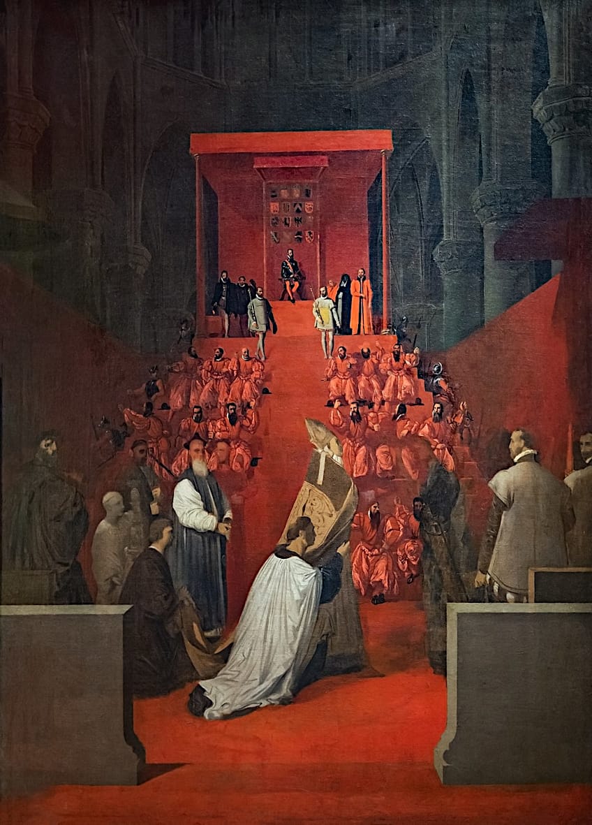 The Duke of Alba at Sainte-Gudule in Brussels by Jean Auguste Dominique Ingres (c. 1815); Jean Auguste Dominique Ingres, Public domain, via Wikimedia Commons
Using contrast strategically means creating a vivid emotional resonance that manifests through cool or warm colors, soft and rigid shapes, as well as textures, light, and the color wheel. These elements are crucial to shaping the impact of images, which have been used across graphic art, fine art, digital art, painting, and even sculpture.
Understanding the Value of Contrast
Before we dive into the different types of contrast, it is crucial to understand the value of contrast in art. Contrast in artwork implies that opposite elements can be combined to result in visually pleasing artwork. When used appropriately, contrast can be used to narrate a story, convey a mood or emotion, and draw attention to the main subject. Contrast in artwork is essential to produce unique beauty, establish balance, and even construct feelings of discomfort, tension, and peace.
The benefits of using contrast in artwork appropriately are endless. From crafting bold works that stimulate drama to intensifying a specific color in your composition to highlighting a duality, contrast is a potent tool.
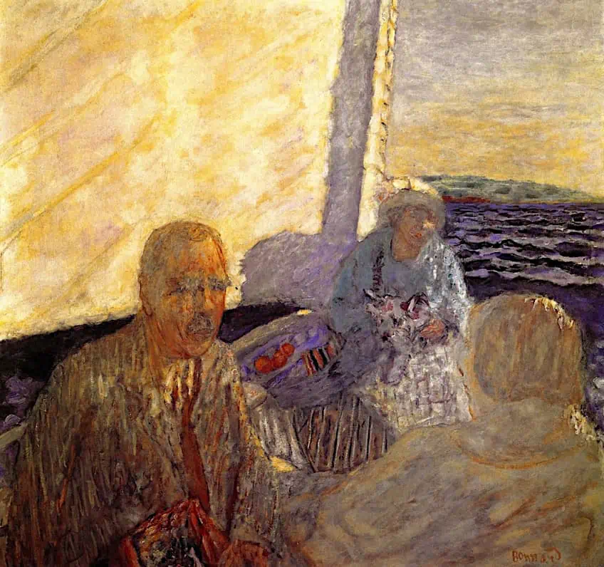 Sailing or the Hahnloser Family by Pierre Bonnard (before 1947); Pierre Bonnard, Public domain, via Wikimedia Commons
It is also important to note that contrast in art also involves a wide range of techniques across different mediums that rely on various elements such as shape, value, texture, and color. For example, in painting, artists can manipulate colors by incorporating complementary hues or juxtaposing cool and warm-toned colors to establish tension and harmony. Layering paint can also produce a texture contrast, as well as adding depth to the composition.
In the field of drawing, various mark-making techniques can also be used to create contrast in linework and textural contrast.
Sculptors also employ contrast in their materials by playing with different surfaces and textures to evoke relationships between light and shadow. Similarly, graphic designers also utilize contrast in typography to juxtapose thin and bold fonts, while photographers employ techniques such as controlled lighting to emphasize contrast. Photographers also use high-key lighting, low-key lighting, and even lighting to create brightness, strong contrast, and dramatic effects, and reduce tonal range.
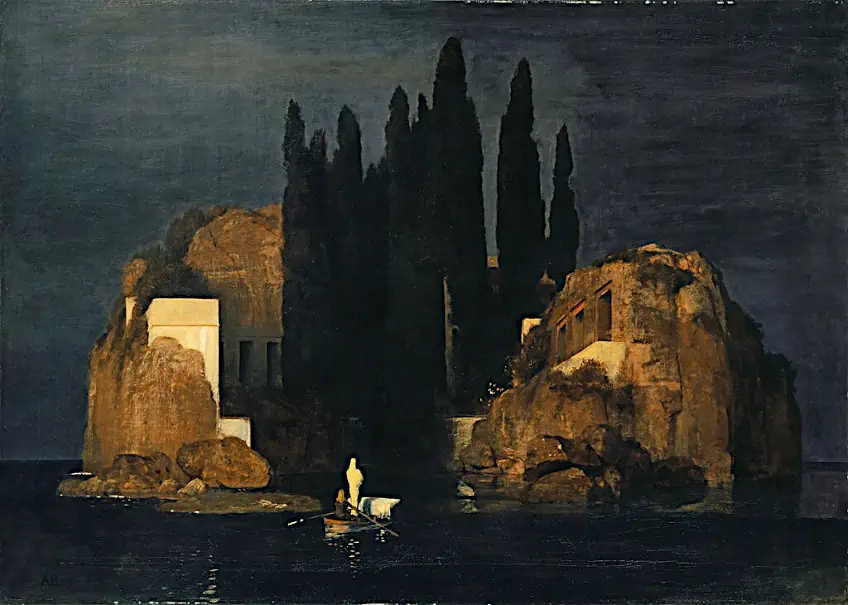 Isle of the Dead by Arnold Böcklin (1880); Arnold Böcklin, Public domain, via Wikimedia Commons
To master contrast, it is important to learn more about the different types of contrast, how they are used, and the various art examples in history that have used contrast strategically to produce impactful images.
Below, we will dive into the different types of contrast, as well as various famous examples of contrast seen in paintings by some of the world’s best artists.
Exploring the Different Types of Contrast in Art
Now that you understand the definition of contrast and its value in creating impactful art, you can now explore the different types of contrast that will guide you to produce the desired effect. Before we dive right in, it is important to first establish the three main components of contrast, which are informed by light and dark, contrasting size, and complementary colors. Furthermore, contrast is understood in two defining elements, as measured, and controlled.
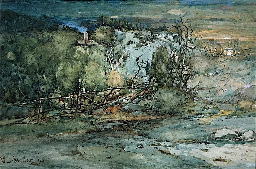 Frontier Cabin by William Louis Sonntag, Sr. (1894); William Louis Sonntag, Sr., CC0, via Wikimedia Commons
Measured and controlled contrasts in artwork can involve works that rely on chaotic elements that contradict the idea of unity and balance, yet somehow, they work together with contrast to achieve a rhythmic effect.
Examples of this can be seen in the work of Jackson Pollock, whose paintings appear unorganized, however, their use of contrasting colors and lines helps create the rhythm and establish enough contrast to create unity. Below, we will explore the different types of contrast that will help you fully grasp the different approaches available to create works that pop!
Color Contrast (Hue Contrast)
This contrast type is also recognized as hue contrast and can be understood by the color wheel. The color wheel displays colors that will contrast in opposition to each other but will also produce a visually aesthetic image. For example, colors that contrast well include red-green, blue-orange, and yellow-purple.
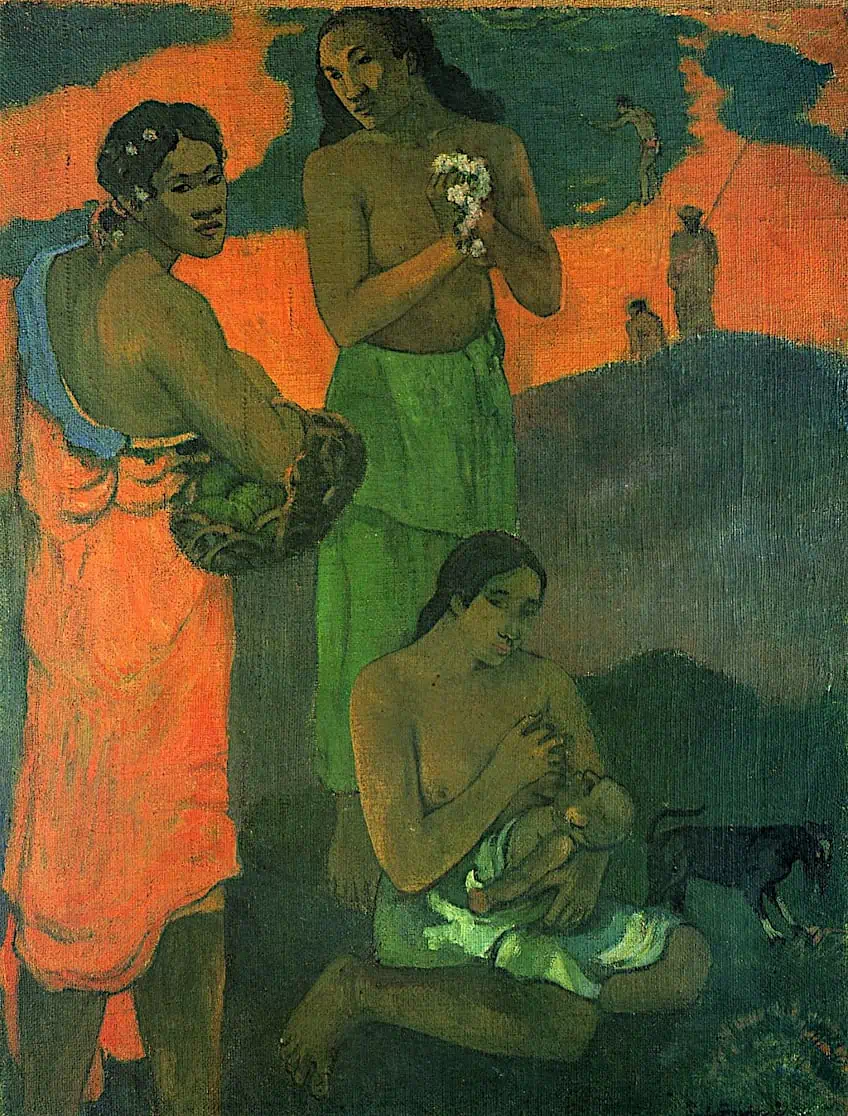 Women on the Seashore or Motherhood I by Paul Gauguin (1899); Paul Gauguin, Public domain, via Wikimedia Commons
There are certain catches to using complementary colors since text-based works can also “clash” in terms of color, such that it becomes hard to read.
Color contrast is further understood in terms of saturation and value, which we will explore below.
Saturation Contrast
Contrast is understood through saturation, which involves the difference between dull and bold colors. Saturation contrast also implies the differences between the pure hue and the darker or lighter shades that create contrast.
It is important to remember that saturation refers to the amount of white combined with a hue and encompasses the intensity of color from gray tones to vivid, highly saturated colors.
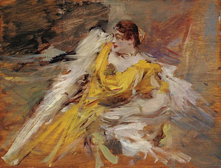 Lady in Yellow by Giovanni Boldini (1912); Giovanni Boldini, Public domain, via Wikimedia Commons
Edge Contrast
An edge contrast refers to the arrangement of hard and soft edges, which make elements visible and invisible in a composition. One can achieve a light atmospheric mood in a painting when using soft edges or creating hard edges to distinguish objects from one another.
Artists have also combined the two to create visually interesting compositions that rely on hard and soft edges to form relationships between objects and subjects.
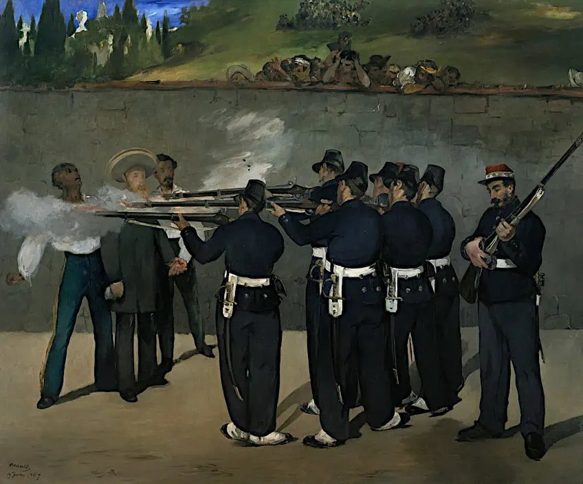 The Execution of Emperor Maximilian of Mexico, June 19, 1867 by Edouard Manet (between 1868 and 1869); Édouard Manet, Public domain, via Wikimedia Commons
Without soft edges, your use of solely hard edges can make your composition appear stylized and cartoonish. The composition can also appear hazy and unclear if only soft edges are used. By contrasting hard and soft edges, artists can bring their focal points into perspective to emphasize the necessary elements.
Texture Contrast
What is texture contrast? Texture contrast refers to the inclusion of various surfaces such as roughness or visual details that emphasize softness, motion, and drama. By experimenting with texture, artists can create works that visually guide the viewer’s eye to the core details, while adding a sensory dimension to the work.
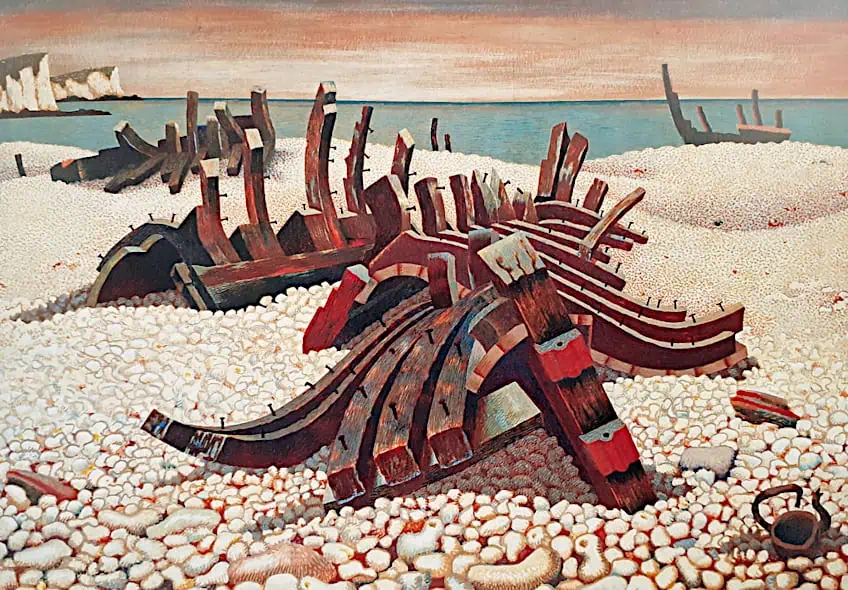 Requiescat (Let Him Rest) by Edward Wadsworth (1940); Edward Wadsworth (1889-1949), Public domain, via Wikimedia Commons
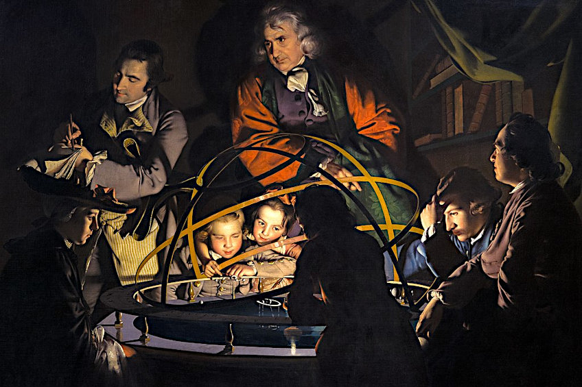
Value Contrast
The value contrast of a work refers to the relationship between the light and dark colors such as black and white, which are two extremes on the value scale. Many famous monochrome artworks effectively demonstrate value contrast to provide a striking effect and showcase clarity in form, depth, and line.
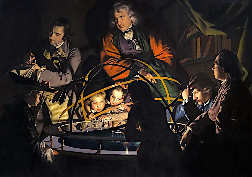 Untitled, but known as A Philosopher Giving a Lecture on the Orrery by Joseph Wright of Derby (c. 1766); Joseph Wright of Derby, Public domain, via Wikimedia Commons
Detail Contrast
If you are a perfectionist when it comes to creating art, you would certainly benefit from practicing detailed contrast. Many artists attempt to capture as many details as possible, which can prove to be a challenge and become confusing to the viewers, especially if all elements in a composition are rendered in the same amount of detail.
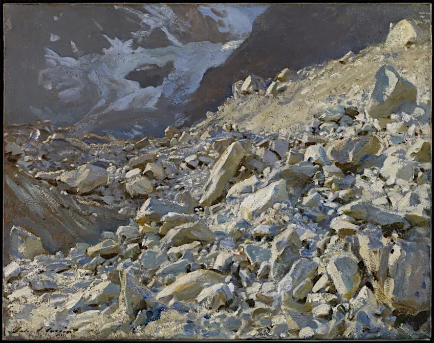 The Moraine by John Singer Sargent (1908); John Singer Sargent, Public domain, via Wikimedia Commons
Artists can employ high detail for only the core elements of an artwork while toning down the detail on background elements.
Detail contrast is essential to creating works that are easy to read and require one to consider the aspects of the artwork that need simplification.
Size Contrast
Many artists create size contrast regularly but may not realize that they do. By contrasting elements according to their opposite proportions, you can create a work that conveys intention and emphasizes the mood, subject, and emotional impact of the work.
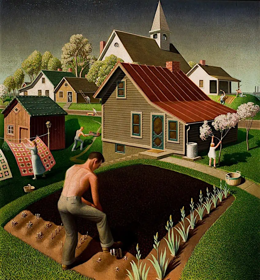 Spring in Town by Grant Wood (1941); Grant Wood, Public domain, via Wikimedia Commons
Artists can make their subjects seem insignificant, alone, and distant by contrasting small figures against vast landscapes.
On the other hand, artists can make the subject appear powerful and confident, and perhaps evoke a sense of discomfort by enlarging the subject or placing them in relation to smaller elements.
Line Contrast
Contrast can also be created with marks such as lines instead of color. Lines can be used to form patterns that can work to create optical illusions and various marks that influence the way an artwork is read. From curvy lines to dotted and short lines, line contrast is a strategic approach to incorporate in works that attempt to hold the viewer’s attention.
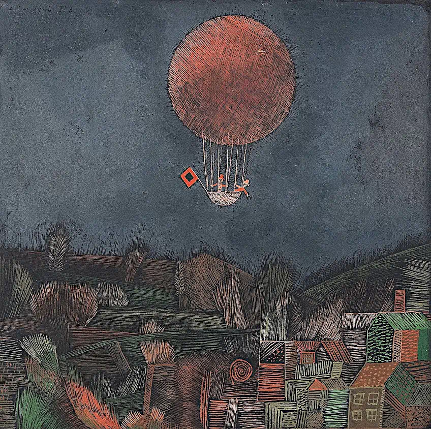 The Balloon by Paul Klee (1926); Paul Klee, Public domain, via Wikimedia Commons
Shape Contrast
Creating shape contrast allows for more experimentation since shapes can be presented as organic, geometric, small, large, and warped. There are many possibilities in terms of juxtaposing shapes against one another, which can affect the design of your work.
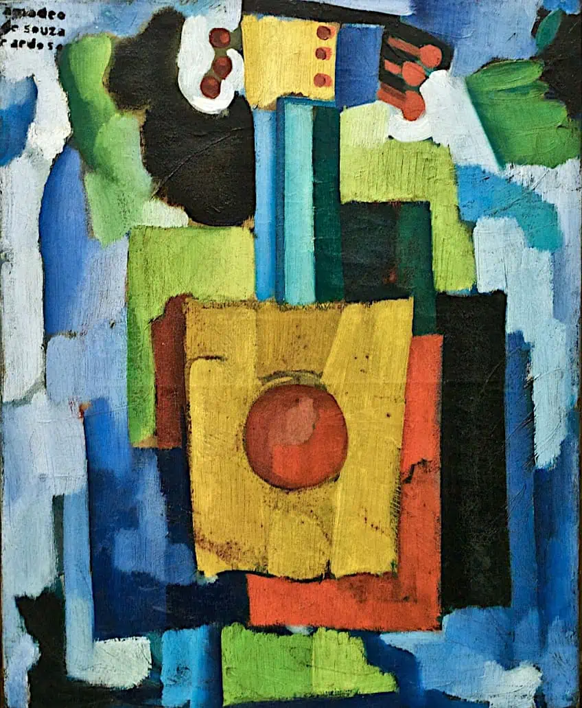 Untitled or Musical Instruments by Amadeo de Souza-Cardoso (1915-1916); Pedro Ribeiro Simões from Lisboa, Portugal, CC BY 2.0, via Wikimedia Commons
Famous Artworks That Showcase Contrast
There are numerous famous artists, who have skillfully applied their knowledge of contrast to elevate scenes of the mundane into extraordinary works of art. From works by Caravaggio to Mark Rothko, you can now enjoy a selection of artworks that demonstrate the uses of contrast in art.
The Lady with an Ermine (1489) by Leonardo da Vinci
| Artist Name | Leonardo di ser Piero da Vinci (1452 – 1519) |
| Date | 1489 |
| Medium | Oil on walnut panel |
| Dimensions (cm) | 54 x 39 |
| Where It Is Housed | Czartoryski Museum, Kraków, Poland |
The Lady with an Ermine is one of the most renowned contrast painting examples by Leonardo da Vinci that demonstrates the use of contrast in painting a portrait.
Da Vinci elevated the depth of the portrait by contrasting the woman’s face against the diffused light to draw the viewer’s attention.
He also used a dark background to contrast the illuminated subject and add a level of three-dimensionality, such that the lady appears to emerge from the darkness. Her delicate facial features are also contrasted by the texture of the ermine, as well as her youthfulness, which is contrasted by the small animal.
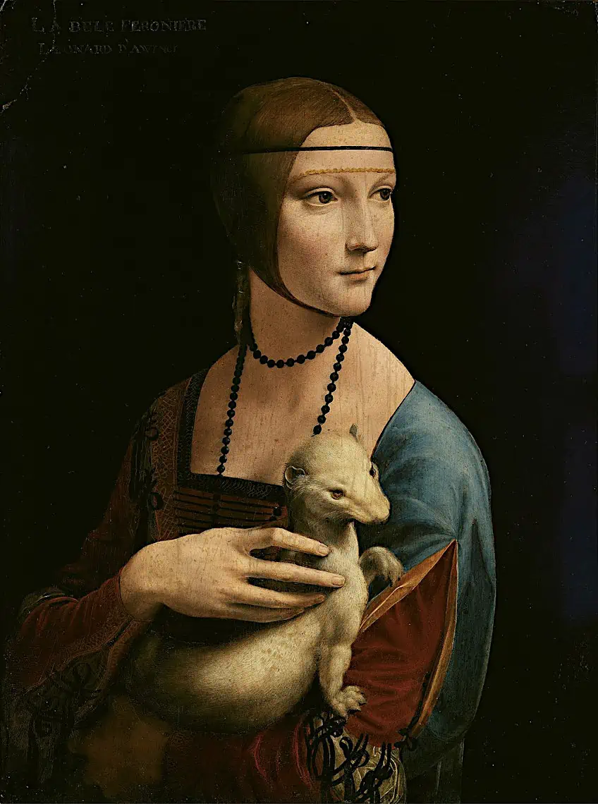 Lady with an Ermine by Leonardo da Vinci (1489); Leonardo da Vinci, Public domain, via Wikimedia Commons
Such an image of a woman and a smaller animal draws attention to the size contrast to emphasize the lady’s power over nature and sense of control. Color contrast is another type of contrast that Da Vinci uses to accentuate the lady’s skin. He does so using warm tones on her skin, which are contrasted against the cool tones of the background.
Another important form of contrast that Da Vinci used was emotional contrast, which is expressed in the lady’s demure expression contrasted by the curious and alert nature of the ermine. This is an example of narrative tension that stimulates interest in the subjects’ relationship.
Boy Peeling Fruit (1592 – 1593) by Caravaggio
| Artist Name | Michelangelo Merisi da Caravaggio (1571 – 1610) |
| Date | 1592 – 1593 |
| Medium | Oil on canvas |
| Dimensions (cm) | 75.5 x 64.4 |
| Where It Is Housed | Longhi Collection, Florence, Italy |
Boy Peeling Fruit is recognized as one of Caravaggio’s earliest contrast paintings, which captures his hallmark style of chiaroscuro painting, which creates a strong contrast between the light and dark elements in the composition. Caravaggio was one such painter who was regarded as the master of chiaroscuro and in contrast with many of his works celebrated for their evocative and dramatic qualities.
Caravaggio used different types of contrast to heighten the emotional intensity of the painting and drew attention to the boy’s illuminated face by employing the chiaroscuro technique to create a strong contrast between the light and shadow and make the boy’s face appear to emerge from the darkness.
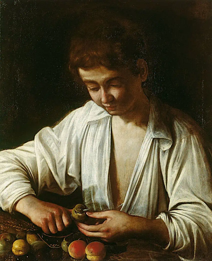 A Boy Peeling Fruit by Caravaggio (1592-1593); Caravaggio, Public domain, via Wikimedia Commons
The strong contrast that is created highlights the boy’s face, the fruit, and his hand against the dark background, which creates a striking focal point. Additionally, Caravaggio also highlights the transience of youth and the boy’s vulnerability by emphasizing his youthful and innocent appearance in contrast to his aged hands.
Reconnoitering (1911) by John Singer Sargent
| Artist Name | John Singer Sargent (1856 – 1925) |
| Date | 1911 |
| Medium | Oil on canvas |
| Dimensions (cm) | 55.5 × 72 |
| Where It Is Housed | The Metropolitan Museum of Art, New York City, United States |
Reconnoitering is another excellent example of how contrast was used effectively by John Singer Sargent. The painting was created in 1910 and captures a moment, when John Singer Sargent paints a portrait of his friend Ambrogio Raffele, against the hazy and atmospheric landscape of the Simplon Pass in Switzerland. Sargent admired his friend who was also an artist and seen as a celebrity, whom Sargent greatly admired. Their friendship was also connected by their shared passion for the mountains and outdoor painting.
Raffele appears to pose in a contemplative manner and appears to select a vista to paint while viewing the magnificent Alpine panorama. Sargent uses the compositional arrangement to draw attention to spatial contrast, which contrasts his friend’s body against the expanse of landscape and the atmosphere behind him.
There is also a visible difference between the texture used to paint the atmosphere and landscape and the stark contrast in the colors and the brush strokes used to depict Raffele. One can also spot edge contrast in the edges of Raffele’s silhouette and the softness of the rest of the landscape.
Self Portrait (1917) by Erich Heckel
| Artist Name | Erich Heckel (1883 – 1970) |
| Date | 1917 |
| Medium | Woodcut print |
| Dimensions (cm) | 36.3 x 29.7 |
| Where It Is Housed | Victoria & Albert Museum, London, United Kingdom |
Self Portrait by Erich Heckel showcases the use of value contrast between the solid white background and the black ink of the woodcut print. The angular lines of the print allude to Heckel’s mood of introspection, which was captured in a woodcut print since the 20th century saw many German expressionists adopt woodcut as the primary medium for creating simple imagery. Woodcut was traditionally printed using black ink printed directly against the white paper to create a striking and powerful contrast.
Another famous artist who used the contrast of black and white effectively was Joseph Albers, which can be seen in his 1933 print titled Circles.
Untitled (1949) by Mark Rothko
| Artist Name | Mark Rothko (1903 – 1970) |
| Date | 1949 |
| Medium | Pigmented hide glue and oil on canvas |
| Dimensions (cm) | 204.15 × 168.6 × 5.08 |
| Where It Is Housed | National Gallery of Art, Washington D.C., United States |
Mark Rothko is another famous Modern abstract artist whose use of color fields in painting resulted in some of the most striking and velvety contrast paintings of the 20th century. Rothko began using colors and numbers to distinguish his contrast paintings from 1947 as an unconventional approach that focused solely on the way that he stacked his colors against the contrasting backgrounds.
Rothko is known for contrasting bands of color against corresponding or complementary backgrounds, that bring out themes of introspection and silence. Through rectangles, saturated colors, and high-contrast bands, Rothko creates compositions that span the entire width of a canvas.
In Untitled, Rothko softens the edges of his color bands and inserts a narrow rectangle below, with copper green coated over a rusty orange. He also uses contrast horizontally at the top of the composition, with a thin strip of vivid orange positioned above a wider band of rich plum purple. The contrast thus becomes the life force of creativity, which enables artists to transform their canvases into a symphony of visual pleasure. In learning how to use contrast, one can explore the endless possibilities of creating harmony in painting and establishing narratives that resonate more deeply with your viewers. Contrast is also not limited to shapes and colors alone and can be used to evoke a sense of chaos, order, release, tension, or simply explore the relationships between shadow and light.
It is essential to develop a solid understanding of contrast and understand how contrast is valued in art. From directing our eyes to the focal points of an image to sparking emotions that words are not enough to convey, contrast is incredibly powerful. As such, whether you are an advanced professional or you are a beginner embarking on your first lesson in contrast in art, you can be sure that your practice will improve by learning about the different types of contrast.
Frequently Asked Questions
What Is Contrast in Art?
The term contrast in art refers to the arrangement of different visual elements in a composition that oppose one another yet work together to enhance the impact of the artwork. Contrast is the juxtaposition of opposites such as light and dark, as well as texture, color, size, shape, and various other forms of contrast.
What Are the Different Types of Contrast in Art?
There are several different types of contrast in art. These include value contrast, color contrast, texture contrast, shape contrast, edge contrast, as well as emotional and concept contrast, which highlight opposing meanings. The different types of contrast are used to enhance storytelling, establish emotional impact, mood, create unity, and create a visually pleasing artwork that is harmonious.
Which Three Artists Are Famous for Using Contrast in Art?
Many famous artists use contrast in art. Among the top three artists who are renowned for contrast in art include Caravaggio, who was recognized for his chiaroscuro technique, Bridget Riley, who is famous for her line contrast in Op art, as well as Mark Rothko, who is recognized for his color field paintings that rely on contrast to evoke emotions.
Why Do Artists Use Contrast in Art?
There are endless reasons why artists choose to leverage contrast in art. Artists may use contrast to enhance the mood and composition or to tell a story, direct the viewer’s attention to the focal point, clarify the subject, establish emotions, and create visually stimulating artwork. Contrast is a useful tool for many artists who also wish to convey a sense of unease, peace, unity, and balance, and express duality. Additionally, contrast has also been used to create optical illusions and highlight important objects in a work.
What Is the Most Famous Example of Contrast in Art?
Saint Jerome Writing (1605 – 1606) by Caravaggio is recognized as one of the most famous examples of contrast in art, and is usually identified alongside strong hue contrast artworks such as Vincent van Gogh’s Self-Portrait with Bandaged Ear and Pipe (1889).

In 2005, Charlene completed her wellness degrees in therapeutic aromatherapy and reflexology at the International School of Reflexology and Meridian Therapy. She worked for a company offering corporate wellness programs for several years before opening her own therapy practice. In 2015, she was asked by a digital marketer friend to join her company as a content creator, and it was here that she discovered her enthusiasm for writing. Since entering the world of content creation, she has gained a lot of experience over the years writing about various topics such as beauty, health, wellness, travel, crafting, and much more. Due to various circumstances, she had to give up her therapy practice and now works as a freelance writer. Since she is a very creative person and as a balance to writing likes to be active in various areas of art and crafts, the activity at acrylgiessen.com is perfect for her to contribute their knowledge and experience in various creative topics.
Learn more about Charlene Lewis and about us.