Mauve Color – Learn About the Color Mauve and Its Soft Shades
This post may contain affiliate links. We may earn a small commission from purchases made through them, at no additional cost to you.
Are you intrigued by the mesmerizing hue known as mauve? Wondering what color is mauve and what makes it so captivating? Well, let us take you on a journey through the enchanting world of this delicate shade. The mauve color, a harmonious blend of soft lavender and pale pink, exudes a sense of sophistication and tranquility. Exploring the vast spectrum of shades of mauve, from dusty rose to muted violet, opens up a realm of possibilities when it comes to creating breathtaking color combinations. Whether you are seeking inspiration for your wardrobe or interior design, discovering what colors go with mauve and exploring the mauve color palette will unlock a realm of endless beauty and elegance!
Table of Contents
What Color Is Mauve?
Enter the enchanting world of the color mauve, where beauty and elegance intertwine in a symphony of captivating hues. What color is mauve, you ask? Let us whisk you away on a sensory journey. Mauve color, a delicate and sophisticated shade, is a harmonious blend of serene lavender and subtle blush pink. It exudes a timeless charm, radiating both warmth and tranquility. As you delve deeper into the realm of mauve, a vast palette of shades unveils itself, each of which are made up of their own unique character. From the ethereal allure of light mauve, reminiscent of a delicate morning mist, to the regal depth of mauve purple, reminiscent of velvety twilight skies, the spectrum of mauve colors unfolds like a painter’s dream.
The color mauve has an inherent ability to mesmerize, to transport you to a place where creativity knows no bounds. Its gentle whispers beckon you to explore its countless companions in the art of color combinations.
Imagine a mauve color palette adorned with soft grays, earthy browns, and touches of gold, creating a sanctuary of refined elegance. Feel the soothing harmony as mauve embraces hues such as lilac, sage green, and dove gray, evoking a sense of serenity and balance. In the world of fashion, mauve color becomes an embodiment of grace and sophistication. Picture a flowing gown in a delicate light mauve color, adorning its wearer with an ethereal glow.

| Mauve Color | Mauve Hex Codes | RGB | Mauve Color Code CMYK (%) | Shades of Mauve |
| Mauve | #e0b0ff | 224, 176, 255 | 12, 31, 0, 0 | |
| Medium Purple | #9370db | 147, 112, 219 | 33, 49, 0, 14 | |
| Thistle | #d8bfd8 | 216, 191, 216 | 0, 12, 0, 15 | |
| Liseran Purple | #de6fa1 | 222, 111, 161 | 0, 50, 27, 13 | |
| Mulberry | #c54b8c | 197, 75, 140 | 0, 62, 29, 23 | |
| Pearly Purple | #b768a2 | 183, 104, 162 | 0, 43, 11, 28 | |
| Plum | #dda0dd | 221, 160, 221 | 0, 28, 0, 13 | |
| Orchid | #da70d6 | 218, 112, 214 | 0, 49, 2, 15 | |
| Heliotrope | #df73ff | 223, 115, 255 | 13, 55, 0, 0 | |
| Pomp and Power | #86608e | 134, 96, 142 | 6, 32, 0, 44 | |
| African Violet | #b284be | 178, 132, 190 | 6, 31, 0, 25 |
Envision a bouquet of mauve flowers, their petals kissed by the morning sky, emanating a sense of delicate beauty. Mauve is more than just a color; it is an experience. It stirs emotions, ignites inspiration, and lends a touch of allure to any creative endeavor. So, let yourself be captivated by the allure of mauve, and let it guide you on a journey of artistic expression.
Whether you seek to adorn your living space or your imagination, mauve will be your faithful companion, always ready to inspire and enchant.
Mauve Color Meaning
Step into the captivating world of mauve color and unravel the profound meaning behind its ethereal shades. Mauve, a color that bridges the realm of softness and sophistication, carries with it a symbolism that goes beyond its mere appearance. Let us delve into the depths of mauve color meaning, where light mauve color and mauve purple, amongst other shades, intertwine to create a tapestry of emotions. At its core, light mauve color exudes a gentle and soothing energy. It symbolizes tranquility and serenity, reminiscent of a serene sunset casting a delicate glow over the horizon. Light mauve invites you to pause, to breathe in its calming essence, and find solace amidst the chaos of everyday life. It whispers of inner peace and spiritual awakening, like a gentle embrace that wraps around your soul.
On the other end of the spectrum, mauve purple emerges with a regal grace and a sense of mystique. This deeper shade of mauve symbolizes luxury, opulence, and creativity.
Mauve purple evokes a sense of grandeur, drawing you into a world of rich imagination and artistic expression. It is a hue that captivates the senses and ignites a spark of inspiration, urging you to explore the depths of your creativity with confidence and flair. Beyond its individual shades, mauve color as a whole carries a broader symbolism. It represents balance and harmony, seamlessly blending warm and cool tones in perfect equilibrium. Mauve color meaning encompasses a delicate dance between femininity and spirituality, elegance and creativity. It embodies a union of strength and vulnerability, where softness and grace intertwine with determination and resilience.
In the realm of psychology, mauve color is believed to promote emotional healing and introspection. It encourages self-reflection and introspection, allowing one to delve deep within and uncover hidden truths. Mauve color meaning invites us to embrace our emotions, to explore the depths of our being, and to find solace in our inner journey. Whether you find yourself drawn to the gentle embrace of light mauve color or the enigmatic allure of mauve purple, mauve color meaning resonates on a profound level. It speaks to the core of our existence, inviting us to embrace the delicate balance of our emotions, creativity, and spirituality.
So, allow the mesmerizing essence of mauve color to guide you on a transformative journey of self-discovery and artistic expression.
Mauve Throughout Art History
Throughout the vast tapestry of art history, the captivating hue of mauve has woven its way into the works of renowned artists, leaving an unmistakable mark on the canvas of artistic imagination. From the Renaissance to the modern era, mauve color has held a unique significance, inspiring artists to explore its delicate and enchanting nuances. Let us embark on a captivating journey through time, exploring the profound presence of mauve in art.
Mona Lisa (c. 1503 – 1506) by Leonardo Da Vinci
| Artist | Leonardo Da Vinci (1452 – 1519) |
| Date Completed | c. 1503 – 1506 |
| Medium | Oil on poplar panel |
| Dimensions (cm) | 77 x 53 |
| Current Location | Louvre Museum, Paris, France |
One of the earliest glimpses of mauve color in art can be traced back to the Renaissance period, where artists sought to capture the beauty of nature in their works. In the paintings of artists like Leonardo da Vinci, we find subtle hints of mauve in the delicate blush of a cheek or the graceful folds of a flowing garment. Da Vinci’s masterpiece, the Mona Lisa, showcases the skillful use of light mauve tones, adding a sense of depth and softness to her enigmatic smile.
As we venture into the world of Impressionism, the influence of mauve becomes more pronounced.
Artists like Claude Monet and Pierre-Auguste Renoir embraced the enchanting qualities of mauve, using it to evoke fleeting moments of light and atmosphere. Monet’s iconic water lilies series features mauve-infused reflections on tranquil ponds, immersing the viewer in a world of serene beauty. Renoir, known for his celebration of the human form, utilized mauve hues to add a subtle sensuality and warmth to his portraits.
 Mona Lisa (c. 1503 – 1506) by Leonardo Da Vinci; Leonardo da Vinci, Public domain, via Wikimedia Commons
The Joy of Life (1905) by Henri Matisse
| Artist | Henri Matisse (1869 – 1954) |
| Date Completed | 1905 |
| Medium | Oil on canvas |
| Dimensions (cm) | 176.5 x 240.7 |
| Current Location | Barnes Foundation, Philadelphia, United States |
The early 20th century witnessed the emergence of the Fauvist Movement, characterized by bold and vibrant colors. Mauve, in its various shades, found a place among the exuberant palettes of artists like Henri Matisse and André Derain. Matisse’s The Joy of Life radiates with mauve undertones, creating a dreamlike atmosphere of harmonious bliss.
Charing Cross Bridge (1906) by André Derain
| Artist | André Derain (1903 – 1970) |
| Date Completed | 1906 |
| Medium | Oil on canvas |
| Dimensions (cm) | 82 x 104 |
| Current Location | Museum of Contemporary Art, Los Angeles, United States |
Derain’s Charing Cross Bridge embraces mauve as a contrasting element, juxtaposing it against bold greens and blues to capture the essence of urban modernity. The strategic placement of mauve within the composition serves as a conduit between the tangible and the intangible.
 Portrait photograph of André Derain (c. 1903); AnonymousUnknown author, Public domain, via Wikimedia Commons
The Kiss (1907) by Gustav Klimt
| Artist | Gustav Klimt (1862 – 1918) |
| Date Completed | 1907 |
| Medium | Oil on canvas |
| Dimensions (cm) | 180 x 180 |
| Current Location | Austrian Gallery Belvedere, Vienna, Austria |
The Art Nouveau movement, with its emphasis on organic forms and decorative elegance, found an ideal companion in mauve color. Artists such as Alphonse Mucha and Gustav Klimt embraced the delicate charm of mauve, incorporating it into their ornate and intricate compositions. Mucha’s ethereal posters, with their flowing hair and flora motifs, often featured mauve accents, adding a sense of otherworldly allure. Klimt’s masterpiece,
The Kiss, showcases the regal presence of mauve purple, infusing the painting with a sense of passion and opulence.
As we reflect upon the journey of mauve color throughout art history, it becomes evident that its allure transcends time and style. From the delicate strokes of the Renaissance masters to the bold gestures of the abstract expressionists, mauve has provided artists with a language of subtlety, grace, and emotional resonance. It invites us to explore the delicate balance between light and dark, softness and strength, capturing the essence of the human experience.
 The Kiss (1907) by Gustav Klimt; Gustav Klimt, Public domain, via Wikimedia Commons
The Color Wheel and Its Relationship With Mauve
The color wheel, a fascinating tool of artistic exploration, reveals the intricate relationship between mauve and its chromatic companions. Positioned between cool blues and warm pinks, mauve finds its place as a harmonious bridge. Its subtle undertones of both warmth and coolness allow it to effortlessly complement a wide range of hues, from vibrant purples to delicate grays. As the color wheel spins, mauve emerges as a versatile and captivating shade, inviting us to explore its endless possibilities and create breathtaking harmonies.
Mauve Complementary Color
The world of color, the relationship between mauve and its complementary counterpart, tea green, unfolds like a harmonious duet. Mauve, with its delicate blend of lavender and pink, finds an unexpected companion in the refreshing tones of tea green. Together, they create a captivating contrast that tantalizes the senses. Mauve, with its subtle elegance, radiates a sense of tranquility and sophistication. Its gentle presence invites us into a realm of softness and grace.
Tea green, on the other hand, bursts forth with the vibrancy of new growth and nature’s vitality. Its crisp and invigorating hues offer a refreshing counterpoint to mauve’s calm allure.
When mauve and tea green come together, a dynamic interplay ensues. Their complementary relationship creates a visual dance, each shade enhancing the other’s beauty. The soft warmth of mauve finds a lively companion in the cool and invigorating tones of tea green. They bring out the best in one another, creating a captivating synergy that commands attention.

| Color Name | Color Hex Codes | RGB | CMYK Color Code (%) | Shades of Color |
| Mauve | #e0b0ff | 224, 176, 255 | 12, 31, 0, 0 | |
| Tea Green | #cfffb0 | 207, 255, 176 | 19, 0, 31, 0 |
Mauve Split Complementary Colors
Moving further into the realm of color, mauve unveils yet another harmonious dance with its split complementary counterparts, which are light mint and parchment. Mauve, with its delicate fusion of lavender and pink, finds an exquisite balance between these two contrasting hues, creating a visual symphony that captivates. Mauve, with its graceful and serene demeanor, serves as the anchor in this triadic relationship. Its soft and sophisticated allure sets the stage for the lively interplay between light mint and parchment.
Light mint, with its refreshing and cool tones, breathes life into the composition, infusing it with a sense of vibrancy and subtle sophistication, reminiscent of aged manuscripts and timeless elegance.
When mauve, light mint, and parchment converge, a captivating harmony emerges. Mauve acts as the bridge between the two contrasting hues, creating a delicate equilibrium that is visually intriguing. Picture a scene where mauve blooms intermingle with light mint leaves, their colors dancing together in perfect synchronization. Imagine an interior adorned with mauve walls, complemented by accents of light mint and touches of parchment, creating a space that exudes both tranquility and energy.

| Color Name | Color Hex Codes | RGB | CMYK Color Code (%) | Shades of Color |
| Mauve | #e0b0ff | 224, 176, 255 | 12, 31, 0, 0 | |
| Light Mint | #b0ffb9 | 176, 255, 185 | 31, 0, 27, 0 | |
| Parchment | #f7ffb0 | 247, 255, 176 | 3, 0, 31, 0 |
Mauve Triadic Colors
With its far-reaching versatility, mauve finds itself entwined in a captivating dance with its triadic companions: pale turquoise and Navajo white. Mauve sets the stage for a harmonious trio exudes both grace and depth. Mauve, with its subtle sophistication, becomes the anchor of this triadic relationship. Its gentle presence emanates a sense of tranquility and elegance, inviting us to explore the possibilities of its vibrant partners. Pale turquoise, like the shimmering waters of a tropical paradise, infuses the composition with a refreshing vibrancy. It’s cool and calming tones add a touch of serenity to the mix, creating a sense of balance and depth.
Navajo white, reminiscent of warm desert sands and sunlit landscapes, brings a grounding warmth to the trio.
Its creamy hue offers a subtle contrast, enveloping the arrangement in a sense of timelessness and understated beauty. When this trio converges, a captivating symphony of colors emerges. Imagine a bouquet of mauve blooms intermingled with delicate turquoise petals, accentuated by the gentle elegance of navajo white wrapping paper. Visualize an interior space adorned with mauve walls, punctuated by accents of pale turquoise, and adorned with the inviting embrace of Navajo white furnishings, creating a sanctuary of serenity and style.

| Color Name | Color Hex Codes | RGB | CMYK Color Code (%) | Shades of Color |
| Mauve | #e0b0ff | 224, 176, 255 | 12, 31, 0, 0 | |
| Pale Turquoise | #b0ffe0 | 176, 255, 224 | 31, 0, 12, 0 | |
| Navajo White | #ffe0b0 | 255, 224, 176 | 0, 12, 31, 0 |
Mauve Monochromatic Colors
Remaining within the world of color, you may find that mauve can reign as its own enchanting protagonist, captivating our senses with its delicate charm. Yet, within the realm of monochromatic hues, mauve unveils a captivating journey of shades and depth that invite us to explore its rich variations and nuanced expressions. Mauve, with its graceful blend of soft pinks and purples, becomes the foundation of this monochromatic symphony. It serves as the anchor, emanating a sense of tranquility and sophistication.
From this central point, a range of mauve shades unfold, each with its own unique character and allure.
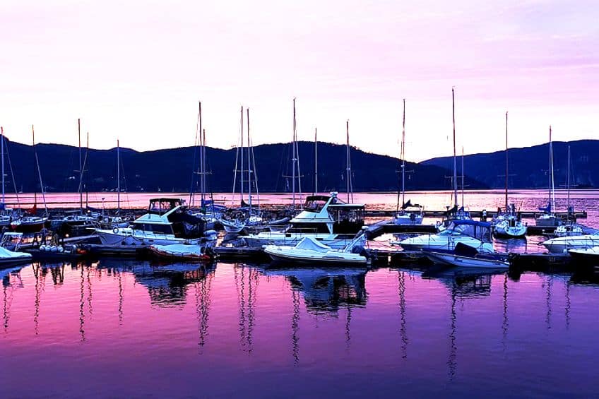
While a light mauve color, like a gentle whisper of a breeze, bathes the canvas in a delicate ethereal glow, deep mauve colors instead emanate a mysterious allure, invoking a sense of intrigue and contemplation. In the middle, however, mid-tone mauve shades exude a balanced warmth and depth. It captures the essence of dusk, where the sky holds a captivating blend of pastel hues.
| Color Name | Color Hex Codes | RGB | CMYK Color Code (%) | Shades of Color |
| Midnight Purple | #1f0036 | 31, 0, 54 | 43, 100, 0, 79 | |
| Dark Mauve | #2e004f | 46, 0, 79 | 42, 100, 0, 69 | |
| Royal Purple | #3c0069 | 60, 0, 105 | 43, 100, 0, 59 | |
| Mauve | #e0b0ff | 224, 176, 255 | 12, 31, 0, 0 | |
| Purple Iris | #5a009c | 90, 0, 156 | 42, 100, 0, 39 | |
| Violet Blue | #6800b5 | 43, 100, 0, 29 | 43, 100, 0, 29 | |
| Electric Mauve | #7700cf | 119, 0, 207 | 43, 100, 0, 19 |
What Colors Make Mauve?
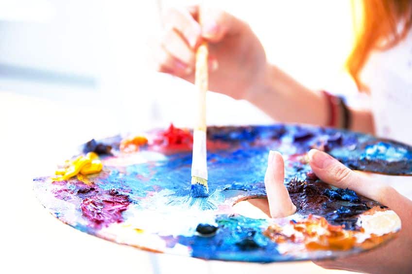
Embark on a captivating journey as you unlock the secrets of creating your own mauve color paint using other vibrant hues. With a palette of colors at your disposal, you have the power to blend and mix your way to the enchanting world of mauve. To begin, gather your paints and immerse yourself in the realm of color exploration. Start with a base of red paint, chosen carefully to lean towards a soft, rosy hue. From there, introduce a touch of blue paint, preferably a cool-toned variant like cerulean, in order to infuse the mix with a hint of lavender.
As you experiment, remember that achieving the perfect mauve requires a delicate balance. Gradually add small increments of blue paint to the red, blending and observing the evolving shades.
The goal is to strike a harmonious equilibrium that balances the warmth of the red with the coolness of the blue. To further refine your mixture, consider introducing a touch of white paint. This addition helps to soften the intensity of the hues and achieve the desired delicate and ethereal quality characteristics of mauve. Be mindful of the amount of white you incorporate, as it can quickly shift the balance of the color.
| Color Name | Color Hex Codes | RGB | CMYK Color Code (%) | Shades of Color |
| Rose Red | #b76e79 | 29, 45, 109 | 73, 59, 0, 57 | |
| Cerulean Blue | #2a52be | 68, 64, 111 | 12, 42, 0, 56 | |
| White | #ffffff | 227, 49, 157 | 0, 78, 31, 11 | |
| Forest Green | #228b22 | 34, 139, 34 | 76, 0, 76, 45 |
Remember, the art of creating your own mauve color paint lies in experimentation and intuition. Take your time, observe the changing hues, and adjust as needed to achieve the precise shade that captivates your imagination. Once you have achieved your desired mauve color, revel in the creative possibilities it presents. Use your homemade paint to breathe life into canvas, paper, or any surface that calls for a touch of mauve magic. Explore its gentle elegance in landscapes, portraits, or abstract compositions, allowing the color to evoke emotions and convey the depth of your artistic vision.
In the realm of creativity, the ability to concoct your own mauve color paint offers a world of endless inspiration. So, embrace the journey of color exploration, blend your paints with passion, and unlock the captivating allure of mauve in your artistic endeavors!
Take a look at our color mauve webstory here!
Frequently Asked Questions
What Colors Go With Mauve?
Mauve is a versatile color that can be paired with various hues to create different effects. Some colors that compliment mauve beautifully include soft greens like sage or mint, pale blues such as sky or baby blue, and neutrals like cream, beige, or gray.
What Is the Mauve Color Code?
The mauve color code can vary depending on the color model or system being used. The mauve RGB code is often represented as R: 224, G: 176, and B: 255, while the mauve hex code is often represented as #e0b0ff.
Duncan graduated with a diploma in Film and TV production from CityVarsity in 2018, after which he continued pursuing film while taking on a keen interest in writing along the way. Since having graduated, he began working as a freelance videographer, filming a variety of music videos, fashion and short films, adverts, weddings and more. Throughout this, he’s won a number of awards from various film festivals that are both locally and internationally recognized. However, Duncan still enjoys writing articles in between his filming ventures, appreciating the peace and clarity that comes with it.
His articles focus primarily around helping up-and-coming artists explore the basics of certain colors, how these colors can be paired with other shades, as well as what colors are created when you mix one with another. All while relating these shades to historically significant paintings that have incorporated them into their color palette. As a lover of the arts himself, he takes great interest in the Renaissance era of paintings, an era that has directly inspired many of his favorite films.
Learn more about Duncan van der Merwe and about us.
