Fire Drawing – A Guide to Creating Realistic Flames
This post may contain affiliate links. We may earn a small commission from purchases made through them, at no additional cost to you.
Fire is a unique structure and can be shaped in many ways depending on how large the flame is. There is a major difference between raging fires and dwindling flames, but it is important to understand the fundamental composition of a flame. In this tutorial on how to draw flames, we look at how to create a realistic flame through the layering process of colors. Flame drawings are very versatile and can be utilized in various ways, so understanding how to draw fire realistically can be a beautiful addition to many artworks. Moreover, this tutorial on how to draw flames also provides you with a really good understanding of how to utilize colors effectively to achieve a very specific airy quality within a flame drawing.
Step-by-Step Guide on Drawing Fire
In this tutorial on how to draw fire, we will first break down the shape and flow of how a flame is formed. We will break down the concepts of how flames interact with the wind and therefore cause these sporadic oscillations within the structure of the flame drawing. We will then work along these lines to establish the correct color values as they flow and change throughout the entire fire sketch. Then we will work through a layering process of colors that shift between the lightest and darkest parts of the flame. This is where we will spend time shaping the flame through a painterly process of whites, oranges, and reds, resulting in a realistic representation of a flame. Now that we are prepared, let’s get into this tutorial on how to draw fire realistically.

Step 1: Shaping the Flame
We can start the drawing by establishing a black background which will bring out the colors of the flame more distinctly. We want to work with an oscillating motion in the fire sketch, moving from left to right.
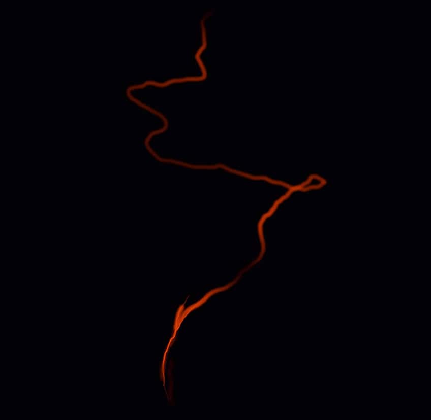
Try to imagine the flame like a ribbon structure that has a curling effect every time it moves from one side to the other. We want to start with a burnt orange color as we construct the shape of the flame. We also want to keep the lines soft so consider using a soft airbrush tool in the procreate application.

With drawing fire, it’s important to know that flames move in unpredictable ways in various directions, where they will respond to the wind, causing these oscillations in their formation.

As we make these strokes, we can also start to establish these cluster moments, where the flames cross over one another. Because a flame is a translucent structure, the areas where the flame crosses over will be bright.

As the flame has these moments of separation, the brightness dims down as it gets cool, allowing for the background to be slightly more present. As we continue drawing fire, we want to have a balance of bright moments and transparent moments within the flame structure.

Step 2: Adding Unique Details to the Flame
We can also start working on these softer and lighter marks that show the web-like separation in the areas of the flame where it breaks apart. Another good suggestion is to add smaller curls or shapes along the edges of the flame.

As you do this, try to imagine how the flame curls in on itself and breaks apart as it does so. This is where we see these small triangular or circular structures near the edges of the flame.

As long as we maintain the overall ribbon-like structure in the flame, we can then add in these smaller details of curled structures along the edges of the flame and web-like separations in the center of the flame.

Step 3: Adding Mid-Tones to the Drawing
As we continue with this drawing, we can start to build upon the colors with lighter and lighter tones, eventually working in white highlights in the central areas. With a natural flame, we will see that the cooler it gets, the warmer the darker the color.

We want to be strategic with lighter yellow colors, making sure that they run along the inner edges of the orange marks. We can be scattered with these lighter yellows, as a flame can shift between hotter and cooler moments.

We want to remember that as the flame has moments of separation, the background will be more evident. Keep this in mind in the web-like separations as you add in mid-tones of yellow.

Take your time with these yellow details, really trying to capture the hottest moments in the flame where there is a gathering of the flames or a crossover on the flames.

We want to make sure we are also keeping our lines very soft, so remember to use an airbrush tool, keeping the structure more airy and translucent in shape. We want to establish these pulling effects from bright hot areas to cooler areas.

Step 4: Making Transitions As Seamless As Possible
As you establish these hotter areas within the flame with lighter mid-tones of yellow, really try to create seamless gradients in these areas between hotter and cooler areas in the flame.

We can have moments where the lines of hotter areas in the flame seem distinct, but we then want them to become soft again and flow into the areas where there is a separation in the flame.

Try to consider how a flame is affected by the wind, meaning it can have moments of immense heat and then slowly dissipate into cooler flames. This is where we see those fluctuations in the flame as it oscillates in an upward direction as it is brighter and darker.

Having these forks in the structure of the flame will maintain a realistic quality in the flame as it breaks apart. We want to establish these lighter midtones shifting into these forks or webs as they move from the moments of density.

We can also add these highlights to the small flames that break off and scatter around the little shapes near the edges of the flame. We want to make sure we maintain the layering of colors even in these little scattered flames.

You can also let the yellow mid-tones flow along the thinner strokes of flames, as they shift into the thicker and more dense areas of the flame.

Step 5: Adding White Highlights
Once we have established the flame in both the darker oranges and lighter yellow colors, we can start incorporating white highlights into the areas where the flames are most dense.

We simply want to start working in these very light highlights into the lightest areas of the flames, which will start to emphasize the heat of the flame. Again, we want to keep these lighter moments within the yellow midtones.

We want to make sure that these white highlights stay within the lightest parts of the flame. That being said, we can also make these white marks curve in certain areas where the flame shifts from dense areas to thinner areas in the flame.

We can also add hues of blue at the origin of the flame to give it a more realistic representation of where the flame originates.
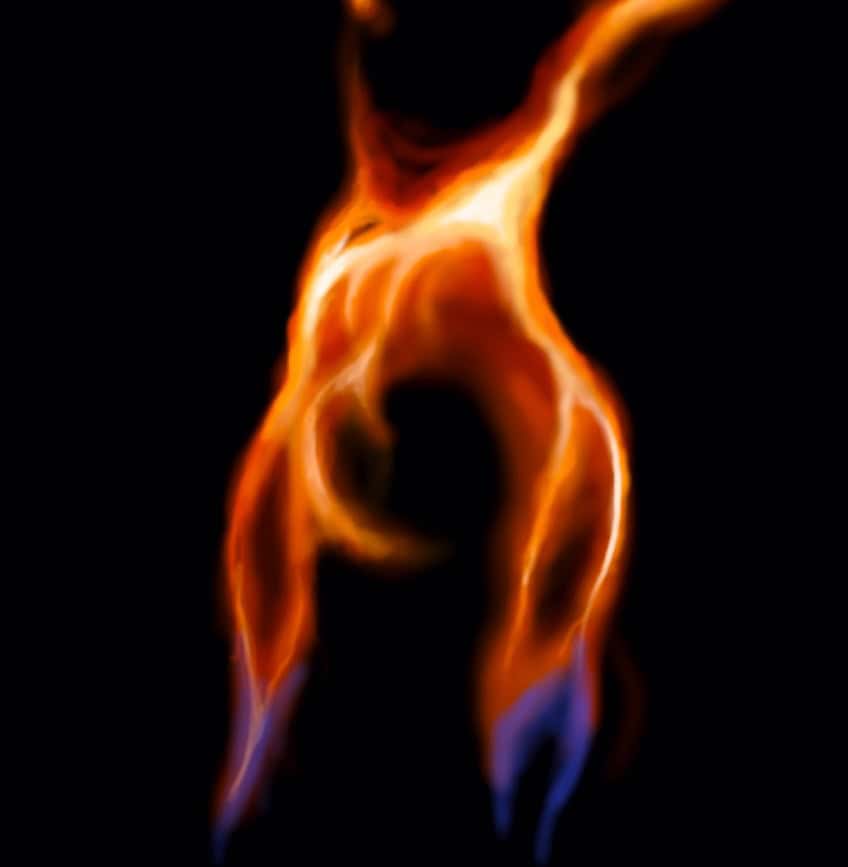
Most importantly, keep these white highlights in the areas of the flame that are lightest to keep consistency in the shift between brighter and darker areas in the flame. From here you can play around with layers and unique shapes within your flame drawing

And there you have it! how to draw fire through the use of layering colors. Once you understand the shape and color values within a flame, the process of creating a large body of fire becomes much easier.
Tips and Tricks to Remember
- Work out the flow and shape of the flame sketch. When drawing fire, you want to capture the flow before adding various color details.
- Build up your layers of color. We want to work from darker oranges to white highlights layered on top.
- Allow for sporadic motion on the movement of the flame. We don’t want parallel strokes in our flame, as asymmetrical movements are more realistic.
- Take your time with the highlights. Make sure that you add in these highlights last to emphasize the darker oranges along the edges of the flame.
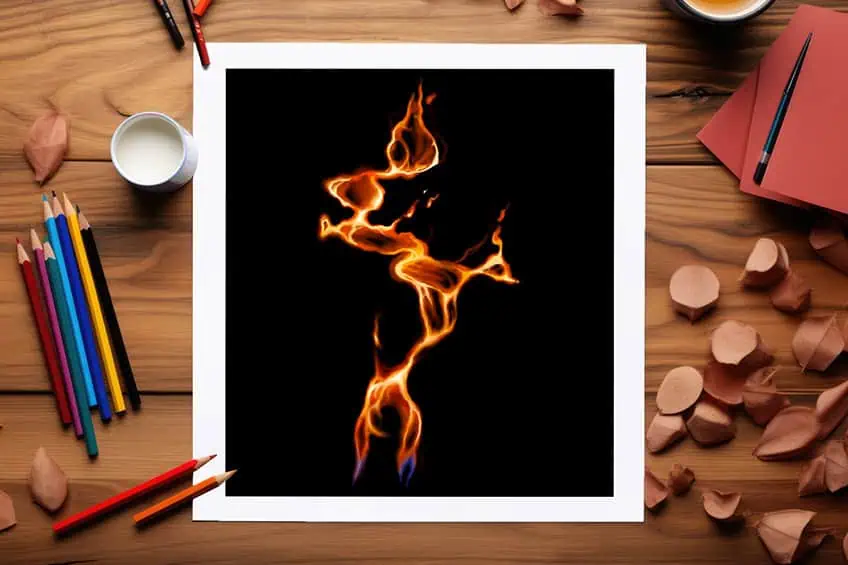
Learning how to draw fire in Procreate is a great learning experience for digital drawings because of how versatile it is as a feature. It also gives you in-depth knowledge of how to effectively layer with colors to achieve a very unique structure. If you can layer in Procreate to create fire, you can create anything!
Frequently Asked Questions
How to Color a Fire Drawing?
Fire can take on many colors depending on its source of origin. However, for a more natural flame, we want to utilize a spectrum between yellow, orange, and white highlights. The idea is that the flame gets lighter the hotter it is, and in the case of a realistic flame, it can even appear white in the hottest areas. As the flame moves and shifts from its hottest points, it starts to cool down through a progression of lighter to warmer colors. This is where we want to work with creating seamless gradients between white highlights and fluidly shift them into oranges and eventually hints of red. The oranges and reds will generally be along the edges of the flames as they become much cooler. The idea with a fire drawing is to build up from the darker colors and then work the lighter highlights into the center of the flame structure.
How to Shape a Flame Drawing?
Fire is a unique structure that responds quite vigorously to the surrounding environment. This means that it changes form as the wind interacts with the flame. In the case of a smaller flame, we will find that it has a lot of oscillation as it moves in an upward direction. From the origin point, we want to draw these lines that define this oscillation from right to left. That being said, there are smaller moments of shifting in the larger flame, where the flame can create unique movement in these smaller areas. This is where we can be creative with creating unique shapes of curls, zig-zags, and other patterns in the flame to represent a quality of sporadic movement. The idea is to have a general shape of oscillating lines but also incorporate more sporadic shapes to break the quality of symmetry and predictability in the movement of the flame.

Matthew Matthysen is a multidisciplinary artist. He completed his fine art degree, majoring in History of Art and Contemporary Drawing Practice at the University of Witwatersrand, South Africa. Before joining acrylgiessen In 2020, Matthew worked part-time as an art teacher at Reddford Blue Hills High school. Matthew creates drawing and painting tutorials for acrylgiessen and captures them not only photographically and in written form. He also records the creation of his works in his own creative studio as in video format, from which later with a voiceover and a video editor also drawing tutorials for the Youtube channel of acrylgiessen are created.
Learn more about Matthew Matthysen and about acrylgiessen.