Principles of Art – The Seven Design Principles of Art
This post may contain affiliate links. We may earn a small commission from purchases made through them, at no additional cost to you.
What are the principles of design in art and how are these art principles applied? In art theory, they speak about the elements of art and principles of design. In this article, we will be focusing on the seven principles of art, which are movement, proportion, contrast, pattern, variety, balance, and emphasis.
What Are the Principles of Design in Art and How Are They Used?
To gain a clearer understanding of the seven principles of art, we first need to discuss the difference between the elements of art and principles of design. The elements of art can be thought of as the building blocks of an artwork, such as line, color, shape, and value. The principles of art are the ways in which we apply those elements in our artwork, and the techniques we use to achieve an aesthetically pleasing result.
 The Last Supper by Leonardo da Vinci (1498); Leonardo da Vinci, Public domain, via Wikimedia Commons
While not all principles will necessarily be applied to every artwork, it is usually a good balance of all the principles that results in an outstanding artwork, This is because they all work with – and rely on – each other. For example, the use of contrast can result in an emphasis on certain elements that results in overall balance.
| Principle | Definition |
| Balance in Art | Balance in art is achieved when the visual weight of the various elements is distributed equally throughout the composition. |
| Movement in Art | Movement is achieved in art by using the elements in a manner that moves the eye around the canvas. |
| Contrast and Emphasis in Art | Contrast in art can be achieved by placing contrasting elements next to each other, such as complementary colors, to make both stick out. |
| Pattern in Art | Patterns can be created by repeating certain elements, adding additional interest and movement to the piece. |
| Unity and Variety in Art | Variety can be added to artwork by placing many distinct elements side by side. |
| Emphasis in Art | Placing emphasis on certain aspects can make them stand out in your artwork, by using lighting or contrast. |
| Proportion and Scale in Art | By making certain elements larger than others, we can use proportion to make certain aspects of an artwork stand out. |
Balance
Balance, as a design principle, relates to the arrangement of elements in a particular design. In whatever image we observe, our eyes automatically search for order and a feeling of stability. This is also the psychological basis for why individuals are more drawn to symmetrical features and objects. The observed weight of a particular design feature is referred to as visual weight. One can change the element’s color, size, shape, and texture to control visual weights.
The direction in which an individual element seems to move is referred to as visual direction. One can change the structural skeleton or the position of pieces to change the visual direction. Playing with visual direction and visual weight allows one to experiment with various kinds of design balance. A design that is balanced is visually pleasing. Designs with balance produce a distinct focal point in the image that could prove valuable in conveying the message of the piece more effectively.
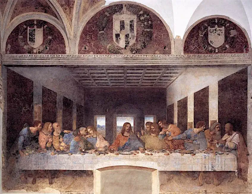
The principle of balance can be found in ancient and early art styles. Yet, it was the artists working throughout the Renaissance era that helped to formalize the concept and bring it into common use. Leonardo da Vinci, for example, is well-known around the globe for his painstaking attention to balance in works such as The Last Supper (1490) and The Vitruvian Man (1490). Marcus Vitruvius Pollio thought that a temple should be proportioned similarly to the human body.
 Illustration from Architecture: ou Art de bien bastir by Vitruvius Pollio (1547); Houghton Library, Public domain, via Wikimedia Commons
Vitruvius stated this because he felt the human physique was perfectly proportioned. This is what inspired Da Vinci’s painting. The individual in the image is perfectly balanced and symmetrical. Each side is proportional to and balanced in relation to the other. Da Vinci employed symmetrical balance, which means that if you draw a line through the center, each side would be the same or very similar to the other.
Movement
Movement refers to directing the viewer’s attention along a specified path in a composition. When a person looks at a design, their eye is drawn to the focal points. Designers can simply direct the observer through the design by carefully positioning these focal points. In design, movement can be utilized in fascinating ways, such as the location of a subject to imply how other external influences may cause it to move. Furthermore, the same position of a subject might indicate how these factors impacted its movement prior to reaching that position.
You may include movement in your composition by using several features. These features guide the observer to the intended elements in the design. You can also use rhythm to generate a sense of motion in your artwork. A rhythm is formed when an element is repeated over varied distances. When the same element occurs at regular intervals, viewers know what to anticipate next. Static designs become dynamic through movement. That is what keeps your viewers from becoming lost in your composition.
The harsh and aggressive strokes in Claude Monet’s artwork Fishing Boats on the Coast at éTretat (1884) fit the character of the water. Sweeping strokes represent the ebb and flow of the water, while dense dabs of gray and white depict white water. In Joaquin Sorolla’s artwork Beach of Valencia by Morning Light (1908) you can practically feel the wind in the boat sails and women’s clothing, while the thick paint and powerful strokes that define the waves draw your focus around the artwork.
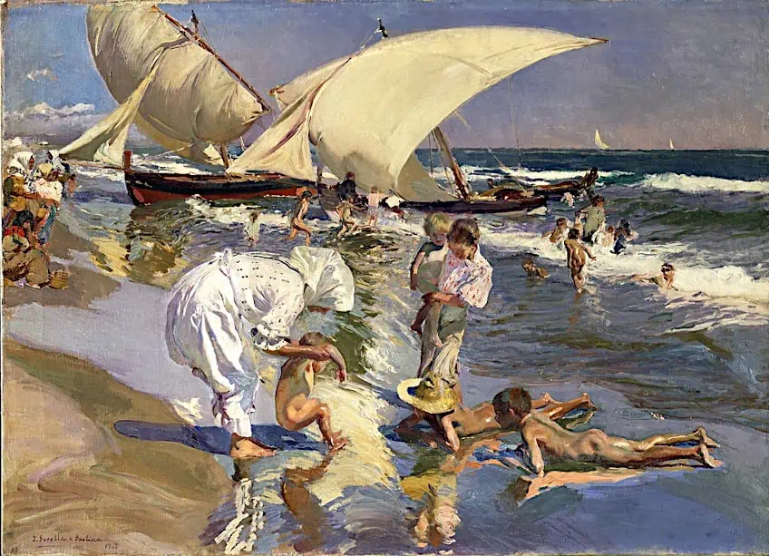 Beach of Valencia by Morning Light by Joaquín Sorolla (1908); Joaquín Sorolla, Public domain, via Wikimedia Commons
Broken color is a painting technique that includes using little dabs of distinctive hue. It’s excellent for conveying movement because your eyes tend to leap between all the different colors. Following the general flow, you may also mix the broken color with suggestive brushwork. Joaquin Sorolla achieved just that in his artwork On The Rocks At Javea (1905); one can observe the many green, blue, white, yellow, and purple tones, as well as how his brushwork follows the movement of the river. Additionally, when the colors overlap, the rocks in shadow begin to mix in with the shallow water.
Contrast
As one of the art principles, contrast represents the depiction of distinct elements in composition in two contrasting ways. When you use black typeface on a white background, you have contrast. The enormous font size of the headlines of your articles contrasts with the smaller type of the body material. With a design, you may even perceive the contrast between various shapes. Contrast is used by designers to draw attention to particular aspects of a design.
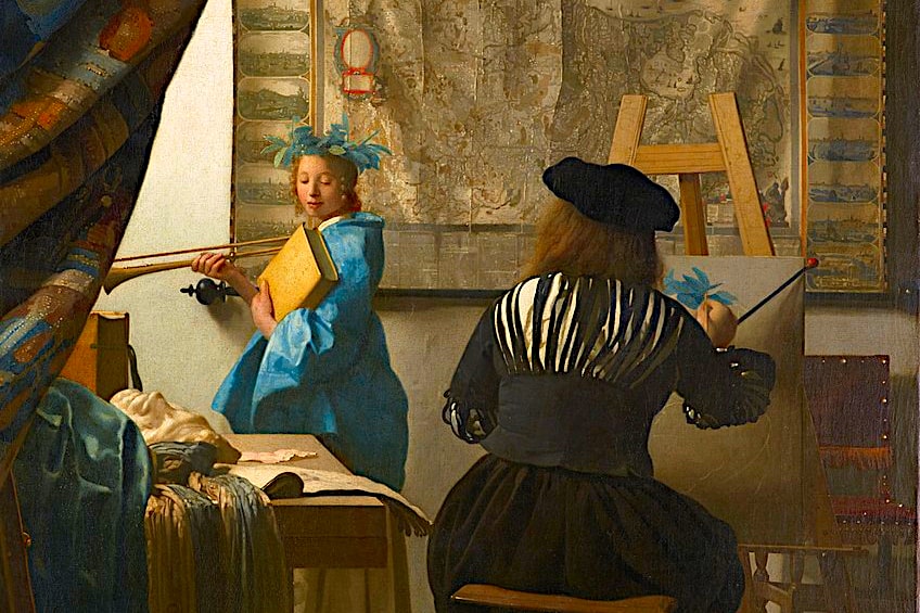
To establish contrast in a design or work of art, a designer or artist must evaluate the entire composition and the relationships of various components, instead of merely looking at each section of a composition individually. An excellent example is Johannes Vermeer’s Art of Painting (1666 – 1668), where the artist’s model is bathed in light, contrasted by the dark curtain that partially obscures her from the viewer’s sight.
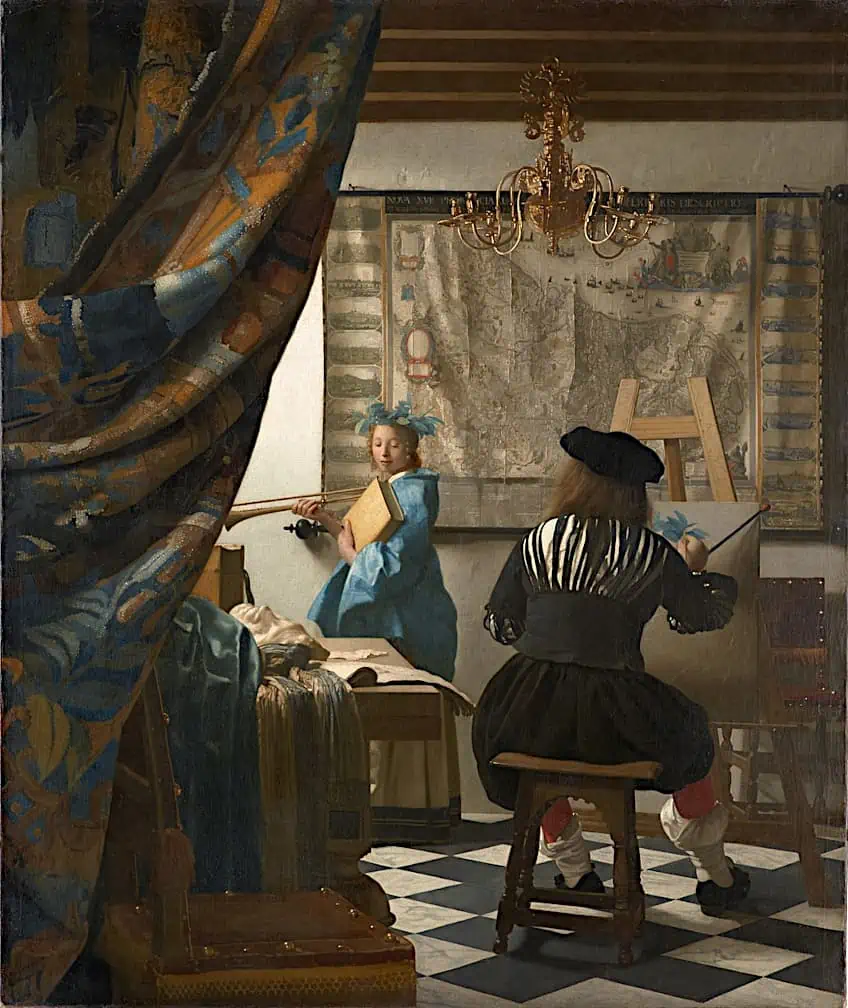 The Art of Painting (The Painter in his Studio) by Johannes Vermeer (1666 – 1668); Johannes Vermeer, Public domain, via Wikimedia Commons
A little gray circle, for example, would convey very little on its own. Yet, if you placed the circle next to a much bigger circle, you’d be conveying the message that the larger sphere deserves your attention before the smaller one. This is due to the fact that elements with higher visual weight require more instant attention in any composition. There’s a reason why black and white painting and photography have long been considered fine art. The black-and-white contrast is simple yet classy. There are few artists that can teach you more about tonal contrast than Ansel Adams, the renowned photographer.
If you want to add dimension to your black-and-white work by using tonal contrast, read about Ansel Adams’ zone method. Adams created the zone system to create more variation and detail inside a black-and-white image despite the absence of color. The zone method ensures the application of a range of tones between black and white.
A notable example of Adams’ work that effectively uses his zone method is The Tetons and the Snake River (1942) A large and dark mountain range covered with light snow, can be seen in the top part of the frame. In other sections, the sky is overcast, but only partly cloudy, and the light streams through to brighten the environment and reflect off the river.
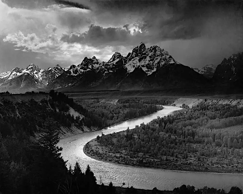 The Tetons and the Snake River by Ansel Adams (1942); Ansel Adams, Public domain, via Wikimedia Commons
Pattern
Repetition, pattern, and rhythm are all related yet different. Patterns may have a wide range of relevance and functions in design. Repetition focuses on the duplication of the same element; patterns are composed of distinct components that are then replicated in the same way all through the design or artwork. A seamless pattern is one that runs from start to finish with no discrepancies: the entire pattern is a continuous, coherent structure. This approach is notably significant when working with designs that have a lot of texture, color, or depth. Rhythm, unlike pattern and repetition, is far more complex. Unlike the other two, which need the same elements to be replicated in the same way all through the layout, rhythm requires the repeating of a range of design elements in a precise order.
Individual design components need not recur or be the same at all times as a consequence; instead, their recurrence is adaptable and evolves throughout the design. With the proper use of patterns, you can add life and depth to an artwork, inject texture into a design, and attract more attention. Patterns, like many principles of design in art, may have a big impact on your target audience by expressing personality, brand values, and preferences. Consider the patterns you see on the backgrounds of websites and apps. Patterns draw attention to a certain aspect of a composition.
 The Kiss by Gustav Klimt (1907-8); Gustav Klimt, Public domain, via Wikimedia Commons
A pattern applied around a logo that highlights essential features and colors may highlight the logo while conveying an important message.
A good example of the use of patterns in art is the works of Gustav Klimt, such as The Kiss (1908) for instance. Gustav Klimt, renowned for his rich, ornamental style and lavish gold leafing, frequently incorporated patterns in his artworks. Greek, Byzantine, and Egyptian art influenced the themes. The Kiss, for instance, is composed entirely of flat regions with uneven patterns. The man’s body is made up of repetitive rectangles, while the woman’s body is made up of circles.
Variety
Adding variety involves breaking up the monotony of a design. It adds aesthetic appeal and can immediately prevent your design from getting dull and boring by incorporating variation into it. With a few easy tweaks, you can attract and enchant your audience. It adds aesthetic excitement and dynamism to the image. Keep in mind that using too much diversity in your design might make it overpowering and confusing, eventually appearing disorganized and confusing to the general public. Use curving lines next to straight lines, geometric patterns in the middle of organic shapes, or vibrant colors opposite somber gray tones to add variety to your work.
Using a range of different colors, fonts, textures, and shapes can help create variety. But, variety for its own sake is pointless. Variety should be employed with the other principles of art to produce a more engaging and visually appealing result that improves the observer’s experience. Variety is also an overarching principle in type design. A good variety of broad and thin, flat and round, or light and dark elements within a font may give a simple line of type an elegant and pleasant rhythm. A variety of typefaces in a single design might be effective – or it can be disastrous.
 Orchard in Blossom (Plum Trees) by Vincent van Gogh (1888); Vincent van Gogh, Public domain, via Wikimedia Commons
Vincent van Gogh was a famous painter who excelled in incorporating variety into his artworks. The juxtaposition of the various elements provides interest through his use of various colors, textures, and flowing and jagged lines. Van Gogh knew how to make these separate elements look cohesive by employing color schemes and reducing forms and details. Van Gogh employs complementary colors green and red in the grasses in his artwork, The Orchard in Blossom (1888), to provide contrast and variation. Nonetheless, because of the reduced color scheme and the employment of only those two colors and their expanded range, the artwork appears harmonious.
As is evident from looking at Van Gogh’s works, using multiple colors is one of the easiest ways to add variety to an artwork.
Emphasis
The technique of making a single aspect stand out is known as emphasis. The designer can establish emphasis by arranging components on the page in natural eye-drawing places and by employing other principles such as pattern, contrast, or movement. Text can be highlighted using bold and italic type. Image emphasis can be provided through visual weight, size, color, intricacy, and distinctiveness. When it comes to design, the prominent element should cover at least two-thirds of the overall visual composition. This leaves one-third of the area available for copy text. This technique is often applied on the first pages of magazine articles. Readers will continue reading if the layout captures their interest with the dominating picture and opening text.
The focal point does not have to be in the center of the image. The most essential component of a picture might be placed off-center, to the side, and higher or lower than the center line to add interest. Subordinates are additional compositional components that have been reduced or scaled back in order to draw attention to the focal point. The focal point might be the biggest, clearest, darkest, or most intricate element of the picture, or it could draw special attention for some other reason. Only one component should compete for the main attention. When more than one element has equal attention, emphasis is lost.
 The Rose in Vase of Sassonia by Giovanni Boldini (1906); Giovanni Boldini, Public domain, via Wikimedia Commons
In The Rose in Vase of Sassonia (1906) by Giovanni Boldini, the artist employed thick paint and vivid color to draw attention to the flowers in the vase. We can also see that the backdrop is little more than a faint stain of color. The lady staring out over the water in Valentin Serov’s artwork Iphigenia in Tauris (1893) breaks up the tapering line made by the breaking coastline. This disruption of the line conveys a powerful message and emphasizes the woman’s status.
The presence of the humans and the comparatively brilliant red poppies, which jump out among the surrounding colors of blue and green, emphasize the foreground in Monet’s landscape painting, Poppies (1873).
Proportion
Proportion is one of the seven principles of art that pertains to the relationship of multiple components in a composition and how they relate to one another in terms of color, size, degree, context, and so on. When two or more components in an artwork are combined, a connection is established. The arrangement is considered to be harmonious when the components are in an ideal relationship with each other proportionally. This relates to the proper sizing and arrangement of a component, which results in an optimum proportion.
A well-proportioned design creates symmetry, harmony, or balance among its components. Proportion is often overlooked until something has an incorrect proportion. It is considered to be “out of proportion” when the comparative sizes of two things being compared look inaccurate or uneven.
 Mount Rushmore by Gutzon Borglum (1927 – 1941); Shah Ronak S, CC BY-SA 4.0, via Wikimedia Commons
For instance, if a person’s head is bigger than their entire body, we would say they are out of proportion. There are numerous methods for establishing appropriate proportions, such as grouping similar elements that are comparable or share a feature. Since equal elements can rapidly become tedious and dull, divide the design into large and smaller regions. But, the size discrepancies must not be so great that the pieces look unconnected and, as a consequence, out of harmony. Mount Rushmore (1941) is an excellent illustration of proportion in art. While all of the heads in the sculpture’s composition are in proper proportion to one another, the sculpture’s scale is vast in comparison to the observer.
That wraps up our look at the seven art principles. The principles of design in art all work together and often overlap in function. For example, contrast can be used to also create emphasis, and patterns can be used to influence the perception of movement. With a better understanding of the seven principles of art, your work will look more appealing and your designs will be more engaging!
Frequently Asked Questions
What Are the Principles of Design in Art?
The principles are movement, proportion, emphasis, contrast, pattern, and variety. These principles can all be used to make your designs and artworks more interesting to look at. They are used by commercial designers as they are known to effectively draw attention to the message and products within an advert. Artists use it for the same reason to attract the viewer’s attention and move the eye around the image in a captivating manner.
What Is the Difference Between the Elements of Art and the Principles of Design?
While both elements and principles of art are used to create artwork, they are slightly different in form and function. The elements of art are like the basic building blocks from which you create your works, such as color, line, shape, and so on. When you take those elements and then use various techniques to apply those elements in interesting ways, you are then using the various principles of art to do so. So, you can take the element of a line and repeat it by using the principle of pattern, for example.

In 2005, Charlene completed her wellness degrees in therapeutic aromatherapy and reflexology at the International School of Reflexology and Meridian Therapy. She worked for a company offering corporate wellness programs for several years before opening her own therapy practice. In 2015, she was asked by a digital marketer friend to join her company as a content creator, and it was here that she discovered her enthusiasm for writing. Since entering the world of content creation, she has gained a lot of experience over the years writing about various topics such as beauty, health, wellness, travel, crafting, and much more. Due to various circumstances, she had to give up her therapy practice and now works as a freelance writer. Since she is a very creative person and as a balance to writing likes to be active in various areas of art and crafts, the activity at acrylgiessen.com is perfect for her to contribute their knowledge and experience in various creative topics.
Learn more about Charlene Lewis and about us.